I’ve been working with greens for a long time and here’s what I’ll tell you.
Hunter Green Vs Emerald Green is the most common comparison I see in my consultations.
Both are deep, rich and have a sophisticated vibe but they’re NOT interchangeable.
Green as a color carries weight in design.
It connects us to nature but it also gives luxury, growth and stability.
Hunter Green and Emerald Green get confused together and I get why.
They’re both described as deep, rich green shades.
They look similar in bad lighting.
The comparison matters because the wrong choice can throw off the design vision, whether that’s a living room accent wall, your fall wardrobe, or your daughter’s wedding palette.
A client orders Emerald bridesmaid dresses thinking they’re getting the moody forest vibe and then they show up looking like jewel-toned Christmas ornaments.
So, I’m breaking down the differences between hunter green vs emerald green.
The undertones, lighting, which rooms each color works in, the real-life version.
I’m also throwing in comparisons with other greens because once you start looking, you’ll realize there’s a color wheel.
And I’ll share the mistakes I made.
Here are my other blogs that you can also read:
- City Loft Vs Alabaster
- Eider White Vs Alabaster
- Clary Sage Vs Evergreen Fog
- Evergreen Fog Vs Dried Thyme
- Drift Of Mist Vs Alabaster
Overview of Hunter Green
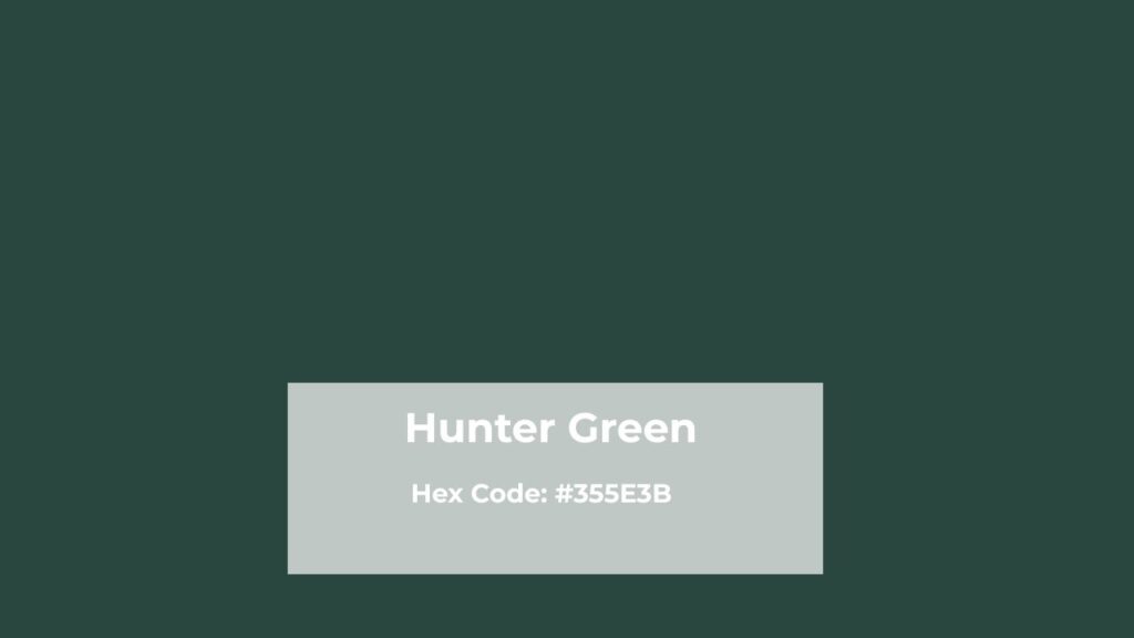
Hunter Green gets its name from the traditional British hunting jackets worn back in the 19th century.
Hunters needed to blend into forests, so they wore a dark, earthy green that disappeared into the trees.
It’s a very dark green with strong blue undertones, but also some brown and black mixed in there that makes it feel grounded and serious.
The HEX code is #355E3B, and the RGB breakdown is 53, 94, 59.
It falls in the dark forest green family.
Low brightness is the key characteristic, we’re talking about a green that absorbs light rather than reflects it.
The saturation is medium-to-high, but it appears toned down because of the low brightness level.
I used Benjamin Moore Hunter Green (2041-10) in a client’s study room and I remember standing there with the paint fan thinking and it was, but in the best way.
The formula has a low LRV, which means it drinks up light.
The room felt like a rich library like leather chairs, brass lamps, the whole room.
Hunter Green makes a statement in interiors without looking for attention.
It’s the strong, silent type. In fashion, it’s that fall and winter staple that works in velvet, works in wool, works in bridesmaid dresses for outdoor weddings.
I’ve styled it many times for rustic wedding clients who want that woodland elegance but don’t want to look washed out.
The impact is always about depth.
You’re adding weight to a space or an outfit.
It’s conservative but not boring.
Traditional but not outdated.
And it looks darker than you expect, so if you’re going for Hunter, commit to the moodiness.
Overview of Emerald Green
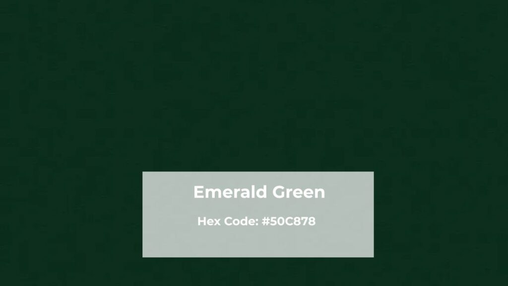
Emerald Green is named after the emerald gemstone, and that’s not only marketing but this green captures the jewel-toned effect.
Historically, emeralds were associated with wealth, royalty, Cleopatra-level luxury and this green shade carries it.
It’s a bright and vivid green and it’s a statement.
The HEX code for Emerald is #50C878, with RGB values of (80, 200, 120).
You can see the difference in the numbers, more green and more brightness.
This shade has strong blue undertones similar to Hunter Green, but here’s the key difference: it’s more luminous.
High brightness, high saturation.
It doesn’t absorb light, it almost glows with it.
I’ll never forget the first time I used true Emerald Green on an accent wall in a contemporary condo.
The client was nervous, but the second we rolled it on, instant drama.
Emerald doesn’t whisper, it announces. In interiors, it creates bold focal points.
In fashion, this is your evening gown color.
Your cocktail dress is like silk, satin, anything with sheen that amplifies that jewel-tone quality.
I’ve had brides choose Emerald for black-tie weddings, and it photographs VIBRANT.
I always warn clients that Emerald bridesmaid dresses will shine in photos more than they appear in person under store lighting.
The impact of Emerald is immediate.
It’s glamorous, it’s fresh, it’s got energy.
Where Hunter Green feels like old-money sophistication, Emerald feels like new-money confidence. Both are beautiful, but the vibe is different.
What is the Difference Between Hunter Green and Emerald Green?
These are both “dark rich greens” if you’re going through paint chips or fabric swatches.
But when you put them side by side and analyze what’s happening with undertones, depth, and brightness, they’re not close.
The differences matter depending on what you’re doing, a bedroom vs a bathroom, a winter wedding vs a spring event, velvet curtains vs a painted kitchen island.
Let me break down what separates these two.
Undertones
Hunter Green has visible brown and black undertones mixed with blue.
That’s what gives it the earthy, grounded, almost murky quality.
It’s not a clean green, there is complexity and darkness in it.
Emerald Green has blue undertones too, but they’re clean and bright.
No brown, no black muddying it up.
The blue in Emerald makes it feel cool and vibrant, while Hunter’s brown and black mix makes it feel warm and heavy.
I learned this when I specified “dark green” to a painter without clarifying the undertone.
He used a shade closer to Emerald when I wanted Hunter, and the room felt wrong.
Too bright, too energetic for a bedroom that was supposed to feel cozy.
Depth
Hunter Green is dark, almost-black-in-low-light dark.
It is in the deep end of the green spectrum.
When you’re looking at it on a wall in a room with limited natural light, it can read almost charcoal.
Emerald is in the medium-to-dark range, but it never looks black.
Even in dim lighting, it still reads as GREEN.
Vibrant green. You never lose the color identity of Emerald the way you can with Hunter.
This is critical for small spaces.
I made the mistake once of using Hunter in a windowless powder room thinking it would feel luxe but it felt like a cave.
A beautiful cave, but Emerald in that same space would’ve stayed lively.
Brightness and Saturation
Hunter Green has low brightness, we’re talking about a shade that’s dim.
The saturation is moderate, which means the color intensity is there but it’s muted by the low brightness.
Emerald Green has high brightness AND high saturation.
It’s a double of intensity.
The color is strong, and it’s BRIGHT.
It reflects light instead of absorbing it.
When I’m choosing between these two, brightness is my deciding factor.
I want the room to feel intimate and enclosed or open and energized.
There’s no wrong but there’s a wrong choice if you’re not honest about the vibe you want.
Lighting Impact
Lighting will change EVERYTHING about how these greens perform.
Hunter Green in natural daylight looks rich and forest-like.
Under warm artificial light, it can look almost brownish.
Under cool LED lights, the blue undertones come out more.
I always test Hunter in the space with the lighting before committing.
Emerald Green handles lighting changes better because it’s saturated.
It stays vibrant in most lighting conditions.
Natural light makes it sing, it’s stunning in a room with big windows.
Artificial warm light makes it look more mellow but bright.
Cool light amplifies the blue undertones and makes it almost teal.
Style and Best Uses
Hunter Green is a traditional, rustic, moody aesthetic.
It works beautifully in spaces that have wood tones, leather, brass, vintage vibes.
Fashion-wise, it’s fall and winter all the way.
Outdoor weddings, rustic ceremonies, woodland themes.
It pairs with burgundy, mustard, cream, and gold.
Emerald Green is contemporary, glamorous, bold.
It thrives in modern spaces with marble, white trim, black accents, metallic finishes.
In fashion, it’s your formal event color like evening wear, cocktail dresses, black-tie weddings.
It pairs with gold, silver, white, black, blush.
I’ve used both in the same house for different rooms, and it worked because the CONTEXT was different.
Hunter in the study, Emerald in the powder room.
Different purposes, different energy.
Comparison Table:
| Feature | Hunter Green | Emerald Green |
| Depth | Very dark, almost black | Medium to dark |
| Brightness | Low | High |
| Saturation | Moderate to low | High |
| Undertones | Brown, black, blue | Clean blue |
| Visual Feel | Earthy, grounded, moody | Vibrant, luxurious, energetic |
| Formality | Conservative, traditional | Bold, dramatic, glamorous |
| Best Lighting | Warm artificial, limited natural | Abundant natural, any artificial |
| Pairs With | Burgundy, mustard, cream, brass | Gold, silver, white, black |
| Season Association | Fall, winter | Spring, summer |
| Style | Rustic, traditional, moody | Contemporary, Art Deco, glam |
Hunter Green Vs Emerald Green: Room-By-Room Comparison

I’m about to get specific because this is where theory meets reality.
You can read about color values but When you see these greens in rooms with furniture and lighting conditions, it’s different.
I’ve worked with both Hunter and Emerald in every type of space.
The thing is, a green that’s perfect in a living room can be wrong in other spaces.
So, let’s go and see about this.
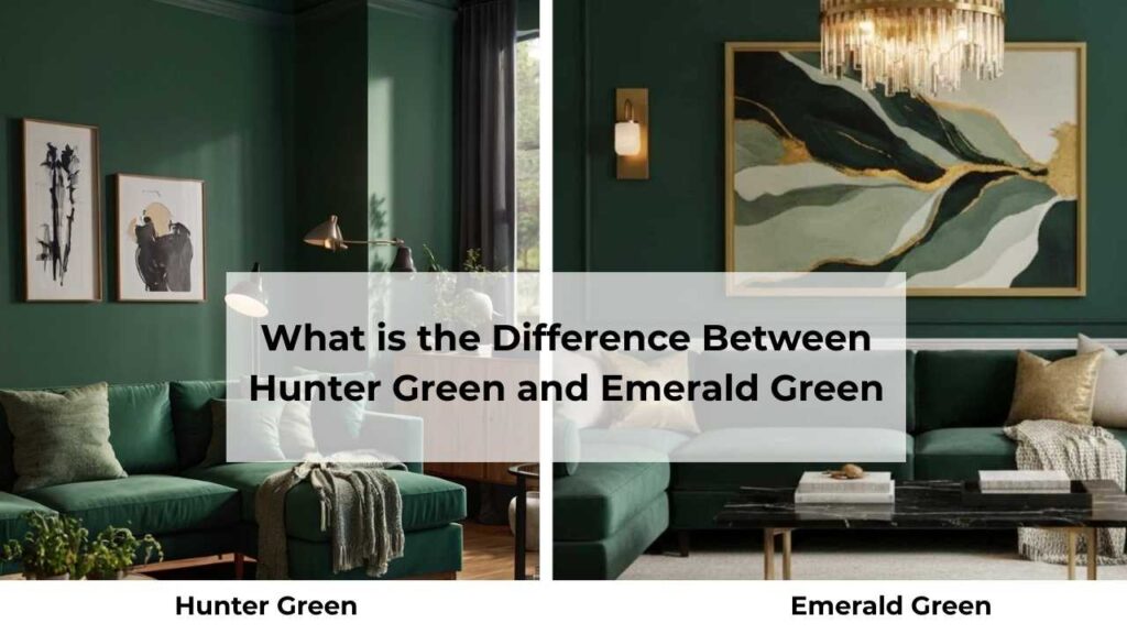
Living Room
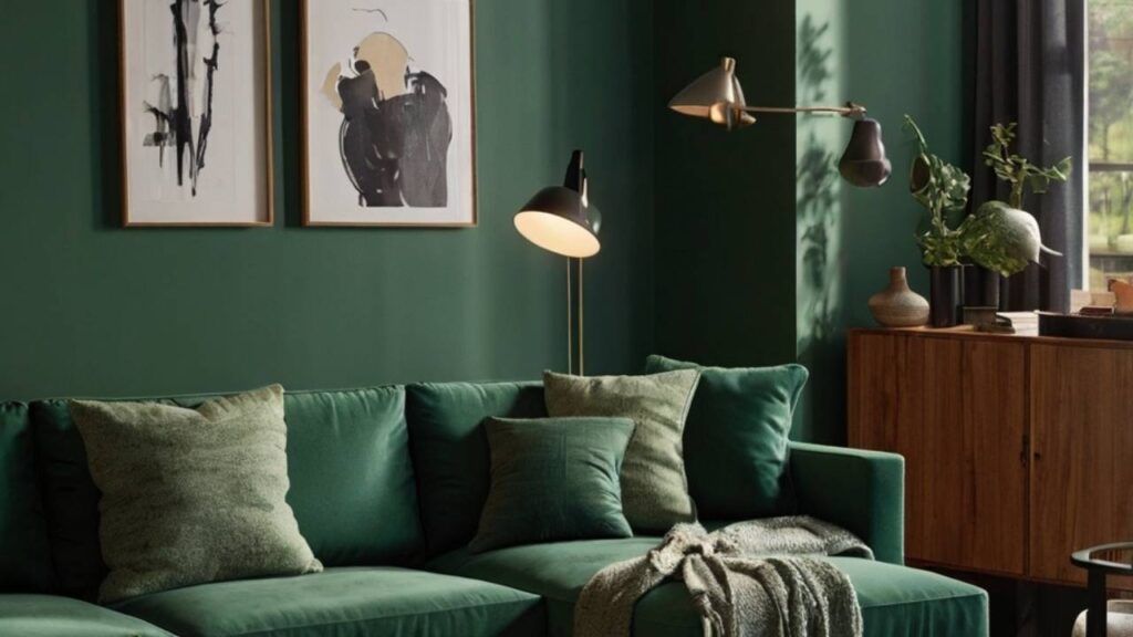
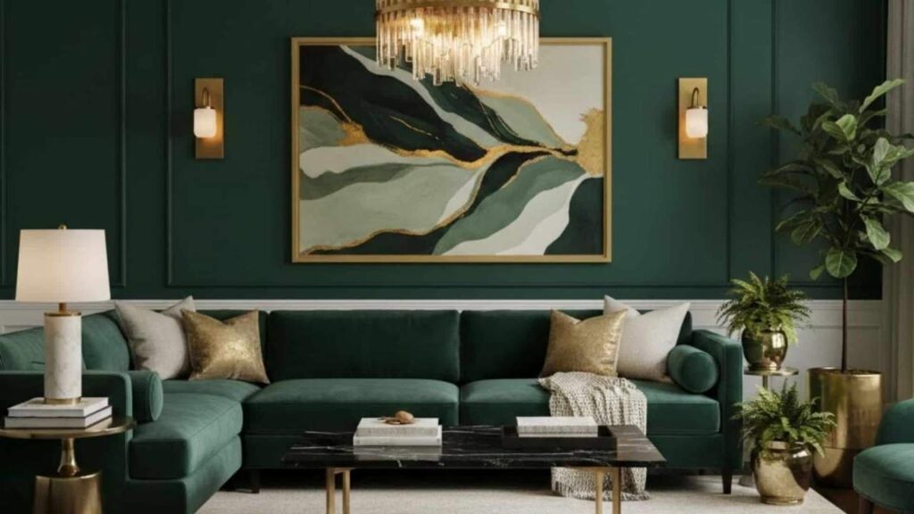
Hunter Green in the living room is a move I’ve done many times and it almost always delivers a cozy, sophisticated vibe.
I used it on an accent wall behind a client’s sofa and the wall, floor to ceiling.
We did Benjamin Moore Hunter Green (2041-10), and paired it with a cream sofa, cognac leather chairs, and brass floor lamps.
The impact was IMMEDIATE.
The room felt grounded, serious and curated.
Hunter absorbs light that makes the living room feel small, more intimate.
But this only works if you have natural light coming in from other walls.
My client had big windows on two adjacent walls, so the Hunter accent wall didn’t make the room feel dark.
I made the mistake of using Hunter on THREE walls in a living room with only one small window and it looked the worst like a dungeon.
Hunter needs balance, one dramatic wall and light elements around it.
Emerald Green in the living room is different.
I’ve used it in more contemporary spaces where the client wants a statement but wants the room to feel open and bright.
Did an Emerald accent wall in a modern farmhouse-style living room with white shiplap on the other walls, black metal light fixtures, and a grey sectional.
The Emerald wall became the STAR of the room.
Every single person who walked in commented on it.
It was photographed beautifully and my client’s real estate agent told her it added value to the home.
Emerald keeps a living room feeling alive and energetic.
It doesn’t absorb light like Hunter, so the room felt spacious.
The trick with Emerald is not overdoing it.
One wall is like one piece of upholstered furniture.
I saw a DIY project online where someone did ALL FOUR walls in Emerald and it was too much.
Emerald needs breathing room.
Bedroom
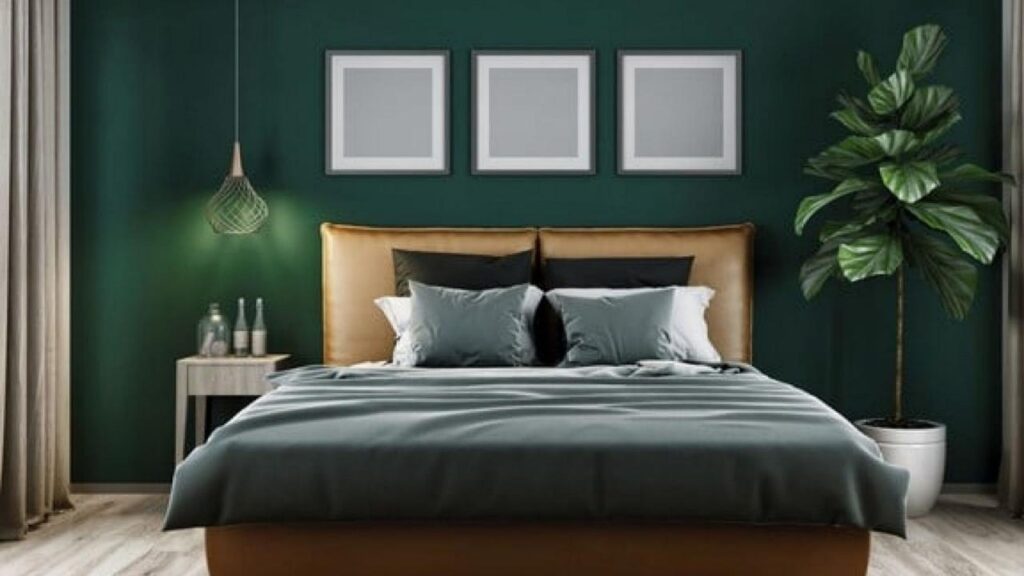
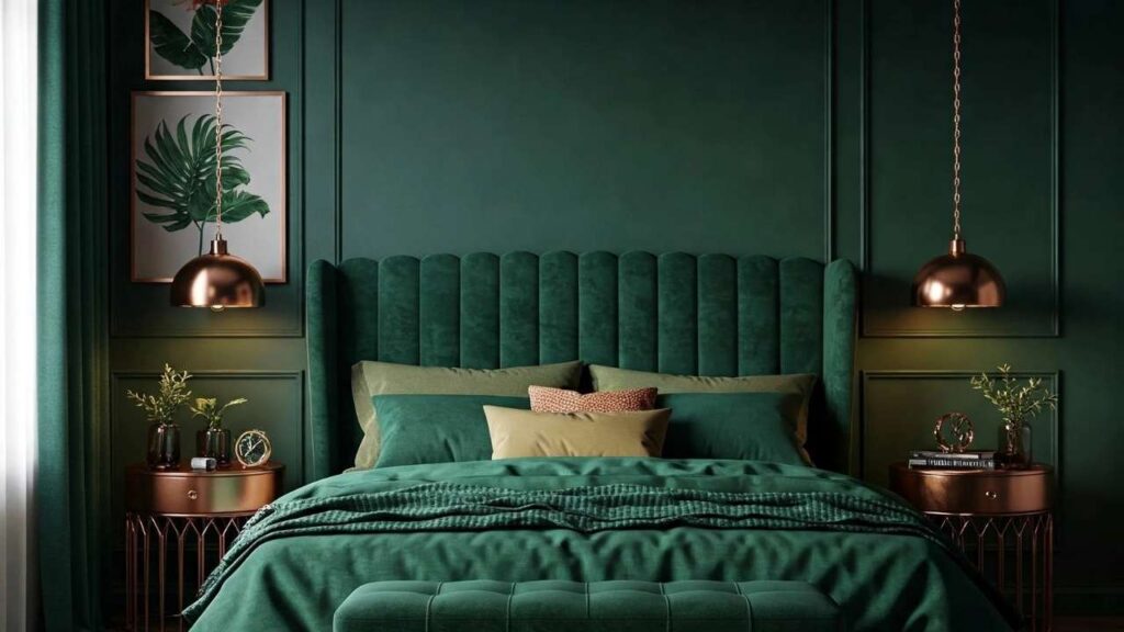
Hunter Green in a bedroom is one of my favorite choices for clients who want a moody, cocooning sleep space.
I did a full Hunter bedroom on all four walls, white trim, brass sconces, cream bedding with burgundy throw pillows.
It felt like sleeping in a luxurious forest cabin.
The darkness HELPED with sleep because it made the room feel enclosed and restful.
Hunter in a bedroom works best in larger bedrooms with high ceilings.
I also recommend good task lighting because Hunter will make your room dark.
One mistake I see people make is pairing Hunter walls with dark furniture.
Too much darkness, no contrast.
I always go light with furniture and bedding when the walls are Hunter.
Cream, white, light grey.
Emerald Green in a bedroom is a bit tough.
It requires the right personality.
Emerald is energizing, which isn’t always what you want where you sleep.
BUT for a guest bedroom or a primary bedroom where you want a glamorous vibe, it can be stunning.
I used Emerald on one accent wall behind the bed in a client’s primary suite.
White walls with gold mirror above the bed, white bedding with emerald velvet throw pillows. It looked like a boutique hotel room which is a luxury.
But my client admitted she had to get blackout curtains because the Emerald wall was too stimulating at night.
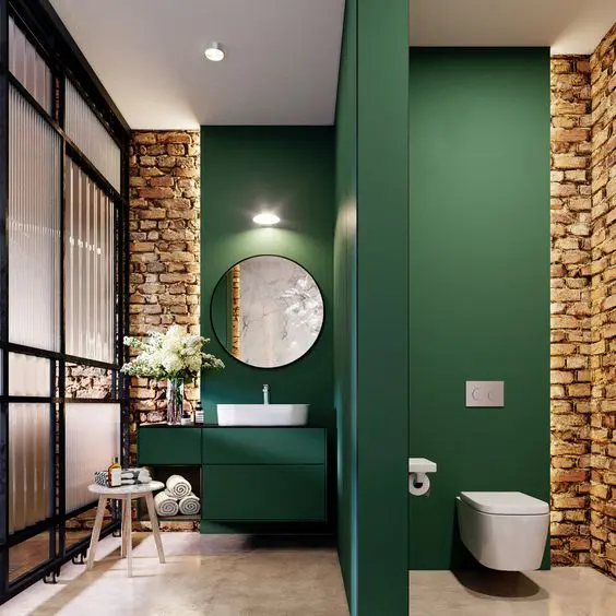
Bathroom
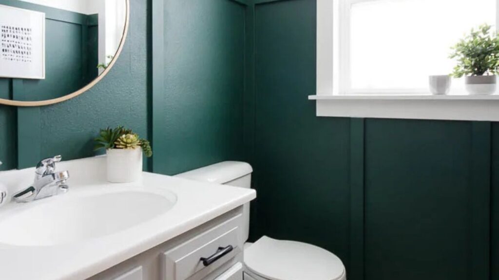
Hunter Green in a bathroom is having a MOMENT and I’m here for it.
I’ve done Hunter in powder rooms, primary bathrooms, a kids’ bathroom.
The key is that bathrooms are small, and Hunter in a small space feels intentional and designed rather than claustrophobic.
I did a powder room with Hunter walls, white hexagon floor tile, a marble countertop, brass faucet and mirror. It felt expensive.
Hunter hides imperfections too, if your bathroom lighting is harsh, Hunter softens it.
If your bathroom is windowless, Hunter makes it feel more like a jewel box than a cave.
Remember, moisture and paint finish matter here.
I always spec a satin or semi-gloss finish in Hunter for bathrooms because you need wipeable, moisture-resistant coverage.
Flat or matte Hunter in a bathroom will show water spots and get dingy fast.
Emerald Green in the bathroom feels fresh and calm.
I used Emerald subway tile in a client’s primary bathroom shower, and it was STUNNING.
The glossy tile finish amplified the jewel-tone quality, and it paired beautifully with white grout, marble floors, and brass fixtures.
Emerald painted walls in a bathroom work best if you have natural light.
I did an Emerald bathroom with a window and skylight, and it felt like being in a lush garden.
But I also saw a DIY Emerald bathroom with no windows and only fluorescent lighting and it looked sick.
Go semi-gloss or high-gloss with Emerald paint in bathrooms.
The sheen adds to the luxe, polished feeling.
Kitchen
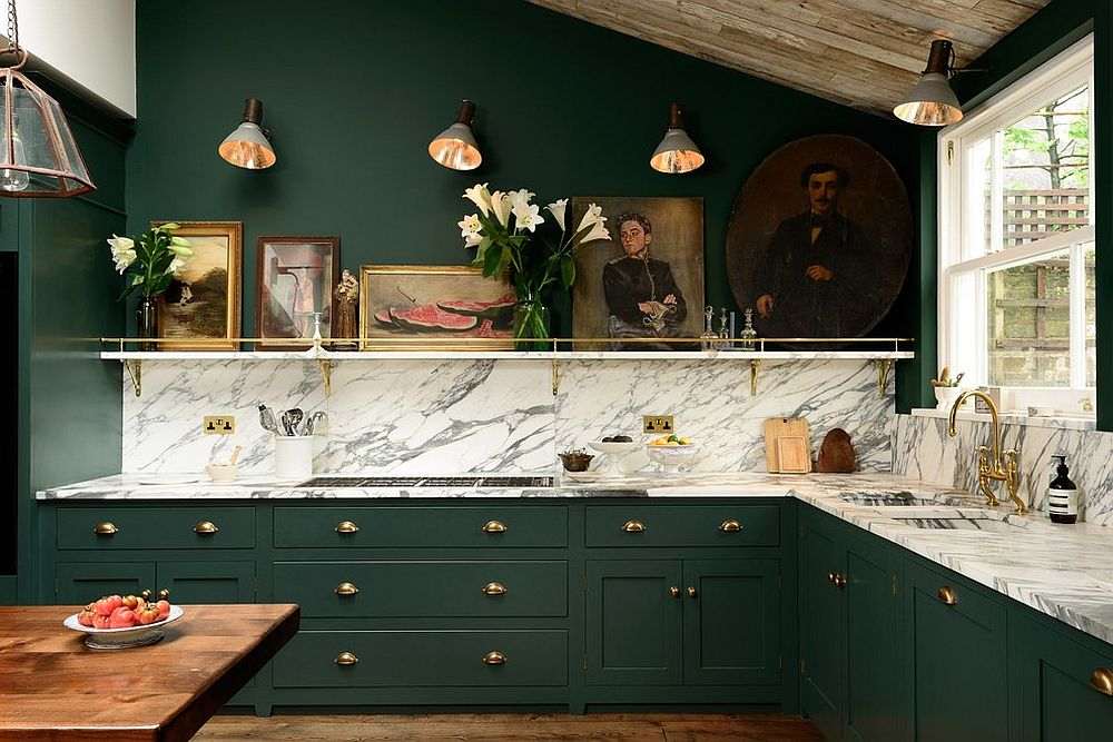
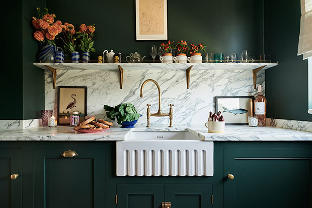
Hunter Green kitchen cabinets are in trend and for good reason.
I’ve done Hunter lowers with white uppers, all Hunter cabinets with brass hardware.
Hunter island with white perimeter cabinets and it works if you plan the rest of the finishes carefully.
Hunter cabinets feel timeless and sophisticated.
They don’t look as trendy the way some colors do.
I did a full Hunter kitchen with marble countertops, white subway tile backsplash, brass cabinet pulls, and open shelving with cream dishes.
It looked like it belonged in a historic home but felt current.
The mistake I see is people doing Hunter cabinets in a kitchen with limited natural light and dark countertops.
It creates too much darkness and the kitchen feels heavy and oppressive.
If you’re going Hunter cabinets, you NEED light countertops and good lighting.
Under-cabinet lighting is non-negotiable.
Emerald Green in a kitchen is bold, and you have to commit.
I’ve done Emerald on a kitchen island (white perimeter cabinets), and it worked beautifully as a statement piece.
The Emerald island became the focal point of the entire open-concept main floor.
But I’ve also seen Emerald cabinets, and it’s a LOT.
You have to love it because Emerald demands attention.
If you’re going full Emerald cabinets, keep EVERYTHING else neutral like white walls, white or light countertops, simple backsplash, it makes the cabinets shine.
Emerald also works as a backsplash color if you’re nervous about cabinets.
I did an Emerald glass tile backsplash in a white kitchen, and it added color without overwhelming the space.
Hunter Green Vs Emerald Green Vs Other Colors
Let’s throw more greens into the mix because the green family is big and there’s a lot of overlap and confusion.
I’ve had clients come to me saying they want “that green” while pointing at something that could be Hunter, or Forest, or a dark olive depending on the lighting.
So I’m going to break down how Hunter Green Vs Emerald Green compared to the other greens.
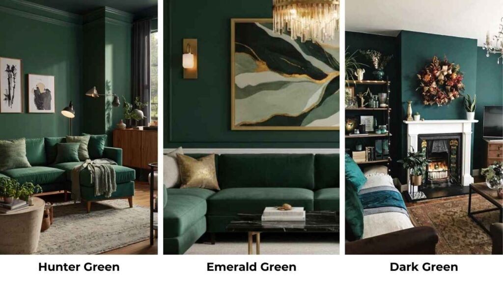
Hunter Green Vs Emerald Green Vs Forest Green
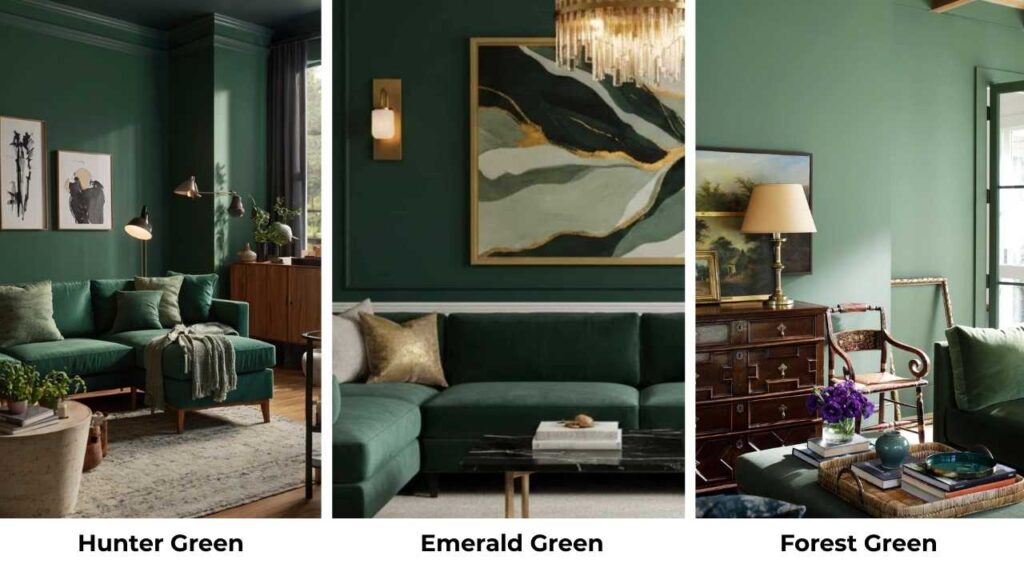
Forest Green (HEX #228B22) is between Hunter and Emerald in terms of vibe.
It’s a true, nature-inspired green like tall pine trees and dense woods.
Hunter is the dark and muted of the three, with the brown and black undertones making it feel earthy.
Forest is brighter than Hunter but not as vibrant as Emerald, it’s a medium-dark green that looks as “green” in most lighting.
Emerald is bright and saturated, with the jewel-tone quality.
I used all three in the same house once but in different rooms.
Hunter in the study, Forest in the mudroom, Emerald in the powder room.
Forest ended up being the most versatile and it worked with both traditional and contemporary elements, while Hunter skewed traditional and Emerald skewed contemporary.
If you can’t decide between Hunter and Emerald, Forest can be your middle ground.
It’s got depth without being as dark as Hunter, and it’s got richness without being as bold as Emerald.
Dark Green Vs Emerald Green Vs Hunter Green
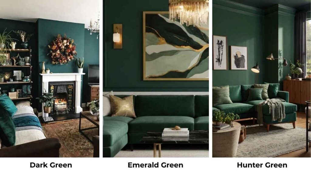
“Dark green” isn’t a specific color but it’s a category.
But when people say “dark green,” they mean something in the Hunter and Forest family.
Hunter IS a dark green, one of the darkest you can go while looking as green instead of black.
Emerald is NOT considered a dark green, it’s a medium-dark and the high saturation makes it feel brighter than its depth.
The confusion happens because in low lighting, Emerald CAN look dark.
I’ve had clients swear their Emerald bridesmaid dresses looked dark and in dim reception lighting, Emerald loses some of its brightness.
But put that same dress in daylight next to an dark green like Hunter, and the difference is obvious.
If someone tells me they want “dark green,” I always ask: dark and moody (Hunter), or dark and rich (Forest), or vibrant jewel-tone (Emerald)? The answer completely changes which direction we go.
Olive Green Vs Hunter Green
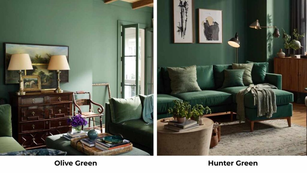
Olive Green (HEX #808000) is different from Hunter that I’m almost surprised people confuse them, but they do.
Olive is a muted, yellowy-green.
It’s got brown in it like Hunter does, but it leans WARM almost khaki-like in some formulations. Hunter leans COOL with the blue undertones.
Olive feels casual, organic, very earthy in a Southwestern or Mediterranean way.
Hunter feels formal, traditional, British countryside.
I did an olive kitchen once and it had a rustic, farmhouse vibe.
When I’ve done Hunter kitchens, they feel more like an English country or traditional colonial. Both are beautiful, but the associations are different.
Comparison Table:
| Color | HEX Code | Depth | Vibe | Best Use |
| Hunter Green | #355E3B | Very dark | Traditional, moody, forest | Formal interiors, fall fashion |
| Emerald Green | #50C878 | Medium-dark | Luxurious, vibrant, jewel-toned | Statement walls, evening wear |
| Forest Green | #228B22 | Medium | Natural, versatile, balanced | Casual interiors, outdoor gear |
| Olive Green | #808000 | Medium-light | Warm, rustic, earthy | Casual fashion, farmhouse style |
| Dark Green (general) | Varies | Dark | Depends on specific shade | Category, not specific color |
What Colors Pair Well with Hunter Green?
Hunter Green is one of the colors that LOOKS like it would be hard to pair, but it’s versatile once you understand its personality.
Because it’s so dark and grounded, it needs partners that either contrast with it or complement its traditional, earthy vibe.
Gold and brass are my GO-TO metallics with Hunter.
There’s something about the warm metallic against that cool, dark green that WORKS
. I use brass hardware on Hunter cabinets, gold frames on Hunter walls, brass lamps in Hunter rooms.
It’s a classic pairing that feels expensive.
Cream and ivory are better than harsh white with Hunter.
White can feel too harsh against Hunter’s darkness, cream softens it and feels intentional.
I did Hunter walls with cream trim and cream furniture, and it felt rich and layered.
Burgundy and deep red create a gorgeous traditional palette with Hunter.
Think holiday vibes, English countryside, library aesthetics.
I styled a fall wedding with Hunter bridesmaid dresses and burgundy florals.
Mustard yellow is a great pairing.
The warm yellow plays off Hunter’s cool tones and creates a dynamic, slightly modern-traditional look.
I used mustard throw pillows on a Hunter velvet sofa, and it worked.
Dusty rose and mauve soften Hunter beautifully.
If you’re worried Hunter feels too masculine or heavy, add in some dusty pinks.
I did this in a bedroom, Hunter walls, cream bedding, dusty rose pillows and curtains.
It balanced the moodiness with femininity.
Wood tones, mainly medium to dark woods are natural partners.
Walnut, oak, cherry, all of it looks gorgeous with Hunter.
The brown undertones in Hunter connect with the brown in wood, creating a cohesive earthy palette.
Avoid pairing Hunter with: bright whites, cool greys (both cool-toned, feels flat), bright colors like orange or hot pink (clashes with Hunter’s traditional vibe).
What Colors Pair Well with Emerald Green?
Emerald is BOLD, so it needs pairings that can either handle its intensity or provide contrast to let it shine.
Gold is THE metallic for Emerald.
Gold and Emerald together look like luxury, it’s the jewel-tone combination that never fails.
I use gold frames, gold hardware, gold accessories with Emerald walls.
It’s a match made in design heaven.
White especially bright white is perfect with Emerald because it provides contrast.
Emerald pops against white in a way it doesn’t against cream.
I did an Emerald accent wall with bright white trim and white furniture, and the Emerald looked vivid.
Black creates a dramatic, sophisticated pairing with Emerald.
Black and Emerald together feel Art Deco, glamorous, bold.
I’ve used black metal light fixtures, black frames, black accent furniture with Emerald walls and it looks moody but in a different way than Hunter.
Blush pink is a softer pairing that’s popular.
The warm pink plays beautifully against Emerald’s cool blue-green tones.
I styled an Emerald and blush wedding and Emerald bridesmaid dresses with blush floral looked pretty without being overly traditional.
Navy blue creates a jewel-tone-on-jewel-tone look that feels rich and layered.
Both are saturated, both are deep, and they play well together if you keep everything else neutral.
I made an Emerald velvet sofa with navy pillows and it worked beautifully.
Silver and chrome are cool metallic options that enhance Emerald’s blue undertones.
If gold feels too warm for your style, go silver.
I used chrome light fixtures and silver accessories in an Emerald bathroom, and it felt fresh and modern.
Marble, especially white marble with grey veining is a STUNNING material pairing with Emerald.
The cool tones complement each other, and the contrast between the solid Emerald and the veined marble creates visual interest.
I’ve done Emerald cabinets with marble countertops multiple times, always gorgeous.
Avoid pairing Emerald with: browns (muddies the brightness), orange (clashes), overly warm yellows (fights with Emerald’s cool tones).
Conclusion
Look, here’s everything about these two colors.
Hunter Green Vs Emerald Green are NOT the same, though they get confused constantly.
Hunter is the dark, moody, traditional green with brown and black undertones, it’s the color of British hunting jackets and formal libraries.
Emerald is the bright, luxurious, jewel-toned green with blue undertones and it’s the color of expensive gemstones and glamorous evening wear.
The choice between them is about the energy you want.
Hunter ABSORBS light and creates intimate, cocooning spaces.
It’s perfect for bedrooms where you want to feel wrapped up and cozy, powder rooms where you want drama, kitchens where you want timeless sophistication.
Emerald REFLECTS light and creates energizing, statement-making spaces.
Test first, paint big poster boards and move them around the room at different times of day.
See which one makes you excited to be in that space and that’s the choice for your space.
Choosing between Hunter Green Vs Emerald Green can be a bit tough but understandable when you understand the concept.
FAQs On Hunter Green Vs Emerald Green:
Hunter green is a very dark, muted green with brown and black undertones, low brightness, earthy and traditional. Emerald green is a bright, vivid jewel-toned green with blue undertones, high brightness and saturation, luxurious and bold.
No, they’re different shades. Hunter green (HEX #355E3B) is darker, muted, and has brown/black undertones. Emerald green (HEX #50C878) is bright, more saturated, and has clean blue undertones. They create different moods in spaces and styling.
Forest Green is the closest in terms of depth and richness, it’s slightly less vibrant. Teal Green is close in brightness and blue undertones but looks more blue. Jade Green is similar in saturation but softer. True Emerald is unique in its specific jewel-tone quality.
Hunter green is a dark forest green with blue, brown, and black undertones. It’s named after traditional British hunting jackets from the 19th century. The HEX code is #355E3B, RGB (53, 94, 59). It has low brightness, appears black in low light, and creates moody, traditional atmospheres in interiors and fashion.
Hunter Green Vs Emerald Green: Differences, Uses and Styling Tips