Picking a white paint color sounds simple until you’re looking in the paint book at 47 different shades of “white.”
Eider White and Alabaster are two of Sherwin-Williams’ popular off-white paint colors, and they cause more confusion than any other color.
Both have that warm, soft neutral effect that homeowners love.
The eider white vs alabaster comes up in design consultations because they look similar.
Both colors have undertones that change how they go in your space.
Undertones influence warmth, brightness, and how your room feels.
You think it is a soft, warm white but your walls look gray or purple or a bit flat, it’s about understanding how that color goes with your light, your furniture, your flooring.
We’re breaking down everything about Eider White Vs Alabaster.
The most important stuff like LRV, undertones, lighting behavior.
The other important stuff like which rooms they work in, what they pair with, and if you can use them together.
Here are my other blog posts that you can also read:
- City Loft Vs Alabaster
- Clary Sage Vs Evergreen Fog
- Balanced Beige Vs Accessible Beige
- Oyster White Vs Shoji White
- Manchester Tan Vs Accessible Beige
What You Need to Know About Eider White (SW 7014)
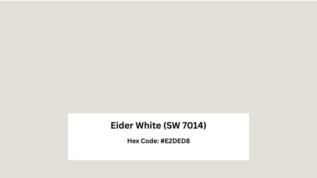
Eider White has a reputation of a versatile off-white, it’s classified as a soft greige, which means it’s both gray and beige undertones mixed together. The LRV is at 73, which is not a true white.
The gray undertone is obvious in lighting.
But Eider White also has a subtle violet or taupe undertone that shows up depending on your lighting. In the north-facing room , the violet-gray shows up but with natural south-facing light, it warms up and is balanced, creamy.
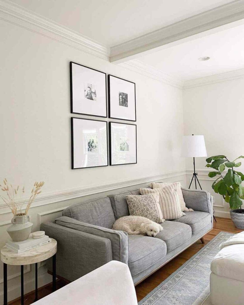
I’ve used Eider White in living rooms where clients wanted softer than stark white.
It works beautifully in bedrooms too, the muted quality creates a calm, cocooning feeling.
Bathrooms with good natural light are best to consider it with. It pairs well with marble, cool-toned tile, and modern fixtures.
Eider White requires coordination. You can’t just put it on the walls.
Your flooring matters. Your countertops matter.
If you’ve got warm honey oak floors and you paint the walls Eider White, it’s going to look dingy and confused.
What You Need to Know About Alabaster (SW 7008)
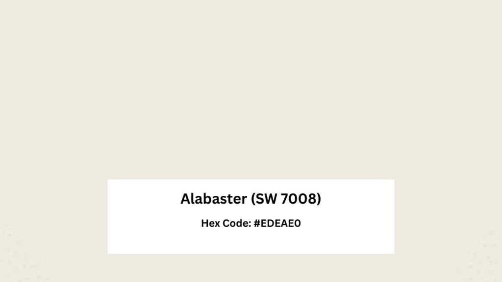
Alabaster is Sherwin-Williams’ best in its paints. This color won Color of the Year in 2016 and shows up in the “Top White Paint Colors” lineup. It’s popular for a reason because it’s forgiving. The LRV is 82, so it reflects light but feels soft and approachable.
Alabaster has warm, creamy undertones with a soft beige-greige influence.
There’s a hint of yellow, but it’s not enough to make the color read as a yellow-white.
It is firmly creamy. The warmth is what makes it livable so it doesn’t feel cold or sterile.
In north-facing light, Alabaster stays warm and inviting instead of going flat and in south-facing rooms, it gets bright and creamy.
It’s one of the colors that adapts well to different lighting without changing character.
Designers love Alabaster for house color schemes because it flows seamlessly from room to room.
I’ve used it in living rooms where clients wanted a fresh, airy feeling without going bright white.
The versatility is real.
Alabaster pairs well with warm woods, beige and greige palettes, earthy tones.
It goes well with black accents, bronze hardware, and with any design style from modern farmhouse to traditional to Mediterranean.
Difference Between Eider White and Alabaster
The impact they make depends on your lighting, room size, and what you’re pairing them with.
Eider White is cool and muted. Alabaster is warm and bright.
The version gets into undertones and light physics and why you should not use these colors in adjacent rooms and remember it makes comparison of Eider White Vs Alabaster easy.
LRV
Light Reflectance Value is the number that tells you how much light a color reflects back.
On the scale of 0 to 100 zero is pure black and 100 is pure white.
Alabaster has an LRV of 82, which puts it in the white category, above the 80 threshold that separates whites from off-whites.
It bounces light around, which is why rooms painted in Alabaster feel bright and open.
Eider White is at 73. Eider White absorbs light, so it is soft and subdued on the wall.
In a small room or a space without great natural light, the low LRV can make the space feel closed in.
When you’re comparing these two, that LRV gap is the first thing you notice.
Alabaster has presence and brightness.
Eider White recedes a bit, creates a backdrop rather than making a statement.
Undertones
Alabaster’s undertones are warm beige with that soft greige influence.
The warmth is consistent and predictable. It is a creamy, inviting white that doesn’t shift in different lights.
Eider White has gray undertones with the violet-purple touch.
In some lighting, mainly north-facing or in rooms with shadows, the violet comes out strong.
It can be lavender-gray, with natural light, the color balances out and it has a more taupe-beige side.
The problem is when someone expects Eider White to be like Alabaster.
Alabaster stays warm. Eider White can go cool.
The undertone difference means they don’t play well together either.
Lighting Appearance
North-facing light is cool, blue-toned, and consistent throughout the day.
In north facing light, Alabaster maintains its warmth but looks muted.
It doesn’t go cold though and the beige undertone holds. Eider White in north light is where things change.
Its cool light amplifies the gray and violet undertones.
South-facing light is warm, golden, and changes throughout the day.
This is where both colors shine. Alabaster gets luminous and creamy, buttery without being yellow.
Eider White warms up and is more balanced.
Artificial lighting temperature matters. If you’re using warm LED bulbs, Alabaster may look more yellow.
Eider White will warm up but can have a gray base.
Cool white bulbs will make Alabaster look flatter and push Eider White more into gray-purple look.
Color Rendering Index (CRI) affects how colors appear under artificial light.
High-CRI bulbs show colors naturally. If you’re using cheap LED bulbs with low CRI, both colors can look off.
Style Compatibility and Best Uses
Alabaster is versatile here. It works as a wall color, trim color, cabinet color.
The bright and warm make it suitable for modern farmhouse, traditional, transitional, soft contemporary spaces.
Pair it with warm wood tones, beige or greige accent walls, natural textures.
Eider White is specific in its applications. It’s a wall color, not a trim color.
The low LRV and gray undertones mean it needs to be paired with bright whites for contrast or coordinated with cool-toned materials.
It fits well in modern, contemporary, minimalist spaces with the muted, sophisticated vibe.
For furniture and accent colors, Alabaster goes well with almost everything like woods, metallics, earthy greens, soft blues, black accents.
But Eider White looks best with cooler accents, gray-toned woods, chrome or brushed nickel.
| Feature | Eider White (SW 7014) | Alabaster (SW 7008) |
| LRV | 73 | 82 |
| Undertones | Gray with violet/purple | Warm beige/greige |
| Brightness | Muted, soft | Bright, reflective |
| Temperature | Cool to neutral | Warm |
| Best Lighting | South-facing, bright spaces | Versatile, all lighting |
| Trim Use | Not recommended | Excellent choice |
| Cabinet Use | Possible but requires coordination | Very popular, works well |
| Design Style | Modern, contemporary, minimalist | Farmhouse, traditional, transitional |
| Versatility | Situational, lighting-dependent | Highly versatile |
Eider White Vs Alabaster: Room-By-Room Suitability
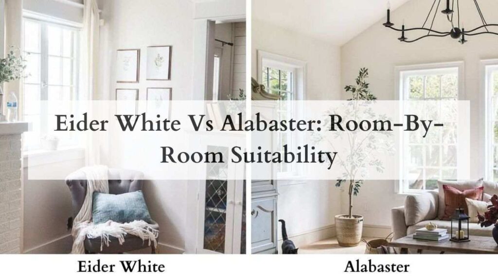
Different rooms have different needs.
Light exposure, function, moisture levels because all affect which color works better.
Living Room
Eider White in a living room creates a sophisticated, gallery-like backdrop.
But you need good natural light for this to work. The color can look flat in a dim living room.
But with big south-facing windows, modern furniture, cool-toned fabrics, Eider White works well.
Alabaster is safe for living rooms. The warmth and high LRV make the space feel inviting and open.
It works if you have natural light or not. Alabaster handles everything like traditional furniture, modern or eclectic mix.
The creamy undertone adds enough warmth to prevent the cold, empty feeling.
Bedroom
Eider White is excellent for the calm, muted bedroom vibe.
The soft, subdued quality helps create a restful environment.
If you’re someone who wants a serene, minimal bedroom where you can unwind, Eider White works.
Pair it with soft linens, cool-toned bedding, minimal decor.
Remember if your bedroom doesn’t get natural light, Eider White can feel cave-like. Not dark but enclosed.
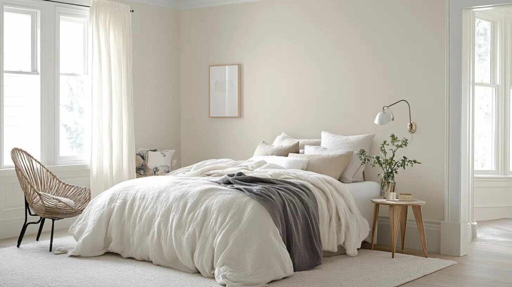
Alabaster makes bedrooms feel open and fresh while maintaining warmth.
It’s bright enough to make the space feel airy but soft enough to avoid the weird feeling and it works best with white bedding, warm woods, any bedroom style.
Bathroom
Bathrooms have specific challenges – moisture, typically smaller spaces, often less natural light, and a lot of reflective surfaces (mirrors, tile, fixtures).
Eider White can look beautiful in bathrooms with good natural light and cool-toned materials.
Go with marble tile, chrome fixtures, glass shower doors because the gray-greige quality feels spa-like and modern.
Finish matters, in bathrooms you want satin or semi-gloss for moisture resistance and cleanability.
Eider White in semi-gloss reflects light and can help compensate for the low LRV.
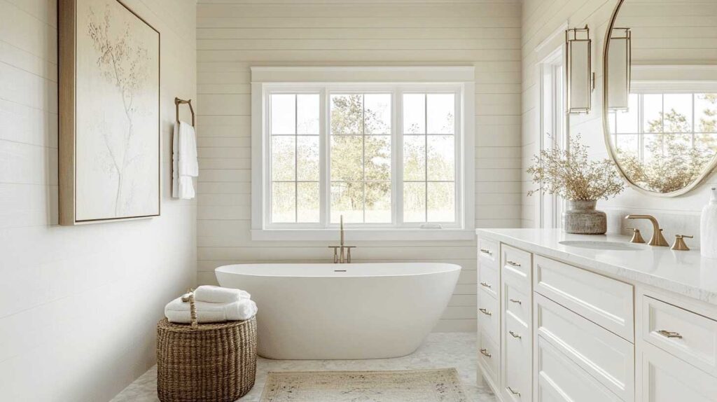
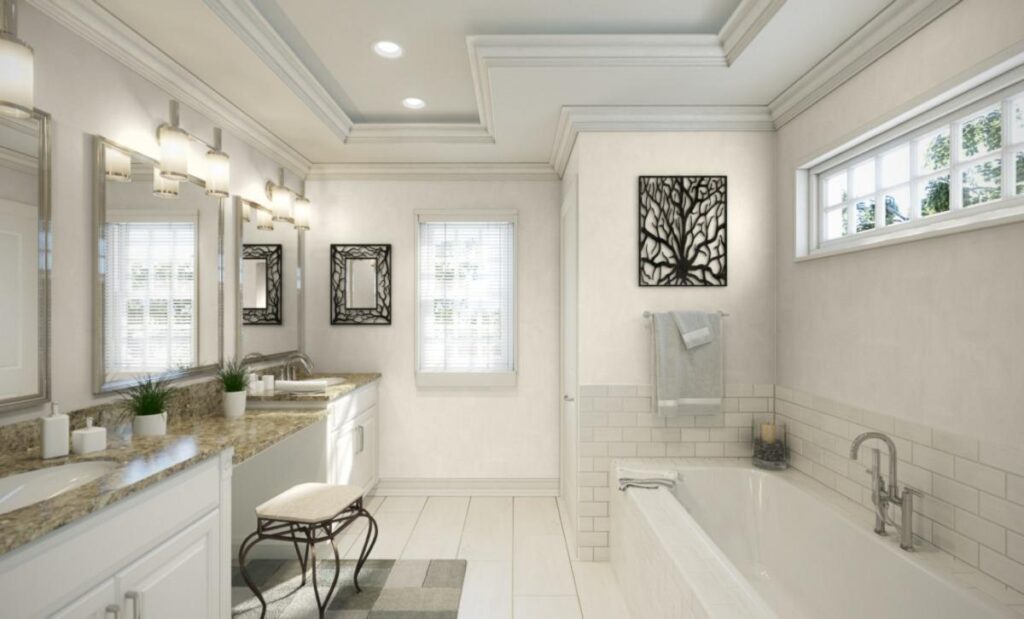
Alabaster is the better bathroom choice.
The brightness helps small bathrooms feel spacious.
The warmth prevents the sterile feeling. It works with white subway tile, marble, and warm materials like wood vanities.
Kitchen
Kitchens need more focus. You need durability, cleanability, and it has elements to coordinate like cabinets, countertops, backsplash, flooring, appliances.
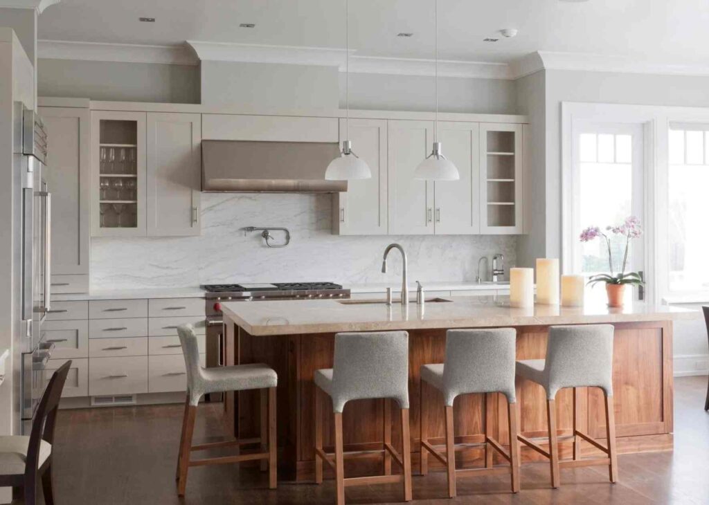
Eider White on kitchen walls can work if it has natural light and a modern, sophisticated look.
It pairs well with white or light gray cabinets, marble or quartz countertops, and stainless steel appliances.
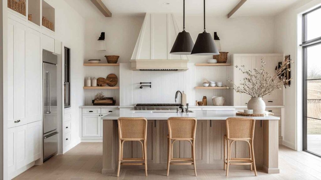
Alabaster is popular for kitchen cabinets. The soft white gives you a fresh, clean look without being cold.
It’s bright to make cabinets feel bright but warm to feel inviting.
On walls, Alabaster creates a bright, airy kitchen that feels spacious.
It pairs well with butcher block countertops, subway tile backsplashes, brass hardware and others too.
Exterior
Exterior applications introduce new variables like intense UV exposure, weather, how color reads from a distance, architectural style.
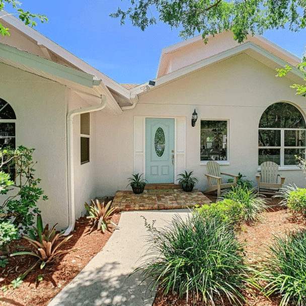
Eider White as an exterior color can look sophisticated on modern or contemporary homes.
The muted quality is elegant rather than trying hard and this is important because it can look dingy or dirty on exteriors.
The gray undertone doesn’t pop from a distance like bright whites.
If you’re considering Eider White for exterior, test it on a section.

Alabaster works better as an exterior color for homes.
The brightness and warmth make houses look fresh and inviting.
It works on traditional, farmhouse, craftsman, Mediterranean styles.
The color stays true from a distance and doesn’t go gray or dingy.
Eider White Vs Alabaster Vs Other Colors
These two aren’t the only options but here are some other options too which you can consider.
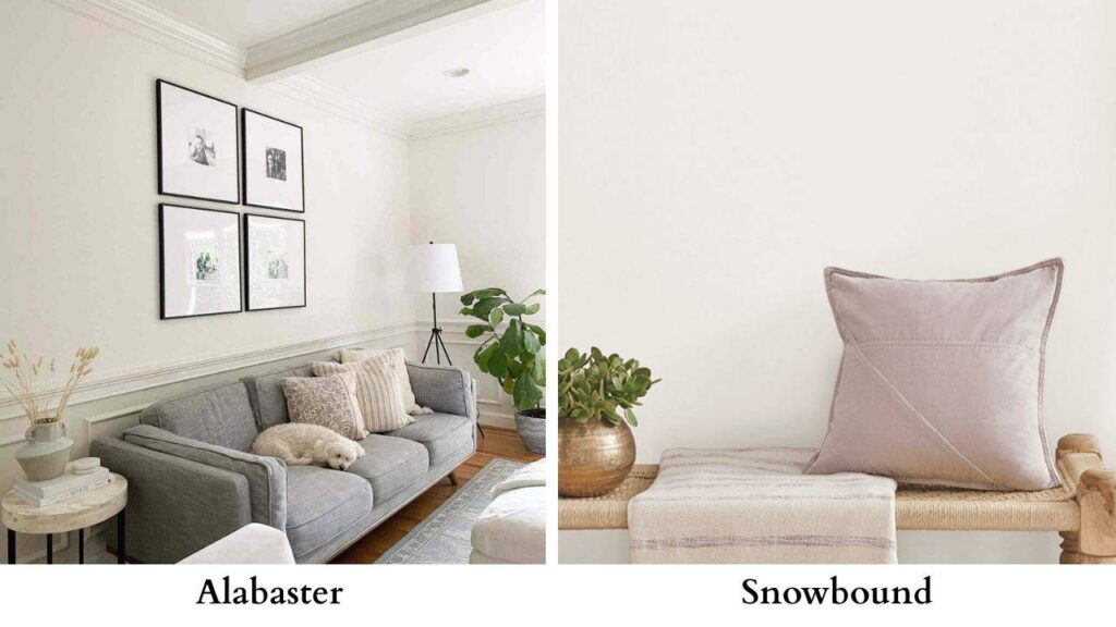
Eider White Vs Snowbound
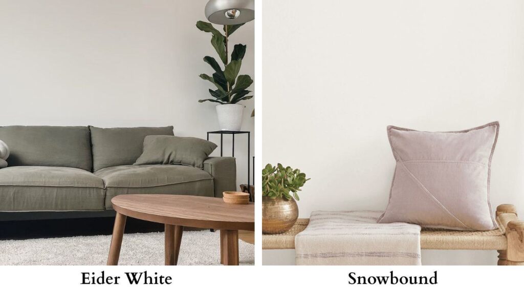
Snowbound is a cool, bright white with gray undertones and an LRV of 83.
It’s brighter than Eider White but has that gray influence. Snowbound is a true white, a cool-toned one.
Eider White reads as a greige-tinted off-white.
If you liked the idea of Eider White but it looked muted or dark, Snowbound is what you can consider.
It has the fresh, modern feel with the gray undertone with brightness.
Eider White Vs Alabaster Vs Agreeable Gray
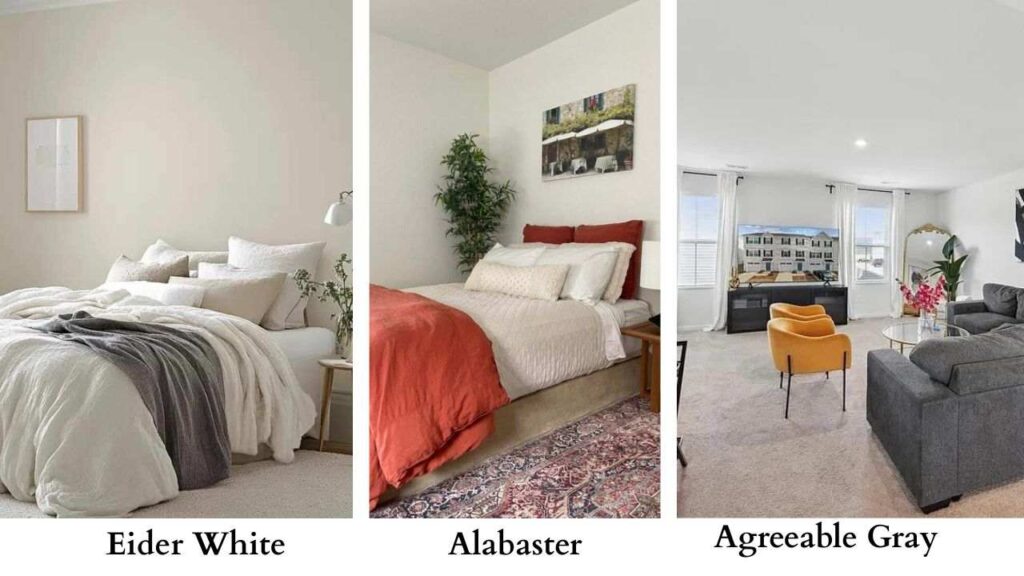
This comparison comes because Agreeable Gray is Sherwin-Williams’ most popular color.
Agreeable Gray has an LRV of 60 which is lower than Eider White or Alabaster.
It’s a true greige, balanced between gray and beige, warm to feel inviting but is neutral, not a white.
If Eider White feels light and Agreeable Gray feels dark, that’s telling you something about your space and lighting.
Alabaster is right in the spot for people who want white-ish but warm.
Eider White Vs Shoji White
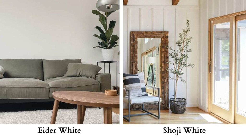
Shoji White is another warm off-white with beige and gray undertones and an LRV of 74.
The difference is subtle. Shoji White is warmer and less violet than Eider White.
If you love the idea of Eider White but if you don’t want the violet undertone then you can consider Shoji White.
Eider White Vs Pure White
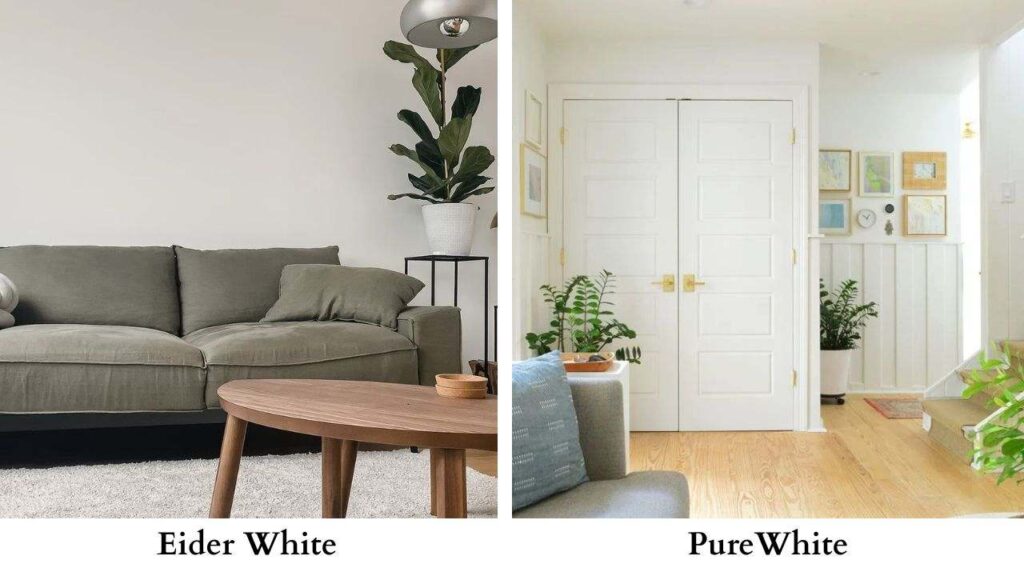
Pure White has an LRV of 84 which is bright, fresh, neutral white.
No significant undertones pulling warm or cool. It’s clean and modern without being too bright.
Eider White next to Pure White looks gray and muted.
If you want a neutral white that doesn’t read as having undertones, Pure White is the best choice.
Alabaster Vs White Dove
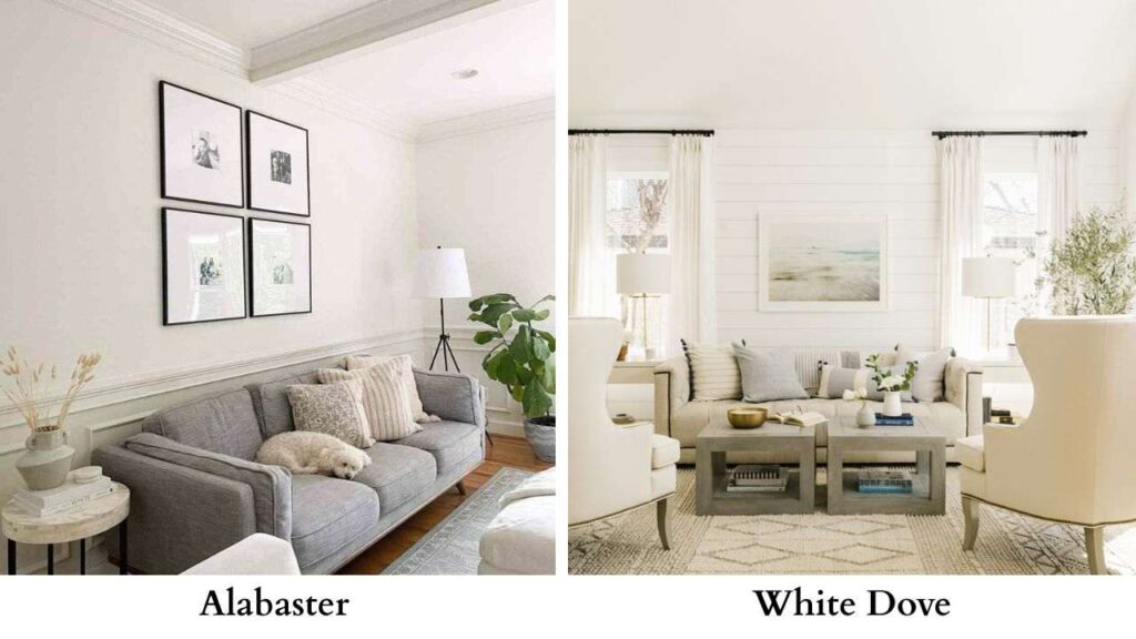
White Dove is Benjamin Moore’s version of Alabaster.
It’s a warm, creamy white with soft undertones and it’s LRV around 83.
The colors are similar, both warm, both versatile, both popular.
The main difference is alabaster is slightly beige-greige while White Dove is more pure cream.
Snowbound Vs Alabaster
Snowbound is cool and fresh. Alabaster is warm and creamy.
Snowbound works better in modern, contemporary spaces. Alabaster fits traditional, farmhouse, transitional better.
If your home has warm hardwoods and you want white walls, Alabaster.
If you have cool-toned tile and modern fixtures, consider Snowbound.
Pros and Cons of Eider White and Alabaster
Eider White Pros:
- Creates a sophisticated, muted backdrop
- Works in modern and contemporary spaces
- Pairs well with cool-toned materials and finishes
- Less stark than bright whites
- Excellent for creating a calm, serene atmosphere in bedrooms
Eider White Cons:
- Low LRV can make spaces feel dark or small
- Violet or purple undertones can appear
- Sensitive to lighting conditions
- Not suitable for trim use
- Requires careful coordination with other elements
- Can look dingy in low-light spaces or exteriors
Alabaster Pros:
- Versatile across different rooms and styles
- Warm, inviting undertones work in lighting
- Suitable for walls, trim, cabinets, ceilings
- Higher LRV brightens spaces effectively
- Pairs well with warm woods and varied design styles
- Forgiving and predictable behavior
Alabaster Cons:
- May read too creamy for the wanting bright white
- Can pick up yellow in warm lighting
- Popular it feels less unique
- Warmth but may not go with modern aesthetics
Conclusion
Choosing between Eider White Vs Alabaster comes down to what your space needs and what you want to create.
Alabaster is a versatile, user-friendly option.
If you’re not sure, if your lighting is mixed, if you want a soft white that works anywhere then Alabaster is the safe to go with and that’s the reason it’s popular.
Eider White is for when you want something specific, more muted, more sophisticated, more modern.
But it demands the right conditions like good light, cool-toned companions, intentional coordination.
And whatever you go with, check it in your space and multiple walls if possible, at different times of day and with your furniture and flooring and remember that big swatches to know accordingly because comparing Eider White Vs Alabaster can be confusing but with the right information you can consider what you want in your space.