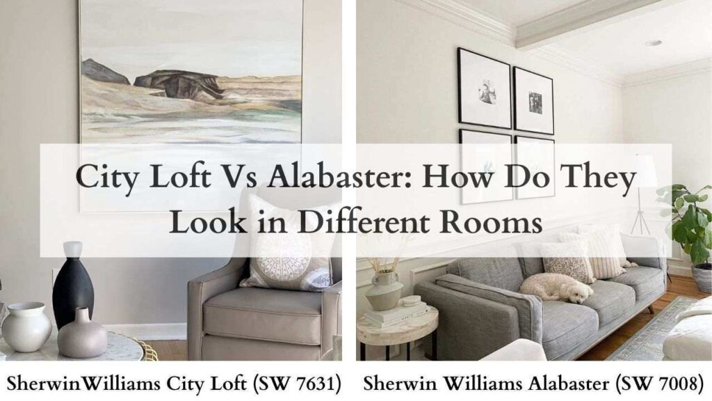
So, City Loft and Alabaster are two Sherwin-Williams off-whites.
They both are “warm whites” but they look different in your space.
The subtle undertones, they’re not subtle when you paint a room.
They can make your space feel cozy and inviting or dingy.
City Loft vs Alabaster is the warm white, both are searched, pinned and recommended by designers who work with every style like modern, traditional, farmhouse, transitional.
Homeowners stress about this because they should.
The wrong white makes your furniture look off. Your lighting feels wrong. The whole room doesn’t work.
So, I’m breaking down City Loft Vs Alabaster, their undertones, their Light Reflectance Values, how they look in different lighting, and where they work best in your home.
We’ll look at them room by room, and compare them to other popular colors.
Here are my other blog posts that you can also read:
- Peppercorn Vs Iron Ore
- Eider White Vs Alabaster
- Alabaster Vs Shoji White
- Tricorn Black Vs Iron Ore
- Oyster White Vs Shoji White
Sherwin Williams City Loft Color Profile (SW 7631)
City Loft is a soft, warm off-white with subtle greige undertones.
It has an interesting space between white and greige. The base leans gray with muted beige woven in.
The LRV is around 70, which means it’s darker than true whites.
It doesn’t bounce light around the room like bright whites. It absorbs some light, creating a calm, grounded feel.
The color has beige and subtle red undertones.
In north-facing rooms or spaces with cool light, the gray notes come forward and it feels neutral.
City Loft creates a modern, understated backdrop.
Works well with light to medium wood tones, matte black fixtures, and stone that has beige or gray.
Pair it with bright whites on the trim and you get a clean, contemporary contrast that feels intentional.
Sherwin Williams Alabaster Color Profile (SW 7008)

Alabaster is a warm, creamy off-white with soft beige undertones.
This is what warm white people mean when they say “warm white.” It’s got an inviting, cozy appearance.
The undertones have creamy beige with minimal gray influence.
The LRV is at 82, brighter than City Loft.
We’re talking only one point below the true white threshold of 83.
This color reflects light, opens up spaces, and maintains the warmth.
In terms of impact, Alabaster makes rooms feel large, bright, and open while keeping that gentle warmth.
It pairs well with warm wood finishes, brass and gold hardware, natural stone, and marble.
The color works well with everything.
Small bathrooms that need to feel big. Dark hallways that need light. Living rooms, bedrooms, kitchens, exteriors, it makes every space big.
The color maintains consistency across different lighting conditions, which makes it perfect as a whole-house color.
You can use it on walls, trim, ceilings, and cabinets and with many design styles.
What is the Difference Between City Loft and Alabaster?
These two colors both live in the warm off-white family, but they’re not similar once you see them on the wall.
The LRV difference changes how they function in your space.
Then you add in undertones, lighting behavior, and styling, they’re made for different things.
LRV
Light Reflectance Value is the number that tells you how much light a color reflects.
Scale goes from 0 (absorbs all light) to 100 (reflects all light).
City Loft at LRV 70 reflects a moderate amount of light. It’s dark, soft, subdued.
In a low-light room, it can be darker. You’re not getting a bright, airy feeling.
Instead, you get calm and grounded.
Alabaster at LRV 82 is a true white.
It reflects more light, which means rooms feel bright and open.
Even in spaces with less natural light, Alabaster helps bounce around what light you have.
Undertones and Color Depth
City Loft has beige undertones with soft gray influence.
Sometimes the red undertones come through and it is peachy or slightly pink depending on your light.
The color depth is rich, saturated. It doesn’t try to disappear into the background.
In warm, south-facing light, the beige comes. In north-facing or cool light, the gray comes.
Alabaster has warm beige and cream undertones with minimal gray.
It is grayish cream or creamy white, depending on who you ask and what light you’re seeing it in.
The color depth is light, close to pure white but with warmth.
Aesthetic and Lighting
City Loft in south-facing rooms shows beige and can look peachy.
In north-facing rooms, the gray notes dominate and it feels like a true greige.
Under warm LED bulbs, the warmth amplifies. Under cooler bulbs, it looks neutral-gray.
Alabaster in south-facing rooms gets warm and creamy without losing brightness. In north-facing rooms, it is warm but shows a hint of gray.
Warm lighting makes it glow.
Cool lighting keeps it clean but maintains that gentle warmth.
This color is stable across different lighting conditions.
The aesthetic difference is city Loft feels modern, calm, and moody.
Alabaster feels classic, inviting, bright, traditional but contemporary for any style.
Styling and Best Uses
City Loft styling:
- Pair with Pure White or High Reflective White on trim for contrast
- Works with matte black, bronze, or black metal fixtures
- Ceilings can be same color for a cocooning effect or go bright white
- Furniture in light wood, natural linen, or leather tones
- Accent colors: deep greens, warm terracotta, muted blues
Best uses: Modern living rooms, primary bedrooms wanting softness, contemporary bathrooms, spaces with natural light, open-concept areas with warm finishes
Alabaster styling:
- Can be used on walls, trim, ceilings, and cabinets all in one color
- Or pair with Pure White on trim if you want subtle distinction
- Works with brass, gold, chrome, or nickel hardware
- Furniture in warm woods, painted pieces, upholstered neutrals
- Accent colors: navy, sage green, soft blush, charcoal
Best uses: Whole-house color, small rooms needing brightness, traditional and farmhouse interiors, kitchens, bathrooms, bedrooms, hallways, exteriors
| Feature | City Loft | Alabaster |
| LRV | ~70 | ~82 |
| Color Type | Light greige | Warm white |
| Undertones | Beige + soft gray | Creamy beige |
| Brightness | Softer, muted | Bright, airy |
| Warmth Level | Neutral-warm | Warm |
| Best Light | High natural light | Any lighting |
| Style | Modern/transitional | Traditional/farmhouse/transitional |
| Trim Use | Rare | Common |
| Whole House | Conditional | Highly recommended |
City Loft Vs Alabaster: How Do They Look in Different Rooms
Okay, so the theory is great. But what happens when you put these colors in real rooms where you live then the vibe shifts depending on the space, the ligh, the function.
Let’s get specific about these.
Living Room
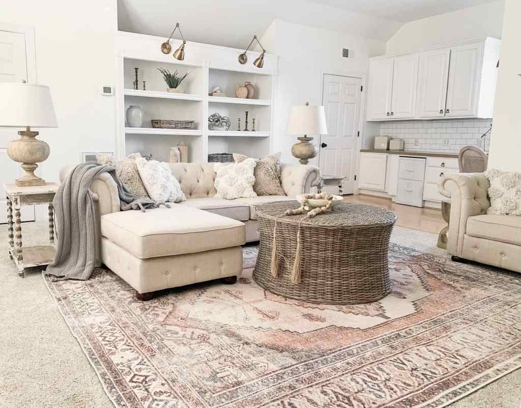
City Loft in living rooms creates a calm, modern retreat feeling.
If you’ve got south or west-facing windows bringing in warm afternoon light, the color stays soft without feeling dark.
The greige undertones work well with contemporary furniture.
The space feels curated and understated.
But if your living room is north-facing or doesn’t get natural light then City Loft can look flat. It may look too gray, too muted, dingy if the lighting isn’t right.
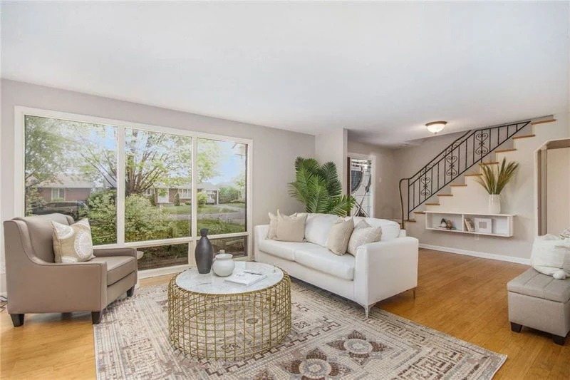
Alabaster in living rooms is your safe bet that looks beautiful.
The brightness makes the space feel open and welcoming.
Whether it’s morning light or evening lamplight, the color stays warm and inviting. It works with both traditional and modern furniture.
Bedroom
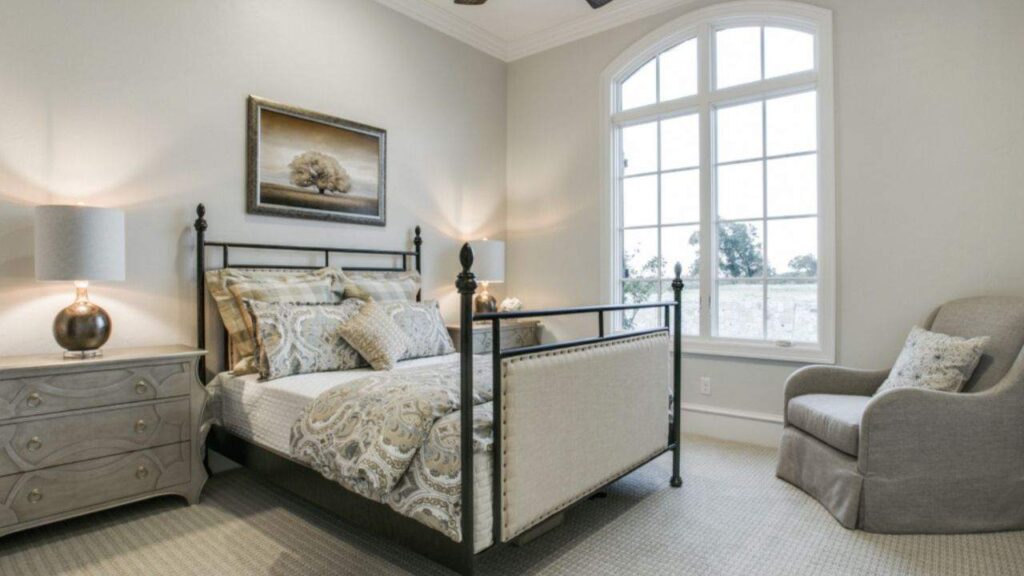
City Loft in bedrooms brings a soft, cozy feeling without being too warm or too bright.
The muted quality works well in spaces where you want calm and rest.
The undertones don’t lean so warm that it feels stuffy, but they’re not cool to feel bright.
Works best in primary bedrooms with good natural light.
Guest rooms with small windows find it subdued.
You want light during the day so it doesn’t feel cave-like, but not much that you lose the gentle, grounded quality.
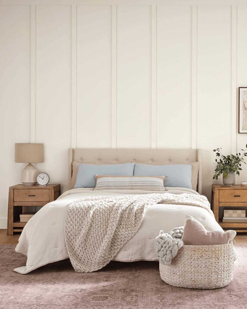
Alabaster in bedrooms is bright but soothing.
The warmth keeps it from feeling cold or clinical.
Small bedrooms benefit from that high LRV, the space feels big.
Even basement bedrooms with minimal windows don’t feel depressing with Alabaster on the walls.
Bathroom
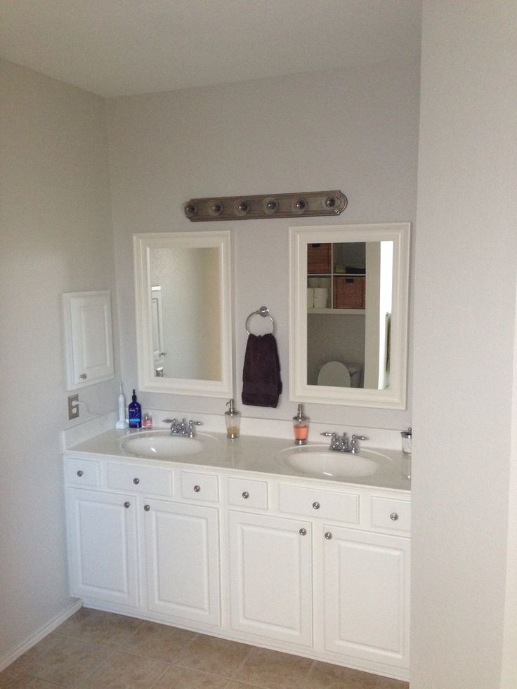
City Loft in bathrooms needs the right scenario.
The modern bathroom with great lighting looks sleek.
The color pairs well with white subway tile, black fixtures, concrete or stone countertops. That contemporary spa feeling everyone wants.
Small bathroom with one small window and builder-grade lighting. It’ll feel dark, gray.
Bathrooms need light both for function and to avoid feeling cramped.
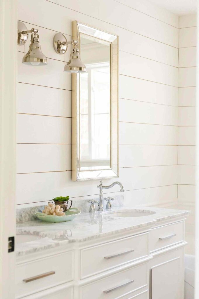
Alabaster in bathrooms works. A small powder room feels big.
The primary bathroom with marble counters looks classic and clean.
The brightness is functional but it stays warm to feel inviting, not sterile.
Works with white fixtures, warm wood vanities, brass hardware and chrome.
Kitchen
City Loft in kitchens shows up in modern or transitional designs where you want a soft neutral.
If you’re doing light wood or white oak cabinets, matte black hardware, and contemporary lighting, City Loft on the walls creates a cohesive, high-end look.
Not great for kitchens who don’t have natural light.
The color can be too gray and make the space feel closed in. Kitchens need brightness for cooking, for gathering, for not feeling like a cave.
Alabaster in kitchens is the most popular choice right now. On walls. On cabinets. Sometimes both.
The color reflects light, which matters when you’re working in space.
Pairs with everything like white marble, butcher block, quartz, stainless steel appliances, gold fixtures, black fixtures, wood floors, tile floors.
Exterior

City Loft on exteriors works for modern homes wanting a soft, neutral facade that’s not true white.
The greige quality is contemporary and understated.
Pairs well with black windows, natural wood accents, stone, and metal roofing.
The dark LRV means it won’t show dirt as much as bright whites.
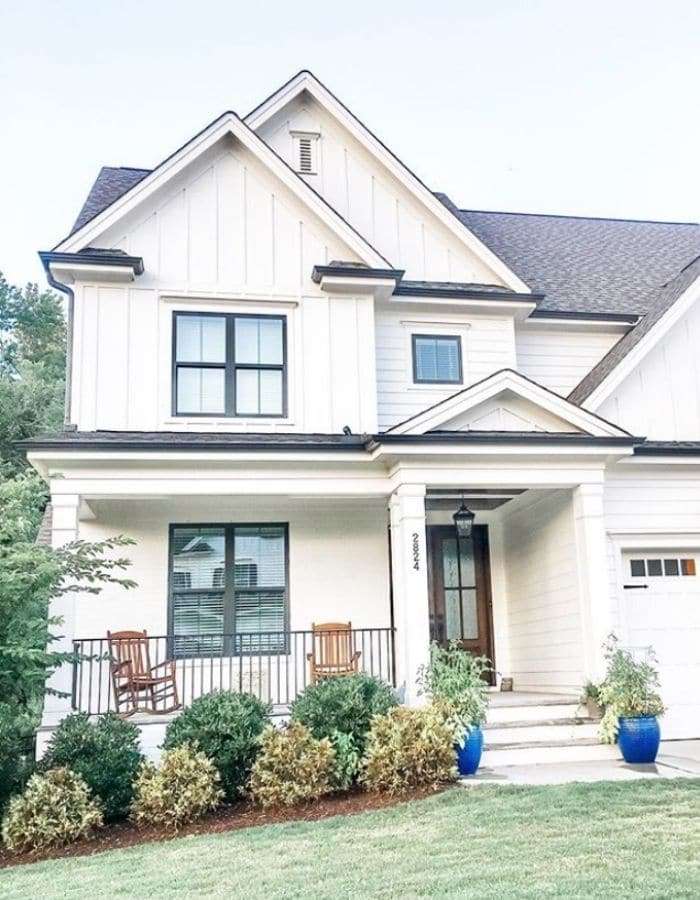
Alabaster on exteriors is classic, clean, and bright without being bright white.
Traditional homes, farmhouses, colonials, craftsmans, it works with many architectural styles.
The warmth keeps it from feeling cold or too modern if you’re in a traditional home.
Reflects light beautifully, which makes your home feel welcoming.
Shows off your trim work if you go with a bright white like Pure White on the trim.
The brightness means you’ll see dirt and need to clean more.
City Loft Vs Alabaster Vs Other Colors
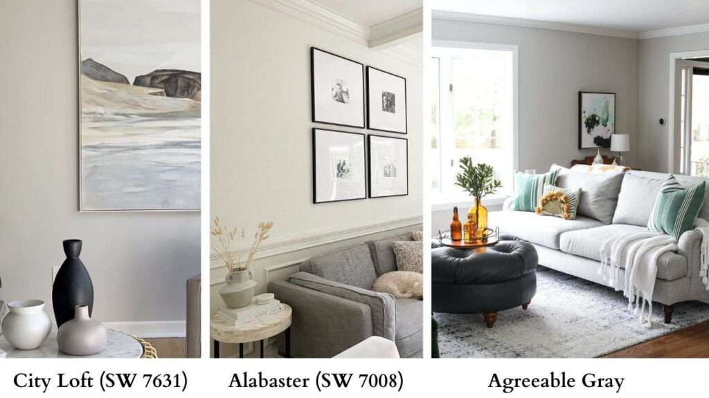
So you’re also looking at other colors because why would you make this easy on yourself, let’s see how City Loft and Alabaster go up against other popular Sherwin-Williams neutrals.
City Loft Vs Drift of Mist
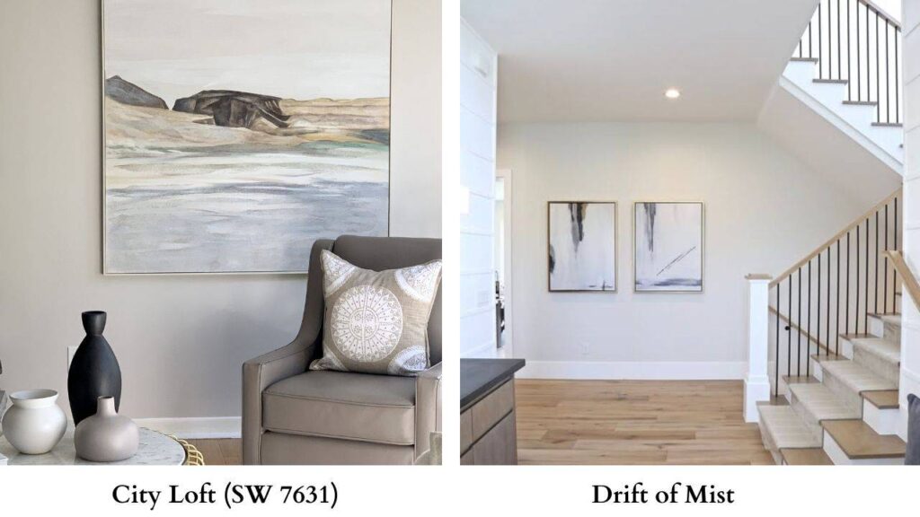
Drift of Mist (SW 9166) is another soft, warm white but it’s lighter than City Loft. LRV is high, undertones are more beige than gray.
Side by side, Drift of Mist feels bright and warm.
City Loft has gray and depth.
If City Loft feels muted for you, try Drift of Mist.
City Loft Vs Agreeable Gray
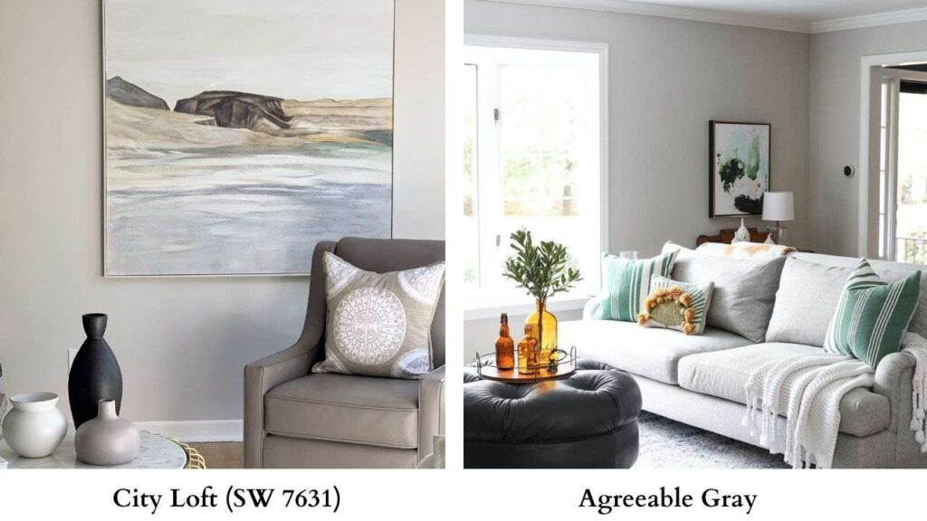
Agreeable Gray (SW 7029) is the most popular greige. And it’s grayer than City Loft.
Where City Loft is between white and greige, Agreeable Gray is in greige territory.
The LRV is around 60 which is darker than City Loft.
City Loft Vs Accessible Beige
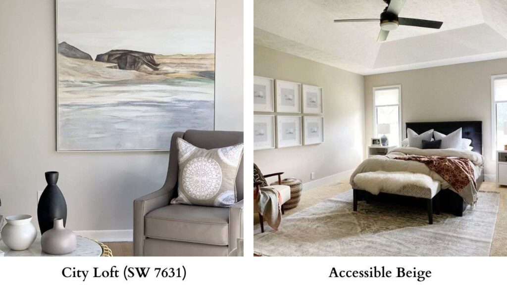
Accessible Beige (SW 7036) is more beige. It’s warm, rich, and more saturated. LRV around 58.
If City Loft feels too gray or too light, Accessible Beige gives you that true warm beige neutral.
City Loft Vs Shoji White
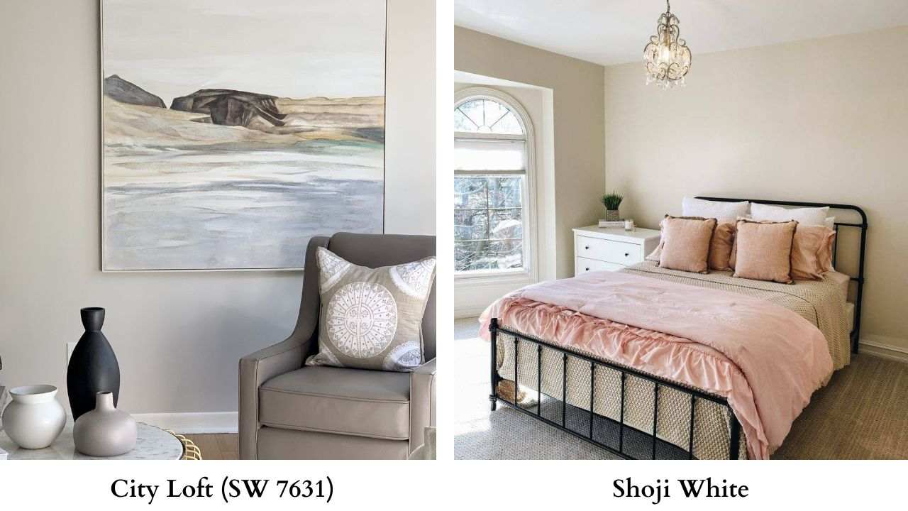
Shoji White (SW 7042) is a light warm white, similar to Alabaster.
LRV around 82, soft beige undertones. Compared to City Loft, Shoji White is bright and warm and more cream, less gray, used on cabinets.
Snowbound Vs Alabaster
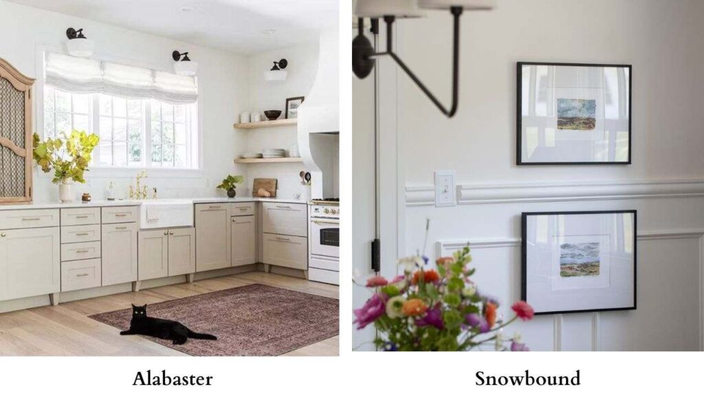
Snowbound (SW 7004) is cooler than Alabaster. LRV around 83, so it’s bright too.
Snowbound has gray undertones where Alabaster has beige.
If you want cool and fresh, go with Snowbound.
If you want warm and inviting, go with Alabaster.
Alabaster Vs Drift of Mist
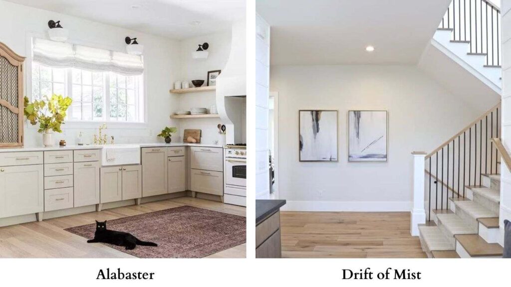
Drift of Mist vs Alabaster is close. Both warm whites, similar LRVs.
Drift of Mist may show more warmth in some lights. Alabaster feels more neutral.
You’d need them side by side to spot the difference.
Alabaster has more name recognition and designer backing.
Alabaster Vs Shoji White
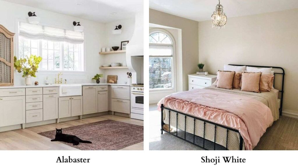
Shoji White vs Alabaster both warm whites around the same LRV.
Shoji White brings creamy, more yellow in warm light. Alabaster stays neutral-warm.
For cabinets, people use both. For walls, Alabaster is popular.
City Loft vs Alabaster vs Agreeable Gray

If you’re stuck between all three:
- If you want closest to white then go with Alabaster
- If you want warm neutral then go with Agreeable Gray
- If you want something in between not quite white, not quite greige then go with City Loft
Which One to Choose Between City Loft Vs Alabaster?
Choose City Loft if:
- You want a modern, soft neutral that’s not bright white
- Your space has natural light
- You’re going for contemporary or transitional style
- True white feels bright or cold for your taste
- You like greige but want it really light
- You plan to use bright white on trim for contrast
Choose Alabaster if:
- You want a warm white that’s safe and versatile
- You need to brighten a dark or small space
- You’re doing a whole-house color
- You want one color for walls, trim, and cabinets
- You like traditional, farmhouse, or transitional style
- You need something that works in any lighting
- You don’t want to think about it too much and just want it to work
If you’re unsure, Alabaster is the safe choice.
It works consistently with different rooms, lighting situations, and styles.
Conclusion
City Loft vs Alabaster, both are beautiful warm off-whites, but they’re not interchangeable.
The 12-point LRV difference, the undertones, the way they handle light, it adds up to different results in your space.
City Loft is soft, modern neutral with greige undertones that needs good lighting to shine.
Alabaster is classic, reliable warm white that works everywhere and makes designers’ lives easier.
Sample them both in space. Watch them in morning light, afternoon light, evening light.
See how they play with your floors, your furniture, your fixtures.
The right choice becomes obvious once you see them in the home with the different lighting.
Because comparing City Loft Vs Alabaster can be a bit confusing and difficult.