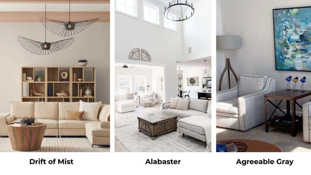
Drift of Mist vs Alabaster, both are Sherwin Williams’ best colors.
Both look perfect on the small paint swatches.
Both have the effortless, neutral vibe which works in modern spaces, transitional homes, and in any space.
Drift of Mist (SW 9166) and Alabaster (SW 7008) are light, versatile, and the kind of colors you’d pin to a mood board and feel good about yourself.
But they look completely different once they’re on your walls.
The thing is, undertones and lighting will make or break your room.
You can have beautiful furniture, the perfect rug, the one lamp, but if your wall color is going against it with the natural light or clashing with your fixed elements, the whole space feels off.
I’ve painted bathrooms that turned green and kitchens where the wrong white makes your cabinets look dingy.
Choosing the wrong paint color isn’t only annoying but it’s expensive.
So here, I’m breaking down what Drift of Mist Vs Alabaster is, how they’re different in different lighting situations, and where they work best room by room.
I’ll also put in some comparisons with other colors.
And I’m sharing the coordinating colors that work with these two.
Here are my other blogs that you can also read:
- Oyster White Vs Shoji White
- Modern Gray Vs Agreeable Gray
- Acacia Haze Vs Evergreen Fog
- Classic Gray Vs Pale Oak
- Quiet Moments Vs Sea Salt
What is Sherwin Williams’ Drift of Mist (SW 9166)?
Okay so Drift of Mist is one of the colors that gives a spa vibe.
It’s a soft, light greige, which is perfect in-between zones where gray and beige are good together and the balance is lovely.
You get the coolness of gray without it feeling cold or sterile, and the warmth of beige looks best.
But here’s the thing nobody tells you that Drift of Mist has a subtle green undertone.
You won’t see it in every room or every light.
But when it shows up, it looks good according to the space.
I used it in a hallway which had northern light and one window facing a bunch of trees.
The green undertone made the space feel alive, organic, moody in the best way.
The LRV (Light Reflectance Value) is 69, which means it reflects a decent amount of light but it’s not bouncing brightness around like a true white would.
It absorbs enough to feel grounded, calm, not harsh.
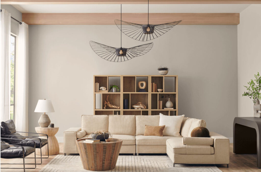
I love Drift of Mist for modern interiors.
Transitional spaces, too. Contemporary homes where you want a clean, minimal backdrop.
It’s muted and warm without crossing into creamy territory.
Homeowners and designers keep coming back to this one for living rooms, bedrooms, and bathrooms because it’s calming without being boring.
You can layer texture on top of it like linen curtains, wood furniture, stone accents, and it works.
What is Sherwin Williams Alabaster (SW 7008)?
Now Alabaster has a different vibe.
This is a warm, creamy off-white with a beige undertone which feels soft and welcoming without looking yellow or dingy.
I’ve seen many “warm whites” that end up looking like old eggshells or worse, the yellowish tone looks bad.
Alabaster doesn’t do that. It’s clean but cozy. Classic but not outdated.
The LRV is 82, which is higher than Drift of Mist.
This means Alabaster reflects more light. It makes rooms feel big, bright, and airy.
If you’ve a space with limited natural light or small square footage, Alabaster is what you should consider.
I used it in a windowless bathroom once and it saved the entire room from feeling like a cave.
It’s a timeless white.
The kind of color that works in farmhouse kitchens, modern bedrooms, traditional dining rooms, coastal bathrooms and.
It’s hard to find a style where Alabaster feels out of place.
It’s been one of Sherwin Williams’ top sellers.
Homeowners love Alabaster for every room: living rooms where you want brightness, bedrooms where you want the soft, restful feel, kitchens where it makes everything look cleaner.
It works for trim, ceilings, and cabinets. It provides contrast against other neutrals without feeling harsh or too white.
What is the Difference Between Drift of Mist and Alabaster?
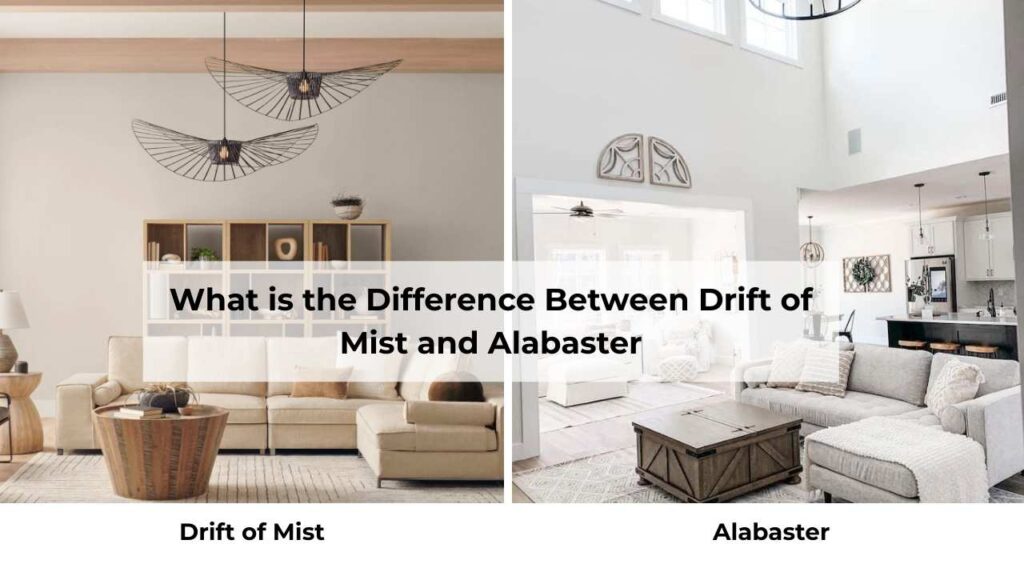
Okay this is where people get stuck and I get it because they sound similar on paper.
They’re both light and neutral.
Also they both are from Sherwin Williams.
Both show up on every “best neutral paint colors” list.
But in reality they are completely different.
LRV
Light Reflectance Value is one of the things that matters in real life.
Drift of Mist has an LRV of 69.
It’s mid-light and reflects a good amount of light but has some depth and softness to it.
You’re not going to feel like you’re in a bright white box.
Alabaster has an LRV of 82.
This is a true light color that bounces light around the room and makes everything feel open and airy.
If you’re working with a small room, low ceilings, or limited windows, the LRV difference is going to be visible.
Alabaster will make the space feel large.
Drift of Mist will make it feel cozy and intimate.
Undertones
This is where I see people make mistakes.
Drift of Mist has a balanced greige undertone with subtle green.
In warm, southern-facing light, it can be more beige.
In cool, northern light or next to a white trim, the green undertone comes.
And if you have green-toned cabinetry or tile or any fixed element with green in it, this color will amplify that.
Alabaster has a warm beige/cream undertone with zero gray.
It’s warm. It doesn’t shift to green or gray or anything else.
What you see on the sample is what you get on the wall, which is rare and refreshing.
Even in cool light, Alabaster stays warm and soft.
If you’re someone who hates surprises, Alabaster is safe.
If you like a color that has some movement and complexity depending on the light, Drift of Mist is interesting.
Lighting Effect
I cannot tell this but lighting changes EVERYTHING.
Drift of Mist is moody and shifts throughout the day.
Morning light makes it look soft, almost off-white.
The afternoon sun brings out the warmth.
Evening artificial light makes it feel cozy and grounded.
But in north-facing rooms or spaces with cool LED lighting, it can gray or show the green undertone.
I always tell people to test this color in your space, on multiple walls, at different times of day.
Alabaster is more predictable.
It stays warm and creamy in all lighting conditions.
Bright natural light makes it look fresh and clean.
Dim lighting keeps it soft.
Even in north-facing rooms, it doesn’t turn cold or gray.
It’s consistent and reliable.
Understanding how cardinal directions affect your paint color is Interior Design 101 but many people skip it.
North-facing light is cool and blue-toned, colors will look dark and cool.
South-facing light is warm and golden, colors look light and warm.
East gets morning light, west gets afternoon glow.
Style and Best Uses
Both colors are neutral to work in with many styles, but they have different energy.
Drift of Mist feels modern, minimal, organic. It’s perfect for:
- Walls in open-concept spaces where you want continuity without it feeling too harsh
- Bedrooms where you want calm and softness
- Living rooms with lots of natural light where the color can shift and feel dimensional
- Pairing with white trim like Pure White or Extra White for contrast
Alabaster feels classic, warm, versatile. It’s perfect for:
- Walls, trim, ceilings, cabinets
- Small spaces that need to feel big
- Low-light rooms that need brightness
- Whole-house color schemes where you want one color that works everywhere
- Pairing with greige or soft gray walls if you’re using it as trim
Here’s a comparison table because I know you love a good visual:
| Feature | Drift of Mist SW 9166 | Alabaster SW 7008 |
| Color Type | Light greige | Warm white |
| LRV | 69 | 82 |
| Undertones | Gray, beige, subtle green | Creamy beige |
| Brightness | Medium-light | Very bright |
| Best Use | Wall color | Walls, trim, ceilings, cabinets |
| Contrast Level | Low contrast | Soft to moderate contrast |
| Overall Feel | Muted, modern, calm | Warm, classic, clean |
Drift of Mist Vs Alabaster: Room-By-Room Suitability
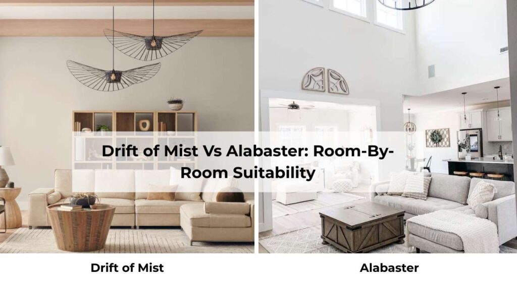
Let’s get specific because “it depends” is not helpful when you’re standing in the store and looking for which one will suit your room layout.
Living Room
Drift of Mist in the living room is good.
If you have big windows, good natural light, and you want a sophisticated backdrop that doesn’t go against with your furniture.
I used it in an open-concept living room last year with light oak floors and linen furniture and it was calm, pulled-together.
The color added warmth and depth without making the space feel dark.
BUT, if your living room is north-facing or has small windows, Drift of Mist can feel too gray and flat.
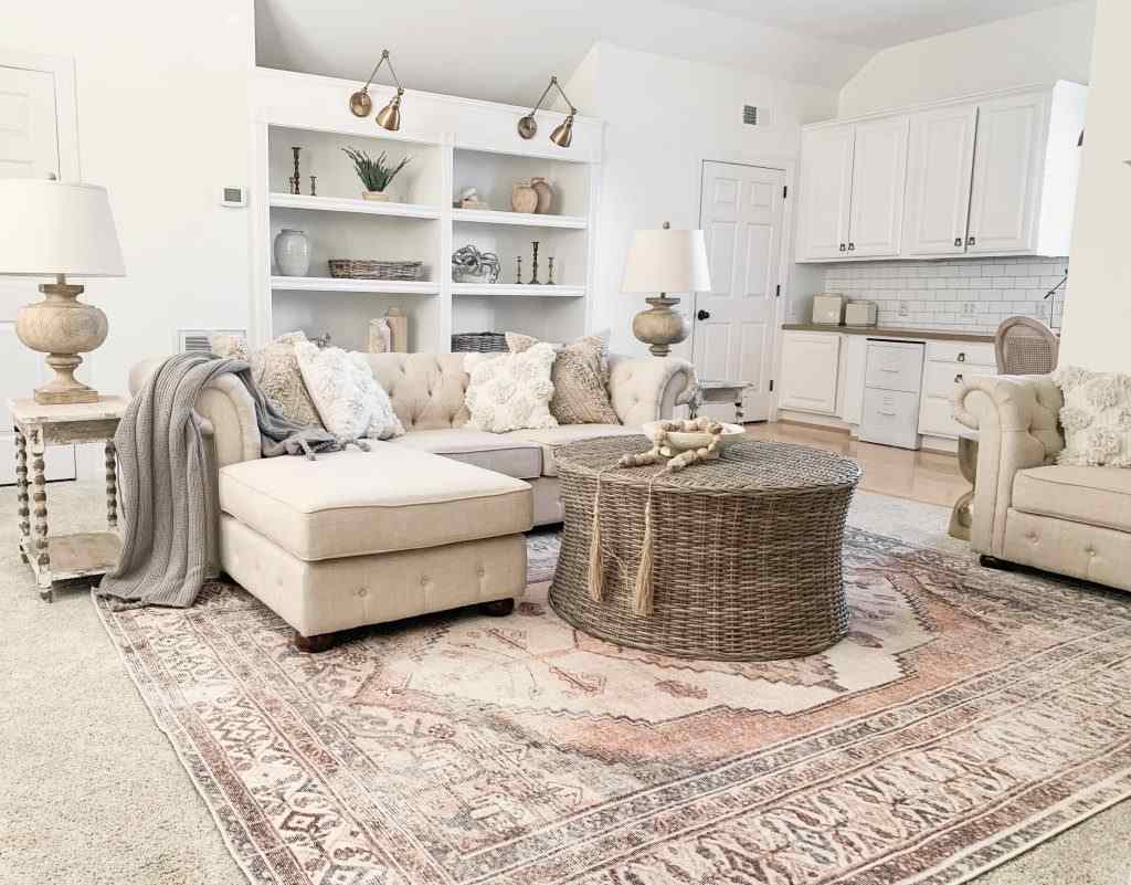
Alabaster in the living room is bright, welcoming, classic.
It’s the color you choose when you want the room to feel open and airy.
If you have a small living room or one who doesn’t get light, Alabaster makes it feel big.
It works beautifully if you have dark furniture or wood tones because it provides contrast without being bright white.
I’ve used Alabaster in living rooms that connect to kitchens and hallways because it flows and doesn’t feel stuffed.
Bedroom
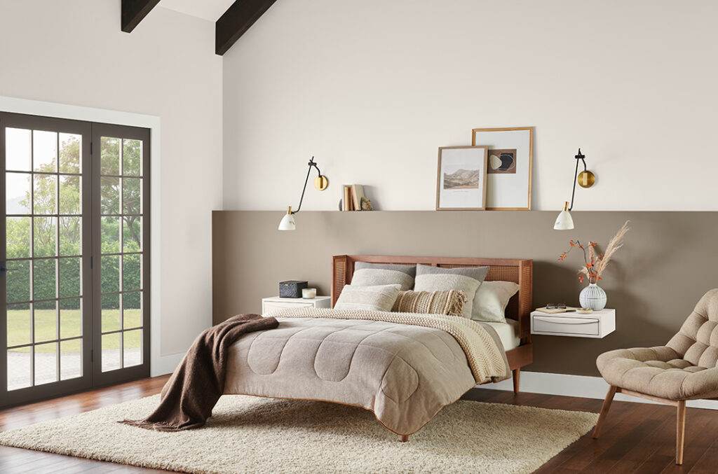
Drift of Mist in a bedroom is pure calm, it’s soft, muted, and has an organic quality that makes the room feel restful.
I always recommend it for primary bedrooms where you want a spa-like, serene vibe.
It pairs well with white bedding, natural wood furniture, and layered textures.
The subtle warmth keeps it from feeling cold.
One thing to remember, test it with your bedding and curtains first.
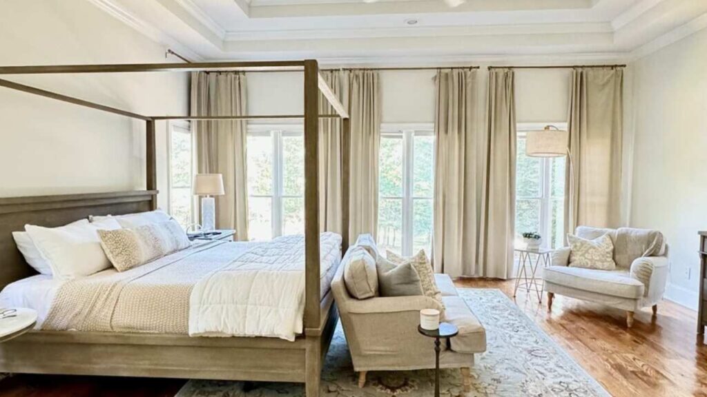
Alabaster in a bedroom feels cozy and enveloping in the best way.
Even though it’s a bright color, it doesn’t feel harsh or sterile in a bedroom.
It stays soft and warm.
I love it for bedrooms that double as dressing rooms or reading nooks because the brightness makes the space feel functional without sacrificing the restful vibe.
And if you’re someone who likes white bedding, Alabaster gives you contrast so the whole room doesn’t wash out.
Bathroom
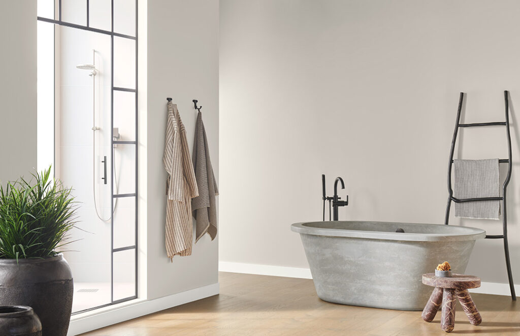
Drift of Mist in a bathroom is hit or miss and you need to be careful.
If you have good natural light and warm fixtures, Drift of Mist looks beautiful, soft, spa-like, elevated.
But if your bathroom has cool lighting, white tile, and chrome fixtures, the green undertone will show up and your bathroom will look heavy or institutional.
I made this mistake, in a powder room with a north-facing window and cool LED bulbs.
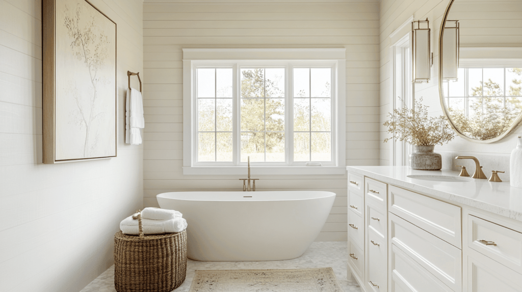
Alabaster in a bathroom is foolproof.
It’s bright, clean, classic, and works with any tile, fixture, or lighting situation.
I’ve used it in bathrooms with white subway tile, marble, and colorful patterned tile, and it always looks fresh.
It’s also popular for bathroom trim and ceilings because it ties everything together without feeling matchy-matchy.
Kitchen
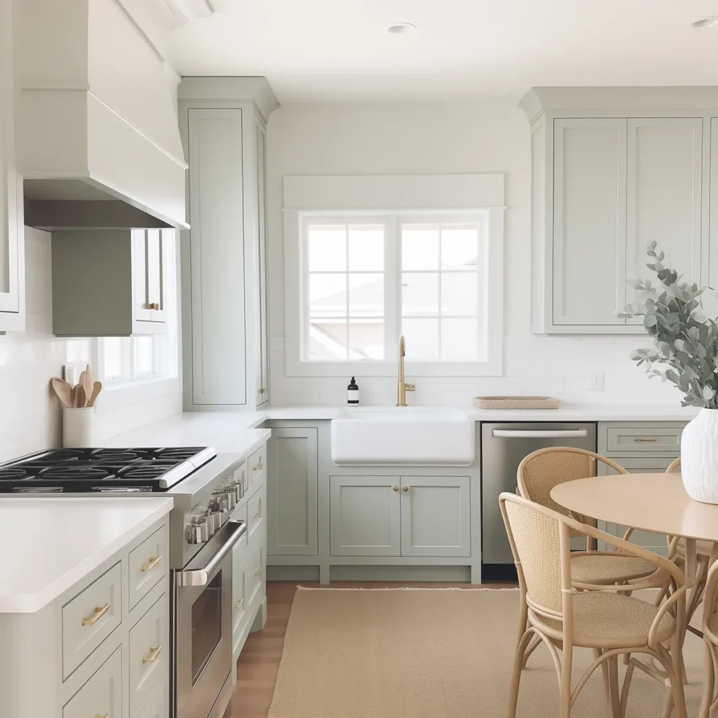
Drift of Mist in a kitchen works if you have light cabinetry and good natural light.
It’s a beautiful soft backdrop that makes white or light wood cabinets pop without creating harsh contrast.
I used it in a kitchen with white shaker cabinets, marble countertops, and brass hardware and it was good.
But in a kitchen with dark cabinets or limited light, Drift of Mist can feel dull and make the space feel small.
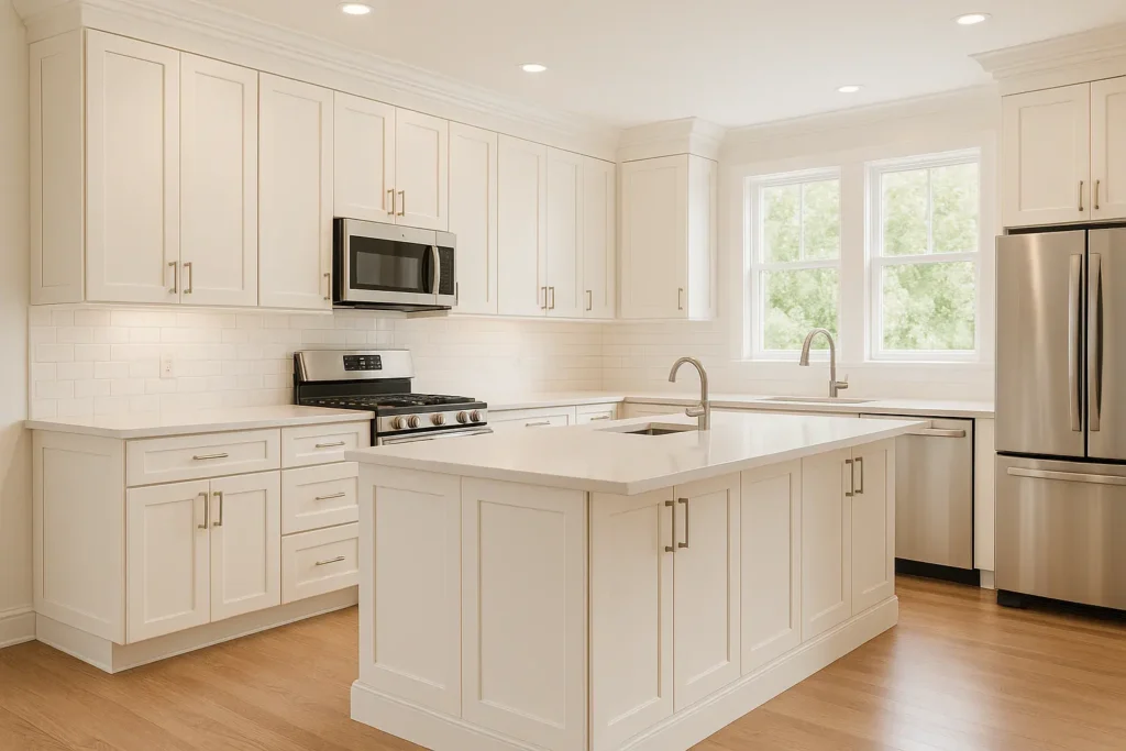
Alabaster in the kitchen is one of my favorites.
It’s bright, clean, and makes everything feel fresh.
It works on walls, but it’s also big for kitchen cabinets.
Alabaster cabinets are most considered because they’re warm to feel inviting but bright to feel clean.
Pair them with a soft greige wall color or use Alabaster for both walls and cabinets with different sheens to create a subtle look.
Exterior
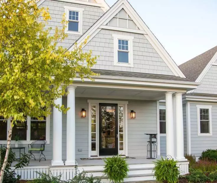
Drift of Mist on an exterior is soft, modern, and unexpected.
It’s not a typical bright white or beige house.
It has an organic, muted quality that works well with natural stone, wood accents, and black windows, but it will look light in direct sunlight.
Exteriors get more light than interiors so that LRV of 69 will be close to an off-white outside.
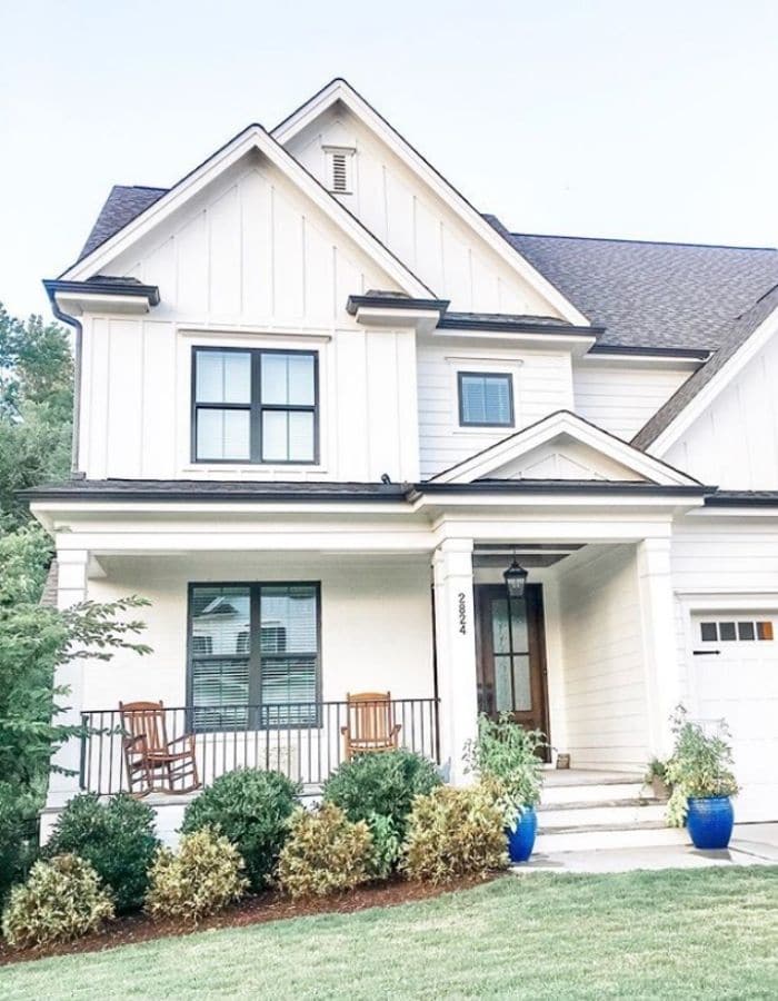
Alabaster on the exterior is classic and timeless.
It’s warm so that it doesn’t feel stark or cold but bright to feel fresh and clean.
It’s one of the popular exterior whites for a reason.
It works on everything from farmhouses to modern builds and pairs well with black trim, natural wood, brick, stone.
Drift of Mist Vs Alabaster Vs Other Colors
Because I know you’re not only looking at these two.
But you’re also wondering about Agreeable Gray, City Loft, White Dove, Balboa Mist and other whites too which can be considered.
Drift of Mist Vs Agreeable Gray
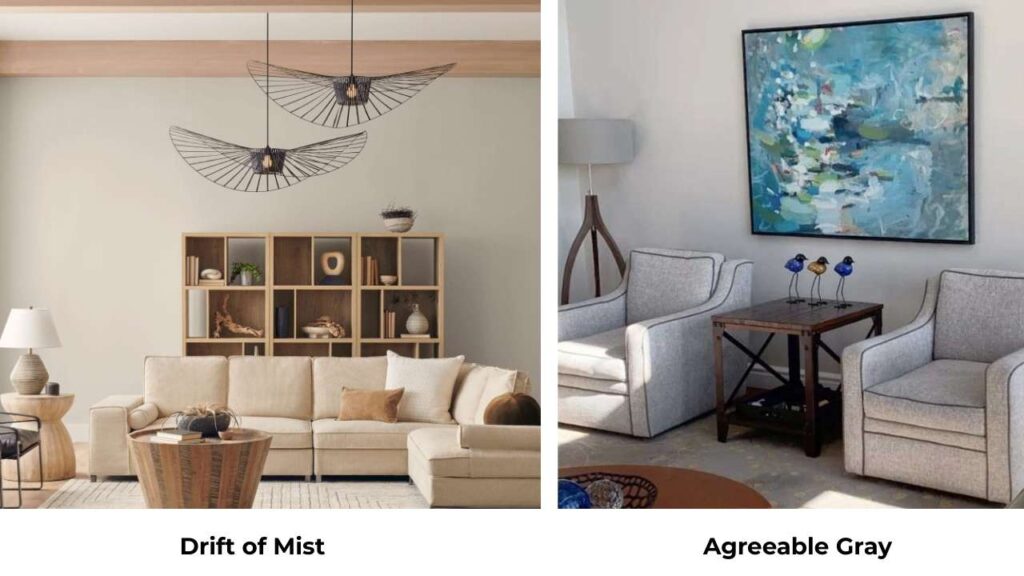
Agreeable Gray (SW 7029) is darker and more saturated than Drift of Mist.
It has an LRV of 60 so it’s going to feel like a true greige, not a light neutral.
Agreeable Gray has a presence on the wall.
Drift of Mist is soft, light and more background.
If you want your wall color to be visible, go with Agreeable Gray.
If you want it to disappear, go with Drift of Mist.
Drift of Mist Vs City Loft
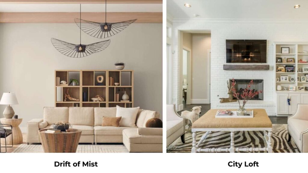
So, you’re asking about light grays here.
City Loft (SW 7415) is cool and is more gray than Drift of Mist.
It doesn’t have the warm beige undertone.
If you want something fresh and modern, City Loft is what you should consider, but it can feel cold.
Drift of Mist has more warmth and balance.
White Dove Vs Alabaster
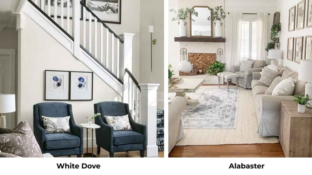
White Dove (Benjamin Moore OC-17) is soft and has more gray in it than Alabaster.
Alabaster is warm and creamy.
Both are beautiful but if you want something that stays warm and doesn’t shift gray, Alabaster is predictable.
Drift of Mist Vs Balboa Mist
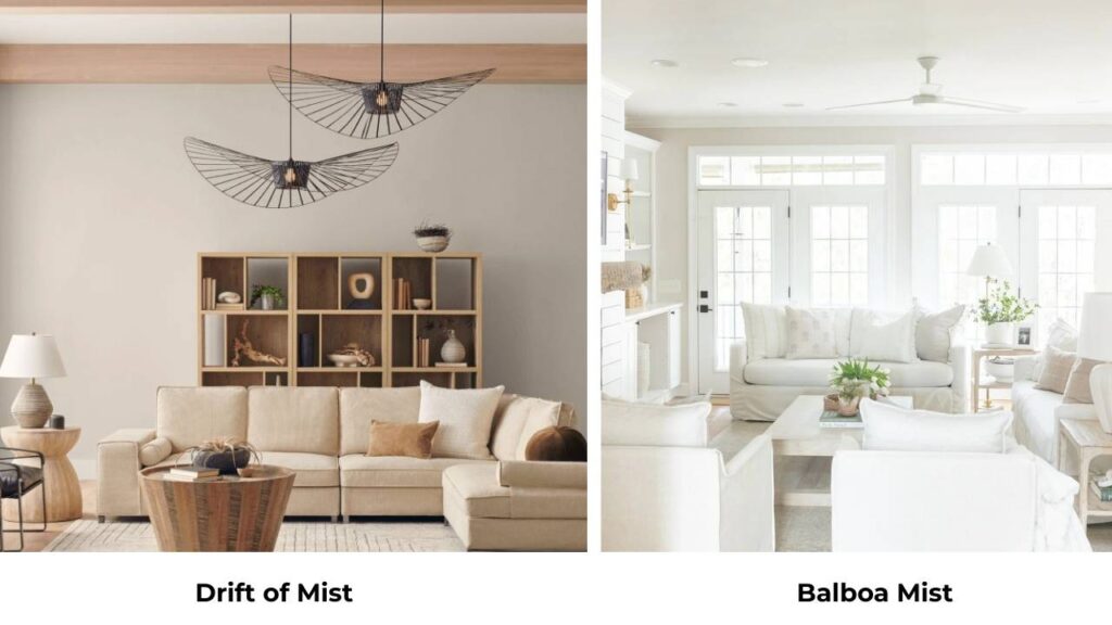
Balboa Mist (Benjamin Moore OC-27) is a greige which is similar to Drift of Mist but cool and has a touch more gray.
It’s also a Benjamin Moore color so the formulation is different.
If you can get Sherwin Williams, I’d go with Drift of Mist.
| Comparison | Key Difference |
| Drift of Mist vs Agreeable Gray | Agreeable Gray is darker (LRV 60), more saturated, stronger presence |
| Drift of Mist vs City Loft | City Loft is cooler, more gray, less warm undertone |
| White Dove vs Alabaster | White Dove has more gray; Alabaster is warmer and creamier |
| Drift of Mist vs Balboa Mist | Balboa Mist is cooler, slightly more gray, Benjamin Moore formula |
Drift of Mist Coordinating Colors
If you’re going with Drift of Mist on the walls, here’s what works with it.
White trim is non-negotiable. I love Pure White (SW 7005) for a bright, modern look.
Extra White (SW 7006) if you want more contrast.
Snowbound (SW 7004) if you want something soft that provides definition.
For accent colors, consider warm neutrals and organic tones, like soft terracotta, warm browns, deep greens, muted blues.
Drift of Mist has the subtle green undertone so it pairs well with other nature-inspired colors.
I also love it with brass and gold hardware, natural wood furniture, and linen textiles.
Alabaster Coordinating Colors
Alabaster is versatile.
It works as walls with greige or gray trim.
You’re using Alabaster as the trim with a soft wall color.
Pair it with Drift of Mist walls for a beautiful soft contrast. Pair it with Agreeable Gray for definition.
Pair it with deep colors like Urbane Bronze or Naval for high contrast.
For accent colors, Alabaster works with everything.
Warm tones, cool tones, bright colors, muted colors.
It’s neutral to let other colors shine.
I love it with navy blues, deep greens, warm terracottas, soft blush pinks.
Conclusion
So, choosing between Drift of Mist Vs Alabaster is a bit choosy.
Drift of Mist is your color if you want something soft, modern, and a little more interesting than basic white.
It’s got depth, warmth, and that subtle complexity that makes a room feel layered and thoughtful.
But it requires good lighting and careful pairing with your fixed elements.
Alabaster is your color if you want bright, classic, and foolproof.
It works everywhere, with everything, in any lighting.
It’s the safe choice but in the best way because it is not boring but reliable.
Sample them both in space.
Watch them in morning light, afternoon light, evening light.
See how they play with your floors, your furniture, your fixtures.
The right choice becomes obvious once you see them in the home with the different lighting.
Because comparing Drift of Mist Vs Alabaster can be a bit confusing and difficult.
FAQs on Drift of Mist Vs Alabaster
Drift of Mist has a balanced greige undertone with a subtle green undertone which is visible in certain lighting, mainly in northern light or cool artificial light.
Sherwin Williams Drift of Mist SW 9166 is a soft, light greige, a neutral color which is between gray and beige with an LRV of 69. It’s warm but not creamy, muted but not flat.
Yes, Drift of Mist walls with Alabaster trim is one of the most popular pairings. Alabaster provides soft contrast without being harsh, and the two colors have complementary warm undertones.
No. Alabaster has a warm beige or cream undertone but it doesn’t look as yellow. It’s one of the reasons it’s popular because it’s warm without being golden or dingy. If you’re using cool lighting or have blue tones in the room, you see the warmth more.