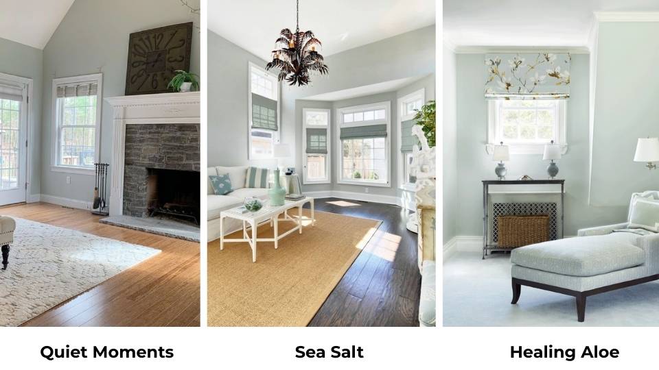
So you’re confused between Quiet Moments vs Sea Salt.
These two soft blue-green colors look identical on the small paint swatches, but in reality, they’re not.
One is more blue and gray while the other one is green and feels airier.
And this difference matters when you look at those four walls for the next five years and wonder why your “calming spa bathroom” looks like a boring office instead.
Choosing between Sherwin Williams Sea Salt and Benjamin Moore Quiet Moments can be quite confusing because both are like chameleon colors as they shift according to different lighting conditions.
Morning light hits them one way, afternoon sun does something totally different, and by evening with your warm lamps on, it has a completely different vibe.
The undertones change based on exposure, your flooring, whether you’ve got white or wood trim, or your furniture.
You can’t be wrong with this or you’ll spend way too much time looking at your walls, thinking “is that green or gray or what am I looking at?”
In this post, I’m breaking down everything about these two paint colors – quiet moments vs sea salt.
We’ll look at their undertones, their Light Reflectance Values, how they look in different rooms, and how they appear with other similar colors.
I’ll also share which coordinating colors work best, and where I’d use each one.
Here are my other blogs that you can also read:
- City Loft Vs Alabaster
- Perfect Greige Vs Agreeable Gray
- Swiss Coffee Behr Vs Benjamin Moore
- Ballet White Vs White Dove
- Liveable Green Vs Softened Green
Color Profile of Quiet Moments (Benjamin Moore 1563)
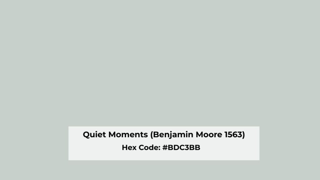
Benjamin Moore Quiet Moments is a soft blue-green with a strong gray undertone.
It’s a part of their Classic Color Collection which is also labeled CC-700, and it was designed to feel spa-like and calming.
What it looks like is a muted, cool color that looks more blue than green.
I’ve used Quiet Moments many times over the years. It’s popular with the modern farmhouse and anyone considering the transitional spa vibe, like the Pottery Barn catalog look with white trim and natural wood accents.
Homeowners love it for bathrooms, but I’ve also done this in bedrooms, living rooms, one kitchen where the client had white shaker cabinets and wanted something soft on the walls.
The gray undertone is what makes Quiet Moments BM work in contemporary spaces. It’s not bright or cheerful.
It won’t make you smile when you walk in but it will make a room feel quiet and controlled.
The blue-green balances toward blue. In north-facing rooms, the blue comes through.
I did a primary bedroom once that faced north, and Quiet Moments looked slate blue by mid-afternoon.
Not what the client wanted.
What I recommend: if your room gets soft, indirect light or you have warm wood tones, Benjamin Moore Quiet Moments can look beautiful.
But if you’re in a bright space or you’ve got cool-toned everything like gray floors, chrome fixtures, white furniture, it can look blue-gray and feel cold.
Color Profile of Sea Salt (SW 6204)
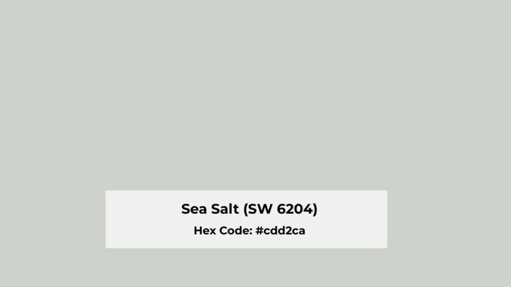
Sherwin Williams Sea Salt is their most popular blue-green-gray.
It’s in their Top 50 Colors, and I see it in many spaces.
Sea Salt is a soft green-gray which has subtle blue undertones.
But here’s what makes it different from Quiet Moments: the green is more dominant.
Sea Salt is at an LRV of 63, which makes it lighter and airier than Quiet Moments.
It reflects more light, so in a bright room it can look washed out. I’ve seen Sea Salt in south-facing living rooms where it disappeared into the walls.
You could not tell there was color there.
The gray undertone in Sea Salt is interesting because it shifts based on lighting.
In low light or north-facing rooms, that gray takes over and Sea Salt can look flat, dull and boring.
But in balanced light with some natural warmth it looks pretty.
I use Sea Salt more than Quiet Moments because it’s forgiving.
It pairs well with beige and greige, which existing homes have in their flooring and countertops.
It works in open floor plans where you need one color to flow through multiple spaces without feeling heavy.
Bedrooms, bathrooms, kitchens with white cabinets, Sea Salt handles all.
But if you have a room with zero natural light, Sea Salt will not look good. It’ll go gray and sad.
I learned that this while going with this in a windowless powder room.
The client wanted “coastal vibes” and we went with Sea Salt, and it looked only gray.
Quiet Moments Vs Sea Salt: Key Differences
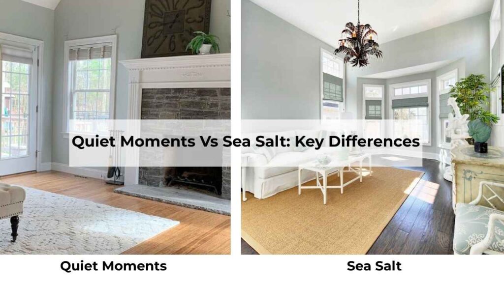
Alright, so you’re thinking Quiet Moments Vs Sea Salt, these two colors sound similar and they are, that’s the problem.
But there are some differences that’ll make or break your room, and you need to know them before you buy the wrong paint.
LRV
Light Reflectance Value measures how much light a color reflects on a scale of 0 to 100.
The higher the number, the lighter and brighter the color looks.
Quiet Moments has an LRV of 60. It’s a medium-light color that absorbs more light than Sea Salt.
This makes it look deep and more saturated and you’ll see the color more clearly on the wall.
Sea Salt has an LRV of 63. It is three points higher, but you can see the difference when they’re side by side.
Sea Salt is lighter, reflects more light, and in a bright room it can vanish. It feels softer and less.
If you want people to notice your wall color, Quiet Moments is what you should go for.
If you want color that goes into the background and feels barely-there, Sea Salt’s your pick.
Undertones
Quiet Moments has blue and green undertones, but the blue dominates.
There’s also a gray undertone that keeps everything muted and soft. It looks green unless you pair it with warm yellows or beiges.
In many lighting, you see blue-gray with a hint of green.
Sea Salt has green and gray undertones, with the green taking the lead. Blue’s there too, but it’s secondary.
Depending on your lighting and surroundings, Sea Salt can shift between looking green, gray, or blue. It’s a chameleon.
I always tell clients: if you hate green, don’t pick Sea Salt.
Even if it looks gray on the chip, the green will show up at any point during the day.
Lighting Affect
Quiet Moments in different lighting:
- North-facing rooms: looks cool, blue, or maybe slatey
- South-facing rooms: softens up, feels balanced, the green comes
- Low light: gray undertone takes over, can feel flat
- Warm artificial light: pulls greener and warmer
Sea Salt in different lighting:
- North-facing rooms: can look gray, muted and dull
- South-facing rooms: this is where it shines, it looks fresh, light, shows the green-blue
- Low light: goes flat gray, loses its charm
- Cool artificial light: the blue-green tones pops
Both of these colors need good natural light to look their best.
If you’re painting a basement, then go with something else, like go dark or go rich.
These mid-tone blue-greens need light to show their personality.
Style and Best Uses
Quiet Moments works best with:
- Crisp white trim like Chantilly Lace or White Dove
- Brushed nickel or chrome fixtures
- Cool-toned grays and whites
- Modern, contemporary, or transitional spaces
- Natural wood that’s more gray-toned
Sea Salt works best with:
- Warmer whites like Alabaster or Creamy
- Brushed gold or brass fixtures
- Beiges, greiges, sand tones
- Coastal, farmhouse, or transitional spaces
- Wood tones that is warm
Here’s a comparison table because looking at this stuff side by side helps:
| Feature | Quiet Moments | Sea Salt |
| LRV | 60 | 63 |
| Dominant Undertone | Blue | Green |
| Secondary Undertone | Gray | Gray |
| Color Depth | Deeper, more saturated | Lighter, airier |
| Best Light | Balanced/South-facing | South-facing |
| Worst Light | North-facing (too blue) | Low light (goes gray) |
| Vibe | Spa-like, intentional | Soft, adaptable |
| Best Trim | Crisp whites | Warm whites |
| Fixtures | Cool metals | Warm or cool metals |
Quiet Moments Vs Sea Salt: How Do They Look In Different Rooms
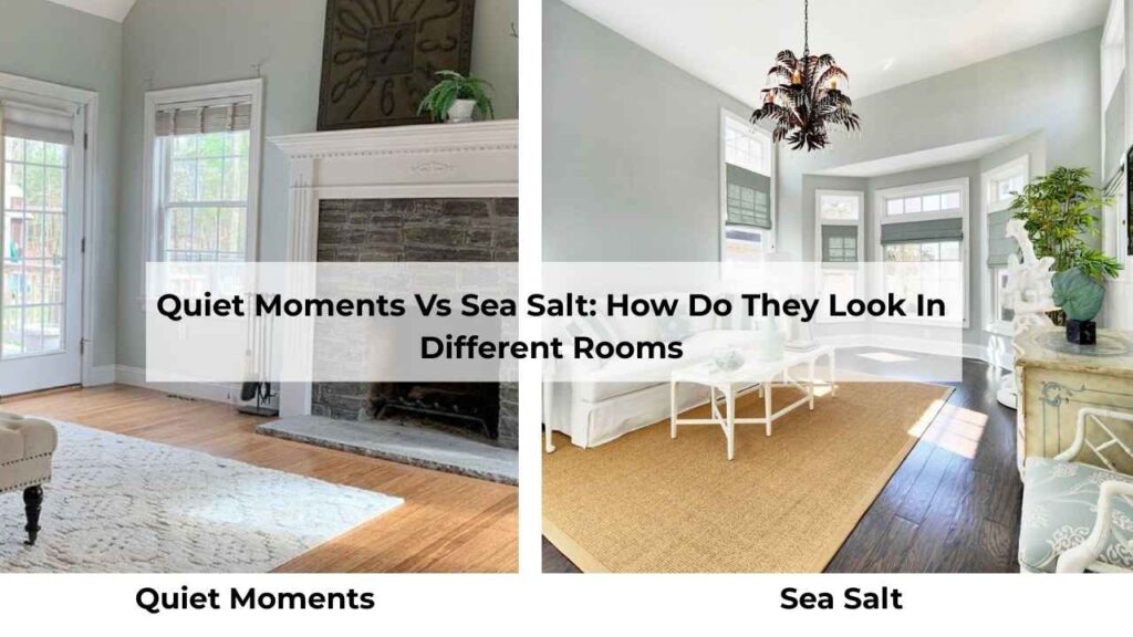
The room matters. A color that looks perfect in the bathroom may not look in the living room and the reason can be different light, different purpose, different feel.
Let me break down how these two look in real spaces.
Living Room
Quiet Moments in the living room: I’ve done this a few times, and it works when the room has good natural light and you’re considering a calm, sophisticated vibe.
It’s not a “fun” color nor cheerful. But if you’ve a south or west-facing living room with white trim and neutral furniture, Quiet Moments can create a serene, pulled-together look.
The blue-gray keeps it feeling cool and modern without being cold.
The mistake I see people make is using Quiet Moments in a dark living room. It dies and looks muddy and sad.
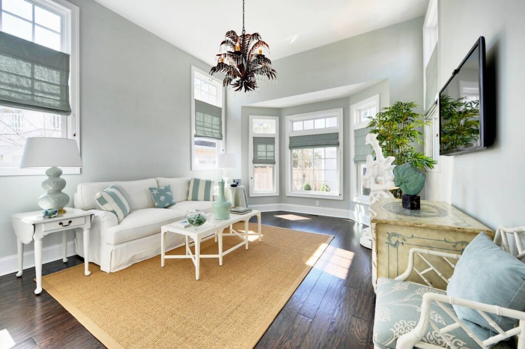
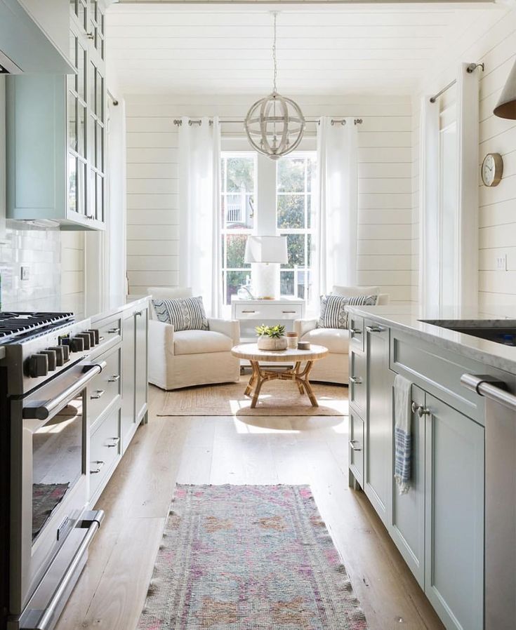
Sea Salt in the living room: This is one of the Sea Salt’s best applications.
It’s light that doesn’t overwhelm a large space, and in a living room with decent light, it gives you barely-there color without committing hard.
It is perfect for open floor plans where you need the walls to recede and let your furniture and decor shine.
If your living room is bright, Sea Salt may wash out.
You’ll end up with walls that look more off-white than blue-green.
Bedroom

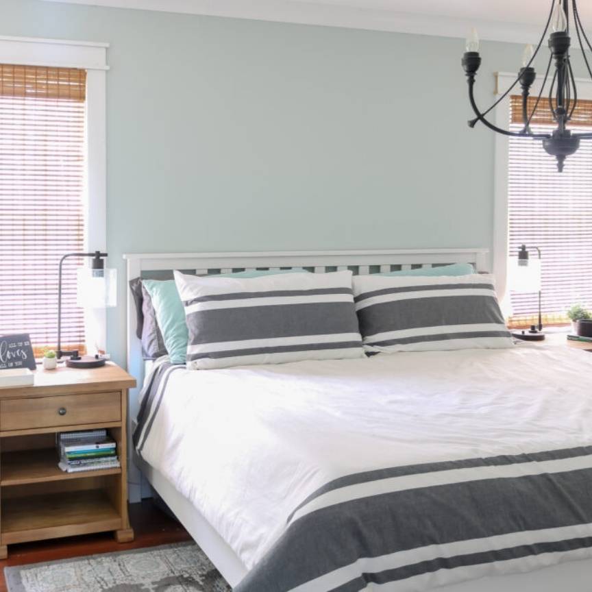
Quiet Moments in the bedroom: This is a solid choice. Bedrooms are soft light, and you want the calm, muted feeling.
The blue undertones in Quiet Moments work beautifully for sleep spaces.
I’ve used it in primary bedrooms with white bedding and natural wood furniture, and it creates a spa-like retreat feeling.
But watch out if your bedroom faces north. That blue can get pronounced and feel cold when you’re trying to wake up in the morning.
Sea Salt in the bedroom, also great. Maybe better than Quiet Moments because it’s soft and less defined. Sea Salt in a bedroom with warm wood tones and creamy bedding looks nice.
The green-gray creates a cozy, wrapped-up feeling without being too cool or too warm.
I’ve had clients use Sea Salt in guest bedrooms. It’s appealing, not too bold, and it photographs well which matters.
Bathroom
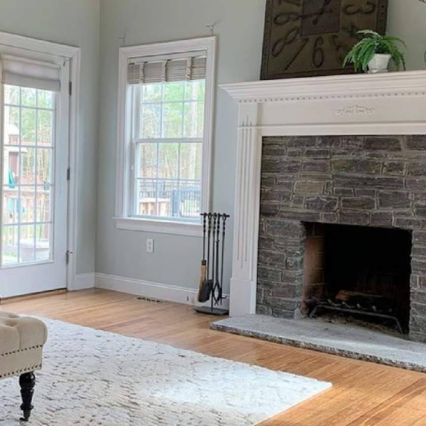
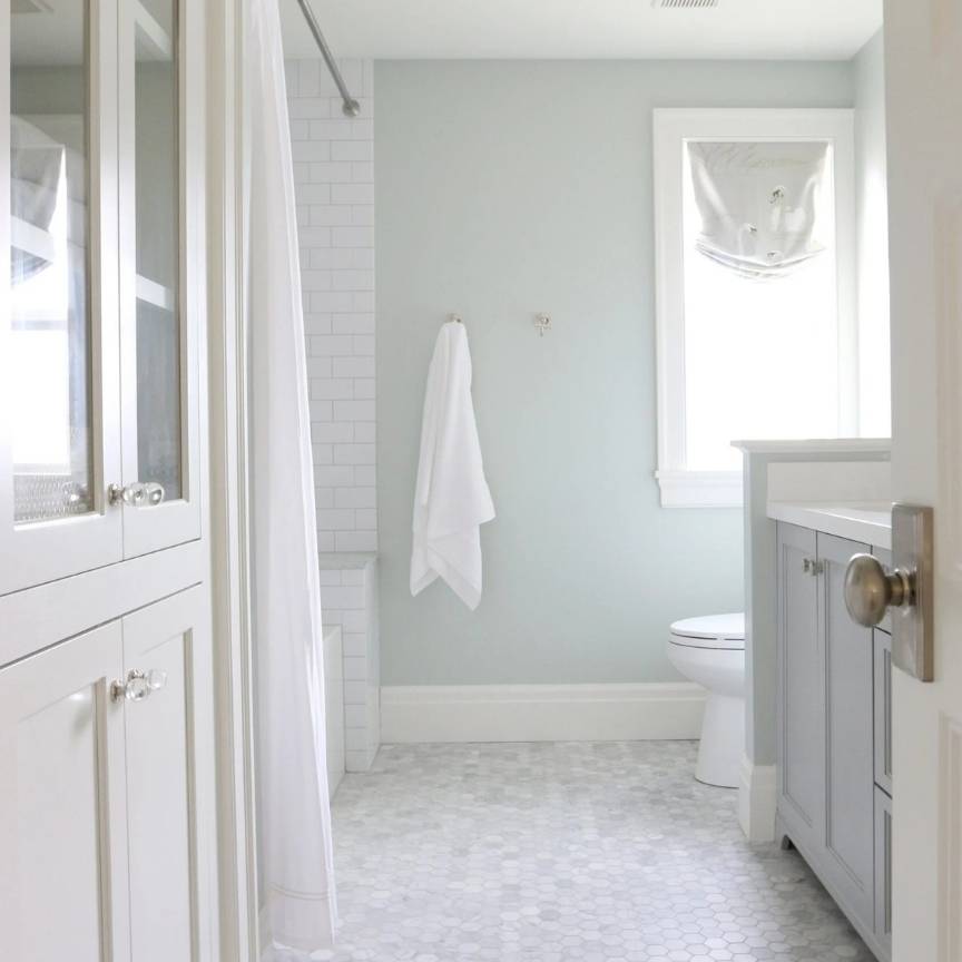
Quiet Moments in the bathroom: This is the number one place I use Quiet Moments. Bathrooms are where the spa vibe makes sense.
Pair it with white subway tile, chrome fixtures, and marble, to create an expensive hotel bathroom look.
The blue-green looks as clean and fresh without being minty or too colorful.
In a bathroom with good artificial lighting, Quiet Moments holds its color and looks intentional.
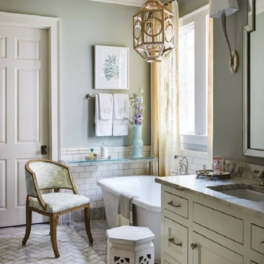
Sea Salt in the bathroom: Also a classic bathroom color. Sea Salt in a bathroom with natural light is beautiful because with this you get a soft, watery feeling.
But I’ve seen it in many bathrooms with bad lighting where it looks gray and disappointing.
If you’re doing Sea Salt in a bathroom, invest in good lighting.
Warm-toned bulbs help bring out the green and keep it from going flat.
Kitchen
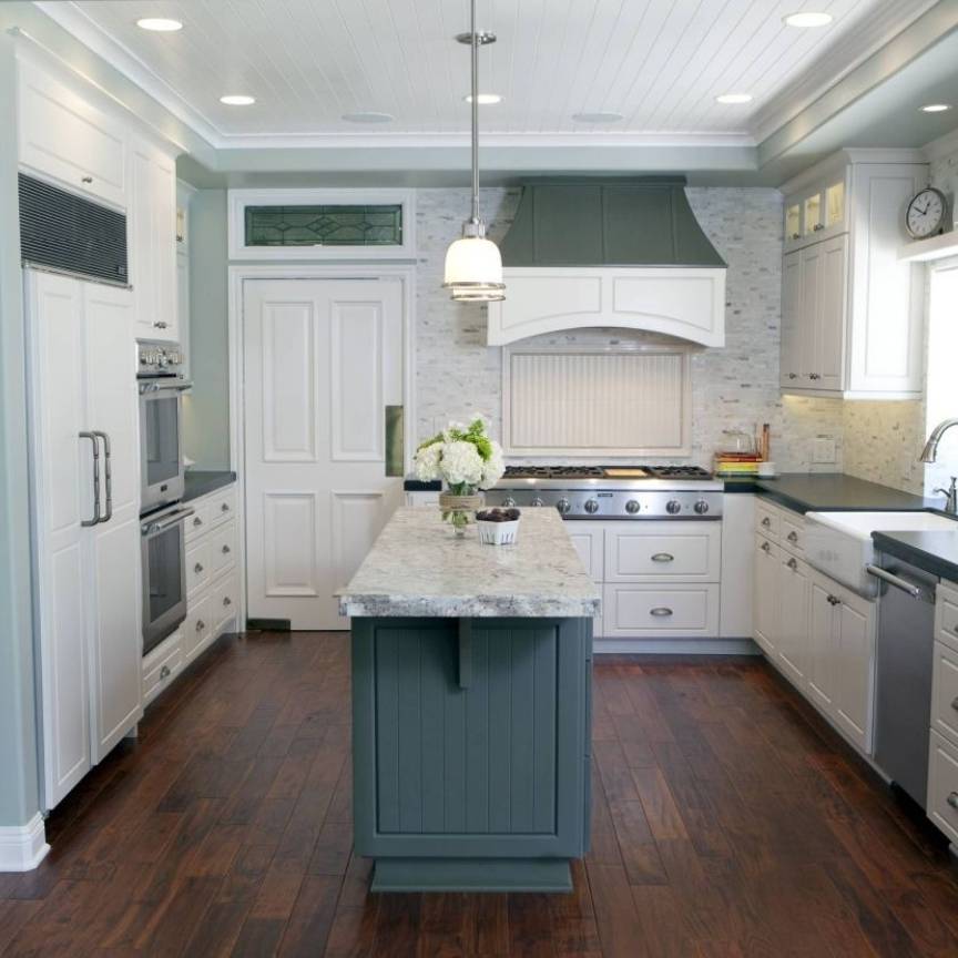
Quiet Moments in the kitchen: I’ve done this once with white shaker cabinets, white quartz counters, and stainless appliances. It looked really good.
The blue-gray gave the kitchen a sophisticated edge without being dark or heavy.
Kitchens have decent light, and Quiet Moments can handle it.
But would I do it with wood cabinets, maybe not because it may feel too cool.
Sea Salt in the kitchen: Is common, and forgiving.
Sea Salt works with white cabinets obviously, but it also works well with gray cabinets and some wood tones.
The light LRV means it doesn’t compete with your cabinets or backsplash.
I like it in kitchens which flow into living spaces because they are neutral to work.
One warning: in a kitchen with south-facing windows, Sea Salt can wash out and look almost white.
You can go a shade darker if your kitchen’s bright.
Exterior
Quiet Moments on the exterior: I’ve seen this a few times, and it’s hit or miss.
Exterior light is intense, and Quiet Moments can look washed out, especially in full sun.
The color depth that looks good inside doesn’t always look outside.
If you’re considering Quiet Moments for exterior, sample it on a board and look at it at different times of day.

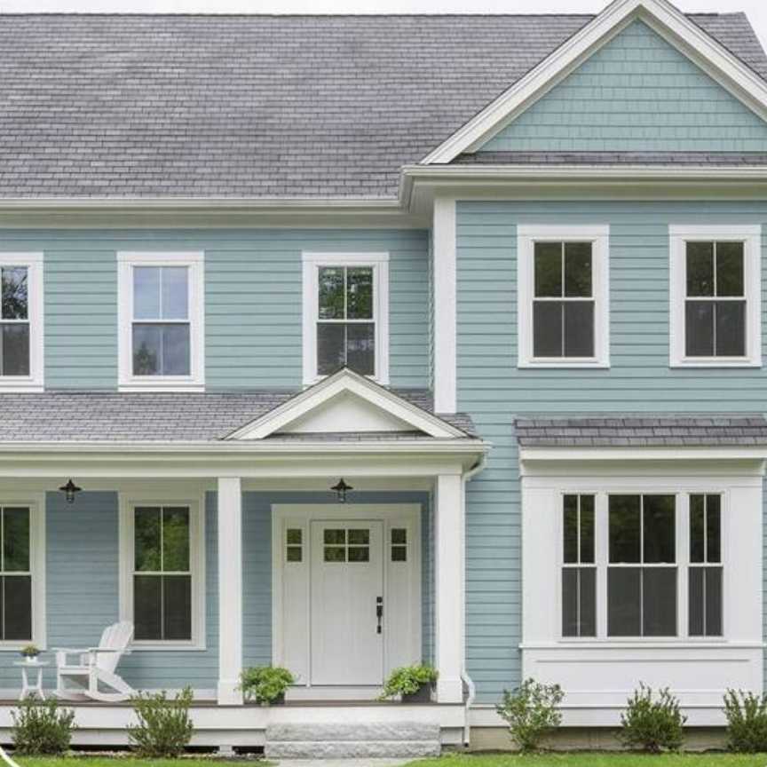
Sea Salt on the exterior: More popular for exteriors, and it works better because it’s light and meant to be airy.
Sea Salt on a coastal cottage with white trim is a classic.
But in the full sun, even Sea Salt can disappear. Some people love that subtle look.
Others want their paint color to show up.
I recommend going darker than you think for exteriors because the sun is brutal.
Quiet Moments Vs Sea Salt Vs Other Colors
Okay, so maybe none of these is right for what you are considering, or you want to see what else is out there. Smart move.
Comparing extra colors costs you in samples but saves you from repainting.
Benjamin Moore Quiet Moments vs Healing Aloe
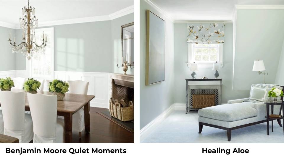
Healing Aloe is greener and softer than Quiet Moments.
It has less gray, more pure green. If Quiet Moments feels too blue-gray, then Healing Aloe is what you should consider.
It’s calm and spa-like but with a friendly, warm vibe.
Beach Glass Vs Quiet Moments
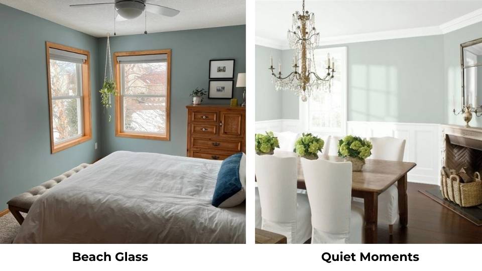
Beach Glass is darker with the LRV of 49.7 compared to Quiet Moments’ 60.
Beach Glass has more color saturation, which means it doesn’t wash out in bright light.
I prefer Beach Glass for sunny rooms or for front doors and cabinets where you want the color to show up.
But it’s not as soft or serene as Quiet Moments.
Quiet Moments Vs Palladian Blue
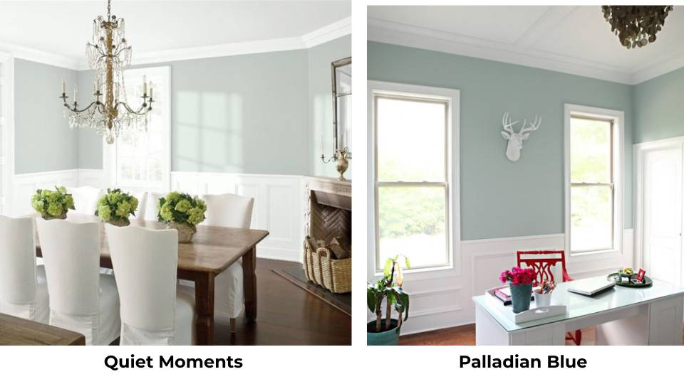
Palladian Blue is more blue and less gray. It’s cheerful, fresh, and happy.
Quiet Moments is calm and controlled.
If you’re doing a kids’ room or want a beachy, fun vibe, Palladian Blue is what you go for.
If you want sophisticated and spa-like, Quiet Moments is better. They’re pretty different despite both being blue-greens.
Gray Cashmere Vs Quiet Moments
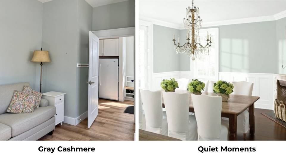
Gray Cashmere is grayer and warmer.
It’s barely blue-green but it is more of a soft greige with a hint of blue. If Quiet Moments feels too colorful or too cool, Gray Cashmere can be the neutral.
But they’re not in the same category.
Quiet Moments Vs Woodlawn Blue
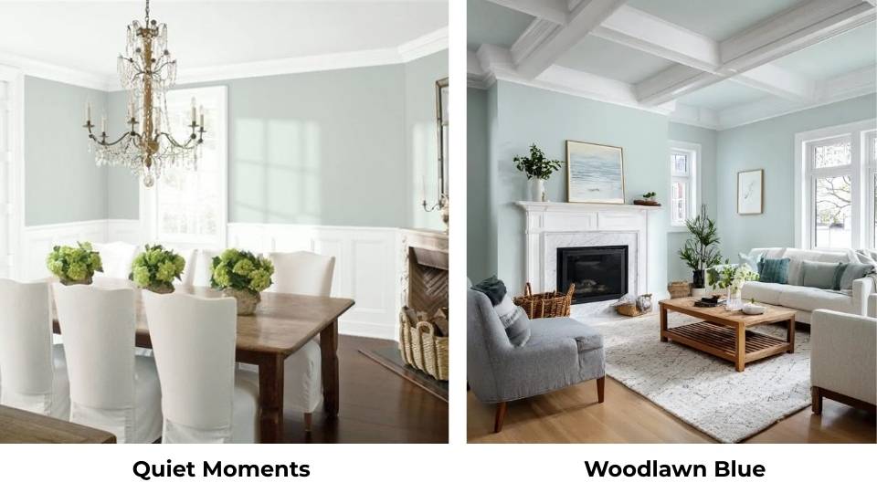
Woodlawn Blue is another blue-green from Benjamin Moore, but it’s rich and saturated.
It has more personality than Quiet Moments. I use Woodlawn Blue when someone wants a real color statement but calm and not bright.
Quiet Moments is more background, Woodlawn Blue is more present.
Quietude Vs Sea Salt
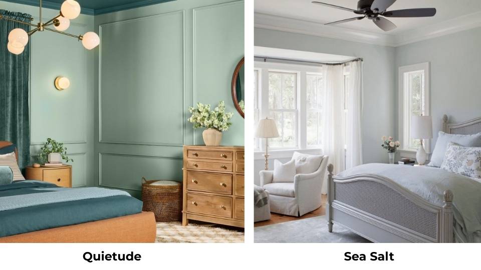
Quietude (Sherwin Williams) is cool and grayer than Sea Salt. It is less green, more gray-blue, and it is moody too. Sea Salt is lighter and softer.
If Sea Salt feels too green or too wishy-washy, try Quietude.
Here’s a comparison table for all these:
| Color | Brand | LRV | Main Undertone | Best For |
| Quiet Moments | Benjamin Moore | 60 | Blue-gray | Spa bathrooms, calm bedrooms |
| Sea Salt | Sherwin Williams | 63 | Green-gray | Living rooms, open spaces |
| Healing Aloe | Benjamin Moore | ~58 | Green | Warm spaces, less formal |
| Beach Glass | Benjamin Moore | 49.7 | Blue-green | Bright rooms, cabinets |
| Palladian Blue | Benjamin Moore | ~62 | Blue | Kids’ rooms, cheerful spaces |
| Gray Cashmere | Benjamin Moore | ~64 | Greige | Warm neutrals |
| Woodlawn Blue | Benjamin Moore | ~59 | Blue-green | Statement walls |
| Quietude | Sherwin Williams | ~61 | Gray-blue | Moody, sophisticated |
Quiet Moments Coordinating Colors
So you picked Quiet Moments. Cool. Now you need colors that work with it so your room doesn’t look like a sad aquarium.
White trim colors: Chantilly Lace or Simply White from Benjamin Moore create good contrast and keep Quiet Moments looking fresh.
If you want soft contrast, White Dove works but makes Quiet Moments look a bit more colorful.
I go bright with the trim when I’m using Quiet Moments.
Ceiling color: Only use white. Decorator’s White or match your trim. Don’t overthink the ceiling.
Accent colors: This is where you bring in warmth. Quiet Moments are cool, so you need to balance it.
- Warm grays like Revere Pewter or Accessible Beige
- Soft whites with cream undertones
- Natural wood tones
- Navy or charcoal for drama
- Soft corals or blush for a feminine touch
- Sage or olive greens if you want color
What doesn’t work: Don’t pair Quiet Moments with cool grays or blue-grays. Too much cool. It’ll feel like an ice cave.
Also avoid anything with yellow undertones because the contrast is weird and the blue in Quiet Moments will look too blue.
Metals and fixtures: Brushed nickel, chrome, or matte black all look good. Brass can work if it’s brushed and not too shiny-yellow.
Conclusion
Look, choosing between Quiet Moments Vs Sea Salt comes down to what you want to see on your walls.
Quiet Moments is more blue, defined and deep. It’s the choice when you want a color that looks like a color.
Sea Salt is green, light, and adaptable. It’s the choice when you want something subtle that won’t commit.
If you’ve great natural light and modern finishes, Quiet Moments can look sophisticated.
If you’ve got an open floor plan with existing beiges and warm tones, Sea Salt is safe to go with.
But honestly choosing between Quiet Moments Vs Sea Salt, I think you should sample them both.
Get peel-and-stick samples, put them on your wall, look at them in morning light and evening light and crappy overhead light.
See which one your space responds to. According to your flooring, your light, your furniture.
FAQs on quiet moments vs sea salt
Beach Glass is darker with an LRV of 49.7 versus Quiet Moments at 60. Beach Glass has more color saturation and doesn’t wash out as easily in bright spaces. Quiet Moments is light and spa-like.
Quiet Moments has blue and green undertones with a strong gray influence. The blue is dominant in almost all lighting situations, which is why it looks as blue-gray rather than green-gray.
Bright whites like Chantilly Lace or Simply White for trim, warm neutrals like Revere Pewter or Accessible Beige for adjacent walls, natural wood tones, navy or charcoal for accents, and soft corals or blush for warmth. Avoid cool grays and anything with strong yellow undertones.
Sherwin Williams Quietude is similar but cooler and grayer. Benjamin Moore Beach Glass is similar but dark. Benjamin Moore Palladian Blue is the same but more blue and less gray. If you want the same vibe but from Benjamin Moore, try Silver Marlin or Woodlawn Blue.
Quiet Moments Vs Sea Salt: Which Paint Color Works Best in Your Home?