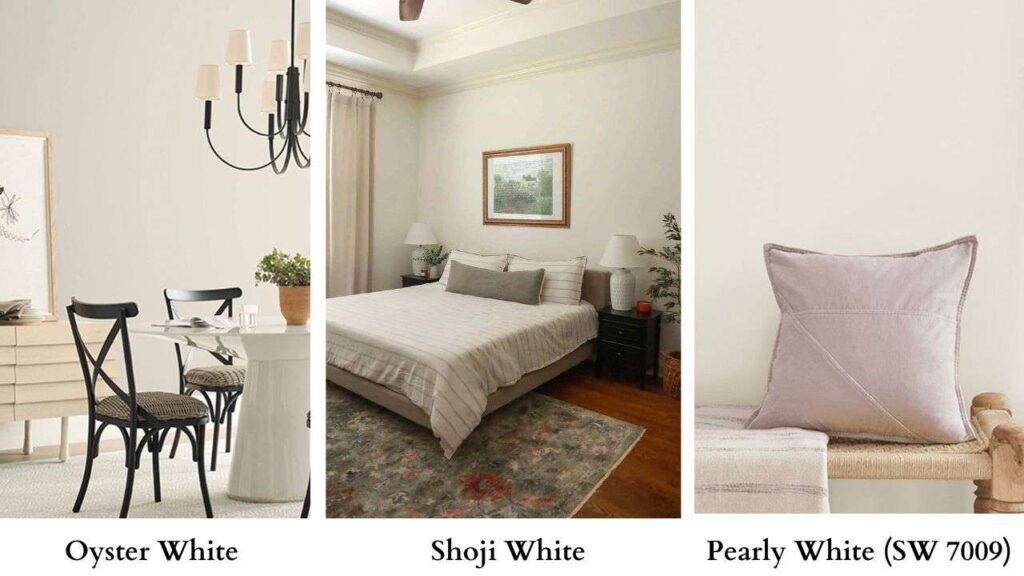
Oyster White Vs Shoji White, these are two most talked-about warm off-white paint colors from Sherwin-Williams.
Both have that perfect spot between bright white and beige.
They’re warm without going yellow. Soft without looking dingy. The kind of colors that make a space feel finished.
Once you get these colors on your walls, in lighting, with your floors and your furniture, the subtle undertones can change how a room feels.
Shoji White may bring gray in your north-facing bedroom.
Oyster White can be beige next to white cabinets.
It’s that the wrong undertone in your space can throw off the whole space.
I’ve seen homeowners repaint whole rooms because they didn’t consider how their oak floors would warm up a warm white
So, we’re breaking down about Oyster White Vs Shoji White like their LRV, their undertones, how they look in different lighting.
We’ll look at how each performs in rooms.
I’m discussing comparisons with other popular Sherwin-Williams whites.
Here are my other blog posts that you can also read:
- Woodlawn Blue VS Palladian Blue
- White Dove Vs Alabaster
- Clary Sage VS Evergreen Fog
- Liveable Green Vs Softened Green
- Wythe Blue Vs Palladian Blue
What You Need To Know About Oyster White (SW 7637)
Oyster White is a warm off-white with greige influence.
The LRV is at 72 which means it reflects 72% of light back into the room which is not bright, not dark.
It’s in that middle zone where it is a soft white in some conditions and as a light beige in others.
The undertones are where Oyster White gets interesting.
It has green undertones mixed with beige warmth.
In warm lighting like south-facing rooms or spaces with warm LED bulbs, the green undertones can shift yellow.
Not builder-grade cream yellow, but that it leans warmer.
In cool light or north-facing spaces, the greige aspect comes forward and it looks taupe.
Here’s the thing about Oyster White that it was originally marketed as an exterior paint color.
And that’s where it shines bright.
On an exterior, mainly in bright sun conditions or at high altitudes, Oyster White is a soft, warm white.
It has depth that doesn’t look flat or bright against stone, brick, or natural materials.
For painted brick exteriors, this color is perfect.
It unifies the surface without going too bright or too flat.
If you’ve got warm-toned brick or stone accents, the green-beige undertones in Oyster White harmonize.
In interior applications, Oyster White looks light beige. Mainly on walls in rooms without natural light.
I’ve used it in a living room with warm oak floors and cognac leather furniture that looked cozy.
But I’ve also seen it in a modern kitchen with white cabinets and cool gray counters and it looked muddy.
For cabinet application, it is nice but be careful.
If you’re doing Oyster White cabinets, your walls need to be light. Something like Pearly White or Alabaster.
The finish matters more.
Oyster White in a flat or matte finish on walls will look deep and muted.
In an eggshell or satin, it’ll reflect light and be bright.
On trim in semi-gloss It’s going to look beige and less white.
What You Need To Know About Shoji White (SW 7042)

Shoji White is warmer than a true white, but it feels more neutral than Oyster White. The LRV is 74 which is two points more than Oyster White, but that’s enough to make it visibly brighter.
The two points mean Shoji reflects more light into your space.
The undertones are where Shoji White differs from Oyster.
Instead of green-beige, it gives gray-greige with subtle taupe influence.
It is definitely not a cool white but it’s clean and less earthy.
In a north-facing room, you get that flat, cool indirect light and Shoji White will show more of its gray undertones.
It may shift toward a soft greige. In a south-facing room with warm sunlight, Shoji gets warm and soft.
For exteriors, Shoji White is fantastic. It stays clean-looking in natural daylight without going harsh or cold.
The taupe undertones help it blend with a wider variety of architectural materials than Oyster White.
If you’ve got a mix of stone, stucco, or painted surfaces, Shoji’s neutral-warmth handles variation better.
And it neutralizes green foliage better than Oyster White.
Inside, Shoji White is versatile for trim, cabinets, and walls.
I’ve used it as a trim color paired with warm wall colors.
It gives you a “soft white trim” look instead of the bright white that can feel contrasted.
Especially in kitchens where you want white cabinets but don’t want them to feel cold or sterile.
The warmth in Shoji keeps it approachable.
On walls, it’s a safe bet for modern, transitional, and Japandi-inspired interiors.
It has the clean-but-not-cold thing going on that works with minimal aesthetics.
Pairs well with light woods, warm and cool grays, black accents, some muted colors.
The finish choice matters less dramatically with Shoji than with Oyster.
Because Shoji is more neutral and less undertone, it stays consistent across finishes.
But matte will look deeper, semi-gloss and bounce more light.
Oyster White Vs Shoji White: Key Differences
Okay so both are warm off-whites from Sherwin-Williams. Both are popular.
Both look similar on paint swatches but in reality, they’re different that choosing wrong can bug you every time you walk into the room.
LRV (Light Reflectance Value)
Oyster White: LRV 72
Shoji White: LRV 74
But here’s what the two points mean: Shoji White reflects more light.
In a room with decent natural light, Shoji will feel bright and open.
Oyster will feel soft, cozy.
In a dim room or one without natural light, the difference is visible.
Shoji maintains its white appearance.
Oyster can start looking beige.
If you’re trying to maximize light in a small room, limited windows, then Shoji’s high LRV gives you an advantage.
Undertones Comparison
Oyster White: Green-beige undertones, reads as greige with warmth
Shoji White: Gray-greige with taupe, reads more neutral-warm
Oyster’s green undertones mean it harmonizes with warm wood, earthy materials, and spaces that are warm.
But the same green undertones can clash with cool grays, cool-toned tile, or very white trim.
The beige element makes it feel traditional, cozy, dated depending on how you style it.
Shoji’s gray-taupe undertones make it more neutral. It can swing warm or cool depending on lighting.
It doesn’t commit as hard to the warm side, which means it plays nice with a broad range of colors and materials.
Brightness and Reflection
Oyster White feels soft and more muted in good light.
The quality makes it lovely in cozy, intimate spaces. Bedrooms, reading nooks, traditional living rooms.
Places where you want warmth over brightness.
Shoji White feels clean and reflective. It bounces light around the room more efficiently.
In an open-concept space with windows, Shoji keeps things feeling bright and cohesive.
It doesn’t absorb light the way Oyster does.
If you’re painting a space with ceilings or architectural detail you want to highlight, Shoji’s brightness helps define the features.
Oyster tend to soften and blur details.
Lighting Appearance
North-facing rooms:
Oyster White will look greige, taupe-ish but could feel a bit flat.
Shoji White shows gray, stays light and has a less dramatic shift.
South-facing rooms:
Oyster White gets warm, beige comes forward, green undertones may go toward yellow.
Shoji White stays balanced, shows a bit of taupe warmth but doesn’t shift dramatically.
East-facing rooms:
The morning sun warms both colors. Oyster can glow beautifully. Shoji stays bright.
Afternoon/evening, both cool down. Oyster looks beige, Shoji gray-neutral.
West-facing rooms:
Warm evening light amplifies Oyster’s warmth.
Shoji handles warm evening light without shifting.
Artificial lighting matters just as much. Warm LED bulbs will make Oyster White lean yellow-beige.
Shoji stays stable. Cool LEDs can make Oyster look dingy or muddy; Shoji handles cool light better.
CRI (Color Rendering Index) of your bulbs affects how you see undertones.
Low CRI bulbs can distort how these whites appear.
Use high CRI bulbs if you want to see the colors as intended.
Style and Best Uses
Oyster White:
- Traditional, farmhouse, transitional, earthy modern styles
- Exteriors with warm brick, stone, or natural materials
- Interiors with warm wood tones and earthy palettes
- Pairs with: muted greens, warm beiges, bronze hardware, natural textures
- Best for: spaces where coziness trumps brightness
Shoji White:
- Modern, transitional, Japandi, contemporary styles
- Exteriors that need to stay clean-looking with varied materials
- Whole-house color for open floor plans
- Pairs with: soft grays, warm and cool neutrals, black accents, mixed metals
- Best for: versatility across multiple spaces and lighting conditions
| Aspect | Oyster White (SW 7637) | Shoji White (SW 7042) |
| LRV | 72 | 74 |
| Undertones | Green-beige, greige | Gray-greige, taupe |
| Brightness | Soft, muted | Clean, reflective |
| Temperature | Warm, earthy | Warm-neutral, balanced |
| Best exterior use | Warm brick/stone, bright sun | Mixed materials, versatile conditions |
| Best interior use | Cozy rooms, warm palettes | Whole-house, open concepts |
| Trim pairing | Needs brighter white | Can be trim or wall color |
| Style affinity | Traditional, farmhouse | Modern, transitional |
How Do Oyster White and Shoji White Look in Different Rooms?

Paint colors don’t exist in a vacuum but the same color and different room is a different result.
Let’s walk through how these two look in real spaces.
Living Room
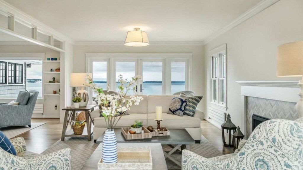
Oyster White in a living room is about creating the pulled-together, warm feeling.
If you’ve hardwood floors, Oyster White on the walls creates a cohesive envelope.
The green-beige undertones echo the warmth in the wood without matching closely.
Works beautifully with leather furniture, warm textiles, some vintage or antique pieces.
The muted quality, the LRV of 72 means the space feels intimate rather than bright and airy.
Good for living rooms where you want people to settle in and stay..
Shoji White in the living room feels modern and flexible. Because it’s bright and neutral, it opens up the space more.
You can mix furniture styles and finishes like cool gray sofa, warm wood coffee table, black metal accents and Shoji holds it together.
The gray-taupe undertones keep it sophisticated without feeling cold.
Perfect for open-concept spaces where the living room flows into the kitchen and dining area.
Bedroom
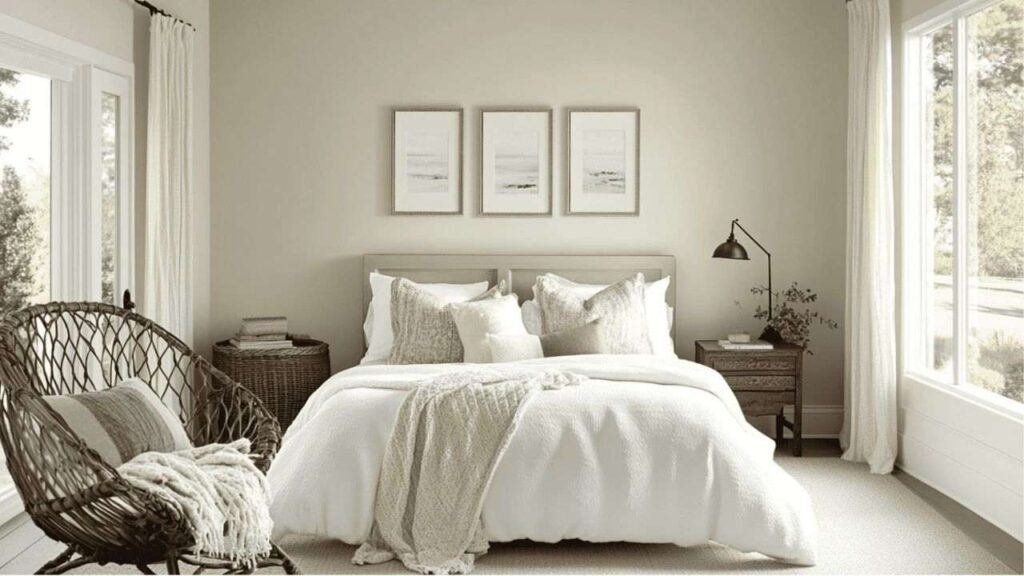
Bedrooms are interesting because you see them in so many different lighting conditions.
Morning light, evening lamps, middle of the night.
Oyster White creates a cozy, warm bedroom. The soft quality works well for spaces.
It doesn’t feel harsh or clinical. Looks nice in bedrooms with warm wood furniture like oak, walnut, even pine.
If you’re going for a traditional or farmhouse bedroom vibe, Oyster White looks the best.
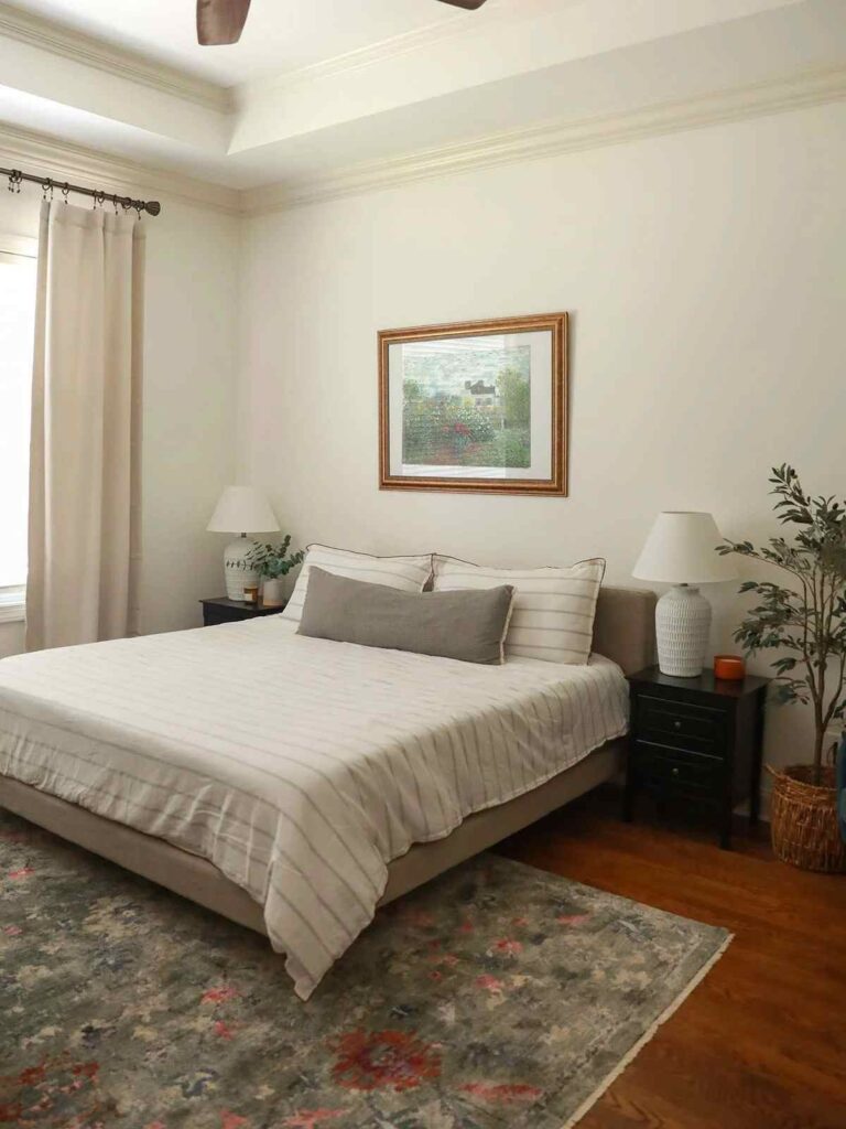
Shoji White is safe for bedrooms with varied lighting. It transitions better from natural daylight to artificial lamp light at night.
Works well in both modern and traditional bedroom settings because it’s neutral to adapt. If you’ve cool-toned bedding or gray accents, Shoji won’t go against them.
Bathroom
Bathrooms are tricky. You’ve tile, fixtures, mirrors reflecting color, have limited natural light, and bright artificial lighting for tasks.
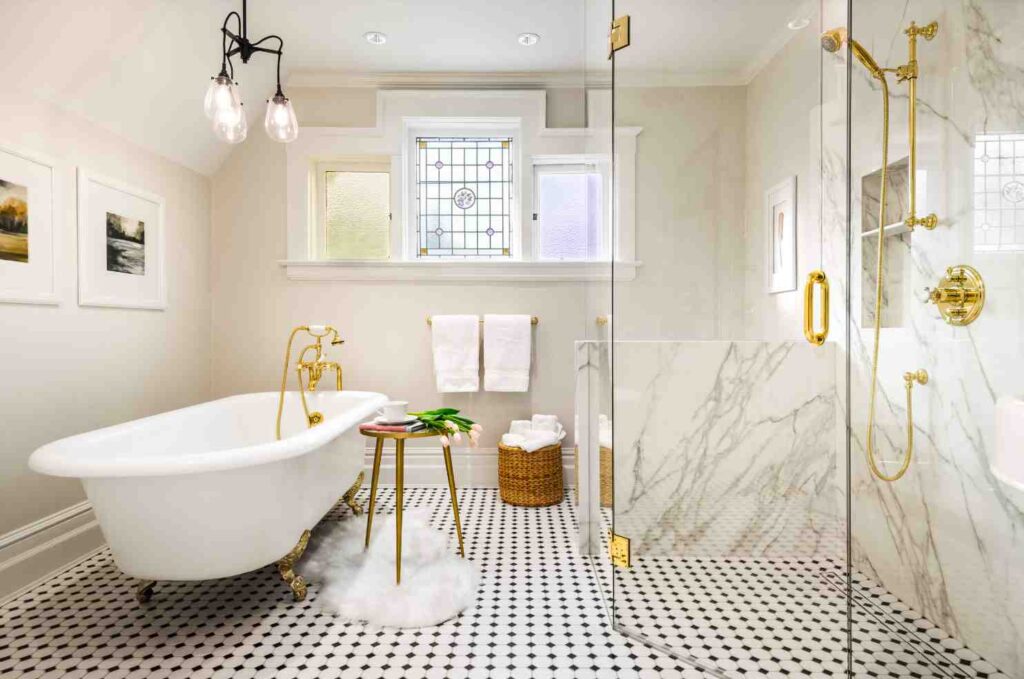
Oyster White in a bathroom you have to be careful. If you’ve warm-toned tile like beige, cream, travertine, and warm marble, then Oyster White can look elegant.
But if you’ve white fixtures and cool or neutral tile, Oyster’s beige-greige undertones can look muddy or dingy.
The high moisture in bathrooms can also make paint look different than in dry spaces.
Satin or semi-gloss finish is non-negotiable in bathrooms for moisture resistance.
Shoji White is bathroom-friendly. It is clean, which is what you want in a bathroom.
Works with white fixtures without clashing. Handles the bright task lighting over mirrors without looking yellow.
Shoji’s neutral undertones adapt.
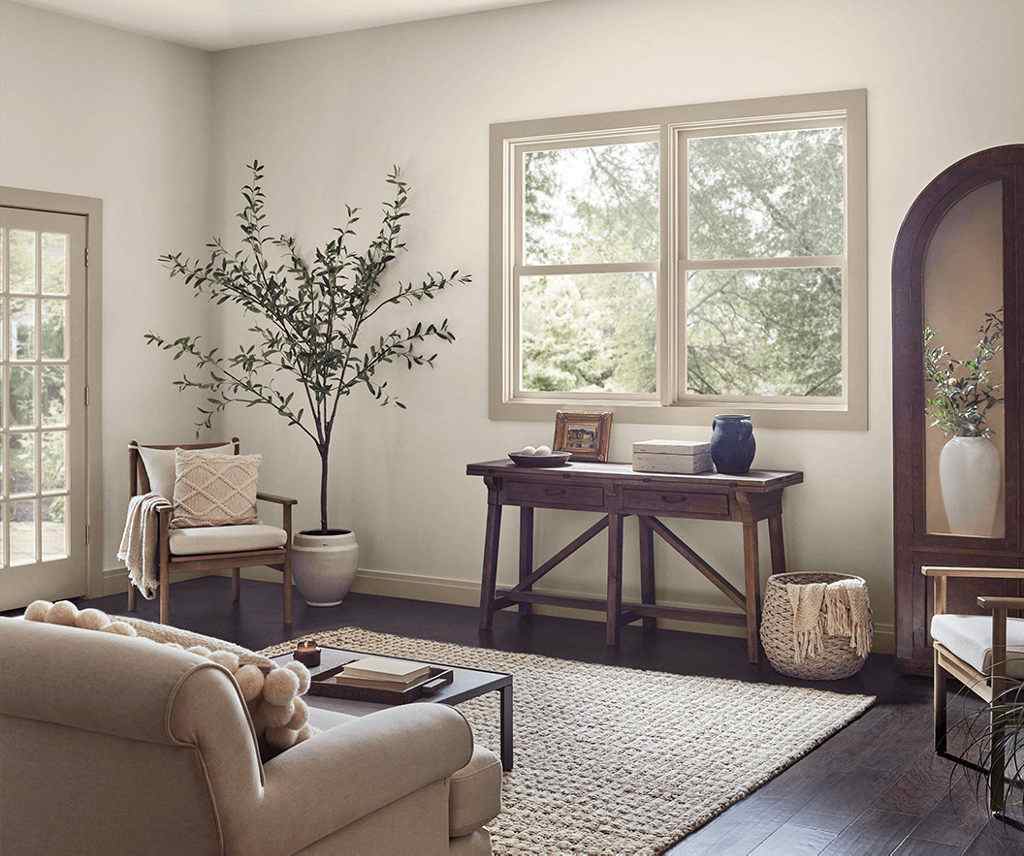
Kitchen
Kitchens have so many elements affecting color perception. Cabinets, countertops, backsplash, flooring, appliances, multiple light sources.
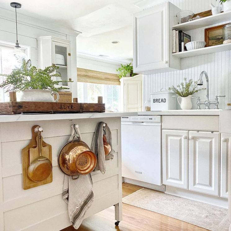
Oyster White works in kitchens with warm, traditional aesthetics.
If you’ve wood cabinets, warm granite or butcher block counters, a neutral backsplash, Oyster White walls create a cohesive warm look.
Also works well as a cabinet color if your walls are light or if you’re doing a two-tone kitchen.
Shoji White is versatile in kitchens. White cabinets in Shoji White look soft and elegant without going cold.
Pairs well with quartz counters, subway tile, modern backsplash, basically everything.
As a wall color with dark cabinets, Shoji keeps things bright without going harsh.
Exterior
Exterior paint is different from interior paint.
Direct sunlight, shadows from eaves and trees, how it looks from the street.
Oyster White on exteriors is where this color performs. In bright outdoor light, it is a warm, soft white.
Not cream, not beige but white with warmth.
The green-beige undertones harmonize with natural stone, warm brick, and wood elements.
At high altitudes or in sunny climates, Oyster has depth that it doesn’t look flat or washed out.
Shoji White on exteriors is clean and versatile. It is bright and fresh-looking without going cold.
The gray-taupe undertones help it play nice with mixed materials like stone and stucco, brick and siding.
Better at neutralizing green foliage because it doesn’t have competing green undertones.
Works with many architectural styles.
Oyster White Vs Shoji White Vs Other Colors
Let’s put these in context with other popular Sherwin-Williams warm whites.
Because maybe one of these other options is better for your space.
Oyster White Vs White Duck (SW 7010)
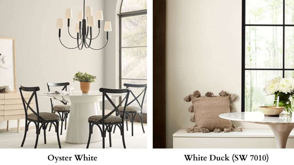
White Duck is similar to Oyster White. Same LRV of 72, similar warm greige undertones.
White Duck has less green influence. It’s a hair gray-beige, a hair less earthy.
But in spaces, they are nearly identical.
If you’re torn between them, pick one. You won’t notice the difference.
Oyster White Vs Accessible Beige (SW 7036)
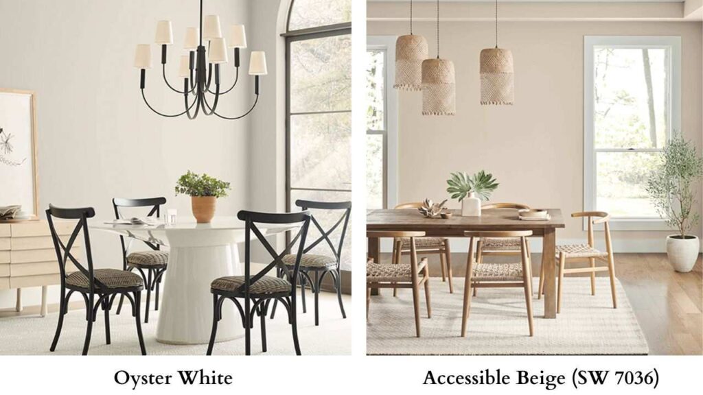
Accessible Beige is warm and beige. LRV is 58, lower than Oyster’s 72.
This makes Accessible Beige dark and saturated.
It’s a lovely, versatile beige, but beige nonetheless.
Where Oyster White is “warm white with beige undertones,” Accessible Beige reads as “soft beige.”
Oyster White Vs Natural Choice (SW 7011)
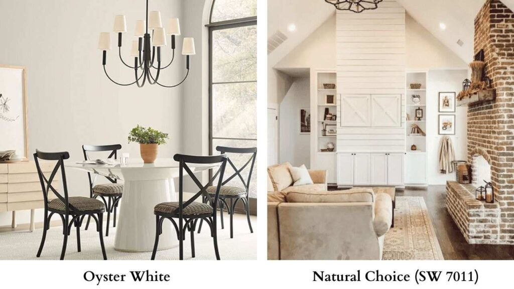
Natural Choice is light and warmer than Oyster White. LRV is 75, more light reflection.
But the undertones are more yellow-beige than Oyster’s green-beige.
Natural Choice is cheerier, sunnier. Oyster is muted and earthy.
If you’ve green foliage around your house exterior, Natural Choice is the better choice.
It doesn’t amplify green the way Oyster can. Inside, Natural Choice works well in rooms that need warmth and brightness.
Oyster White Vs Pearly White (SW 7009)
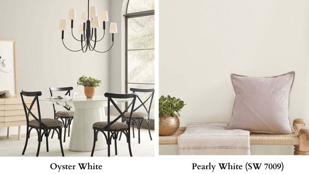
Pearly White is bright and fresher than Oyster White. LRV is 77. Pearly White has warm undertones but is much more as “white” than “greige.” Less muted, less earthy.
If Oyster White feels beige or soft in your space, try Pearly White. You’ll keep the warmth but have brightness and clarity.
Pearly White works better for interiors where you want a clean, bright foundation.
Oyster White works better where you want softness and warmth.
Oyster White Sherwin Williams Coordinating Colors
Oyster White’s warm, earthy undertones pair best with colors that either echo that warmth or provide gentle contrast without going too stark.
Trim and ceiling colors:
Don’t use Oyster White as your trim if your walls are light. You need contrast.
SW Pure White or SW White Snow work well, bright enough to define trim without feeling too cool or blue against Oyster’s warmth.
For accent walls or deeper colors:
Muted, earthy tones work best like SW Rosemary or SW Dried Thyme, the soft, grayed-down greens that harmonize with Oyster’s green undertones.
Mid-toned blues like SW Blustery Sky or SW Debonair provide contrast without clash.
Exterior trim with Oyster White body:
You can go light for a classic look or go dark for contrast like SW Portico or SW Sealskin if you want a dramatic, traditional exterior.
For shutters, SW Uncertain Gray or SW Fawn Brindle keep things soft and coordinated.
Whole-house palette:
If you’re using Oyster White as your main neutral, pair it with warm beiges and greiges in the same family. SW Accessible Beige for deep walls, SW Grecian Ivory for soft spaces.
One thing to avoid: stark contrast and very cool tones. Oyster White’s warmth means cool grays, cool blues, and dark accent colors can create discord rather than harmony.
Conclusion
Oyster White is warm, soft, and earthy which is best for exteriors in bright conditions, and interiors where you want cozy warmth over bright versatility. It’s got personality.
It has beige-greige with green undertones. It plays favorites with warm woods and traditional styles.
Shoji White is bright, clean, and neutral-warm and perfect for house use, modern interiors, and exteriors that need to stay fresh-looking. It’s diplomatic.
Works with more styles, more colors, more situations.
If you can’t decide, test both. Get samples or brush out big patches.
Watch them over for a few days in your lighting.
See which one feels right in your space because choosing between oyster white vs shoji white can be a bit confusing but when you get to know exactly then it becomes easy.