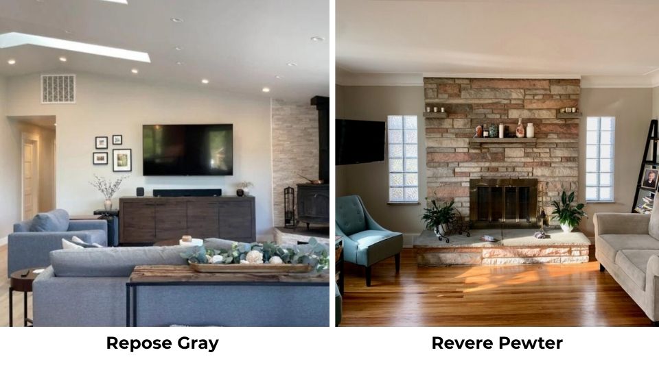
I’ve looked at Edgecomb Gray and Revere Pewter side by side many times and they still confuse people. Both are Benjamin Moore’s best color, it has the perfect gray-beige.
The thing is, Edgecomb Gray vs Revere Pewter isn’t about picking between two similar neutrals. One’s a light greige that floats off the wall, the other’s a mid-tone greige with weight to it.
Both colors have a safe neutral. They’re both sitting pretty in Benjamin Moore’s Historic Color collection. But in rooms, they act differently.
I’ve seen Revere Pewter turn into green in a north-facing kitchen, and I’ve watched Edgecomb Gray disappear into nothing in a sun-drenched living room. Picking the wrong color can make your space flat.
So, the real characteristics of Edgecomb Gray Vs Revere Pewter.
How they look in different spaces, their LRV difference, undertones and when to skip both of them, because sometimes neither one is what you want.
Here are my other blogs that you can also read:
- Acacia Haze Vs Evergreen Fog
- Sherwin Williams Natural Tan Vs Accessible Beige
- Drift Of Mist Vs Alabaster
- Aesthetic White Vs Shoji White
- Cloud White Vs White Dove
Color Description of Benjamin Moore Edgecomb Gray (HC-173)
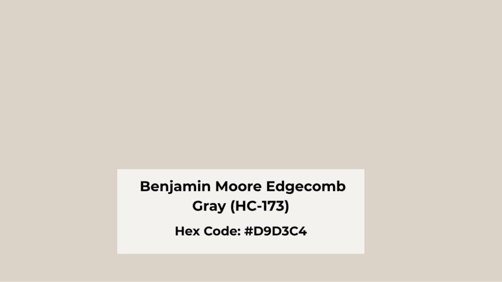
Edgecomb Gray is what happens when beige gets gray to feel modern but keeps all its warmth. It has a soft, almost quiet presence on walls.
The LRV of 63 means it’s light, not “I think it’s light” but reflects a good amount of light back into the room.
What I love about Edgecomb Gray is how it creates a calm backdrop without taking over. Your furniture, your art, your weird vintage finds, it needs to be the focus.
The paint holds space quietly in the background, which is what you want in bedrooms and hallways.
The undertones are toward soft taupe and beige with a hint of green that shows up.
I’ve used this in many homes, and that green undertone has only been a problem once. Most of the time it looks warm and slightly creamy.
Homeowners and designers reach for Edgecomb Gray when they need to brighten up dark rooms or when they want the house to flow in open concepts.
It works well in living rooms with limited natural light because it doesn’t look stuffed like deep colors.
Color Description of Benjamin Moore Revere Pewter (HC-172)
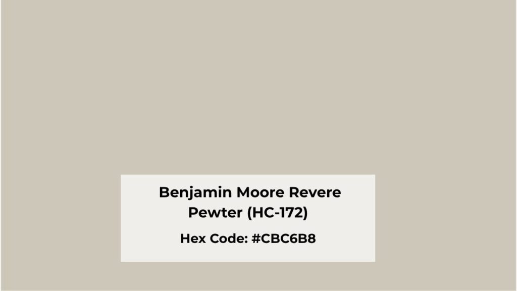
Revere Pewter has a presence on a wall. It is a confident, grounded neutral with a medium depth. The LRV is around 55, which puts it visibly darker than Edgecomb Gray.
The color is a balanced mix of gray and beige, but it has a green undertone that shows up. I’ve seen it go mossy in north-facing spaces with cool light.
Sometimes that’s gorgeous and organic-feeling. Sometimes it’s not what you wanted.
What makes Revere Pewter popular is how it behaves across different lighting. In low or moderate light, it looks warm and cozy without going beige-boring.
In bright spaces, it holds its color instead of washing out like light greiges do.
I recommend this for living rooms, family rooms, and kitchens where you want a neutral that doesn’t feel wimpy.
It has depth to work as a main color without needing trim contrast. Bedrooms work too if you want something enveloping than airy. And exteriors, Revere Pewter on doors and cabinets is good.
Edgecomb Gray Vs Revere Pewter: Key Differences
Edgecomb Gray Vs Revere Pewter, get compared because they’re both warm-ish greiges from the same brand and the same collection, but they’re not interchangeable.
The differences matter more than the similarities, mainly when you’re trying to figure out which one works for your specific room with your specific lighting and your specific goals.
Let me break down what makes these two different.
LRV
Light Reflectance Value is the single differentiator between these colors. Edgecomb Gray is at 63 LRV while Revere Pewter comes in at 55 LRV.
Edgecomb Gray reflects more light back into space. This makes it the go-to for dark rooms, small spaces, or you’re fighting to maximize brightness.
Revere Pewter absorbs light, which gives it the grounded, substantial feeling but can backfire in rooms with limited natural light.
I’ve had to repaint more than one poorly-lit hallway where someone used Revere Pewter thinking “medium neutral” will look fine but it looked dingy.
Undertones
Both have warm bases, but they diverge hard on undertones. Edgecomb Gray is more toward beige and soft taupe with only a green undertone that rarely causes problems.
It straddles the line between greige and beige and leaning more beige.
Revere Pewter has a green undertone mixed with taupe. This is the defining characteristic people either love or hate.
In the right lighting with warm woods and creamy whites, that green looks organic warmth.
In the wrong lighting, mainly in north-facing rooms or spaces with cool LEDs, it can look muddy.
Lighting Behaviour
Edgecomb Gray brightens in strong daylight. I’ve seen it disappear into cream-white in south-facing rooms with windows.
Under warm artificial lighting it gets more beige-forward. Cool lighting keeps it neutral but can make it feel flat.
The key is that it always stays light and soft, which is great when that’s what you want.
Revere Pewter holds its ground in bright light, which is its best thing. Where light greiges wash out, Revere Pewter maintains the medium-tone presence.
But important is how it acts in low light, the green undertones become obvious, and the color can look dark and cooler than you expected.
Warmth and Depth
Edgecomb Gray is warm but lightweight. It creates an airy, open feeling that makes rooms feel big and bright. There’s no visual weight to it, which is perfect for the fresh, clean backdrop.
But if you want a color with personality or coziness, Edgecomb Gray isn’t what you should go for.
Revere Pewter brings warmth with depth. It creates coziness and makes spaces feel intimate without going dark.
The medium tone gives walls dimension and substance. It’s the difference between a room that feels open and one that feels grounded and wrapped.
Styling and Best Uses
Edgecomb Gray works best with cream trim, harsh white can make it look dingy. I pair it with Benjamin Moore’s White Dove or something similarly warm.
It’s gorgeous with light wood tones and needs warm accent colors to keep it from looking flat.
Best for small rooms, dark spaces, bedrooms, hallways, and open concepts where you want to feel light and cohesive.
Revere Pewter can handle bright white trim, the contrast looks intentional and clean. It pairs beautifully with medium to dark woods and can accommodate both warm and cool accent colors because of the balanced greige base.
It is best for main living areas, kitchens, family rooms, cabinets, and anywhere you want a neutral with substance.
| Feature | Edgecomb Gray | Revere Pewter |
| LRV | 63 | 55 |
| Undertones | Beige, soft taupe, minimal green | Green, taupe, balanced gray-beige |
| Depth | Light, airy | Medium, grounded |
| Best Lighting | Low to moderate natural light | Bright or well-lit spaces |
| Warmth | Warm but soft | Warm with more complexity |
| Trim Pairing | Cream whites (White Dove) | Bright whites or cream |
| Best Rooms | Bedrooms, small spaces, dark rooms | Living rooms, kitchens, open concepts |
| Risk Factor | Can wash out in bright light | Green undertones in cool/low light |
How Do Edgecomb Gray and Revere Pewter Look In Different Rooms?
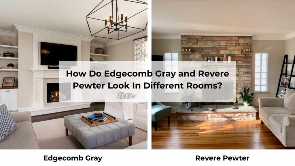
What works in the south-facing living room may look wrong in the north-facing bedroom, and only by lighting.
Then you add in ceiling height, furniture color, floor tones, and how much natural light makes it through your windows.
I’ve learned that I refuse to recommend paint without knowing the specific room situation.
So let’s talk about how Edgecomb Gray Vs Revere Pewter performs in real spaces.
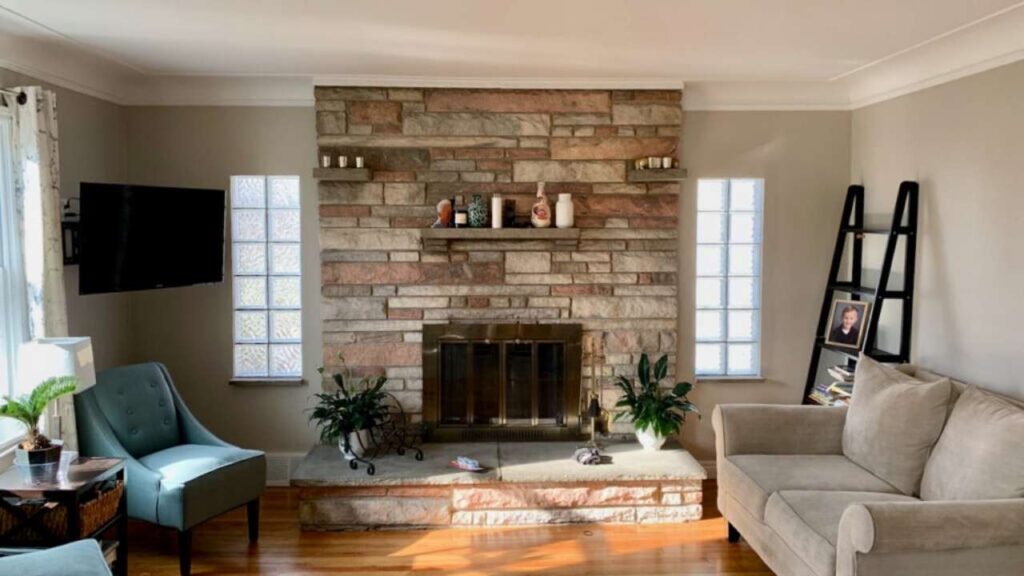
Living Room
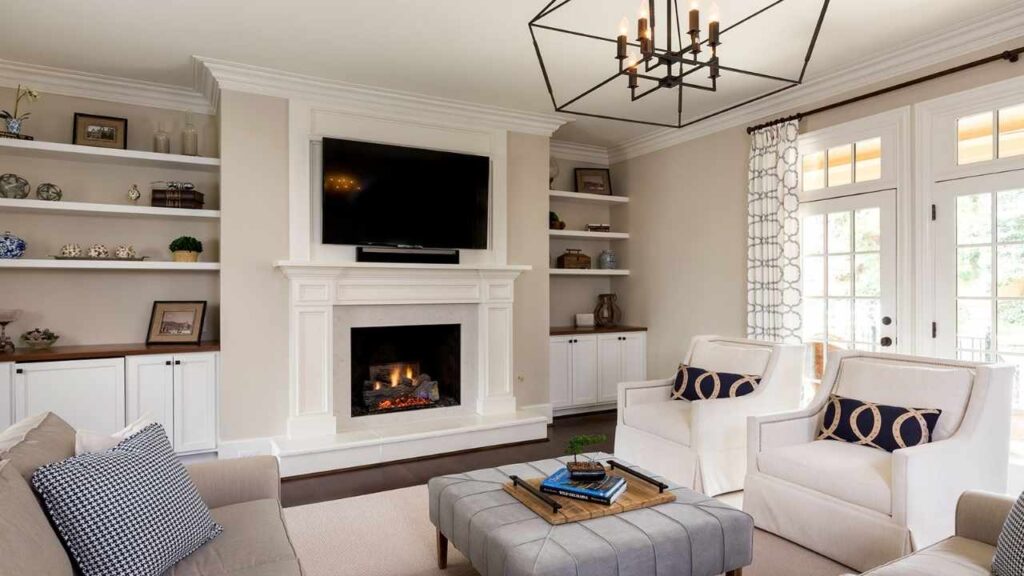
Edgecomb Gray in a living room is best when you’ve limited natural light or you’re going for the bright, open, Scandinavian vibe.
I used this in a client’s living room that had only two small windows facing northeast, and it saved the space from feeling cave-like.
The light LRV bounced around what natural light existed and made the room feel twice as big.
But you need to bring warmth back in by furniture and textiles because Edgecomb Gray won’t do it for you.
The mistake people make is using Edgecomb Gray in bright living rooms thinking it’ll stay neutral but it doesn’t. It goes almost cream-beige and loses gray character. If your living room is flooded with southern light, skip this.
Revere Pewter in a living room is where it shines. The medium depth creates a cozy, pulled-together feeling.
I’ve used it in many living rooms, and it makes spaces feel intentional and designed. The color has a presence that you don’t need to go crazy with accent colors.
The best scenario is a living room with decent natural light but not too bright. The color stays true, reads as that gorgeous warm greige everyone wants, and works with any furniture style.
I paired it with cool-toned gray furniture and the slight green undertone tied everything together.
Bedroom
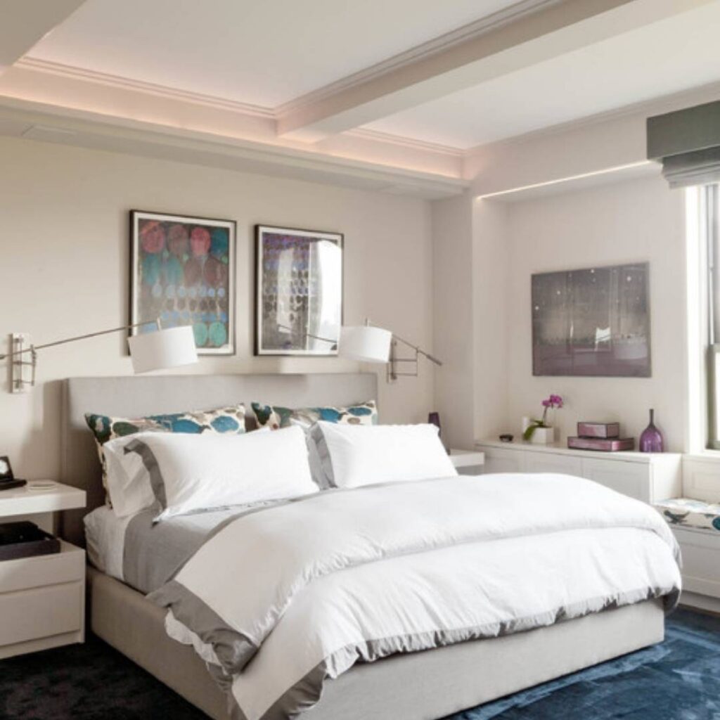
Edgecomb Gray in bedrooms is its best application. There’s something about how soft and gentle it looks in bedroom lighting that works.
Morning light makes it feel fresh and clean, evening light with warm lamps makes it cozy. I use this in main bedrooms where people want calm and serene.
Pro tip to remember, pair it with warm white bedding and wood furniture. If you go too cool or too gray with your styling, Edgecomb Gray can feel sad and dingy.
It needs warm companions to look its best. It also works beautifully in kids’ rooms or guest rooms where you want a neutral base.
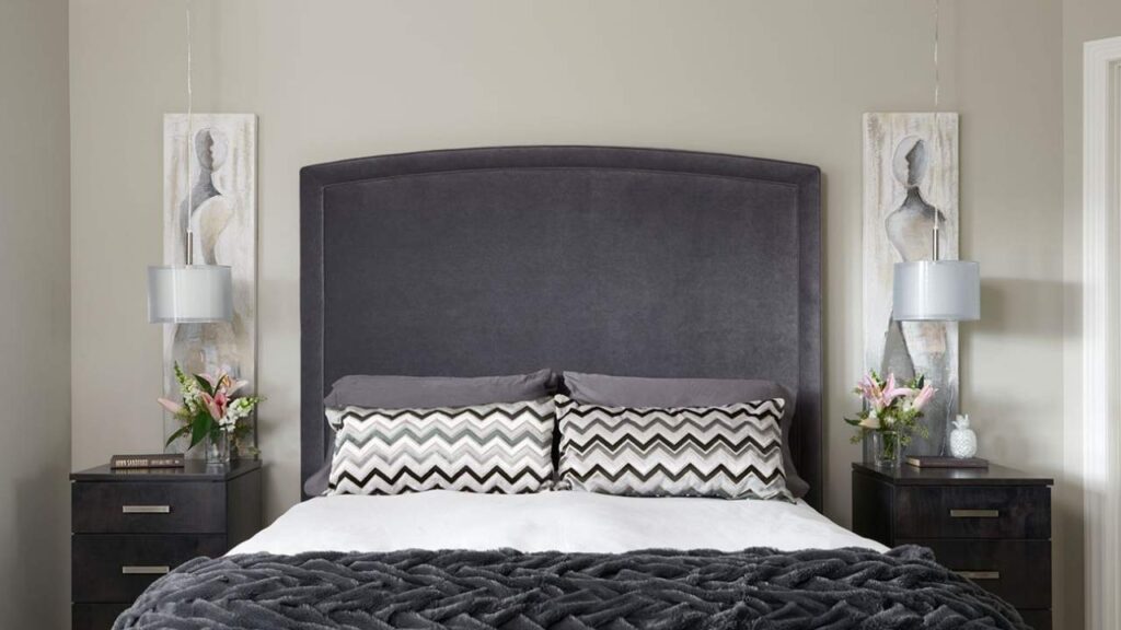
Revere Pewter in bedrooms is polarizing. Some people love the cocooning, enveloping feeling of that medium tone in a bedroom. Others find it too dark or too moody.
I think it works best in large bedrooms with good natural light where you want cozy and intimate.
I did a main bedroom with Revere Pewter on the walls, White Dove trim, and warm brass lighting, and it was gorgeous, it felt like a boutique hotel room. But that room had three large windows and 9-foot ceilings.
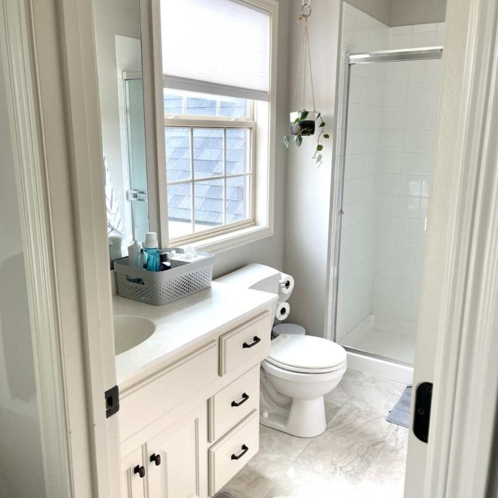
Bathroom
Edgecomb Gray in bathrooms needs good lighting or it falls flat. I learned this in my own powder room. Put it on the walls thinking it would feel spa-like and soft, and it looked flat.
So, I added better lighting and it improved but never hit the mark. The problem is bathrooms have harsh, cool lighting, and Edgecomb Gray doesn’t fight back.
Where it DOES work is large bathrooms with natural light and warm lighting fixtures.
I used it in a primary bathroom with a big window and warm Edison bulb fixtures, and it was perfect, soft, clean and peaceful.
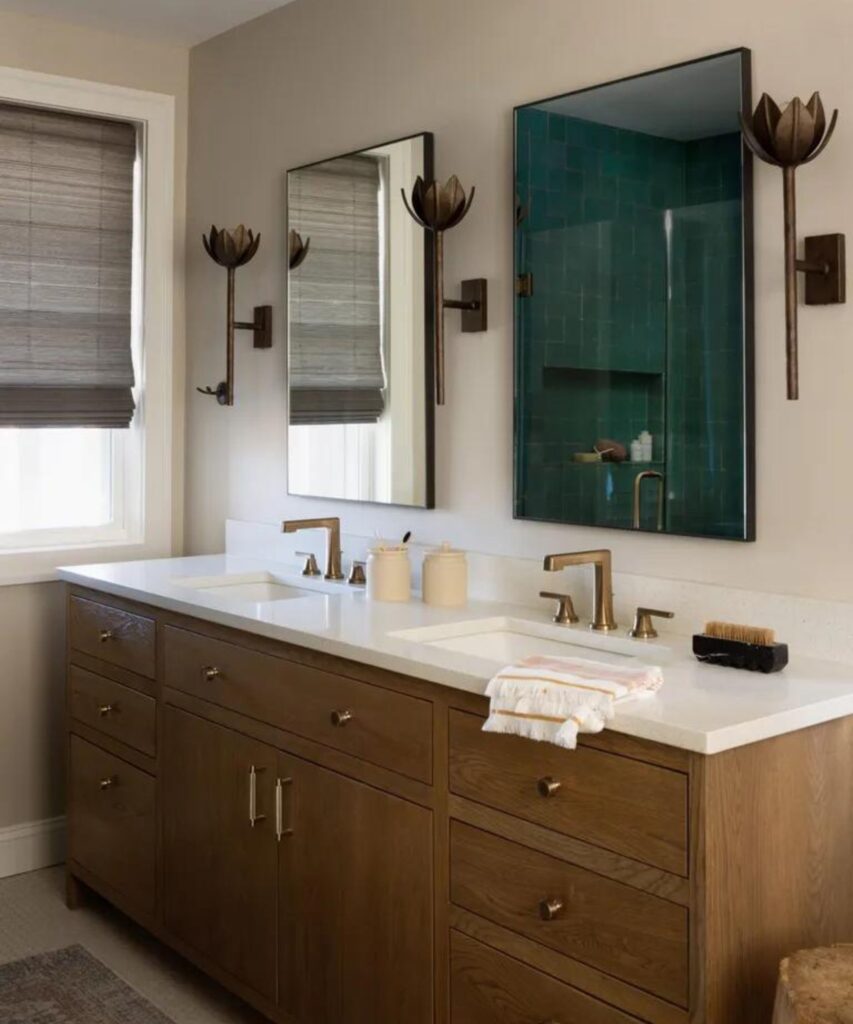
Revere Pewter in bathrooms is underrated. The medium tone gives bathrooms substance and makes them feel designed instead of functional.
I’ve used this on bathroom walls paired with white subway tile and white vanities, and the contrast is clean and intentional-looking.
The green undertone that can be problematic but it looks well in bathrooms, it feels natural and organic.
It works in both small and large bathrooms as long as you have decent lighting. Powder rooms especially, Revere Pewter makes them feel elevated and boutique.
Kitchen
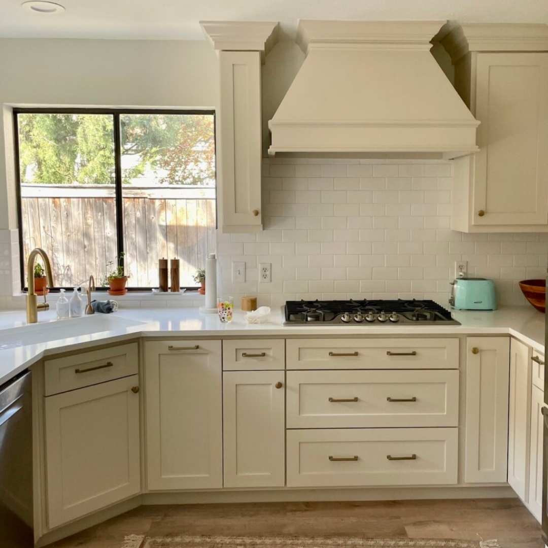
Edgecomb Gray in kitchens is tricky. It can look beautiful as a soft neutral backdrop, but kitchens are high-traffic spaces with visual competition like cabinets, counters, appliances, backsplashes.
Edgecomb Gray’s nature can work against it here, making the walls fade into nothing while everything else fights for attention.
The best use case is open-concept kitchens where you want the wall color to flow from living areas into the kitchen without making a statement.
I’ve done this when the goal was cohesion over contrast. Pair it with white or cream cabinets and warm wood tones.
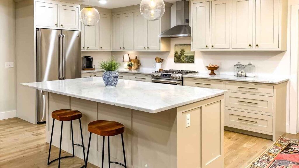
Revere Pewter in kitchens is where it built its reputation. This color works beautifully in kitchens because it has depth to stand up to white cabinets, counters, and tile without disappearing.
The warm greige tone makes kitchens feel less flat and more lived-in.
I’ve also used Revere Pewter ON kitchen cabinets multiple times, and this can be my favorite application.
The medium LRV works perfectly for cabinetry, dark enough to feel substantial but not so dark it overwhelms. It pairs with many wall colors and looks expensive.
Edgecomb Gray Vs Revere Pewter Vs Other Colors
Look, if you’re going deep in the greige, you’re not only looking at these two.
But you’re looking at every other neutral with “gray” in the name because sometimes these two colors are not what you are looking for and the others can save you from being lost. Let me save you with this.
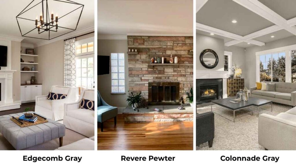
Colonnade Gray vs Revere Pewter:
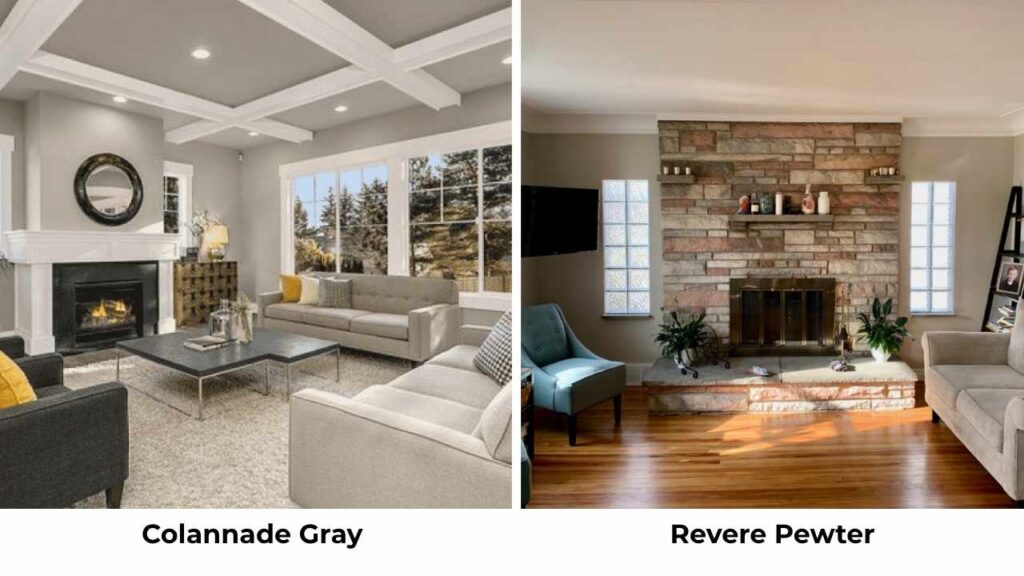
Colonnade Gray (Sherwin Williams) is in a similar depth zone as Revere Pewter but is cool with a subtle violet undertone instead of green.
Where Revere Pewter feels organic and warm, Colonnade Gray looks more modern and cleaner.
I choose Colonnade when clients want true gray without beige warmth, Revere Pewter when they want that warm greige.
Edgecomb Gray vs Revere Pewter vs Agreeable Gray:
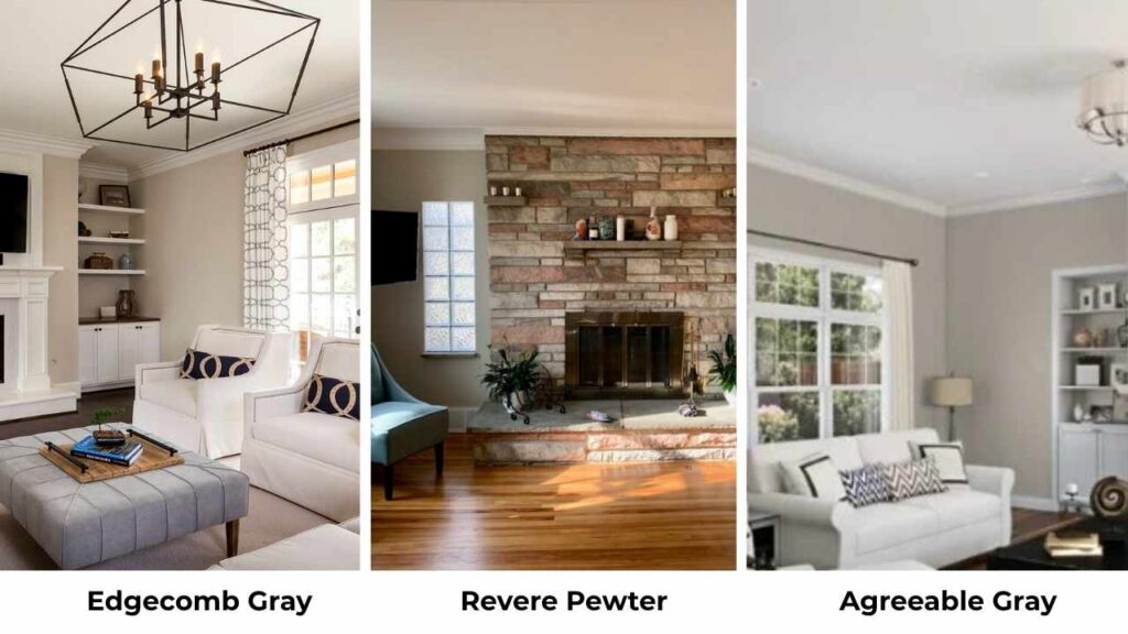
Agreeable Gray (Sherwin Williams) is between these two in brightness. It’s less muddy than Revere Pewter, less likely to show green, and more forgiving in difficult lighting.
If someone’s nervous about Revere Pewter’s green undertones but finds Edgecomb too light, Agreeable Gray is the compromise.
It’s becoming more popular than Revere Pewter for cabinetry because it is safe.
Gray Owl vs Revere Pewter:
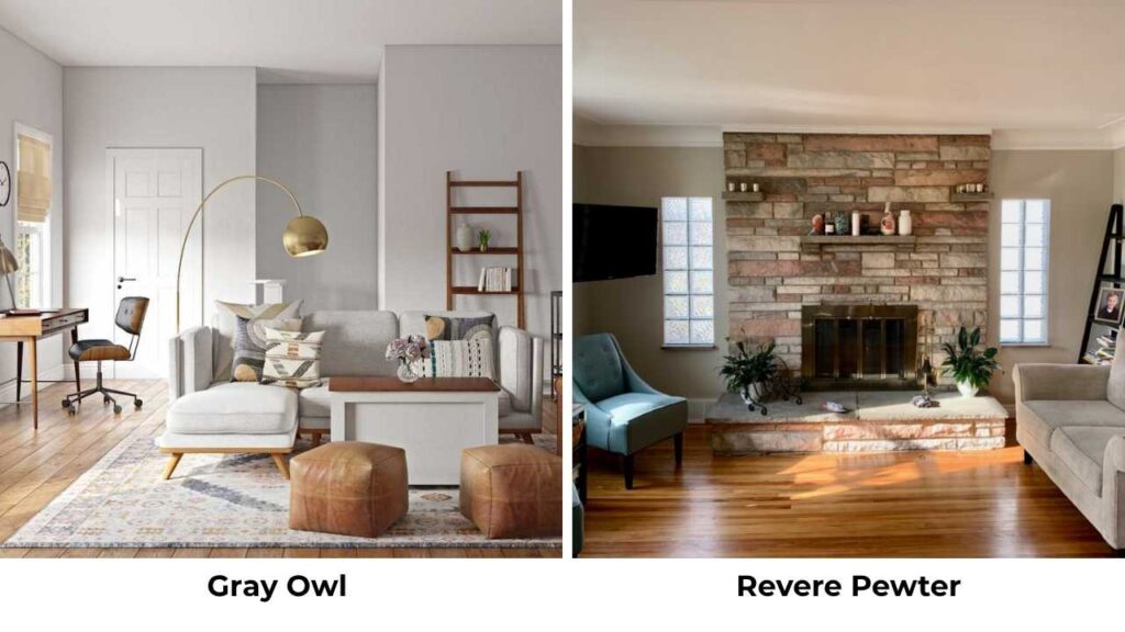
Gray Owl (Benjamin Moore) is light and cooler than both Edgecomb Gray and Revere Pewter. This is what you choose when you want gray-gray, not greige.
Different category, but people compare them because Pinterest says to.
Stonington Gray vs Revere Pewter:
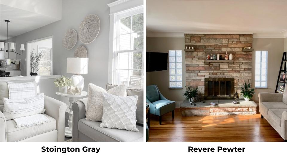
Stonington Gray (Benjamin Moore) is a true cool gray with blue undertones. If Revere Pewter is warm and organic, Stonington Gray is fresh and clean. Not comparable unless you’re trying to decide between warm and cool neutrals from the same brand.
Repose Gray vs Revere Pewter:
Repose Gray (Sherwin Williams) is a warm gray without the beige influence. Lighter than Revere Pewter, less likely to show green, but also less depth and warmth. It is a good alternative if Revere Pewter’s complexity feels like a risk.
Edgecomb Gray vs Revere Pewter vs Pale Oak:
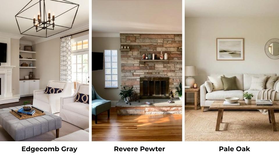
Pale Oak (Benjamin Moore) is warm and lighter than both, leaning more toward greige-beige than gray-greige. This is the soft, warm neutral that works and offends no one.
It has less character than either Edgecomb or Revere Pewter but forgiving.
| Color | Brand | LRV | Undertone | Best For |
| Edgecomb Gray | Benjamin Moore | 63 | Beige, soft taupe | Dark rooms, bedrooms, soft spaces |
| Revere Pewter | Benjamin Moore | 55 | Green, taupe | Living rooms, kitchens, main spaces |
| Agreeable Gray | Sherwin Williams | 60 | Warm gray, minimal green | Whole house, cabinets, safe choice |
| Colonnade Gray | Sherwin Williams | 53 | Subtle violet | Modern spaces, cool neutrals |
| Gray Owl | Benjamin Moore | 65 | Cool gray-green | Bright rooms wanting true gray |
| Pale Oak | Benjamin Moore | 69 | Warm greige-beige | Forgiving neutral everywhere |
Which One To Choose Between Edgecomb Gray and Revere Pewter?
Choose Edgecomb Gray when:
Your room is dark or has limited natural light and needs all the help it can get. Small spaces that need to feel big and bright.
Bedrooms where you want soft, calm, and gentle. You’re painting an open-concept house and want one color that flows everywhere without drama.
Your trim is cream or warm white. You go towards warm, beige-leaning neutrals over true grays. You want a backdrop that disappears and lets your furniture and decor shine.
Choose Revere Pewter when:
Your space has decent to good natural light. You want a neutral with presence and depth. Living rooms, kitchens, and main spaces where you need substance not softness.
You’re painting cabinets or doors and need a color that works with many wall colors. You’re okay with managing green undertones.
Your trim is bright white. You want a color that feels designed and intentional, not safe.
Conclusion
After comparing Edgecomb Gray Vs Revere Pewter, in different spaces, here’s what I know: Edgecomb Gray and Revere Pewter are both excellent neutrals that solve completely different problems.
Edgecomb Gray is the soft, gentle, light-bringing neutral for spaces that need brightness and calm.
Revere Pewter is the grounded, substantial, presence-having neutral for spaces that can handle depth.
The LRV difference matters more. The 8 points change everything about how these colors perform in real rooms and the same goes with the undertones.
Edgecomb’s beige-forward warmth and Revere Pewter’s green-toned complexity aren’t interchangeable.
Sample both in your space with your lighting. I know everyone says this and it sounds annoying, but Revere Pewter will surprise you depending on your light.
Comparing Edgecomb Gray Vs Revere Pewter can be a bit tough but after understanding the colors well it’ll become easy.
FAQs On Edgecomb Gray Vs Revere Pewter
Skip Edgecomb Gray in bright rooms where it’ll wash out to white. Don’t use it when you need depth or substance on walls. Avoid it with cool gray furniture or harsh white trim that’ll make it look dingy.
Don’t use Revere Pewter in dark rooms or spaces with limited natural light and it’ll look muddy and gray-brown. Skip it in north-facing rooms unless you’re prepared to manage the green undertones with warm lighting. Avoid it if you hate a hint of green in your neutrals.
Edgecomb Gray is warm. It is more toward beige and taupe with soft, warm undertones. The green undertone exists but barely shows up. This is not a cool neutral but it looks warm and soft in every lighting situation.
Revere Pewter has been in Benjamin Moore’s top 10 because it has the perfect middle ground of warm greige with depth. It works across different lighting conditions better than most neutrals, holds color in bright spaces and stays warm in moderate light. The medium LRV makes it versatile for walls, cabinets, and trim. And it looks expensive and designed without trying hard.