So here’s about Benjamin Moore Cloud White and White Dove, they’re the popular choice when you want a classic, creamy white.
But you should consider the undertones, lighting, and the finishes around them change how these colors show on your walls.
The cloud white vs white dove confusion is real, and I’m breaking it down because choosing between them isn’t as like as the paint store makes it.
Both colors get compared because they are in the warm white wheel, but the differences between them make them look different in spaces.
I’ve used Cloud White in bedrooms that felt like cozy retreats and bathrooms where it looked.
White Dove shows up everywhere from living rooms to exteriors, and it has an ability to go with anything.
With the wrong one can make your space feel off.
Choosing the wrong paint color isn’t annoying but it messes with how your space feels.
So, I’m walking you through Cloud White Vs White Dove, the LRV, undertones, how lighting affects each one, and which rooms they work in.
Then we’re doing a room-by-room comparison. I’m also comparing them to other whites like Simply White, Swiss Coffee, Alabaster for consideration.
Here are my other blogs that you can also read:
- Drift Of Mist Vs Alabaster
- Bm Sea Pearl Vs White Dove
- Wythe Blue Vs Palladian Blue
- Tricorn Vs Iron Ore
- Clary Sage Vs Evergreen Fog
Color Summary of Benjamin Moore Cloud White (OC-130)
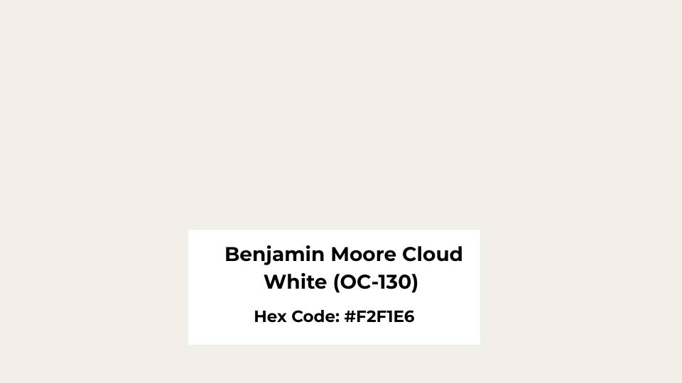
Cloud White (OC-130) is what I call a traditional warm white with creamy undertones.
The color has a soft, cozy feel that works well if you’re going for something that feels lived-in and inviting rather than harsh and modern.
I’ve recommended it for clients who wanted their living room to feel warm without going beige, and it delivers.
But the slight yellow warmth becomes visible depending on your lighting situation.
The LRV is around 87, which means it’s bright and reflects a good amount of light.
It is higher than White Dove, so if you put them side by side, Cloud White will feel light and airy. But the brightness also means the undertones show up.
I used Cloud White in a client’s bedroom with south-facing windows, and it was beautiful, it made the walls look expensive and buttery.
But in a north-facing bathroom, it looked out of place because the cool light was fighting against the warm undertones.
Homeowners and designers love this color for living rooms, bedrooms, and traditional spaces where you want warmth.
It’s a go-to for trim, especially when your walls are in warm grays or greiges.
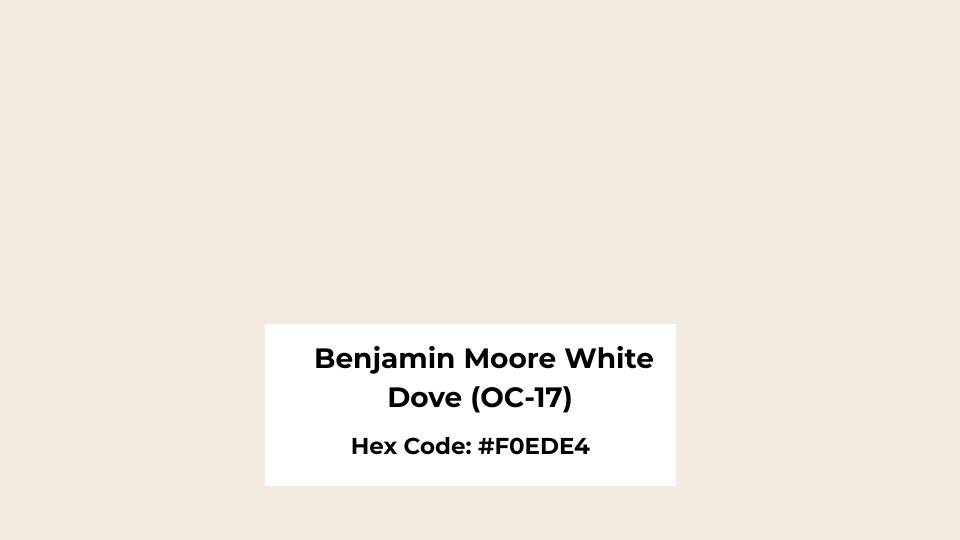
Color Summary of Benjamin Moore White Dove (OC-17)
White Dove OC-17 is the most talked-about white in the Benjamin Moore, and it deserves the hype.
This is a soft, creamy white with the subtle gray undertones that make it more versatile.
What I love about White Dove is how it manages to feel warm without being yellow.
It has the perfect balance where it looks white but doesn’t look cold.
The LRV is around 85, so it’s less bright than Cloud White but reflects light. In natural light, White Dove looks clean and fresh with warmth to feel inviting.
Under artificial light, it holds up well and doesn’t shift colors on you like some whites do.
I’ve seen it go from bright morning sun to warm evening lamps without turning weird, which is rare.
This color is way less yellow than Cloud White, that’s the key difference. Where Cloud White looks warm, traditional side, White Dove stays more neutral.
It works well in modern spaces, contemporary kitchens, living rooms that need to feel bright but not harsh.
I’ve used it on exteriors where it looks elegant and timeless, and in bedrooms where clients wanted something peaceful without being cold.
What is the Difference Between Cloud White and White Dove?
So, Cloud white Vs White dove, both warm whites from Benjamin Moore, they’re both popular, they both have the creamy qualities but they are NOT the same color.
The main differences come down to brightness, undertone, and how they look in the space around them.
LRV
Light Reflectance Value is how much light the color bounces back, and it is on a scale from 0 (pure black) to 100 (pure white).
Cloud White is at an LRV of about 87, while White Dove is around 85. The two-point difference may not sound like much, but in a room, it is visible.
Cloud White feels bright and open because it’s reflecting light back.
This makes it great for spaces that need the luminosity like darker hallways or rooms without natural light.
White Dove’s lower LRV gives it body and depth, so it doesn’t feel harsh.
It has a grounded quality that works when you don’t want your white to feel too white.
Both are considered soft whites rather than bright whites, so they have depth to feel interesting without going cream or off-white.
Undertones
Cloud White has warm yellow-cream undertones that are front and center.
Especially in warm light or next to cool colors, the yellow shows and changes the feel of the room. I saw Cloud White next to a cool gray tile, and it looked yellow.
White Dove has subtle gray undertones with a hint of warmth. It’s the greige influence that keeps it from leaning into cream or yellow territory.
The gray keeps it neutral and easy to work with across different finishes and styles.
When I need a white that’s going to coordinate with modern quartz countertops, stainless steel, or cool paint colors, White Dove is what I consider.
Cloud White in this situation looks too warm and clashes.
Lighting Affect
Cloud White in warm afternoon sun or with warm LED bulbs becomes visibly rich and cream-colored.
The yellow undertone gets amplified, and the room becomes cozy, with a traditional feel.
In cool northern light, Cloud White can look flat or dingy because the cool light fights against the warm undertones.
White Dove handles different lighting situations better. In bright natural light, it looks fresh and clean, the gray undertone keeps it balanced.
In warm artificial light, it gets warm but doesn’t yellow. In cool light, it stays soft and neutral. This adaptability is why it’s a designer favorite.
It’s consistent, which may sound boring, but when you’re living with a color every, it creates consistency.
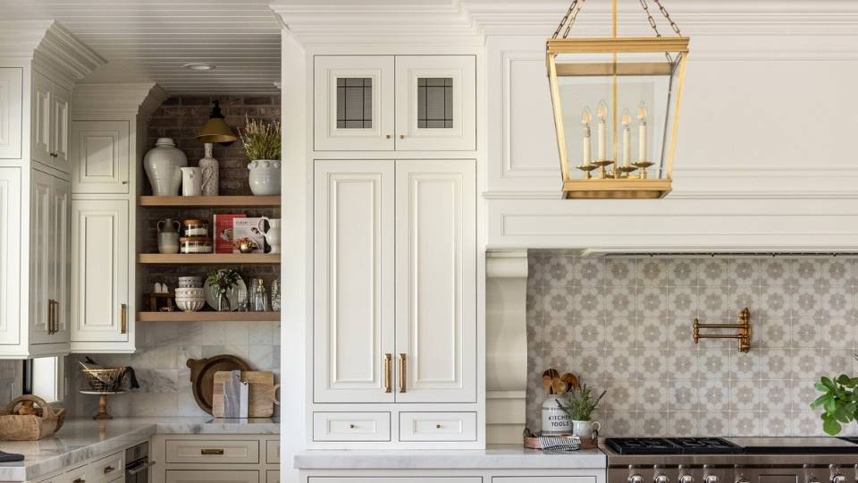
Style and Best Uses
Style-wise, these colors have different personalities. Cloud White is a traditional, cozy, warm white.
It works well in spaces with warm wood trim, beige tile, traditional furniture, brass or gold hardware. Like classic, lived-in, inviting.
It’s gorgeous as trim paint when your walls are in warm neutrals, and it’s lovely on ceilings where you want a soft, enveloping feel rather than harsh white.
I’ve used it in farmhouse-style kitchens, traditional living rooms, and bedrooms where clients wanted the warmth vibe.
White Dove is versatile and leans contemporary without being cold. It works in modern spaces, transitional designs, clean-lined kitchens, and you need a white that plays nice with both warm and cool elements.
It looks as an all-over wall color because it creates a soft, cohesive backdrop that lets your furniture and decor shine.
As a trim color, it gives you a nice contrast without being bright or harsh. For cabinets, White Dove is beautiful, it has depth to not look flat but stays clean and fresh.
For accent color pairings, Cloud White loves warm beiges, soft golds, and creamy tones, while White Dove coordinates with everything.
| Aspect | Cloud White (OC-130) | White Dove (OC-17) |
| LRV | ~87 | ~85 |
| Undertones | Yellow-cream, noticeable warmth | Gray-cream, subtle and balanced |
| Lighting Response | Gets warmer/more yellow in warm light; can look flat in cool light | Consistent across lighting; stays balanced |
| Best Style | Traditional, cozy, farmhouse, classic | Modern, transitional, versatile, contemporary |
| Best Uses | Trim, ceilings, warm-toned spaces, traditional interiors | Walls, cabinets, trim, whole-house color, mixed finishes |
| Works With | Warm woods, brass, beige, cream, traditional finishes | Cool and warm tones, modern fixtures, various styles |
Cloud White Vs White Dove: Room-By-Room Comparison
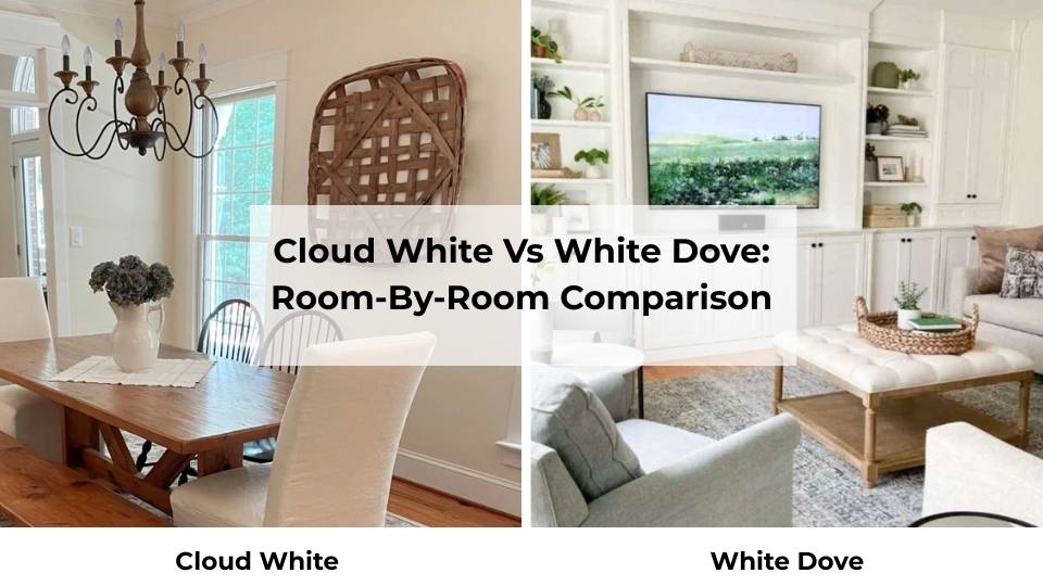
Alright, so knowing the important details is great, but how do these colors look in real rooms, this is what matters.
I’ve compared Cloud White Vs White Dove in every type of space, and they have their strengths and weaknesses depending on what room you’re going with.
Living Room
Cloud White in a living room works well if you’ve warm lighting and south or west-facing windows.
The golden afternoon light makes Cloud White look rich and inviting, it creates a cozy envelope that makes people want to sit down and stay.
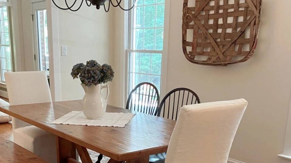
I used it in a client’s living room with warm oak floors and a brick fireplace, and it was perfect.
The yellow undertones picked up the warmth from the wood and brick, and the whole space felt cohesive and comfortable.

White Dove in a living room is safe, versatile, especially if you’re mixing warm and cool elements.
I’ve used it in living rooms with gray sectionals, white trim, and mixed metal accents, and it works.
It creates a soft, clean backdrop that lets your furniture and art shine. The slight gray undertone keeps it from feeling too warm or too cool.
Bedroom
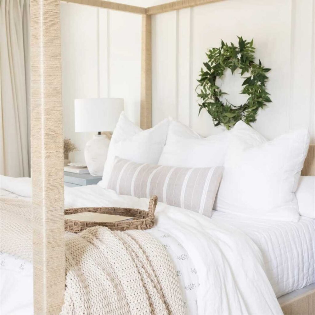
Cloud White in a bedroom can be dreamy if you want a cozy, warm feeling.
Bedrooms with warm wood furniture, cream bedding, and soft textures look gorgeous with Cloud White walls.
I painted a client’s primary bedroom in Cloud White, and with warm bedside lamps at night, it felt warm.
The yellow-cream undertone creates a restful, traditional vibe that works if your bedroom style looks classic or farmhouse.
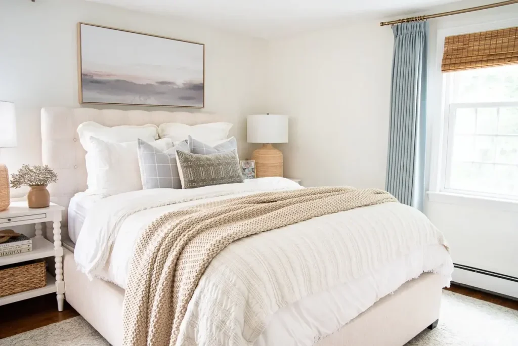
White Dove in a bedroom is my go-to for clients who want serene and peaceful without cold.
It has a calming quality because of the subtle gray undertone, it feels clean and fresh but soft to be restful.
I’ve used it in bedrooms with white bedding, light gray accents, and modern furniture, and it creates a spa-like feel that helps you relax.
It’s also great in bedrooms with limited natural light because it doesn’t look flat.
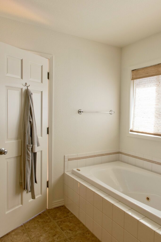
Bathroom
Bathrooms needed to be considered carefully because of tile, countertops, and the artificial light.
Cloud White in a bathroom can make it look nice or look flat. If you’ve warm-toned tile like beige, cream, or warm gray, then Cloud White can look nice.
I used it in a powder room with warm marble countertops and brass fixtures, and the yellow undertones tied everything together.
But if your bathroom has white subway tile, white quartz countertops, or cool-toned finishes, Cloud White looks yellow.
White Dove in the bathroom is easy to work with. It coordinates with white tile, white countertops, and modern fixtures without looking harsh or too yellow.
I’ve used it in bathrooms with everything from marble to quartz to simple white subway tile, and it looks clean and fresh.
The gray undertone keeps it from clashing with pure white fixtures, and it doesn’t get yellow or green casts under bright bathroom lighting.
Kitchen
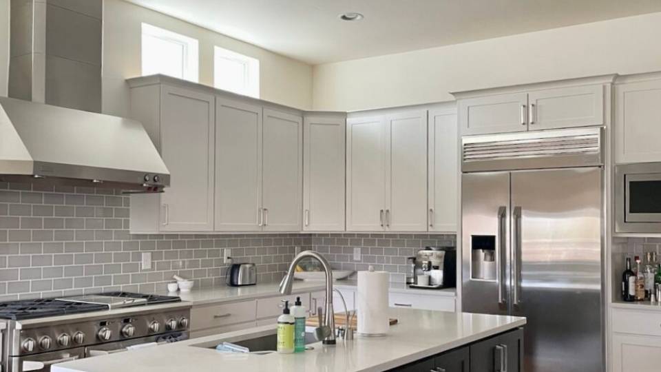
Cloud White in a kitchen works if your vibe is warm and traditional.
I’ve seen it look beautiful as a cabinet color in kitchens with warm granite countertops, warm wood floors, and brass or gold hardware.
It creates a cozy, farmhouse feel that’s inviting and comfortable.
But if you have white quartz countertops, Cloud White can look too yellow.
I learned this on a project where we painted the cabinets Cloud White, and next to the bright white quartz, they looked cream, not white.
It works better as a wall color in kitchens with warm finishes.
White Dove as kitchen cabinets or walls is phenomenal.
It’s one of the popular choices for a reason because it has warmth to not feel cold, but it’s neutral to work with white countertops, stainless appliances, and modern fixtures.
I’ve used White Dove on kitchen cabinets paired with everything from white quartz to gray granite to butcher block, and it adapts beautifully.
It gives you a clean, fresh kitchen look without being stark or cold.
For walls, it creates a soft backdrop that makes the space feel big and bright without competing with cabinets or backsplash.
Exterior

Cloud White on an exterior can look gorgeous if your house has a traditional style and warm undertones in the brick, stone, or roof color.
I’ve seen it on farmhouse-style homes with warm wood accents, and it looks creamy and charming.
But on a modern home or a house with cool-toned stone or gray roofing, Cloud White can look too yellow and feel dated.
The warmth that works inside can feel too strong on a large exterior surface, in bright daylight where the yellow undertone shows up.
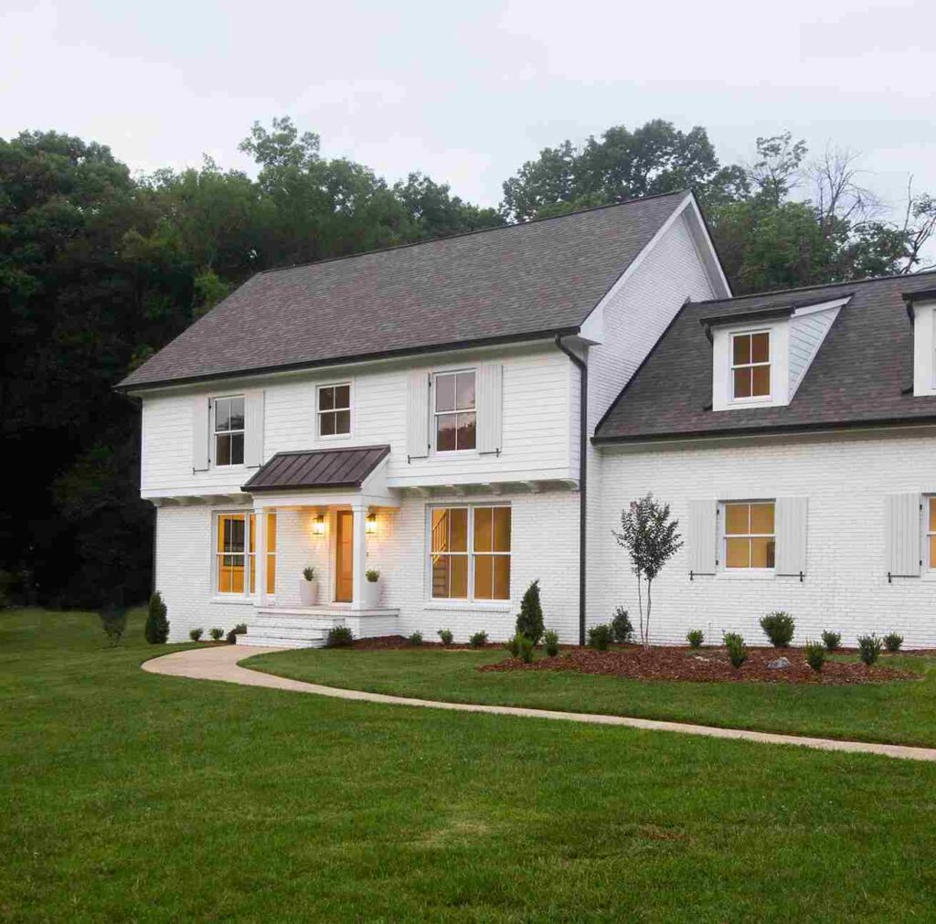
White Dove on an exterior is a classic choice that works across different architectural styles.
It’s been used on everything from colonial homes to modern farmhouses to contemporary designs, and it holds up beautifully.
The balanced warmth keeps it from looking cold, but the gray undertone prevents it from looking too cream or yellow.
I’ve recommended it for exteriors where the homeowner wants a timeless, elegant white that won’t look outdated.
It coordinates well with black or dark gray shutters, natural wood doors, and both warm and cool-toned stone or brick. It’s a safe, beautiful choice for exteriors.
Cloud White Vs White Dove Vs Other Colors
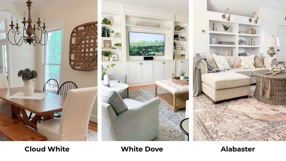
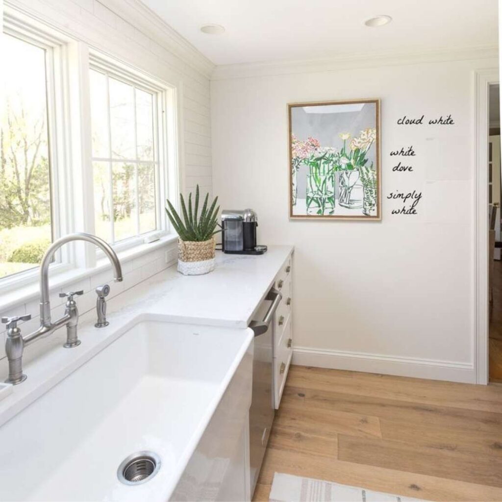
So, you’re standing in the paint aisle, and you’ve Cloud White and White Dove, but then you see Simply White, Swiss Coffee, Alabaster, and you’re drowning in whites that look the same on the paint chip.
You need to know how these other popular whites look against Cloud White Vs White Dove so you can make a decision.
Cloud White Vs White Dove Vs Simply White
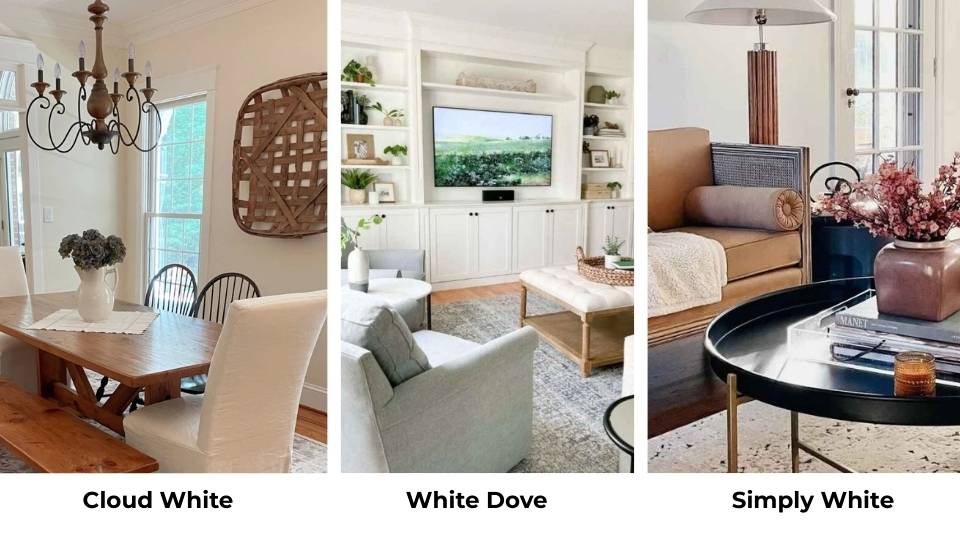
Simply White OC-117 is brighter than both Cloud White and White Dove, it is at an LRV of about 89, which puts it in bright white territory.
It has warmth, but it’s clean and warm rather than the cream-yellow of Cloud White or the subtle gray-warmth of White Dove.
Simply White feels energetic and fresh, where Cloud White feels cozy and White Dove feels balanced.
I use Simply White when clients want a white that looks WHITE.
From these three, Cloud White is the warmest and traditional, White Dove is the versatile and balanced, and Simply White is the bright and clean.
Do I want cozy warmth Cloud White, adaptable soft white White Dove, or fresh brightness Simply White.
Cloud White Vs White Dove Vs Swiss Coffee
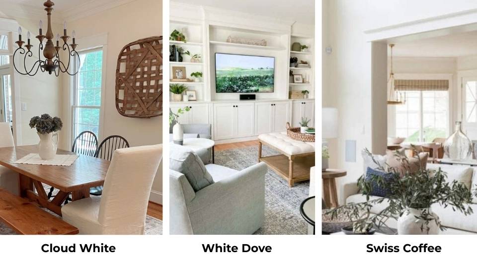
Swiss Coffee OC-45 is warm and darker than both Cloud White and White Dove.
Its LRV is around 82, and it has visible cream-beige undertones that take it toward off-white territory. I love Swiss Coffee in some situations.
It’s gorgeous in traditional spaces, with warm wood, or in cozy bedrooms.
Cloud White is warmer than White Dove but lighter and more white than Swiss Coffee.
If Swiss Coffee feels dark or cream, Cloud White is bright and clean.
White Dove is between them in terms of neutrality, warmer than a modern white, but cleaner than Swiss Coffee.
Cloud White is for traditional cozy white, and White Dove is for versatile soft white.
Cloud White Vs Alabaster
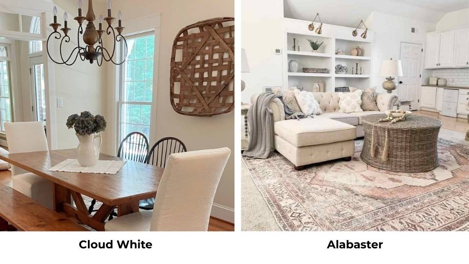
Sherwin Williams Alabaster SW 7008 gets compared to Cloud White and White Dove because it’s Sherwin Williams’ most popular warm white.
Alabaster has an LRV of 82, so it’s darker than both Cloud White and White Dove, with warm cream-beige undertones.
Cloud White is bright and cleaner than Alabaster, if Alabaster feels too dark or too cream, Cloud White gives you lightness while keeping warmth.
White Dove is neutral and balanced than Alabaster, Alabaster is warm and traditional, while White Dove can work in modern spaces.
Cloud White Vs Dove Wing
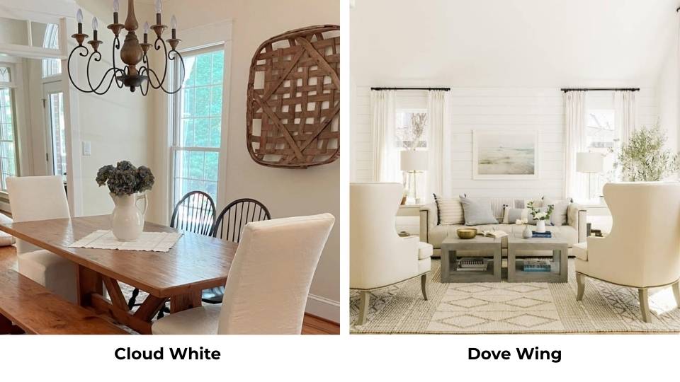
Dove Wing OC-18 and I know the name is similar to White Dove. Dove Wing is a soft gray with warm undertones.
It’s lighter than a gray but looks gray rather than white. I’ve used it when clients want something soft and more colorful than white.
Cloud White is a warm white; Dove Wing is a warm gray. If you’re looking at Dove Wing, you want color, not white.
But if you love the softness of White Dove and are curious about adding more gray.
| Color | LRV | Undertone | Feel | Best For |
| Cloud White | ~87 | Yellow-cream | Warm, traditional, cozy | Trim, traditional spaces, warm interiors |
| White Dove | ~85 | Gray-cream | Balanced, versatile, soft | Walls, cabinets, whole-house, mixed styles |
| Simply White | ~89 | Clean warm | Bright, crisp, fresh | Trim, bright spaces, modern clean look |
| Swiss Coffee | ~82 | Cream-beige | Rich, warm, enveloping | Traditional homes, warm depth |
| Alabaster (SW) | ~82 | Cream-beige | Warm, substantial | Walls, warm traditional spaces |
| Dove Wing | ~75 | Warm gray | Soft, colorful | Feature walls, gray lovers |
Conclusion
So, Cloud White Vs White Dove both are beautiful warm whites, but they’re not interchangeable.
Cloud White is warm, bright, and has the visible yellow-cream undertones that create a cozy, traditional feel, it’s perfect if your space has warm finishes and you want the warm vibe.
White Dove is balanced and versatile with subtle gray undertones that let it work across different styles, lighting situations, and finishes.
I go with White Dove more than Cloud White because it works in most conditions.
But Cloud White has its value, mainly in traditional homes or rooms where the warmth feels intentional and beautiful.
The key is understanding your lighting, your existing finishes, and what vibe you want.
Get samples and test them on your walls in your light because paint swatches don’t justify.
What looks perfect at the store can look different at home. Live with the samples for a few days, look at them in morning light and evening light.
FAQs On Cloud White Vs White Dove
Cloud White is popular because it delivers the warm, traditional white people love without going cream or off-white. It has brightness to feel like white, but the yellow-cream undertones create a cozy, inviting feel that works well in traditional and farmhouse-style spaces.
White Dove has subtle gray-cream undertones, which makes it versatile. The gray influence keeps it from looking too yellow or too warm, while the cream base keeps it from feeling cold or flat. It’s the perfect balance that lets it work with both warm and cool finishes.
Yes, Cloud White has an LRV of about 87, while White Dove is around 85, so Cloud White is bright and reflects more light. You’ll see Cloud White feels open and airy, while White Dove has more depth and body.
White Dove is less yellow than Cloud White, but if you put it next to a cool white or in a room with warm lighting, it can show warmth. Compared to true whites or bright whites, White Dove has a subtle cream base that looks warm. But it’s not near as yellow as Cloud White or Swiss Coffee.
Cloud White Vs White Dove: Which Benjamin Moore White Is Right for Your House?