Here is what you should know about Sherwin Williams In The Navy vs Naval, they look identical on the small paint swatches. But on your walls, it looks different.
Navy blues have an ability to bring drama and sophistication without the harshness of black.
They work in modern farmhouses, traditional homes, and the weird transitional style too.
These two shades are the wave of dark navy popularity. They are EVERYWHERE like kitchen cabinets, exterior doors, moody bedrooms, accent walls.
But here’s the thing to remember, choosing the wrong one can make your space feel flat, too dark, or so cool-toned it feels uninviting.
So, I’m breaking down the color profiles of Sherwin Williams In The Navy Vs Naval, how they act in different lighting, their LRV and undertones, and where each one works best.
We’ll go room by room and talk about the mistakes I made.
Here are my other blogs that you can also read:
- Alabaster Vs Shoji White
- Egret White Vs Alabaster
- Tricorn Black Vs Black Magic
- City Loft Vs Alabaster
- Swiss Coffee Vs Shoji White
Color Profile of In The Navy (SW 9178)

In The Navy is dark but there’s something saturated and attentive about it compared to the Naval.
When I first tested it in my son’s bedroom, I saw boldness. It doesn’t look soft or muted. It looks NAVY.
The thing about In The Navy is its green undertones because they’re subtle. In bright natural light, you can see hints of it.
It gives the color a warm quality without being warm. I think that’s why it works well in modern spaces.
There’s a clean, architectural quality to it. When I used it on built-ins in my living room last year, it looked sharp.
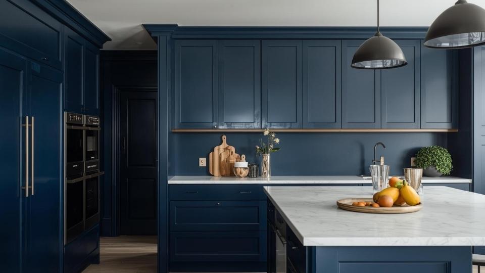
Homeowners and designers are going toward In The Navy for spaces where they want impact without going black.
I see it on kitchen islands, bathroom vanities, and exterior shutters.
My friend used it in her hallway bathroom on all walls and it’s stunning.
Small space, but it doesn’t feel like a cave because In The Navy doesn’t stuff it like other navies do.
Color Profile of Naval (SW 6244)
Now Naval has a different vibe. This is the one that won Sherwin Williams Color of the Year in 2020. It’s rich, saturated, and has a classic navy depth that feels expensive.
There’s more gray in Naval compared to In The Navy. The gray-green undertones make it look soft and muted.
I painted my bedroom Naval and it changed the mood of the room. It felt cocooning.
It wrapped the space in a moody, relaxed feeling that made me want to spend time in there.
Naval creates a dramatic look when you pair it with bright whites or brass fixtures. The contrast is good. The contrast is INTENSE. I used Pure White trim with my Naval walls and the brightness was there in the best way.
But here’s what you should remember, Naval can look almost black in low light. In north-facing rooms, basements, spaces without big windows.
If your room doesn’t get decent natural light, Naval can look too dark.
I made this mistake in a guest bedroom that only has one small window. It looked like a navy cave. We ended up repainting it because with lamps on, it felt heavy.
Designers love Naval for accent walls, kitchen cabinets, and front doors.
Anywhere you want a high-impact moment but not a room commitment. And on exteriors, Naval is STUNNING.
Sherwin Williams In The Navy Vs Naval: Undertones, Lighting, and Uses
Okay, here’s where it gets important but I’ll keep it simple. Because understanding the difference between Sherwin Williams In The Navy Vs Naval, comes down to a few key factors that matter.
LRV
Both In The Navy and Naval have a Light Reflectance Value of 4. Pure black is 0 and pure white is 100. An LRV of 4 means these colors are DARK.
They absorb all the light that hits them. This is why they can feel dramatic and why they can also feel oppressive.
But here’s the confusing part, though they have the same LRV, they don’t look the same level of dark.
In The Navy looks slightly lighter than Naval in many lighting conditions because of the undertones and saturation.
Undertones
In The Navy has green undertones, more blue-green, clean and less muddied by gray.
Naval has gray-green undertones. The gray softens it, makes it muted, and gives it the contemporary “not-trying-too-hard” look.
I didn’t believe undertones matter until I put samples of both colors next to each other. In The Navy looks true-navy, if that makes sense.
The green in In The Navy can look in some lights, mainly if you have warm bulbs or afternoon sun. Naval’s gray keeps it controlled and neutral in different conditions.
Lighting Affect
Natural light:
In rooms with windows and southern exposure, both colors shine. In The Navy stays bold and saturated. Naval softens up and shows its depth without going black.
But in north-facing rooms or spaces with limited windows, then Naval can disappear into near-black.
In The Navy holds up better in low light because it is clean and more saturated.
Artificial light:
With warm bulbs, Naval’s green undertones can come forward in a good way. Not bad, different than you expected. In The Navy stays consistent.
With cool bulbs, both colors look deep and dramatic. Naval can look charcoal-blue.
Test BOTH in your space with your lighting before committing. I know everyone says this, but I’m saying it because I didn’t do it once and regretted it until I repainted.
Darkness and Depth
Both have an LRV of 4, the feeling of darkness is different.
Naval creates an enveloping, cocooning darkness and it pulls you in. It makes spaces feel intimate and small.
In The Navy creates a bold, defined darkness. It makes a statement without making the room feel like it’s closing in on you.
I used Naval in my bedroom because I wanted the wrapped-up feeling. But I used In The Navy in my office because I needed the space to feel functional and energizing.
Styling and Best Uses
For In The Navy:
- Pair with cool whites like Pure White (SW 7005) or High Reflective White (SW 7757)
- Works well with brass and warm metallics
- Best for: full-room applications, offices, living rooms, kitchen islands, cabinets, exteriors
- Use when you want BOLD without going moody
For Naval:
- Pair with warm whites like Alabaster (SW 7008)
- Stunning with matte black hardware and chrome
- Best for: accent walls, bedrooms, built-ins, front doors, shutters
- Use when you want sophisticated and moody
Here’s a comparison table to understand:
| Feature | In The Navy (SW 9178) | Naval (SW 6244) |
| LRV | 4 | 4 |
| Undertones | Green, cleaner | Gray-green, muted |
| Saturation | Higher, more punchy | Softer, more sophisticated |
| Best Lighting | Works in most conditions | Needs good natural light |
| Visual Weight | Bold statement | Cocooning mood |
| Best Trim Color | Cool whites (Pure White) | Warm whites (Alabaster) |
| Risk Level | Lower – more forgiving | Higher – can go too dark |
| Best For | Full rooms, exteriors, large surfaces | Accent walls, small doses, dramatic moments |
Sherwin Williams In The Navy Vs Naval: Room-By-Room Comparison
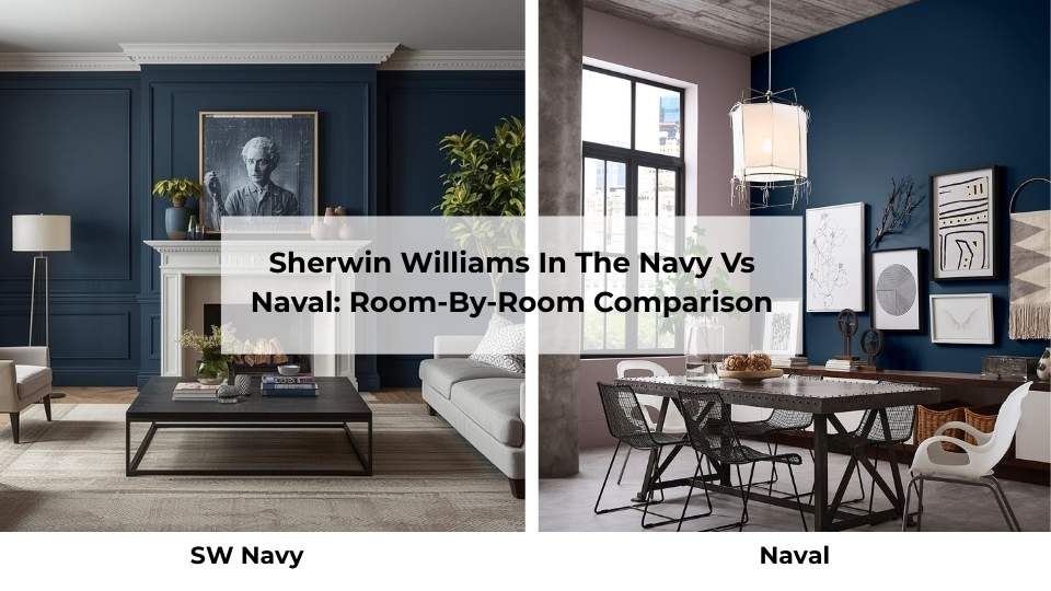
Let me walk you through how these colors look in different rooms.
Because reading is great, but real-life application is where you find out if you made the right choice or not.
Living Room
In The Navy:
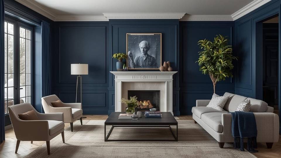
I tested this on one accent wall in my living room before committing to the built-ins. It brought a modern, gallery-like quality to the space.
The color stayed true throughout the day, morning light, afternoon, evening with lamps on.
If you’re doing a full living room in In The Navy, make sure you have natural light and break it up with white or light-colored furniture.
Otherwise it can feel bold for a space which is meant to be relaxed.
Naval:
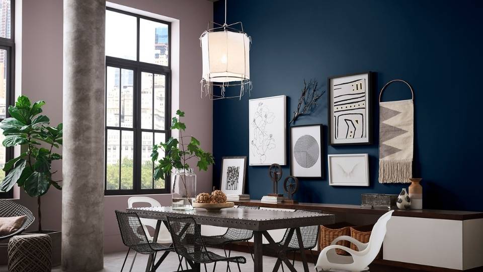
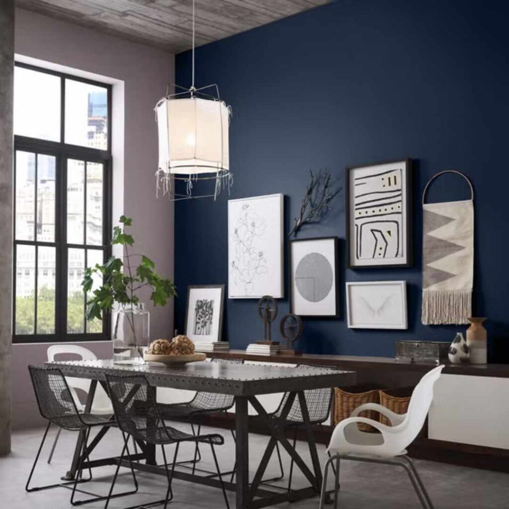
My sister has Naval on her living room accent wall behind the TV and it’s PERFECT. The muted quality makes it feel intentional but not overwhelming.
It doesn’t compete with TV. And in the evening when they’re watching movies, it creates a cozy vibe.
Full-room Naval in a living room, if you have massive windows and light-colored furniture to balance it, then you can go with it.
Bedroom
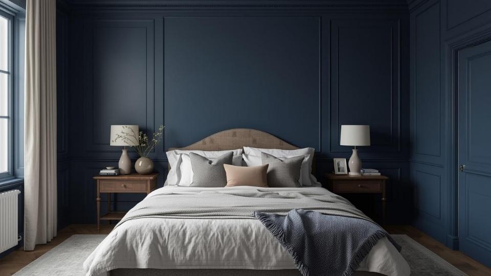
In The Navy:
This would be my choice for a kid’s room or a guest bedroom where you want navy but need it to feel fresh, not cave-like. The saturation keeps it from feeling too heavy for sleep spaces.
Naval:
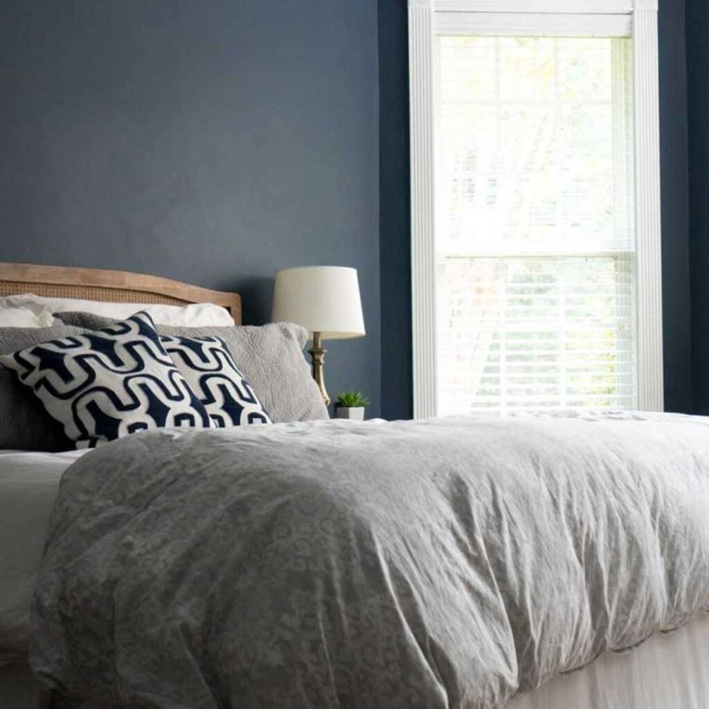
This is where Naval SHINES. My bedroom is Naval and I’ll never go back to light walls in a bedroom. It makes the space feel like a retreat.
It is like you’re stepping away from the rest of the house into your own little sanctuary.
The key is good bedding in whites and creams, decent lighting with warm bulbs, and at least one window with natural light during the day.
Bathroom
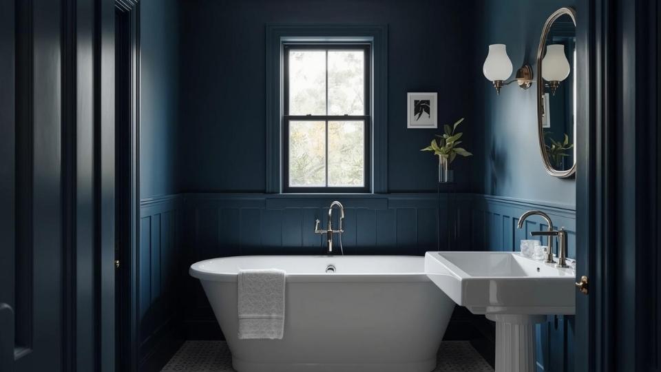
In The Navy:
I used this in our hallway powder room on the vanity cabinet and it looks expensive.
With a white vessel sink and brass faucet, it looks intentional and designed.
For a full bathroom with walls included, In The Navy works better than Naval because bathrooms are small and you need the color to not feel oppressive.
Naval:
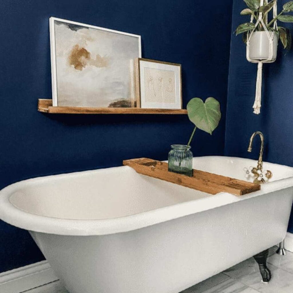
My friend painted her bathroom walls Naval and while it’s beautiful, she had to add extra lighting.
If you’re doing Naval in a bathroom, commit to bright white fixtures, a frameless glass shower if you have one, and excellent lighting.
Kitchen
In The Navy:
Kitchen islands in In The Navy are in trend. I see them everywhere in real homes. The color is bold to anchor the kitchen but doesn’t overwhelm the space.
I helped my neighbor paint her island this color and paired it with white cabinets and marble countertops.
For full kitchen cabinets in In The Navy, you need to commit to white or light countertops, backsplash, and upper cabinets if you have them.
Naval:
Naval on kitchen cabinets creates sophistication. But it needs more planning than In The Navy because the muted quality can look flat if you don’t have contrast.
I’d use Naval on lowers with white uppers, or on an island only.
Exterior
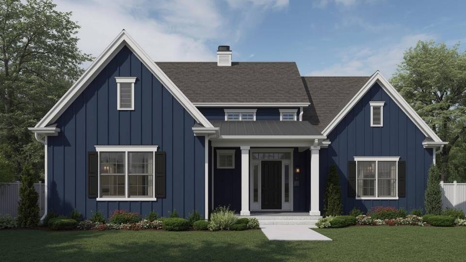
In The Navy:
This color on exterior siding or shutters looks fresh. Clean lines, modern vibe, especially with white trim.
It doesn’t fade into the background but it’s also not shouty. I’ve seen it on front doors too and it’s a solid choice for visual appeal without being trendy.
Naval:

There’s a house in my neighborhood with Naval siding and white trim and people slow down to look at it.
The depth and richness translates beautifully outdoors. It works on modern farmhouses, traditional colonials, even craftsman styles.
The gray undertones keep it from looking saturated or artificial on large exterior surfaces.
In The Navy Vs Naval Vs Other Colors
Let me compare these with other popular navy options because I get asked about this ALL the time.
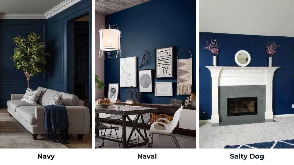
Sherwin Williams Naval Vs Salty Dog
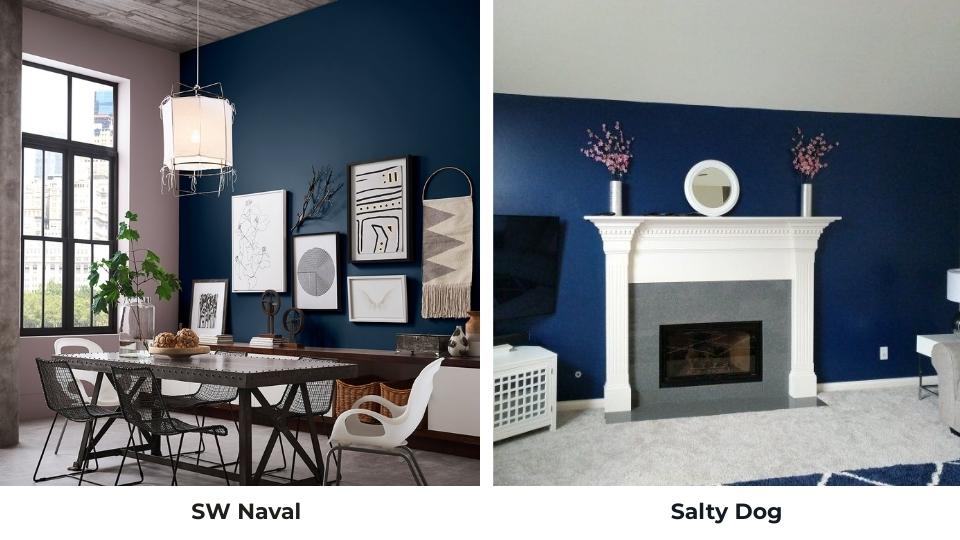
Salty Dog is light and gray. Naval is deep and rich. If you’re nervous about going dark, Salty Dog is the safe choice.
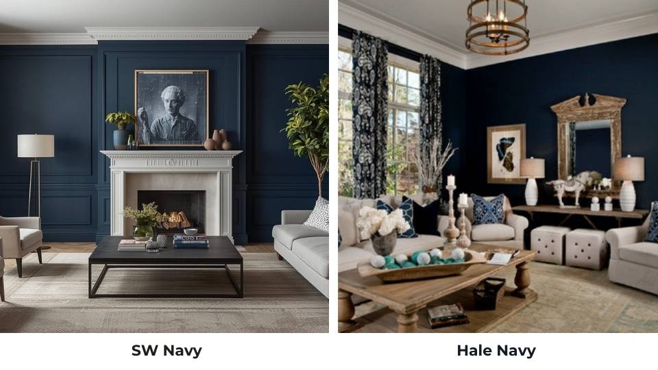
Sherwin Williams Naval Vs Hale Navy
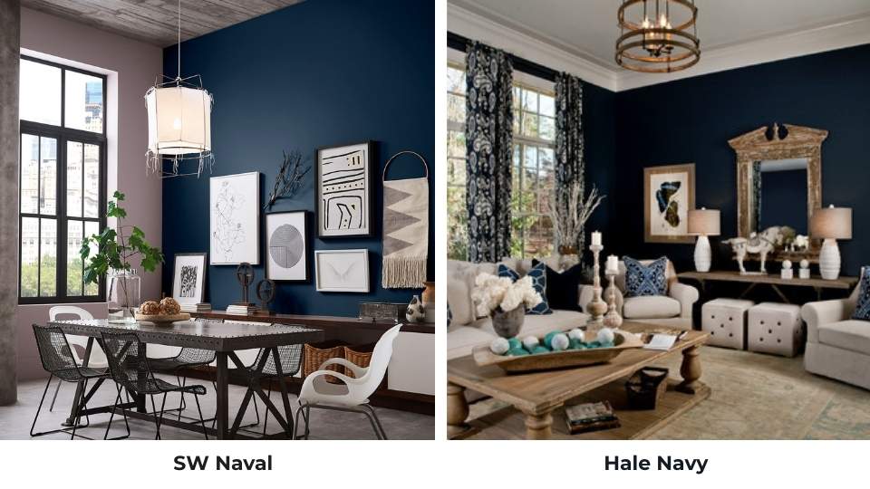
Hale Navy, which is Benjamin Moore, is soft and classic than Naval. Naval is dark and dramatic. I prefer Naval for modern spaces, Hale Navy for traditional.
Sherwin Williams In The Navy Vs Anchors Aweigh
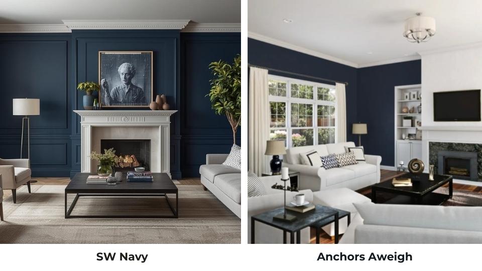
Anchors Aweigh is lighter than In The Navy with visible blue. In The Navy is deeper and more saturated.
Sherwin Williams In The Navy Vs Salty Dog
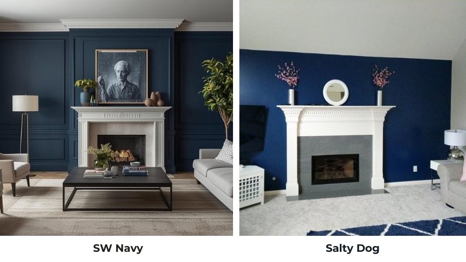
In The Navy is darker and bolder. Salty Dog is more of a medium navy-gray.
Sherwin Williams In The Navy Vs Hale Navy
Hale Navy is soft, muted and traditional. In The Navy is more saturated and modern-feeling.
Sherwin Williams In The Navy Vs Indigo Batik
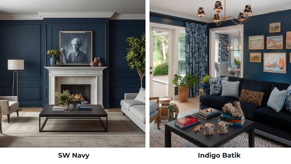
Indigo Batik has purple undertones. In The Navy stays in green-blue territory. It creates different vibes.
| Comparison | Main Difference | Which to Choose |
| Naval vs Salty Dog | Naval much darker and richer | Naval for drama, Salty Dog for safe choice |
| Naval vs Hale Navy | Naval darker and more modern | Naval for bold, Hale Navy for classic |
| In The Navy vs Anchors Aweigh | In The Navy deeper, more saturated | In The Navy for maximum impact |
| In The Navy vs Salty Dog | In The Navy significantly darker | In The Navy for true navy, Salty Dog for lighter |
| In The Navy vs Hale Navy | In The Navy more modern and punchy | In The Navy for contemporary, Hale Navy for traditional |
| In The Navy vs Indigo Batik | Different undertones entirely (blue-green vs purple-blue) | Personal preference on undertone |
Common Mistakes To Avoid While Going With In The Navy and Naval
Let me save you some pain and money. Here are the mistakes I’ve made or seen others make:
• Not testing samples in your space with your lighting: The small paint swatches don’t tell you the truth.. Get sample pots, paint large swatches, live with them for a few days
• Using Naval in rooms without good natural light: It will look black.
• Forgetting about the ceiling: Dark walls make ceilings look out of place, if they’re not bright white. Repaint your ceiling when you do the walls.
• Skipping primer: These dark colors NEED good primer. Don’t skip it.
• Not considering your trim color: The wrong white with these navies can look pink or yellow. Test your trim color too.
• Painting all four walls in a small room without testing first: Start with one accent wall. See how you feel. Then commit.
• Using flat or matte finish in high-traffic areas: These colors show every fingerprint and scuff in flat. Use eggshell or satin in busy spaces.
• Pairing with the wrong undertones: Cool navy with warm wood tones can clash. Be intentional about your pairings.
Conclusion
Here’s my conclusion on Sherwin Williams In The Navy Vs Naval:.
If you want a bold, clean, modern navy that works in more situations and lighting conditions then go with In The Navy.
It’s forgiving, stays true to color, and works beautifully on large surfaces.
If you want a sophisticated, moody, cocooning navy which creates serious drama then go with Naval.
But make sure you have the natural light to support it and you’re prepared for how dark it can read.
I have both in my house. Naval in my bedroom where I wanted the cozy feeling. In The Navy on built-ins where I needed impact without heaviness.
They’re both gorgeous. They’re both popular. But they’re NOT interchangeable.
FAQs On Sherwin Williams In The Navy Vs Naval
Cool whites like Pure White or High Reflective White look fresh and modern. Warm metallics like brass add contrast. Light grays, creams, and natural wood tones work beautifully.
Naval is a deep, classic navy blue with gray-green undertones. It has an LRV of 4, making it dark and dramatic. It looks like a sophisticated, muted navy rather than a bright or saturated blue.
Warm whites like Alabaster balance Naval’s cool undertones beautifully. Matte black hardware, chrome fixtures, and warm wood tones all complement it. Soft grays and creamy neutrals work too.
It depends on your space. Naval can look black in rooms with limited natural light or north-facing exposure. In bright rooms with good lighting, it shows its depth without being overwhelming.
Sherwin Williams In The Navy Vs Naval: Comparing Sherwin Williams' Most Popular Navy Blues