Egret White Vs Alabaster are two of Sherwin-Williams’ popular white paint colors.
Both are warm white that everyone seems to go toward.
At first, they look identical but their undertones and depth are different, and the difference matters more.
The thing about undertones is they’re like chameleons.
They shift depending on your lighting, what time of day it is, and what finishes you have in the space.
I’ve seen Egret White vs Alabaster confuse many homeowners and designers.
Choosing the wrong undertone can make your space look flat.
Your flooring looks off, your cabinets don’t coordinate, and the cozy vibe feels wrong.
So, I’m breaking down the color profiles of Egret White Vs Alabaster.
We’ll look at LRV, undertones that show up in your room, how lighting affects, and which rooms these colors work best in.
I’ll also put in comparisons with other popular colors.
Here are my other blogs that you can also read:
- Tricorn Black Vs Iron Ore
- Smartcore Vs Pergo
- Clay Sage Vs Evergreen Fog
- Eider White Vs Alabaster
- Rainwashed Vs Sea Salt
Color Profile of Sherwin Williams Egret White (SW 7570)
Egret White is a warm white paint color. It has visible beige and gray undertones that make it more like a light greige than a true white.
When I first used it on a project, I expected it to act like other warm whites I’d worked with.
But It has depth to it which is hard to describe.
The LRV is at 70, which puts it in a middle ground.
Not as reflective as the whites, but not dark either.
It’s classified as a taupe that leans toward warm gray which means it has more gray than beige.
Here’s what I learned: Egret White is NOT a greige.
But true greiges have the green undertone, and Egret White doesn’t. It has the warm violet-pink undertones instead that show up in some lighting conditions.
I’ve used this color in living rooms, bedrooms, and exteriors.
Homeowners love it because it feels softer than bright white.
Designers appreciate it when we’re working with spaces that have warm wood flooring or natural stone.
But it’s deep for trim work.
Color Profile of Sherwin Williams Alabaster (SW 7008)

Alabaster is the most popular off-white at Sherwin-Williams, and there’s a reason for that.
It won Color of the Year back in 2016.
This is part of their “Top White Paint Colors” lineup, and I’ve used it on more projects than any other white.
The undertones are warm and creamy, it has the slight beige or yellow influence without feeling yellow.
It’s LRV of 82, it reflects more light than Egret White, making spaces feel open and airy.
It’s soft and more inviting than the bright, clinical whites.
It stays consistent across different lighting situations.
The north-facing room is warm.
South-facing with the sun is creamy, not yellow.
It’s the color I recommend when someone says “I want white walls but not white walls”, then consider Alabaster.
It works well on walls, but it’s my go-to for trim, doors, ceilings, and cabinets.
The versatility is not every color given. I’ve done whole-house color schemes with Alabaster and it never feels boring or flat.
It coordinates with warm neutrals, beiges, greiges, natural wood tones, stone finishes..
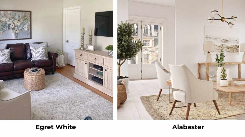
Difference Between Egret White Vs Alabaster
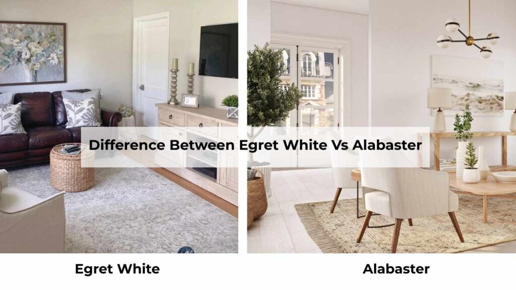
Okay, so Egret white Vs Alabaster are both warm whites from Sherwin-Williams.
They both look good on paint swatches.
But putting them side by side in a room will be different experiences.
LRV
The Light Reflectance Value is telling about how much the color can reflect the light back. Alabaster comes in at 82 while Egret White is at 70.
The 12 point difference makes a big difference.
I always tell clients that LRV determines how a color performs in your space. Alabaster reflects more light, which is why it makes rooms feel big and bright.
Egret White absorbs light because of the lower LRV, giving it visible depth and weight on the wall.
If you’ve got a small room or limited natural light, Alabaster is what you should go for.
If you’ve a massive open-concept space that feels sterile with bright whites, Egret White adds warmth.
Undertones
Egret White has a complex mix of beige and gray with green influence depending on your lighting and surrounding finishes.
The warm violet-pink undertones are subtle, but they’re what keeps this color from reading as a straight-up greige.
In some rooms, with cool light, the gray shows up.
In warm light, the beige comes.
Alabaster is simple, it has the soft beige with minimal yellow, and zero gray pull. No green, no violet.
I learned this on a project where I used Egret White in a north-facing bathroom.
The client wanted warmth, but with the cooler natural light, the gray undertones dominated and it felt cold.
Lighting Affect
Egret White acts like a chameleon. In the north-facing rooms it is cool and gray while keeping some warmth. In the south or west-facing with warm light it is into its beige side.
Artificial lighting can bring the beige or green undertones.
Alabaster stays consistent. North-facing rooms don’t turn it gray.
South-facing rooms keep it soft and creamy without being yellow.
Artificial lighting enhances the warmth without distorting it. This consistency is why it’s versatile across different spaces.
Style Compatibility and Uses
Egret White works best when you want the earthy, grounded, moody vibe.
Think modern farmhouse, transitional spaces, rooms with warm wood flooring or natural stone.
It looks best on walls in open-concept spaces where bright white will feel harsh.
On exteriors, it pairs well with stone and brick.
Alabaster is classic warm white for everything.
Walls, trim, cabinets, ceilings, it all works. It pairs with warm neutrals, beiges, greiges, and works with cool palettes. The versatility is what you need.
I’ve used it in traditional homes, modern spaces, and farmhouse styles.
| Feature | Egret White (SW 7570) | Alabaster (SW 7008) |
| LRV | 70 | 82 |
| Undertones | Beige + gray, slight green possible | Soft beige, minimal yellow |
| Color Classification | Light greige / taupe | True warm white |
| Brightness | More depth, absorbs light | Brighter, reflects more light |
| Best Use | Walls in warm spaces | Walls, trim, cabinets, ceilings |
| Lighting Sensitivity | High – shifts with light | Low – stays consistent |
| Trim Compatibility | Not recommended | Excellent |
| Overall Feel | Earthy, grounded, moody | Airy, creamy, timeless |
Egret White Vs Alabaster: Room-By-Room Suitability
The room you’re painting matters as much as the color you choose.
Both these colors behave differently depending on the space, and I’ve got opinions based on many projects.
Living Room
Egret White in a living room creates a cozy, grounded atmosphere that feels intentional.
If you’ve warm hardwood floors or natural stone, it picks up the tones beautifully.
I used it in an open-concept living room last year with oak flooring and a stone fireplace and it was perfect.
But you need good natural light because in a dark living room, it’ll be too gray.
Alabaster is the safe choice for living rooms. It works well in any lighting situation and makes the space feel open and inviting without being harsh.
I’ve used it in north-facing living rooms, small living rooms, massive open spaces, all looks good.
It’s a classic warm white that coordinates with everything.
Bedroom
Egret White in bedrooms can go either way.
In a south-facing bedroom with morning light, it’s soft and warm and what you want to wake up to.
But in a north-facing bedroom, it is too gray, too cold.
Alabaster is my go-to for bedrooms. It stays warm and creamy depending on which way the room faces.
The consistency means you get the same cozy feeling morning and night, natural light or lamps on.
It’s soft to feel restful but bright that the room doesn’t feel cave-like.
Bathroom
Egret White in bathrooms is tricky.
Many bathrooms don’t have natural light, and artificial bathroom lighting can bring out the gray and green undertones.
I’ve seen it work in large bathrooms with good windows, paired with natural stone tile.
But in a standard bathroom with builder lighting, it looks cold.
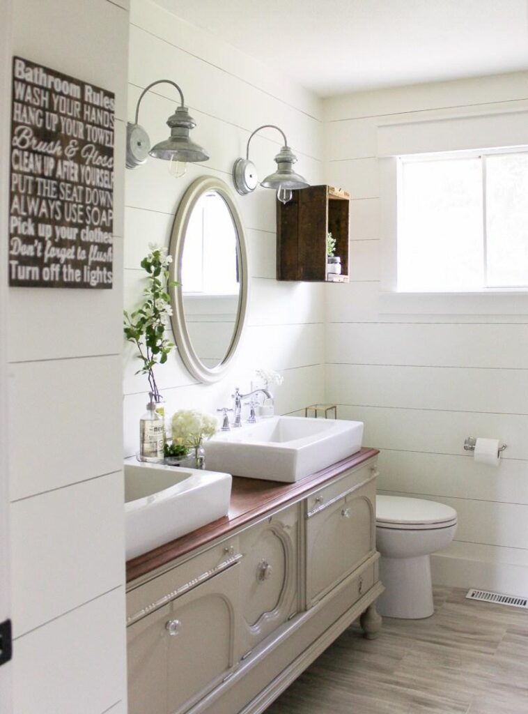
Alabaster is made for bathrooms. It stays warm and inviting with typical bathroom lighting.
Pairs well with white fixtures, tile, and doesn’t fight with the cool tones in chrome or brushed nickel.
I use it on walls and continue it onto the cabinets for a cohesive look.
Kitchen
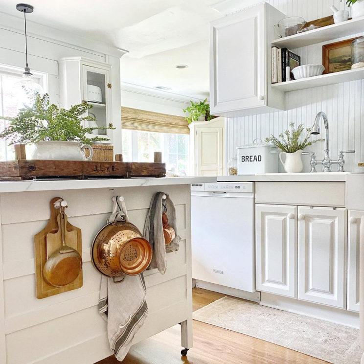
Egret White on kitchen walls can work if you’ve warm wood cabinets or natural stone countertops.
But if you’re thinking about it for cabinets, you need to be careful with your wall color choice. Because of the LRV of 70, your walls need to be dark.
I tried it once with walls around 65 LRV and you could barely tell where the cabinets ended and walls began.
Alabaster is my kitchen MVP. Gorgeous on cabinets, perfect on walls, works on ceilings if you’re doing a white kitchen.
It provides clean contrast against dark colors and coordinates with every countertop material like quartz, granite, marble, butcher block.
Exterior
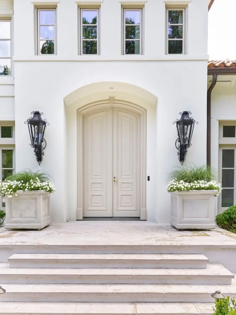
Egret White on exteriors is pretty.
It works well with various roof colors, stone, and brick. But it appears warmer on the outside than you expect.
The beige undertone gets obvious in full outdoor light.
I used it on a modern farmhouse exterior with black windows and white trim and the combo was stunning.
The depth it has makes it more interesting than flat white siding.
Alabaster on exteriors is classic and timeless.
It’s the creamy white you see on beautiful traditional homes.
Stays consistent in outdoor light, doesn’t shift depending on the light.
I’ve used it as both siding color and trim color and it always looks good.
Egret White Vs Alabaster Vs Other Colors
Let’s be real if you’re not deciding between these two.
You’re also looking at six other paint swatches spread across your counter.
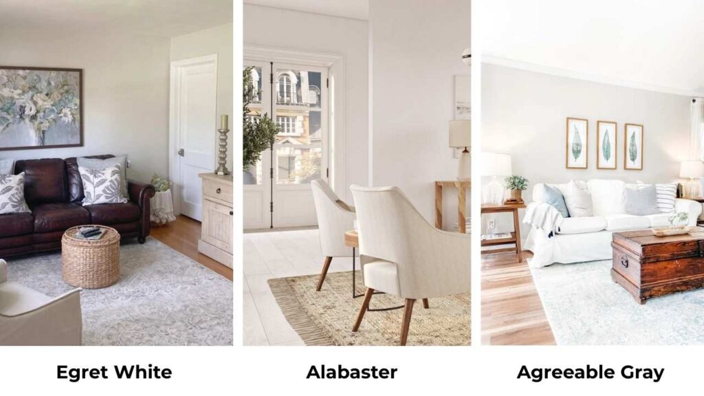
Egret White Vs Agreeable Gray
Agreeable Gray is warmer and has the true greige vibe with the green undertones.
Egret White is light and is more gray-beige without the green.
If you want something brighter than Agreeable Gray but not full white, Egret White is what you should consider.
Egret White Vs Swiss Coffee
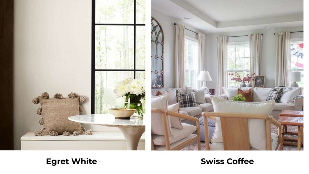
Swiss Coffee is creamier and yellow-leaning.
Egret White is cool with the gray undertones.
Swiss Coffee is more traditional; Egret White feels more modern and transitional.
Egret White Vs Pale Oak
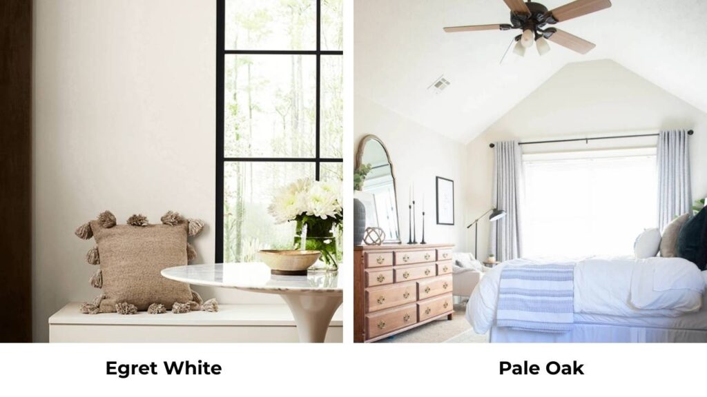
Pale Oak is another warm neutral but it’s beige with definite yellow undertones.
Egret White is light, gray-influenced, and less committed to the yellow-beige family.
Pale Oak feels rich but Egret White feels clean.
Egret White Vs Drift of Mist
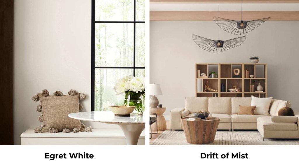
These are close. Drift of Mist may be cooler depending on lighting.
Both have the soft, muted quality. But test both in your specific space because they’re close enough that your lighting will be the deciding factor.
Egret White Vs Shoji White
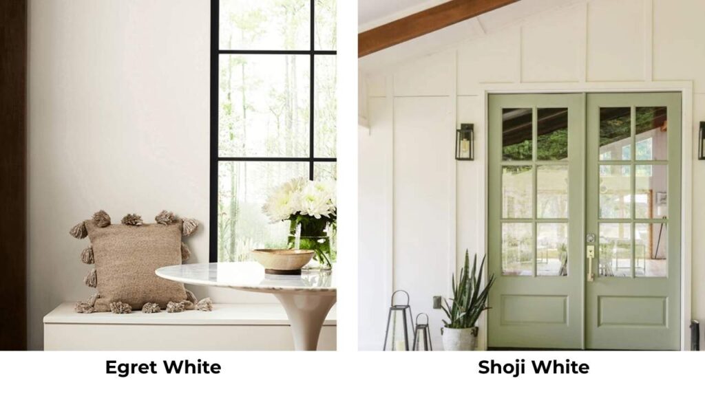
Shoji White is bright and clean with less visible undertone.
Egret White has depth and warmth. If you want something closer to true white but soft, Shoji White is what you should go for.
If you want color and complexity, Egret White.
Egret White Vs Snowbound
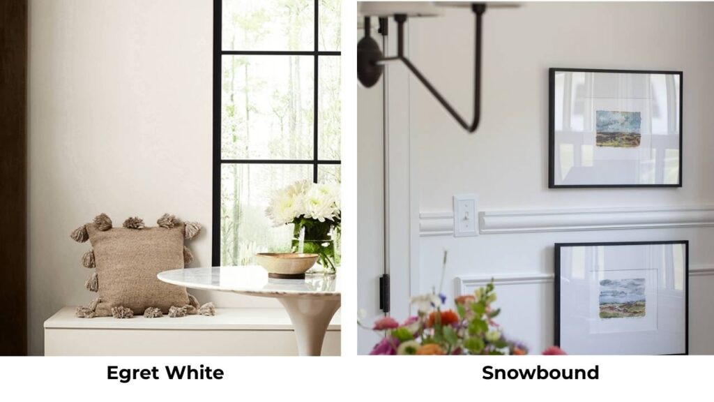
Snowbound is bright (LRV 83) and is a true white with a hint of warmth.
Egret White has depth and visible undertones.
Different vibes, Snowbound is fresh, Egret White is earthy.
Egret White Vs Taupe in the Morning
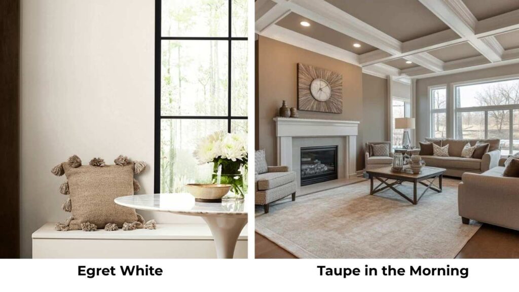
This is a new color that’s similar but shows different undertones depending on the light.
Both are in that warm neutral family, but Taupe in the Morning can lean more beige.
Test both.
White Dove and Alabaster

White Dove (Benjamin Moore) is comparable to Alabaster but can be slightly cooler.
Alabaster has that creamy warmth that stays consistent.
Both are great and come down to brand preference and your specific lighting.
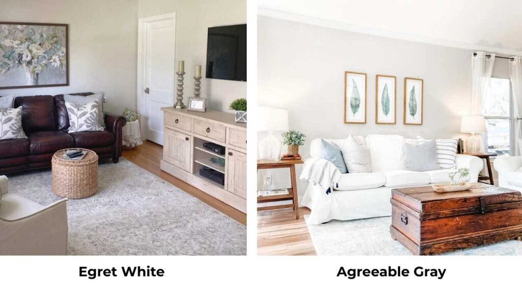
Alabaster Vs Agreeable Gray
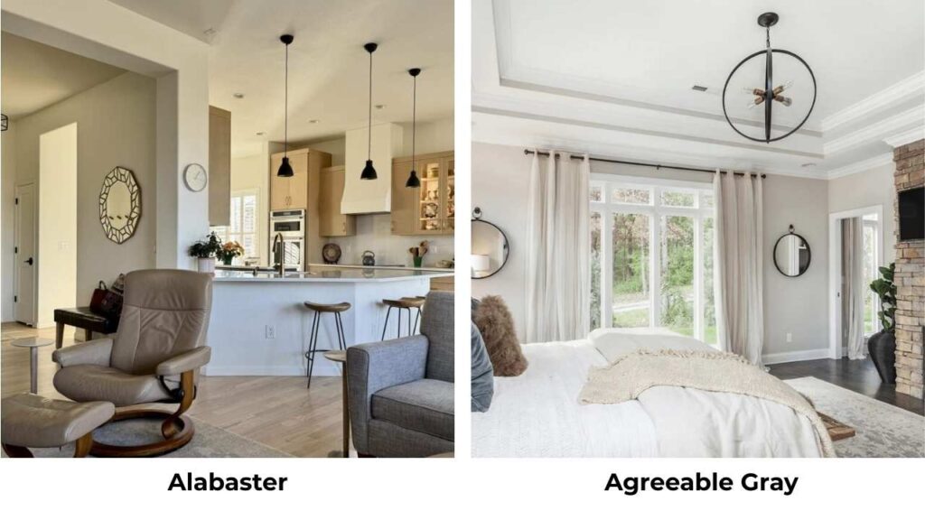
Agreeable Gray is dark (LRV 60) and overtly greige.
Alabaster is lighter and is warm white. Different categories.
Use Agreeable Gray when you want a neutral wall color with depth; use Alabaster when you want white with warmth.
| Color | LRV | Undertones | Best For |
| Egret White | 70 | Beige-gray, slight violet-pink | Walls in warm spaces |
| Alabaster | 82 | Soft beige, minimal yellow | Walls, trim, cabinets |
| Agreeable Gray | 60 | Greige with green | Neutral walls needing depth |
| Swiss Coffee | 77 | Cream-yellow | Traditional interiors |
| Pale Oak | 70 | Beige-yellow | Rich, warm neutrals |
| Shoji White | 72 | Minimal, clean | Modern bright spaces |
| Snowbound | 83 | Slight warm white | Crisp, clean bright spaces |
Which One You Should Choose Between Egret White and Alabaster?
Choose Egret White if you have warm flooring, natural stone, or wood finishes and you want a color that coordinates with the earthy tones.
If your room has good natural light.
If you want something with depth and character than whites. If you’re doing walls only and using a bright white for trim.
Choose Alabaster if you want versatility and consistency.
If your lighting situation isn’t ideal. If you’re painting walls, trim, and cabinets.
If you want a classic warm white which coordinates with everything.
Start with Alabaster. It’s forgiving, versatile, and works in many situations.
Get samples. Paint them on multiple walls in the room and look at them at different times of day.
Conclusion
Choosing between Egret White Vs Alabaster depends on your space, lighting, and what you’re pairing them with.
Egret White offers the sophisticated, earthy depth for the right room with the right light. Alabaster delivers consistent, warm, creamy white magic that works everywhere.
Both are great colors. But they’re not interchangeable, despite looking similar on the paint swatches.
Understanding the undertones, LRV differences, and how each responds to lighting will save your time.
Comparing between Egret White Vs Alabaster can be a little tough task but once you understand the LRV, undertones, lighting and other things you can really decide what will go in your space and there are many other colors too other than these two to consider.
FAQs on Egret White Vs Alabaster
Egret White has beige and gray undertones with warm violet-pink influences that prevent it from going green. Depending on lighting, you can see beige or gray, and a slight green cast.
YES. Egret White is gorgeous in rooms with warm finishes, good natural light, and when you want depth than pure whites. It’s not ideal for trim, north-facing rooms, or spaces with limited light where the gray undertones can be too cool.
For trim with Alabaster walls, stick with Alabaster, it works as both. If you want bright trim, try Extra White or Pure White from Sherwin-Williams. The key is staying in the warm white family so nothing looks dingy.
Skip Egret White for trim work, in north-facing rooms without good lighting, in small dark spaces, on cabinets without wall contrast, and you need a true white. It’s also not great in rooms with heavy cool tones.