I’ve been in many paint stores staring at white paint swatches that look the same under lighting.
And then you get them home and one looks like butter and the other looks like maybe greige? Swiss Coffee Vs Shoji White are two of the warm whites that cause a kind of panic if it goes wrong.
Here’s the thing about Swiss Coffee and Shoji White, they’re gorgeous warm whites that look identical, but on walls they look different.
One’s from Benjamin Moore Swiss Coffee, OC-45, the others is Sherwin-Williams Shoji White, SW 7042.
Both have the perfect “warm but not yellow” vibe.
And picking between them has made confusion a lot.
Here, I’m breaking down everything I’ve learned from using Swiss Coffee Vs Shoji White in real spaces.
Because choosing the wrong undertone doesn’t only affect one wall.
It changes how your whole space feels, how your furniture looks, whether your trim looks bright or weird.
Here are my other blogs that you can also read:
- Origami White Vs Shoji White
- Eider White Vs Alabaster
- Peppercorn Vs Iron Ore
- Sherwin Williams Natural Tan Vs Accessible Beige
- Orange Peel Vs Knockdown
Color Profile of Benjamin Moore Swiss Coffee (OC-45)
Benjamin Moore Swiss Coffee is a classic warm off-white that is creamy without going yellow.
It has soft creamy undertones with subtle beige warmth that gives it coziness.
The thing about Swiss Coffee that I love is that it has depth.
It’s not the flat whites that disappear on the wall.
It looks warm and rich because of the beige and cream undertones.
It doesn’t have strong yellow undertones, which will show if you have a room that you thought was warm white.
It has an LRV around 83, Swiss Coffee is bright.
It reflects light back in a good amount into your space, which means it works in rooms that don’t get much natural light.
I’ve used it in north-facing bedrooms where I needed warmth but also wanted brightness.
Where Swiss Coffee shines is in traditional and transitional spaces.
Living rooms with warm wood furniture, bedrooms that need to feel cozy without being dark, bathrooms where you want softness instead of a cold white look.
It also looks good on trim and ceilings.
But Swiss Coffee can look too yellow in spaces with strong natural light or warm artificial lighting.
I learned this when I was doing it in a west-facing living room where it looked perfect in the morning and too creamy by late afternoon.
Color Profile of Shoji White (SW 7042)

Shoji White from Sherwin-Williams is different, it’s also labeled as a warm white.
This one has warm beige undertones with subtle greige and taupe notes that keep it from looking like cream.
The best thing about Shoji White is it has the green undertones.
Sounds a bit out of place, but the hint of green is what prevents it from looking yellow.
It stays warm and soft but maintains a neutral quality that Swiss Coffee doesn’t have.
Shoji White has an LRV of about 74, which is lower than Swiss Coffee.
This means it’s more saturated and slightly deep on the wall.
It’s a light color, not even close to beige territory.
I prefer this in spaces where I want the color to feel intentional.
This color is brighter and cleaner than many creamy whites while maintaining warmth.
It doesn’t have the yellow-cream, which makes it versatile.
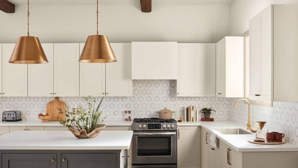
I’ve used Shoji White in modern farmhouse kitchens, contemporary bedrooms, transitional living rooms, and on exteriors where it looks soft warm white.
Lighting enhances Shoji White’s personality.
In bright south-facing rooms, it looks fresh and warm but not creamy.
In north-facing spaces, the greige undertones come out and it can look more muted.
And in spaces with warm artificial lighting, it gets cozy without going yellow.
The reason designers keep coming back to Shoji White is that it works in open floor plans where you need one color to look consistent across different lighting situations.
What is the Difference Between Swiss Coffee and Shoji White?
Okay, so Swiss Coffee Vs Shoji White are warm whites, both are popular, both look similar on small paint swatches.
But they’re not the same at all when you understand what’s going on with their undertones and how they look in real lighting.
LRV
Light Reflectance Value is how much light a color bounces back.
Swiss Coffee is at an LRV of 83, while Shoji White is down at 74.
That’s a significant difference, so Swiss Coffee reflects 10% more light.
What this means in rooms is that Swiss Coffee will make a space feel bright and open.
It’s the better choice if you’re working with a dark room or limited natural light.
Shoji White, is more saturated, has a presence and also it doesn’t disappear.
I had a client insist on Swiss Coffee in a room with big south-facing windows and it was too bright.
Everything felt washed out.
We ended up going with Shoji White instead and it was perfect like warmth, but with more substance.
Undertones Comparison
Swiss Coffee has creamy yellow and soft beige undertones.
It’s warm, looks cream, and that’s its vibe. It wants to feel cozy and traditional.
Shoji White has warm beige undertones with greige and subtle green notes.
The green undertones are what keep it from going into yellow territory.
It stays neutral-warm instead of cream-warm which is different, even though both are “warm whites.”
If you hold them side by side, Swiss Coffee looks creamy and yellow.
Shoji White looks soft and neutral with a touch of warmth.
Brightness and Depth
Swiss Coffee is bright because of the high LRV, it feels open and airy.
But it can also feel flat in some spaces because it reflects light.
Shoji White has depth and body.
It feels like an intentional color choice rather than only “white walls.
” The lower LRV gives it richness that Swiss Coffee doesn’t have.
In rooms where I want the wall color to contribute to the design.
Lighting Appearance
Swiss Coffee gets warm and creamy in natural light.
In north-facing rooms, it can look muted but maintains its creamy quality.
In warm artificial lighting, it looks like the cozy cream vibe which is either perfect or too much depending.
Shoji White shifts between soft white and light greige depending on the lighting.
Bright natural light brings its warm-white side.
Shadowed areas or north light bring the greige undertones.
It’s chameleon-like, which makes it better for open floor plans where lighting varies from space to space.
Style and Best Uses
Swiss Coffee works well in traditional and transitional homes where you want classic warmth.
It looks gorgeous on trim, cabinets, and ceilings when you’re doing a monochromatic scheme.
You can pair it with warm wood tones, beige and taupe palettes, and earthy accent colors.
It looks nice in the farmhouse style and has classic interiors.
Shoji White looks versatile in many design styles like modern, transitional, contemporary farmhouse and in minimalist spaces where you want warmth.
It pairs with both warm and cool accent colors better than Swiss Coffee.
Use Pure White or Extra White from Sherwin-Williams on trim with Shoji White walls for the subtle contrast.
It looks fantastic with warm wood floors, white oak, and natural materials.
| Aspect | Swiss Coffee (BM OC-45) | Shoji White (SW 7042) |
| LRV | ~83 (brighter) | ~74 (more saturated) |
| Undertones | Creamy yellow, soft beige | Warm beige, greige, subtle green |
| Overall Look | Traditional, cozy cream | Soft neutral warm white |
| Best Lighting | Works in low-light spaces | Handles varied lighting better |
| Style Fit | Traditional, farmhouse | Modern, transitional, contemporary |
| Trim Pairing | Often used as trim itself | Needs crisper white trim |
How Do Swiss Coffee and Shoji White Look in Different Rooms?
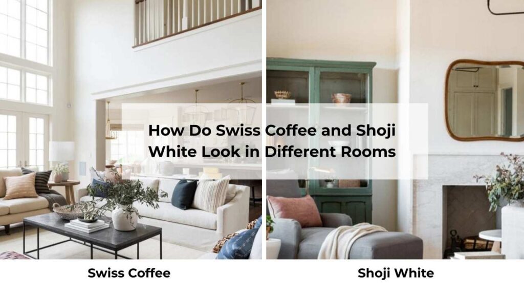
The same paint color can look different depending on the room, the lighting, what’s in the space.
I’ve seen both of these colors look amazing and also look wrong based on the room situation.
Living Room

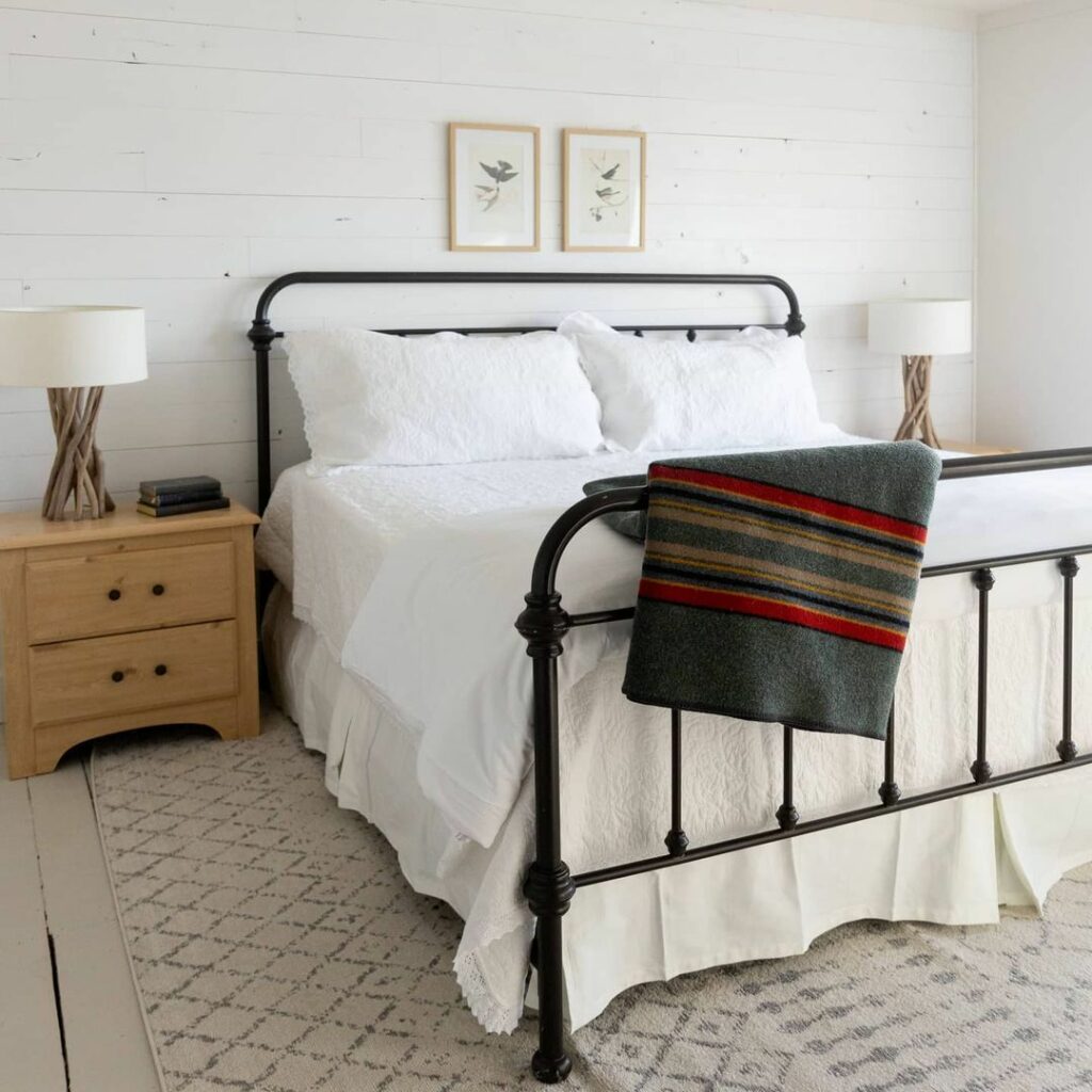
Swiss Coffee in a living room creates an enveloping warmth which is perfect if you’re going for cozy and traditional.
It makes the space feel intimate, mainly in rooms with warm artificial lighting.
I used it in a client’s living room with warm wood furniture, beige upholstery, and traditional rugs.
But in a modern living room with cool tone furniture, it felt off.
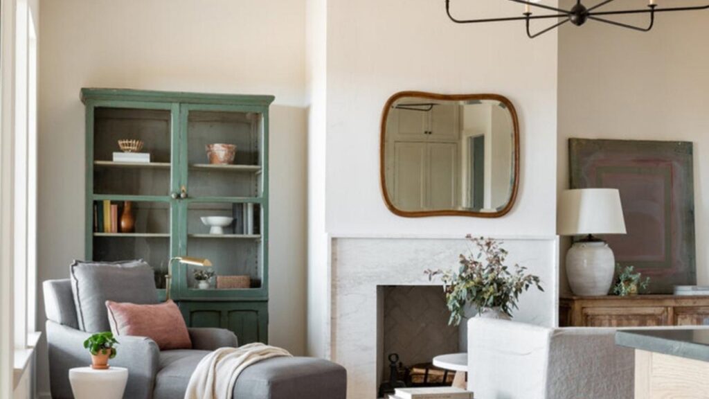
Shoji White in the living room gives you warmth without sacrificing the fresh, clean feeling.
It works in both traditional and modern spaces because it doesn’t have to look creamy.
I’ve used it in open-concept living rooms where the space flows into the kitchen and dining area, it’s consistent across different lighting zones.
Bedroom
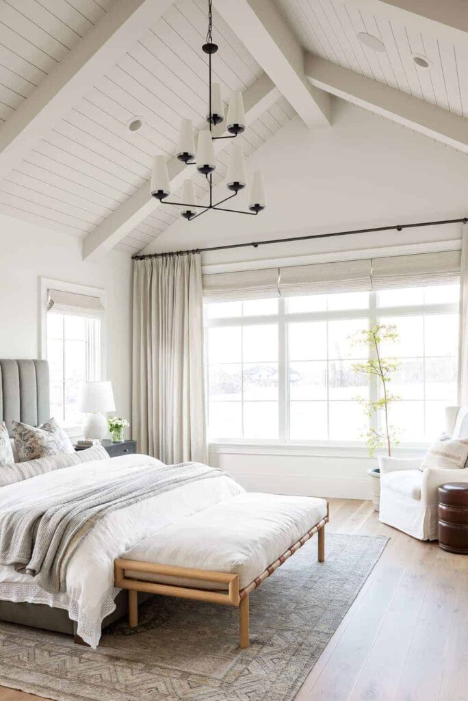
Swiss Coffee in bedrooms is cozy, soft, perfect for the restful vibe.
North-facing bedrooms benefit from the brightness, and the warmth compensates for the cool natural light.
I always recommend it for traditional bedrooms or spaces where you want coziness.
Shoji White in bedrooms feels fresh and serene while being warm.
It doesn’t have the heavy warmth which Swiss Coffee has.
I prefer it in south-facing bedrooms where Swiss Coffee looks too much, or in contemporary bedrooms where you want softness.
Bathroom
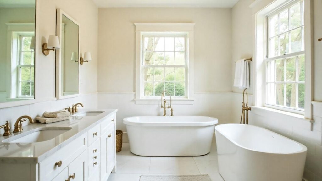
Swiss Coffee in bathrooms works when you want a spa-like warmth.
But it can look too yellow next to white fixtures, mainly in toilets, tubs, and sinks.
I’ve had to talk clients when they have bright white fixtures because the contrast makes Swiss Coffee look more yellow than it is.
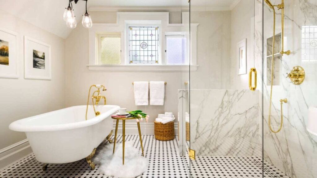
Shoji White in bathrooms is safe.
The greige undertones keep it neutral to not clash with white fixtures, but it has warmth.
It pairs well with marble, white subway tile, and warm wood vanities.
It is more forgiving in bathrooms than Swiss Coffee.
Kitchen
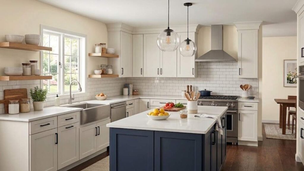
Swiss Coffee in kitchens can be gorgeous on cabinets like the creamy warmth feels rich and traditional.
On walls, it works if your cabinets are wood or a contrasting color.
But if you’re doing Swiss Coffee walls with white cabinets, you need to be careful that it doesn’t make your cabinets look weird.
Shoji White in kitchens is versatile.
It works on walls with white cabinets.
It’s warm to feel inviting but neutral to not compete with your backsplash, countertops, or cabinet color.
I’ve used it in kitchens with dark cabinets like Cyberspace where it provides contrast without being harsh.
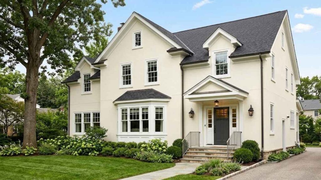
Exterior
Swiss Coffee on exteriors can work, but I don’t use it much for exterior applications.
The creaminess that looks cozy inside can look yellow outside, especially on bright sunny days.
Shoji White on the exteriors is fantastic.
It looks like a fresh warm white outside and less creamy than it looks indoors.
The natural outdoor light brings its fresh quality while maintaining warmth.
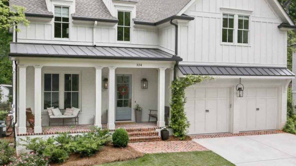
I’ve used it as a body color with Urbane Bronze trim for a sophisticated look, and also as trim color on homes with brick or stone.
Swiss Coffee Vs Shoji White Vs Other Colors
Neither of these colors exists in a vacuum.
You’re also considering other warm whites, and you should be.
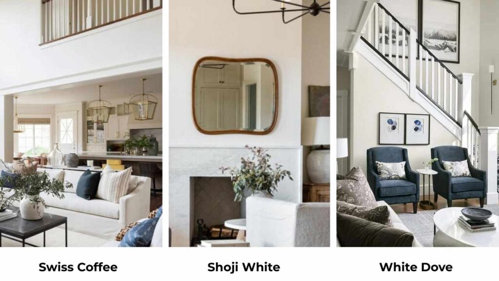
Swiss Coffee Vs White Dove
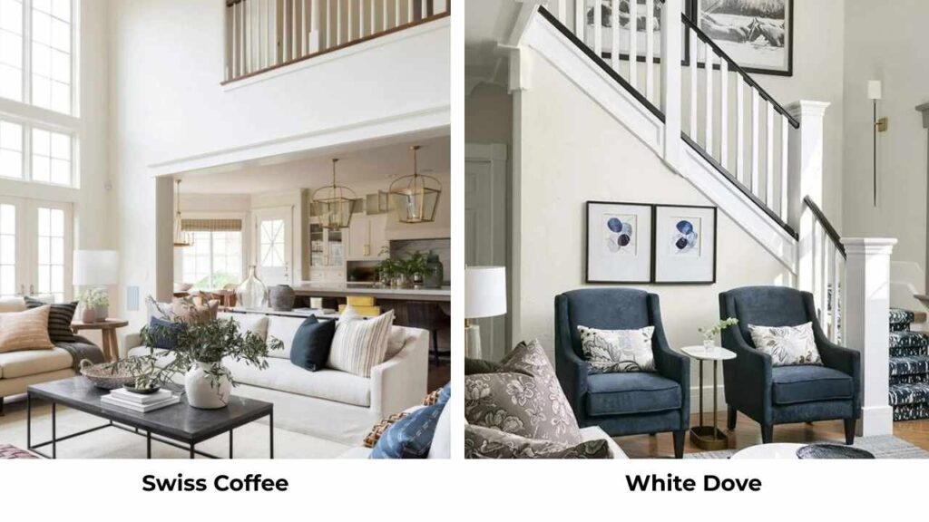
White Dove BM OC-17 is soft and less creamy than Swiss Coffee.
It has more gray in it, less yellow.
If Swiss Coffee feels too warm or yellow for your space, White Dove is much cooler while being warm.
Swiss Coffee Vs Alabaster
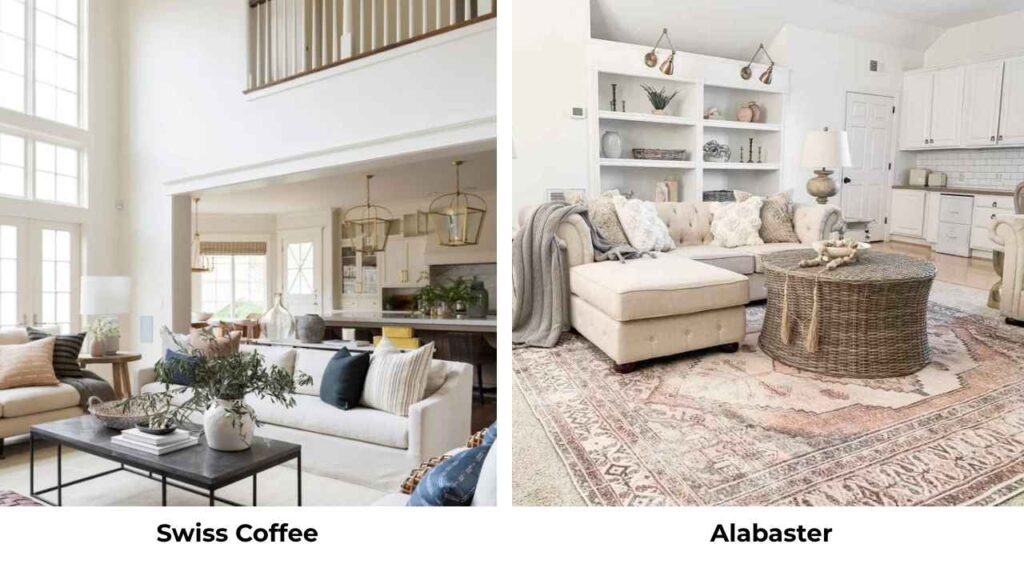
Alabaster SW 7008 has an LRV of 82 and warm yellow undertones which is similar to Swiss Coffee.
But Alabaster is a Sherwin-Williams color, so if you’re in the SW ecosystem, it’s your Swiss Coffee.
They’re close enough that I’d choose based on which brand you prefer.
Shoji White Vs Alabaster
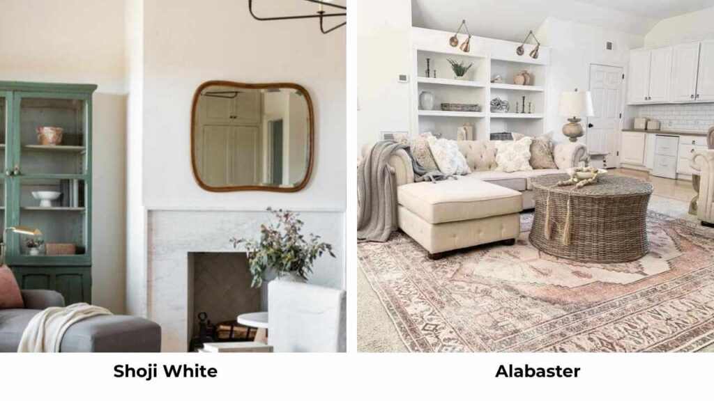
Alabaster is warm and more yellow than Shoji White.
Alabaster is creamy, Shoji White stays neutral-warm.
If you’re choosing between them, Alabaster is better for warmth, Shoji White is better for versatility.
Shoji White Vs Greek Villa
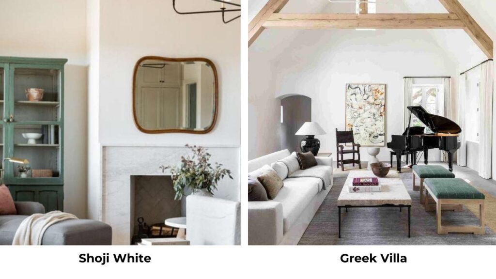
Greek Villa (SW 7551) is cooler than Shoji White with gray undertones.
If Shoji White feels too warm, Greek Villa is a good cooler alternative that’s also soft.
Shoji White Vs Accessible Beige
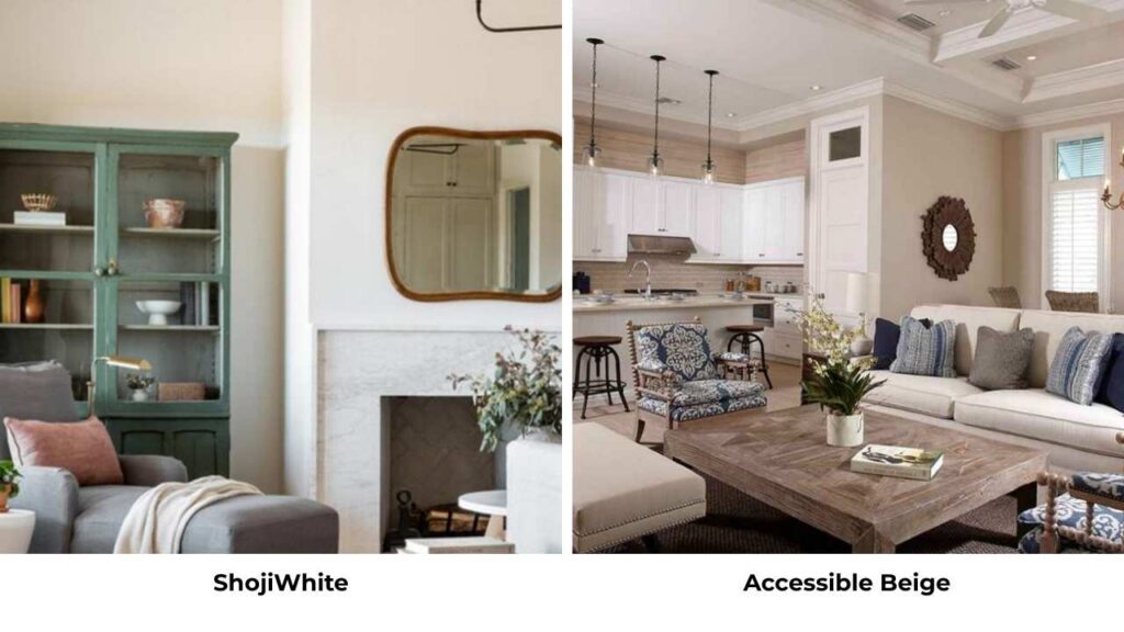
Accessible Beige (SW 7036) is a dark version of Shoji White.
It has the same green undertones, the same family, but with an LRV of 58 which is deeper.
It is great for accent walls or creating a tonal palette with Shoji White.
Shoji White Vs Pale Oak
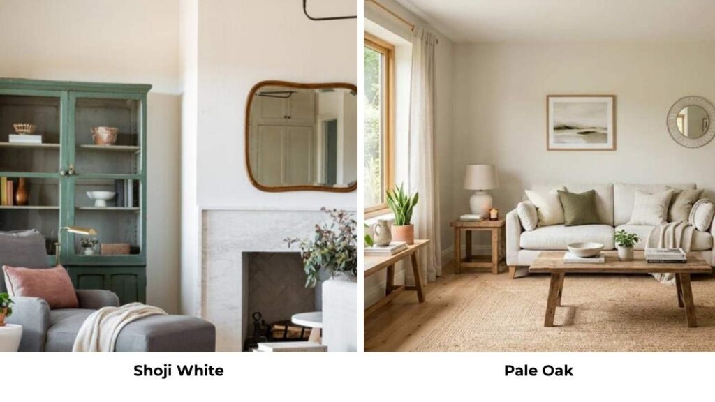
Pale Oak BM OC-20 has the same warmth but it’s darker LRV around 69 and has more taupe.
If you want something with Shoji White’s neutral warmth but with depth, Pale Oak is worth going for.
Shoji White Vs Ballet White
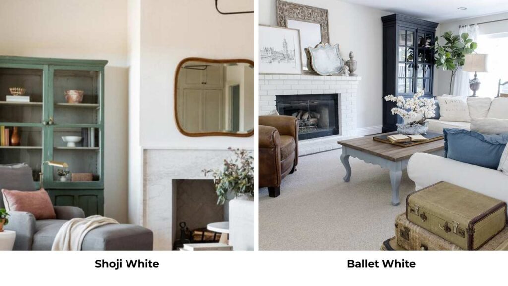
Ballet White (SW 9186) is cooler and brighter than Shoji White.
It has less warmth, more true white.
Also, it has different categories.
Behr Swiss Coffee Vs Shoji White
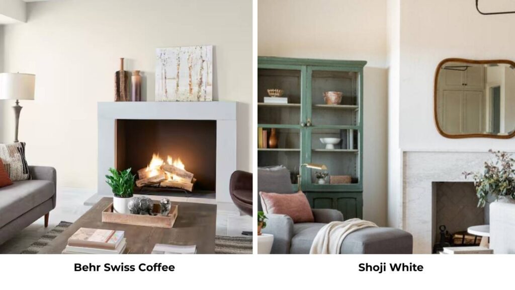
Behr Swiss Coffee is similar to Benjamin Moore’s version, with creamy, warm, yellow undertones.
It’s brighter and warmer than Shoji White.
The same basic comparison applies: Behr Swiss Coffee is creamy traditional warm, Shoji White is neutral warm with versatility.
| Comparison | Key Difference |
| Swiss Coffee vs White Dove | Swiss Coffee is creamy; White Dove has more gray |
| Swiss Coffee vs Alabaster | Similar; Alabaster is SW equivalent |
| Shoji White vs Alabaster | Shoji White is neutral; Alabaster is yellow-warm |
| Shoji White vs Greek Villa | Greek Villa is cooler with gray undertones |
| Shoji White vs Accessible Beige | Accessible Beige is dark with same green undertones |
| Shoji White vs Pale Oak | Pale Oak is dark and more taupe |
| Shoji White vs Ballet White | Ballet White is cool and bright |
| Behr Swiss Coffee vs Shoji White | Behr SC is bright and creamy; Shoji more neutral |
Swiss Coffee Coordinating Colors
Swiss Coffee’s creamy warmth means you want to pair it with colors that either complement that warmth or provide contrast without going cool.
Colors that work beautifully with Swiss Coffee:
- Warm beiges and taupes – creates a monochromatic soothing palette
- Soft warm grays – make sure they lean warm, not cool
- Earthy greens – olive, sage, muted greens
- Warm wood tones – oak, walnut, cherry all look great
- Creamy whites for trim – keep everything in the same warm family
- Terracotta and rust – gorgeous accent colors that play up the warmth
- Warm navy or denim blue – provides contrast without being jarring
- Buttery yellows – if you want to lean into the warmth
What to avoid: Cool grays, harsh white trim, cool blues and greens.
Shoji White Coordinating Colors
Shoji White’s neutral warmth and the subtle green undertones make it versatile.
You can pair it with both warm and cool colors.
Colors that look amazing with Shoji White:
- Pure White or Extra White (SW) – perfect for trim and ceilings, bright contrast
- Accessible Beige – dark tonal pairing in the same family
- Urbane Bronze – sophisticated dark contrast, especially for exteriors
- Evergreen Fog – muted sage green that complements the green undertones
- Warm wood tones – white oak, natural wood, warm walnut
- Soft greiges – creates a cohesive neutral palette
- Iron Ore – if you want dramatic dark contrast
- Warm whites for cabinets – keeps kitchens feeling cohesive
- Muted greens and sages – plays beautifully with the undertones
- Soft blues – both warm and cool blues work
It works with almost everything. Shoji White is that versatile.
Conclusion
So here’s what I conclude about Swiss Coffee Vs Shoji White.
Swiss Coffee is your choice if you want traditional creamy warmth, the kind that feels cozy and enveloping, especially in bedrooms and living rooms with warm furnishings.
It’s bright which helps in dark spaces, but the brightness comes with creaminess that can look yellow in some lighting.
Shoji White is when you want warmth with neutrality, something that works across different design styles, handles varied lighting better, and doesn’t commit to being cream.
It’s saturated, which gives it body and presence, and the green undertones keep it from looking yellow.
Neither is better. They’re only different.
I keep both in my recommendations because they solve different problems.
Test them both in your space with your lighting before committing.
Apply samples on big boards, live with them for a few days, see them in morning light and evening light.
And choosing between Swiss Coffee Vs Shoji White depends on your space and what vibe you want.
FAQs On Swiss Coffee Vs Shoji White
Swiss Coffee Benjamin Moore OC-45 is a creamy warm white with yellow and beige undertones and an LRV of 83, it’s bright and looks traditional cream. Shoji White Sherwin-Williams SW 7042 is a neutral warm white with beige and greige undertones with subtle green notes.
No, Shoji White is a warm white, not a beige. With an LRV of 74, it’s in the white category. It has warm beige and greige undertones, but it doesn’t look beige on the wall. It stays in the soft warm white, with more body than harsh whites.
Swiss Coffee delivers the classic creamy warmth everyone wants without going too yellow. It’s bright to work in dark spaces while feeling cozy. It works well on both walls and trim, making it easy for house color schemes. The warmth feels inviting without being overwhelming.
Rarely, Shoji White stays neutral-warm instead of going into yellow territory. In extreme warm artificial lighting, you may see a hint of warmth, but it won’t look yellow the way some cream whites do.