I’ve lost count of how many times homeowners have sent me paint swatches, “What’s the difference between Origami White vs Shoji White?” These two Sherwin-Williams soft whites look identical on the chips.
But stick them on a wall and you’re wondering if you’re color blind because they’re different.
Both are popular go-to choices for whole-home palettes, trim work, and anywhere you want the soft, not-too-white vibe.
Here’s the thing about origami white vs shoji white, the subtle shifts in undertones, warmth levels, and how they bounce light around can transform how a room feels.
I’ve used both in modern builds, traditional farmhouses, and in-between transitional spaces where nobody can decide what style they want.
The struggle is real when you’re trying to pick between them because one wrong undertone decision and your space looks off.
So, I’m breaking down everything you need to know about Origami White Vs Shoji White.
We’re talking undertones, LRV numbers, how they act in different lighting, which rooms they work in, and how they look against other popular whites.
I’ll also share where I messed up using these colors and what I’d do differently.
Here are my other blogs that you can also read:
- Quite Moments Vs Sea Salt
- City Loft Vs Alabaster
- Tricorn Black Vs Iron Ore
- Drift Of Mist Vs Alabaster
- Light French Gray Vs Agreeable Gray
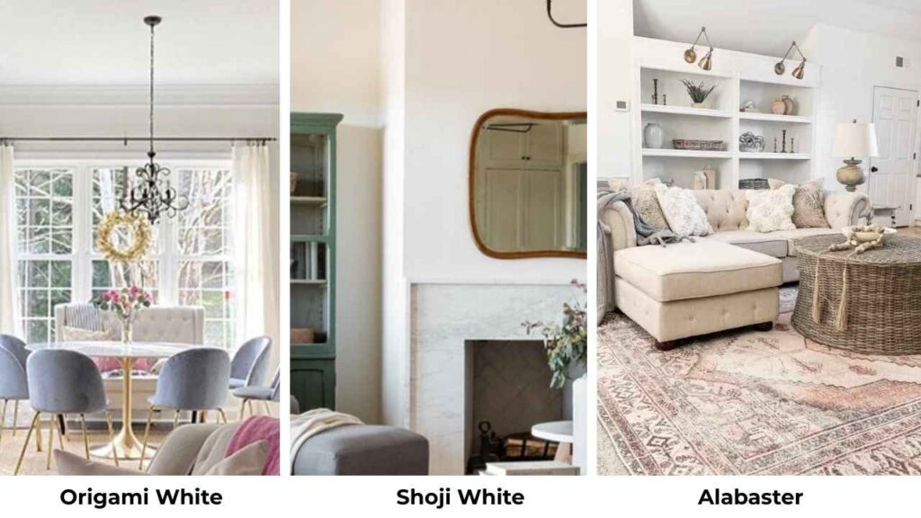
What You Need To Know About Origami White (SW 7636)
Origami White is classified as a warm greige-leaning off-white, but let me tell you what that means in real life.
It has a soft gray base with subtle beige undertones in the background.
The LRV is around 76, which means it reflects a decent amount of light and stays grounded.
When I first used Origami White (SW 7636) in a client’s modern living room, I thought it would read warmer than it did.
The room had north-facing windows, and instead of that soft warmth, it looked gray.
Not bad gray, but cooler than the swatch, when I learned this color is a chameleon.
In bright, south-facing rooms, it is a beautiful, clean neutral.
The thing about Origami White is it doesn’t commit hard to warmth.
It’s pleasant, agreeable, but not making bold statements.
This makes it versatile when you want a neutral backdrop that isn’t creamy or yellow.
I’ve used it in bathrooms with white subway tile, bedrooms with gray bedding, and living rooms where homeowners wanted modern but not cold.
Best uses for Origami White:
- Whole-house color when you’ve got mixed undertones
- Modern and contemporary interiors where fresh matters
- Spaces with natural light that need something softer than pure white
- Exteriors with stone or brick that lean cooler
For trim, I pair Origami White walls with Sherwin-Williams Alabaster or Pure White.
The contrast is subtle but to define the space without that harsh white-on-white look.
And if you’ve light wood floors or gray-toned tiles, this color is beautiful without fighting.
I used Origami White in a bedroom with warm honey oak floors.
The cool-leaning undertones clashed with the warmth, and the room felt disjointed.
What You Need To Know About Shoji White (SW 7042)

Now Shoji White, this one has a personality.
It’s classified as a warm white with subtle gray and greige undertones, and that warmth is visible.
The LRV is around 74, so it’s darker than Origami White and absorbs more light.
It looks softer, cozier, and less stark on the wall.
Shoji White (SW 7042) has this creamy base that gives it flexibility, but also makes it a little unpredictable.
I’ve seen this color shift from a soft white to almost a light greige-taupe depending on what room it’s in.
In the south and west-facing rooms, it glows with this beautiful warmth that feels inviting.
In the north-facing rooms, it can look muddy or look like that taupe.
The undertones here are beige with subtle greige, showing a hint of cream.
I used Shoji White in my own kitchen about three years ago when I was renovating.
The big mistake is, I didn’t test it properly in the lighting. I’d used it in other projects.
My kitchen has these massive west-facing windows, and by late afternoon, the walls looked creamy and almost felt yellow.
But here’s where Shoji White shines, traditional and transitional spaces with warm finishes.
If you’ve got warm wood cabinets, beige stone countertops, or the cozy farmhouse vibe, this color is excellent.
This color is perfect. It doesn’t fight warmth but it embraces it.
Best uses for Shoji White:
- Whole-home color in traditional or transitional styles
- Spaces with warm wood floors, trim, or cabinetry
- Living rooms and bedrooms where you want softness
- Exteriors with warm brick, wood siding, or stone
One thing about Shoji White, if you’re pairing it with cream cabinets, then don’t do it.
The colors are similar in depth and warmth, and everything will be put together into one undefined mess.
If you’ve cream cabinets and want Shoji White walls, you’ll need white trim to create separation.
The beauty of this color is it’s flexible but influenced by everything around it.
Wood finishes, fabric and the color of your furniture can push Shoji White in different directions.
The cream base with subtle red-pink undertones means it picks up surrounding colors like a sponge.
What is the Difference Between Origami White and Shoji White?
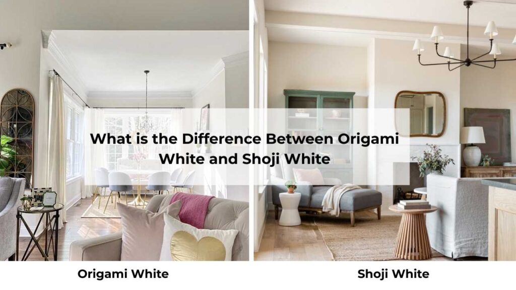
Okay, so they’re both soft whites from Sherwin-Williams, both popular, both used for similar applications, but they’re NOT interchangeable, and here’s why that matters.
The differences seem small like LRV, different undertones, but in real rooms with real furniture and real lighting, these differences matter.
LRV
Light Reflectance Value is the boring topic in paint, but it’s also one of the most important.
Origami White has an LRV of 76, while Shoji White is at 74.
Two points doesn’t sound like much, right but no wrong.
That difference means Origami White reflects light and appears bright, clean, and modern on the wall.
Shoji White absorbs more light, giving it depth and making it feel soft and cozy.
In a bright room, you may not notice the difference.
But in a lower-light space or a room with small windows, then Shoji White can feel dark and heavy.
Both colors fall into the off-white category since they’re below 81-82 LRV threshold where “true whites” live.
This is why both need white trim for contrast.
If you try to use either of these with cream or off-white trim.
Undertones
This is where things get interesting.
Origami White has soft gray with subtle beige undertones.
It’s balanced, neutral, and doesn’t lean hard into warm or cool.
The gray keeps it from reading creamy or yellow, while the beige prevents it from feeling cold.
Shoji White has beige and greige undertones with a cream base and subtle red-pink undertone.
This gives it warmth and makes it more susceptible to shifting based on surroundings.
The red-pink undertones mean Shoji White can pick up warm tones from wood, fabric, and other wall colors.
I learned about that pink undertone in the best way.
Used Shoji White in a bathroom with reddish-pink travertine tile, and the walls looked blush.
Meanwhile, Origami White in the same scenario stayed neutral because the gray undertones counterbalance warm influences.
Lighting Behaviour
Origami White in different lighting:
- Natural daylight (south/west-facing): Appears clean, bright, and neutral with enough warmth to avoid feeling sterile
- Natural daylight (north/east-facing): Gray undertones emerge, can look cool and less inviting
- Warm artificial lighting (LED/incandescent): Maintains neutrality, doesn’t turn yellow or cream
- Cool artificial lighting (fluorescent): Can look a bit gray
Shoji White in different lighting:
- Natural daylight (south/west-facing): Glows warm, can appear creamy or slightly beige
- Natural daylight (north/east-facing): Undertones get muddy, can read as taupe or grayish-beige
- Warm artificial lighting: Gets creamy, more yellow
- Cool artificial lighting: Loses warmth, can look flat or odd
Style and Best Uses
Origami White works best in:
- Modern and contemporary interiors where clean lines matter
- Spaces with mixed undertones
- Rooms where you want brightness without starkness
- Homes with cooler finishes like gray floors, white tile, stainless steel
Shoji White works best in:
- Traditional, farmhouse, and transitional interiors
- Spaces with warm wood, beige stone, or cream elements
- Rooms where coziness trumps crispness
- Homes that embrace warmth throughout
For trim, ceiling, and furniture pairings:
- Origami White walls pair beautifully with Pure White or Alabaster trim
- Shoji White walls need bright white trim like Pure White to avoid blending
- Origami White works with both warm and cool-toned furniture
- Shoji White prefers warm-toned furniture and fabrics
Accent colors:
- Origami White coordinates with grays, soft blues, muted greens, and cool purples
- Shoji White loves warm neutrals, soft beiges, warm grays, and earthy greens
Comparison Table
| Feature | Origami White (SW 7636) | Shoji White (SW 7042) |
| LRV | 76 | 74 |
| Undertones | Soft gray + subtle beige | Beige + greige + cream base |
| Warmth Level | Soft warm-neutral | Noticeably warm |
| Overall Look | Clean, modern, balanced | Cozy, earthy, soft |
| Appears Brighter? | Yes | No, slightly darker |
| Creamy Appearance | No | Sometimes, especially in warm light |
| Best Lighting | Bright, natural light | South/west-facing warm light |
| Best Style | Modern, contemporary | Traditional, transitional, farmhouse |
| Trim Pairing | Alabaster, Pure White | Pure White (needs crisper contrast) |
| Undertone Risk | Can read gray in cool light | Can read creamy/pink in warm light |
Origami White Vs Shoji White: Room-by-Room Suitability
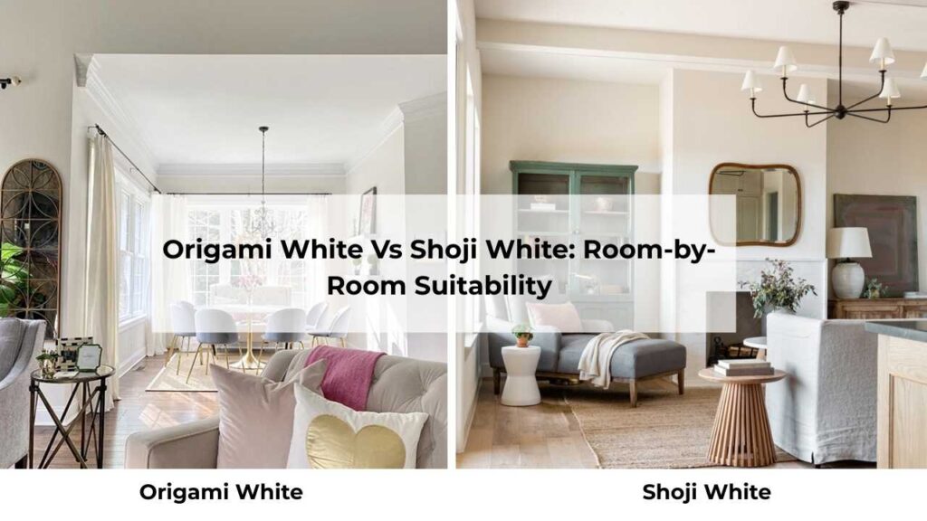
Choosing between these two isn’t about which one you like better on a swatch.
It’s about WHERE you’re using it and what that space needs.
Different rooms have different lighting, different functions, and different vibes.
Let me walk through how each color looks in real spaces.
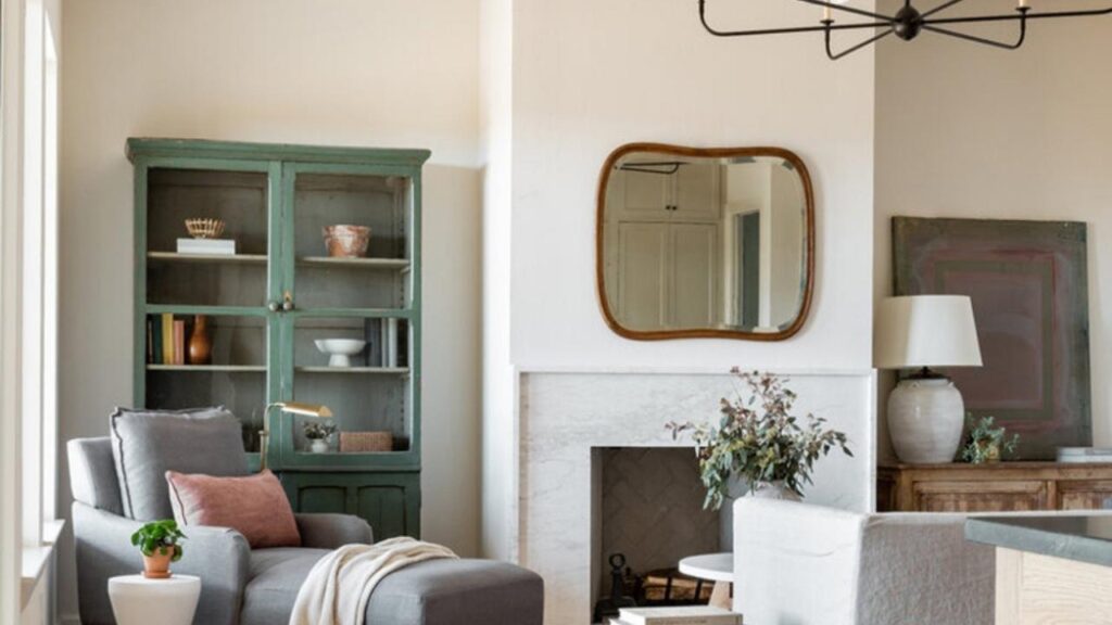
Living Room
Origami White in the living room:
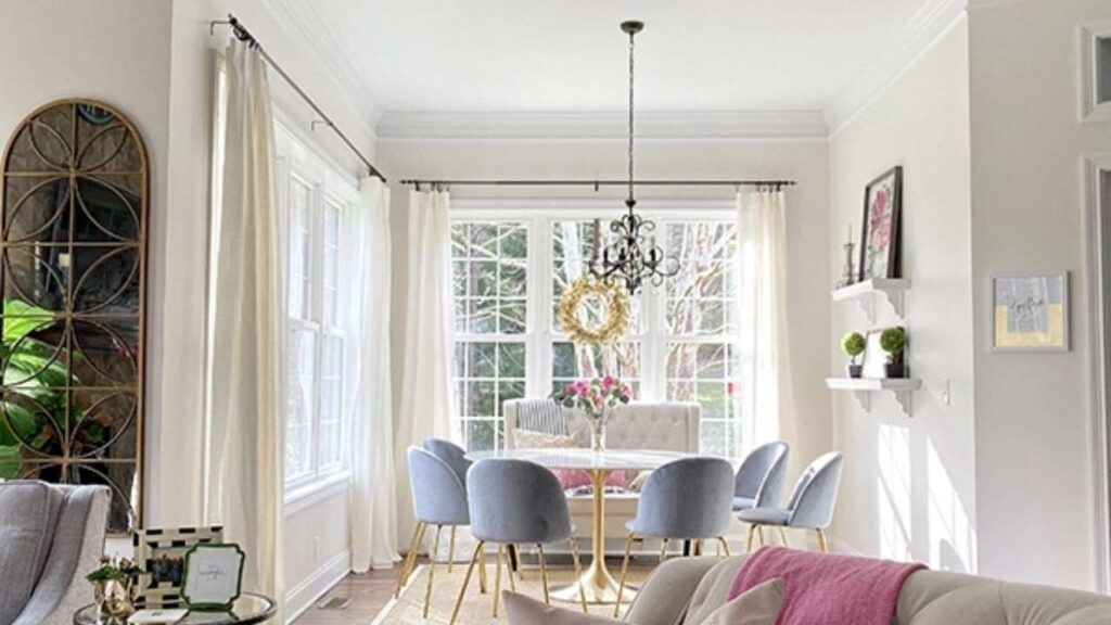
Living rooms need to feel open and clean, mainly in modern or open-concept homes.
Origami White delivers that without feeling cold.
I used this in a living room with gray sectionals, white oak floors, and black metal accents last year.
The color stayed neutral throughout the day, never fighting the cool or warm tones in the room.
Magic happens when you’ve got natural light.
Origami White bounces light around beautifully, making the space feel large and bright.
If your living room is your showpiece, this color keeps things feeling fresh and modern without being boring.
Shoji White in the living room:
If your living room leans traditional or you’ve warm wood furniture, built-ins, or exposed beams, Shoji White is where it’s at.
I’ve used this in living rooms with warm hardwood floors, cream sofas, and wood trim, and it creates a cohesive, cozy feeling.
If your living room has north-facing windows or limited light, Shoji White can look out of place.
I saw this happen in a dark living room with small windows, the walls looked grayish-beige and sad.
Bedroom
Origami White in the bedroom:
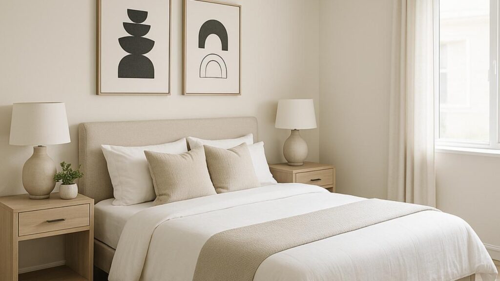
Bedrooms should feel calm and restful. Origami White creates a soft, neutral backdrop that doesn’t impose personality.
I love this in bedrooms where the bedding, art, or furniture is doing the heavy lifting style-wise.
One bedroom I designed had charcoal gray bedding, white furniture, and chrome fixtures.
Origami White on the walls let everything pop without competing.
It’s also great if you like changing your decor because the color doesn’t commit hard to warm or cool.
Shoji White in the bedroom:
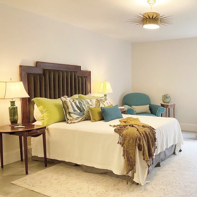
If you want your bedroom to feel warm, Shoji White is what you should consider.
It creates a soft, cozy, almost creamy atmosphere that’s perfect for sleeping.
I’ve used this in primary bedrooms with warm wood furniture, cream bedding, and soft lighting, and it’s felt right.
But here’s my warning: if you’ve bright white bedding or cool-toned furniture, Shoji White walls can look yellowy or cream by comparison.
The contrast becomes unflattering fast.
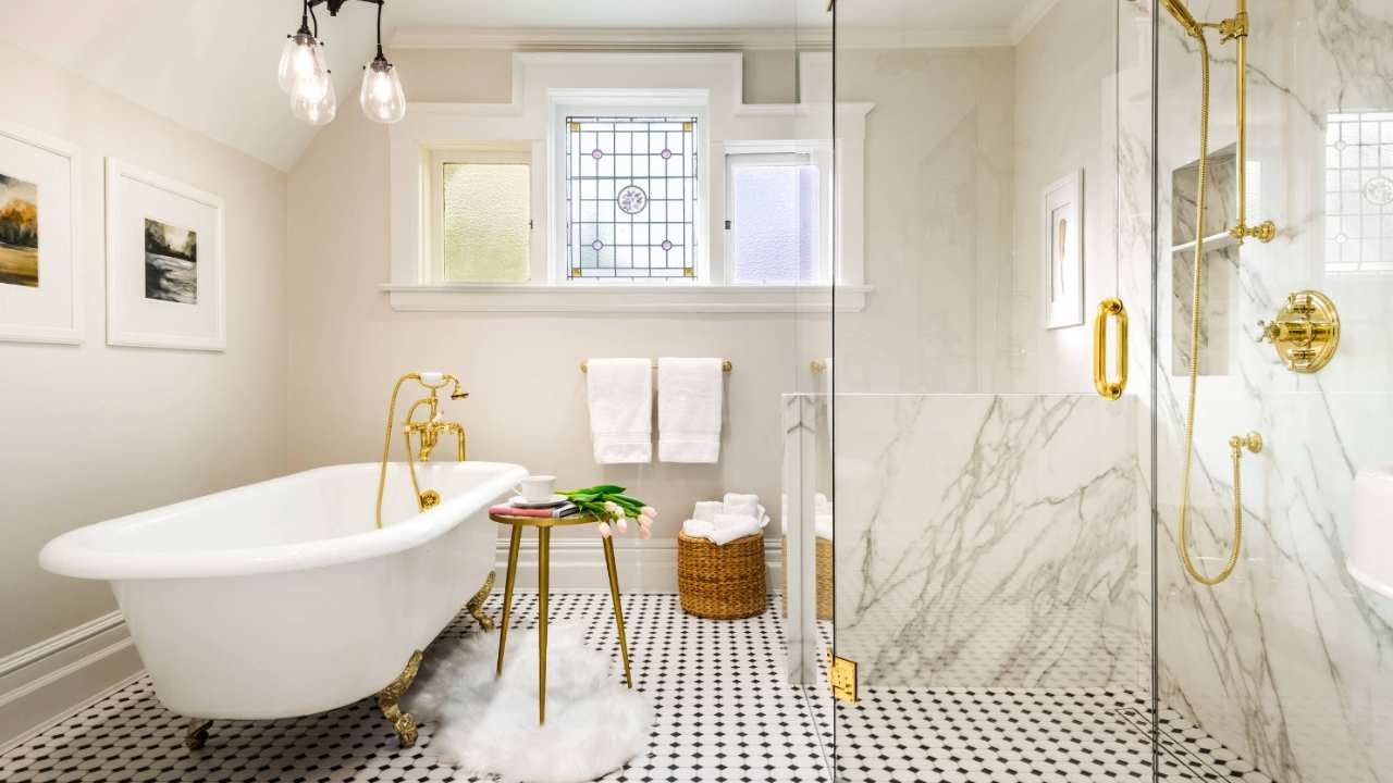
Bathroom
Origami White in the bathroom:
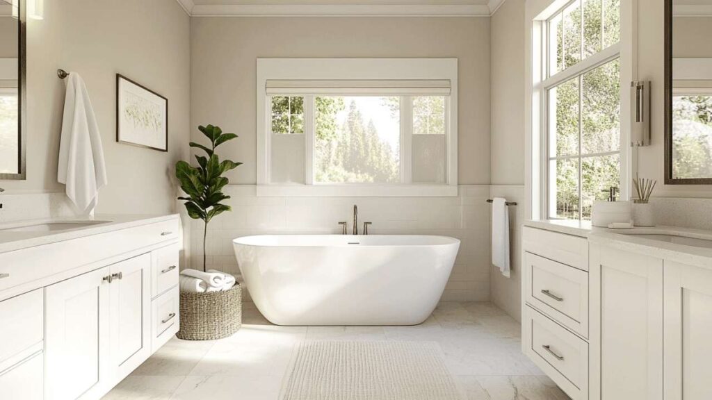
Bathrooms need to feel clean, period.
Origami White delivers that fresh, spa-like quality without being cold.
I’ve used this in bathrooms with white subway tile, gray vanities, and chrome fixtures and it works together.
The bonus with Origami White is it doesn’t yellow or in bathroom humidity the way warmer whites can.
It maintains that clean look when bathroom lighting tries to sabotage it.
Shoji White in the bathroom:
If your bathroom has warm wood cabinets, beige tile, or travertine anything, Shoji White creates this soft, warm environment that feels less clinical.
I used this in a powder room with warm wood floating vanity and brass fixtures. Perfection.
Just watch out if you have white tile or fixtures, Shoji White walls will make your bright white tub or sink look white by comparison, and not always in a good way.
Sometimes that contrast feels off.
Kitchen
Origami White in the kitchen:
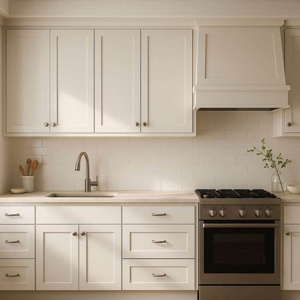
Kitchens get complicated because there’s so much going on like cabinets, countertops, backsplash, flooring.
Origami White works great in modern kitchens with white or gray cabinets, if you’ve got stainless appliances and cooler-toned countertops like white quartz or marble.
I painted a kitchen with white shaker cabinets, gray quartz counters, and subway tile backsplash in Origami White, and it created a clean, cohesive look.
Shoji White in the kitchen:
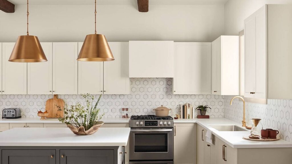
If your kitchen has warm wood cabinets like oak, maple, cherry, then Shoji White is the better choice.
The warmth coordinates instead of clashes.
But do NOT use Shoji White if you have cream cabinets.
The colors are too similar, and you’ll lose all definition.
I made this mistake once.
The kitchen with cream shaker cabinets, Shoji White walls, couldn’t tell where cabinets ended and walls began.
Exterior
Origami White on the exterior:
Exteriors are tricky because outdoor lighting is different.
Origami White works well on exteriors with stone, brick, or siding in cool tones.
The LRV of 76 means it’s bright without being white, and the subtle gray undertones keep it from looking cream or yellow in full sun.
I used Origami White on a modern farmhouse exterior with black windows and gray stone.
It is stunning. It felt fresh and current without being trendy.
Shoji White on the exterior:
Shoji White on exteriors works when you’ve got warm brick, wood siding, or stone with warm undertones.
It creates a soft, approachable look that’s less modern and more traditional.
But Shoji White can look cream or yellow on exteriors in bright afternoon sun.
If that bothers you, test it on a large section of your exterior wall and look at it at different times of day.
Origami White Vs Shoji White Vs Other Colors
Let’s be real, you’re not just comparing these two colors but now you’re more confused than when you started.
Let me break down how Origami White and Shoji White look up against other popular Sherwin-Williams and Benjamin Moore) whites.
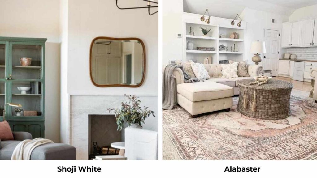
Origami White Vs Alabaster
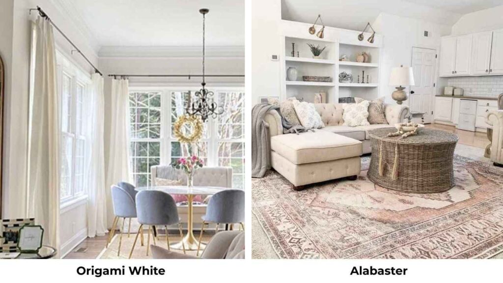
Alabaster (SW 7008) is the golden child of Sherwin-Williams whites.
Everyone loves it, uses it, and recommends it.
But how does it compare to Origami White?
Alabaster is warm, creamy, and has more yellow undertones.
It has an LRV of 82, making it a true white, while Origami White at 76 is an off-white.
If you put them side by side, Alabaster looks bright and traditional, while Origami White looks soft and neutral.
I use Alabaster for trim when the walls are Origami White.
The combination works beautifully.
Origami White Vs Greek Villa
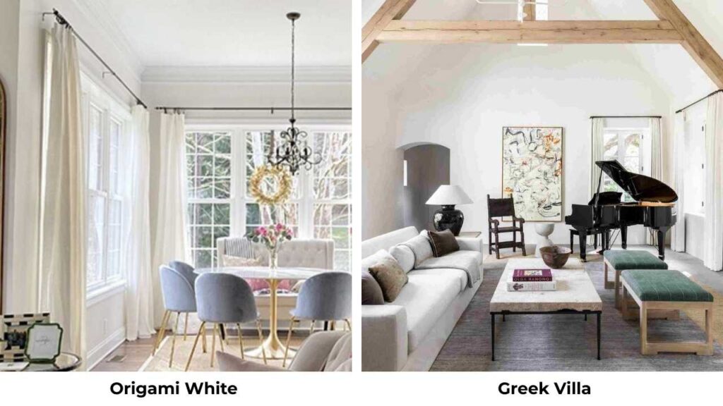
Greek Villa (SW 7551) is cooler than Origami White and has visible gray undertones.
It’s slightly brighter. If Origami White is warm-neutral, Greek Villa is cool-neutral.
Choose Greek Villa if you want something contemporary and less warm.
Choose Origami White if you need the subtle warmth without going full cream or beige.
Aesthetic White Vs Shoji White
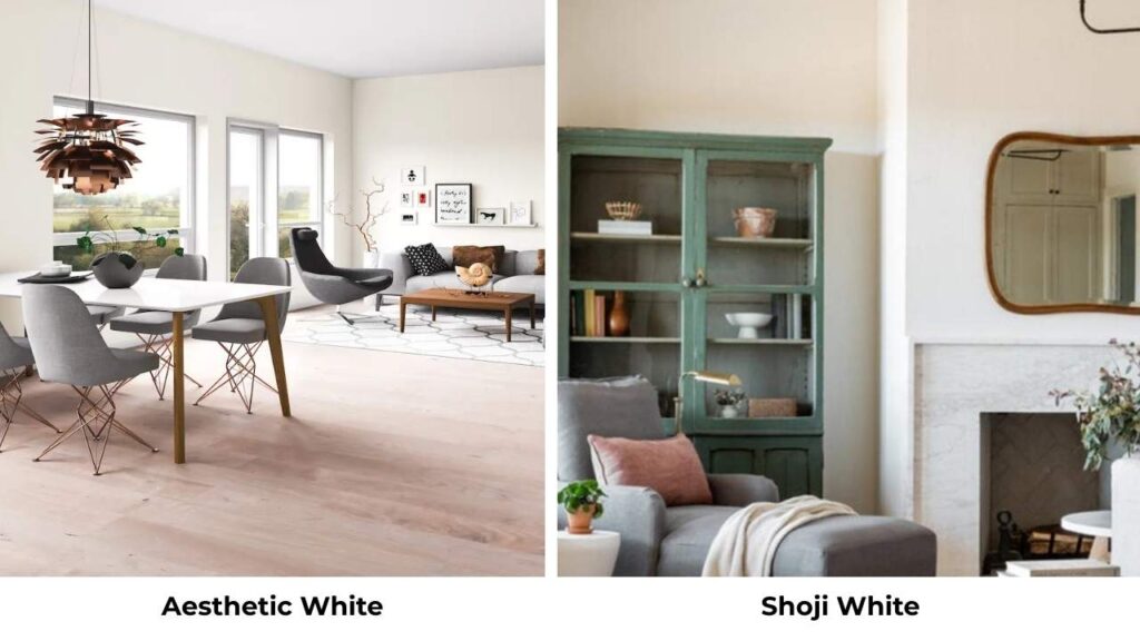
Aesthetic White (SW 7035) is a touch darker and beige than Shoji White.
Both have that greige-leaning quality, but Aesthetic White commits to the beige side.
If Shoji White feels too light or not warm, try Aesthetic White.
If Aesthetic White feels too dark or too beige, Shoji White is what you should consider.
Origami White Vs Aesthetic White
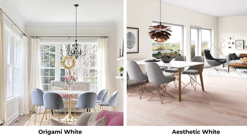
This is interesting because Aesthetic White is visibly warmer and beige than Origami White.
If you’re comparing these two, you’re trying to decide how much warmth you want.
Origami White = subtle warmth with gray balance
Aesthetic White = noticeable warmth with beige commitment
I’ve used both in the same house, Origami White in main living areas for brightness and neutrality, Aesthetic White in a cozy area where more warmth was welcome.
Shoji White Vs Swiss Coffee
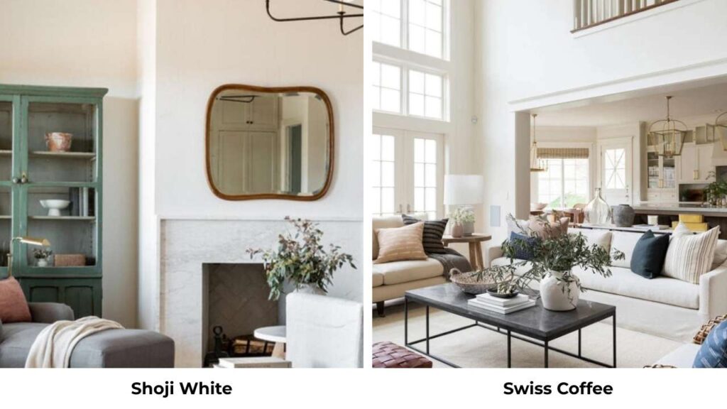
Swiss Coffee (SW 6357) is warmer, creamy, and yellow than Shoji White.
It’s also slightly darker.
Both have a soft, warm quality, but Swiss Coffee is more traditional-feeling.
If you love the warmth of Shoji White but want MORE warmth, go Swiss Coffee.
If Swiss Coffee feels too yellow or cream, Shoji White is the better choice.
Shoji White Vs Alabaster
Alabaster is bright (LRV 82 vs 74) and has less gray in the undertones compared to Shoji White.
Alabaster is a true white with warm undertones, while Shoji White is an off-white with greige-beige undertones.
For trim: use Alabaster
For walls in traditional spaces: use Shoji White
Don’t use them together on walls and trim because they are similar in warmth.
Natural Choice Vs Shoji White
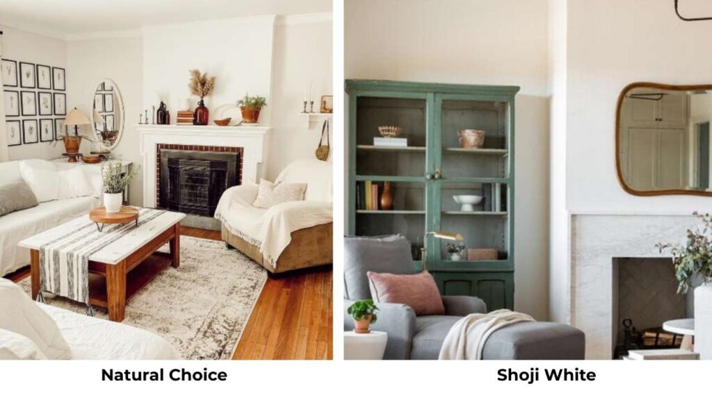
Natural Choice (SW 7011) is very similar to Shoji White but can lean slightly green in certain lighting.
Both are warm off-whites with similar depth, but that potential green undertone in Natural Choice makes me reach for Shoji White more often.
If you’ve tested Natural Choice and see green, switch to Shoji White.
The greige undertones won’t do that to you.
Pure White Vs Shoji White
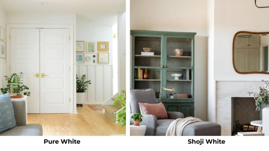
Pure White (SW 7005) is a soft white with gray-violet undertones and an LRV of 84.
It’s a true white, bright and fresher than Shoji White.
These aren’t competitors but they’re partners.
Pure White makes excellent trim for Shoji White walls because it provides the contrast needed without being harsh white.
SW Shoji White Vs White Duck
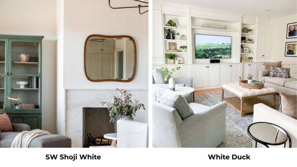
This is the closest comparison.
White Duck (SW 7010) has the same LRV of 74 as Shoji White, but it lacks the red-pink undertone. White Duck is neutral and less likely to shift warm in lighting.
If you like Shoji White but worry about it looking too creamy or picking up pink tones, try White Duck.
If you WANT the warmth and flexibility, go with Shoji White.
Comparison Table: Origami White & Shoji White Vs Others
| Color | LRV | Undertones | Compared to Origami White | Compared to Shoji White |
| Origami White | 76 | Gray + beige | — | Cooler, brighter, less warm |
| Shoji White | 74 | Beige + greige + cream | Warmer, softer, more depth | — |
| Alabaster | 82 | Warm cream-yellow | Warmer, brighter, more traditional | Much brighter, true white vs off-white |
| Greek Villa | 78 | Cool gray | Cooler, more gray | Much cooler, less warm |
| Aesthetic White | ~72 | Warm beige-greige | Warmer, darker, more beige | Slightly darker, more beige |
| Swiss Coffee | ~71 | Warm cream-yellow | Much warmer, creamier, darker | Warmer, more cream, more traditional |
| Natural Choice | 74 | Warm beige (potential green) | Warmer, similar depth, green risk | Same depth, potential green cast |
| Pure White | 84 | Soft white, gray-violet | Much brighter, true white, trim option | Much brighter, crisp contrast, trim option |
| White Duck | 74 | Neutral warm white | Slightly warmer but more neutral | Same depth, less red-pink, more neutral |
Conclusion
So after all this, which one should you choose between Origami White Vs Shoji White, so it depends on what your space needs, not which color is “better.”
Choose Origami White when you want clean, modern, and balanced.
When your space has mixed undertones and you need something that plays nice with both warm and cool elements.
When brightness matters, you can’t risk a color looking dingy or cream.
Choose Shoji White when you want warmth and coziness.
When your space has warm wood, beige stone, or traditional finishes that need a color partner, not a competitor.
When you’re okay with a color that shifts and adapts based on lighting because that flexibility feels lived-in and real.
Both colors are beautiful.
Both work in many applications.
But they’re NOT the same, and pretending to be subtle differences.
My advice is to get the peel-and-stick samples, put them on your walls, and live with them for a few days.
Look at them in morning light, afternoon light, evening light.
And whichever color goes the best will work for the space.
FAQs On Origami White Vs Shoji White
The main differences are LRV and undertones. Origami White (SW 7636) has an LRV of 76 with gray and subtle beige undertones, making it bright and neutral. Shoji White (SW 7042) has an LRV of 74 with beige, greige, and cream undertones, making it warm and dark. Origami White is clean and modern.
Shoji White is popular because it’s a warm, versatile off-white that works in traditional, farmhouse, and transitional interiors. The LRV of 74 gives it depth to feel soft without being dark, and the warm undertones coordinate with wood finishes, beige stone, and warm-toned interiors.
Shoji White is not yellow, but it can be creamy or have a yellow cast in some lighting conditions, mainly in south or west-facing rooms with warm natural light or under warm artificial lighting. The cream base and warm undertones can appear yellow depending on surrounding colors and finishes.
Shoji White (SW 7042) is classified as a warm off-white paint color with a cream base and subtle beige, greige, and red-pink undertones. It is in the off-white category with an LRV of 74, making it soft and less bright than true whites.
Origami White pairs well with both warm and cool accent colors due to its balanced undertones. Great pairings include soft grays, muted blues, sage greens, warm beiges, and even cooler purples. For trim, use Alabaster or Pure White. For furniture, both warm wood tones and cooler gray or black pieces work beautifully.