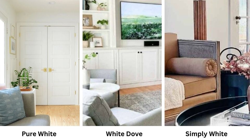
Sherwin Williams Pure White and Benjamin Moore White Dove, both are whites, both considered “safe” choices, and both are popular, but they’re NOT the same.
Not close when you see them on walls next to each other. Pure White is that color who gets along with everyone.
White Dove is the one who’s slightly warmer, a bit more approachable, but versatile.
Choosing between these two soft whites can make or break a room. I learned this when I spec’d Pure White for a north-facing bedroom and the homeowner called me back saying it felt cold.
We ended up repainting with White Dove and the room felt like you could breathe in it. Both are soft whites, but they behave differently when they’re on the walls.
The wrong white can make your space feel cold, uninviting and uncomfortable.
So, we’re going in depth for pure white vs white dove colors, their LRV, undertones, how they react to different lighting and which rooms they work in.
I’ll show you some comparisons with other popular whites like Simply White and Alabaster because you’re considering them too.
Here are my other blogs that you can also read:
- Eider White Vs Alabaster
- Simply White Vs Alabaster
- Oyster White Vs Shoji White
- Perfect Greige Vs Agreeable Gray
- Hunter Green Vs Emerald Green
Color Overview of Sherwin Williams Pure White (SW 7005)

Pure White is in a spot that I wish more paint colors can achieve. It has an LRV of 84, which puts it in the soft white category, not too bright, not veering into off-white territory.
When I first started using Pure White, I was skeptical because of another white. But I tested it in my own kitchen first and I saw the change.
The undertone is where Pure White gets interesting. It has a subtle warm-neutral base with a hint of yellow and a bit of gray.
I’ve put it next to true whites and you can see it’s soft. But putting it next to creamy whites like Alabaster and Pure White looks cool. It’s a chameleon.
What I love about Pure White is it looks yellow or creamy even in spaces with warm lighting.
I used it in a client’s living room that had southern exposure and warm afternoon light pouring in and it looked clean. But in a north-facing bathroom it worked and felt fresh, not cold.
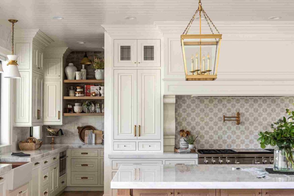
Designers love this color for everything like walls, trim, cabinets, exterior. I’ve used it on kitchen cabinets with white quartz countertops and it works.
The subtle warmth coordinates with the quartz without creating a yellow cast. For bedrooms, it’s clean to feel restful but has warmth. I’ve seen it on exteriors too like modern farmhouses, traditional colonials and contemporary.
The big mistake I made with Pure White is using it in a room with creamy beige existing trim.
The homeowners didn’t want to repaint all their trim and Pure White on the walls made their cream trim look dingy and yellow.
We had to switch to something warm. Pure White needs neutral or cool companions.
Color Overview of Benjamin Moore White Dove (OC-17)
White Dove is the paint color equivalent of the person everyone likes. It has an LRV of 83.16 which is the same as Pure White’s 84, so they have the same depth.
White Dove has a soft, creamy quality with subtle gray undertones, and this is what we call greige.
I bought a sample of White Dove for a home repaint project. The house had existing warm oak floors and the homeowners wanted white walls but were terrified of it looking too cold.
White Dove was perfect. In natural light, it looked soft and welcoming. In artificial light at night, it maintained warmth without looking yellow.
White Dove in different lighting is consistent. In the north-facing rooms, it warms it up. South-facing spaces with sun, it looks balanced and doesn’t look yellow.
The greige undertone appears more. The gray keeps it from getting too cream-puff, and the warmth prevents it from feeling flat.
White Dove is THE most popular color from Benjamin Moore’s palette. I’ve used it on walls, trim, kitchen cabinets, bathroom vanities, and exterior shingles.
It’s less yellow than you’d think when you look at the paint swatch. When it’s on the wall, it looks like a soft, approachable white.
Where does White Dove shine? Spaces with mixed warm and cool elements. I had a client with cool gray tiles in the bathroom but warm brass fixtures. White Dove fills the gap.
It’s also phenomenal in home applications where you want ONE white. I did an entire house on walls, trim, doors, everything and in White Dove, it looked expensive and cohesive.
Pure White Vs White Dove: Key Differences
So here’s where we get into what makes Pure White Vs White Dove different.
People think they’re the same because they’re both soft whites with the same depth, but put them on boards next to each other and you’ll see they’re different.
I’ve learned that understanding these differences will help you in a big way. Let me break down what separates these two.
LRV
Light Reflectance Value is how much light a color throws back. The scale runs 0 to 100, pure black is 0, pure white is 100.
Pure White has an LRV of 84. White Dove is at 83.16. So they’re identical in depth and brightness.
Here’s why this matters, both colors will make rooms feel open and bright but won’t have the harsh, blinding effect you get from true whites like Chantilly Lace or High Reflective White.
Undertones
Pure White has a warm-neutral undertone, a subtle yellow with a bit of gray. It’s balanced and it works with both warm and cool palettes. White Dove is warm with the greige, gray with warmth and creamy.
When I hold paint samples of both colors next to each other, White Dove looks warm and more creamy. Pure White looks clean, neutral.
Neither one is cool though. If you want a cool white, you’re looking at something like Decorators White or Extra White.
Lighting Affect
Lighting is EVERYTHING with white paint. Pure White stays consistent across different lighting conditions.
In north-facing rooms with the cool, gray light, it maintains its clean appearance without going flat. In south-facing rooms with warm afternoon sun, it doesn’t turn yellow.
White Dove warms up spaces, which is why it’s phenomenal in north-facing rooms. The cool light doesn’t make it look dingy or gray and it balances nicely.
But in warm, south-facing rooms, you may see the creaminess coming.
Artificial lighting matters too. LED lights look cool. White Dove under LED lighting at night maintains warmth, which creates a cozy vibe. Pure White under LEDs stays fresh and clean.
Style and Best Uses
Pure White works beautifully for modern and transitional styles where you want clean lines without harsh coldness.
I use it for trim work when walls are a different color because it provides contrast without being aggressive. It’s my go-to for cabinets when there are white quartz counters involved.
White Dove excels in traditional and transitional spaces where warmth is important. It’s perfect for home color schemes where everything is the same white like walls, trim, ceilings, doors.
The subtle warmth makes this approach feel cohesive. For furniture and accent colors, both whites are flexible.
White Dove plays well with warm woods, brass fixtures, and beige-greige tones. Pure White pairs nicely with both warm and cool accent colors.
| Factor | Pure White (SW 7005) | White Dove (BM OC-17) |
| LRV | 84 | 83.16 |
| Undertone | Warm-neutral, subtle yellow + gray | Warm greige, creamy with gray |
| Temperature | Balanced neutral | Warm |
| Best Lighting | Works in all exposures | Excellent in north-facing rooms |
| Style Match | Modern, transitional, contemporary | Traditional, transitional, cozy modern |
| Best For | Trim, cabinets, versatile walls | Whole-home color, walls, warm spaces |
| Pairs With | Both warm and cool palettes | Warm woods, brass, greige tones |
Pure White Vs White Dove: How Each Color Looks In Home
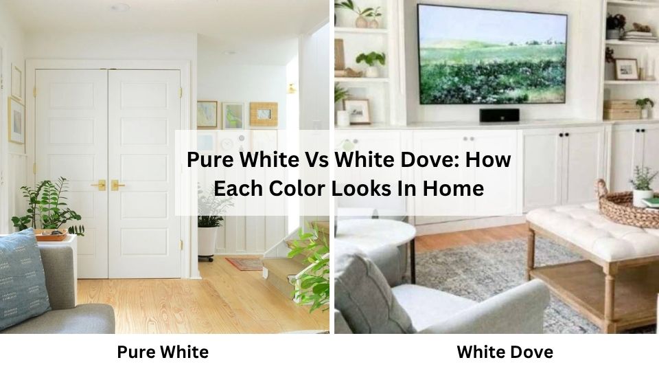
So let’s get real about how these colors perform in different rooms. I’ve used both of these whites in every space, sometimes nicely, sometimes not so much.
The thing is, white paint doesn’t exist in a vacuum. How it looks depends on the lighting, the size of the room, what finishes you have, and the vibe you’re going for.
Living Room
Pure White in a living room is foolproof if you’ve good natural light and you’re going for a fresh, clean aesthetic.
I used it in a client’s south-facing living room with large windows and it stayed beautifully neutral. Morning light, afternoon light, evening, it stayed clean.
The room had cool gray floors and a mix of warm and cool furniture, and Pure White worked as a perfect backdrop.
It made the space feel large and bright without being cold. It is great for modern or transitional living rooms where you want the furniture and art to shine.

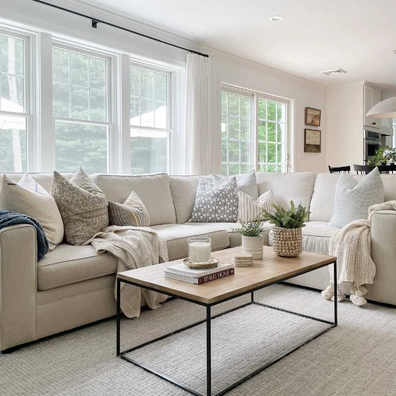
White Dove in a living room creates a cozy, lived-in feeling. I did a whole living room in White Dove like walls, trim, everything for a client who had a north-facing space.
The room could have easily felt cold and unwelcoming, but White Dove’s warmth transformed it. It felt like a room you wanted to spend time in.
The subtle creaminess paired nicely with the warm leather sofa and oak coffee table.
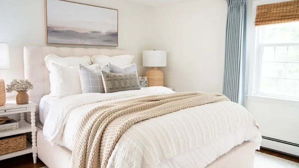
Bedroom
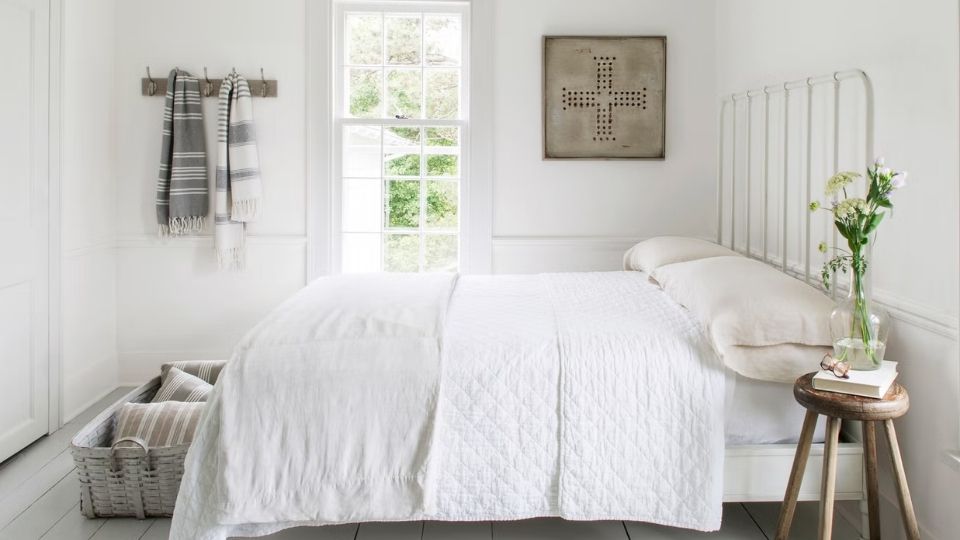
Pure White in bedrooms is clean and restful, it has the spa-like quality. I painted my own bedroom Pure White because I wanted it to feel serene and uncluttered.
It’s an east-facing room so I get nice morning light, and Pure White shines in the morning. At night with warm bedside lamps, it doesn’t fight the lighting, it stays neutral.
Perfect if you’re going for the modern, minimalist bedroom vibe. The subtle warmth means it’s not cold like some bright whites.
White Dove in the bedroom is warm. I’ve used it in many bedrooms, and clients always tell me how much they love waking up in the space.
It’s soft, it’s warm, it feels cozy without being dark. I did a west-facing bedroom in White Dove and in the evening with the warm sunset light coming, it was beautiful.
If you want your bedroom to feel like a retreat, White Dove is the best to consider. It works well with layered bedding, warm wood furniture, and soft textiles.
Bathroom
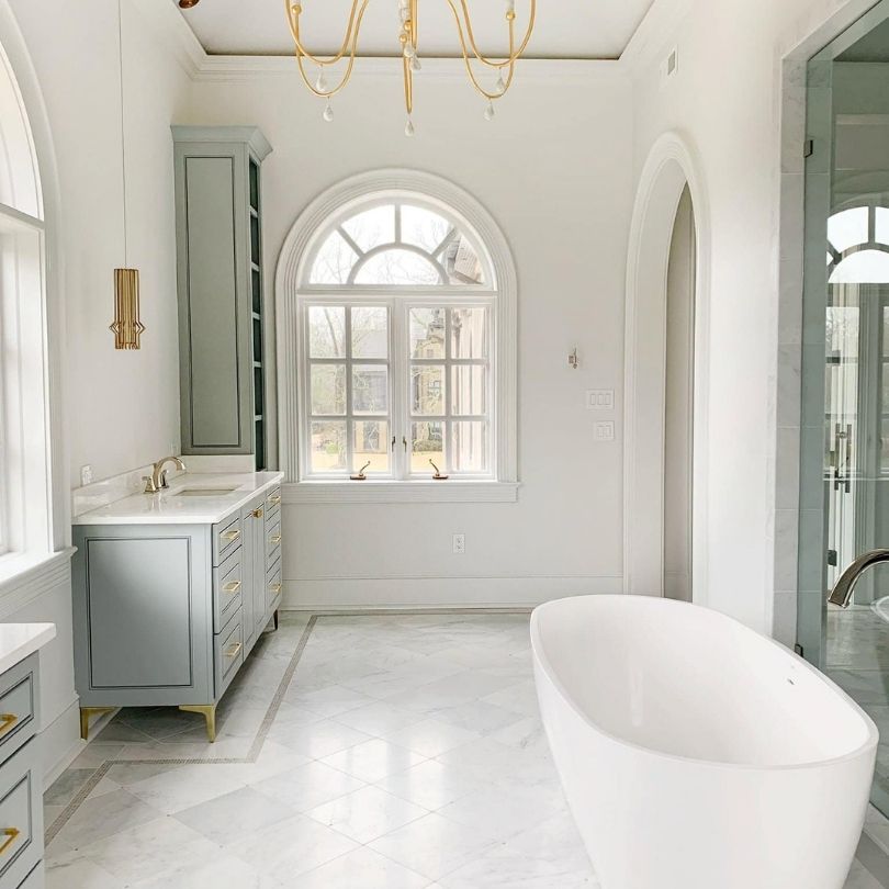
Pure White in bathrooms is fresh and spa-like. I used it in my own master bathroom which has white marble tiles and it’s perfect.
The room feels bright, clean, and expensive. Pure White doesn’t compete with shiny chrome fixtures or white counters. It provides a clean backdrop.
If you’ve good lighting in your bathroom, Pure White will make the space feel large and bright. It is great for modern bathrooms or small bathrooms that need to feel spacious.
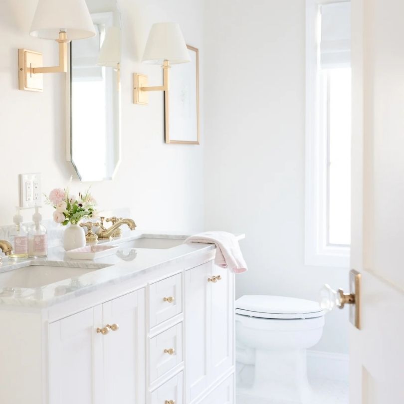
White Dove in bathrooms creates warmth which can be nice depending on what you’re going for.
I did a small powder room in White Dove with warm brass fixtures and marble-look tiles, and the warmth of the paint made the space feel inviting instead of cold.
BUT – and this is important – I’ve also used White Dove in bathrooms where it felt slightly off because everything else was very cool-toned.
If you have cool gray tiles and chrome fixtures, White Dove might feel too warm. But if you’re mixing in brass, warm woods, or beige-ish tiles, White Dove is lovely.
Kitchen
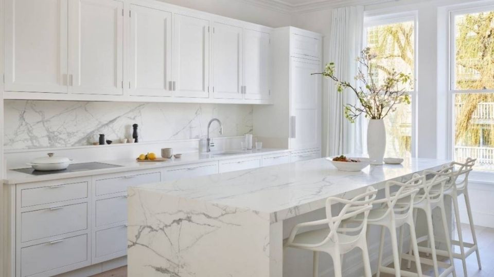
Pure White for kitchen cabinets is the best, if you’ve white quartz counters or marble. I’ve done many kitchens with Pure White cabinets and white counters, and it’s always clean and timeless.
The subtle warmth of Pure White coordinates with white countertops without looking yellow or dingy. It’s also bright because it reflects light, which makes kitchens feel open.
On walls, Pure White works if you want the kitchen to feel fresh and clean. I used it on walls in a kitchen with wood cabinets and it provided nice contrast without being harsh.
White Dove in kitchens is warm and inviting. I did a full kitchen in White Dove cabinets with marble counters that had warm veining, and it was stunning.
The creaminess of White Dove looks well with the warm marble tones. On kitchen walls, White Dove creates a soft backdrop that feels less cold than bright whites.
If your kitchen has warm wood floors or you’re using brass hardware, White Dove ties everything together.
Exterior
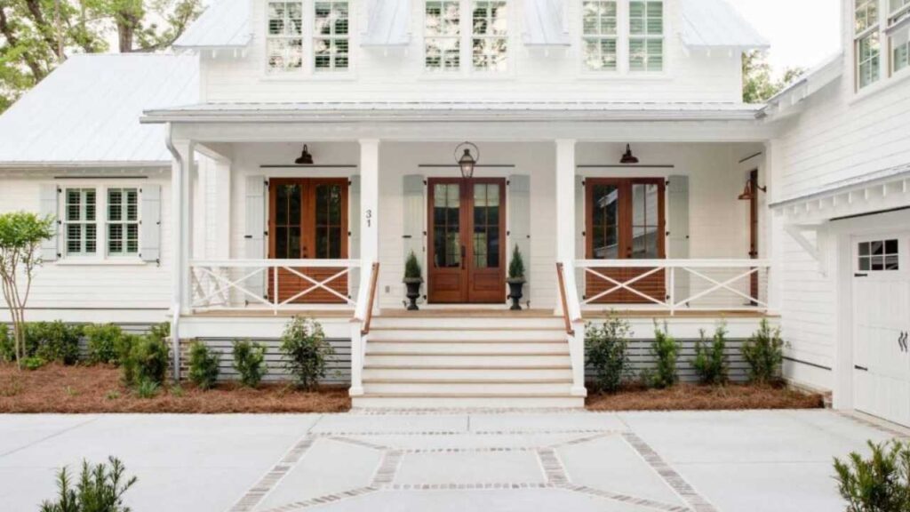
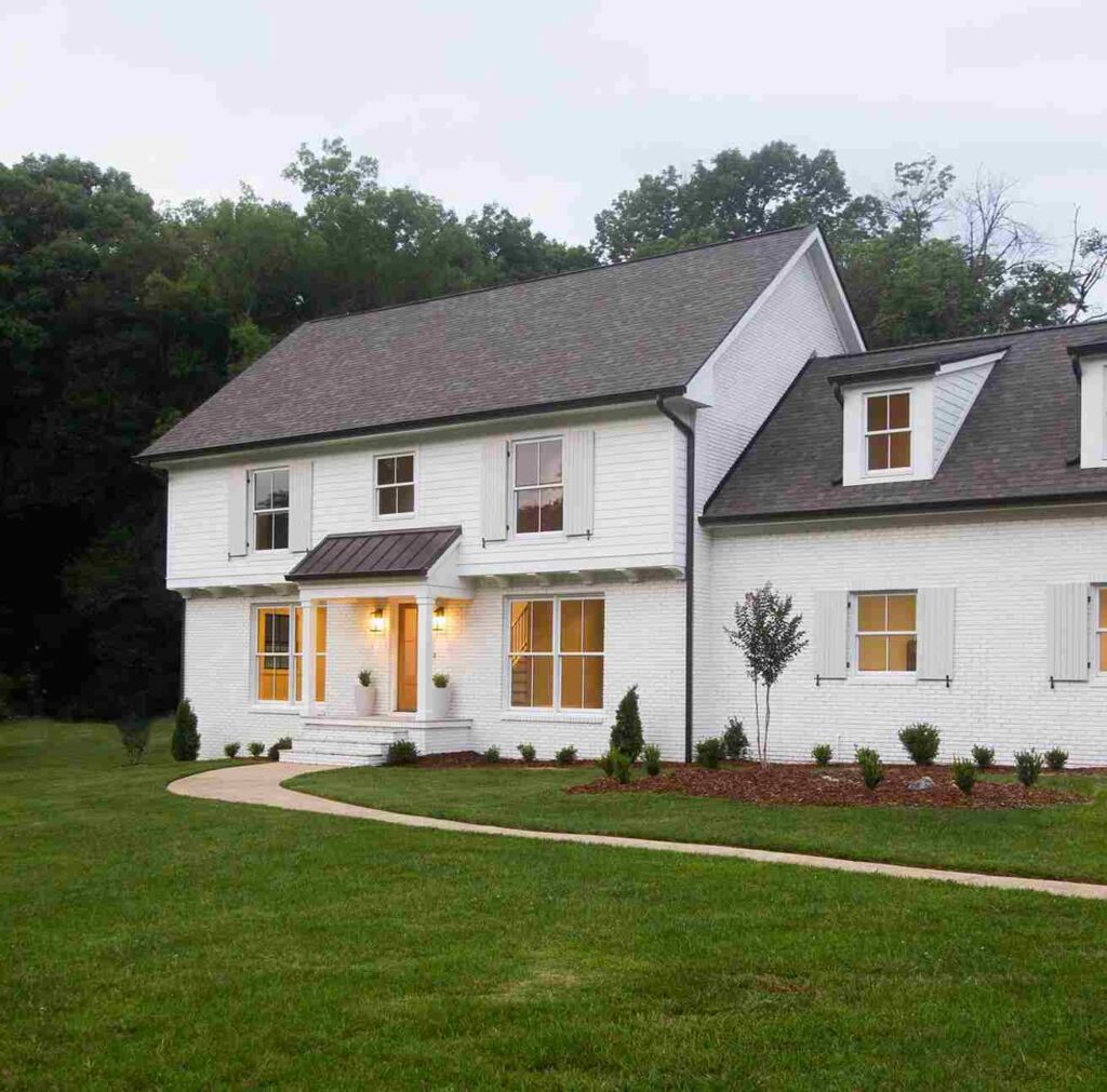
Pure White on exteriors is clean, classic, and adaptable across different architectural styles. I’ve seen it on modern farmhouses with black trim and it was stunning, on traditional colonials it looked beautiful.
Even contemporary homes with windows, it works. The balanced undertone means it doesn’t look yellow or cream on the outside, which can happen with warm whites in direct sunlight.
It stays looking white. Pure White is great if you’ve mixed materials on your exterior like brick, stone, siding.
White Dove on exteriors provides the soft, welcoming look that’s gorgeous on traditional homes.
I drive by a house in my neighborhood that’s painted White Dove with black shutters and it looks expensive and classic.
The warmth of White Dove softens the exterior without looking cream or beige. It’s beautiful on cottage-style homes, Cape Cods, or any traditional architecture.
I’ve also seen it in modern homes where the warmth felt intentional and cozy. White Dove on the exterior works best when you want a soft, less harsh white presence.
Pure White Vs White Dove Vs Other Colors
So, you’re also looking at other whites because that’s how this works. You start with two options and you’re comparing different whites and questioning your choices.
I’m going to walk you through how Pure White and White Dove look against some other popular whites. These comparisons come up in my work, and understanding these differences is important.
Pure White Vs Simply White
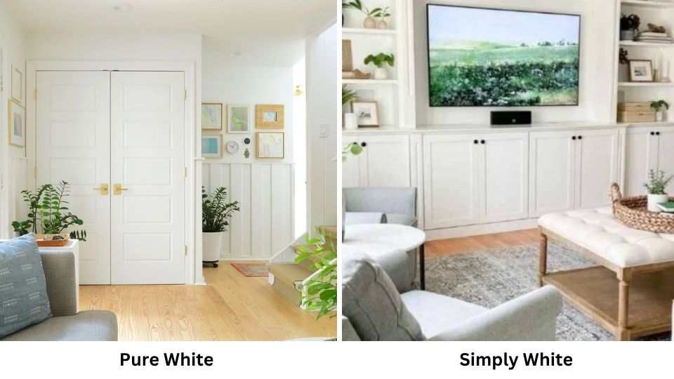
Simply White is brighter than Pure White. We’re talking an LRV of 91 compared to Pure White’s 84.
Simply White also has a stronger warm yellow undertone which becomes important in warm lighting or south-facing rooms.
I used Simply White on trim in a south-facing room and it looked yellow.
Pure White is neutral and balanced. If you want brightness but not the yellow, stick with Pure White.
Simply White works beautifully in spaces with cool lighting or when you want the warm, fresh look.
Pure White Vs Chantilly Lace
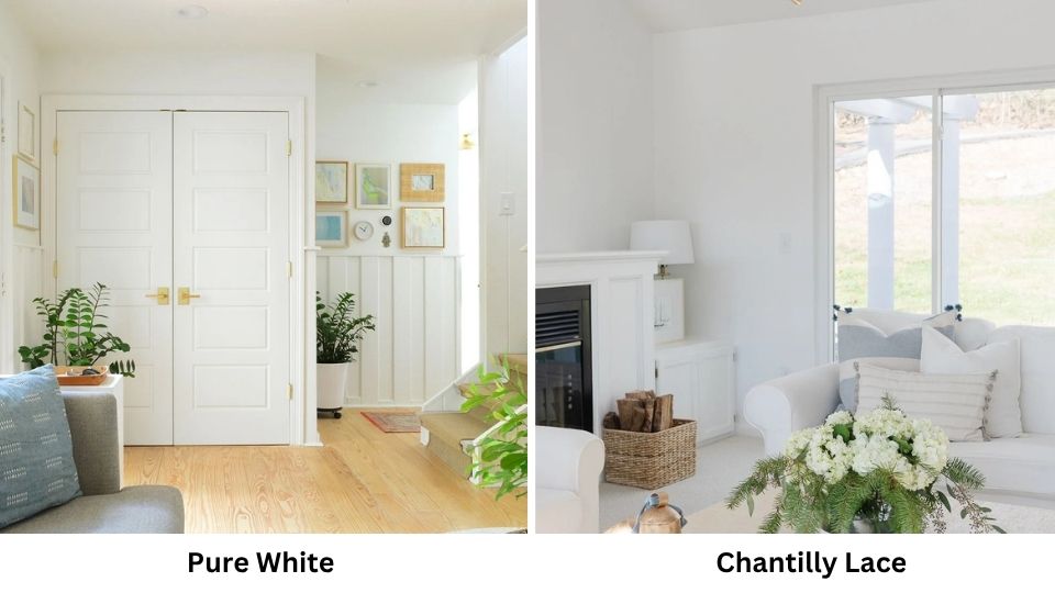
Chantilly Lace is one of the bright whites you can use with an LRV of 90. It’s a true white without warmth.
Next to Pure White, Chantilly Lace looks harsh and bright while Pure White looks soft and approachable.
I use Chantilly Lace for trim when I want contrast or for modern spaces that need the fresh, clean look.
Pure White is soft and warm. If you like the idea of brightness but Chantilly Lace feels too intense, Pure White is your middle ground.
Chantilly Lace can feel cold in some spaces, while Pure White maintains balance.
Alabaster Vs White Dove
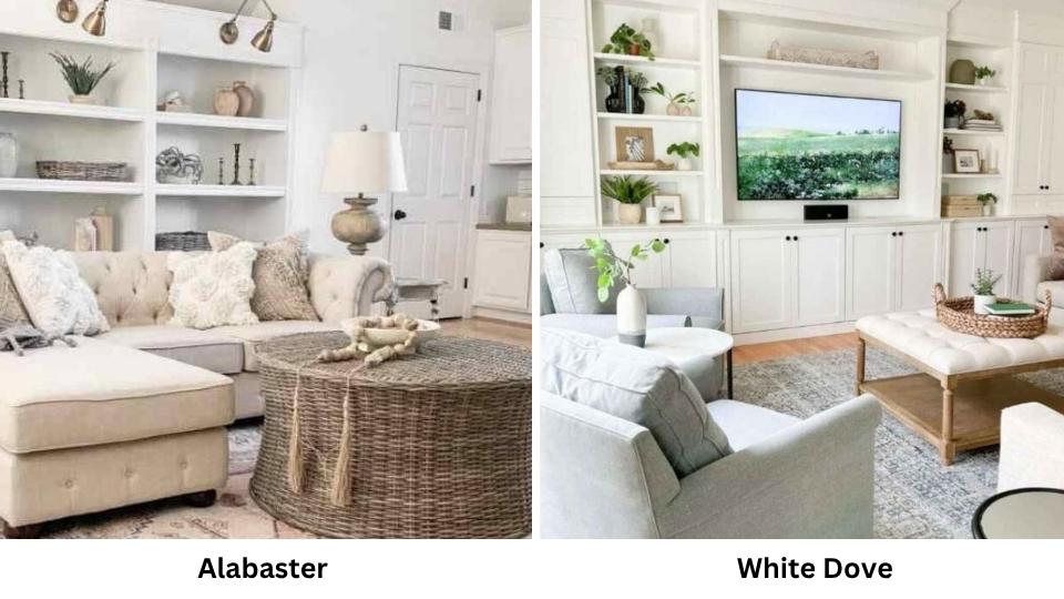
This comparison comes up ALL the time because both are warm whites that people love. Alabaster is warm and creamier than White Dove, it has an LRV of 82 and is closer to the off-white category.
Alabaster has yellow-beige in it. White Dove is warmer than neutral but less creamy than Alabaster.
I’ve used both. Alabaster is phenomenal when you want warmth like cozy bedrooms, spaces with lots of warm wood and traditional homes.
White Dove is versatile and works in both warm and cool settings. If you’re nervous about a white looking too cream, White Dove is safe. If you want the cozy, slightly creamy look, go with Alabaster.
Dover White Vs White Dove
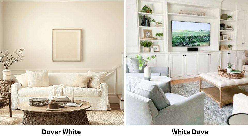
Dover White is soft and warmer than White Dove, similar to Alabaster. Dover White has a low LRV and cream influence. It’s beautiful but looks as a warm white, almost off-white depending on lighting.
White Dove is between Dover White’s warmth and cool neutrals. Dover White is great for warm, cozy, traditional spaces.
White Dove gives you warmth but maintains versatility. I reach for White Dove more because it works in many situations.
| Comparison | LRV | Undertone | Warmth Level | When to Choose |
| Pure White | 84 | Warm-neutral, subtle yellow+gray | Balanced | Versatile spaces, modern/transitional styles |
| Simply White | 91 | Strong warm yellow | Warm | Bright spaces, warm-focused designs |
| Chantilly Lace | 90 | True white, minimal warmth | Cool-neutral | Modern spaces, high contrast needed |
| White Dove | 83.16 | Warm greige | Warm | Whole-home color, cozy spaces, traditional styles |
| Alabaster | 82 | Warm beige-yellow | Very warm | Cozy traditional spaces, warm palettes |
| Dover White | ~83 | Warm cream | Very warm | Traditional, warm, intimate spaces |
Which One To Choose Between Pure White And White Dove?
So after this, which one should you buy? It depends on your space, your existing finishes, and what vibe you’re going for.
I know that’s not the definitive answer you want, but it’s the truth. That said, I can give you some clear guidelines based on what I’ve learned from using both colors many times.
When to choose Pure White:
Choose Pure White if you want maximum versatility. If your room has a mix of warm and cool elements and you’re not sure which way to lean, Pure White is safe.
It’s the neutral middle ground that works with everything.
Pick Pure White if you’re doing trim work and want clean contrast without harshness.
I use Pure White on trim when walls are another color because it provides definition without being aggressive.
Go with Pure White if you have white or light-colored countertops like quartz, marble, solid surface.
The subtle warmth coordinates beautifully without creating any yellow cast. I’ve never had issues pairing Pure White with white counters.
Choose Pure White for modern or contemporary spaces where you want clean lines and a fresh feel. It’s fresh to feel modern but not so stark that it feels cold.
Use Pure White if you’re painting cabinets and want them to stay white-looking in all lighting. It maintains that clean white appearance without drifting cream or yellow.
When to choose White Dove:
Choose White Dove if you’re doing a home paint and want everything the same color. The warmth makes this approach feel cohesive and expensive instead of flat.
I’ve done entire houses in White Dove and it always looks good.
Pick White Dove if you have warm wood floors, trim, or furniture. The greige undertone bridges the warmth beautifully. Pure White can feel off next to warm woods, but White Dove harmonizes.
Go with White Dove for north-facing rooms. The warmth counteracts the cool, gray natural light and keeps the room from feeling flat or cold. This is one of White Dove’s best things.
Choose White Dove if you’re going for traditional or transitional style. It has the classic, timeless warmth that feels appropriate in traditional architecture and cozy spaces.
Use White Dove if you want your space to feel inviting and cozy rather than fresh and clean. It’s soft and more approachable than Pure White.
Pick White Dove if you have brass fixtures, warm metals, or greige accents in the space. It ties the warm elements together.
In my personal opinion, I use White Dove more than Pure White because most of my clients want warmth.
But Pure White is my go-to for cabinets, trim, and spaces that need to feel fresh and bright. You can’t go wrong with either one if you choose based on your situation.
Conclusion
Choosing between Pure White Vs White Dove isn’t that complicated when you understand what each color brings.
Pure White is the balanced, versatile neutral white that works with different styles and lighting situations.
White Dove is the warm, cozy greige-white that makes spaces feel inviting and works well in home applications.
Both are soft whites with the same depth, but they feel completely different on the walls.
I’ve made mistakes with both colors, using Pure White where White Dove would have been warm and better, using White Dove where Pure White would have been appropriate.
But the mistakes taught me when each color shines. The key is understanding your lighting, your finishes, and the vibe you want to create.
Sample both colors in your space. Live with the samples for a few days. Look at them in morning light, afternoon light, and artificial light at night.
One will feel right and one won’t. Pure White Vs White Dove, both are phenomenal whites that will make your space look good.
FAQs On Pure White Vs White Dove
They have the same LRV, so they’re identical in terms of brightness and depth. Pure White looks slightly white because it’s neutral with less creaminess, while White Dove has the warm greige undertone that makes it soft.
No, Pure White is a soft white, not a true bright white. With an LRV of 84, it has depth so that it won’t feel cold or flat like true whites. It has a subtle warmth that keeps it from feeling cold.
“White” as a generic term could mean any white paint and there are many. Pure White is Sherwin Williams SW 7005, a soft white with warm-neutral undertones. Generic “whites” range from true harsh whites to off-whites to creams. Pure White is in the middle as a soft white that looks as white, not cream or off-white.
Yes, but it’s subtle. Pure White has a slight yellow undertone mixed with gray, which creates its warm-neutral character. But it doesn’t look as yellow on the walls like some warm whites do. The yellow is passive so that Pure White stays looking clean and white rather than creamy or yellow-tinged.
Pure White Vs White Dove: How to Choose the Perfect White Paint