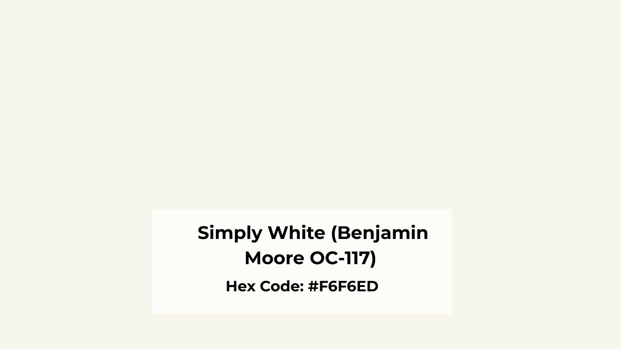
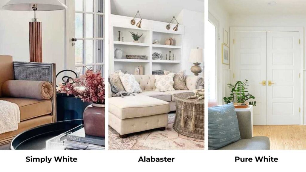
Simply White vs Alabaster can be the comparison I get asked about the most.
Both are from major brands, Simply White (OC-117) from Benjamin Moore and Alabaster (SW 7008) from Sherwin-Williams.
They look identical on the small swatches but when you put them on walls they look different.
Here’s the thing that confuses people, these both are warm whites.
But it means nothing because one looks like a bright, fresh white and the other gives a creamy cozy vibes.
The problem is most homeowners and designers I know struggle to pick between them because they’re looking for the perfect white that works everywhere.
But picking the wrong white isn’t only annoying but it changes how your whole space feels. Your space will feel off and look dingy.
So, I’m walking you through how Simply White Vs Alabaster behave in real spaces, the LRV differences, undertones which shift depending on your light, and which rooms they work in.
We’re comparing them to other whites you’re also considering. I’ll share which colors pair well with each. So, let’s go and find out the one for your space.
Here are my other blogs that you can also read:
- Alabaster Vs Shoji White
- pale Oak Vs Revere pewter
- Quite Moments Vs Sea Salt
- Agreeable Grey Vs Accessible Beige
- Chantilly Lace vs Alabaster
Overview of Simply White (Benjamin Moore OC-117)
Simply White has an LRV of 89.52, sometimes around 90, which is HIGH.
This number matters because it means how much this paint reflects light back into your room and with this it is bright.
Not “off-white trying to be bright” but true bright.
Benjamin Moore calls it a warm white and they’re right because it has subtle yellow undertones.
But here’s where it gets tough, in good natural daylight, Simply White looks almost like a true clean white. The yellow is hidden.
I used Simply White in a south-facing living room once and I saw the yellow come out. South light is warm light, and it amplifies warmth in the paint.
The room looked cheerful but it wasn’t the fresh white.
This color works best in:
- Modern interiors where you want brightness without going cold-white
- Spaces with great natural light
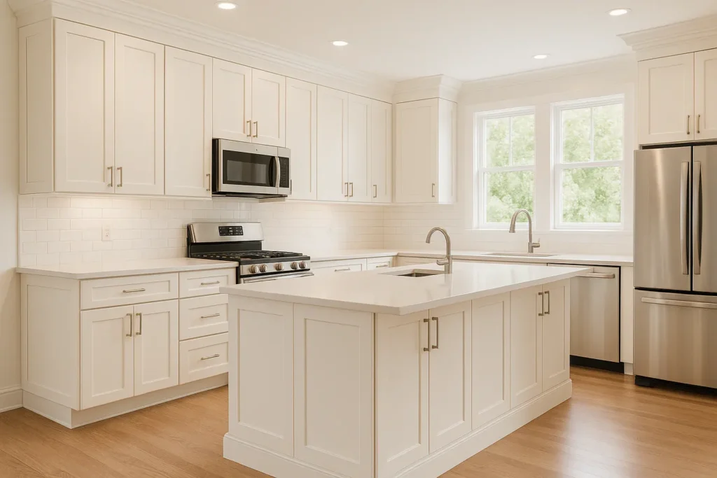
- Kitchen cabinets
- Trim and molding when you want definition
It’s clean to feel fresh but has warmth to not feel cold. One thing to look at, in north-facing rooms, Simply White can lose some of the warmth and look neutral.
Not bad, just different than you’d expect.
There’s also Behr Simply White (BWC-01) which is a different formula. Make sure to don’t mix them up.
I keep coming back to Simply White for house applications because it’s BRIGHT without being aggressive.
You wake up in a Simply White bedroom and it feels awake and the room has energy.
But if you have low light or you’re going for the soft cozy farmhouse thing, this can be too much white for you.
Overview of Alabaster (Sherwin-Williams SW 7008)

Alabaster is at an LRV of 82. This is a 7 to 8 points lower than Simply White, and you see the difference on the wall.
This is a warm, creamy off-white with soft beige undertones and a touch of greige depending on your lighting.
It doesn’t look yellow though and that’s the magic of Alabaster. It’s warm and enveloping but it never goes into the butter yellow.
The appearance is COZY, inviting and a little soft.
I painted my own bedroom in Alabaster and the difference between in the morning and at night is much different.
Morning light makes it look like a true soft white. Evening with warm bulbs makes it creamy and like it’s glowing.
Alabaster pairs beautifully with:
- Warm wood tones
- Beige and taupe neutrals
- Farmhouse and traditional interiors
- Spaces where you want to add warmth to balance cool natural light
This color works in north-facing rooms better than Simply White because it brings warmth with it instead of depending on the light to create warmth.
I’ve used it on exteriors too. It holds up well outside, it looks creamy and elegant without being too harsh against landscaping.
But the alabaster isn’t bright. If you’re in a low-light space or you have dark floors, Alabaster can start to feel heavy.
Not dark but not lifting the room like a bright white would.
It also doesn’t give you the fresh contrast if you’re doing white cabinets against a dark wall. It’s too soft for that.
You want clean lines and definition, then this is not what you should go for.
Where Alabaster is what you should go for making a space feel finished and expensive without trying hard.
Simply White Vs Alabaster: Undertones, LRV, and Best Uses
LRV
So, the LRV difference is the first thing you need to understand before going with one.
Simply White at 89-90 is bouncing light everywhere. Alabaster at 82 is absorbing more light, which creates the soft depth.
This isn’t a small difference. This is the difference between a room feeling bright and open, warm and cozy.
If you’re trying to make a small room feel big then Simply White is what you should go for.
If you’re trying to make a big room feel intimate, then go with Alabaster.
I learned this in a dining room project where I used Alabaster thinking it would brighten things up but it didn’t.
The room stayed dim and when we switched to Simply White and the space opened up.
Undertones and Color Depth
Simply White undertones: Subtle yellow that shows up most in warm, direct sunlight.
In cool light or north exposure, it looks more neutral and almost like a soft true white.
Alabaster undertones: Creamy beige warmth with occasional greige influence and never looks harsh.
The warmth is consistent across different lighting and it gets CREAMY with warm bulbs and evening light.
The depth difference is real. Alabaster has more “body” to it, there’s substance and softness.
Simply White is light, bright and more reflective. It is on top of the wall instead of sinking in.
I remember comparing them side by side on sample boards in the same room and they barely looked related.
Simply White looks energetic and younger and Alabaster looks sophisticated and without the drama.
Aesthetic and Lighting
Lighting is EVERYTHING with these two.
Simply White in different light:
- South-facing rooms: Yellow undertone intensifies, looks cheerful and warm
- North-facing rooms: Loses warmth, reads cleaner and more neutral
- Artificial warm light (2700K bulbs): Brings out yellow slightly
- Artificial cool light (4000K+): Stays fresh and bright
Alabaster in different light:
- South-facing rooms: Gets creamy but doesn’t go yellow
- North-facing rooms: Adds warmth to balance the cool light
- Artificial warm light: Becomes visibly creamy and glowy
- Artificial cool light: Maintains warmth but looks more like a true soft white
Understanding how light impacts these colors is non-negotiable.
I’ve seen people order the wrong color because they only looked at the swatch in one type of light.
Test your samples at different times of day, morning, noon, evening and with your lights on AND off.
The aesthetic difference matters too. Simply White gives you the modern, fresh, clean look.
It’s got energy. Alabaster gives you warmth, tradition, and coziness. It’s got soul.
Styling and Best Uses
Simply White styling:
- Trim: Extra White or Pure White for subtle contrast, or use Simply White on trim too for a monochromatic look
- Ceilings: Works beautifully, keeps rooms bright
- Furniture: Pairs with modern pieces, cool-toned marble, white quartz
- Accent colors: Blues, grays, greens, black for contrast
Alabaster styling:
- Trim: Simply White or Pure White work as trim WITH Alabaster walls for a bright pop
- Ceilings: Use it but expect a soft, cozy feel
- Furniture: Warm woods, beige upholstery, natural textures
- Accent colors: Warm neutrals, sage green, terracotta, creamy taupes
Here’s a breakdown:
| Feature | Simply White | Alabaster |
| LRV | 89-90 | 82 |
| Undertone | Subtle yellow | Creamy beige/greige |
| Brightness | High – very reflective | Moderate – soft and warm |
| Best Lighting | Bright natural light, modern spaces | Low to medium light, needs warmth |
| Style | Modern, contemporary, clean | Farmhouse, traditional, transitional |
| Warmth Level | Warm but bright | Consistently warm and cozy |
| Contrast Ability | High – crisp against darker colors | Low – softer transitions |
| Best Rooms | Kitchens, baths, bright living rooms | Bedrooms, cozy living rooms, exteriors |
How Do Simply White and Alabaster Look in Different Rooms?
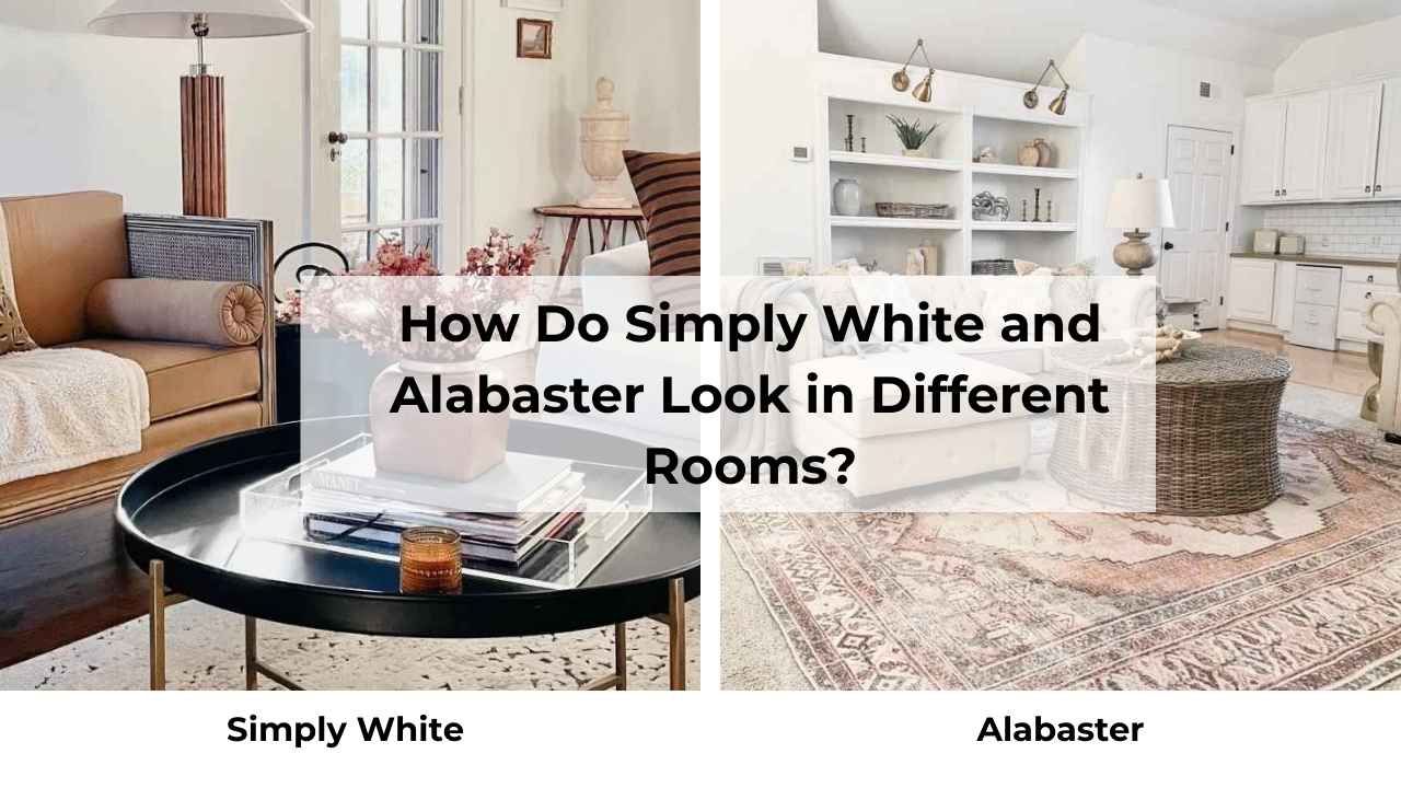
Room location and purpose changes EVERYTHING with these whites.
I’ve used both in every type of space and here’s what happens. So, let’s go and find out which color looks the best in which room.
Living Room
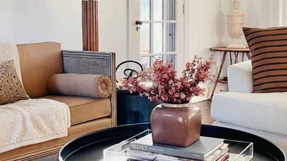
Simply White in living rooms brings energy into the space. If you’ve big windows and good light, it makes the room feel awake and open.
I used it in an open-concept living area that flowed into the kitchen and it works perfectly because it keeps the brightness consistent.
If your living room is your cozy zone, Simply White may feel too bright and active. It doesn’t look relaxed like the way a soft white does.
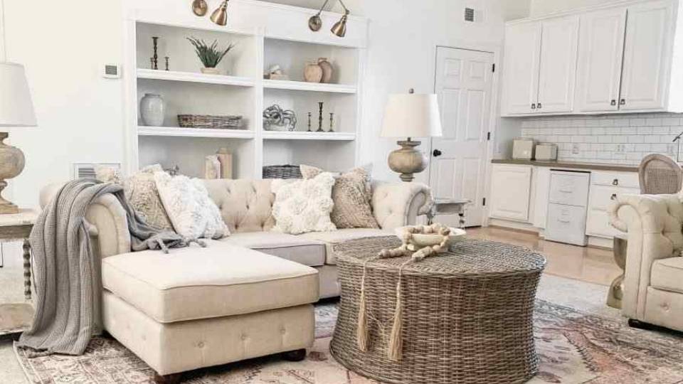
Alabaster in living rooms is where this color shines. It makes the space feel pulled together and inviting without effort.
I’ve noticed people want to sit down in an Alabaster living room.
There’s something about the soft warmth that makes furniture look better and the room feel expensive.
If you have warm wood floors or a brick fireplace, Alabaster is made for your living room.
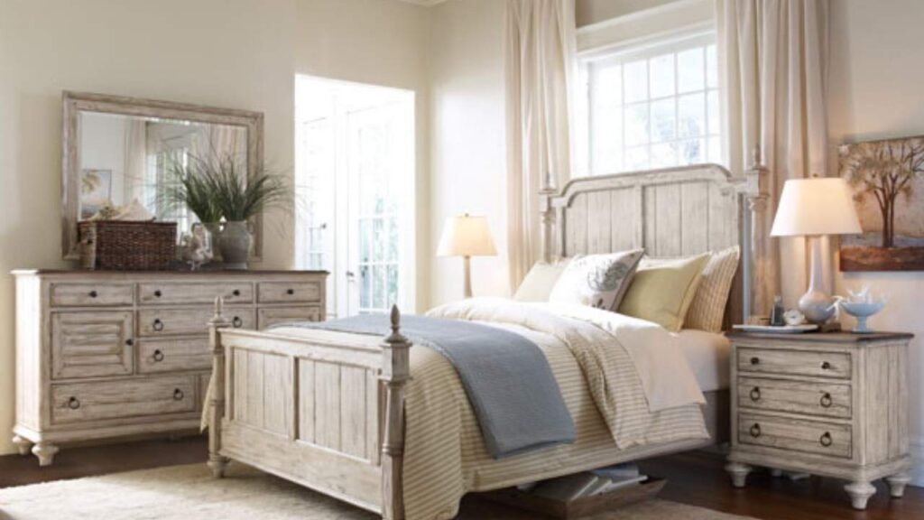
Bedroom
Simply White in bedrooms works if you’re a morning person who wants to wake up to brightness.
I painted a guest bedroom Simply White and it’s GREAT for guests who need to feel awake and oriented.
If you’ve got blackout curtains and you struggle with dark mornings, Simply White helps.
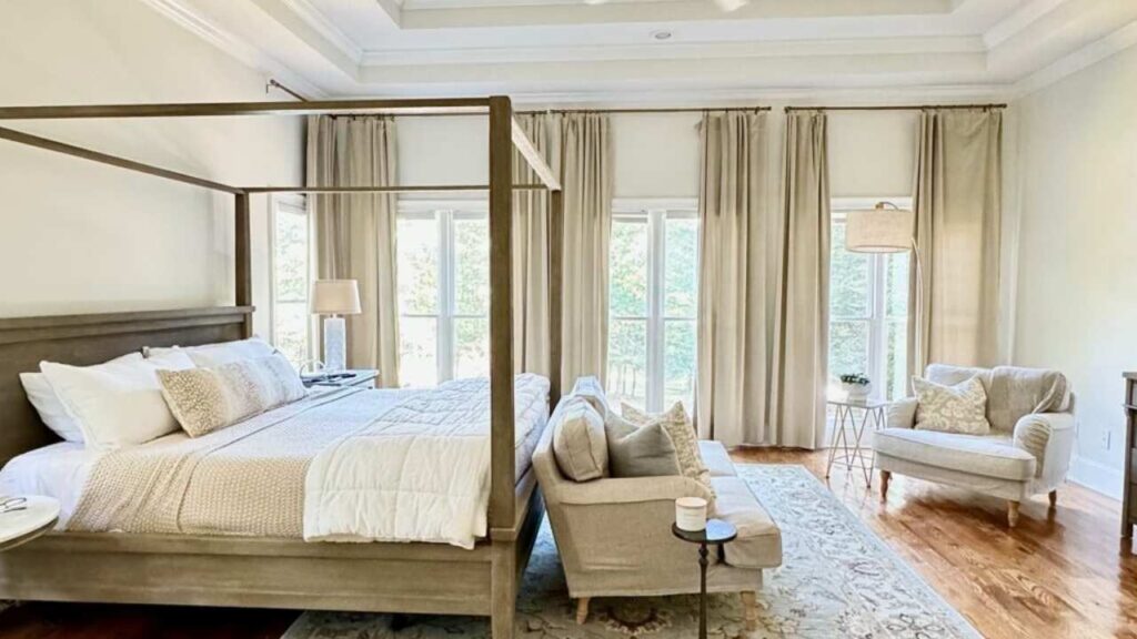
Alabaster in bedrooms is PERFECT for bedrooms. The soft warmth makes the space feel like a retreat.
I sleep better in my Alabaster bedroom than I did when it was a bright white and there’s a calmness. Pair it with warm wood furniture and soft bedding.
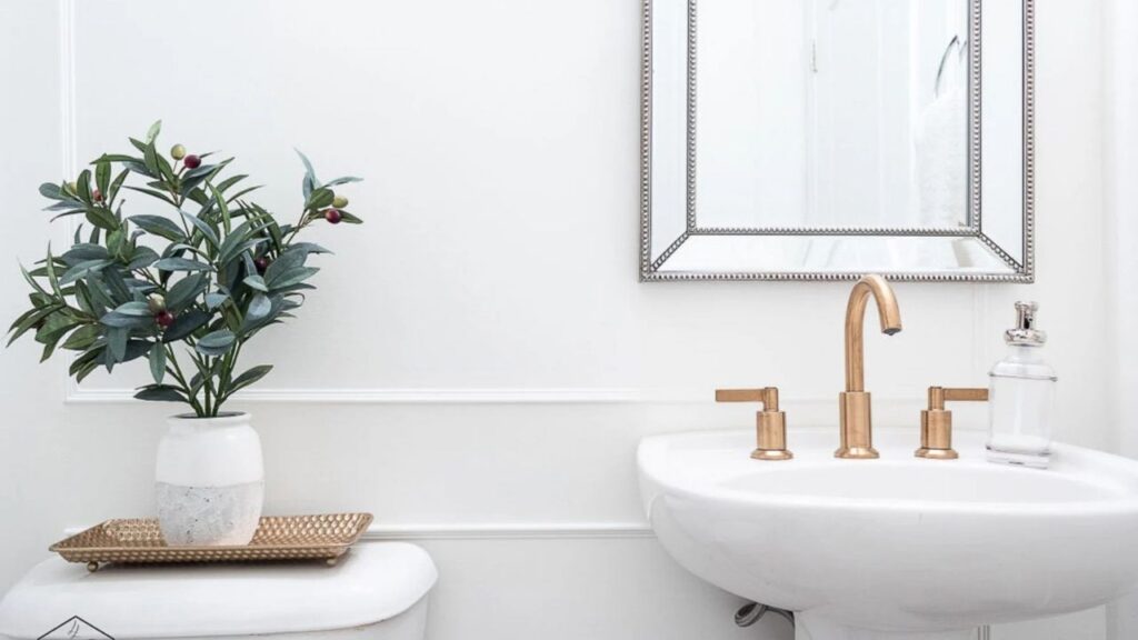
Bathroom
Simply White in bathrooms is common and for good reason. Bathrooms need to feel clean and bright. Simply White delivers that without going full cold-white flat.
I used it in a bathroom with marble tile and the space felt calm and fresh.
The high LRV means a small bathroom with one window feels big and bright.
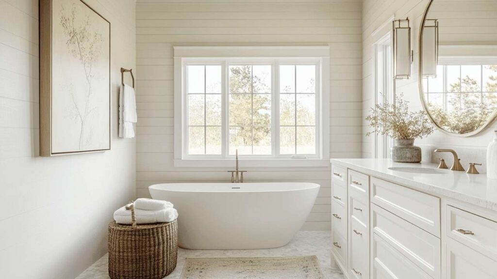
Alabaster in bathrooms can work but you need good lighting. I tried it in a windowless powder room and it felt dim and it was not terrible but not what I wanted.
I added better lighting and it improved a lot.
In a bathroom with natural light, Alabaster adds warmth and feels less clinical than bright whites.
If you’re going for a farmhouse or traditional bathroom, it’s a better fit than Simply White.
Kitchen
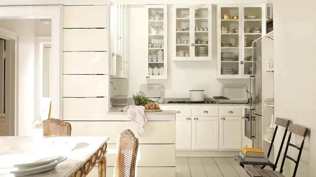
Simply White for kitchen cabinets is iconic. Many kitchens use this color and there’s a reason. It’s bright to feel clean but warm to not feel cold.
I’ve painted many kitchens with Simply White cabinets and it works with every countertop like white quartz, marble and warm butcher block.
Alabaster for kitchen cabinets gives you a soft and traditional look.
If you’re doing a farmhouse kitchen or you want cabinets that feel more furniture-like and less modern, Alabaster is beautiful.
But if you have cool-toned quartz counters, Alabaster can look dingy next to them.
The cream with the bright white of quartz is a tough contrast.
I prefer Simply White for most kitchens unless we’re going for warmth and tradition.
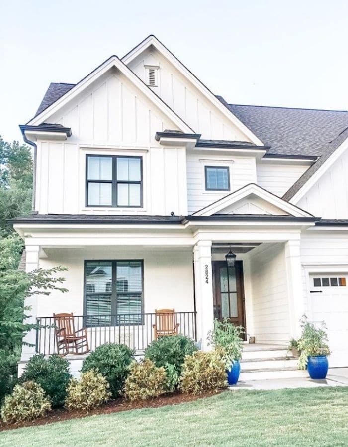
Exterior
Simply White on exteriors looks FRESH. It’s got brightness to stand out and look well-maintained.
I’ve seen it on modern farmhouses and contemporary homes and it works on both.
The yellow undertone is less visible outside, especially if you’ve good landscaping to play off it.
Alabaster on exteriors is common and more versatile. The creamy warmth looks elegant and expensive on a house.
It doesn’t glare in bright sunlight the way bright whites do.
I’ve used it on traditional homes, craftsman styles and transitional builds. It works.
Pairs beautifully with warm wood trim, stone accents, and natural surroundings. If you’re stuck between them for exterior, Alabaster is the safe one.
Simply White Vs Alabaster Vs Other Colors
Look, you’re not only comparing Simply White Vs Alabaster. You’ve got many whites in the list to compare.
Let’s talk about how these stack up against the other usual two shades.
Simply White Vs Pure White
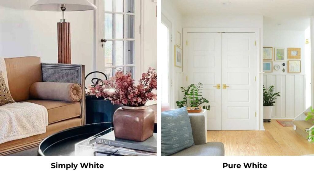
Pure White (SW 7005) is at LRV 84 with more neutral undertones. It’s got subtle warmth but it’s less yellow than Simply White.
Pure White is more versatile because the undertones are passive. It works in more lighting situations without freaking out on you.
Simply White is bright and has personality. Pure White is safe and balanced.
If you want a clean and neutral that works everywhere, Pure White is what you should consider.
If you want bright warmth with light reflection, Simply White is what you should consider.
Simply White Vs Alabaster Vs White Dove
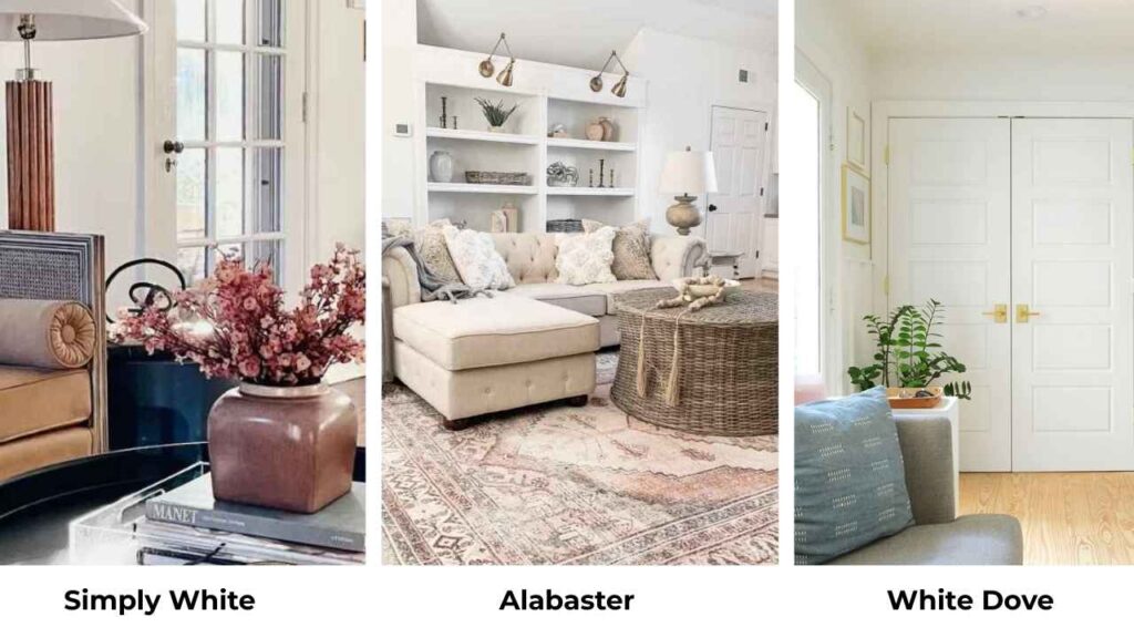
White Dove (OC-17) is Benjamin Moore’s other great white. It has an LRV of 83, creamy warmth similar to Alabaster but slightly different.
White Dove is softer than Simply White but brighter than Alabaster.
I use White Dove when someone wants the warmth of Alabaster but needs more brightness. It’s popular for cabinets and trim.
All three together: Simply White is the brightest, White Dove is the medium soft, Alabaster is the softest and creamiest.
Simply White Vs Greek Villa
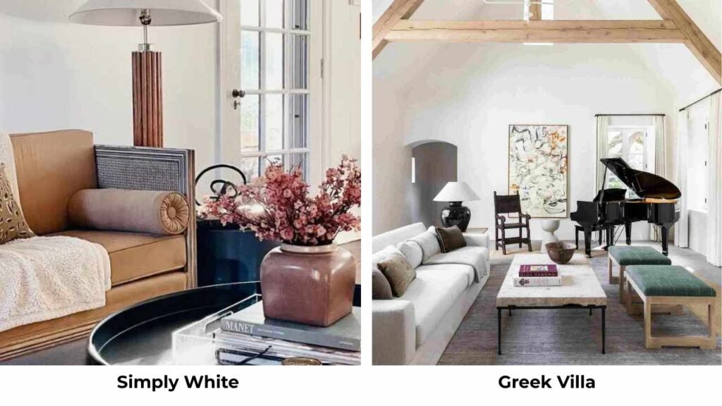
Greek Villa (SW 7551) is an off-white with warm undertones with hints of red and pink.
It’s warmer than Simply White like, visibly creamy and more colorful.
Greek Villa works as a wall color paired WITH Simply White trim. I wouldn’t compare them as alternatives but they’re in different categories.
Simply White is a white. Greek Villa is crossing into off-white territory.
Simply White Vs Alabaster Vs Extra White
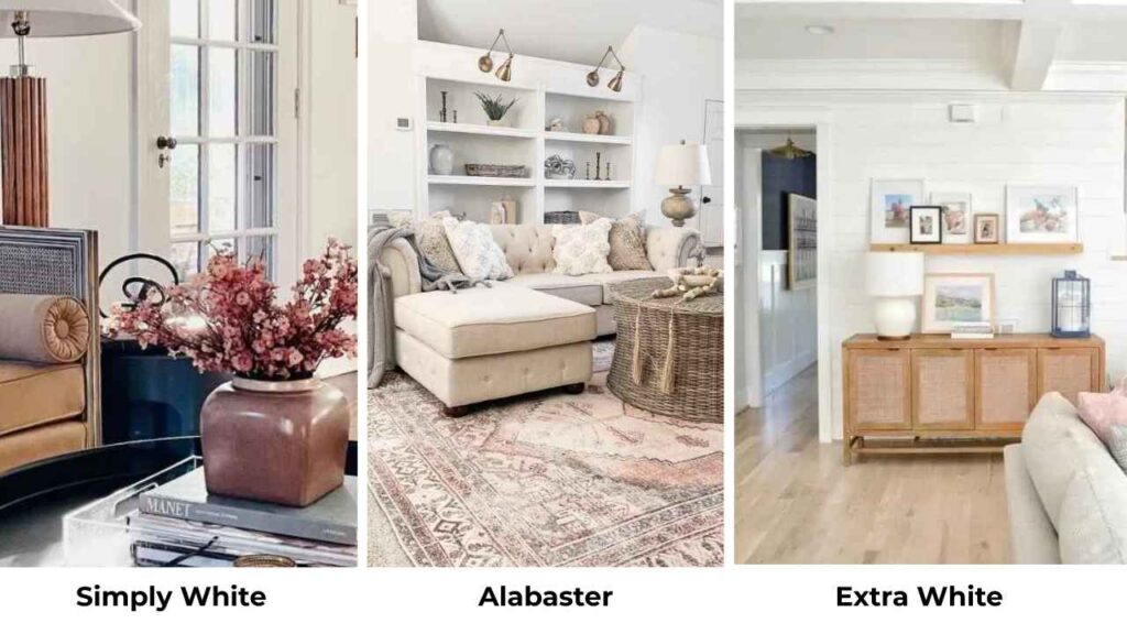
Extra White (SW 7006) has an LRV of 86 and is fresher and cooler than both Simply White and Alabaster.
It’s a popular trim color BECAUSE it’s bright and clean and the less undertone drama.
Extra White next to Alabaster gives you great contrast. Extra White next to Simply White is subtle.
For trim work, I pick Extra White or Pure White over the other two because they’re versatile and give better definition.
Here’s how they stack up:
| Color | LRV | Undertone | Warmth | Best Use |
| Simply White | 89-90 | Subtle yellow | Warm but bright | Cabinets, bright spaces, modern interiors |
| Alabaster | 82 | Creamy beige | Consistently warm | Walls, cozy spaces, exteriors, farmhouse style |
| Pure White | 84 | Soft neutral warmth | Slightly warm | Whole house, flexible spaces, most versatile |
| White Dove | 83 | Creamy warm | Soft warmth | Cabinets, trim, walls, traditional style |
| Extra White | 86 | Minimal/clean | Slight cool | Trim, cabinets, modern contrast |
Simply White Coordinating Colors
Simply White plays well with A LOT of colors because of that brightness and clean warmth.
So, look at the pairings with this color.
Colors that look amazing with Simply White:
- Swiss Coffee (OC-45) – pair it as a wall color with Simply White trim for subtle contrast
- Grays – cool grays like Stonington Gray or Coventry Gray look bright and modern against Simply White
- Blues – navy, dusty blue and soft sky blues pop against Simply White without looking harsh
- Greens – sage, olive, hunter green, the brightness of Simply White makes these colors feel intentional
- Black – if you want drama and contrast, black accent walls or black windows with Simply White trim is stunning
I did a whole kitchen with Simply White cabinets and a deep charcoal island and it’s one of my favorites.
The key with Simply White is it’s bright to handle bold accent colors without getting lost.
Alabaster Coordinating Colors
Alabaster needs colors that match its warmth and softness.
Colors that enhance Alabaster:
- Accessible Beige (SW 7036) – warm greige that flows beautifully with Alabaster trim or vice versa
- Agreeable Gray (SW 7029) – another warm gray that doesn’t fight with Alabaster’s creamy undertones
- Warm earth tones – terracotta, rust, warm browns all feel natural next to Alabaster
- Sage and muted greens – these bring out the best in Alabaster’s warmth without clashing
- Soft blues – not bright blues but soft, warm blues that have some gray in them
I used Alabaster trim with Accessible Beige walls in a house project and the flow was SEAMLESS and everything felt cohesive and warm.
Conclusion
So, Simply White vs Alabaster. It depends on what you need your white to DO.
Choose Simply White if you want brightness and light reflection or you are considering the paint for your cabinets or trim because it enhances it more.
For this your space has to have good natural light to make it airy and open.
If you prefer a modern and clean aesthetic then this is what you should consider.
Also, it makes you space feel energetic and fresh and you’ll feel good. It works best in almost every space but the space should have good lighting to make it work,
Choose Alabaster if you want warmth and a cozy feel.
If you are painting your walls in traditional or farmhouse architectural style then this is the best choice for it because your room will feel warm especially north facing ones.
And if you consider softness over going bright then this is the best pick.
I keep both in my regular rotation because they solve different problems.
But remember to test the samples on the big boards not on the small paint swathes.
Live with them for a few days. See them in morning light AND evening light.
Then decide to commit between Simply White Vs Alabaster because it needs to be considered carefully.
FAQs On Simply White Vs Alabaster
YES, and I love this combo. Use Simply White on trim and Alabaster on walls for a soft contrast that gives dimension without being harsh. The brightness difference is visible but not harsh. I’ve done this in house projects and it creates a cohesive, warm look.
Don’t use Simply White in low-light rooms where you’re trying to create coziness because it’ll go against it. Also skip it if you have warm flooring or warm wood tones that may amplify that yellow undertone too much. And if you’re painting a north-facing room and you WANT warmth, Simply White will lose its warmth in the cool light
Because it makes everything look expensive without trying hard. The soft creamy warmth is forgiving, it works with warm wood, beige tones, traditional architecture, and it makes spaces feel finished and intentional. It’s also predictable because the warmth is consistent across different lighting.
In the right light, it can look yellow. South-facing rooms or spaces with warm afternoon sun will bring out that yellow undertone visibly. But in a balanced or cool light, it stays neutral. I wouldn’t call it “too yellow” but more like “has yellow moments.” If you’re sensitive to yellow tones, test it before committing.