So you’re standing at a paint store trying to decide between Agreeable Grey vs Accessible Beige, and I get it why.
These two Sherwin-Williams neutrals look almost the same and on the tiny sample swatches at the store.
But here’s what I’ve learned after painting rooms.
I can say that they look different when they’re on your walls.
Agreeable Grey SW 7029 and Accessible Beige SW 7036 are both popular, both best-sellers, and both recommended by designers and store employees.
Neither of these is a true gray or a true beige, which is why homeowners get confused.
They’re both greiges, the gray-beige hybrid supposed to be the perfect neutral.
Accessible Beige is warm, close to the beige family with some subtle gray tones.
Agreeable Grey is more toward gray territory but keeps warmth to not feel cold.
The wrong undertone can throw off your space, if you’ve warm wood floors or cool gray tile.
In this post I’m breaking down how Agreeable Gray Vs Accessible Gray differ, their Light Reflectance Values, their undertones.
How they react to different lighting, which rooms they work best in, and the mistakes you should avoid.
We’re also comparing them with other popular neutrals for more options.
Here are my other blogs that you can also read:
- Onyx Colour Vs Black
- Bm White Dove Vs Sw Alabaster
- Woodlawn Blue Vs Palladian Blue
- Wythe Blue Vs Palladian Blue
- Snowbound Vs White Dove
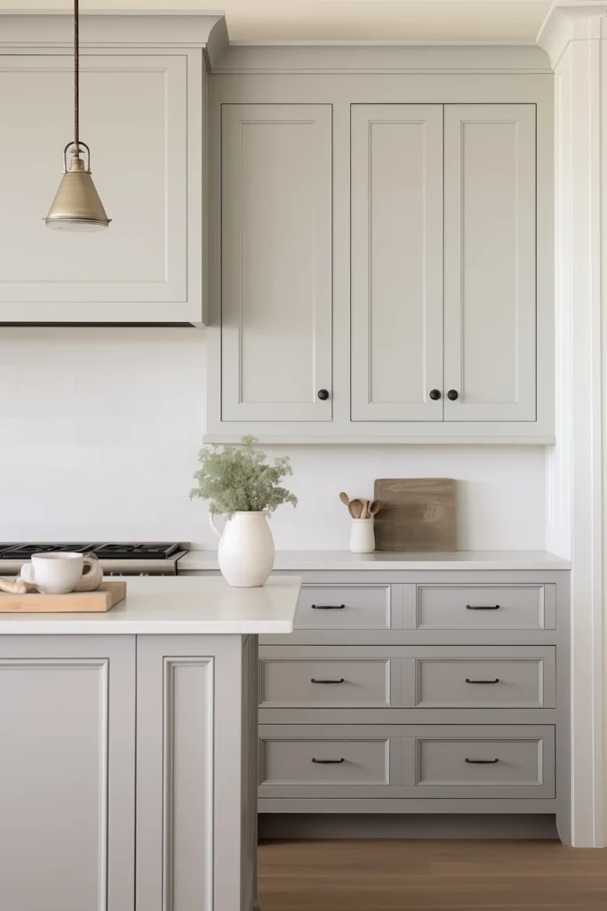
Color Overview of Sherwin Williams Agreeable Grey (SW 7029)

Agreeable Grey has a strong gray presence, but it’s soft and lighter than a true greige like Perfect Greige.
It’s a warm, versatile greige which is towards light gray.
The warmth comes from the subtle beige undertones, which is why it doesn’t look cold or sterile like some grays.
It has an LRV of 60, meaning it reflects a good amount of light.
This color became one of Sherwin-Williams’ best-sellers for a reason.
It feels airy and modern but neutral to work with many different styles.
I’ve used it in living rooms where clients wanted something clean but not harsh, in bedrooms where they needed a calming backdrop, in bathrooms where it should look bright.
The thing about Agreeable Grey is it adapts.
It can look different depending on your lighting and finishes.
In south-facing rooms with natural light it looks light and bright.
In north-facing spaces it can shift to cool.
Designers and homeowners go with this when they are looking for flexibility.
If you’re doing an open floor plan where you need one color in multiple rooms with different lighting situations.
Agreeable Grey is what they go for because it handles everything.
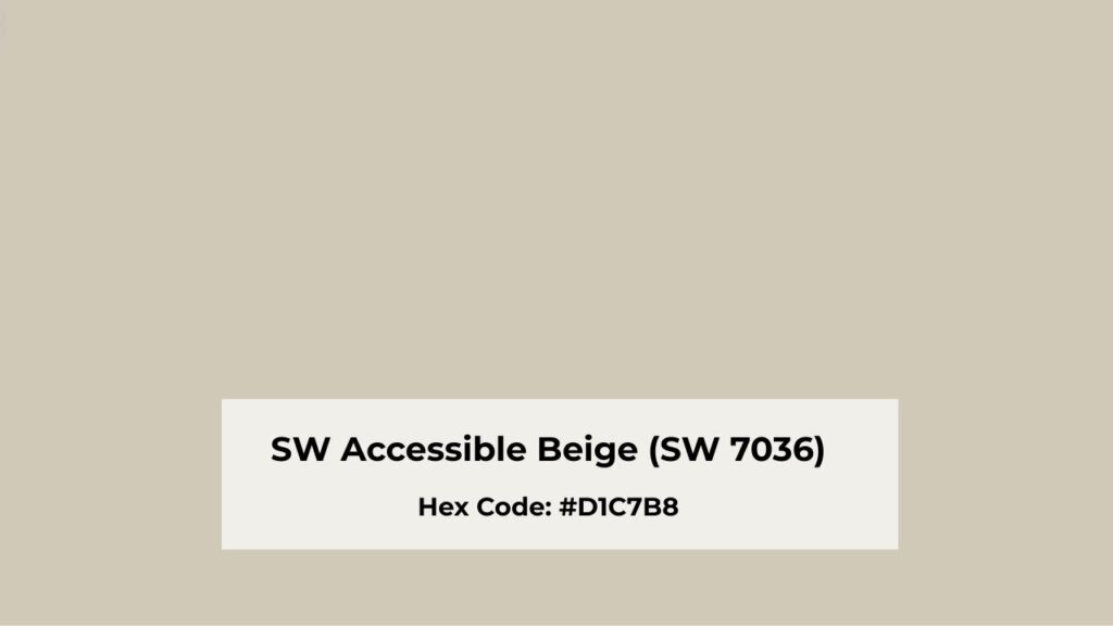
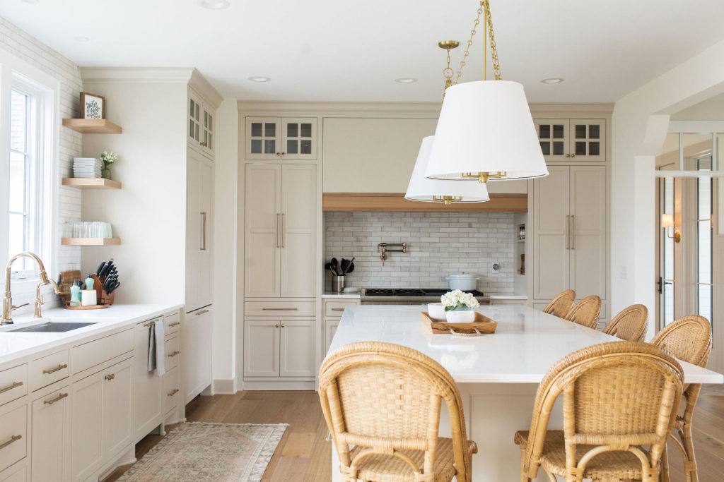
Color Overview of Sherwin Williams Accessible Beige (SW 7036)
Accessible Beige is a different color.
This one’s a warm greige that leans toward beige with a subtle gray base keeping it from looking too yellow or cream.
What catches people are the subtle green undertones that can show in some lighting, when you have a good amount of natural light and artificial lighting.
The LRV is at 58, so it’s slightly darker than Agreeable Grey but not enough.
I’ll say this one is cozy and grounded rather than airy.
It has more richness and depth.
It’s darker than Manchester Tan, which is another Sherwin-Williams neutral which people love.
Accessible Beige works well in spaces with warm finishes like honey oak floors, cherry cabinets, beige tile, warm wood trim.
This color’s also a best-seller, but for different reasons than Agreeable Grey.
Where AG gives you modern flexibility, Accessible Beige gives you warmth and tradition.
It’s popular in bedrooms where people want a cozy and wrapped feeling.
In living rooms with warm wood furniture and cream upholstery, it works.
Bathrooms too, if you’ve beige or tan tile, it’ll work.
Some designers avoid it because of the green undertones.
What is the Difference Between Agreeable Grey and Accessible Beige?

Alright, so Agreeable Grey Vs Accessible Beige, colors are in the greige category and both are popular, but the differences matter more than the similarities.
Let me break down where these two diverge cuz this is where your decision gets made.
Light Reflectance Value
Agreeable Grey has an LRV of 60 while Accessible Beige is at 58.
In reality, Agreeable Grey reflects more light, making rooms feel bright.
But we’re talking about a difference so small you wouldn’t notice unless you painted them side by side.
Both are in the moderate range, not dark to make a room feel cave-like.
The LRV thing matters when you’re thinking about which rooms get which color.
In the north-facing rooms which don’t get much direct sunlight, the extra light reflection from Agreeable Grey can help.
But if you’re going with a south-facing space that has light, Accessible Beige has low LRV and can feel more grounded and less washed out.
Undertones
Accessible Beige has warm beige and yellow undertones with the gray base.
The green undertones as I mentioned earlier, they’re subtle but they come in some lighting conditions.
Next to a true gray, Accessible Beige will always look warm and beige.
Agreeable Grey has warm gray undertones with beige mixed in, and there’s a subtle violet undertone where many people never notice but it’s part of what makes the color feel balanced.
It has less green presence than Accessible Beige.
The undertones are more neutral, which is why it plays nice with both warm and cool finishes.
I always tell people to test the undertones with your lighting and finishes.
Paint a big sample on your wall but not a small card, and watch it for a few days.
Morning light, afternoon light, evening with your lamps on.
Lighting Behaviour
Accessible Beige stays warm in most lighting situations.
In north-facing rooms it keeps the cozy warmth.
South-facing rooms with sun, it becomes creamy and rich.
But in warm artificial lighting it brings the beige tones, which can be gorgeous or depending on what you’re going for.
Agreeable Grey shifts according to the light.
North-facing rooms can make it look cool, sometimes pulling more gray than greige.
South-facing spaces make it look light and clean.
East-facing rooms get nice balanced light in the morning that shows Agreeable Gray true color.
West-facing rooms with the warm afternoon sun will push it warm.
This behavior thing matters.
I’ve had clients who liked Agreeable Grey or online, paint a room, and then call me confused because it looks too gray in their space.
It was a north-facing bedroom with minimal windows.
Warmth
Accessible Beige is a warm color.
It creates a cozy, wrapped-up, traditional warmth that works so well in bedrooms and living rooms with warm finishes.
If your home has warm wood tones, beige or tan furniture, cream accents, Accessible Beige amplifies the warmth and makes everything feel cohesive.
Agreeable Grey is more balanced between warm and cool, which gives it versatility but less character.
It doesn’t create warmth as it accommodates warmth that exists in your space, and makes it better for open floor plans or homes with mixed finishes.
Styling and Best Uses
For Accessible Beige, you want to lean into the warmth.
Pair it with creamy whites on trim and ceilings like warm wood furniture, brass or gold hardware, warm-toned fabrics.
This color shines in traditional, transitional, and rustic interiors, like living rooms, bedrooms, hallways, dining rooms with warm finishes.
Agreeable Grey is more forgiving with trim colors, like pure White, Alabaster and bright white works.
It handles white cabinets, works with gray furniture, and plays nice with mixed metal finishes and you can also do brass and chrome in the space without feeling disconnected.
It is best for modern, contemporary, and transitional styles, great in open floor plans, kitchens, living rooms.
| Feature | Agreeable Grey (SW 7029) | Accessible Beige (SW 7036) |
| LRV | 60 | 58 |
| Base Lean | Gray-forward greige | Beige-forward greige |
| Undertones | Warm gray + beige, subtle violet | Warm beige with yellow, subtle green |
| Warmth Level | Balanced, moderate | Warm |
| Best Lighting | South-facing, well-lit rooms | Works in lighting, holds warmth |
| Trim Pairing | Pure White, Alabaster, bright whites | Creamy whites, warm whites |
| Metal Finishes | Mixed metals (brass + chrome) | Warm metals (brass, gold) |
| Wood Tones | Medium to dark, neutral woods | Warm woods (oak, cherry, walnut) |
| Style Match | Modern, contemporary, transitional | Traditional, transitional, rustic |
| Flexibility | High, adapts to many finishes | Moderate, best with warm finishes |
How Do These Colors Look In Different Rooms? Agreeable Grey Vs Accessible Beige
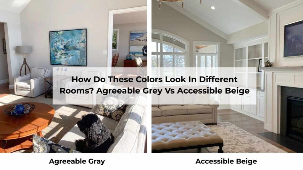
Room choice matters as much as the color.
I’ve seen both the neutrals look amazing and terrible depending on where they were used and what was already in the space.
Let’s break it down room by room because it is important to understand.
Living Room
Agreeable Grey in a living room gives you a clean, fresh backdrop which works whether it is modern or transitional.
If you’ve mixed finishes like some cool gray furniture, some warm wood pieces, then Agreeable Grey ties everything together.
In south-facing living rooms with big windows it looks bright and airy.
The walls disappear and let your furniture and decor shine.
I’ve done this in open-concept spaces where the living room flows into the kitchen and dining area, and it maintains the light, cohesive feel.
If your living room is north-facing or doesn’t get natural light, Agreeable Grey can feel flat, but not terrible, but it loses its warmth and becomes more gray.
If all your furniture and decor is cool-toned that can be fine, but if you’ve warm wood pieces it can feel disconnected.
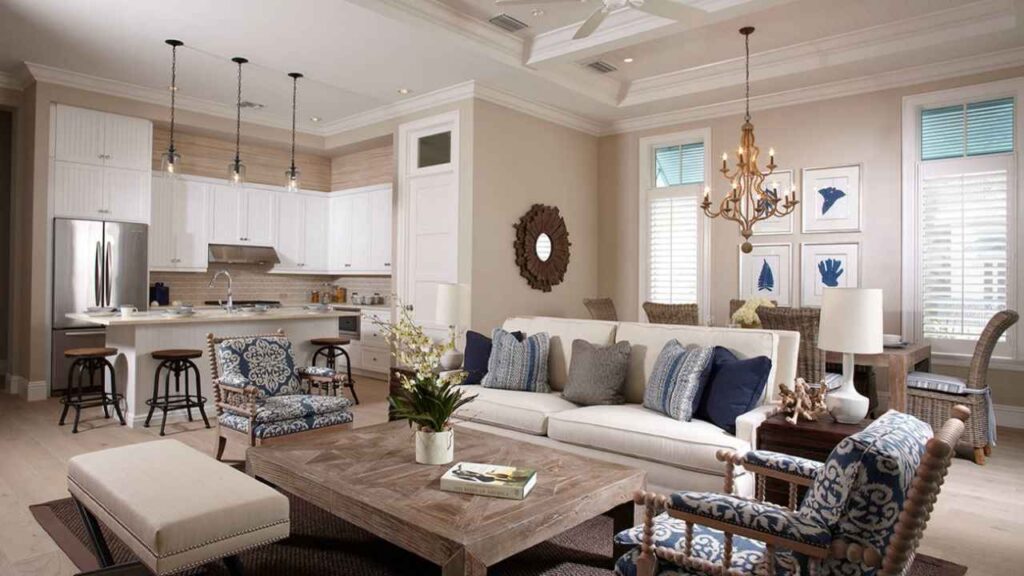
Accessible Beige in a living room creates coziness.
This is the color for spaces with warm hardwood floors, beige or tan sofas, wood coffee tables, brass lamps.
It makes the room feel grounded and inviting.
I’ve used it in living rooms with cherry wood built-ins or honey oak floors where Agreeable Grey can go against it.
The walls pick up the warmth from the wood and everything feels harmonious.
But if your living room has cool gray furniture or you’re planning to add gray accents, Accessible Beige can feel outdated.
It needs warm finishes to shine.
Also if your living room is on the small side, the extra warmth and lower LRV can make it feel enclosed.
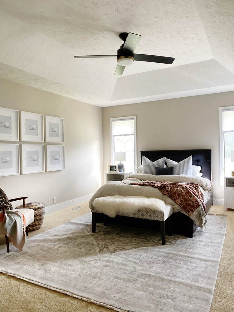
Bedroom
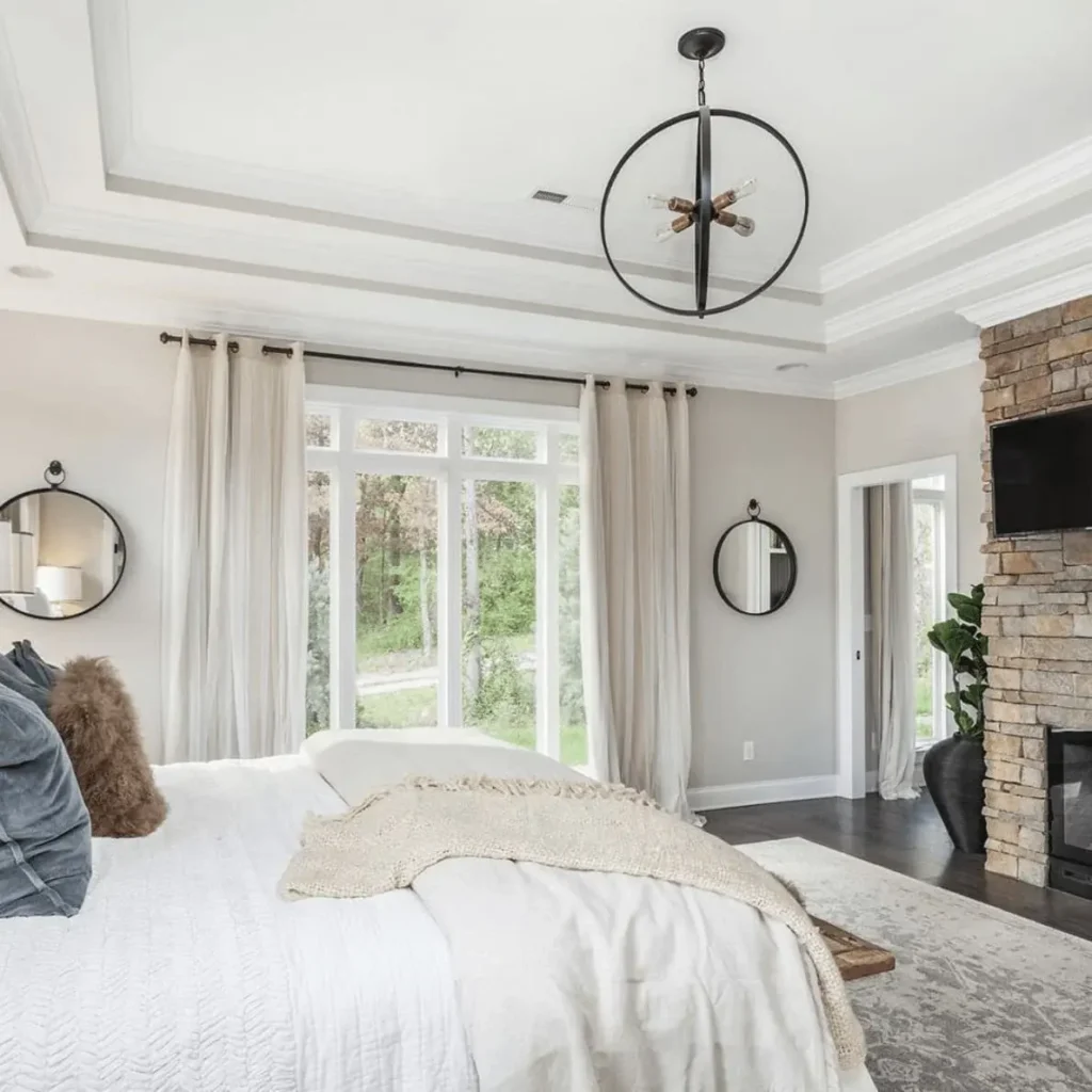
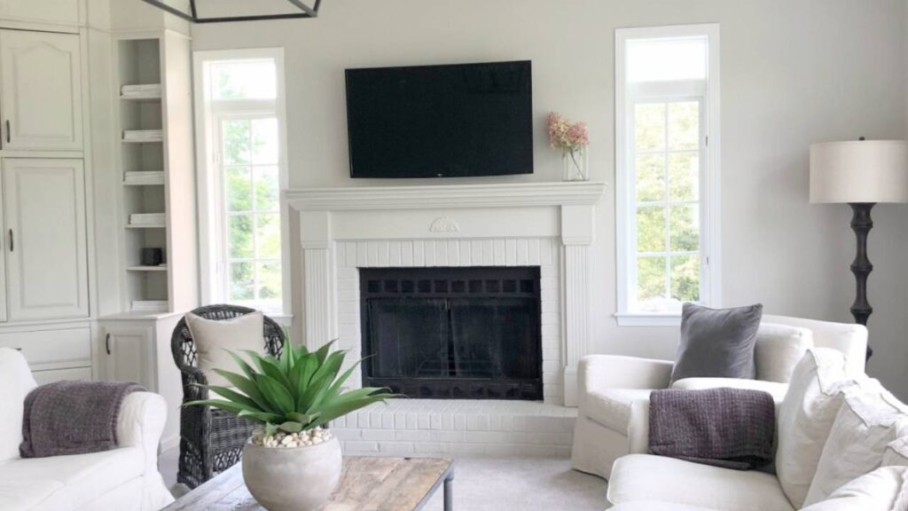
Agreeable Grey in bedrooms works great if you want a fresh, clean, hotel-room aesthetic, it’s calming without being boring.
It works well with white bedding, gray upholstered headboards, mixed wood and metal nightstands.
I’ve done this in primary bedrooms where clients wanted something serene and uncluttered. The color doesn’t demand attention.
One thing to keep in mind, if your bedroom is on the cool side temperature-wise or gets north light, Agreeable Grey can feel sterile.
Not everyone wants to wake up to gray walls even if they’re warm gray.
Accessible Beige in bedrooms is warm.
It’s cozy and enveloping in the best way.
Perfect for bedrooms with wood furniture, warm-toned bedding, and the traditional or transitional style.
I always recommend this for guest bedrooms where you want people to feel comfortable and relaxed.
The only time I’ll not go with this is if the bedroom is small or has limited natural light.
The warmth combined with the lower LRV can make tight spaces feel tighter.
And if you’re someone who likes a bright, fresh bedroom look, Accessible Beige can look too cozy.
Bathroom
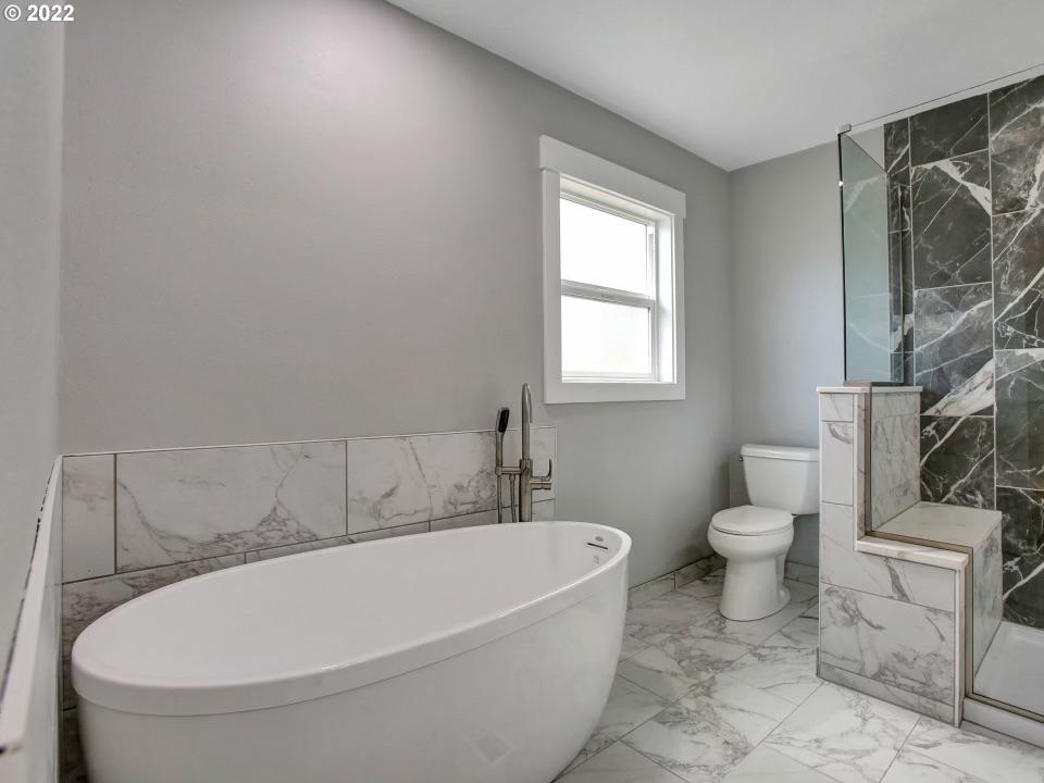
Agreeable Grey in bathrooms is popular, especially with white vanities and chrome or brushed nickel fixtures.
It looks clean and spa-like without being cold.
I’ve used this in bathrooms with white subway tile and gray-veined marble and it ties everything together.
The color handles moisture and bathroom lighting well and it doesn’t get washed out under the lights.
If you’ve a windowless bathroom, test it first.
The artificial lighting may push it too gray, because not everyone wants a gray bathroom.
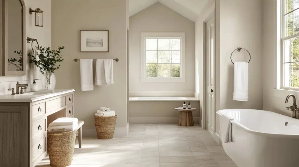
Accessible Beige in bathrooms works if you’ve beige or tan tile that you’re not replacing.
I’ve saved clients by painting the walls Accessible Beige and the builder-grade beige tiles from 2003 look intentional.
It also works with oil-rubbed bronze or brass fixtures.
The warmth makes small bathrooms feel cozy rather than cramped.
Kitchen
Agreeable Grey in kitchens is fantastic with white cabinets, white cabinets, Agreeable Grey walls, stainless appliances, mixed metal hardware.
It’s a modern kitchen look everyone wants.
It also works if you’ve gray cabinets and want the walls to look light but cohesive.
One thing to keep in mind, if you’ve a kitchen full of warm wood cabinets, Agreeable Grey may go against it.
Test it first because the undertones can go against each other.
Accessible Beige in kitchens is less common but works in some situations.
If you’ve wood cabinets that you’re keeping, then Accessible Beige can harmonize the space.
It is also great if you’ve beige granite countertops.
I mentioned earlier how some granites need warm whites or warm neutrals, and Accessible Beige fits it perfectly.
You can pair it with brass or gold hardware, for a warm, traditional kitchen.
Skip it if you’re doing white cabinets.
The combination can feel muddy or disconnected unless you’re careful about styling everything to be warm-toned.
Exterior
Agreeable Grey on exteriors is becoming common, mainly on modern farmhouse or contemporary style homes.
It is a soft, warm gray that’s approachable and works with white trim, black accents, mixed stone or brick.
The thing about exteriors is you’ve to consider your roof color, your landscaping, your neighborhood.
Agreeable Grey can shift in full outdoor light, sometimes pulling different undertones than it does inside.
Accessible Beige on exteriors gives you a classic, warm neutral exterior which is popular.
It’s safe in traditional neighborhoods and looks more timeless than trendy.
It works well with brick, stone, and warm wood accents.
If you’ve beige or tan brick you’re trying to coordinate with, Accessible Beige is a better bet than Agreeable Grey.
I don’t do much exterior work, but according to what I’ve seen.
Agreeable Grey is trendy right now while Accessible Beige is traditional and neighborhood-friendly.
Agreeable Grey Vs Accessible Beige Vs Other Colors

Sometimes these two aren’t the right choice, or you need to see them next to other popular neutrals to know for sure what you want.
Here’s how they look against some other Sherwin-Williams favorites.
Accessible Beige Vs Natural Linen
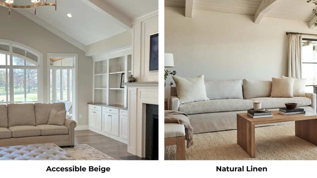
Natural Linen (SW 9109) is warmer and creamier than Accessible Beige.
It has more yellow undertones and less gray influence, so it is more like a warm cream than a greige.
If Accessible Beige feels too gray for the warm-toned space, Natural Linen is what you should go for.
But it can also look too yellow if you’ve the wrong lighting or finishes.
Accessible Beige Vs Agreeable Gray
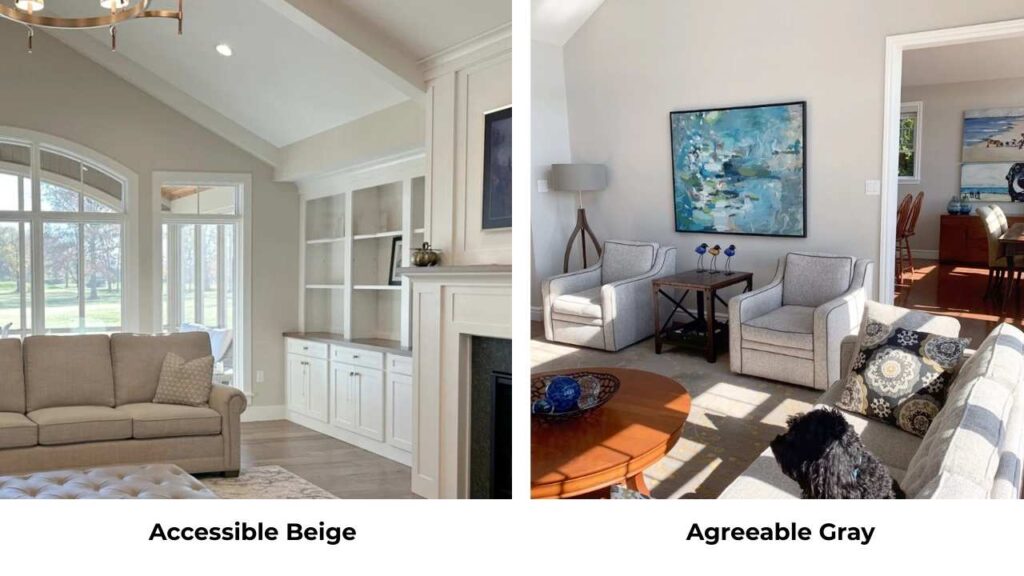
We’ve already covered this, but for the review: Accessible Beige is warmer and beige-forward, Agreeable Gray is more balanced and gray-forward.
Accessible Beige needs warm finishes, Agreeable Gray is flexible.
Modern Gray Vs Accessible Beige
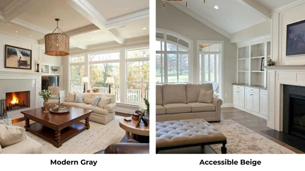
Modern Gray (SW 7632) is cooler than both Accessible Beige and Agreeable Gray.
It’s a true cool gray with subtle green undertones.
If you’re comparing Modern Gray to Accessible Beige, you’re confused about what you want because these serve different purposes.
Modern Gray is for cool-toned, contemporary spaces. Accessible Beige is for warm, traditional spaces.
Agreeable Gray Vs Repose Gray
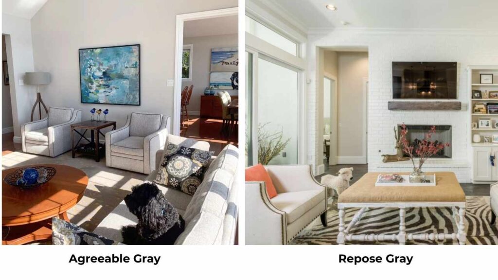
Repose Gray (SW 7015) is another popular SW neutral.
It’s cooler than Agreeable Gray, and is more in true gray territory.
Repose Gray has an LRV of 60 but the undertones are cooler.
If Agreeable Gray feels too warm or beige for your space, try Repose Gray.
It’s clean and fresh but can be cold in north-facing rooms.
Mindful Grey Vs Accessible Beige
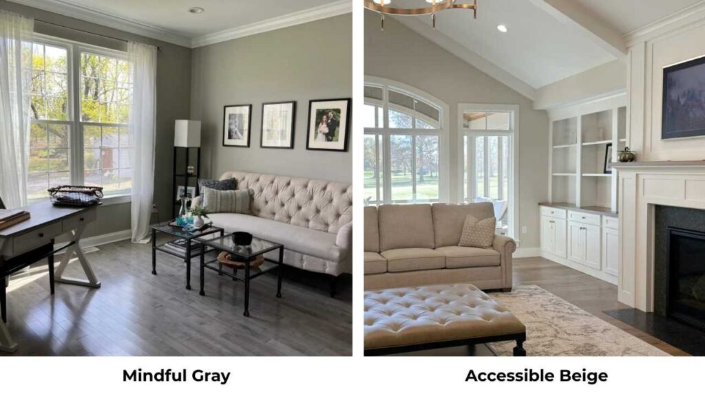
Mindful Gray (SW 7016) is a true warm gray which is darker than both our main colors.
LRV of 49 which means it’s deep.
If Accessible Beige feels right according to the warmth but too light, Mindful Gray can work.
Accessible Beige vs Modern Gray vs Agreeable Gray vs Other Key Comparisons
| Paint Color (Brand) | LRV (Approx.) | Undertone Profile | Warmth Level | Best Used In |
| Accessible Beige (Sherwin Williams) | 58 | Beige-forward greige with subtle gray | Warm | Traditional homes, spaces with warm wood and finishes |
| Natural Linen (Sherwin Williams) | 66 | Creamy with noticeable yellow undertones | Very warm | Soft, cozy spaces with controlled warm lighting |
| Agreeable Gray (Sherwin Williams) | 60 | Balanced greige (beige + gray) | Warm | Flexible whole-home neutral, mixed finishes |
| Modern Gray (Sherwin Williams) | 62 | Cool gray with subtle green undertones | Cool | Contemporary, cool-toned interiors |
| Repose Gray (Sherwin Williams) | 60 | True gray with cooler undertones | Cool-neutral | Modern spaces, clean and crisp palettes |
| Mindful Gray (Sherwin Williams) | 49 | Deeper warm gray | Warm | Larger rooms, feature walls, spaces needing depth |
Common Mistakes to Avoid While Going With Agreeable Grey and Accessible Beige
I’ve seen these same mistakes many times, so learn from other people’s mistakes and save yourself from it and the cost of redoing the paint.
Pairing Accessible Beige with cool gray floors.
I cannot tell you how many times I’ve walked into a house where someone painted the walls Accessible Beige and they’ve a gray luxury vinyl plank or gray tile, and everything looked out of place.
The warm beige walls fight with the cool gray floors and nothing feels cohesive.
If you’ve got cool gray flooring, go with Agreeable Grey or something which is cooler.
Using Agreeable Grey in dark north-facing rooms without testing.
I get it, you saw it somewhere and it looked amazing.
But if your room doesn’t get natural light and faces north, Agreeable Grey can shift too cool and feel flat or dull.
You need something with consistent warmth like Accessible Beige, or you should add more through warm lighting to the space.
Pairing Accessible Beige with bright white trim.
People think it’s a neutral, it’ll work with white trim” but if you use a bright white like Pure White next to Accessible Beige, the walls will look dingy or yellowed.
You need creamy whites or warm whites with Accessible Beige.
The trim color matters as much as the wall color.
Not testing paint samples in your space.
I don’t care how many photos you’ve seen or how many sample cards you’ve grabbed.
Paint samples on your walls, big ones, at least 2×2 feet.
Watch them for a few days in different lighting. Colors look differently when they’re in your space.
Ignoring your existing finishes is a big mistake.
You can’t pick a color in isolation.
Like what color are your floors, your cabinets, your countertops or your furniture.
If everything in your space is warm-toned and pick Agreeable Grey because it’s popular, you may have the disconnected look.
If everything is cool or mixed and you go with Accessible Beige because you like beige, same problem.
The color has to work with the furniture and other things.
Following trends without considering your home.
Agreeable Grey is trendy right now.
It’s in every new build and every renovation show.
But if your home has warm wood and traditional finishes, Agreeable Grey may not be the right choice even though it’s popular.
Painting your whole house the same color without thinking about room-specific needs.
Like Agreeable Grey is perfect for your open-concept living area but wrong for your north-facing bedroom and Accessible Beige is best in your primary bedroom but too warm for your bright south-facing office.
It’s okay to use different colors in different rooms.
Conclusion
Look, both Agreeable Grey Vs Accessible Beige are popular, they’re versatile, livable neutrals that work in different spaces, but they’re not interchangeable.
Agreeable Grey gives you a balanced, flexible neutral which adapts to mixed finishes and works in modern or transitional spaces.
It has more light reflection, cool undertones, and handles both warm and cool accents.
Accessible Beige gives you consistent warmth which harmonizes with warm wood, beige, and traditional finishes.
It’s cozy, grounded and warm rather than balanced.
Your choice comes down to your existing finishes, your lighting, and what feeling you want in your space.
If you have warm wood and traditional style, then Accessible Beige is what you should consider.
If you have white cabinets, mixed finishes, and want flexibility, then Agreeable Grey is what you should go for.
And sometimes the color you think you want isn’t the one your home needs.
I’ve had clients who wanted Agreeable Grey but ended up with Accessible Beige after testing.
Whatever you pick, make sure it works with your existing finishes and do big sample tests.
FAQs on Agreeable Grey Vs Accessible Beige
Neither is better because it depends on your space. Agreeable Gray is better if you have mixed finishes, want flexibility, or have a modern and contemporary style. It works with both warm and cool accents. Accessible Beige is better if you have warm wood floors, warm cabinets, or traditional style.
Don’t use Accessible Beige with cool gray flooring, cool-toned furniture, or in contemporary spaces with stainless and chrome. Also skip it if you’re pairing with bright white cabinets or trim unless everything else in the space is warm-toned.
Yes, Agreeable Gray is one of Sherwin-Williams’ best-sellers and is popular in new construction and renovations. It’s become a go-to neutral for real estate staging and open floor plans.
With Agreeable Grey: Pure White or Alabaster for trim, navy or charcoal for accents, sage green, warm terracotta, or cool blues. It handles mixed palettes well. With Accessible Beige: creamy whites like Swiss Coffee for trim, warm browns, burnt orange, sage green, soft corals, or warm terracotta.
Use Agreeable Gray if you want flexibility, have mixed or cool finishes, prefer modern or transitional style, or need one color to flow through multiple rooms with different lighting. Use Accessible Beige if you have warm wood floors or cabinets, prefer traditional or rustic style.