So you’re confused between Woodlawn Blue and Palladian Blue. These two Benjamin Moore blues from their Historical Collection have caused more confusion than any other paint pair.
Both are the soft, dreamy blue-green shades that look gorgeous on paint swatches.
I’ve seen homeowners and designers while these neutral paint colors look interchangeable at first look, picking the wrong one can change how your room feels.
One feels fresh and airy and the other one is more muted, gray-green depending on your light.
In this post, we’re breaking down about Woodlawn Blue Vs Palladian Blue .
The LRV numbers, the undertone, how your lighting impacts, and which rooms work best for each.
Here are my other blog posts that you can also read:
- Tricorn Black Vs Iron Ore
- Clary Sage Vs Evergreen Fog
- Balanced Beige Vs Accessible Beige
- Peppercorn Vs Iron Ore
- Tricorn Black Vs Black Magic
Color Profile of Woodlawn Blue (HC-147)
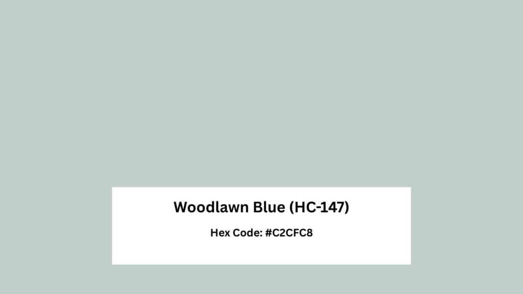
Woodlawn Blue is the clean, bright one in these two. It’s a light blue-green paint color but with a more blue.
It has a soft, muted quality that feels airy rather than bold or saturated. The gray undertone keeps things calm and sophisticated.
Woodlawn Blue is a cool-leaning color, but there’s subtle warmth hiding in there.
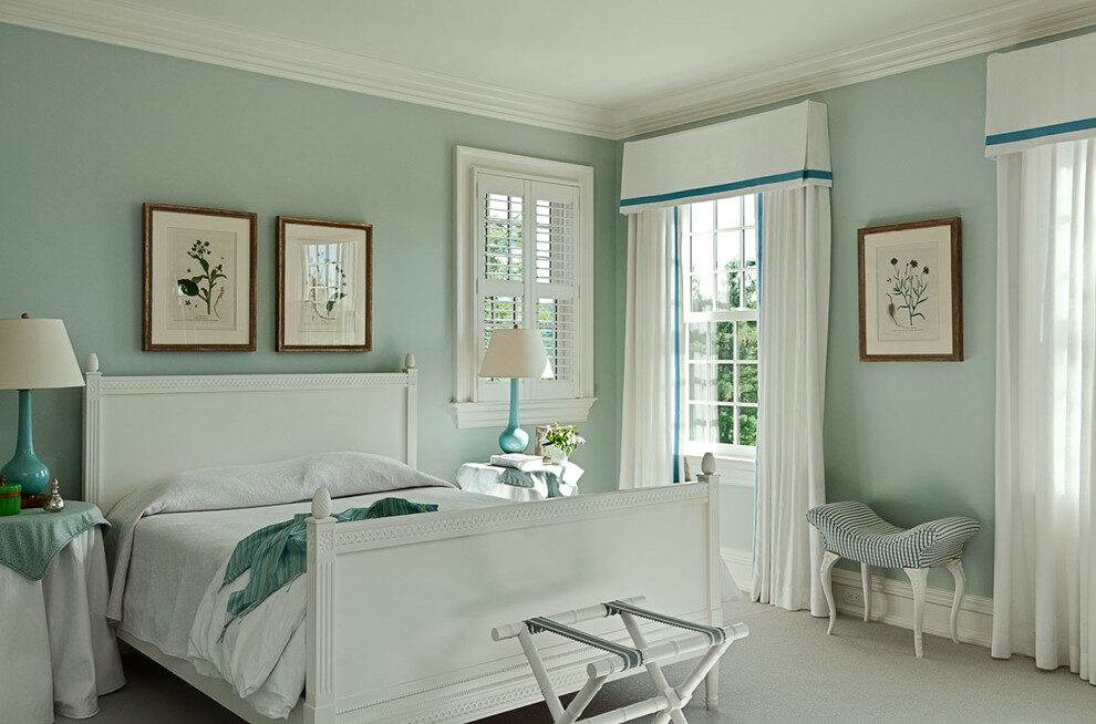
It won’t turn icy in north-facing rooms. The balance is why designers love it for bedrooms, bathrooms, living rooms.
The LRV is around 60, which means it reflects an amount of light.
It has that spa-like softness everyone wants in a bathroom, but it also handles a living room without feeling precious.
I’ve used Woodlawn Blue in a client’s primary bedroom with east-facing windows.
Morning light brought out blue-green and in the afternoon, it softened up but never was dull or muddy.
Color Profile of Palladian Blue (HC-144)
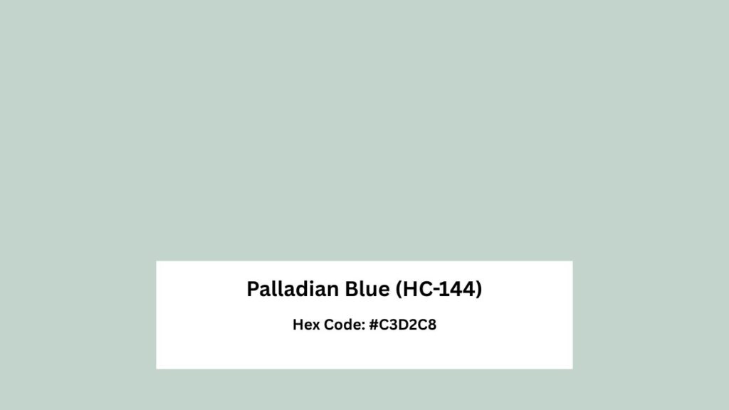
Palladian Blue is more complex and temperamental. It has a soft blue-green, but the green presence is strong.
And the gray undertone is heavy because some days it is a soft aqua.
Other days, in cool light, it shifts toward gray-green. This is why people call it a “chameleon color.”
The LRV is around 61 and identical to Woodlawn Blue on paper.
But it feels soft, subdued. Where Woodlawn Blue maintains its brightness, Palladian Blue can recede and go on your walls.
Designers love this color for spaces that need to feel serene.
It works beautifully in bedrooms with warm light, bathrooms paired with warm wood tones, and living rooms that have texture and warmth to balance the cool undertones.
Palladian Blue disappoints sometimes. They expect blue.
They get gray-green mainly in north-facing rooms or spaces with cool artificial lighting.
If you’re committed to seeing blue on your walls, Woodlawn is what you should consider.
Woodlawn Blue Vs Palladian Blue (Side-By-Side Comparison)
Okay, let’s get into the differences. Because side by side, these colors tell different stories.
LRV (Light Reflectance Value)
Both colors are around 60-61 LRV, putting them in the medium-light range.
This means they’re not going to darken your room, but they’re also not light that they disappear.
Woodlawn Blue: LRV ~60
Palladian Blue: LRV ~61
That one-point difference can sound meaningless but the undertones create the perception that Woodlawn Blue is brighter and Palladian Blue feels soft.
Undertones
Woodlawn Blue undertones: Green and gray, but the blue stays forward. It’s balanced.
You can see three colors working together.
Palladian Blue undertones: The green undertone dominates, and the gray softens everything. In some lighting, the blue disappears entirely.
When you put samples next to each other, Palladian Blue looks dusty, less saturated.
Woodlawn Blue looks clean and defined.
Lighting Impact
Natural light changes everything with these two.
In south-facing rooms with warm, abundant light:
- Woodlawn Blue looks airy and fresh, maintains its blue character
- Palladian Blue shows its true color but can lean to green
In north-facing rooms with cool, gray light:
- Woodlawn Blue holds up better, stays recognizable
- Palladian Blue can go gray-green and lose all blue
Artificial lighting:
- Woodlawn Blue: reads as blue-green, handles it well
- Palladian Blue: can look gray depending on your bulbs
I always tell clients to sample both in their space for at least 48 hours. Watch them in morning light, afternoon light, evening with your lamps on. That’s the only way to know what you’re getting.
Style Compatibility
Both colors pair well with warm white trim like White Dove or Simply White.
Avoid bright, cool whites because they’ll emphasize the gray undertones in both colors.
Woodlawn Blue works with:
- Coastal vibes
- Modern transitional spaces
- Rooms that need a fresh, clean feeling
- Satin or eggshell finishes in bedrooms and living rooms
- Semi-gloss for bathrooms and kitchens
Palladian Blue works with:
- Traditional interiors
- Soft, muted color schemes
- Spaces with warm wood tones and textures
- Eggshell or matte finishes to keep it soft
- Pairs beautifully with Revere Pewter as a neutral
Mood and Feel
Woodlawn Blue creates a spa-like, serene atmosphere but keeps things feeling fresh.
It’s calming without being sleepy.
Palladian Blue goes into relaxation mode because it’s quiet and soft.
Almost cocooning in the right space. But it can also feel flat if your room doesn’t have warmth or texture to balance it.
Both are versatile in their own ways, but they appeal to different sensibilities.
Comparison Table
| Feature | Woodlawn Blue (HC-147) | Palladian Blue (HC-144) |
| LRV | ~60 | ~61 |
| Undertones | Green and gray | Strong green with heavy gray |
| Color Read | Bright, clean, more blue | Softer, muted, green-gray |
| Best Lighting | Handles low light well | Needs warm, abundant light |
| Mood | Fresh, airy, spa-like | Serene, quiet, cocooning |
| Style | Coastal, modern, transitional | Traditional, soft, cottage |
| Sensitivity | Stable across lighting | Chameleon, shifts dramatically |
Which Color Suits the Best in Different Rooms?
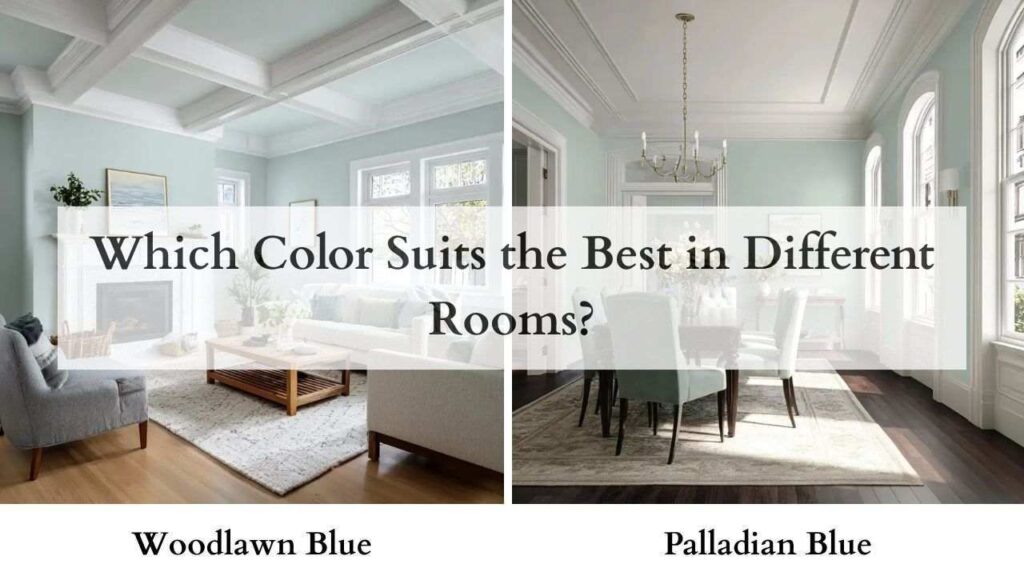
Let’s get practical.
Here’s where each color works best.
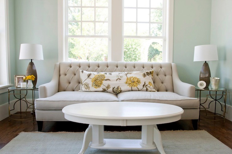
Living Room
Woodlawn Blue: Great choice if your living room is the heart of your home and needs to feel inviting but fresh.
Works well with light oak or maple floors, white or cream upholstery, and spaces that get decent light.
Palladian Blue: Better for living rooms that have warmth like warm wood furniture, textured fabrics, cozy lighting.
It’ll soften the space without making it feel cold.
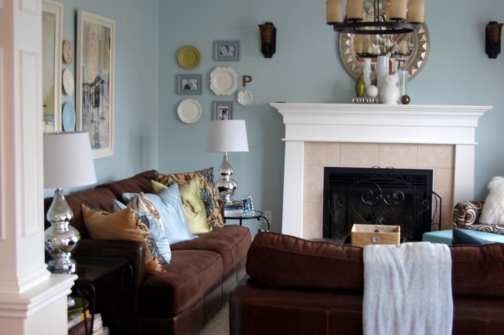
Bathroom
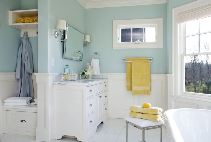
Woodlawn Blue: My go-to for bathrooms that need that fresh, clean spa feeling.
Pair it with white subway tile, brushed nickel fixtures, and a semi-gloss or satin finish.
The sheen brings out the blue.
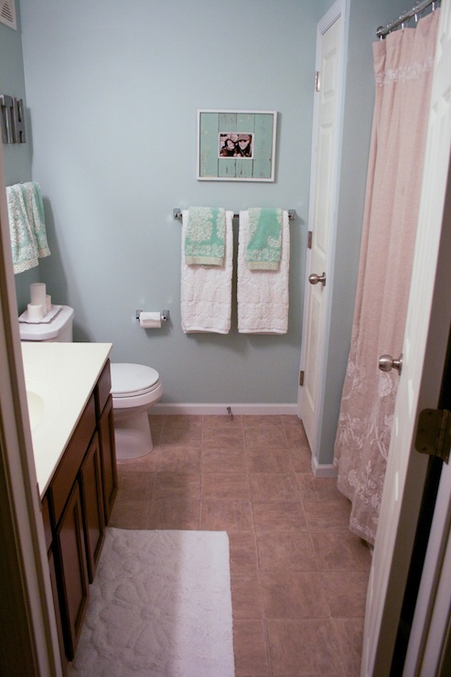
Palladian Blue: Works in bathrooms with warm wood vanities or travertine tile.
The green undertones complement warm materials well. But make sure you have good lighting.
Bedroom
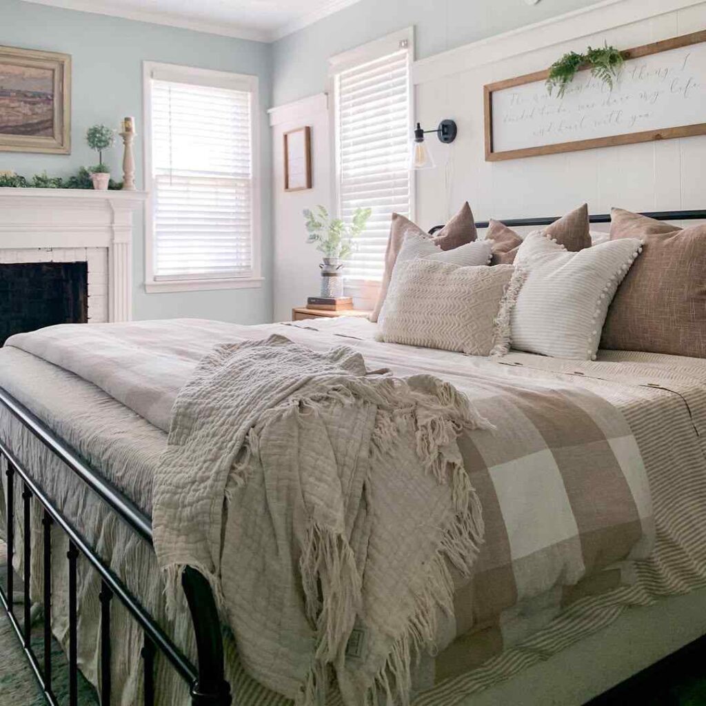
Woodlawn Blue: It is perfect for bedrooms with eastern or southern exposure.
You’ll wake up to that fresh, airy feeling. Keep it in eggshell or matte for bedrooms.
Palladian Blue: Ideal for bedrooms where you want to unwind.
It’s quieter than Woodlawn.
Kitchen
Both colors can work in kitchens, especially on cabinets.
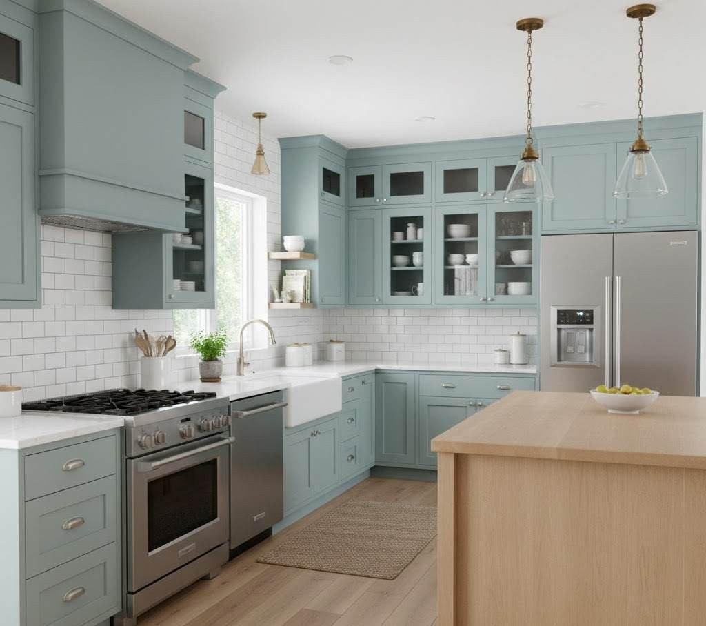
Woodlawn Blue cabinets: Pair with white countertops, warm brass hardware, and it creates a fresh, modern coastal kitchen.
Palladian Blue cabinets: Go traditional like marble counters, oil-rubbed bronze hardware, warm gray walls.
Exterior
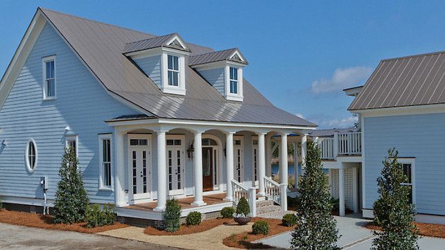
Woodlawn Blue: Beautiful on exteriors, especially coastal homes or farmhouses.
Stays true in harsh sunlight. Pair with white trim and a warm gray or charcoal door.
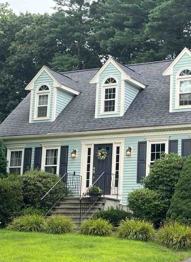
Palladian Blue: Also gorgeous on exteriors, for haint blue porch ceilings.
But know it’ll become more gray-green on cloudy days.
What is the Difference Between Woodlawn Blue and Palladian Blue?
Woodlawn Blue is bright, clean, and more blue. Palladian Blue is soft, muted, and leans green-gray.
Despite having almost the same LRVs, they are different because of their undertones.
Woodlawn Blue maintains its character across different lighting conditions.
Palladian Blue is more sensitive to light quality and surrounding colors.
Choose Woodlawn Blue if you want a noticeable color that feels calm.
Choose Palladian Blue if you want a subtle, sophisticated color that blends more than it pops.
Woodlawn Blue Vs Palladian Blue Vs Other Colors
While we’re here, let’s talk about the other blues you’re probably eyeing.
Palladian Blue Vs Sea Salt
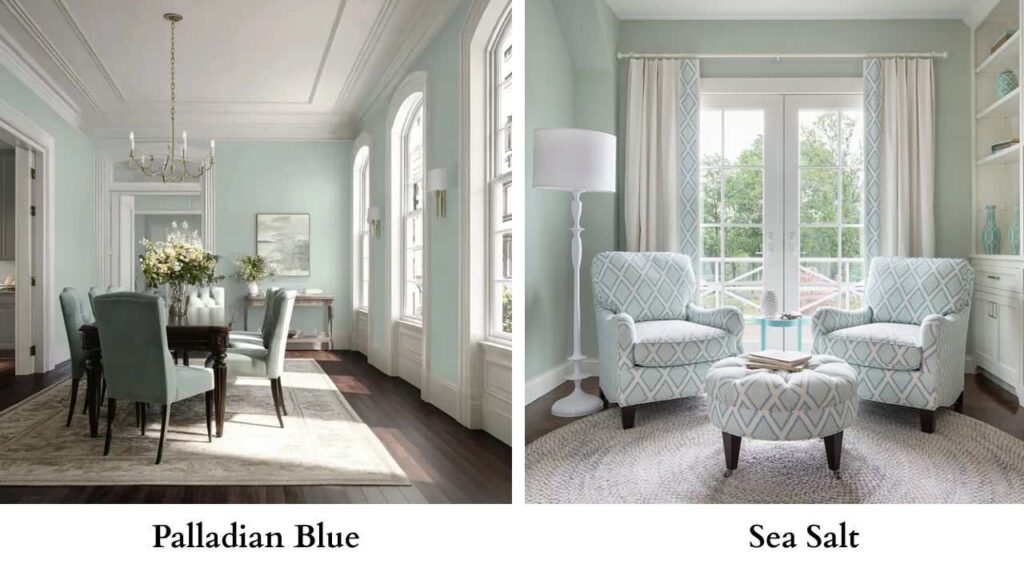
Sherwin Williams Sea Salt is Palladian Blue’s close. LRV around 63 but slightly lighter.
It’s a blue-green with gray, but Sea Salt is more green and can wash out in bright spaces.
If you’re worried Palladian Blue is muted, Sea Salt will disappoint you more.
Palladian Blue Vs Quiet Moments
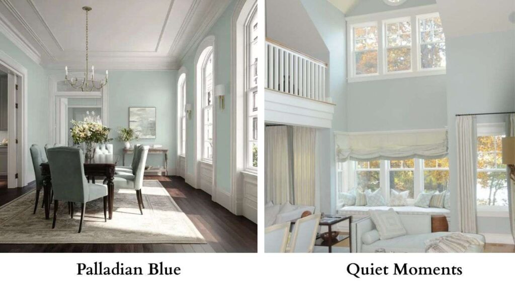
Benjamin Moore Quiet Moments is lighter and gray than Palladian Blue.
It’s beautiful but is more of a soft gray with a hint of blue-green.
Yarmouth Blue Vs Palladian Blue
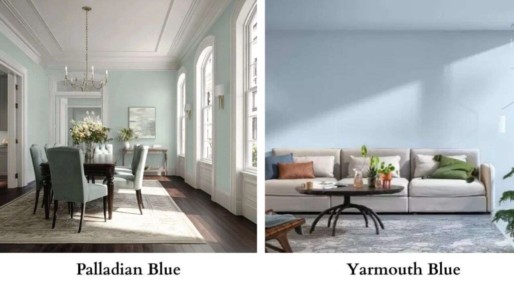
Yarmouth Blue (HC-155) has similar softness but leans more blue with less green.
It’s a good alternative if you like Palladian Blue’s mood but want less of that green shift.
Palladian Blue Vs Rainwashed
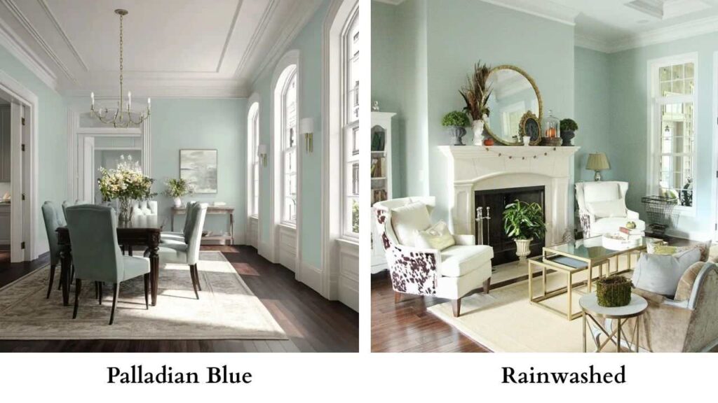
Sherwin Williams Rainwashed is SW’s version of Palladian Blue.
Soft blue-green, serene, works in the same spaces.
They’re close enough that you’d choose based on which brand you prefer.
Palladian Blue Vs White Dove
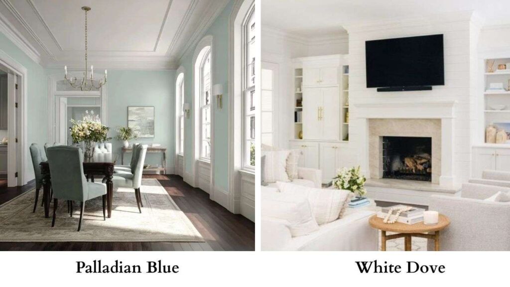
This isn’t a comparison, White Dove is a warm white that works well as trim with Palladian Blue.
The creamy undertones in White Dove warm up Palladian Blue’s coolness.
Don’t use them as alternatives but use them together.
Benjamin Moore Palladian Blue Complementary Colors
If you’re going with Palladian Blue, here’s what works:
White Dove (OC-17): Warm white for trim, ceilings, built-ins
Revere Pewter (HC-172): Perfect warm gray for adjacent rooms
Hale Navy (HC-154): Deep, moody blue for accents or a feature wall
Silver Satin (OC-26): Soft gray-beige that won’t compete
Pale Oak (OC-20): Another great warm neutral for flow
Pros and Cons of Woodlawn Blue and Palladian Blue
Woodlawn Blue (HC-147)
Pros:
- Maintains color across different lighting
- Fresh and airy without being bold
- Works well in rooms with less natural light
- Versatile across design styles
- More blue presence
Cons:
- Can feel bright crisp in traditional spaces
- May be too “blue” if you wanted something gray
- Less complex than Palladian Blue
Palladian Blue (HC-144)
Pros:
- Beautiful, soft, sophisticated color
- Creates a serene atmosphere
- Works well with warm materials
- More subtle and blended than Woodlawn Blue
- “Chameleon” quality
Cons:
- Very sensitive to lighting
- May disappoint if you expect blue
- Needs warm light and warm surrounding colors to work
- Can fall flat in north-facing rooms
Conclusion
Look, both Woodlawn Blue and Palladian Blue are the best colors when they’re in the right space.
But they’re not interchangeable.
If your room has questionable light or you want something that feels fresh and recognizable as blue-green then Woodlawn Blue is what you should consider.
If you’ve warm light, warm finishes, and you want something soft and understated then you should consider going with Palladian Blue because it creates an effect which is muted but almost looks nice and airy.
Take the samples of both of them and then live with them for a few days.
See what happens when the sun moves across your room because that’s the only way you’ll know which one belongs on your walls.
Comparing Woodlawn Blue Vs Palladian Blue can be interesting as well as confusing but considering these can help you out a lot.