Choosing the right white paint is hard. The undertones hiding in there can transform how a room feels, and lighting conditions can make your white into gray, or light yellow.
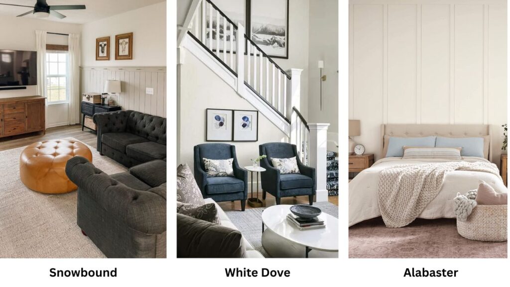
When you’re confused between Snowbound vs White Dove, you’re deciding between two different moods for your space.
Snowbound from Sherwin-Williams (SW 7004) and White Dove from Benjamin Moore (OC-17) are two most considered white paints.
They’re one of those trendy colors that look outdated but both paints work nicely for interiors and exteriors. But still, going with the wrong one in your space can be a mistake.
So, I’m breaking down Snowbound Vs White Dove, the undertones, the LRV, and how they look in real rooms with lighting.
We’re going room by room because Snowbound in a bathroom is different from Snowbound in a bedroom. I’m putting in comparisons with other popular whites too.
Here are my other blog posts that you can also read:
- Alabaster Vs Shoji white
- Eider White Vs Alabaster
- Manchester tan Vs Accessible beige
- Peppercorn Vs Iron ore
- Wythe blue Vs Palladian blue
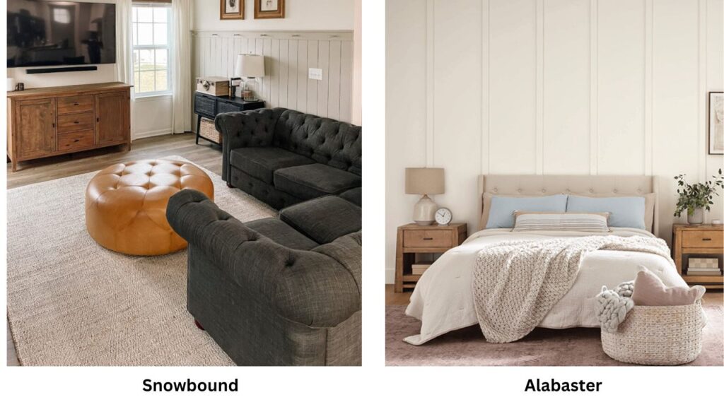
Color Profile of Sherwin Williams Snowbound (SW 7004)
Snowbound is a clean, bright white with subtle cool undertones, soft gray with the faint violet hints. I bought my first sample of Snowbound for a modern living room project, expecting another basic white.
But when I painted the sample board, the gray undertone came up.
The cool thing about Snowbound is that it is fresh and modern without being harsh. It has an LRV around 83, which means it reflects light but doesn’t have blinding conditions. In spaces with natural light, mainly south-facing rooms, Snowbound looks fresh and clean.
It’s an aesthetic which works well with stainless steel appliances, cool gray countertops, and modern furniture with clean lines.
I use Snowbound in modern kitchens and bathrooms. It works well with white subway tile and chrome fixtures. It creates a spa-like feeling.
The subtle violet undertone keeps it from being cold.
Snowbound can look flat or a bit gray in north-facing rooms or spaces with limited natural light. I learned this when I had a home office that had one small window facing north.
What looked perfect in the paint store looked depressing on the walls.
Designers and homeowners go for Snowbound for living rooms with contemporary furniture, home offices where you want a focused feeling, and for trim and cabinets when you’re pairing with cool wall colors.
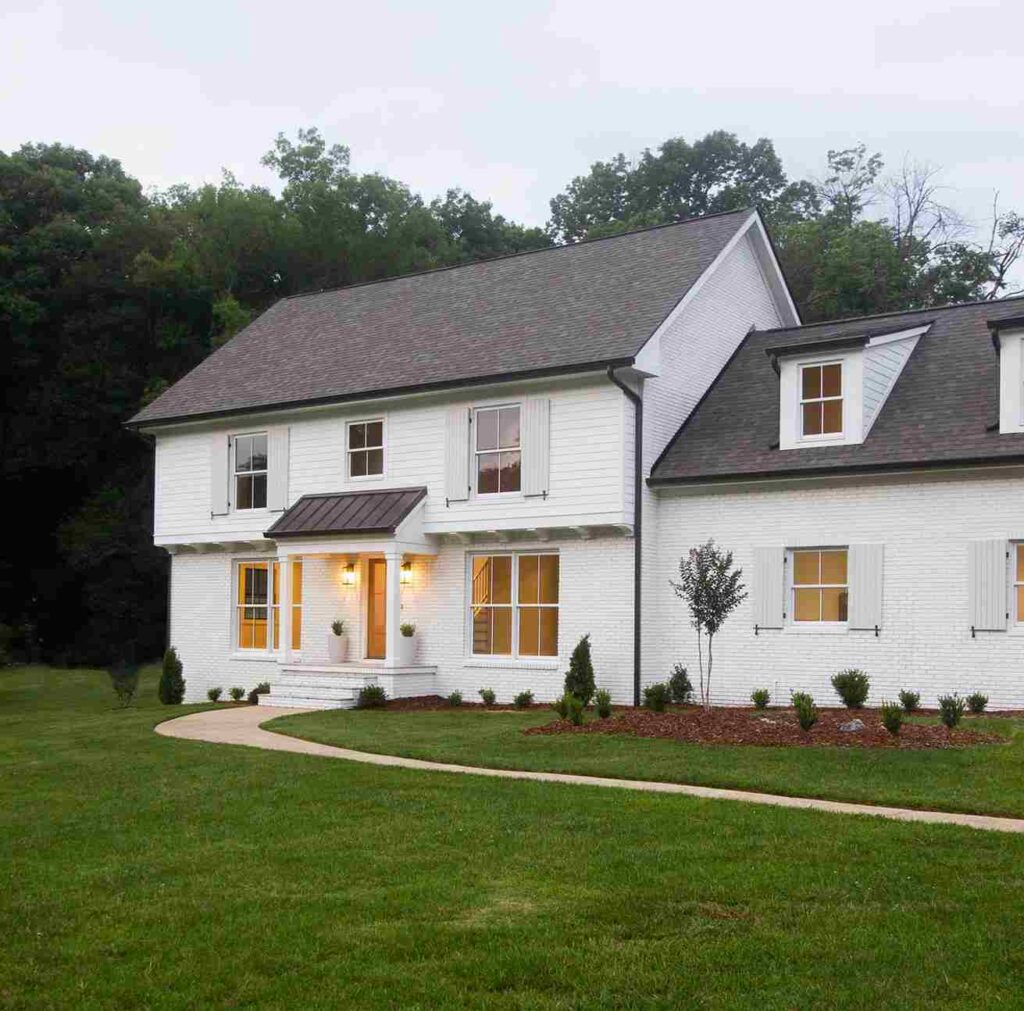
I’ve also used it on exteriors, like modern farmhouses with black windows and doors.
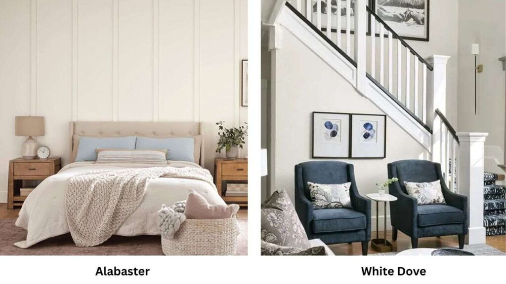
Color Profile of Benjamin Moore White Dove (OC-17)
White Dove is a soft, creamy white with subtle gray undertones. It is not like Snowbound’s cool gray, White Dove has a warm greige undertone.
When I first used White Dove, it was for my own bedroom, and I remember thinking “finally, a white that doesn’t make me feel like I’m in a laboratory.”
The LRV on White Dove is around 85, so it’s brighter than Snowbound. It holds a warmth across different lighting conditions.
In natural light, White Dove looks soft and inviting without yellow creaminess. In artificial light, it maintains a warm, cozy feeling.
White Dove has become one of the popular colors in the Benjamin Moore palette. It’s less yellow than traditional creamy whites but is warm and welcoming.
For bedrooms, White Dove is my go-to recommendation. The soft, creamy quality creates a restful environment which feels right for a sleeping space.
I’ve used it in living rooms where families wanted a cozy, gathering feeling. On kitchen cabinets with warm wood floors and brass hardware.
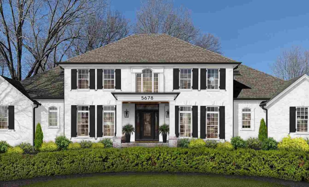
On exteriors, traditional or craftsman-style homes where you want warmth.
Here’s what I love about White Dove is that it’s forgiving. The greige undertones mean it doesn’t go against warm or cool accent colors.
You can put warm wood furniture next to it, or cool gray sofas, and it works.
What is the Difference Between Snowbound and White Dove?
Alright, let’s get into the differences between Snowbound Vs White Dove, because this is where your decision happens.
They’re both white, they both have similar LRV numbers, but they create different feelings in a space.
LRV
Light Reflectance Value, this is the measurement of how much light a paint color reflects. Snowbound is at an LRV of 83, while White Dove is at 85.
The difference is meaningless. You won’t walk into a room and look for the light reflection.
The real difference comes from the undertones, not the brightness level.
Both colors reflect light to brighten up a space without being the bright, harsh whites that feel cold and uninviting.
They’re in the spot where you get brightness but also depth.
Undertones
This is the difference that matters. Snowbound has cool gray undertones with subtle violet hints. It is on the cool side of neutral.
When you put it next to warm whites or beiges, the coolness becomes obvious.
In some lighting, mainly the flat, cool light from north-facing windows, the gray undertones can come up and make the room feel muted.
White Dove has warm greige undertones, the blend of gray and beige that gives it softness without being old-school cream. It doesn’t have yellow in it.
So many “warm whites” are yellow, and then you’re stuck with walls that look dingy or dated. White Dove has a perfect balance where it feels warm and inviting but fresh and clean.
Lighting Affect
Lighting can make or break both of these colors, but in different ways. Snowbound in north-facing rooms or spaces with cool artificial lighting can shift gray.
I’ve seen it look like a pale gray instead of white. But in rooms with natural light, mainly warm southern light, Snowbound looks fresh and bright.
White Dove handles varied lighting conditions better.
The warm undertone means it doesn’t get muddy or gray in low light.
In warm artificial light, it gets cozy and inviting. In natural light, it has a beautiful soft glow that doesn’t feel cold.
Understanding how room lighting affects each color is the important factor.
I tell people to test large samples on multiple walls in the room, and look at them at different times of day.
Style and Best Uses
Snowbound works best in modern and contemporary spaces where you want the clean, minimalist feeling.
It pairs well with cool gray accent colors, black trim or windows, stainless steel, and chrome finishes.
I use it for trim and ceilings when the walls are of a cool color. It’s perfect for the all-white modern kitchen look with white cabinets, white counters, and a clean aesthetic.
White Dove shines in traditional, transitional, and modern farmhouse spaces where warmth matters.
It works with warm wood tones, brass and gold hardware, beige and tan accent colors, and natural materials like wood and stone.
Here’s a comparison table that may help:
| Aspect | Snowbound (SW 7004) | White Dove (OC-17) |
| Brand | Sherwin-Williams | Benjamin Moore |
| LRV | 83 | 85 |
| Undertones | Cool gray with violet hints | Warm greige |
| Best Light | South-facing, bright spaces | Works in varied lighting |
| Style | Modern, contemporary | Traditional, transitional, farmhouse |
| Pairs With | Cool grays, black, chrome | Warm woods, brass, natural tones |
| Best For | Kitchens, bathrooms, offices | Bedrooms, living rooms, whole-home |
| Watch Out | Can go gray in low/north light | May feel too warm in strong sun |
Snowbound Vs White Dove: Room-By-Room Comparison

Let’s get specific here because how a white paint performs changes depending on the room. A white that’s perfect in your kitchen can not go in your bedroom.
Living Room
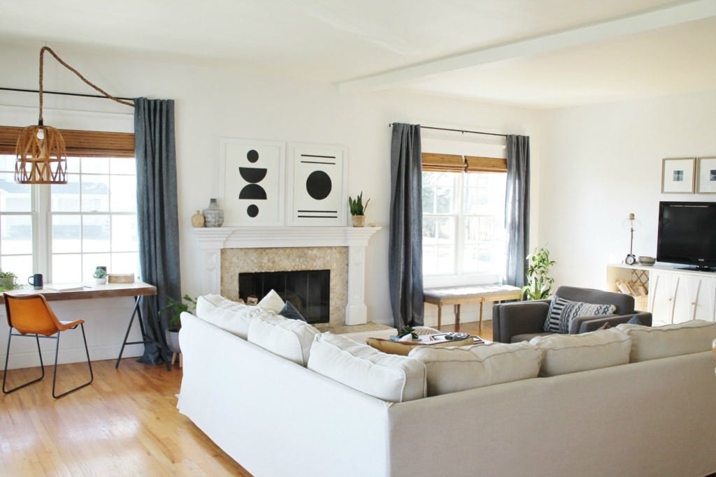
Snowbound in a living room works when you’ve got a modern aesthetic with sleek furniture, minimal decor, and natural light.
I used it in an open-concept living room that had floor-to-ceiling south-facing windows, paired with mid-century modern furniture and a cool gray sofa. The fresh, clean feeling it creates made the space feel large and open.
But the same color in a cozy, traditional living room with north-facing windows will look cold and unwelcoming.
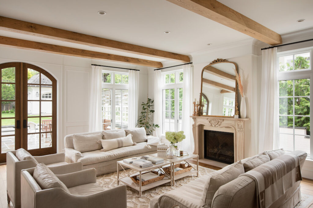
White Dove in a living room creates an inviting, warm atmosphere which makes people want to hang out in the space.
I’ve used it in many living rooms from traditional to modern and it makes spaces feel comfortable without taking the brightness.
It works well if you’ve warm wood floors, comfortable upholstered furniture.
Bedroom
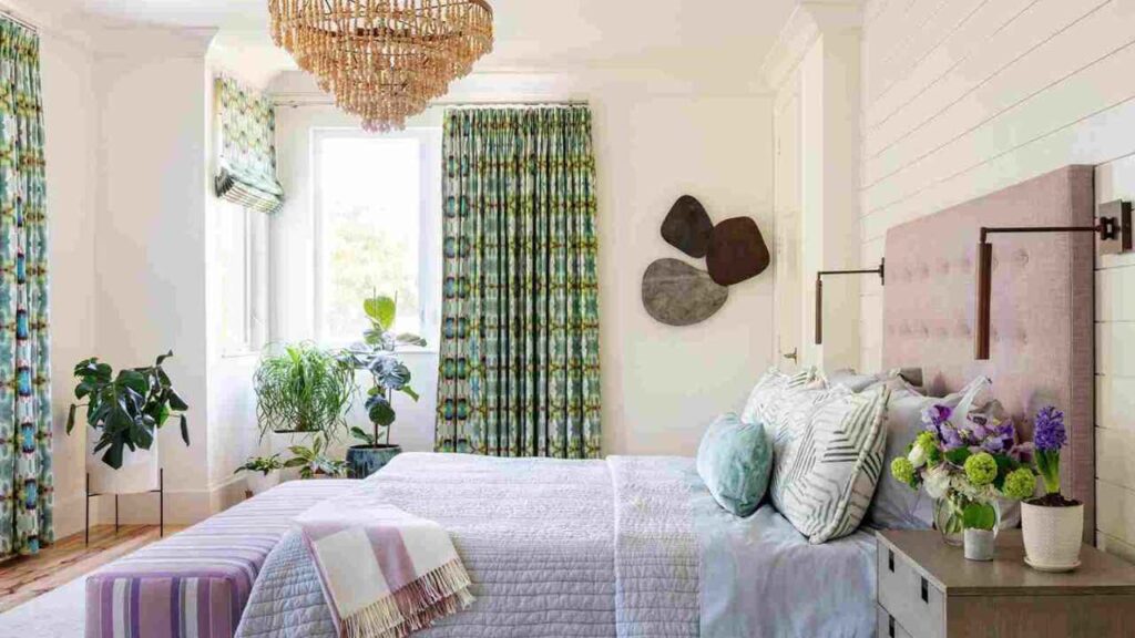
Snowbound in a bedroom is tricky. But only in some conditions like a modern primary bedroom with light and a cool-toned color.
And I end up recommending something warm because bedrooms need to feel restful and cozy.
The cool undertone can make a bedroom feel less inviting for sleep.
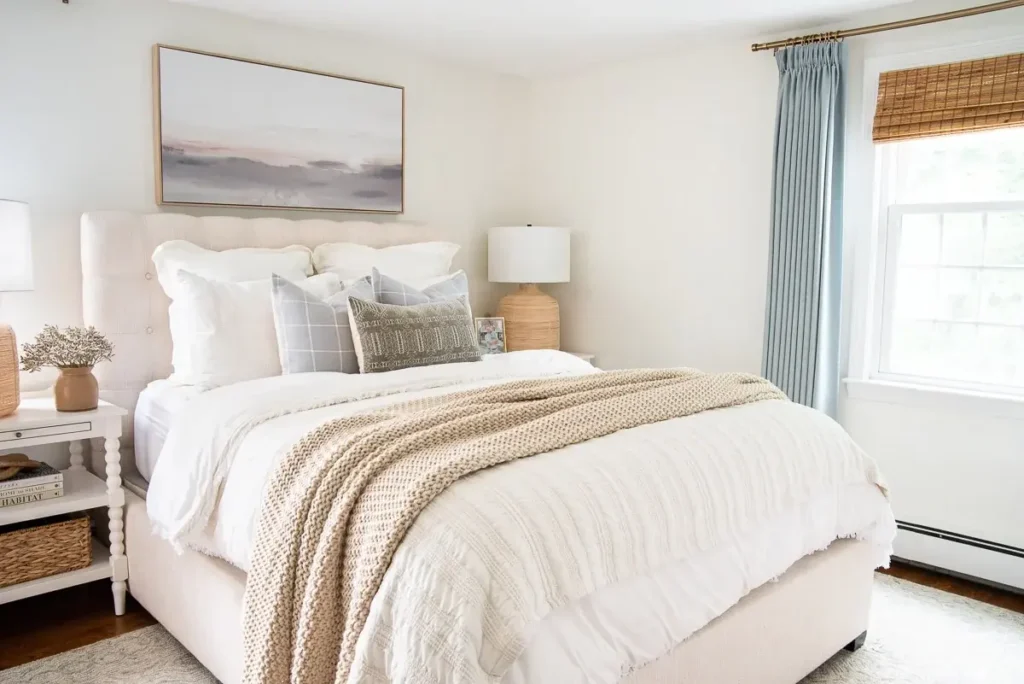
White dove in the bedroom is perfect. I used it in my own bedroom and I’ve specified it in 75% of bedroom projects.
The soft, warm quality creates the restful environment you want when you’re trying to sleep.
It doesn’t have the harsh, cold feeling that some whites bring to bedrooms.
Bathroom
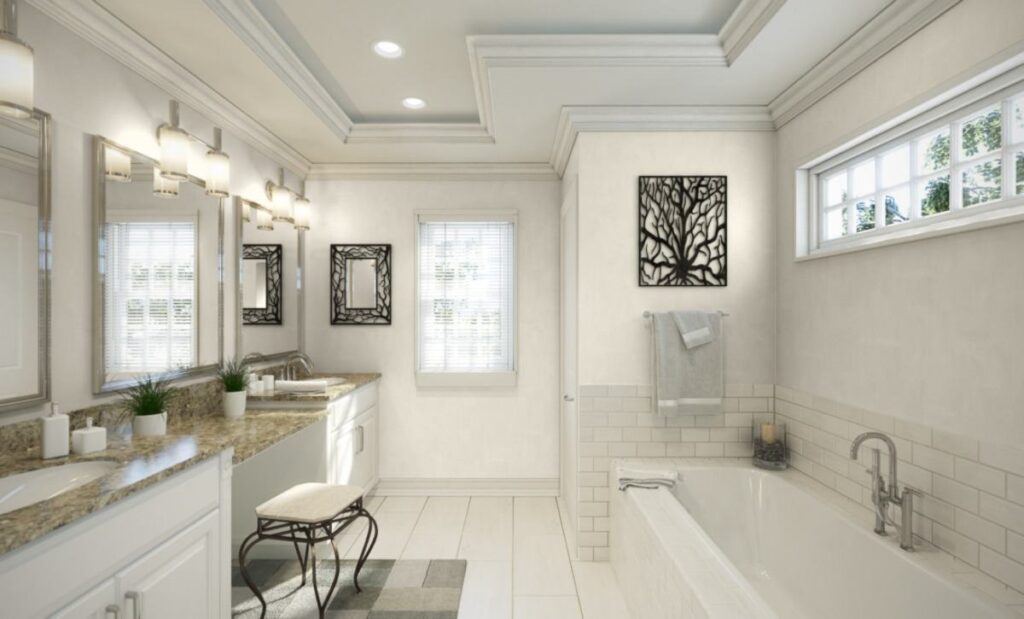
Snowbound in bathrooms is where this color shines. If you want a spa-like, clean, modern bathroom aesthetic, you can go with Snowbound.
I’ve used it with white marble, white tile, chrome fixtures, and frameless glass showers to create fresh, bright bathrooms that feel luxurious.
The cool undertone works in a bathroom because you want the clean, fresh feeling in a space.
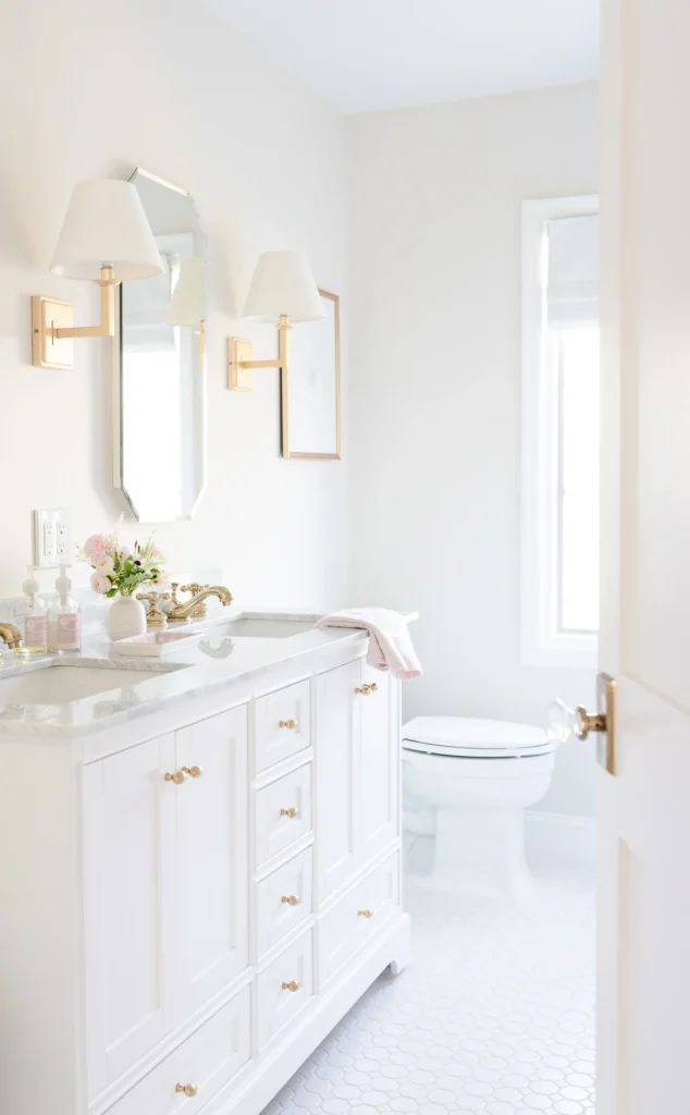
White Dove in bathrooms gives you a soft, traditional bathroom feeling. It works well with white subway tile, marble counters, and warm finishes like brass or gold hardware.
If your bathroom has limited natural light, White Dove handles that better than Snowbound because it won’t shift gray.
One of my favorite bathroom projects used White Dove with warm wood vanity and brass fixtures.
Kitchen
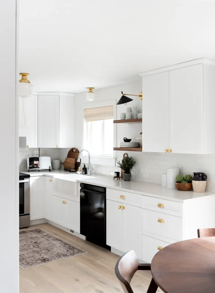
Snowbound in kitchens is about the modern, all-white kitchen. White cabinets, white walls, white counters, Snowbound is perfect to go for because it won’t overwhelm your space.
It pairs well with stainless steel appliances, cool gray or white countertops, and modern hardware.
I used it in a kitchen last year where we did white shaker cabinets, white quartz counters, and Snowbound on the walls.
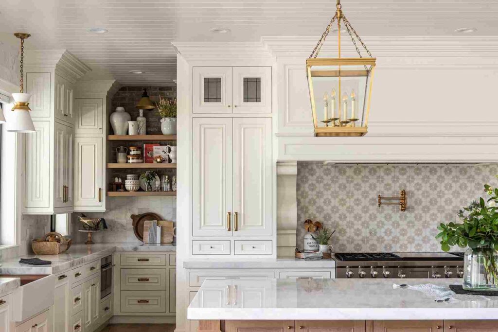
White Dove in kitchens works when you’ve warm wood elements, colored cabinets, or you want a traditional kitchen feeling.
I specify White Dove for kitchen cabinets, it’s the most popular cabinet color I use.
It looks beautiful with warm wood floors, brass hardware, marble with warm veining, and colored islands.
Exterior
Snowbound on exteriors works for modern or contemporary homes where you want a fresh , clean white. It looks good on modern farmhouses with black windows and doors.
The cool undertone reads as fresh and modern from the street. But watch the orientation of your house because on north-facing facades with limited sun, Snowbound can look a bit flat or gray.
White Dove on exteriors is a classic choice for traditional, craftsman, or colonial-style homes. The warm undertone gives houses a welcoming, timeless look that doesn’t feel harsh.
It works with different lighting conditions better than Snowbound, which makes it more forgiving for exteriors where you can’t control the light.
Snowbound Vs White Dove Vs Other Colors
Neither of these colors exists in one but there’s an option of white paint out there, and you should know how these two compare to other popular options.
Snowbound vs Alabaster
Alabaster (SW 7008) is warmer and creamier than Snowbound. If you find Snowbound too cool or gray, Alabaster is what you can consider.
It’s neutral but has more warmth without going beige. I use Alabaster more than Snowbound in many projects because it’s versatile in different lighting conditions.
Alabaster vs White Dove
These two are close competitors. Alabaster is warmer than White Dove, with a bit more cream. White Dove has the greige undertones that keep it from reading as creamy, while Alabaster is more into the soft cream territory.
Both are great, it depends if you want warm or the perfect neutral-warm.
Snowbound vs Simply White
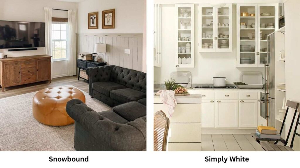
Simply White (BM OC-117) is brighter and fresher than Snowbound. If you want brightness and less gray, Simply White is what you should consider.
But it can feel harsh in spaces without natural light. Snowbound is soft and muted in comparison.
Snowbound Vs Swiss Coffee
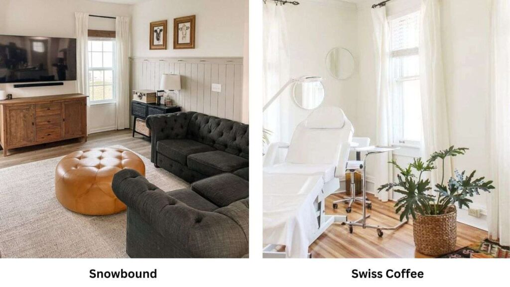
Swiss Coffee (BM OC-45) is warmer than Snowbound. Swiss Coffee has warm beige undertones that make it feel traditional and cozy, while Snowbound is cool and modern.
If you’re considering both of these, you need to decide warm vs cool first.
Pure White Vs White Dove
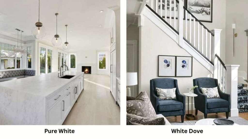
Pure White (SW 7005) is cool and brighter than White Dove. It’s a bright, clean white without warmth.
White Dove is soft, warm, and forgiving. Pure White can feel harsh if you’re not ready for that level of brightness.
Snowbound vs Pure White vs Alabaster
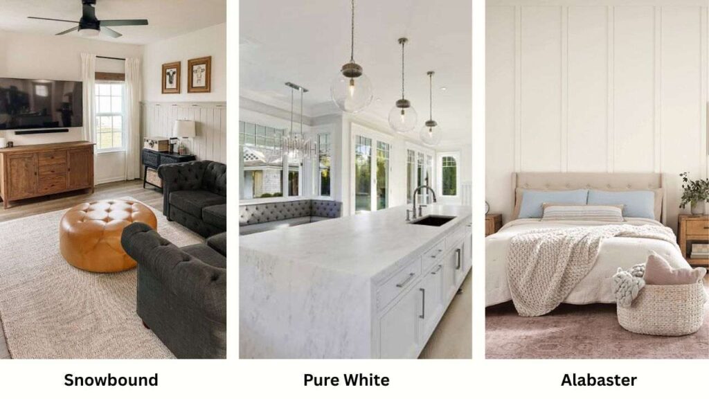
This is the Sherwin-Williams white comparison.
Snowbound is the coolest with gray undertones, Alabaster is the warmest with cream undertones, and Pure White is the bright and pure of the three.
White Dove Vs Greek Villa
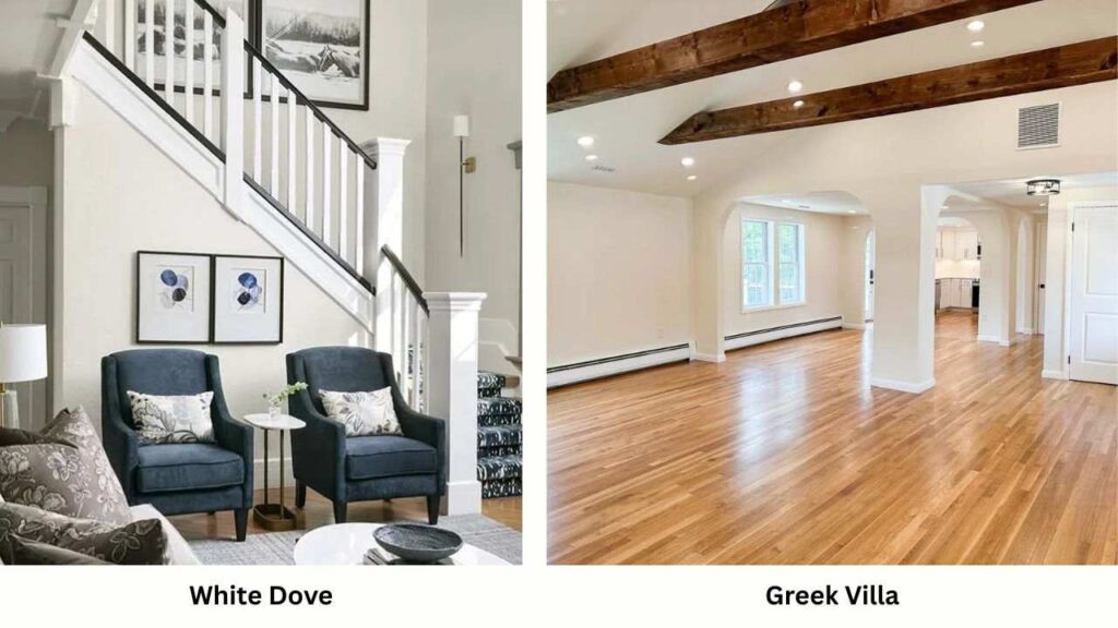
Greek Villa (SW 7551) is warmer than White Dove, close to cream territory.
If White Dove feels neutral for you and you want warmth, Greek Villa will work. But be aware it definitely reads as cream, not warm white.
Here’s a comparison table for these alternatives:
| Paint Color | Brand | Temp | Character | Best For |
| Snowbound | SW | Cool | Gray undertones, modern | Contemporary spaces, bright rooms |
| White Dove | BM | Warm | Greige undertones, versatile | Most rooms, whole-home color |
| Alabaster | SW | Warm | Soft cream, popular | Versatile, most spaces |
| Simply White | BM | Cool | Bright, crisp | High-light spaces |
| Pure White | SW | Cool | Very bright, stark | Modern, lots of light |
| Swiss Coffee | BM | Warm | Beige undertones | Traditional spaces |
| Greek Villa | SW | Warm | Creamy | Warm, cozy rooms |
Common Mistakes to Avoid When Going With Snowbound and White Dove
Let me save you from the mistakes I’ve made over the years. These are the things that’ll make you repaint before you’ve finished the whole room.
- Not testing large samples in your space.
- Ignoring room orientation
- Not considering your existing finishes
- Choosing based on someone else’s house
- Using the wrong sheen
- Painting everything before doing one wall
- Not accounting for artificial lighting
Conclusion
Choosing between Snowbound Vs White Dove comes down to understanding what you want your space to feel like.
Snowbound is the fresh, cool, modern white which works well in bright spaces with contemporary design.
White Dove is the soft, warm, versatile white which creates cozy, inviting rooms and works with almost any lighting situation.
I’ve used both of these colors many times, and they’re both excellent whites. If I’m designing a modern kitchen or bathroom with light, Snowbound is my choice.
For bedrooms, living rooms, or whole-home color schemes where warmth and versatility matter, White Dove is what I will consider.
The trick is testing them in YOUR space with YOUR lighting and YOUR existing finishes.
If you’re not sure after testing, White Dove is the safe to go with because it’s forgiving and works in many situations.
But comparing Snowbound Vs White Dove is not that tough if you follow the checking process seriously.
FAQs on Snowbound Vs White Dove
The main difference is undertones, Snowbound has cool gray undertones with subtle violet hints, while White Dove has warm greige (gray + beige) undertones. Snowbound feels fresh and modern, White Dove feels soft and inviting.
No, White Dove doesn’t look dingy but that’s one of its strengths. It has warm undertones without yellow, which is what makes whites look dingy or dated. The greige undertone keeps it feeling fresh and clean while being warm and inviting.
Skip White Dove if you want a bright, modern white with no warmth because it’ll feel too soft for the aesthetic. Also avoid it in rooms with strong, warm southern light if you don’t want any warmth.
White Dove’s versatility is what makes it popular. It’s warm but not yellow, bright but not harsh, and it works with different lighting conditions without looking flat or gray. The greige undertones let it pair with both warm and cool accent colors.
Snowbound is cool, it has soft gray undertones with subtle violet hints that place it on the cool side of the white paint, this is why it works well in modern spaces with cool-toned finishes, but it can feel cold in rooms which has no good lighting or in spaces where warmth is needed.
Snowbound Vs White Dove: Everything You Need to Know Before Choosing