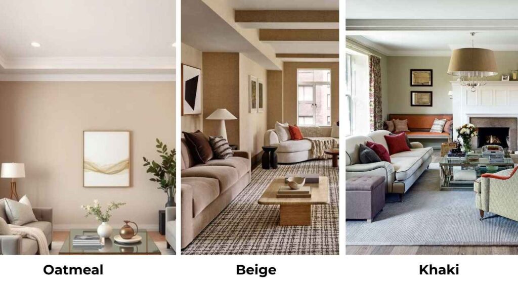
So, If I talk about Oatmeal Color Vs Beige is the common confusion I get from homeowners.
Both come in the cozy neutral category which compliments everything.
They’re warm and soft, but they’re not the same, even though they are in the same family and they look different in some light.
The thing is, both oatmeal and beige show up everywhere like walls, furniture, upholstery, the linen curtains and any textile that wants to feel grounded but not boring.
What makes picking between them is how much lighting impacts them.
The finish you choose also makes an impact and accent colors can make the paint look different, designers know this.
Renovators learn it and homeowners are looking at it.
So, I’m breaking down everything about Oatmeal color Vs Beige.
We’re talking undertones, LRV numbers, how each one looks under different lighting, and which rooms they work best in.
I’ll also compare them to other neutrals because sometimes people also consider the other ones too.
Here are my other blogs that you can also read:
- Eider White Vs Alabaster
- Agreeable Grey Vs Accessible Beige
- Classic Gray Vs Pale Oak
- Hunter Green Vs Emerald Green
- Ballet White Vs White Dove
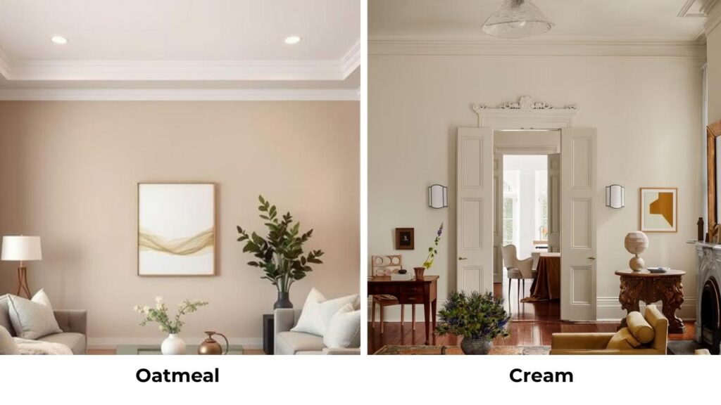
About Oatmeal Color

Oatmeal color is the warm, light neutral that looks like oat grains.
It is somewhere between off-white and light beige, but with this beautiful complexity that keeps it from feeling flat.
The undertones are where oatmeal gets interesting.
It is a soft gray mixed with greige with a hint of taupe.
Benjamin Moore’s Oatmeal (268) is into the brown-cream.
Dutch Boy’s Oatmeal Beige (413-2DB) has an earthy vibe without going yellow-beige.
What I love about oatmeal is it feels calmer than beige.
It’s lighter and airy than beige, which makes it perfect for spaces that need to feel open but grounded.
When I use oatmeal in modern, industrial, or contemporary design styles, it works because it brings warmth without the traditional vibes like regular beige.
It pairs well with concrete, matte black fixtures, and natural wood.
For exteriors, oatmeal looks sophisticated.
For interiors, it’s my go-to when clients want white but their space needs something with substance.
The soft gray undertones mean it doesn’t go against cool metals like brushed nickel or chrome.
About Beige

Beige is the classic warm neutral.
It’s been around forever and it works every time.
The difference between beige and oatmeal is that beige commits to the yellow, tan, or brown undertones.
It’s deep, warm and sometimes golden.
Sherwin Williams Accessible Beige SW 7036 is the most popular beige, but it’s more greige than pure beige.
True beige can be creamy, sandy, golden, or a bit orange depending on the LRV and the light it’s in.
Beige feels traditional, cozy, and familiar in a way that oatmeal doesn’t.
When you walk into a beige room, there’s a warmth and it’s inviting.
But it can also feel heavy or muddy if you’re not careful with your lighting and pairings.
Here’s what I tell people about beige: it will appear dark or heavy depending on your lighting.
Incandescent bulbs make it glow warm.
LEDs can pull out of place undertones if you pick the wrong color temperature.
In natural daylight, beige looks its best, but in late afternoon, beige gets yellow.
Beige works in transitional, traditional, and modern farmhouse styles.
It makes exteriors feel welcoming without being boring.
For interiors, beige is your go to consideration when you have warm wood floors, traditional furniture, or you’re trying to create the layered neutral look with creams and taupes.
Oatmeal Color Vs Beige: Key Differences
So, Oatmeal Color Vs Beige, both colors are neutrals, both are warm, both won’t go against your existing finishes.
But they’re different in that choosing wrong can leave your room feeling off.
The differences come down to some considerations and it matters.
LRV
Light Reflectance Value is how much light a color reflects back.
The scale is from 0-100, where 0 is pure black (absorbs everything) and 100 is pure white (reflects everything).
Oatmeal is around LRV 60-70 depending on the specific conditions.
Benjamin Moore Oatmeal 268 is around 65.
It is high which means it reflects a good amount of light back into the room, which is why it feels airy and open.
Beige usually falls around LRV 50-60, making it visibly dark and less reflective than oatmeal.
Some deep beiges can drop into the high 40s. Sherwin Williams Accessible Beige is at about 58.
In a small room or a space with limited natural light, the 10 to 15 point LRV difference matters. Oatmeal will make the space feel big and bright.
Beige will make it feel cozy but closed-in.
Undertones
This is where people get tripped up because undertones show up.
Oatmeal’s undertones lean gray, greige, and soft taupe.
There’s warmth, but it’s subtle.
The gray keeps it from going warm-cozy-traditional.
It’s like warmth with boundaries, that’s why it works in modern spaces and it has restraint.
Beige goes all-in on yellow, tan, and brown undertones.
Depending on the specific beige, you may get peachy notes, golden notes, or straight-up caramel vibes. It’s warm.
Here’s my opinion: put your paint sample next to pure gray and pure brown.
If it looks purple or greenish next to the brown, you’ve strong undertones.
Oatmeal will look cool next to brown. Beige will look right at home.
Lighting Affect
Remember lighting changes everything with these colors.
Oatmeal in natural north-facing light can look gray-beige.
Not bad, but cooler than you expect.
In south-facing rooms with warm, direct sunlight, oatmeal brightens up and the subtle warm undertones come out to play.
And in warm LED or incandescent lighting, oatmeal holds its own character without going yellow.
Beige in north-facing light can look flat or a little dull, the warm undertones need light to activate.
In south-facing or west-facing rooms, beige glows.
Late afternoon sun makes it golden.
And under warm artificial lighting, beige can get warm.
I learned this when I was on a project where I used a sandy beige in a room with only north-facing windows and cool white LED can lights.
It looked sad and chalky.
We switched to warm bulbs and it helped, but oatmeal is what should’ve been considered for this.
Style and Best Uses
Oatmeal shines in:
- Modern and contemporary spaces
- Minimalist designs
- Industrial lofts with concrete or metal elements
- Scandinavian-inspired interiors
- Spaces with cooler accent colors like blues, grays, soft greens like sage
- Open-concept areas where you want flow without heaviness
Pair it with bright white trim like Benjamin Moore Simply White or Sherwin Williams Pure White, keep your ceiling white or barely-there cream, and use furniture in natural light woods, black metal, or soft grays.
Accent colors that work are muted sage, soft terracotta, dusty blue, charcoal.
Beige works best in:
- Traditional and transitional styles
- Cozy, lived-in family spaces
- Rooms with warm wood floors and traditional furniture
- Exteriors that need to feel welcoming and established
- Spaces where you’re layering multiple warm neutrals
Pair it with warm white or cream trim like Benjamin Moore White Dove or SW Alabaster, keep your ceiling a warm white, and use furniture in medium to dark woods, warm metals like brass or bronze, or layered textiles in cream and taupe.
Accent colors that work are warm terracotta, golden yellows, olive greens, rich browns.
Comparison Table
| Aspect | Oatmeal Color | Beige |
| LRV Range | 60-70 (light, reflective) | 50-60 (deep, less reflective) |
| Primary Undertones | Gray, greige, soft taupe | Yellow, tan, brown |
| Warmth Level | Warm but restrained | Fully warm, sometimes very warm |
| Best Lighting | Works in most; excellent in bright natural light | Needs warm or abundant light to avoid flatness |
| Style Association | Modern, contemporary, minimalist, industrial | Traditional, transitional, cozy, farmhouse |
| Pairs Well With | Cool and warm accents, white trim, light woods | Warm accents, cream trim, medium/dark woods |
| Common Feel | Airy, calm, sophisticated | Cozy, familiar, welcoming |
| Risk Factor | Can look dingy in very low light | Can go too yellow/orange in warm light |
Oatmeal Color and Beige: Room-By-Room Comparison
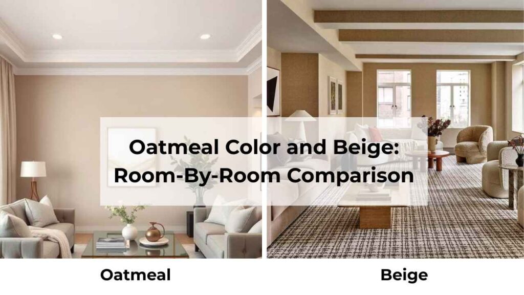
Different rooms have different needs, different lighting, different vibes you’re trying to create.
Here’s how these two colors look where you live.
Living Room

Oatmeal in the living room creates a beautiful modern backdrop that makes your furniture and art shine.
I’ve used it in open-concept spaces where the living room flows into the dining area and kitchen, and it provides warmth without competing with everything.
The light LRV means if you have a lot of furniture, the walls don’t feel closed in.
It works well if you’re going for the curated, minimal look with a mix of textures like linen sofa, leather chair, wool rug and some greenery.
The gray undertones keep it from feeling matchy with warm wood floors.
One thing to remember, if your living room is your cozy oatmeal may feel too cool or modern. Not always, but worth considering.
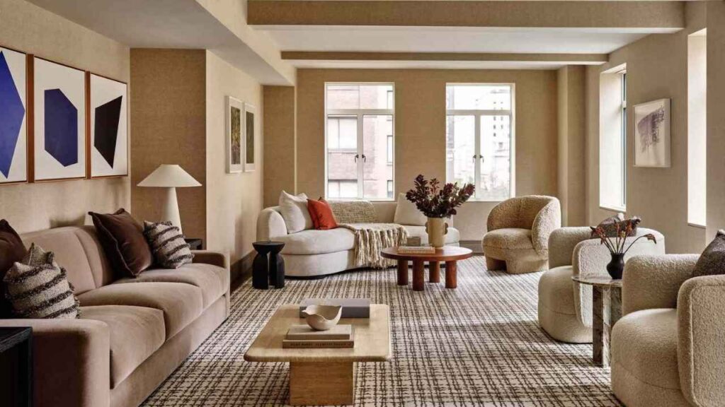
Beige in the living room is classic for a reason.
It makes the space feel inviting and lived-in.
If you have traditional furniture, warm wood, or you’re trying to create a layered neutral thing with beige walls, a cream sofa, taupe pillows, and a tan throw.
The deep color creates intimacy, which is great for living rooms where you want the cozy, gathered feeling.
It also hides imperfections better than light colors.
But small living rooms with limited light can feel cramped with beige walls.
Bedroom
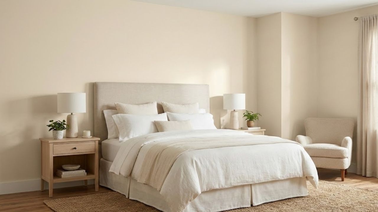
Oatmeal in bedrooms is one of my favorite moves, mainly in primary bedrooms.
There’s something about the soft, muted quality that feels calm without being cold.
It’s warm to feel comfortable when you wake up, but not so warm that it feels stuffy.
I love it in bedrooms with textiles like white bedding, linen curtains, and a chunky knit throw.
The oatmeal walls create a serene backdrop.
It works well in small bedrooms because the high LRV makes the space feel less tight.
If you’re someone who likes your bedroom to feel like a spa or a retreat, oatmeal delivers the vibe.
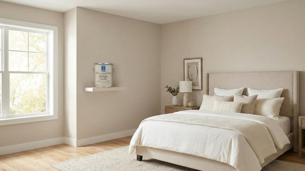
Beige in bedrooms goes into cozy mode. It creates a wrapped up energy.
Traditional bedrooms with wood furniture, bedrooms in old homes with architectural details, guest bedrooms where you want people to feel welcomed.
The warmth is comforting.
It makes the room feel finished and intentional if your decor is minimal.
But in small bedrooms or rooms with small windows, beige can feel heavy.
Bathroom
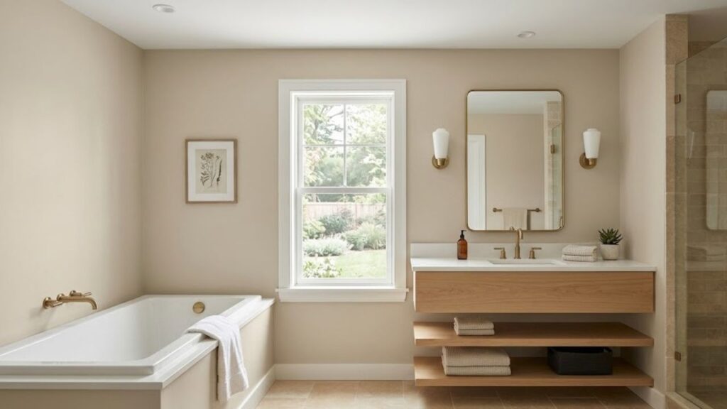
Oatmeal in bathrooms has become popular, mainly in modern bathroom renovations.
It pairs well with white subway tile, marble, concrete-look tile, matte black fixtures like all the stuff people are doing.
The soft warmth keeps the bathroom from feeling sterile, but it’s light to make small bathrooms feel open.
The gray undertones work with chrome or brushed nickel fixtures without any clashes.
One consideration, bathrooms with no natural light or only small windows need good artificial lighting with oatmeal, or it can look flat.
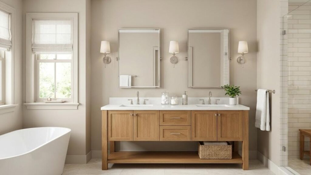
Beige in bathrooms creates a warm, spa-like feeling but in a traditional way.
It works well with cream or beige tile, warm wood vanities, brass or bronze fixtures.
If you’re going for the warm, enveloping bathroom vibe, beige is what you should consider.
Kitchen
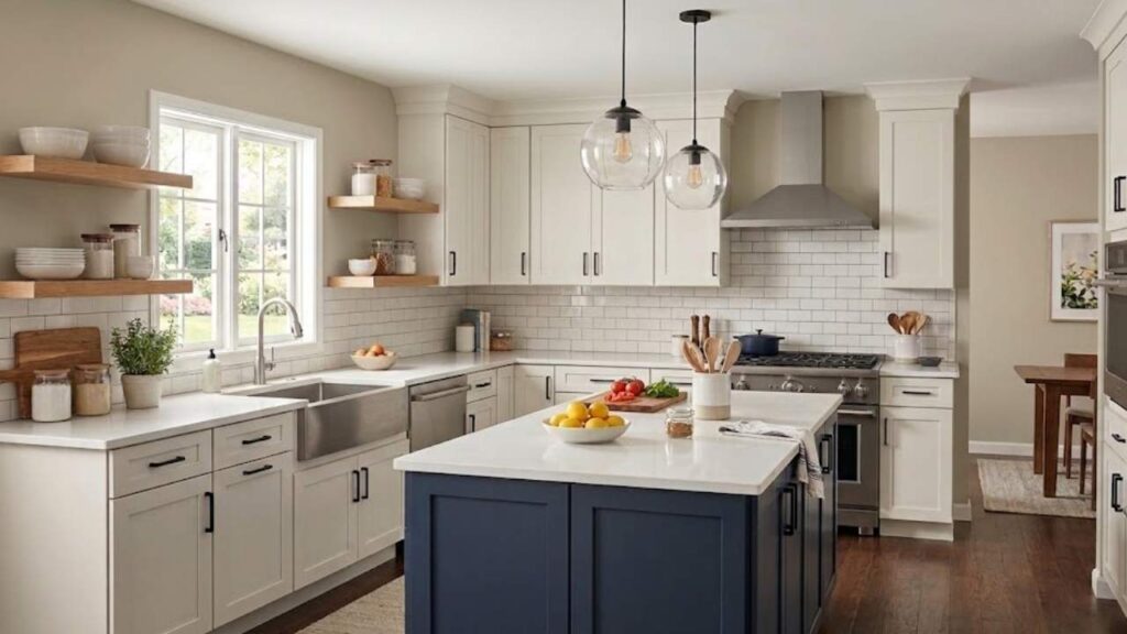
Oatmeal in kitchens are being considered, mainly on walls or as a cabinet color.
I’ve used it with white countertops, light wood floors, white upper cabinets with oatmeal lowers in a two-tone setup, or as wall color with white or light gray cabinets.
It brings warmth to what could be a cool, modern kitchen without committing to traditional beige vibes.
The light color makes kitchens feel open and airy, which many people want in a kitchen.
Works great with stainless appliances, matte black hardware, concrete or quartz counters, and the popular light wood or white oak floors.
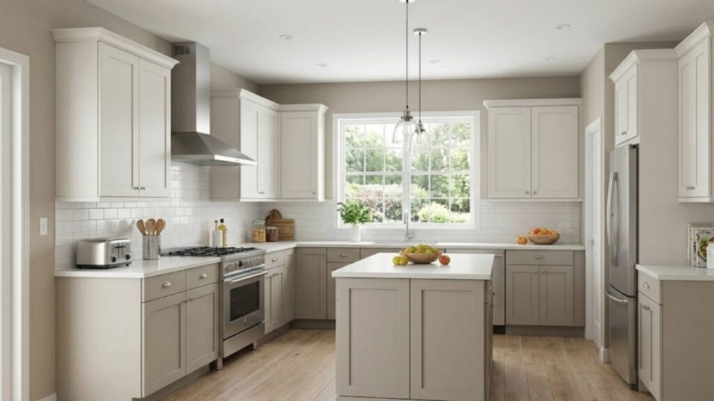
Beige in kitchens are traditional warmth and approachability.
It’s excellent with medium to dark wood cabinets, granite counters in warm tones, and traditional tile backsplashes.
If you’re doing a farmhouse kitchen or traditional kitchen, beige walls or beige-toned cabinets create an established, cozy feeling.
But in kitchens with limited natural light, beige can start to feel heavy or outdated.
Oatmeal Color Vs Beige Vs Other Colors
Because once you start looking at neutrals, you end up comparing many different shades.
Here’s how oatmeal and beige look against other popular neutrals.
Oatmeal Color Vs Khaki
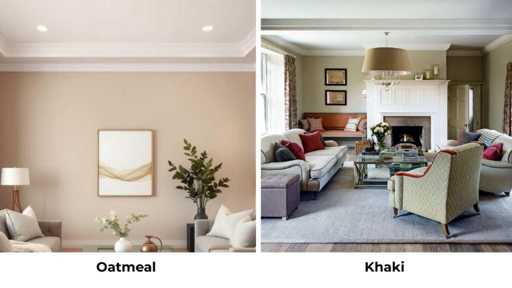
Khaki is beige’s earthy, slightly greener version.
It has tan and brown undertones like beige, but with an olive or green-gray note mixed in.
It’s less refined than oatmeal, more rugged.
Oatmeal is soft and lighter than khaki.
Where khaki can feel open or realistic, oatmeal feels more sophisticated and interior-design-worthy.
If you want something that feels grounded and earthy but warm, go with khaki.
If you want soft and neutral that works in refined spaces, go with oatmeal.
Oatmeal Color Vs Ivory
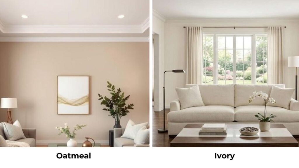
Ivory is warmer and creamier than oatmeal, it’s off-white with warm yellow undertones.
It’s light and brighter than oatmeal.
Oatmeal has complexity with the gray-greige undertones. Ivory is simple, clean, close to white.
Ivory works when you want something which feels fresh and bright but not harsh white.
Oatmeal works when you want depth and modern sophistication.
Ivory can look almost white in bright light.
Oatmeal will always look like something, never mistaken for white.
Oatmeal Color Vs Beige Vs White
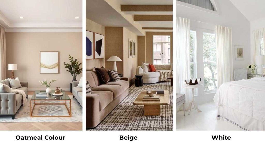
White is lighter and brighter than both.
Pure white like SW Pure White or BM Decorator’s White reflects the light, feels modern and clean.
But here’s the thing, white is HARD
. It shows everything, it can feel cold or flat, it requires your space to be in design.
Oatmeal gives you white’s airiness with warmth and forgiveness.
Beige gives you warmth and comfort without white’s harshness.
If you think you want white walls but if it feels cold or modern, then go with oatmeal.
If you want something that feels established and cozy, beige is what you should go for.
Oatmeal Color Vs Cream
Cream is warmer and richer than oatmeal, with yellow and sometimes peachy undertones.
It’s like a light version of beige with smoothness.
Oatmeal is muted and complex because of the gray notes.
Cream feels soft and delicate.
I use cream when I want something gentle and warm without going beige.
I use oatmeal when I want sophistication and modern warmth.
Cream is soft and sweet, whereas Oatmeal is grown-up and interesting.
Comparison Table
| Color | Relationship to Oatmeal | Relationship to Beige | Best For |
| Khaki | Earthy, dark, greener than oatmeal | Similar warmth, more olive/green notes | Casual, outdoor-inspired spaces |
| Ivory | Light, creamy, simpler than oatmeal | Much lighter and closer to white | Fresh, bright spaces without harsh white |
| White | Much lighter and cooler | Much lighter and cooler | Modern, minimal spaces; requires commitment |
| Cream | Warm, soft, less complex than oatmeal | Lighter than beige, same warmth | Soft, gentle, traditional-leaning spaces |
| Taupe | Similar gray influence, often cooler | Cooler than beige, more gray | Sophisticated neutrals with cool undertones |
Conclusion
So after this, Oatmeal Color Vs Beige comes down to the vibe you want and the light you’re working with.
Oatmeal gives you modern warmth with restraint.
Beige gives you traditional warmth with commitment.
Both are good choices depending on your space, your style, and your lighting situation.
If I had to give you a decision: Go with oatmeal if you want something contemporary, you have good natural light, you’re pairing with cool accents or modern finishes, or you want maximum light reflection.
Go with beige if you want traditional coziness, you have warm lighting, you’re working with warm wood and traditional furniture, or you want the established, welcoming feeling.
Before choosing between Oatmeal Color Vs Beige, get samples.
Paint big swatches.
Live with them for a few days in a different light.
Neither color is going to look like you think it will be on a small paint swatch at the store.
FAQs On Oatmeal Color Vs Beige
No, they’re different even though they’re both warm neutrals. Oatmeal is light with gray-greige undertones and has an LRV of 60-70. Beige is deep with yellow-tan-brown undertones and is around LRV 50-60. Oatmeal feels modern and moderate but beige feels traditional and warm.
Balanced Beige Sherwin Williams SW 7037 is a warm greige, a beige with gray mixed in. It has subtle warm undertones but looks more neutral and balanced than traditional beige. It’s not as yellow or tan as classic beige, making it versatile and modern.
Oatmeal’s undertones are soft gray, greige, and subtle taupe; it is a mix that gives it warmth without going yellow-beige. Depending on the formula, you can see more gray or more cream, but there’s always the restraint from the gray notes.
Greige has been the main thing replacing traditional beige. Colors like SW Accessible Beige, Agreeable Gray, and Repose Gray give you neutrality with warmth but without beige’s yellow undertones. Oatmeal and soft warm grays are also being considered where beige is used.