After years of working with clients and testing what feels like gray Sherwin-Williams makes, Mindful Gray and Repose Gray keep showing up in my projects.
They’re the reliable neutrals which work in modern homes, transitional spaces, and anywhere you need a sophisticated backdrop.
The mindful gray vs repose gray comparison comes up many times because both are beautiful, both are versatile.
Here’s the thing about these two.
They look the same at first, next to each other on the paint swatch with the nice greige-gray vibe. People use them everywhere like living rooms, bedrooms, hallways and open floor plans.
But once you put them on walls, they look completely different depending on your lighting, what undertones show, and what’s next to them.
So here, I’m breaking down about Mindful Gray Vs Repose Gray, like the LRV and undertones, how they look in different rooms, what lighting does to them, and which one makes sense for your space.
I’ll also throw in some comparisons with other popular grays that can be considered other than these.
Here are my other blogs that you can also read:
- Clary Sage Vs Evergreen Fog
- Eider White Vs Alabaster
- Peppercorn Vs Iron Ore
- Sherwin Natural Tan Vs Accessible Beige
- Agreeable Grey Vs Accessible Beige
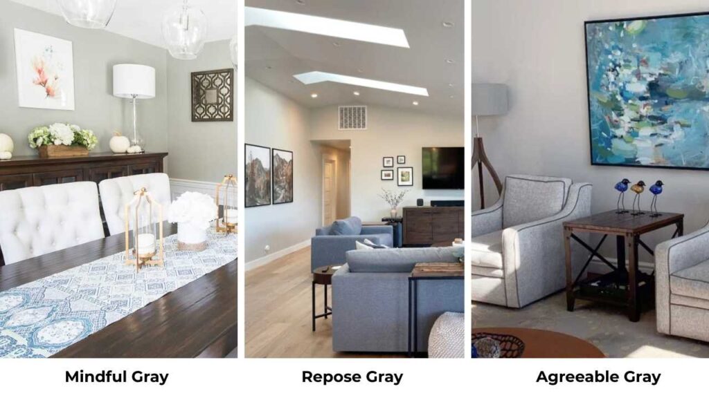
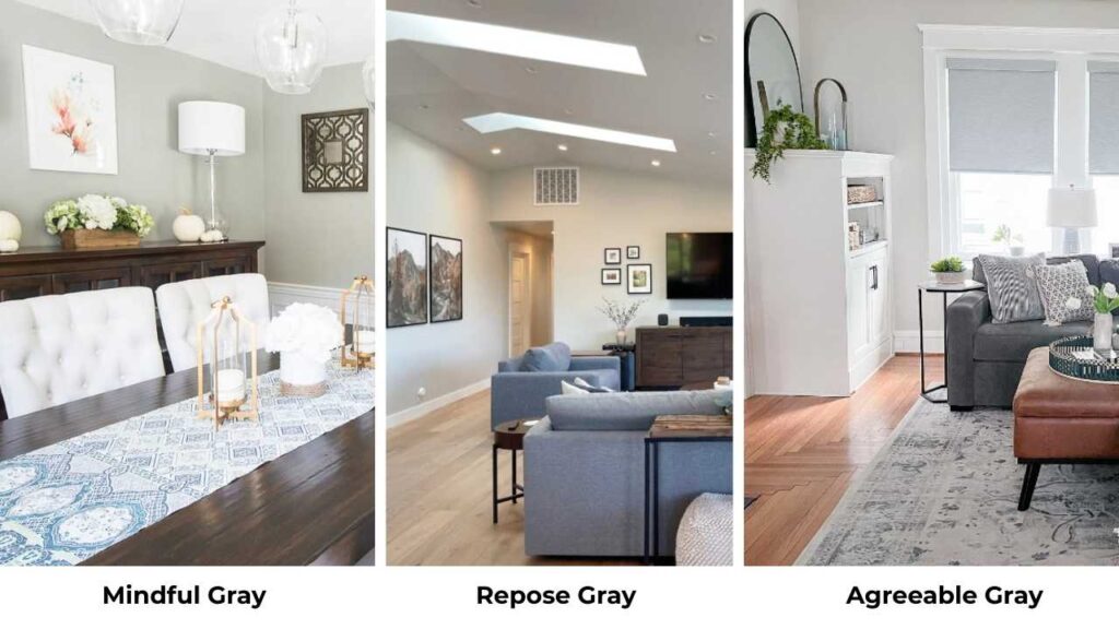
What You Need To Know About Mindful Gray (SW 7016)
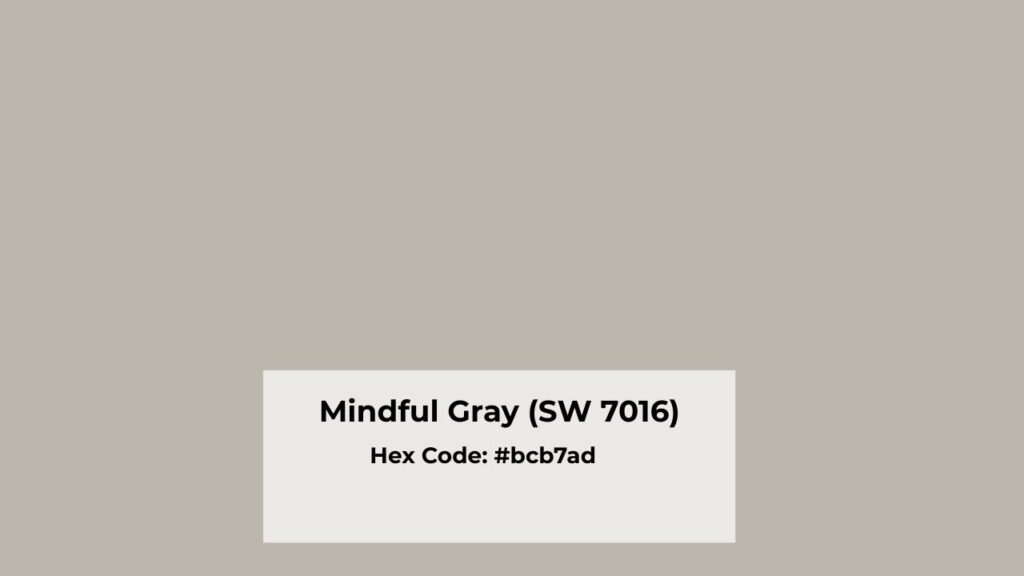
Mindful Gray (SW 7016) is a Sherwin-Williams warm gray with greige influence.
It is a bit beige compared to true grays, but not so much that it looks brown.
I’ve used this color many times, and here’s what I’ve learned: it’s grounded and heavier than the airy, light grays.
The LRV is at 48, which puts it in mid-tone territory.
It has a presence without being dark or moody.
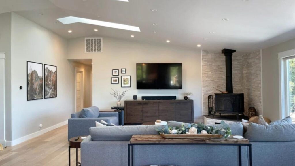
Kitchen cabinets, this is where Mindful Gray shines.
I painted my own kitchen cabinets this color two years ago and I walk in there and feel good about it.
The warmth keeps it from feeling cold, but it’s modern that you don’t get farmhouse vibes.
I’ve also used it in living rooms with warm wood floors, dining rooms where you want something more substantial, and bedrooms that get decent natural light.
The undertones are where it gets interesting.
Warm green undertones with hints of violet.
The violet keeps it from reading too green or brown.
In south-facing rooms with natural light, you get the warm greige quality.
In north-facing rooms, the green can show up uninvited.
I made that mistake in a client’s north-facing bedroom and we had to switch directions.
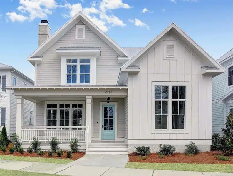
For exteriors, I’ve done it on modern farmhouse builds.
It looks good with white trim and black windows, paired with natural stone or wood accents.
But make sure your house gets light exposure because exterior painting is expensive to redo.
What You Need To Know About Repose Gray (SW 7015)

Repose Gray (SW 7015) is considered a light greige with balanced warmth, and it’s one of the colors that works in more situations than it should.
It’s soft and lighter than Mindful Gray.
The LRV is 58, which means it reflects more light into your space.
This is why designers love it for house color.
It doesn’t weigh down small rooms or spaces with limited natural light.
I use it for hallways, small bedrooms, bathrooms where you want the spa-like feel.
The undertones are more beige than Mindful Gray.
There’s a taupe quality depending on your lighting, but it shows green sometimes.
It stays warm in lighting conditions, making it predictable.
Where do homeowners and designers reach for this one is everywhere.
It’s the neutral backdrop color that lets your furniture, art, and decor shine.
I’ve used it in living rooms with white cabinetry, bedrooms that face any direction, kitchens with marble countertops, and bathrooms where clients want something soft but bright.
One thing is best about Repose Gray is that it pairs well with light wood floors and white or off-white everything.
Chrome fixtures, nickel hardware, quartz countertops, soft textiles, it works without going against each other.
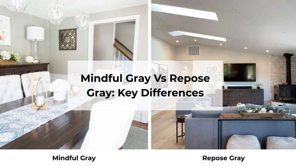
Mindful Gray Vs Repose Gray: Key Differences
Okay, here’s where we get into the comparison.
Mindful Gray Vs Repose Gray, both are gorgeous Sherwin-Williams grays that work in modern and transitional homes, but the differences matter more than you’d think.
Getting this wrong means living with a color that will never make you happy and you’ll feel cramped.
LRV
Light Reflectance Value is how much light a color reflects back.
The scale goes from 0 (absolute black) to 100 (pure white).
Mindful Gray has an LRV of 48, this makes it a medium-depth color.
It absorbs more light than it reflects, which creates a cozy, more intimate feel.
In rooms with natural light, this is perfect.
In dark rooms or north-facing spaces, it can feel too heavy and make your room look small.
Repose Gray has an LRV of 58, ten points makes a real difference.
It reflects more light, which makes rooms feel open and spacious.
This is better for small rooms, spaces with limited windows, or where you want to maintain brightness while having color on the walls.
I messed this up in my own house.
Put Mindful Gray in a north-facing bedroom and spent six months feeling like I was walking into a cave.
Repainted with something lighter and it was like opening a window.
Undertones
Mindful Gray has warm greige undertones with subtle green and slight violet influences.
The violet is what prevents it from reading brown, which is good.
The green can appear in some lighting like some cool, north-facing light or under some LED bulbs.
In warm, south-facing light, you get balanced greige quality.
Repose Gray leans more beige-gray with taupe undertones possible.
It’s more beige-forward than Mindful Gray, which makes it warm.
Green rarely shows up here, which is a relief if you’re sensitive to the surprise undertones that appear after you’ve painted.
Testing both colors with peel-and-stick samples in your space with your lighting is NON-NEGOTIABLE.
I learned this the hard way multiple times before it stuck.
Lighting Affect
Lighting changes everything.
Natural light: In south-facing rooms, Mindful Gray looks warm and balanced.
In north-facing rooms, it can look gray-green and feel darker than you expect.
Repose Gray appears creamy and soft in bright sunlight and maintains its warmth in cool north light.
Artificial light: Under warm LED bulbs, Mindful Gray can deepen and appear more neutral or a bit green.
Repose Gray becomes warm and beige under warm artificial lighting.
I always tell clients to look at samples all the day like morning light, afternoon, evening with lights on.
The color you see in the morning may look different at night.
Style and Best Uses
Mindful Gray pairs well with medium to dark wood floors, warm oak and walnut tones, leather furniture, and black or oil-rubbed bronze hardware.
It goes the best with natural stone with beige or warm veining.
For trim, go with Pure White or Alabaster because it creates contrast without being harsh.
Repose Gray works with light wood floors, white or off-white cabinetry, marble and quartz countertops, and nickel or chrome finishes, and soft textiles and light furniture styles complement it.
Same trim recommendations like Pure White, Alabaster, or Snowbound.
| Feature | Mindful Gray | Repose Gray |
| LRV | 48 | 58 |
| Undertones | Warm greige, subtle green, hints of violet | Warm greige, more beige, slight taupe |
| Warmth Level | Warm-neutral | Warm |
| Best Rooms | Living rooms, dining rooms, bedrooms with good light | Bedrooms, hallways, kitchens, bathrooms, small spaces |
| Lighting Behavior | Can shift gray-green in cool light | Warm, minimal shifts |
| Best Trim | Pure White, Alabaster, Extra White | Pure White, Alabaster, Snowbound |
| Flooring Match | Medium-dark wood, warm tones | Light wood, white cabinetry |
Room-By-Room Comparison: Mindful Gray Vs Repose Gray
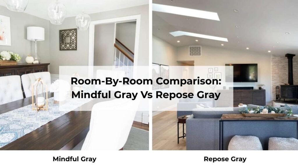
Let me walk you through how these colors perform in different spaces. Theory is great, but real-life application is what matters when you’re going with it.
Living Room
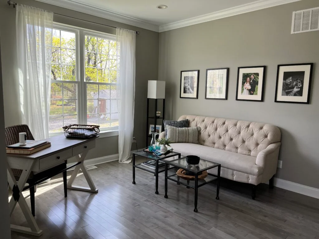
Mindful Gray in a living room creates depth and sophistication without going dark.
I used it in an open-concept space with south-facing windows, warm oak floors, and cognac leather furniture.
The room felt grounded and modern and cozy.
The warmth kept it from feeling cold or sterile.
But make sure your living room gets decent natural light.
Repose Gray makes living rooms feel airy and open.
I’ve used it in small living rooms, spaces with limited windows, and homes where the client wanted a light, bright feel.
It’s soft and subtle, which works well if your living room flows into other spaces.
The light LRV keeps the room feeling spacious.
It’s good with white cabinetry, light furniture, and for fresh, clean aesthetic.
Bedroom
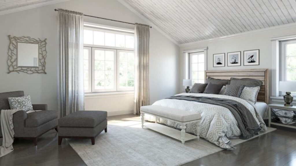
Mindful Gray in a bedroom with good light creates a cozy, restful atmosphere.
I painted my guest bedroom this color with white bedding and warm wood furniture – it feels like a retreat.
The medium depth makes the room feel more intimate, which is exactly what you want in a bedroom.
Just avoid it in north-facing bedrooms unless you want that moodier feel.
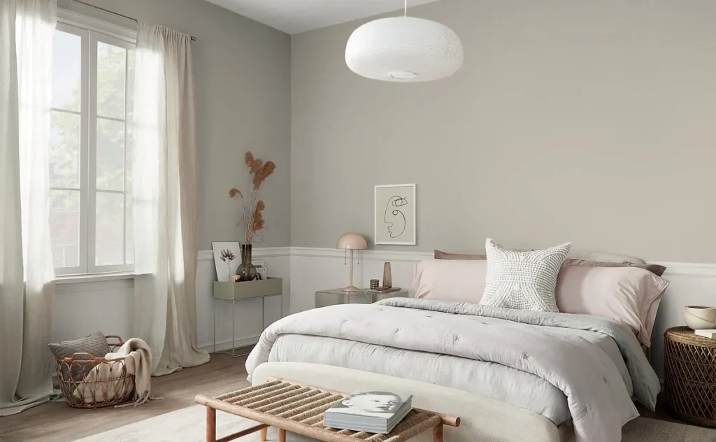
Repose Gray is my go-to recommendation for most bedrooms.
It’s soft, calming, and works with which direction your windows face.
The light quality keeps the room from feeling heavy.
I’ve used it with everything from modern minimalist setups to traditional styles because it adapts beautifully.
Bathroom
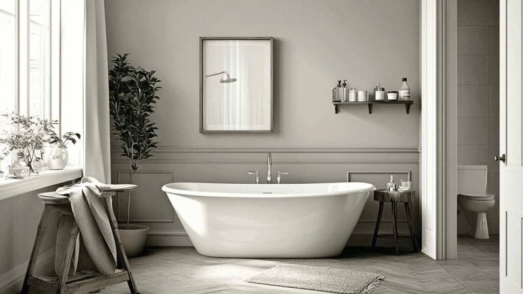
Mindful Gray in bathrooms works best in large spaces with windows.
I specified it for a primary bathroom with a soaking tub and natural light and paired with white subway tile and marble countertops, it felt like a high-end spa.
The color adds sophistication without overwhelming the space.
In small, windowless bathrooms, don’t do it.
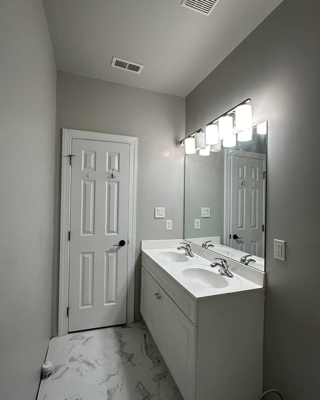
Repose Gray is perfect for bathrooms.
The high LRV keeps small bathrooms fresh and clean.
It pairs well with white fixtures, chrome or nickel hardware, and both marble and quartz.
I’ve used it in everything from powder rooms to primary baths and it works.
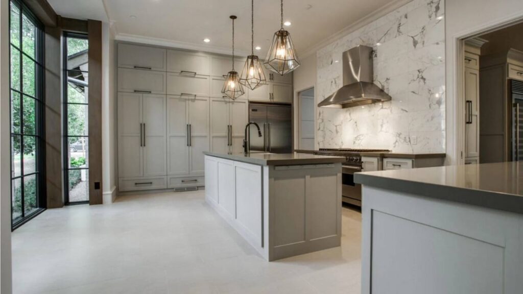
Kitchen
Mindful Gray on kitchen cabinets is best.
The warmth prevents the sterile, cold kitchen feel while being modern.
I’ve done a full cabinet in this color with white quartz countertops, stainless steel appliances, and white subway tile backsplashes.
Pair it with brass or matte black hardware for a new look.
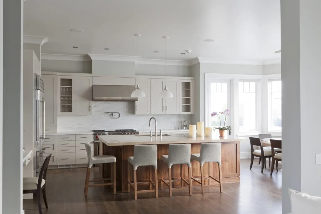
Repose Gray as a wall color in kitchens provides the perfect neutral backdrop.
It works well in kitchens with white or off-white cabinetry.
The lightness keeps the space feeling open and clean, important in kitchens where you’re spending time.
I don’t recommend it for cabinets because it can look too light and show dirt easily.
Exterior
Mindful Gray on exteriors works on modern farmhouse styles, contemporary builds, and transitional homes.
I’ve specified it with white trim, black windows, and natural wood or stone accents.
It has depth to create architectural interest without going dark.
Make sure your home’s orientation provides decent light exposure like southern or western exposures work best.
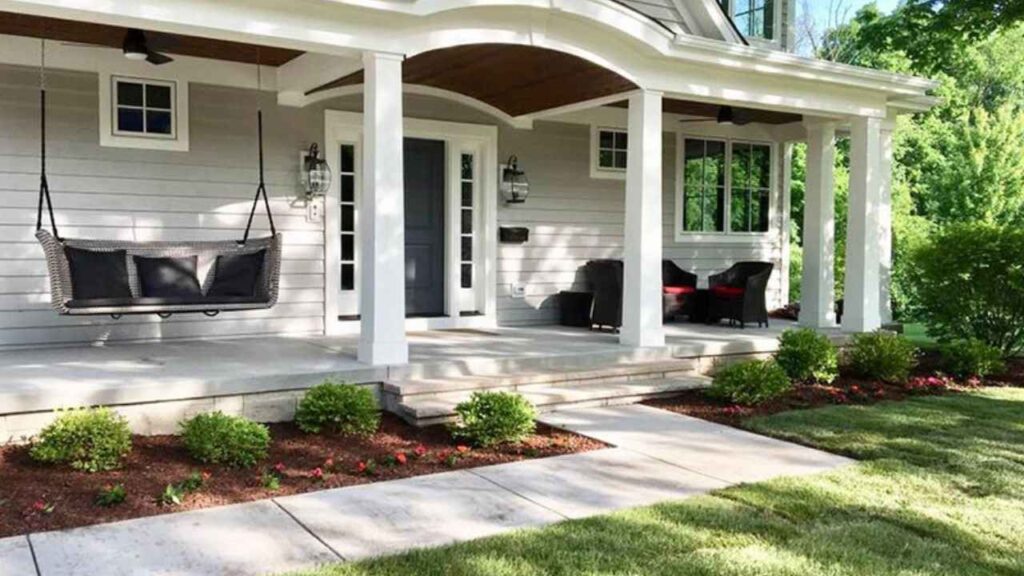
Repose Gray for exteriors is light and works well on cottage styles, traditional homes, and anywhere you want a soft look.
Pair it with white trim and consider dark accent colors for shutters or doors.
It’s less common as an exterior color but can look beautiful in the right way.
Mindful Gray Vs Repose Gray Vs Other Colors
You’re also considering other popular grays because why make this easy.
Let me break down how Mindful and Repose look against the other colors.
Mindful Gray Vs Repose Gray Vs Agreeable Gray
Agreeable Gray (SW 7029) is warm and beige than both Mindful and Repose.
LRV is 60, making it the lightest of the three.
If you want warmth and the most light option, go with Agreeable.
If you want something that looks more gray than beige, go with Mindful or Repose.
Agreeable is everywhere, so if you’re worried about choosing something trendy, consider the other two.
Mindful Gray Vs Accessible Beige
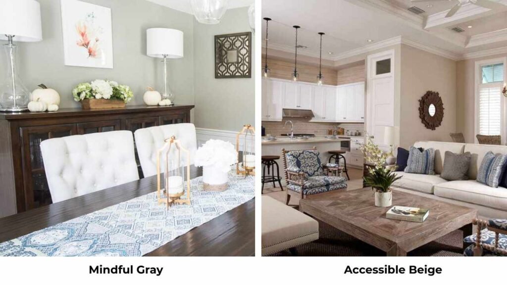
Accessible Beige (SW 7036) is more beige than gray.
If you’re comparing these, you’re torn between gray and beige families.
Mindful Gray keeps you in gray territory with warm undertones.
Accessible Beige is warm, traditional, and is clearly beige.
Mindful Gray Vs Revere Pewter
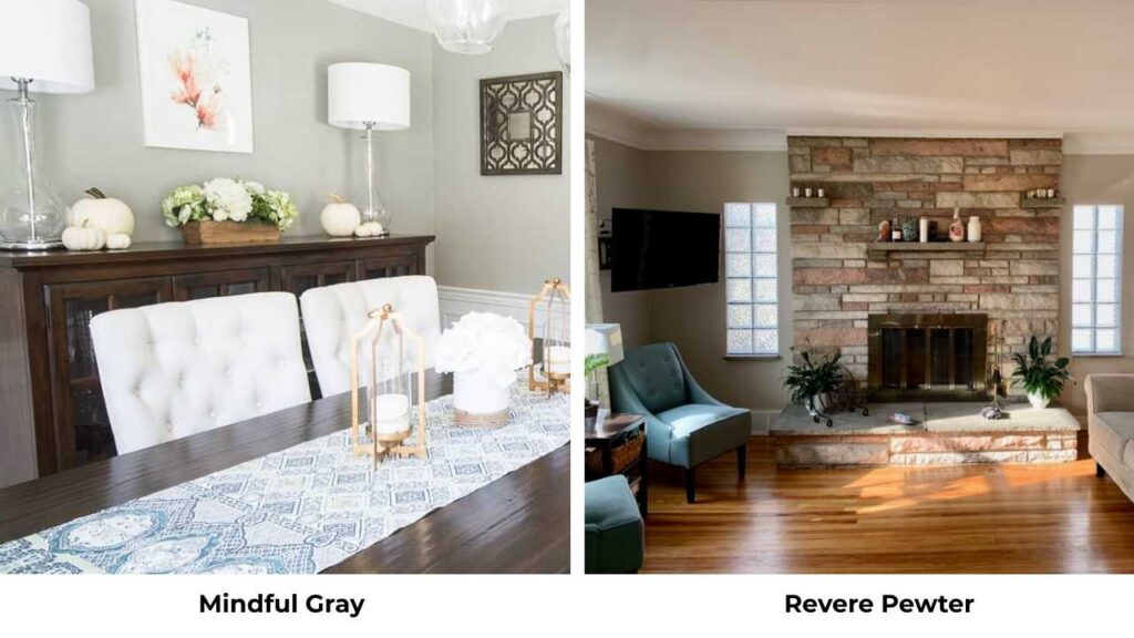
Revere Pewter (Benjamin Moore HC-172), different brand, but everyone asks.
Revere is lighter than Mindful Gray and has strong beige undertones.
Both are warm grays with presence, but Revere is beige while Mindful is neutral.
Revere also shifts more in different lighting.
Mindful Gray Vs Colonnade Gray
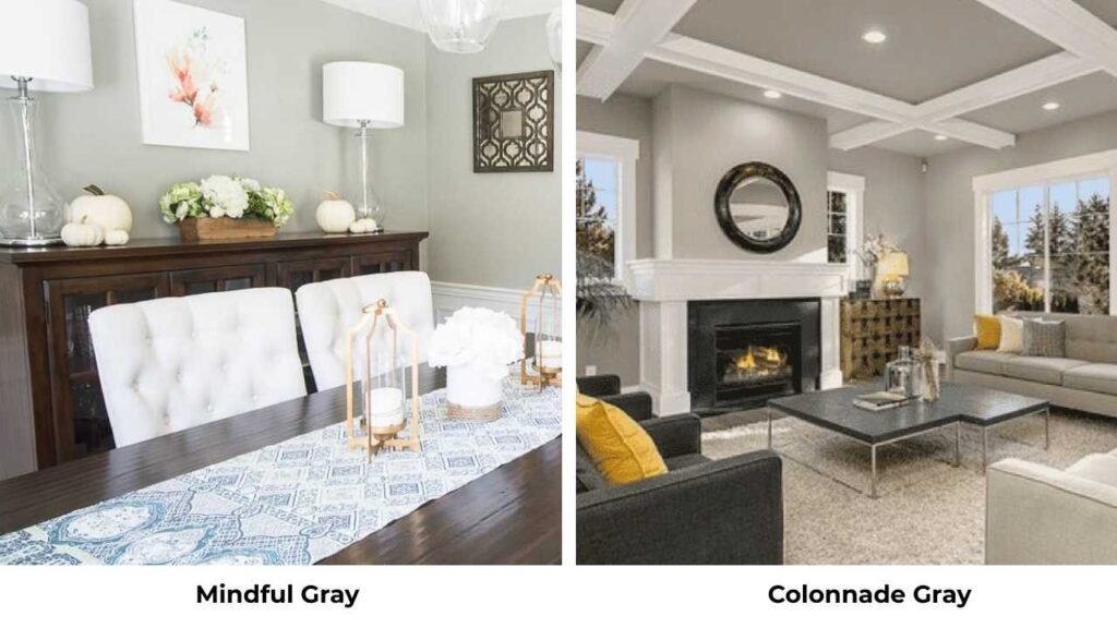
Colonnade Gray (SW 7641) is cooler and truer gray than Mindful.
LRV is similar at 53, but the undertones are different.
If you want something without the warmth, Colonnade is your direction.
Mindful is the warm, more versatile option for many homes.
Mindful Gray Vs Intellectual Gray
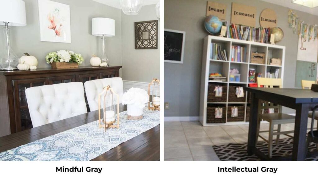
Intellectual Gray (SW 7045) is light (LRV 54) and cooler than Mindful Gray.
It’s a true gray without the greige influence.
If you want warmth, Mindful Gray is better.
If you want something neutral-cool, Intellectual is more considered one.
| Color | LRV | Warmth | Best For |
| Mindful Gray | 48 | Warm-neutral greige | Depth, cozy modern spaces |
| Repose Gray | 58 | Warm greige | Bright, airy, whole-house color |
| Agreeable Gray | 60 | Warmest, more beige | Maximum warmth and light |
| Accessible Beige | 58 | Clearly beige | Traditional, warm spaces |
| Colonnade Gray | 53 | Cool, true gray | Less warmth needed |
Mindful Gray Color Palette
Mindful Gray pairs beautifully with some colors that complement its warm, grounded nature.
For trim and ceilings, Pure White (SW 7005) and Alabaster (SW 7008) create clean contrast.
Extra White (SW 7006) works if you want a fresh look.
For coordinating wall colors in adjacent rooms, consider Homburg Gray (SW 7622) for darker accent walls, or light options if you need to transition to bright spaces.
Navy blues, warm blacks, and muted greens all work well.
For cabinetry and built-ins, pairing Mindful Gray cabinets with white walls creates a stunning modern look.
Brass, matte black, and oil-rubbed bronze hardware all complement the warmth.
Repose Gray Color Palette
Repose Gray loves soft, warm pairings that maintain its airy quality.
Pure White, Alabaster, and Snowbound (SW 7004) all work well for trim.
For whole-house schemes, Repose on walls with Pure White trim creates a fresh, cohesive look that flows room to room.
Pair it with soft blues, warm whites, and blush or sage accents.
Chrome, nickel, and polished finishes complement its light, cool-leaning nature.
If you’re using it as a wall color, white cabinetry keeps everything bright and open.
Light wood tones, marble, and quartz look stunning against Repose Gray walls.
Conclusion
So, mindful gray vs repose gray, which one to go for.
It depends on your space and what you’re trying to get in your space.
Mindful Gray is the best choice if you want depth, have good natural light, and want to go with the warm, grounded feel.
It looks stunning on kitchen cabinets and in living spaces with warm wood tones.
Repose Gray is the better option for small rooms, spaces with limited light, house color, and where you want to keep things bright and airy.
It’s forgiving, versatile in different lighting situations, and easy to work with.
Both are beautiful, both are over neutrals that have staying power.
Sample them both in your space, look at them the whole day, and go according to it.
You’ll know which one feels right when you see it on your walls.
Choosing between Mindful Gray Vs Repose Gray depends on your lighting and space where you are putting it.
FAQs on Mindful Gray Vs Repose Gray
It depends on your lighting. With an LRV of 48, Mindful Gray is medium-toned, not dark. In rooms with good natural light, it feels balanced and cozy. In north-facing or dark rooms, it can feel heavier than expected.
Mindful Gray is dark. It has an LRV of 48 compared to Repose Gray’s LRV of 58. The ten point difference is visible, Mindful Gray has depth and presence, while Repose Gray is light and reflects light.
Skip Repose Gray if you want a color with depth and presence, if your room is so bright and you’re worried about it washing out, or if you’re going for a dark, moody aesthetic.
Yes, Mindful Gray is darker than Repose Gray. Mindful is at LRV 48 while Repose is at 58, making Mindful visibly deep and grounded. If you hold paint swatches side by side, the difference is clear.