I’ve been working with Sherwin-Williams neutrals for a while now, and if I had a dollar for every time someone asked me about eider white vs repose gray, I could afford to repaint my entire house.
These two colors next to each other on the Sherwin-Williams paint swatches is where the confusion begins.
Both Eider White SW 7014 and Repose Gray SW 7015 are what I call “safe zone” neutrals.
They’re the colors homeowners go for when they want something softer than bright white but aren’t ready to commit to anything bold.
Choosing between a warm white and a soft gray feels like it should be simple.
But these two look so different in spaces.
They’re both in the warm-leaning neutral category.
Here, I’m breaking down everything I’ve learned about Eider White Vs Repose Gray.
We’re talking about the LRV, undertones, lighting effect, which rooms each color works in and what mistakes people should avoid.
I’ll also compare them to other popular Sherwin-Williams colors for more considerations.
Here are my other blogs that you can also read:
- Acacia Haze Vs Evergreen Fog
- Onyx Color Vs Black
- Drift Of Mist Vs Alabaster
- Woodlawn Blue Vs Palladian Blue
- Eider White Vs Alabaster
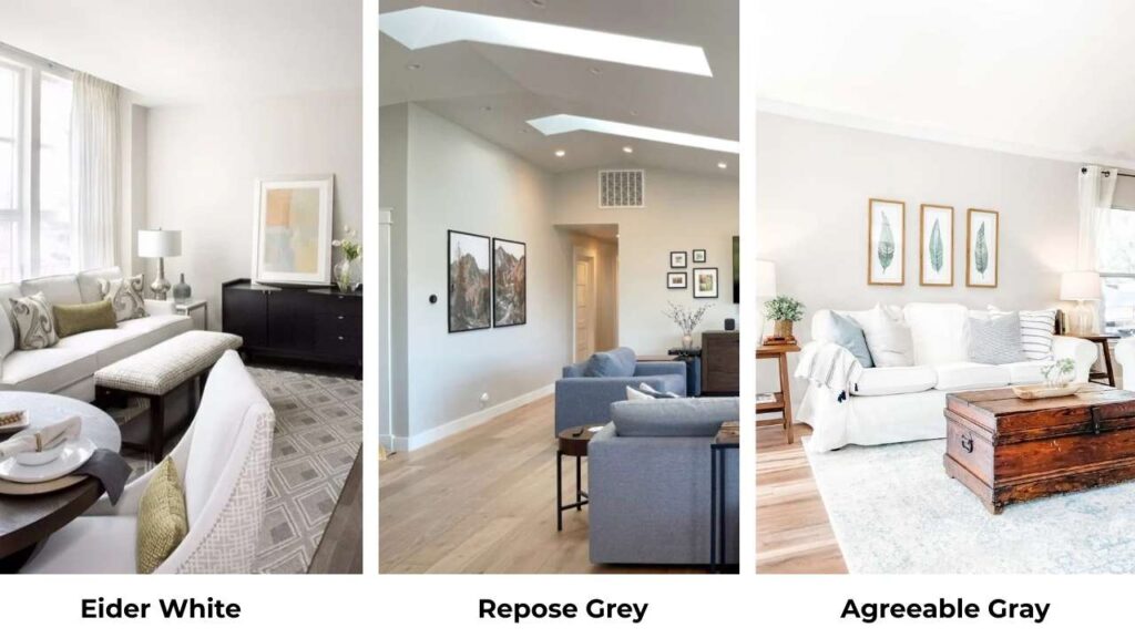
Color Profile of Sherwin Williams Eider White (SW 7014)
Eider White is one of the off-whites that Sherwin-Williams recommended.
It has got a soft greige thing where gray meets beige in the non-committal way.
When I first used it in a client’s bedroom, I thought it would look like a clean white.
But no, instead it showed the subtle violet and taupe undertones.
They are different from the paint swatches.
That’s when I learned to always test the color in your space.
The thing about Eider White is it is in a middle ground.
It’s not white to use as trim in many cases, but it’s not gray to give you the modern gray look.
It’s an off-white with enough pigment to feel cozy without going full cream or beige.
I love it for spaces that need brightness but where pure white feels flat.
There’s something about Eider White in a bedroom that works, like it’s warm to feel restful but light to keep the space from feeling heavy.
In the living rooms, if you’ve warm wood floors or beige-ish furniture that look out of place.
The LRV is 73, which means it reflects a good amount of light.
Color Profile of Sherwin Williams Repose Gray (SW 7015)

Now Repose Gray is a whole different tone.
It’s what I reach for when someone says they want gray but they’re scared of it because it starts looking cold or sad.
This color is a light greige with balanced warmth and when I say balanced, it’s like between warm and cool which doesn’t fall off.
It’s softer and lighter than Mindful Gray, but it’s looking as gray, not white.
I’ve used Repose Gray as a house color many times.
It’s one of the neutral backdrop colors that works in any room type.
Like modern kitchens, traditional living rooms, because it is versatile.
The undertones are where Repose Gray plays its role. It has got a subtle taupe warmth with hints of gray that keep it from feeling flat.
In south-facing rooms with natural light, it stays soft and neutral.
But in north-facing rooms, it can pull a little cool and show some violet notes.
Designers love this color because it’s stable.
It doesn’t flip from beige to blue depending on the time of day like other grays.
Its LRV is at 58, so it’s visibly darker than Eider White.
Eider White Vs Repose Grey: Key Differences
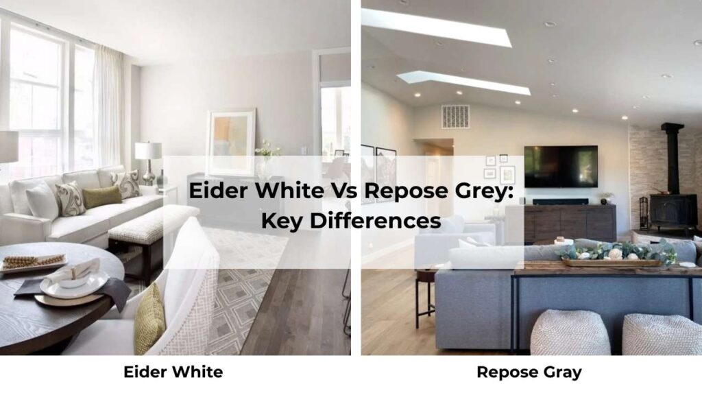
Okay, here’s where we get into the differences between these two.
They may be next to each other on the paint swatches, but in your real home, they’re going to look all different.
LRV (Light Reflectance Value)
Light Reflectance Value is the most important number you need to know when picking paint colors.
It measures how much light a color reflects on a scale from 0 (pure black) to 100 (pure white).
Eider White has an LRV of 73.
This is high enough that it’s going to bounce light around your room, making spaces feel open and bright.
I use this in small rooms, dark hallways, or any space that needs help feeling large.
The reflected light works.
Repose Gray comes in at 58, in the light-to-medium range, but it’s absorbing more light than Eider White.
This makes rooms feel cozy, grounded.
Not dark or moody, but less airy than Eider White.
When you put them side by side, the difference is visible.
Repose Gray looks darker and more saturated.
But in different rooms, they both look “light neutral” depending on your lighting situation.
Undertones
Eider White’s undertones are gray with beige warmth.
But in some lighting, you’ll see violet or taupe undertones showing.
The north-facing rooms bring the cool gray.
South-facing rooms with warm light make it feel creamy.
It doesn’t have yellow undertones, which is good if you don’t like the builder-beige look.
Repose Gray’s undertones are consistent.
It’s a soft warm gray with taupe/beige influence.
The undertones don’t shift with lighting changes, which is why it’s popular for house color.
I always tell people, if you’re serious about color shifts and you’ll look for undertones, go with Repose Gray, because it’s predictable.
But if you want something light and you can handle undertone variation, Eider White gives you that.
Light Behaviour
Natural light will make or break both of these colors.
Eider White in bright, natural south-facing light looks gorgeous.
It looks soft, creamy-gray, warm but not yellow.
In north-facing rooms with limited natural light, it can look cool and the violet hints come out.
But under warm artificial light, it gets warm and cozy.
Repose Gray stays neutral in different lighting.
Strong daylight makes it look light and shows off its gray nature.
Cool LED lights keep it clean and modern.
Warm lights add warmth but it looks as gray.
It’s not as dramatic as Eider White’s personality changes.
If your room gets barely any natural light, I’d push you toward Eider White for the high LRV.
Style Compatibility and Best Uses
Eider White works best with:
- White or off-white trim
- Warm wood finishes
- Beige or greige furniture
- Farmhouse, traditional, soft modern styles
- Light wood or natural flooring
Repose Gray pairs well with:
- Bright white trim
- Gray or white cabinetry
- Modern, transitional, contemporary styles
- Both warm and cool accent colors
- Gray or medium-toned wood floors
Here’s a quick comparison:
| Feature | Eider White | Repose Gray |
| Color Family | Off-white / Greige | Light Gray |
| LRV | 73 | 58 |
| Brightness | Lighter, airier | More grounded |
| Warmth | Soft warm-neutral | Balanced neutral |
| Undertones | Gray + beige (violet in some light) | Gray + taupe |
| Best Trim Color | Pure White | Extra White or Pure White |
| Style | Farmhouse, traditional, soft modern | Modern, transitional, contemporary |
Eider White Vs Repose Grey: Room-By-Room Comparison
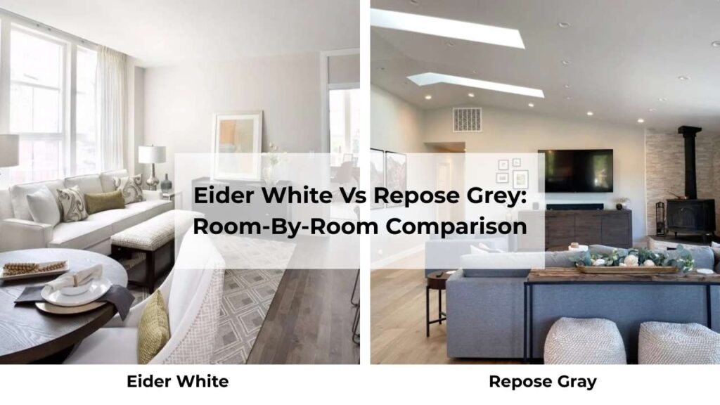
I’ve tested both these colors in every room type.
Some work better than others, but it depends on your lighting and existing finishes rather than the room.
Living Room
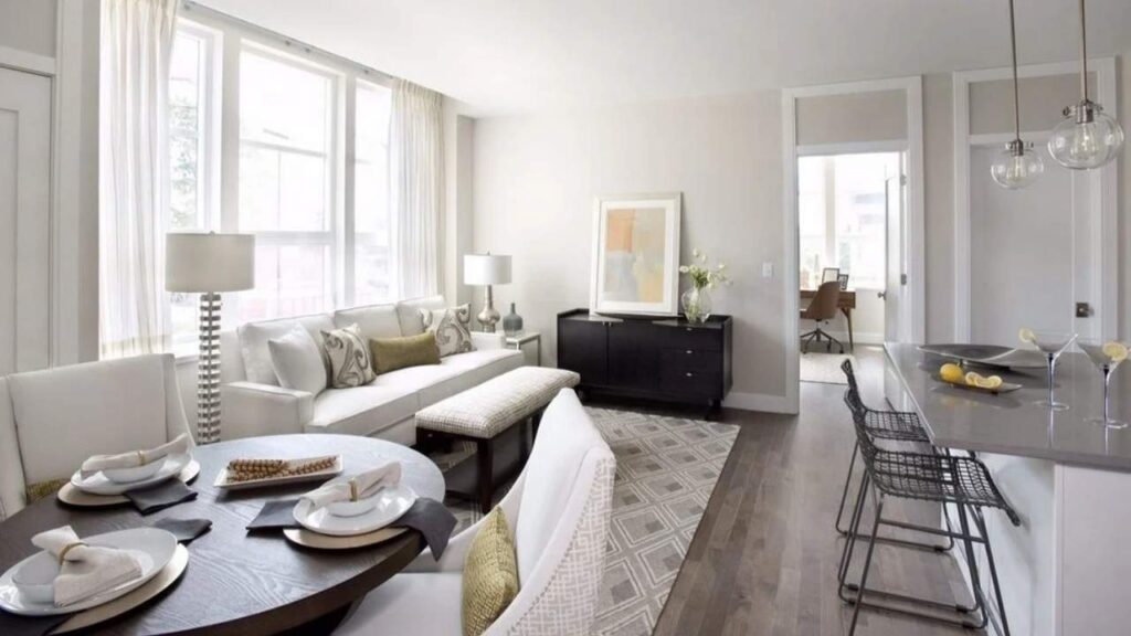
Eider White in a living room creates a soft, inviting backdrop that doesn’t compete with your furniture or decor.
It’s warm to feel cozy but light that the room doesn’t feel closed in.
If you’ve a small living room or one with limited windows, this is your color.
The high LRV reflects light around the space and makes it feel open.
I used it in my own living room and with warm wood floors and beige furniture, it looked cohesive, calm and peaceful.
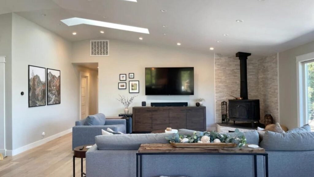
Repose Gray in a living room gives sophistication and modern appeal.
It creates better contrast with white trim and makes the architecture come up.
In large living rooms or open-concept spaces, it provides color presence without feeling dark.
It’s good if you’re going for the clean, contemporary look.
The downside, in small living rooms without much natural light, it can feel a bit flat.
Not bad, but less dynamic than you want.
Bedroom
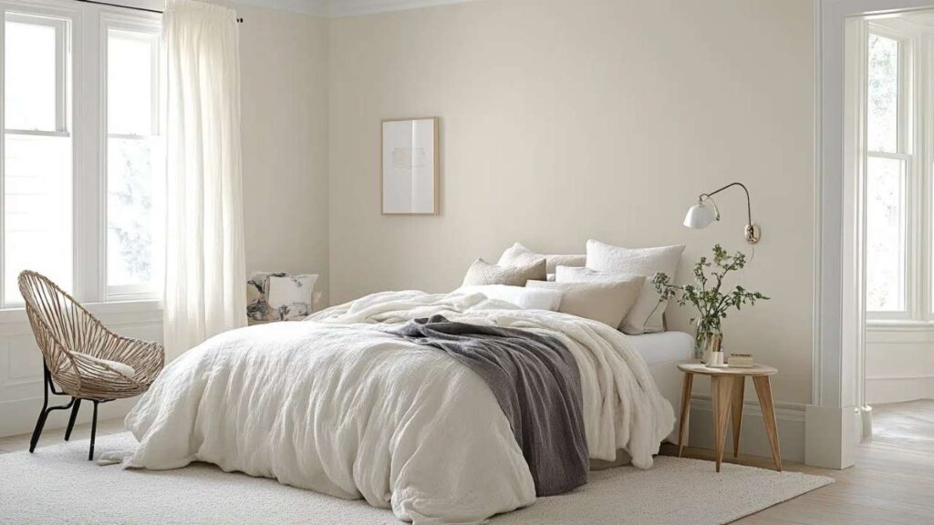
Eider White for bedrooms is good.
The softness creates a restful vibe which is perfect for a room.
It’s not harsh, it’s not bright, but it’s gentle.
Pairs beautifully with white bedding, warm wood furniture, and basically any bedding color you throw at it.
Repose Gray in bedrooms works if you want something cocooning.
It’s light enough to not feel cave-like, but it has more visual weight than Eider White.
I’ve seen it look amazing in primary bedrooms with natural light and white furniture.
Personal advice: I lean toward Eider White for bedrooms unless you’ve amazing natural light.
Then Repose Gray is good to go with.
Bathroom
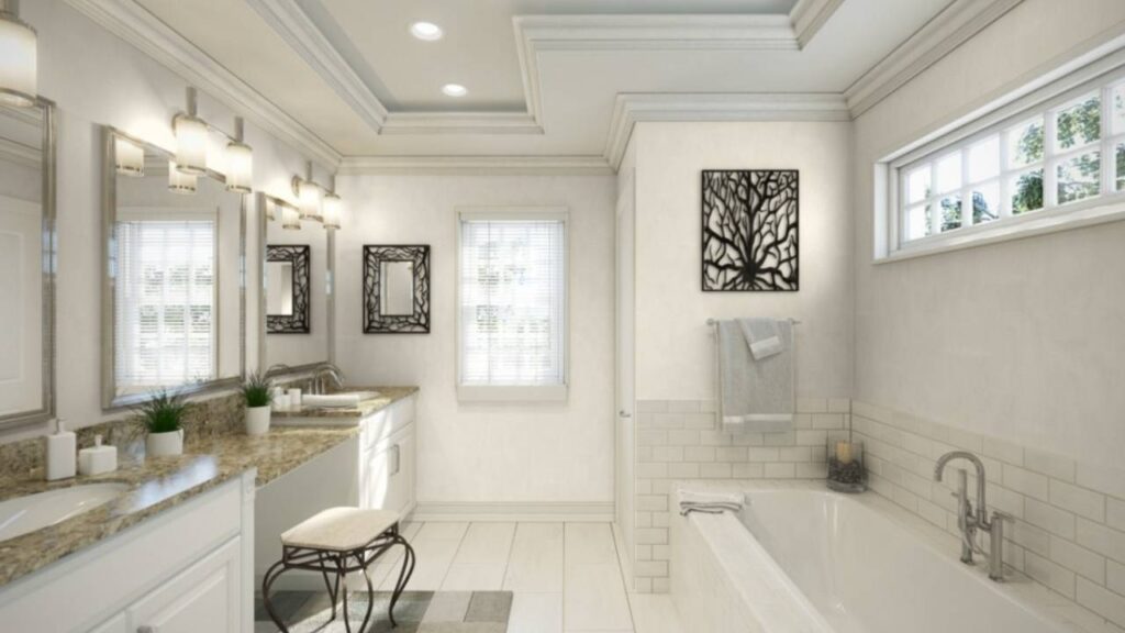
Eider White in bathrooms needs the right lighting and fixtures to work.
If you’ve warm-toned tile or wood vanities, it’s beautiful.
But pair it with cool gray tile or chrome fixtures, and the undertones can look off.
You need to commit to the warm side of things.
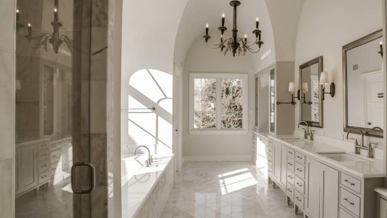
Repose Gray in bathrooms is where this color shines.
It creates a spa-like, calm atmosphere that feels expensive.
Pair it with white subway tile, marble, chrome or brushed nickel fixtures and it all works.
It’s forgiving with different fixture finishes too.
I’ve used Repose Gray in three different bathroom projects and it’s never let me down.
Eider White in bathrooms worked, one time the undertones looked out of place with the client’s existing tile.
Kitchen
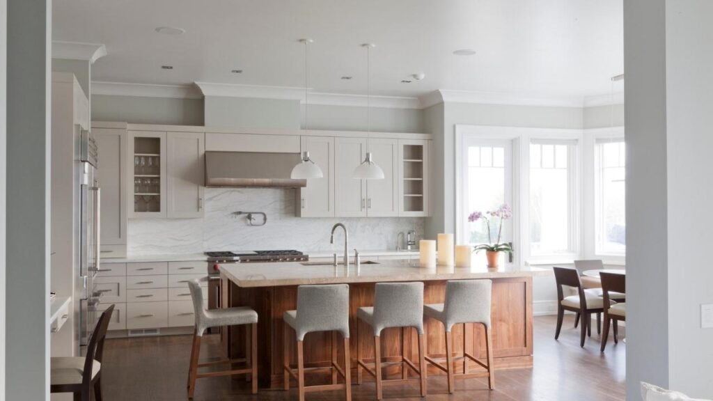
Eider White in kitchens can work in contemporary spaces with white or light wood cabinetry.
It’s softer than pure white so it doesn’t feel sterile or hospital-like.
But it needs the right balance – you don’t want it competing with warm wood tones or looking dingy next to bright white cabinets.
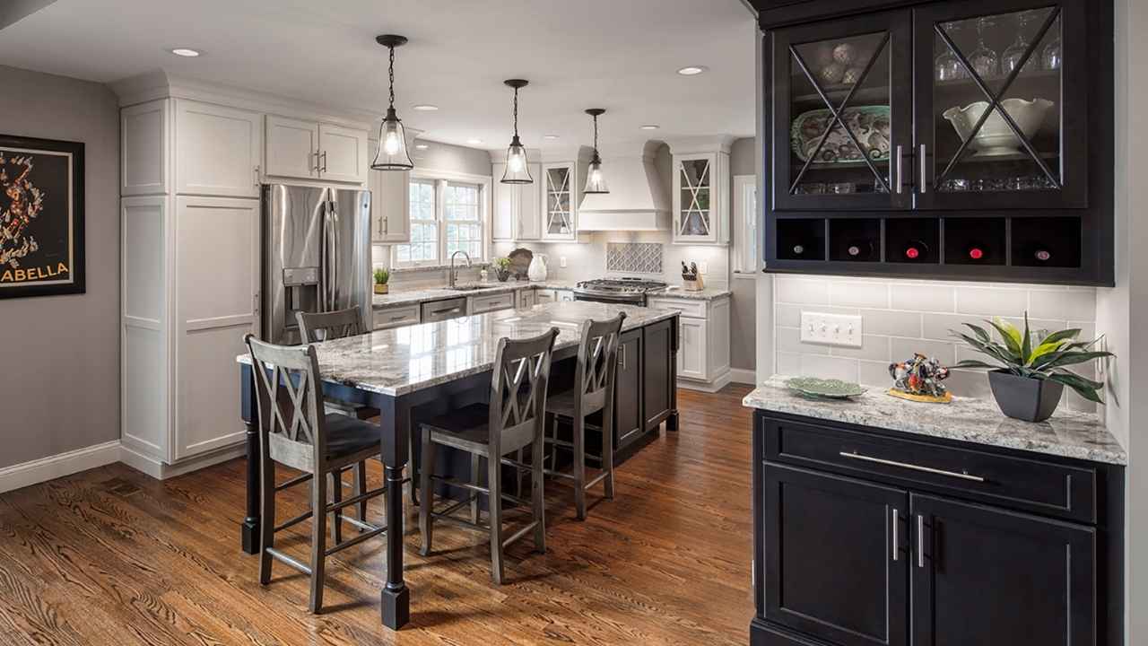
Repose Gray for kitchens is more versatile.
White cabinets, gray cabinets, natural wood, it works with all of it.
It provides a neutral backdrop that lets your cabinetry and countertops shine.
Also, it hides dirt and scuffs better than light colors.
Exterior

Eider White on exteriors, there are many opinions.
It CAN work on home exteriors, especially with dark trim or shutters for contrast.
But you need to think about heat absorption and how the undertones will look in full outdoor sunlight.
Sometimes the taupe and violet undertones show up stronger on exteriors than interiors.
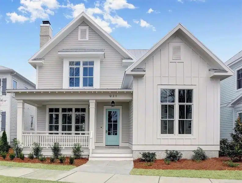
Repose Gray for exteriors is solid.
It’s become popular for exterior paint because it’s light to not absorb tons of heat but has color to look intentional, not washed out.
It works with white trim, black shutters, natural stone because it’s a good neutral exterior choice.
Eider White Vs Repose Grey Vs Other Colors
Once you start comparing paint colors, it’s a lot.
But these comparisons matter because you realize one of these other colors is what you wanted all along.
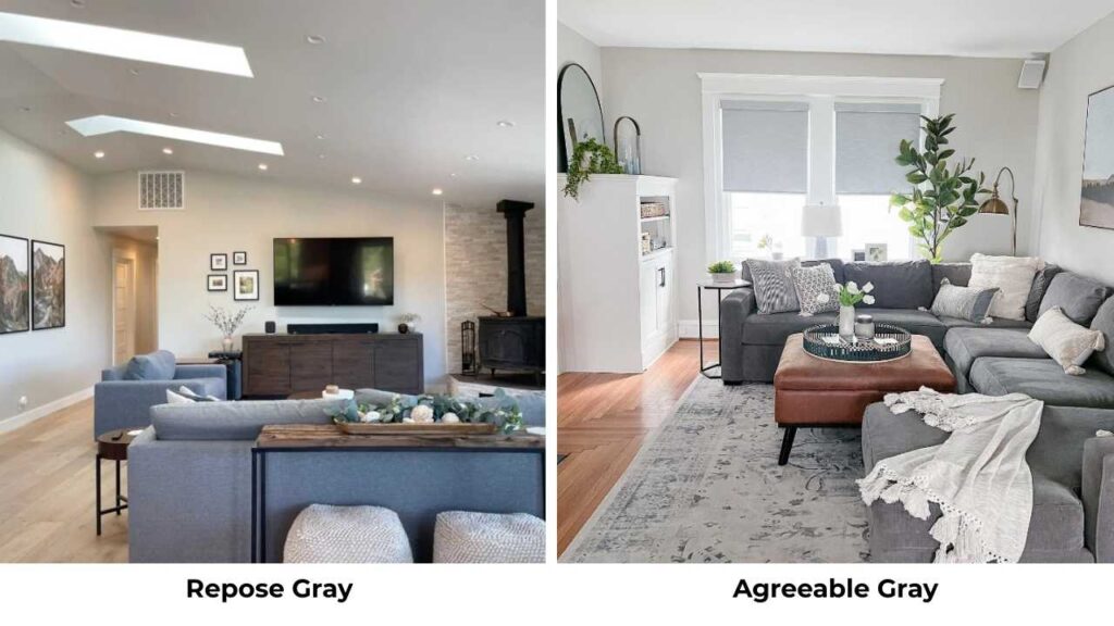
Eider White Vs Agreeable Gray
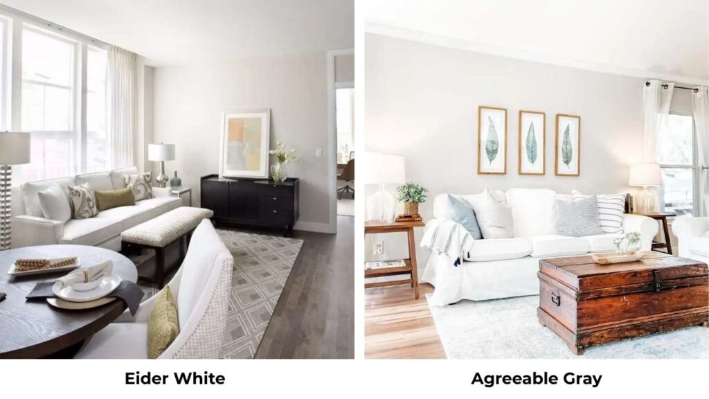
Agreeable Gray is warmer and more beige-leaning than Eider White.
It’s a true greige, darker too (LRV around 60).
If Eider White feels too light or gray for you, Agreeable Gray gives you more warmth and presence.
Eider White Vs Snowbound
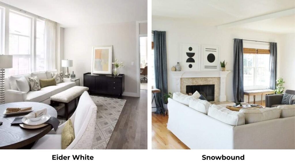
Snowbound is a coordinating color that’s whiter and brighter than Eider White.
Less undertones and straightforward.
Use Snowbound for trim if you want some contrast with Eider White walls.
Eider White Vs Alabaster
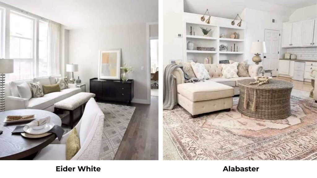
Alabaster (SW 7008) is LIGHTER than Eider White with an LRV around 82.
It’s warm, creamy, less gray and more versatile.
If Eider White’s undertones are not looking good during testing, try Alabaster.
It’s one of my go-to whites.
Repose Gray Vs Agreeable Gray
Agreeable Gray is darker and more saturated than Repose Gray, also it leans more beige.
Repose Gray is light, soft, more gray than greige.
For the house color, I prefer Repose Gray because it’s subtle and works with many design styles.
Eider White Vs Drift of Mist
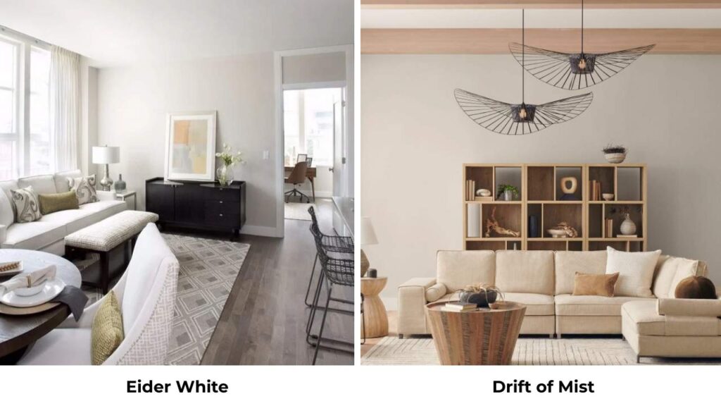
Drift of Mist, I’m assuming this means Misty, it’s cooler than Eider White, less beige warmth.
If cool grays are your thing, skip Eider White.
Eider White Vs Revere Pewter
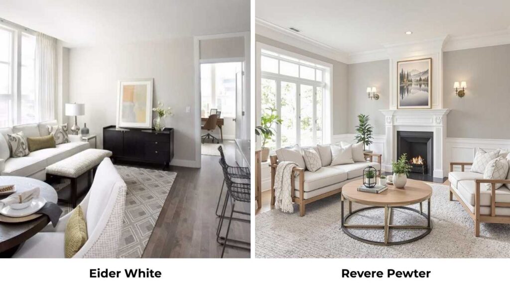
Revere Pewter (that’s a Benjamin Moore color) is dark, warm, more beige than Eider White.
Different manufacturers too.
Revere Pewter has more presence on the wall, it’s a medium-toned greige vs Eider White’s light off-white.
Eider White Vs White Duck
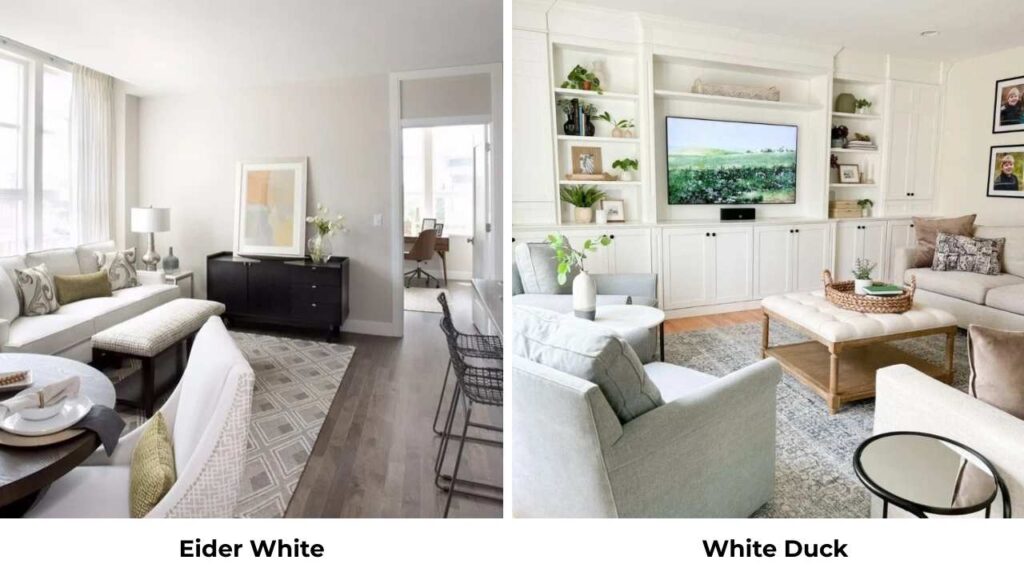
White Duck is similar to Eider White but more gray and less beige.
It is in the same family, but cooler.
Test them side by side if you’re deciding between them.
Here’s how they all look up:
| Color | Brand | LRV | Warmth | Best For |
| Eider White | SW | 73 | Soft warm | Light neutral, versatile |
| Repose Gray | SW | 58 | Balanced | Whole-house gray |
| Agreeable Gray | SW | 60 | Warm greige | Warmer neutral |
| Alabaster | SW | 82 | Warm white | Bright versatile white |
| Snowbound | SW | ~83 | Pure white | Trim, bright white |
| Revere Pewter | BM | ~55-56 | Warm greige | Medium greige |
Common Mistakes to Avoid While Going With Eider White and Repose Gray
I’ve watched people make the same mistakes with these colors many times.
Let me save you with them.
Not testing in your lighting.
Paint big samples for a reason.
Buy the sample pots, paint large poster boards, and move them around your room throughout the day.
Morning light vs afternoon light vs evening artificial light and they’ll look different.
Forgetting about existing finishes.
Your flooring, your furniture, your countertops, they ALL affect how these colors look.
Eider White with cool gray floors, may look off.
Repose Gray with warm honey oak floors, can clash.
Using the wrong trim color.
Don’t default to whatever white you have on your trim.
If you’re painting walls Eider White, your trim needs to be a clean, bright white for contrast.
Same with Repose Gray, you need the bright white trim to make the gray shine.
Painting a whole room before testing.
Please, paint a sample board first.
I’ve seen many people paint entire rooms, hate it, and have to repaint.
It’s not good to watch.
Ignoring the LRV difference.
The 15-point LRV gap between Eider White (73) and Repose Gray (58) is big.
They will NOT look similar in your space.
One is visibly lighter and brighter than the other.
Not considering room size.
A small, dark room with Repose Gray, it will feel darker and smaller.
A large, bright room with Eider White is perfect. But reverse them and you have problems.
Which Color to Choose Between Eider White and Repose Grey?
Here’s my opinion after using both colors dozens of times:
Choose Eider White if:
- You want maximum brightness and light reflection
- Your room is small or has limited natural light
- You prefer warm neutrals over gray
- You have warm wood floors, beige furniture, or warm-toned finishes
- You’re going for farmhouse, traditional, or soft modern style
- You can handle undertone variation with lighting changes
Choose Repose Gray if:
- You want a true gray that feels warm
- You need a whole-house color that’s consistent room to room
- Your style is modern, contemporary, or transitional
- You want something with presence than off-white
- You’ve good natural light in rooms
- You prefer predictable colors without undertone shifts
Personally, I use Repose Gray more in my projects because it’s more versatile and predictable. But when I need something light and soft, Eider White is what I go for.
Conclusion
Eider White Vs Repose Gray both are solid neutral choices from Sherwin-Williams, but they’re not interchangeable despite being next to each other on the paint swatch.
Eider White gives you a soft, warm brightness with an LRV of 73, which is perfect for small spaces or anywhere you need maximum light reflection.
But be prepared for the subtle violet-taupe undertones to show up depending on your lighting.
Repose Gray delivers balanced, sophisticated gray with an LRV of 58, which is ideal for whole-house color or modern spaces where you want presence than off-white provides.
Test them both in your space. Live with the samples for a few days.
See how they look with your floors, your furniture, your lighting throughout the day.
And after considering this knowing which one to go with Eider White Vs Repose Gray is up to you.
FAQs On Eider White Vs Repose Gray:
Yes, you can use them together. Eider White on ceilings or trim with Repose Gray on walls creates nice subtle contrast without being sad. They’re close in undertones that they don’t fight each other.
Extra White SW 7006 or Pure White SW 7005 both work well with Repose Gray. Extra White is fresh and clean, Pure White has a touch more warmth. I lean toward Extra White for trim because the contrast is clean.
Gray and beige undertones are dominant in Eider White, but you’ll also see subtle violet or taupe undertones depending on lighting. In north-facing rooms, it looks cool and gray. In south-facing rooms with warm light, the beige comes more.
For Eider White: Morris Room Grey (mid-tone gray accent), Snowbound (trim), Aqua-Sphere (soft blue-green), Evergreen Fog, and Accessible Beige all work well. Stick with warmer-toned accents.
For Repose Gray: Mindful Gray (deeper gray), Sea Salt (calming green-gray), Comfort Gray, Simple White (trim), and Oceanside (bold blue-green) are all good pairings. You’ve more flexibility with both warm and cool accents.