So, you’re stuck between Edgecomb Gray Vs Pale Oak. These two Benjamin Moore neutrals are the most talked paint colors in every design.
Both of them are into the spot category of “warm greige“, the perfect blend of gray and beige that doesn’t commit hard.
But here’s the thing that trips up most people: they look more similar on the small paint swatches than they are in real life.
What makes this comparison tricky is that Pale Oak (OC-20) and Edgecomb Gray (HC-173) are in the same warm greige family, but they behave differently when they’re on the walls.
Pale Oak looks light and airy, it has an off-white vibe in bright spaces. Edgecomb Gray has a presence and depth.
I’ve used Edgecomb in bedrooms where clients wanted the cozy, wrapped feeling, and Pale Oak in living rooms that need to feel big and bright.
But picking the wrong one for your space and lighting can make the space feel off.
Here in this post, I’m breaking down everything about Edgecomb Gray Vs Pale Oak. We’ll look at their LRV, how their undertones show up and which rooms each color works best in.
I’ll also compare them against other popular neutrals too.
Here are my other blogs that you can also read:
- Drift Of Mist Vs Alabaster
- Oyster White Vs Alabaster
- Quite Moments Vs Sea Salt
- Acacia Haze Vs Evergreen Fog
- Aesthetic White Vs Shoji White
Color Summary of Edgecomb Gray (Benjamin Moore HC-173)
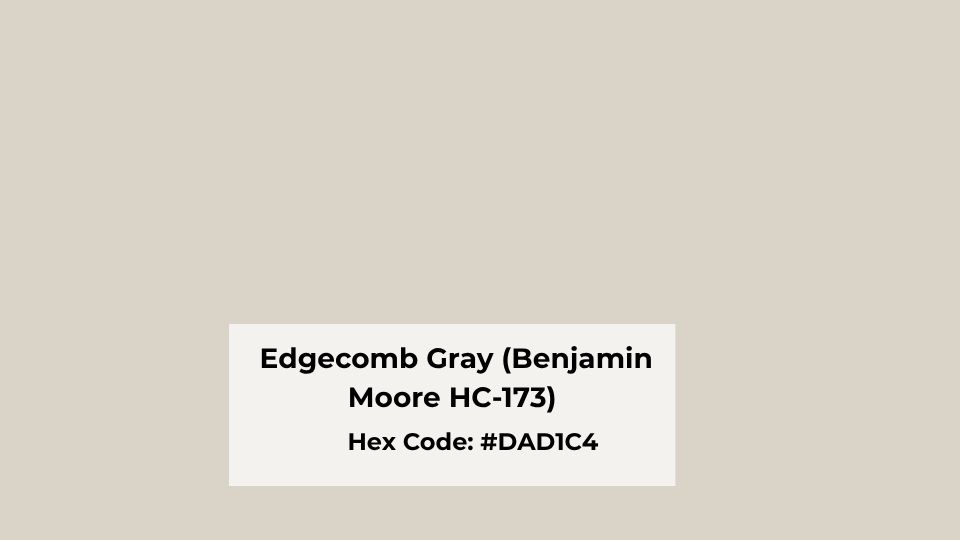
Edgecomb Gray is a warm color. It’s labeled as a greige, but it looks more beige than gray.
The HC-173 code puts it in Benjamin Moore’s Historical Collection, and there’s something about it that feels classic and timeless without being boring.
When I used Edgecomb Gray in a client’s living room had terrible north-facing light.
I was worried it would look gray and cold, but Edgecomb held onto its warmth beautifully.
It has a strong beige undertone working as the base, with gray to keep it from looking like a 1990s builder beige.
There’s minimal pink or violet in it, which is great if you’re sensitive to the tones that can look mauve in some lights.
With an LRV of about 63, Edgecomb Gray has a depth that doesn’t disappear on your walls like some of the light neutrals do.
It creates a calm, grounded backdrop that doesn’t compete with your furniture or art, but it’s present.
Homeowners and designers keep coming back to Edgecomb for bedrooms, something about that warmth makes a bedroom feel restful and cozy.
I’ve also used it in dining rooms and traditional living rooms where the goal was comfort, airy modern look. It pairs well with creamy whites on trim and warm wood tones.
Color Summary of Pale Oak (Benjamin Moore OC-20)
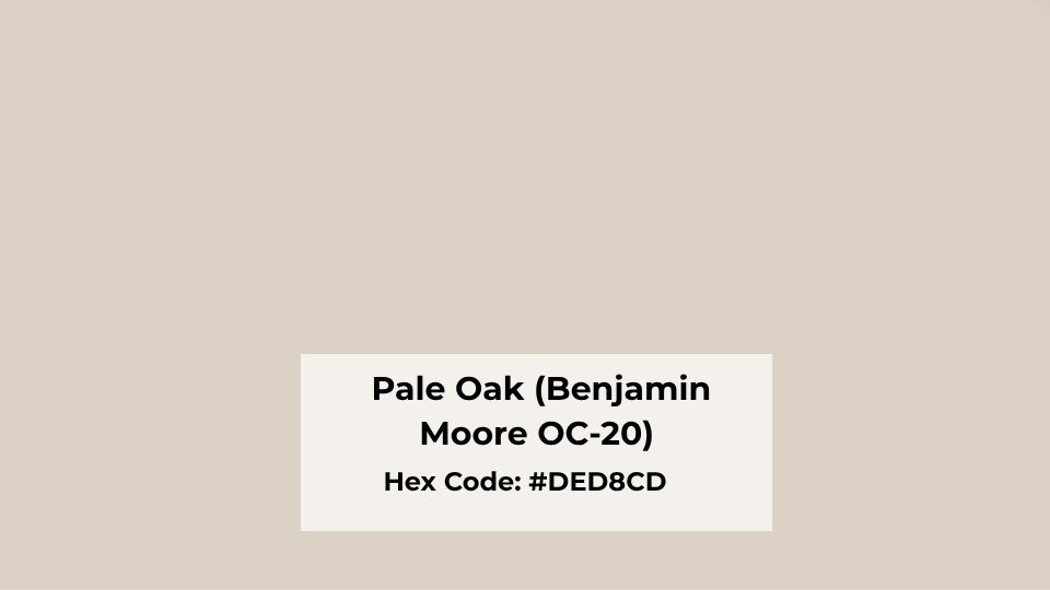
Pale Oak is the cool and modern version. It is in Benjamin Moore’s Off-White Collection as OC-20, and the classification tells you something right there, it’s between a true neutral and an off-white.
The color is a light greige with a beige-taupe base, but Pale Oak has the warm undertones with hints of pink and violet that can show up depending on your lighting.
In south-facing rooms with natural light, you may not see them. But in north-facing rooms or spaces with cool LED bulbs, the subtle purple-pink undertone will come up.
What I appreciate about Pale Oak is how it maintains its warmth in challenging lighting situations. It has an LRV around 69, which makes it visibly lighter than Edgecomb Gray.
The high light reflectance means it bounces light around the room, making spaces feel large and bright. It’s soft and has more presence than something like Balboa Mist.
I’ve specified Pale Oak for open-concept spaces where clients wanted one color that wouldn’t feel heavy or dark.
It’s fantastic in living rooms with white shaker cabinets or spaces with white trim because that contrast makes both the trim and the wall color look intentional.
In bedrooms, it creates a peaceful, airy feeling without being harsh white. And in bathrooms, small ones without great natural light, Pale Oak can make the space feel big and fresh without the cold feeling.
The homeowners who love Pale Oak are going for a modern or minimalist aesthetic. It’s the perfect neutral that lets your furniture and decor shine while adding some warmth and interest.
Edgecomb Gray Vs Pale Oak: Undertones, Lighting, and Best Uses
So, where we get into the differences that’ll help you pick the right one. I’ve had clients choose the wrong one based on the small paint swatches, and then we’re scrambling to fix it.
These details matter more than you’d think when you’re standing in the paint store.
LRV
Light Reflectance Value is how much light a color reflects back into the room, measured on a scale from 0 (absolute black) to 100 (pure white). This isn’t some number to ignore, it impacts how light or dark a color feels on your walls.
Pale Oak is at an LRV of about 69, while Edgecomb Gray is around 63. The 6-point difference may not sound huge, but you’ll see it. Pale Oak is going to feel visible light and airy.
In rooms with limited natural light, the high LRV helps bounce light you do have around the space. Edgecomb Gray’s low LRV means it absorbs light, creating a cozy, intimate feeling.
Undertones
Edgecomb Gray has strong beige undertones with some pink or violet interference. It’s straightforward and warm. What you see on the chip is close to what you’ll get on the wall, warm in bright light.
Pale Oak has a warm gray base with yellow-beige undertones, plus the hidden pink and violet hints that show up in some lighting.
I learned this in a client’s north-facing bedroom where the pink undertone became more obvious than anyone wanted. We ended up switching to Edgecomb Gray in that room.
But in south-facing rooms or spaces with warm artificial lighting, the undertones stay subtle and look soft, warm and neutral.
Lighting Behaviour
Pale Oak in north-facing rooms show its cool, gray side. The pink-violet undertones become visible, and the color can feel less warm than you expected.
In south-facing rooms, it stays warm and balanced, looking beige in bright afternoon light.
East-facing spaces get the soft, neutral look in morning light that shifts grayer as the day goes on.
West-facing rooms bring the warmth, but Pale Oak keeps the restrained, modern feeling.
Edgecomb Gray is forgiving with light direction. It holds onto its warmth better in north-facing spaces.
South-facing rooms can look warm and beige, not bad, just warm. In low light, Edgecomb looks deep and cozy. Bright light balances it out but it stays warm.
Warmth and Depth
If you want light and airy with modern vibes, Pale Oak is the best. Its high LRV and light appearance create a fresh, spacious feeling. It adds warmth without being beige or yellow.
For cozy, grounded, and traditional warmth, Edgecomb Gray is the best choice. It has depth and substance on the wall.
It’s the color that makes a room feel finished and intentional without trying to be something it’s not.
Styling and Best Uses
Both colors work beautifully with white trim. I use Simply White or Cloud White depending on how much contrast the client wants.
Pale Oak needs bright whites to create definition. Edgecomb Gray pairs better with creamy whites because the warmth matches better.
For furniture, Pale Oak looks stunning with light linen furniture, sage green accents, powder blue, and warm metals like brass. It’s the perfect backdrop for modern, minimalist styling.
Edgecomb Gray pairs with rich, deep tones like warm wood furniture, earth-toned textiles, moody greens, and traditional decor styles.
| Feature | Edgecomb Gray | Pale Oak |
| LRV | ~63 | ~69 |
| Undertones | Beige-forward, minimal pink | Gray-beige with pink/violet hints |
| Depth | Deeper, more grounded | Lighter, airier |
| Warmth | Noticeably warm | Soft warm-neutral |
| Best Light | Holds warmth in north light | Best in south/east light |
| Style | Traditional, cozy, classic | Modern, fresh, minimalist |
| Trim Pairing | Creamy whites | Crisp whites |
| Best Rooms | Bedrooms, dining rooms, cozy living rooms | Open concepts, bright living rooms, small bathrooms |
How Do Edgecomb Gray and Pale Oak Look In Different Rooms?
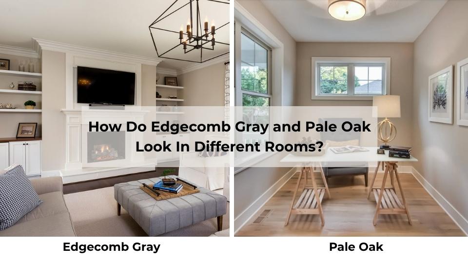
Room placement makes or breaks these colors. I’ve seen both look perfect in one room and wrong in another in the same house.
It is all about the light, room size, and what you’re trying to achieve with the space. Let me walk you through how each performs in the rooms I get asked about.
Living Room
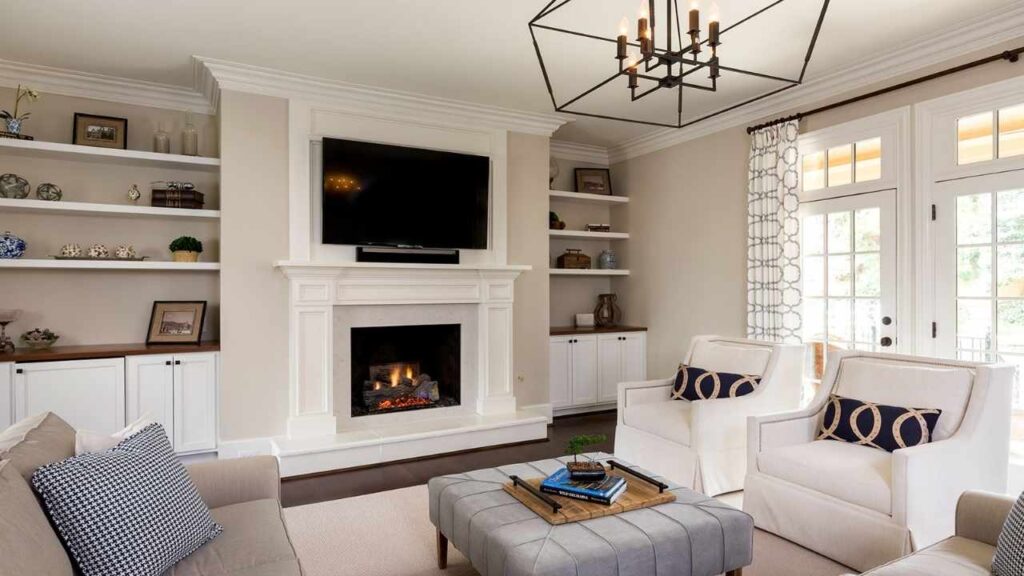
Edgecomb Gray in living rooms creates a warm, inviting space that feels collected and comfortable.
I used it in a client’s traditional living room with a stone fireplace and warm oak floors and it was perfect.
The color provided depth that the room felt intentional and finished, not washed out. It made the white trim pop without creating harsh contrast.
If your living room is small or doesn’t get natural light, Edgecomb can make it feel enclosed, not dark but cozy and intimate.
Which can be what you want, or it may work against you if you’re trying to make the space feel big.
Pale Oak in living rooms is where this color shines. It makes the space feel large and bright without being harsh white.
I specified it for an open-concept living room that connected to the kitchen and dining area, and the client wanted one color throughout.
Pale Oak was light to keep everything feeling open and airy but added warmth and interest to the walls.
It looked good with their light linen sectional and sage green accent pillows. The whole space felt modern and fresh.
Bedroom
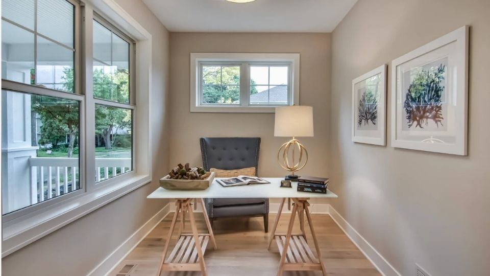
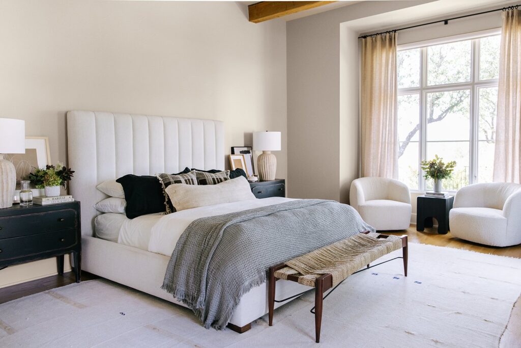
Edgecomb Gray in bedrooms is my favorite use of this color. There’s something about the warmth and depth that makes a bedroom feel restful and cozy.
I’ve used it in primary bedrooms, guest rooms, and kids’ rooms where parents wanted something calm and neutral.
It pairs beautifully with white bedding and warm wood furniture. The low LRV means it creates a dark, intimate space, which for a bedroom is a good thing.
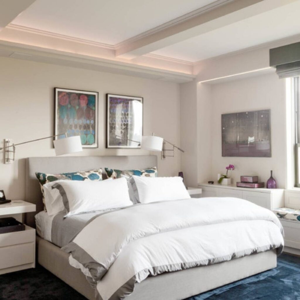
Pale Oak in bedrooms works best when you want the peaceful, airy feeling. I specified it for a client’s primary bedroom that had great south-facing windows.
The room felt light and serene. It complemented the natural materials in the room without competing. But in a north-facing bedroom, I’d prefer you to go with Edgecomb.
Pale Oak can feel a touch too cool and gray in bedrooms without good natural light, which isn’t the restful vibe.
Bathroom
Edgecomb Gray in bathrooms adds warmth and makes the space feel more finished than builder-grade white, but it’s not my first choice for small bathrooms.
The deep color can make a compact powder room or windowless bathroom feel small.
Where it works well is in large primary bathrooms with good light, if you’ve warm-toned tile or wood vanities. It creates a cohesive, high-end look.
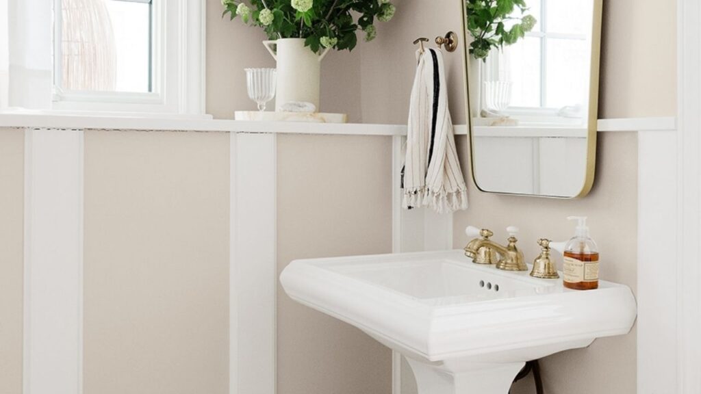
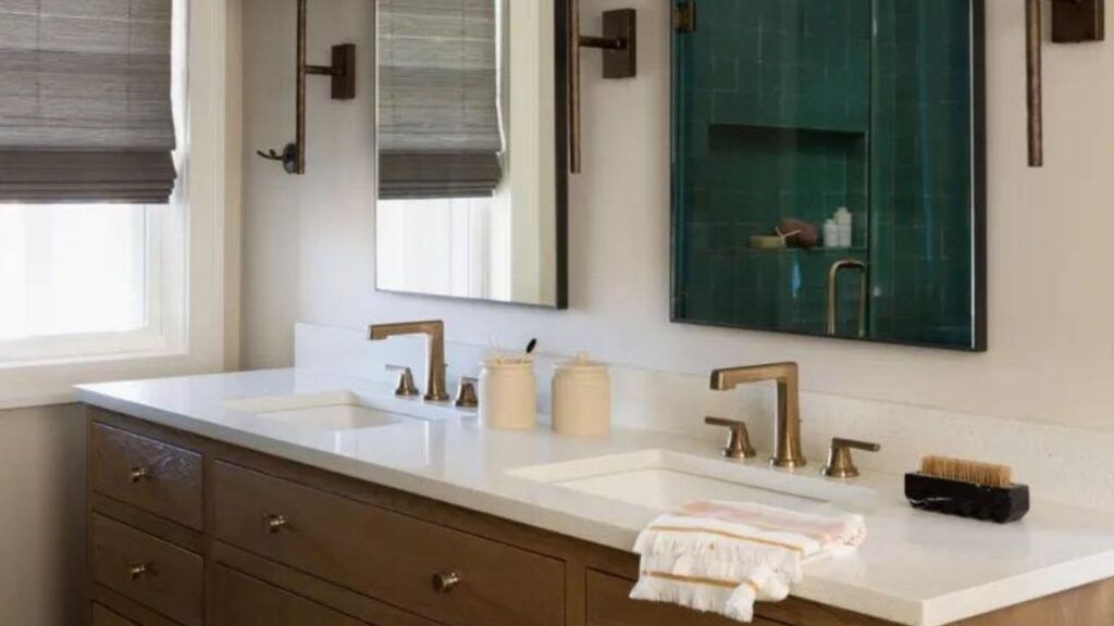
Pale Oak in bathrooms is magic, mainly in small spaces. I used it in a small guest bathroom with no windows, and it made a difference.
The high LRV bounced light around and made the room feel big and fresh. It’s also fantastic in bathrooms with white subway tile, marble counters, or the modern, spa-like aesthetic.
Be careful of your lighting fixtures like cool LED bulbs can bring the pink-violet undertones.
Kitchen
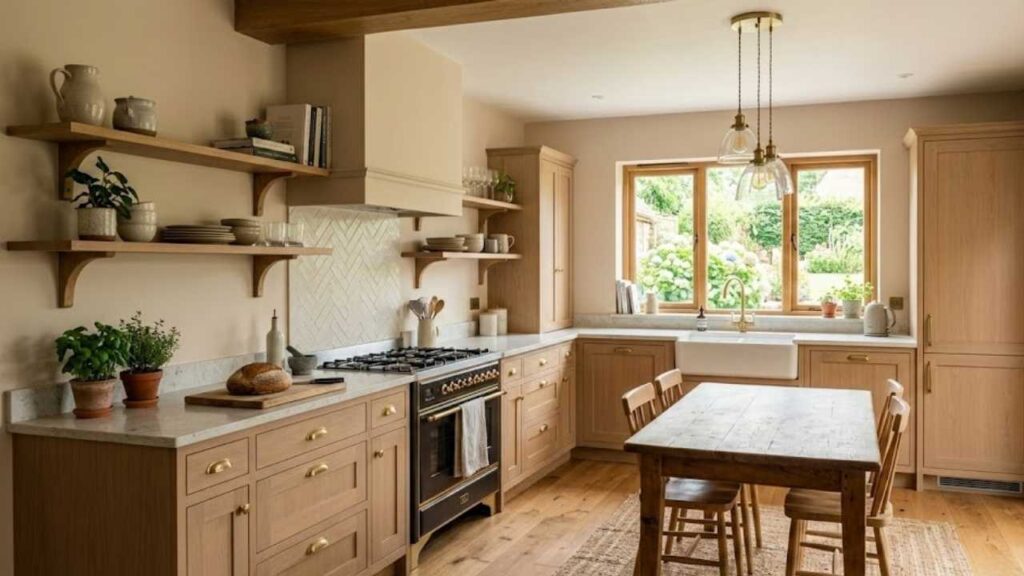
Edgecomb Gray in kitchens pairs well with warm wood cabinetry, if you’ve oak or maple cabinets.
It creates a cohesive, traditional look that feels collected. I’ve seen it work well in kitchens with dark countertops where the wall color provides a nice middle-ground between dark counters and light cabinets.
If you have white cabinets and want something warmer than pure white walls, Edgecomb can work.
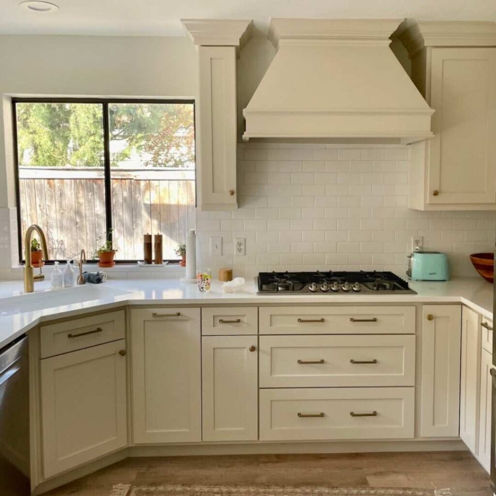
Pale Oak in kitchens is my go-to for modern kitchens with white shaker cabinets and marble or white quartz counters. It creates a clean, minimalist aesthetic while adding warmth.
The light color keeps the kitchen feeling open and bright, which is always the goal in a kitchen.
It works well in open-concept spaces where the kitchen flows into the living area, Pale Oak keeps everything feeling light and connected without being boring.
Edgecomb Gray Vs Pale Oak Vs Other Colors
If you’re considering Edgecomb Gray Vs Pale Oak, you’ve also looked at other neutrals trying to figure out what makes them different.
Let me break down how these are against some other popular options, because sometimes the best way to understand a color is to see what it’s not.
Edgecomb Gray Vs Pale Oak Vs Agreeable Gray
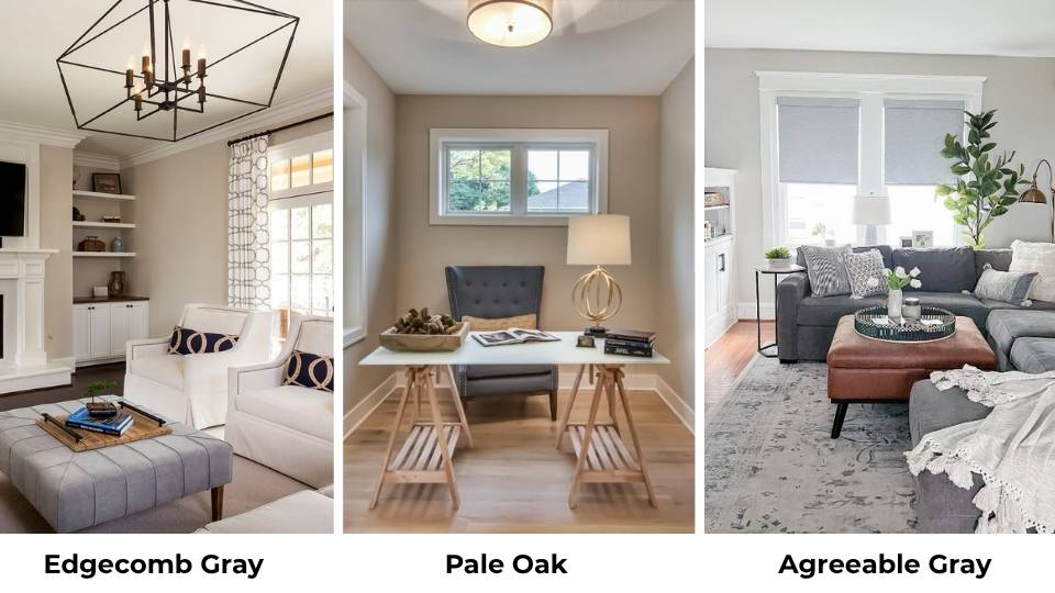
Agreeable Gray is cool and grayer than both of these Benjamin Moore colors. It has an LRV around 60 and looks true gray with warm undertones, but it’s more gray than greige.
If you put all three side by side, Agreeable Gray will be the cool, Pale Oak in the middle leaning warm, and Edgecomb Gray the warm and beige.
Agreeable Gray works great if you want a true gray that’s not cold, but if you’re wanting the beige-greige warmth, both Edgecomb and Pale Oak will feel warm and inviting.
Edgecomb Gray Vs Balboa Mist Vs Pale Oak
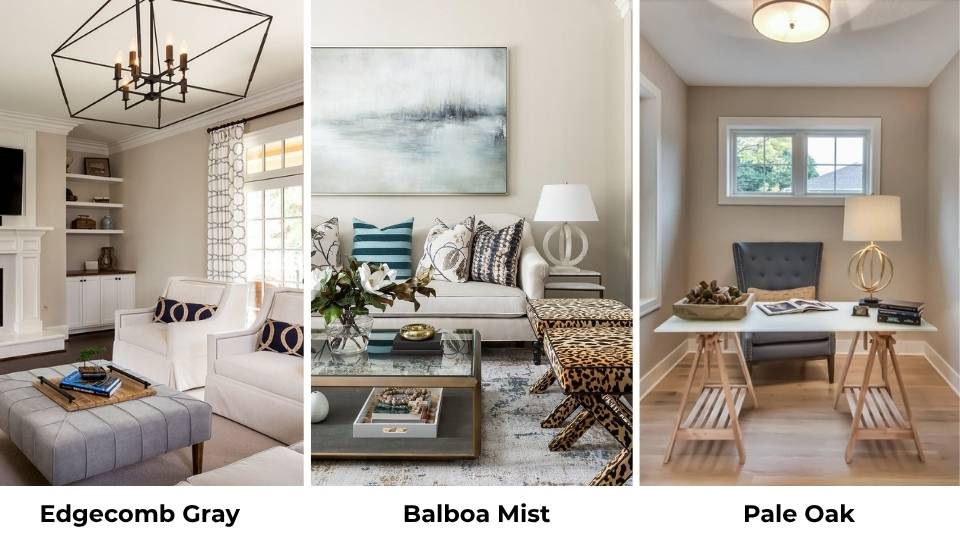
Balboa Mist is between Edgecomb Gray and Pale Oak in terms of LRV and warmth. It’s lighter than Edgecomb but not as light as Pale Oak.
Balboa Mist has soft, less defined undertones than Pale Oak. Where Pale Oak can show the hidden undertones, Balboa Mist stays consistently soft and neutral.
If you’ve tested Pale Oak and the pink-violet undertones are bothering you, try Balboa Mist before giving up on the light greige category.
Edgecomb Gray Vs Accessible Beige
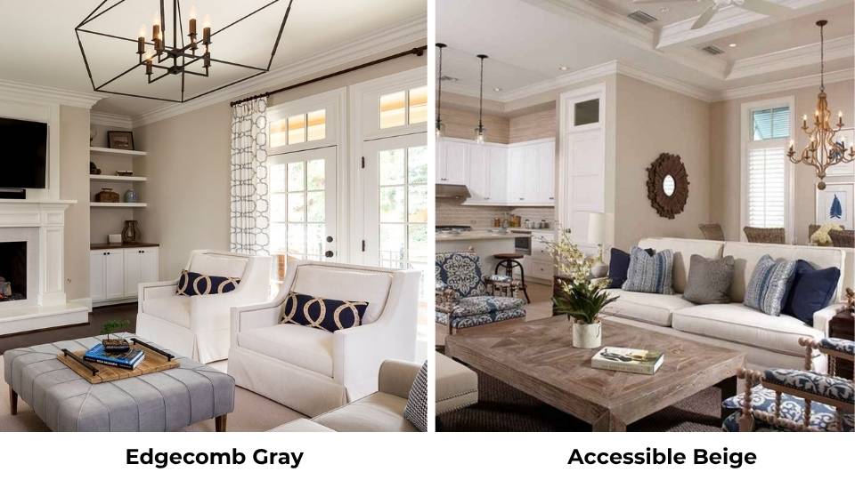
Accessible Beige is warm and more beige than Edgecomb Gray. It has less gray tempering the beige, so it looks true warm beige neutral.
Edgecomb Gray has complexity with its gray-beige balance. If you’re worried Edgecomb can be too beige, you’ll think Accessible Beige is too beige.
But if you want warmth and aren’t scared of beige undertones, Accessible Beige is a solid option that’s cozier than Edgecomb.
Pale Oak Vs Revere Pewter Vs Edgecomb Gray
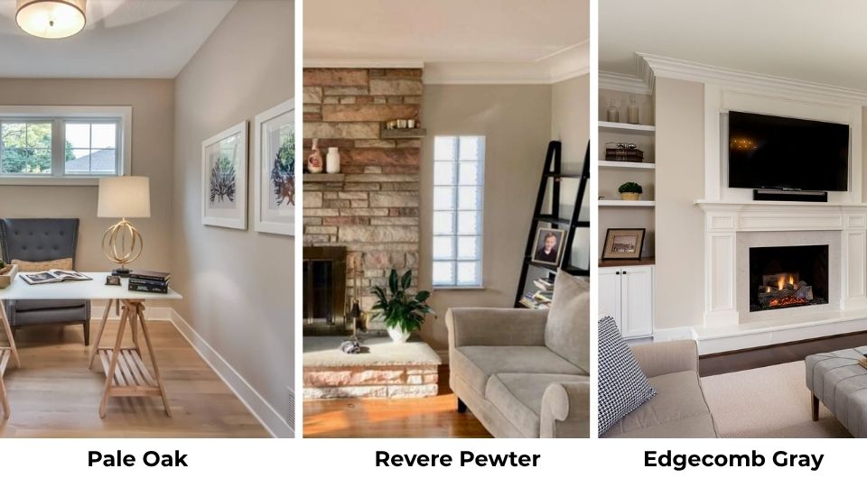
Revere Pewter is dark and grayer than both Pale Oak and Edgecomb Gray. It’s one of the colors that looks different depending on your light, it can look beige and gray in warm light and gray in cool light.
It has more depth and presence than either Pale Oak or Edgecomb. If you want something with visuals and drama, Revere Pewter is the best choice.
But it’ll make rooms feel small and cozy compared to the airy feel of Pale Oak or Edgecomb Gray.
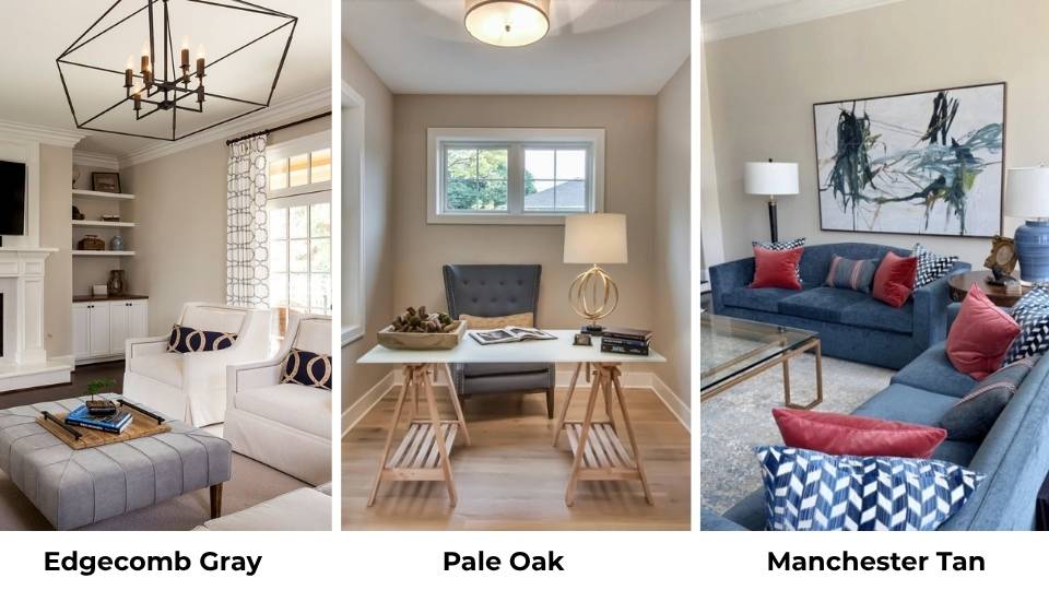
Edgecomb Gray Vs Manchester Tan
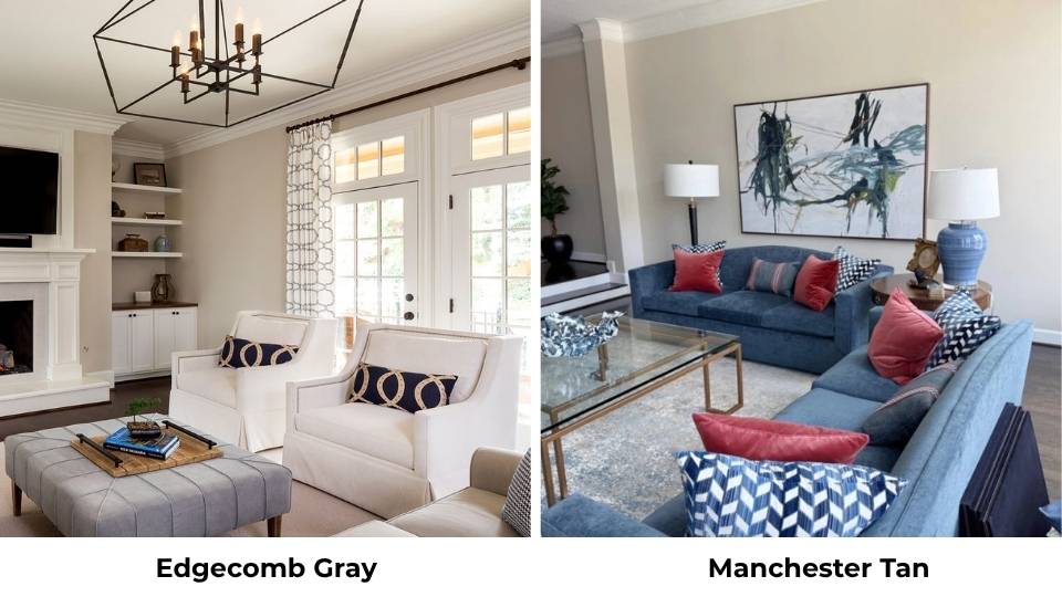
Manchester Tan is warm, tan, and deeper than Edgecomb Gray. It has an LRV around 60 and looks true warm tan-beige with no gray.
If you line them up, Manchester Tan looks visibly yellow-beige compared to Edgecomb’s greige quality.
Manchester Tan works beautifully in traditional spaces where you want clear warmth, but Edgecomb Gray gives versatility with its gray component keeping things from feeling too beige.
| Comparison | LRV | Warmth Level | Undertones | Best For |
| Edgecomb Gray | ~63 | Warm | Beige-forward | Traditional, cozy spaces |
| Pale Oak | ~69 | Soft Warm | Gray-beige with pink/violet | Modern, airy spaces |
| Agreeable Gray | ~60 | Neutral-Warm | Gray with slight warm | True gray lovers |
| Balboa Mist | ~67 | Soft Warm | Subtle, less defined | Easy neutral, less tricky |
| Revere Pewter | ~55-56 | Neutral | Gray-beige, very light-dependent | Depth and drama |
| Accessible Beige | ~58 | Very Warm | Clear beige | Maximum coziness |
| Manchester Tan | ~60 | Very Warm | Tan-beige | Traditional warmth |
Edgecomb Gray Complementary Colors
So you’ve picked Edgecomb Gray for your walls. Now you need to know what works with it because having warm greige walls doesn’t make a room feel finished but you need complementary colors to make the space work. Here’s what I’ve found pairs well with Edgecomb from projects:
Trim and Molding:
- Simply White or White Dove for trim if you want clean contrast without harshness
- Linen White if you want trim that’s closer in tone for a subtle, cohesive look
Accent Wall or Cabinet Colors:
- Deep greens like Hunter Green or Forest Green: rich and traditional
- Charcoal Gray or Wrought Iron for doors or accent elements
- Warm wood tones
Accent and Decor Colors:
- Warm terracotta and rust tones
- Deep burgundy or wine colors for textiles
- Warm gold and brass metals
- Cream and ivory for layering neutrals
- Olive and sage greens
- Warm browns and cognac leather
What to Avoid:
- Cool blues and grays
- Bright white decor
- Hot pinks and bright purples
Pale Oak Complementary Colors
If you went with Pale Oak, you’ve a modern, airy base to work with. The colors you pair with it should enhance the fresh, light feeling without making everything feel washed out or boring. From my projects using Pale Oak, here’s what works in real spaces:
Trim and Molding:
- Simply White or Chantilly Lace for fresh, clean contrast
- Cloud White if you want less harsh contrast
Accent Wall or Cabinet Colors:
- Soft blacks like Kendall Charcoal or Graphite for modern contrast
- Navy blue for depth without overwhelming
- Natural wood tones in light finishes
Accent and Decor Colors:
- Sage green and eucalyptus tones
- Powder blue and soft sky blues
- Blush pink and dusty rose)
- Warm brass and gold metals
- Soft whites and creams for layered neutrals
- Terracotta in small doses
- Warm taupes and mushroom tones
What to Avoid:
- Orange tones
- Very cool grays
- Bright, saturated colors
Conclusion
Choosing between Edgecomb Gray Vs Pale Oak comes down to the vibe you want and the light you’re working with. I
f you want warmth, coziness, and traditional comfort, Edgecomb Gray gives you that with its deep LRV and beige undertones.
It’s forgiving in north light and creates spaces that feel finished and grounded.
If you want bright, airy, and modern, Pale Oak is your best choice. The high LRV makes spaces feel big and light, and it works well in open-concept homes and contemporary spaces.
But be prepared to sample it because the pink-violet undertones come up.
Both are fantastic neutrals that have popularity. I keep coming back to both in different projects because they each solve different problems.
Sample them both in your space, watch how they change throughout the day, and pay attention to which one makes you feel good when you walk into the room.
FAQs On Edgecomb Gray Vs Pale Oak
Skip Pale Oak in north-facing rooms if you’re sensitive to cool, pink, or violet undertones, they’ll show up more in the cool natural light and look slightly purple-gray instead of warm neutral. Also avoid it if you want a true warm beige; Pale Oak stays in the gray-greige zone though it’s warm for a gray.
Edgecomb Gray is warm. It’s a warm greige that looks toward beige with minimal gray. It holds onto the warmth in north-facing rooms, which makes it a reliable choice if you want consistent warmth in your home.
Pale Oak has a warm gray base with yellow-beige undertones and subtle hints of pink and violet. The pink-violet undertones are tricky, they’re noticeable in south-facing rooms with warm light, but they become obvious in north-facing spaces or under cool LED lighting. The yellow-beige base keeps it from being a cool gray, but the violet hints are what make it complex.
Edgecomb Gray is popular because it’s a warm neutral that works in different spaces without being risky. It’s warm to feel cozy but not so beige that it feels dated. It has depth to feel substantial on walls without making rooms feel dark. It pairs well with both traditional and transitional styles, works with warm wood tones, and doesn’t have hidden undertones.
Edgecomb Gray Vs Pale Oak: How to Choose the Perfect Greige