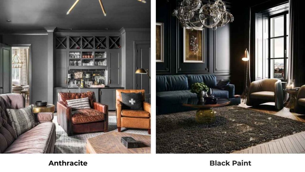
So here’s the thing about anthracite color vs black, that they look identical when you’re looking at these two, but get them on your walls and the difference is visible.
I’ve watched many homeowners stand in the painted room wondering why it doesn’t feel right.
Anthracite and black are both dark, both moody, both give you the dramatic vibe.
Anthracite is this gorgeous deep grey like it is black’s soft, more approachable version.
Black is the bold one, true, intense, no undertones to soften the blow.
At first look, mainly in the small paint samples, they look identical.
Put them in daylight though, and anthracite reveals its subtle grey undertones that black doesn’t have.
The visual effects are different depending on your lighting.
Choosing between these two isn’t about picking a dark color and calling it done.
The decision matters more than you’d think.
Lighting changes everything with these shades, like anthracite can look almost charcoal grey in bright morning light, then shift almost black by evening.
Black stays black, but how it feels in your space shifts based on natural light, finishes and what colors you’ve got around it.
Here in this post, I’m breaking down about Anthracite Color Vs Black, when you should pick one over the other, and how they perform in real rooms.
We’ll look at LRV, undertones, how light plays with each shade, and room-by-room comparisons so you can visualize it.
Here are my other blogs that you can also read:
- Dove White Vs White Dove
- City Loft Vs Alabaster
- Agreeable Grey Vs Accessible Beige
- Evergreen Fog Vs Dried Thyme
- Peppercorn Vs Iron Ore
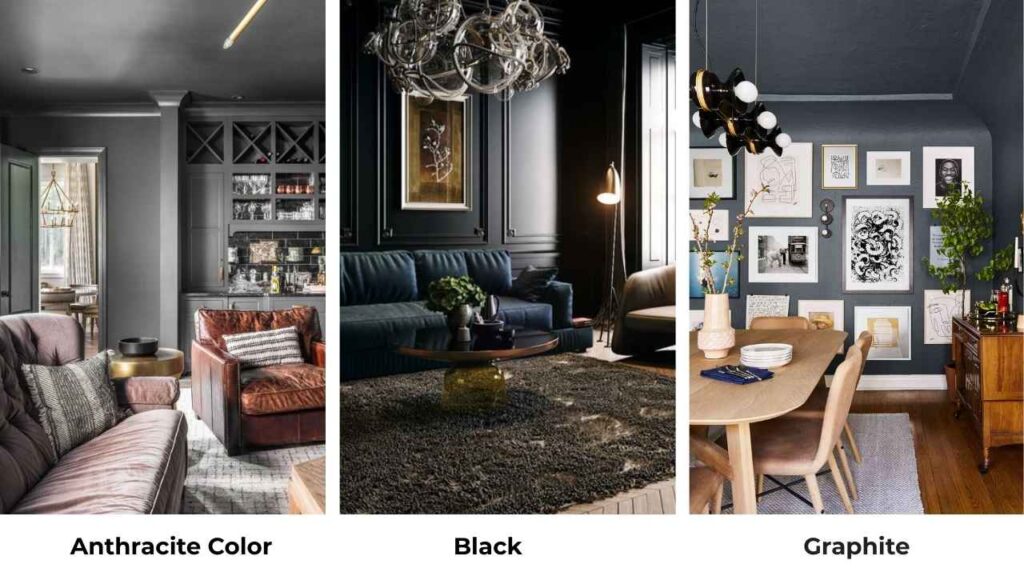
About Anthracite Color

Anthracite color is basically a very dark grey shade inspired by anthracite coal which is hard, carbon-rich coal that burns with barely any smoke.
The color mimics that coal’s appearance, is between charcoal grey and black but never committing to either one.
People call it “soft black” or “near-black grey” and both work.
It’s one of the colors that plays tricks depending on your lighting situation.
In the low light, it looks almost black
. In the bright light, the grey undertones come out and you can see it’s not true black.
What I love about anthracite is it always has visible grey undertones.
When it’s trying hard to look black in a dim hallway, there’s a subtle complexity that black doesn’t have.
The undertones are cool, sometimes you’ll catch blue or even slight green hints depending on the finish and what’s around it.
This shade has become THE color for modern, industrial, and contemporary design styles.
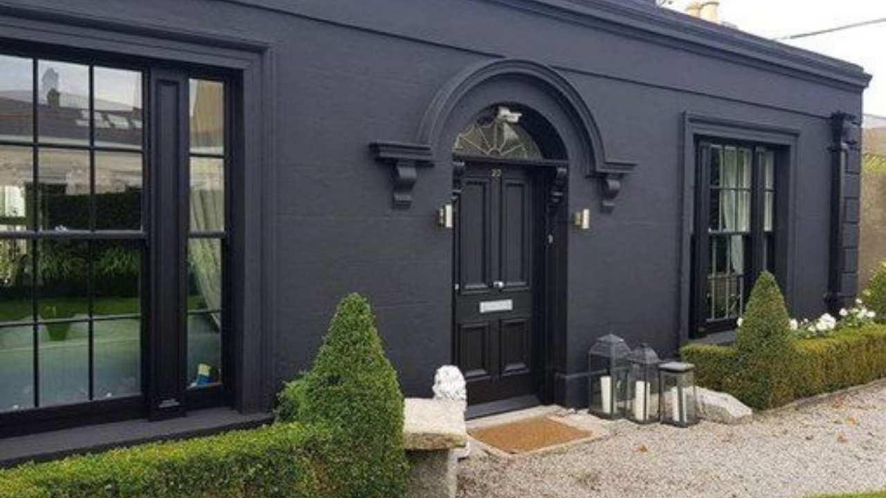
I’ve used it on exteriors where it looks best on windows and doors (RAL 7016 is the standard everyone uses in Europe, and it looks excellent.
For interiors, it brings a sophisticated edge.
The impact on exterior design is dramatic.
Anthracite on window frames against white or light-colored siding looks stunning.
It’s replaced black in a modern build because it ages better, shows less dirt and fading, and feels fresh.
For interiors, I’ve seen it work beautifully as accent walls in living rooms, kitchen cabinets and even in bathrooms where you want the spa-like modern vibe.
About Black
Black is a true neutral with no undertones.
It’s the absence of color.
While anthracite reflects a bit of light and has that grey personality, black absorbs light like it’s getting paid to do it.
This gives black the flat, solid appearance that can be either amazing or overwhelming.
There’s no arguing that black is timeless, bold, and dramatic.
It is used in design and it’s not going anywhere.
When you want maximum contrast and visual impact, black delivers it.
But here’s what they don’t always tell you, that black can feel heavy or sometimes harsh.
I’ve walked into rooms with large black walls and had to take a breath because the space felt like it was closing in.
When used in large areas, black feels overwhelming, mainly in rooms without great natural light.
Black is perfect for formal, minimalist, and high-contrast designs.
Go for black window frames against bright white walls.
Black kitchen cabinets with marble countertops.
The fresh, defined look where everything has a clear boundary, it looks architectural and intentional.
Impact on exterior and interior design, for exteriors, black is classic but it fades faster than anthracite and shows dust, pollen, and whatever lands on it.
I’ve had clients with black front doors who need to wipe them down weekly.
For interiors, black works beautifully as an accent but you need to balance it.
Anthracite Color Vs Black: Key Differences
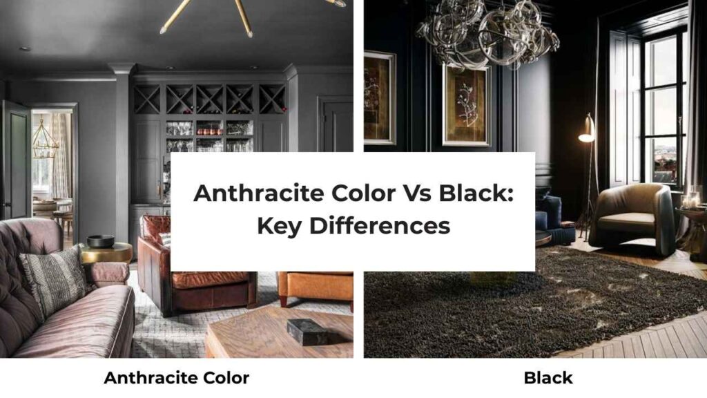
These two get confused, but once you know what to look for, you’ll spot the differences.
You have to look at the major differences of Anthracite Color Vs Black to know the real difference.
LRV
Light Reflectance Value is how much light a color reflects back, measured on a scale from 0 ( black, absorbs all light) to 100 (pure white, reflects all light).
Black paint is around LRV 5-6, depending on the paint.
It’s down there in the dark zone, absorbing most light that hits it.
This is why black rooms can feel small and why black exteriors heat up.
Anthracite has a higher LRV, around 8-12 depending on the shade.
This might not sound like much, but the small difference means anthracite reflects visibly more light than black.
Your room won’t feel cave-like.
Your exterior won’t get as hot.
Undertones
Here’s where these colors change their paths.
Black has no undertones. It’s neutral to its core.
What you see is what you get like pure, flat black.
This makes it predictable, which can be good or bad depending on your perspective.
You know what you’re getting with black.
Anthracite is about the grey undertones.
Depending on the lighting and surrounding colors, you may see cool blue hints, sometimes slight purple, occasionally greenish tones.
This complexity is what makes anthracite feel soft and sophisticated than black.
It changes throughout the day as light shifts.
The color character is different.
Black is definitive.
Anthracite is nuanced.
Lighting Affect
This matters and where most people mess up their decision.
Black absorbs light aggressively.
In a room with limited natural light, black walls will make that space feel dark, small, and kind of oppressive unless that’s the mood you’re going for.
And under artificial lighting, black can look amazing but you need light sources or it becomes a dark void.
I’ve seen beautiful black accent walls that look incredible at night with proper lighting but feel like a mistake during the day.
Anthracite plays with light instead of fighting it.
Because it reflects light, it doesn’t reduce your room quite as much.
Natural light brings out the grey undertones which you’ll see the color shift from morning to afternoon to evening.
It’s forgiving in spaces without perfect lighting.
And under artificial light, anthracite maintains dimension and depth instead of going flat.
Understanding this lighting impact is important when choosing between them.
Think about your room, your windows, your life.
Don’t only pick based on a paint swatch under store lighting.
Softness and Boldness
Anthracite brings softness even if it’s a dark color.
Sounds contradictory, but it’s true.
The grey undertone gives it an approachable quality.
It’s dramatic without being aggressive.
You can use anthracite in large spaces without it feeling like too much.
Black is all boldness, all the time. There’s no softness to pure black.
It makes a statement.
It creates sharp contrast.
It demands attention.
Sometimes what you need.
I did an accent wall in a bedroom, and the client couldn’t decide between anthracite and black.
We tested both and the black sample looked best in photos but felt intense to consider.
The anthracite gave the moody vibe without the harshness.
Style and Best Uses
Anthracite works beautifully in modern and contemporary spaces. I use it for:
- Kitchen cabinets paired with white or light grey walls and marble countertops
- Exterior window frames and doors
- Accent walls in living rooms where you want depth without heaviness
- Bathroom fixtures and cabinets for that spa-modern look
For trim and ceiling pairings, anthracite loves white or cream trim.
Keeps things bright but not as harsh as black-and-white contrast.
Furniture-wise, it pairs well with natural wood tones, metallics, and both warm and cool neutrals.
Black thrives in high-contrast, minimalist, and formal settings:
- Window frames and trim for that defined architectural look
- Kitchen cabinets in large kitchens with excellent lighting
- Furniture pieces as anchors in light rooms
- Exterior doors for maximum visual appeal
Black trim with white walls is classic for a reason.
Black furniture against light floors creates drama.
For accent colors, black can handle bright pops of color like red, yellow, emerald green.
Comparison Table:
| Feature | Anthracite | Black |
| Base Color | Deep grey | True black |
| Undertones | Grey, cool blue/purple hints | None |
| LRV | 8-12 | 5-6 |
| Light Reflection | Moderate | Minimal |
| Visual Weight | Soft, approachable | Heavy, bold |
| Best Spaces | Modern interiors, exteriors, large areas | High-contrast designs, accent pieces |
| Maintenance | Hides dust and wear better | Shows smudges, fingerprints |
| Typical Uses | Cabinets, walls, windows, doors | Trim, furniture, doors, accent walls |
| Design Style | Contemporary, industrial | Minimalist, formal, classic |
Anthracite Color Vs Black: Room-By-Room Comparison
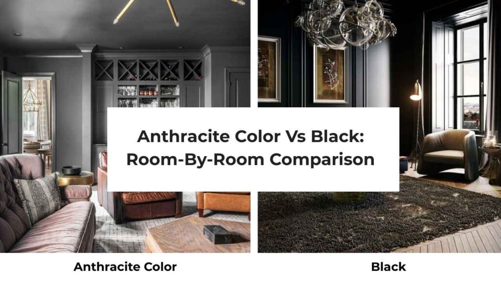
Let me walk you through how these colors look in real spaces, because theory only gets you so far.
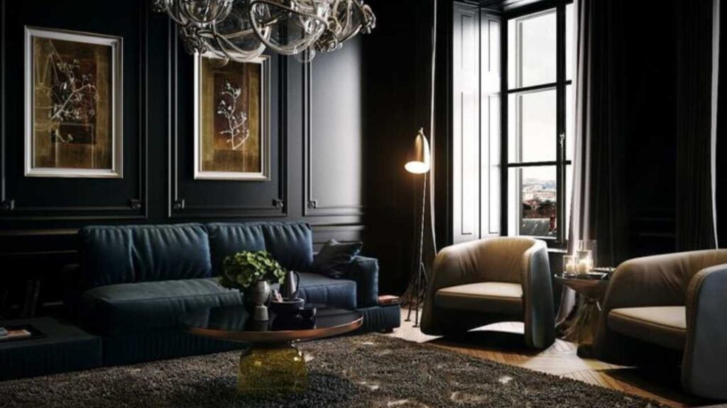
Living Room
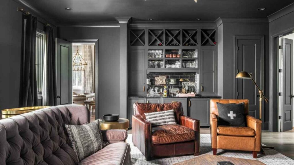
Anthracite in living rooms is forgiving.
I’ve used it on accent walls behind TVs or sofas and it creates a beautiful depth without swallowing the room whole.
Because living rooms have decent natural light, anthracite’s grey undertones show up nicely during the day.
It gives you a sophisticated, modern vibe without making the space small.
For furniture, an anthracite sofa has become popular because it gives you a dark color that hides stains but doesn’t feel as severe as black leather.
The impact is moody but livable.
You can spend hours in an anthracite living room without feeling like you’re in a cave.
Black in living rooms needs more planning.
A black accent wall can look STUNNING, but the drama is unmatched.
You need good lighting, both natural and artificial. I’ve seen black walls work well in living rooms with large windows and multiple light sources.
But without that, it looks too much.
Black furniture pieces like coffee tables, media consoles, picture frames work better than large black walls for many living rooms.
The impact is bold and makes a statement, but it’s less forgiving if you do not consider the lighting situation.
Bedroom
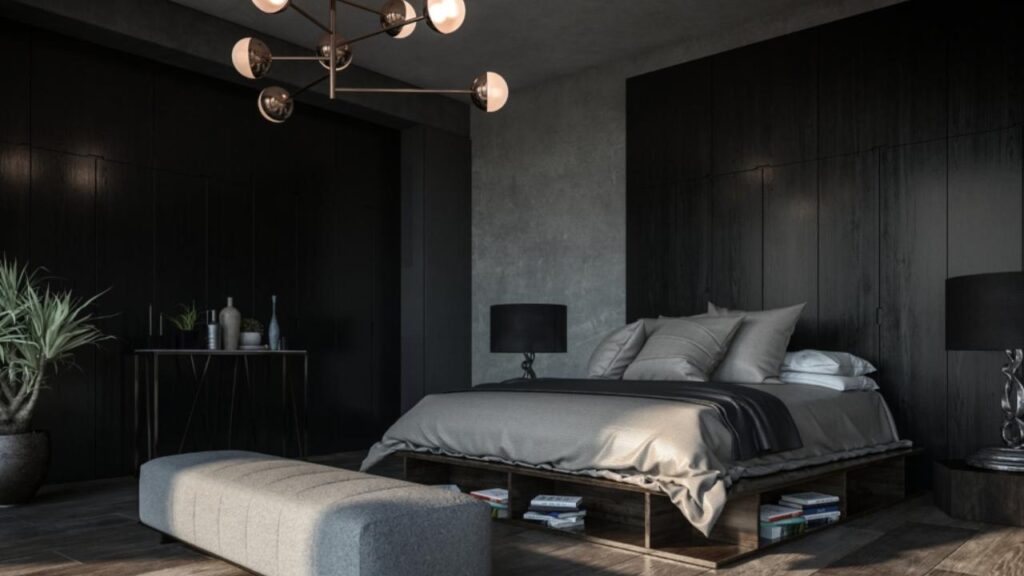
Anthracite in bedrooms creates a cozy, cocoon-like atmosphere which is perfect for sleeping.
I was in doubt when I tried it the first time, but it works.
The grey undertones keep it from feeling oppressive.
I’ve done anthracite accent walls behind beds and it creates a beautiful focal point.
Also, full anthracite bedrooms can work if you balance with white bedding, light wood furniture, and good window treatments.
The impact is calming and sophisticated.
Makes the room feel intentional and restful.
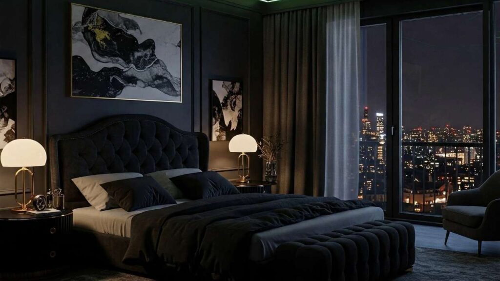
Black in bedrooms is where you should be careful.
I’ve seen it work, but only in some situations, mainly large bedrooms with excellent natural light and light-colored everything else.
A full black bedroom can feel intense for a sleep space.
Black accent walls work better, or black furniture pieces.
Black bed frames against white walls are what you call beautiful.
The impact ranges from dramatic and luxurious to oppressive and sleep-disrupting.
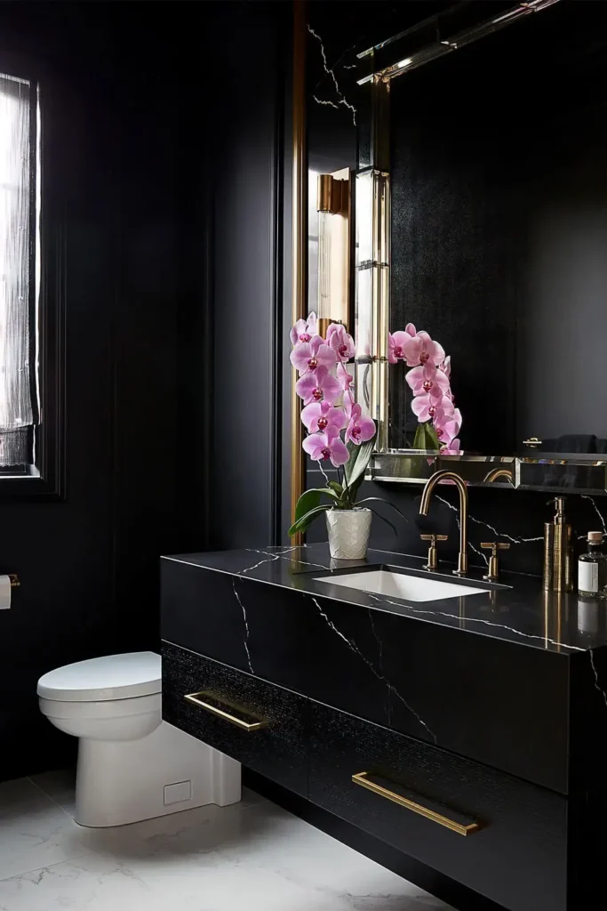
Bathroom
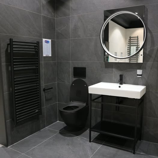
Anthracite in bathrooms has become popular for modern renovations.
Anthracite cabinets, anthracite tile, anthracite fixtures, they create that upscale spa feeling. Because bathrooms are small spaces, you’d think dark colors would be a problem, but anthracite’s light-reflective quality helps.
I love pairing anthracite bathroom cabinets with white subway tile and chrome or brass fixtures. The grey undertones play well with the reflective surfaces.
The impact is modern, clean, and doesn’t make small bathrooms feel cramped.
Black in bathrooms works but requires confidence.
Black tile can look incredible but shows water spots like nobody’s business.
Black cabinets need regular wiping to avoid showing every fingerprint and splash.
Go for black fixtures like faucets, shower heads, towel bars because they look good. Black and white bathrooms are classic for a reason.
The impact is high-end and dramatic, but maintenance-intensive.
Kitchen
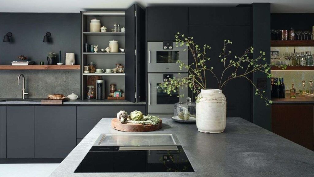
Anthracite kitchen cabinets are my favorite application of this color.
Paired with white or light grey walls, marble or quartz countertops, and brass or stainless steel hardware is beautiful.
The dark cabinets ground the space while the grey undertones keep it from feeling heavy. Anthracite works well in modern and contemporary kitchens.
It hides better than light colors and doesn’t show grease.
The impact is sophisticated and current. Makes your kitchen feel designed, not only decorated.
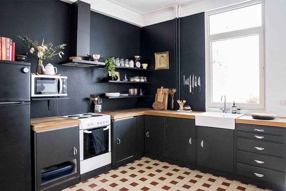
Black kitchen cabinets make a statement.
They look amazing in photos, which is why everyone wants them. In real life, they require commitment.
Black shows dust, fingerprints, and water marks.
You’re wiping down the cabinets daily.
And in large kitchens with good lighting, black cabinets with white counters and backsplash, it creates incredible contrast.
The impact is dramatic and timeless, but high-maintenance.
Exterior
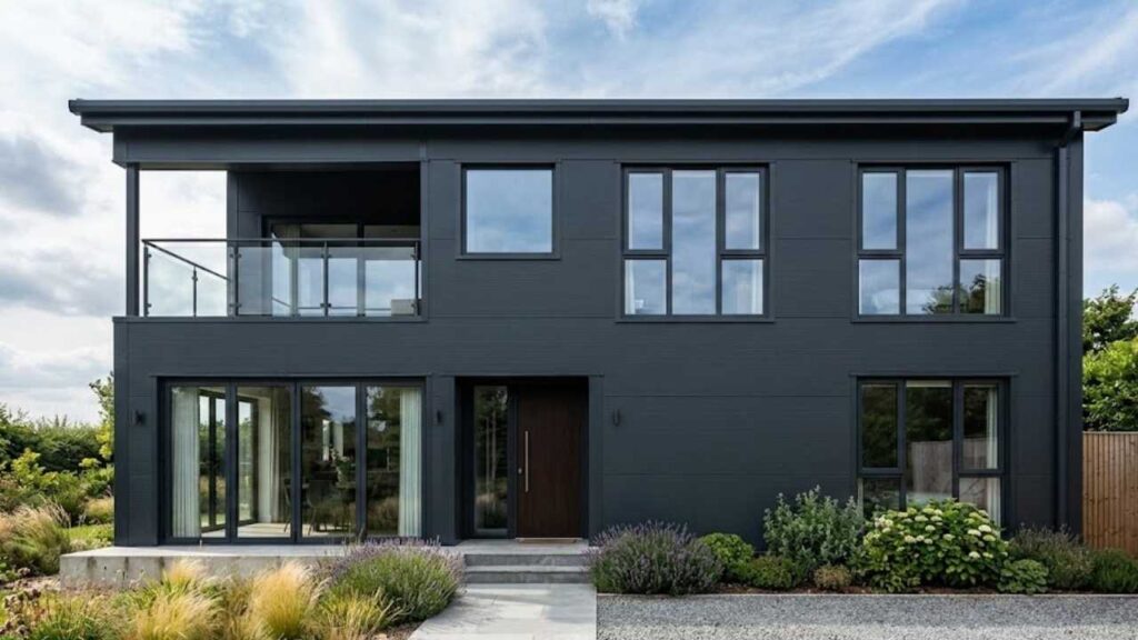
Anthracite on exteriors has basically taken over modern architecture.
RAL 7016 anthracite grey for windows and doors is standard in contemporary builds especially in Europe.
It’s replaced black in many applications because it ages better and shows less fading from UV exposure, hides dirt better, and doesn’t get quite as hot in direct sun.
I’ve used anthracite on garage doors, front doors, window frames, and full exterior cladding.
The impact is modern and practical. Your home looks updated and the color looks well long-term.
Black on exteriors is classic but has some practical drawbacks.
Black doors and trim look beautiful but require maintenance because they show dust, pollen, and weathering more than anthracite.
Black absorbs heat. Black also fades faster from UV exposure.
Like a black front door against light siding is timeless.
The impact is traditional and bold, but requires maintenance and heat management.
Anthracite Color Vs Black Vs Other Colors
Quick comparisons to help you understand where anthracite is in the grey-to-black spectrum.
Anthracite Vs Graphite Color
Graphite ( RAL 9011 Graphite Black) is darker than anthracite and closer to true black.
It has minimal grey undertones compared to anthracite.
Like graphite as the middle step between anthracite grey and pure black.
It’s sharp and less soft than anthracite but not as intense as black.
If anthracite feels light and black feels harsh, graphite is what you should consider.
Anthracite Vs Dark Grey
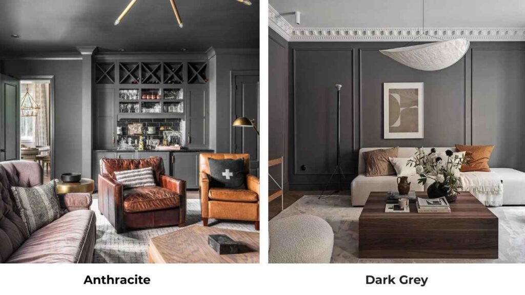
Dark grey is lighter than anthracite and has a visible grey character.
Where anthracite looks as “almost black with grey undertones,” dark grey looks as grey.
Dark grey is versatile and beginner-friendly.
Anthracite is dramatic and modern.
For most applications where people think they want dark grey, anthracite may give them the depth.
Anthracite Vs Black Paint
This is what this whole point is about, but the key distinction: anthracite is a dark grey paint with undertones and light reflection.
Black paint is true black with no undertones and maximum light absorption.
Anthracite is the modern alternative to black which gives you drama with versatility.
Black is the classic choice when you want maximum contrast and bold statements.
Comparison Table:
| Color | Darkness Level | Undertones | Best For | Visual Character |
| Anthracite | Very dark grey | Cool grey, blue hints | Modern interiors/exteriors | Soft, sophisticated |
| Graphite Black | Near black | Minimal grey | Contemporary designs | Sharp, defined |
| Dark Grey | Medium-dark | Visible grey | Versatile applications | Approachable, neutral |
| Black | True black | None | High-contrast, formal | Bold, dramatic |
Pros and Cons of Anthracite Color and Black
Let me be straight with you about the good and the bad parts of both the colors.
Anthracite Pros:
- Soft and versatile than black while being dramatic
- Grey undertones add depth and visual interest
- Reflects light, won’t darken rooms
- Hides dirt, dust, and wear better than black
- More forgiving in various lighting conditions
- Modern and current aesthetic
- Works in large applications without feeling overwhelming
- Ages well on exteriors with less fading
Anthracite Cons:
- Can look muddy if you pick the wrong shade
- Sometimes looks as “not quite black, not quite grey” if that bothers you
- Requires good paint quality to show the subtle undertones
- May feel less classic or timeless than true black to some people
- The color varies between brands and standards
Black Pros:
- Maximum drama and visual impact
- Creates perfect high-contrast designs
- Timeless and classic appeal
- Predictable
- Makes other colors pop brilliantly
- Sleek and sophisticated in modern spaces
- Definitive and bold
Black Cons:
- Shows every speck of dust, fingerprints, and water marks
- Absorbs light, can make spaces feel small and dark
- Feels heavy or oppressive in large applications
- Gets hot in direct sunlight on exteriors
- Fades fast from UV exposure
- Less forgiving if you misjudge your lighting
- Can feel harsh or overwhelming without careful balance
- High maintenance in practical applications
When to Choose Anthracite Color?
Pick anthracite when you want the dark, dramatic look but need something forgiving and versatile than true black.
Go with anthracite for:
- Modern exteriors like on windows, doors, cladding that need to look current and age well
- Kitchen cabinets where you want sophistication without fingerprint-wiping
- Accent walls in rooms without perfect lighting
- Bathrooms where you’re creating a spa-like modern atmosphere
- Larger applications where black feel like too much
- Spaces where you want color that shifts throughout the day with natural light changes
Anthracite is your answer when black feels aggressive but regular grey feels too light.
When to Choose Black?
Choose black when you want maximum impact and you’re prepared for the commitment.
Black works best for:
- High-contrast designs where you need definitive separation
- Smaller applications like trim, furniture pieces, accent elements
- Formal or minimalist spaces where bold simplicity is the goal
- Well-lit rooms where you can handle the light absorption
- Making other colors pop, black backgrounds make bright colors sing
- Classic, timeless aesthetics over trendy modern looks
Black is the right choice when nothing else will give you the drama you’re craving and you’re realistic about maintenance.
Conclusion
Look, anthracite color vs black isn’t about which one is “better” because they’re both excellent dark colors with different personalities.
Anthracite is the sophisticated, adaptable modern choice with the gorgeous grey undertones. Black is the bold, classic statement that demands attention.
I’ve used both and my honest comment is, Anthracite is more forgiving for most people.
It gives you a dark drama without the drawbacks of true black.
It ages better on exteriors, maintains better on interiors, and works in lighting situations.
But black has its place because sometimes you need the pure, unapologetic boldness.
Test both in your space before committing.
Paint large samples, look at them morning, noon, and night.
Consider your lighting, your maintenance patience, and your design goals.
Either color can be incredible in the right application.
Choosing between Anthracite Color Vs Black can be a little tough but when you consider your space while going with either of them it can make it a bit better.
FAQs On Anthracite Color Vs Black
Anthracite is darker than most colors labeled “dark grey.” Anthracite is near black on the darkness scale, it’s a near-black grey. Regular dark grey is visibly light and looks clearly grey rather than almost-black.
They can work together but it’s tricky. Because they’re so similar in darkness but different in tone, using them together looks like a mistake rather than intentional. If you’re going to pair them, make sure there’s clear separation like anthracite cabinets with black hardware.
Not anymore. Anthracite has become popular in modern architecture and interior design. It used to be common in industrial contexts, but now it’s everywhere mainly in contemporary home design. RAL 7016 anthracite grey is a standard color offering from most manufacturers of windows, doors, and building materials.
No, anthracite is a very dark grey, not true black. It’s called “near-black” or “soft black” because it looks almost black, mainly in low light. But it always has visible grey undertones that creates a difference from pure black. In bright light, you can see it’s grey.
Anthracite Color Vs Black: What Color Works Best For Your Home?