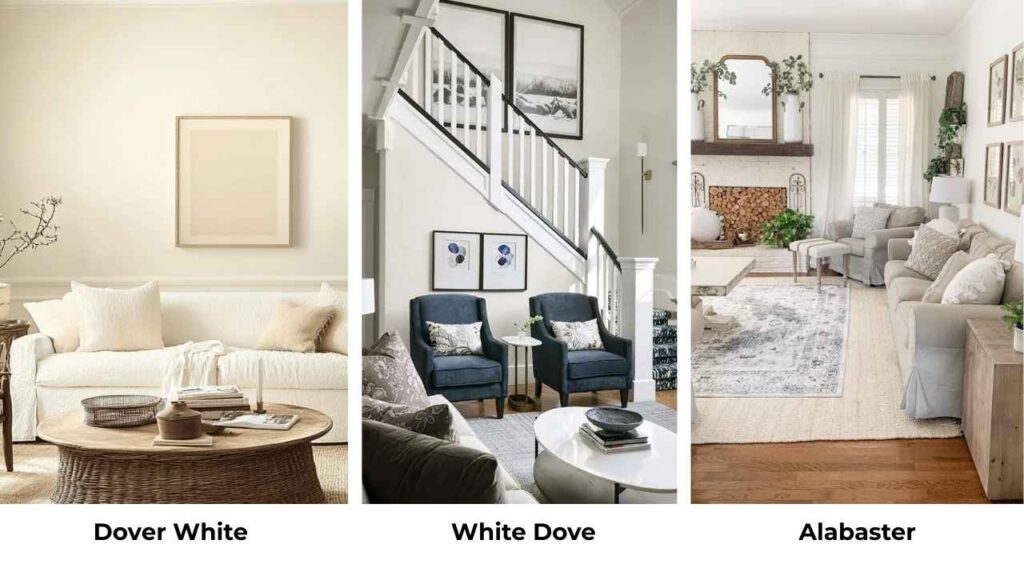
You know when you’re standing in the paint store, holding two white paint swatches that look identical, and you’re wondering which one to go with? That’s Dover White vs White Dove.
Dover White from Sherwin Williams and White Dove from Benjamin Moore are both popular for interiors where you want classic, creamy white vibe.
But their undertones and how they play with lighting can transform your space.
I’ve specified both of these colors for more projects than I can count, and I’ve seen them go wrong when people don’t consider brand formulations.
See, Sherwin Williams and Benjamin Moore don’t mix their paints the same way.
which means the color depth, the warmth and how the paint looks on your wall.
Choosing the wrong color can make your space a mess when you want to be warm and cozy.
And both work well for interiors and exteriors.
So, we’re breaking down everything about Dover White Vs White Dove, like the undertones, the LRV, how they look room by room, and which one you should pick based on your lighting and existing finishes.
I’m also putting in comparisons with other whites because, once you start looking at white paint, you end up with many samples.
Here are my other blogs that you can also read:
- Quiet Moments Vs Sea Salt
- Peppercorn Vs Iron Ore
- Rainwashed Vs Sea Salt
- Orange Peel Vs Knockdown
- Swiss Coffee Behr Vs Benjamin Moore
What You Need To Know About Dover White (SW 6385)
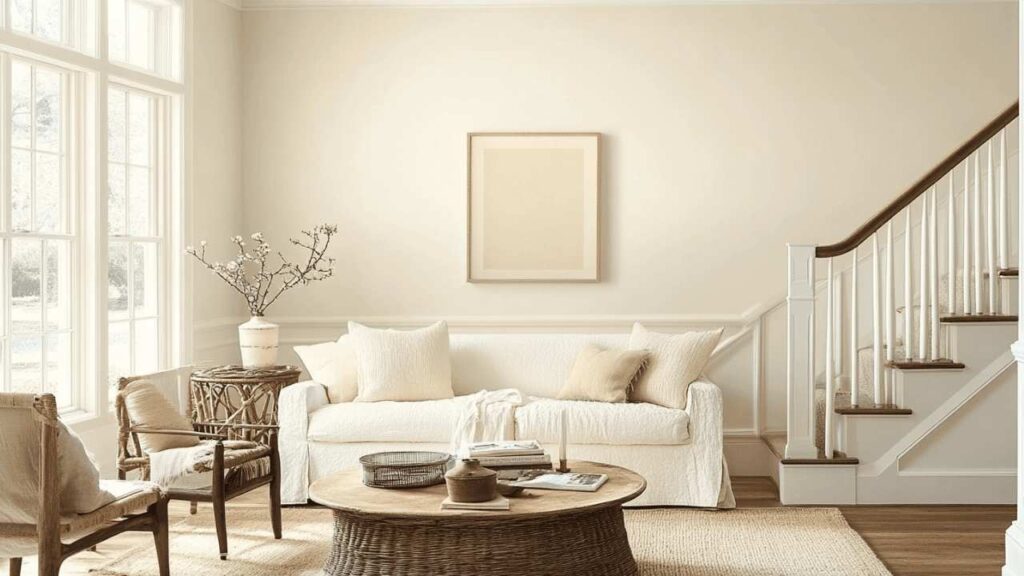
Dover White is a warm white that leans into those cozy, traditional vibes.
It has a subtle warmth that comes from yellow and beige undertones, not screaming yellow, but that you’ll notice in some lighting conditions.
When I first used Dover White on a client project, I thought it would be a perfect neutral white for a house color.
The homeowner wanted something warm but not cream, clean but not sterile.
In their south-facing living room with natural light, it looked beautiful, warm and inviting.
But in their north-facing bedroom it has that weird creamy-yellow touch.
The main thing with Dover White is that it shows its true colors based on your lighting.
The LRV is around 82, which means it reflects a good amount of light but holds onto more depth than bright whites.
I’ve used it in living rooms where people want that cozy, traditional feel.
It works well with warm wood tones like honey oak floors, walnut furniture, or the farmhouse table.
Designers love it for traditional and classic interiors because it doesn’t go against existing warm finishes.
For bedrooms, it creates a wrapped-in-warmth feeling that’s perfect if you’re going for comfort over bright modernism.
I specified it for a master bedroom last year with brown and tan bedding, and it was perfect. The warmth didn’t compete with it but it complemented it.
Bathrooms are where I get more careful with Dover White. If you have cooler-toned tiles or modern fixtures, the yellow undertones can clash.
But pair it with travertine, warm beige tile, or oil-rubbed bronze fixtures, it will look beautiful.
Kitchens with warm wood cabinets or traditional styling look beautiful. Modern kitchens with stainless steel and white quartz, will not go with this.
I learned this when I painted a kitchen with Dover White cabinets, and the homeowner had cool gray countertops.
The yellow undertone made everything look off.
On exteriors, Dover White gives you a classic, timeless look.
It’s warm to feel inviting but looks as white visually.
Also, it works great with brick, stone, or warm-colored siding accents.
What You Need To Know About White Dove (OC-17)
White Dove is Benjamin Moore’s rockstar white, and I get why.
It’s a soft, creamy white with gray undertones and that gray is what makes it much more flexible than Dover White.
The LRV is approximately 85.38, so it’s brighter and reflects light than Dover White.
But it doesn’t feel stark or cold, which is the magic of this color.
The subtle gray undertones keep it from being clinical while feeling fresh.
Here’s what I love about White Dove: in natural light, it glows.
In artificial light, if you’ve warm incandescent bulbs or the yellowish LEDs that everyone installed five years ago, White Dove holds its ground.
I used White Dove in my own house for the main living areas, and I was shocked at how different it looked in the morning versus evening.
Morning light makes it feel fresh and clean but also looks warmer.
Evening light with lamps, it gets cozy but never dingy.
White Dove is one of THE most specified paints from Benjamin Moore’s palette, and for good reason.
It’s less yellow than most “warm whites,” which means it pairs with both warm AND cool accent colors.
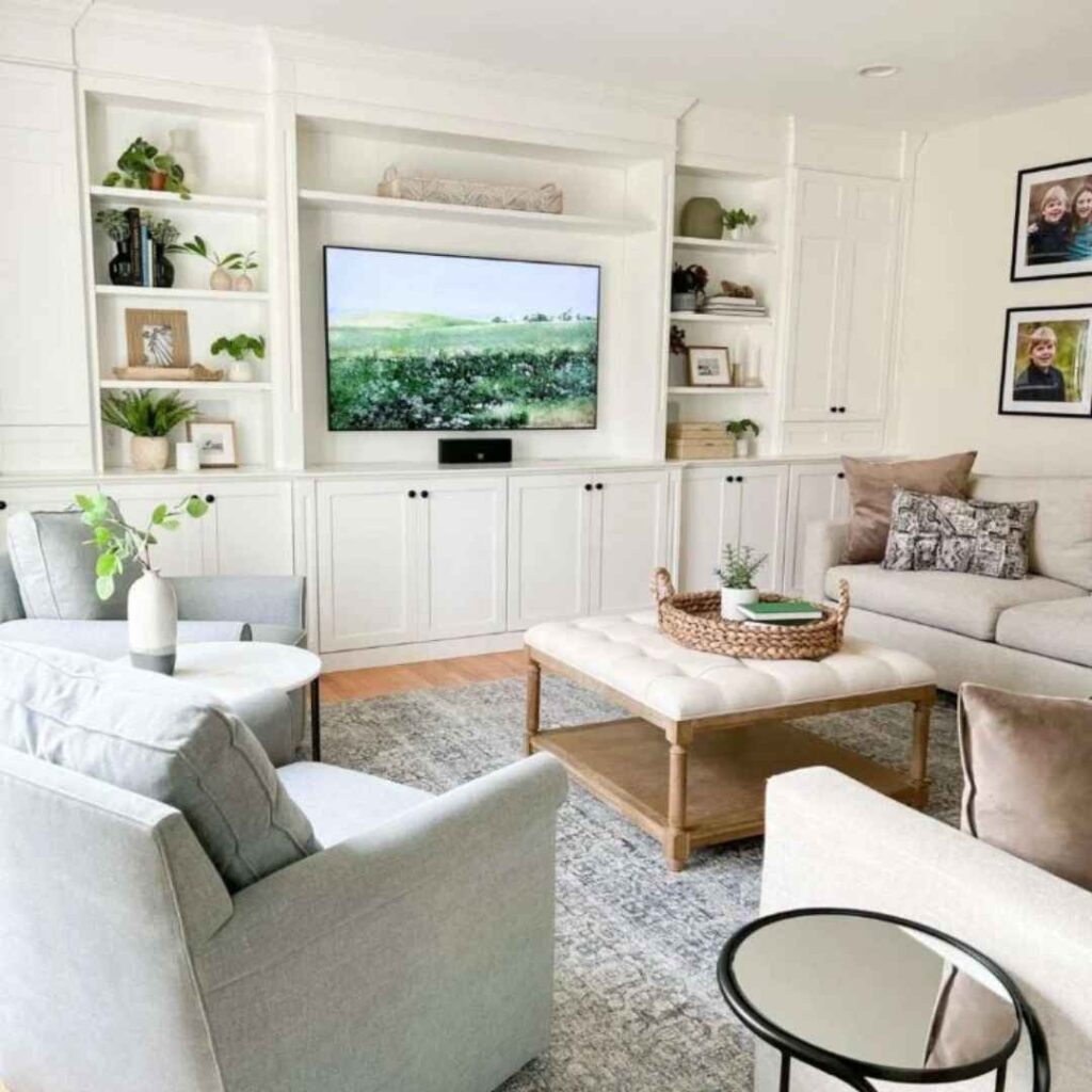
For living rooms, White Dove creates this bright, airy feeling without going full minimalist-white-box.
It works with modern furniture, traditional pieces, that weird mix of both that most of us actually have in our homes.
I’ve seen it paired with Hale Navy for an accent wall, and the contrast is stunning.
Bedrooms get a soft, peaceful quality with White Dove.
It’s warm to feel restful but bright that you’re not waking up in a cave.
It works well with gray bedding, white bedding and some warmer tones.
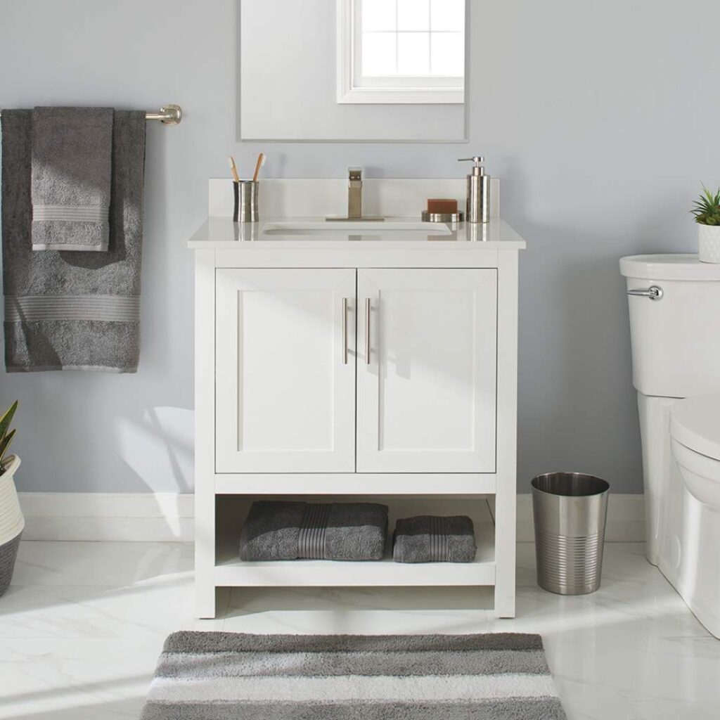
In bathrooms, this is my go-to over Dover White.
The gray undertones play well with white subway tile, marble, modern fixtures.
It feels clean and spa-like without being cold.
I’ve used it with both warm and cool metal finishes, and it works.
Kitchens, this is the space where White Dove shines for me. On cabinets, on walls, doesn’t matter.
It’s bright to make your kitchen feel open and clean, but it has warmth that it’s not giving you operating-room vibes.
Also, it pairs well with marble countertops, quartz and butcher block.
On exteriors, White Dove gives you a fresh, classic look that makes your landscaping pop.
It’s clean without being too bright, warm without looking yellow or cream.
Less traditional than Dover White but in a good way.
What is the Difference Between Dover White and White Dove?
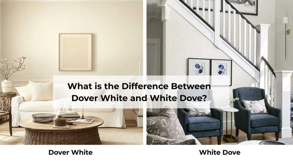
Okay, so Dover White Vs White Dove, both are warm whites, both are popular, both are going to look better.
But the differences matter more than you’d think.
The undertones shift how these colors interact with your floors, your furniture, your lighting.
LRV
Light Reflectance Value is how much light a color bounces back at you.
Higher numbers means brighter space.
White Dove’s LRV is around 85.38, which makes it brighter than Dover White.
In a simple way, your room will feel open, airy and like you have natural light even if your windows are kind of sad.
Dover White is at about 82 LRV. Which is bright, reflects light, but it holds onto more depth.
Some people prefer this because it feels less harsh, more grounded.
I prefer the high LRV most of the time because I’m trying to maximize light.
The three-point difference doesn’t sound big, but when you put them side by side on a wall, you’ll see it.
White Dove will look fresh and bright.
Dover White will look deep and warm.
Undertones
This is where these two colors split paths.
Dover White has creamy yellow and beige undertones.
It’s warm in an obvious way, you can see the warmth.
It is great if you’re working with warm wood, beige carpet, and traditional furniture.
The yellow becomes noticeable in warm lighting conditions, and it can look cream-colored in some spaces.
White Dove has gray undertones with a hint of yellow and sometimes green.
The gray is what keeps it from sliding into yellow territory also when you’ve warm lighting.
It looks as warm white, but it’s a more neutral warm white.
I made the mistake once of using Dover White in a space with cool gray floors, which was a big mistake.
The yellow undertone and the cool gray went against each other, and everything looked muddy.
Switched to White Dove and the whole room came together.
Lighting Affect
Light is everything with these colors. EVERYTHING.
Dover White in north-facing rooms can look flat, or cream-colored.
In south-facing rooms with warm, direct sunlight, it looks gorgeous.
It soaks up the warmth and gives you a cozy, inviting feeling.
On the other hand, under incandescent lighting, the yellow undertones get strong.
But under cool LED lighting, it can look washed out.
White Dove handles different lighting conditions like a champ.
North-facing rooms look good because the gray undertone prevents it from looking too warm or too flat.
South-facing rooms look bright and fresh without going yellow.
And under artificial lighting, both warm and cool, it maintains its character.
This is why I go for White Dove.
I always tell people to buy samples and paint large swatches on different walls in the room.
Look at them morning, noon, and night.
Look at them with natural light, with lamps, with everything at once.
Style and Best Uses
Dover White is your traditional, classic, cozy white. It works best in:
- Traditional or farmhouse-style homes
- Spaces with warm wood
- Rooms where you want to emphasize warmth and comfort
- Exteriors for a timeless, warm look
Pair it with warm wood tones, beige and tan accent colors, oil-rubbed bronze or brass fixtures. For trim, you can go warm and create subtle contrast with Dover White walls and a fresh white trim.
White Dove is your flexible, modern-but-not-too-modern white. Best for:
- Transitional spaces
- Modern farmhouse looks
- Rooms where you want brightness without harshness
- Basically anywhere you need a reliable white
It pairs well with cool grays like Revere Pewter or dark contrasts like Hale Navy.
It works with both warm and cool wood tones. For trim, White Dove is popular because it creates clean lines without harshness.
Dover White vs White Dove Comparison Table
| Aspect | Dover White (SW 6385) | White Dove (OC-17) |
| LRV | ~82 | ~85.38 |
| Primary Undertone | Creamy yellow/beige | Soft warm gray |
| Overall Feel | Warm, traditional, cozy | Fresh, clean, versatile |
| Best Lighting | South-facing, warm light | Works in most lighting |
| Yellow Presence | Noticeable, especially in warm light | Minimal, well-controlled |
| Pairs With | Warm woods, beiges, traditional finishes | Both warm and cool tones |
| Best Style | Traditional, farmhouse, classic | Transitional, modern farmhouse, contemporary |
| Brightness | Slightly deeper | Brighter, more reflective |
Dover White Vs White Dove: Room-By-Room Comparison
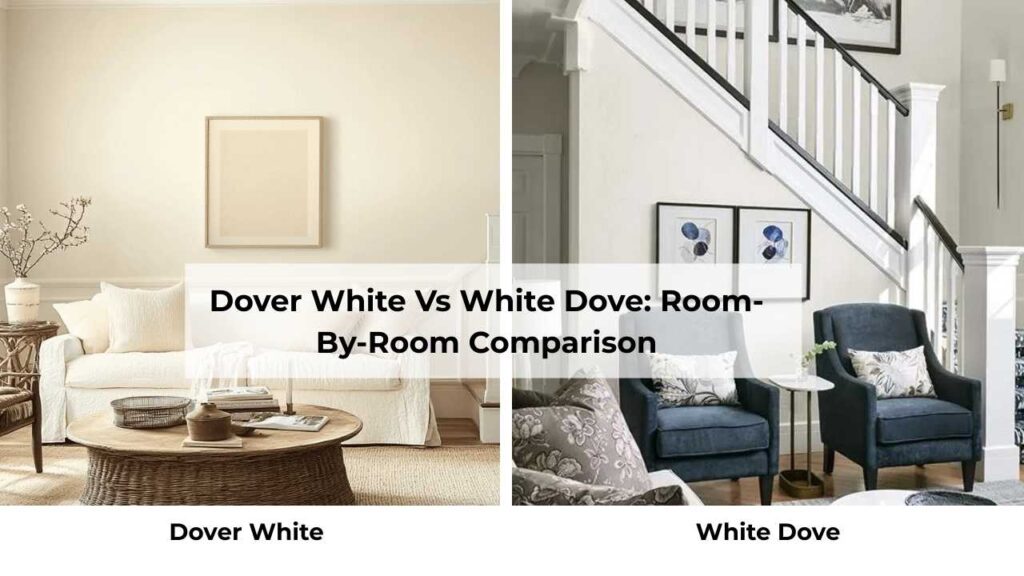
Choosing between these two comes down to how they perform in your space.
Your lighting, your floors, your existing finishes, they shift how these colors show up.
I’m breaking this down by room because you may use Dover White in one room and White Dove in another.
Living Room
Dover White in a living room works when you want a wrapped-up-in-a-blanket feeling.
If you are going with a south-facing living room with decent natural light, Dover White creates a warm, inviting atmosphere.
It plays well with warm wood floors, and if you’ve got brown, tan, or warm-toned furniture.
But if your living room has cool-toned grays or modern furniture with clean lines, Dover White may feel out of place.
I’ve seen it look beautiful in traditional living rooms with crown molding and built-ins.
White Dove in a living room gives you flexibility.
It’s bright and airy but has that warmth that keeps it from feeling cold.
I used it in a living room that had a mix of furniture styles, and it tied everything together without imposing the aesthetic.
It made the space feel big, which is great.
And it works well with leather sofas, fabric sofas, modern pieces, traditional pieces.
Bedroom
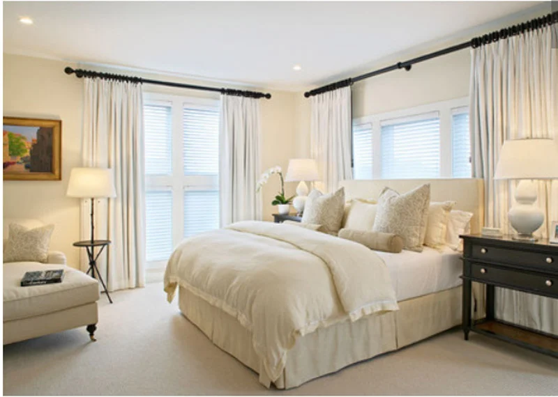
Dover White creates a cozy cocoon effect in bedrooms.
If you want your bedroom to feel like a warm hug, then this is your color.
It’s nice in bedrooms with warm wood furniture or textiles in beige and brown tones.
The slight yellow undertone can make the space feel restful and less stimulating.
The downside, in bedrooms with limited natural light, it can feel heavy or dim.
I specified it once for a master bedroom with only one small window, and the homeowners ended up repainting because it felt dark in the mornings.
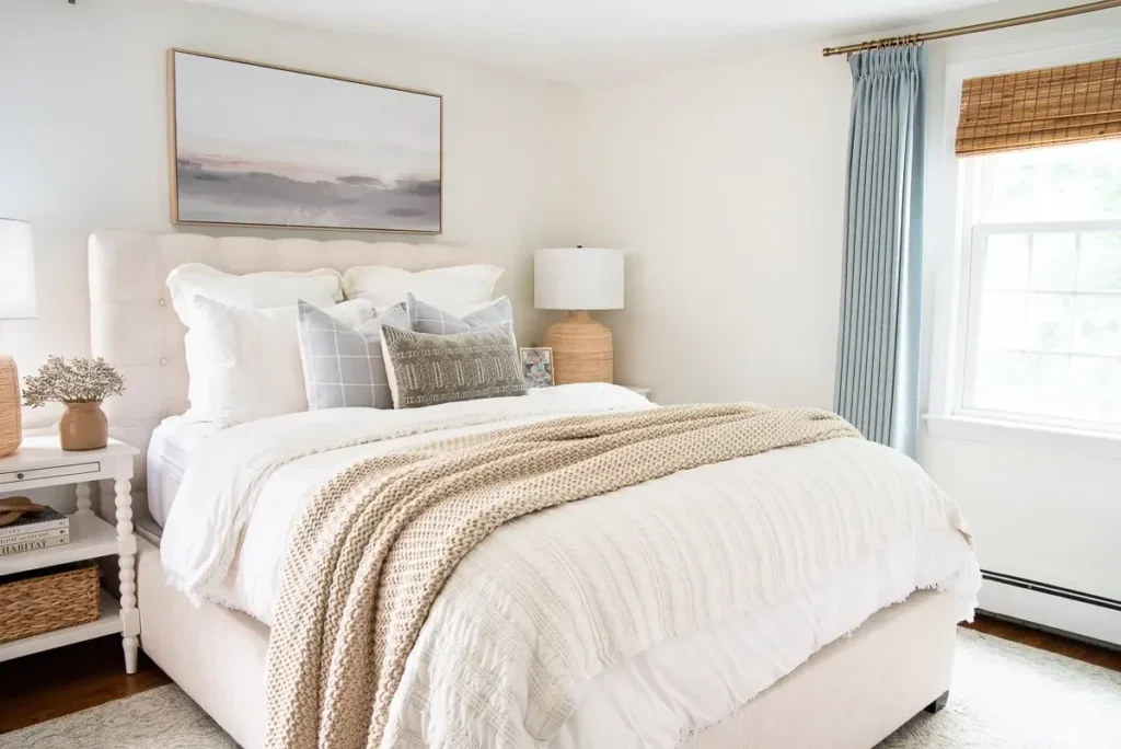
White Dove in bedrooms is my personal preference.
It’s warm and restful, but it brings in more light, which makes mornings less painful.
It works well with white bedding, gray bedding, and some warm tones.
The versatility means you can change your bedding and decor without the wall color looking wrong.
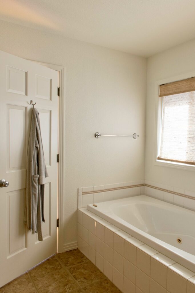
Bathroom
Dover White in bathrooms can work or maybe not.
If you’ve a traditional bathroom with warm-toned tile, some beige or tan, and oil-rubbed bronze fixtures, then it can look nice.
Classic and clean without being sterile.
But in modern bathrooms with white subway tile, chrome fixtures, and marble countertops, then the yellow undertone looks off.
White Dove is my default bathroom color.
It creates a fresh, clean, spa-like feeling without being cold.
The gray undertone works with any tile color, any fixture finish, any counter material.
I’ve used it with all-white bathrooms, with gray tile, with marble because it works.
And in a small bathroom with terrible lighting, the high LRV helps bounce the light around.
Kitchen
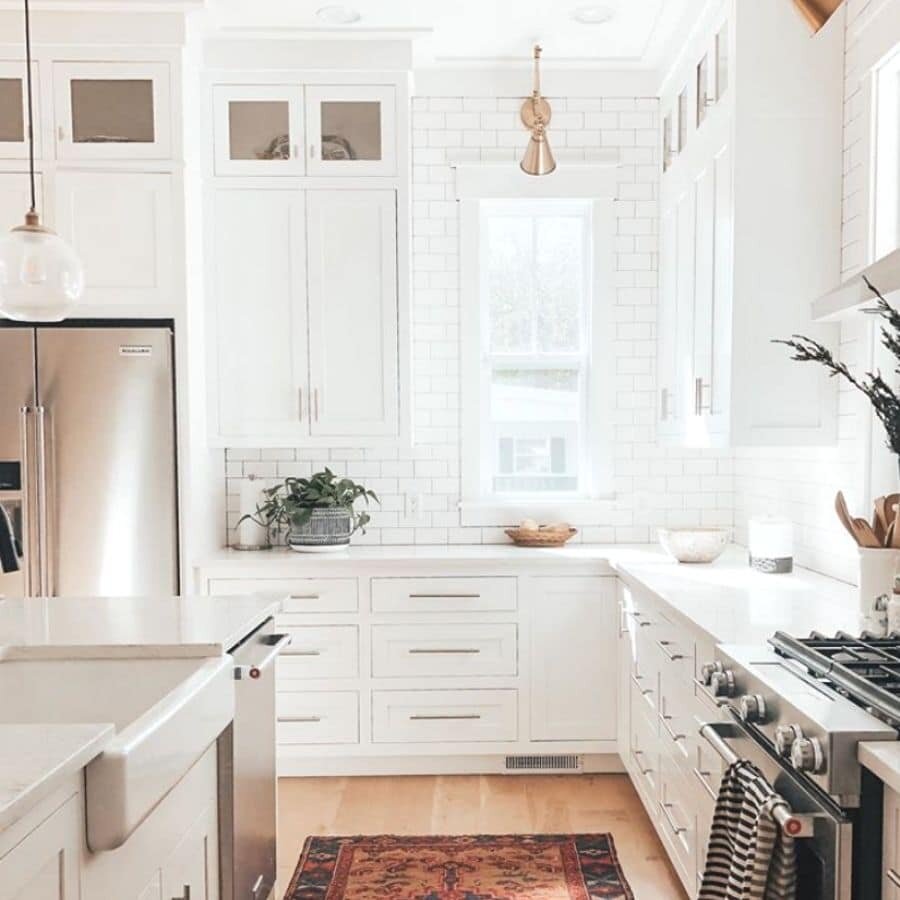
Dover White kitchens can be beautiful in the right setting.
If you’re going for traditional, warm, or country-style kitchen vibes, Dover White on cabinets or walls creates a cozy feeling.
It pairs well with warm wood floors, warm-toned granite countertops, and traditional hardware finishes like oil-rubbed bronze.
Where it struggles is in modern kitchens.
I tried it with white quartz countertops and stainless steel appliances, and the yellow undertone made everything look mismatched.
The countertops looked blue-white, the cabinets looked cream-yellow, and it was not cohesive.
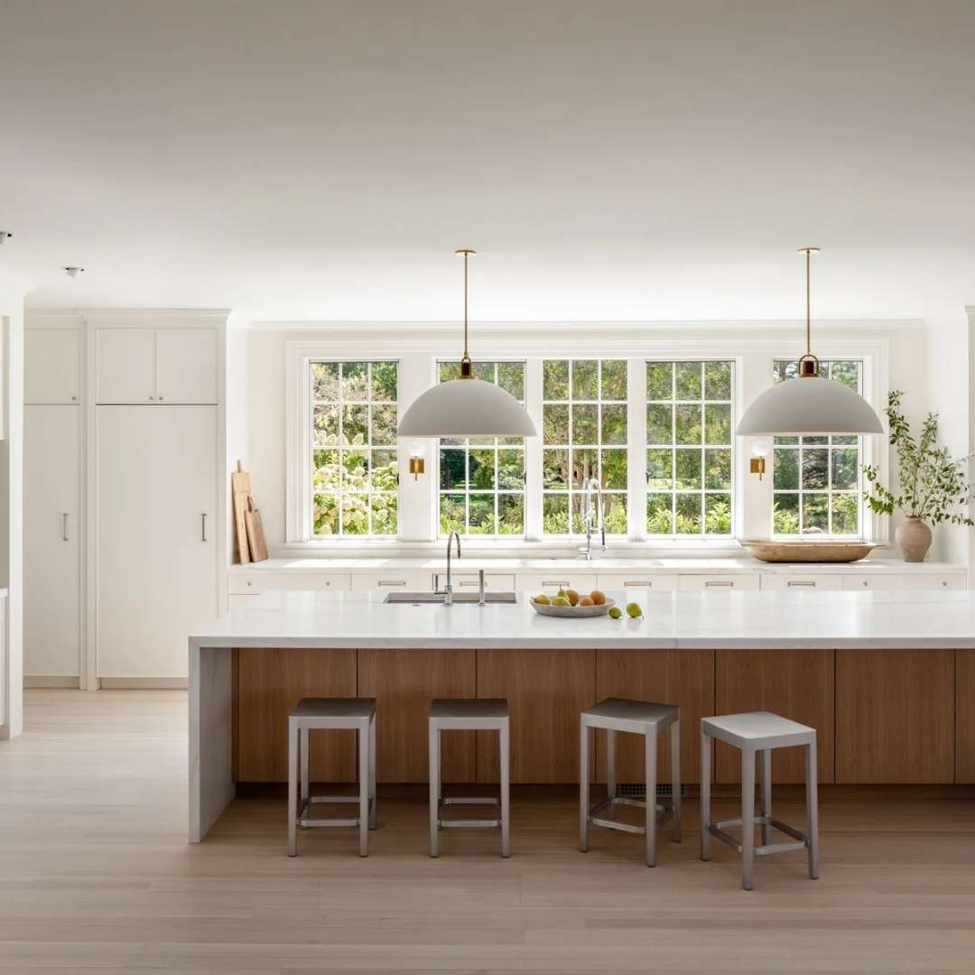
White Dove is popular in kitchens, and I understand why.
On cabinets, it’s bright to make your kitchen feel open and clean but warm that it’s inviting.
It works with any countertop material like marble, quartz, granite and butcher block.
It pairs well with both modern and traditional hardware.
On walls with white cabinets, it creates a soft, less harsh look than pure white.
Exterior
Dover White on exteriors gives you a classic, traditional look.
It’s warm and inviting from the visual, and it works well with brick accents, stone, or warm-toned roofing.
It’s timeless in the sense that it won’t look outdated.
It is also a great choice for colonial, traditional, or farmhouse-style homes.
The yellow undertone is less problematic on exteriors because you’re not living inside the color, you’re viewing it from a distance with natural light.
It looks as a warm white, not as yellow-white.

White Dove on exteriors is fresh and clean without being harsh.
It’s more modern-looking than Dover White while being classic so that it won’t feel trendy.
The gray undertone keeps it from looking yellow or cream-colored, not in warm evening light.
Also, it works with any accent color, any roofing color, any landscaping.
Dover White Vs White Dove Vs Other Colors
Okay, so now you’re wondering how these two look against other white paint that exists.
Fair, because there are seven million white paint colors, and somehow they’re all different.
Let me break down the most common comparisons people ask about.
Dover White Vs Alabaster
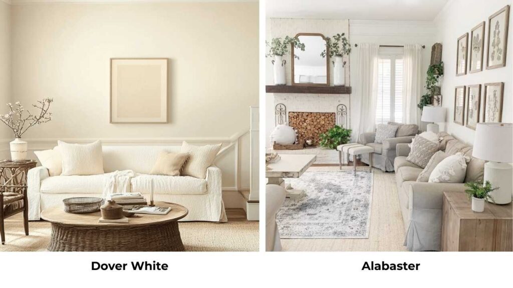
Alabaster (SW 7008) is another Sherwin Williams white, and it’s cooler than Dover White.
Alabaster has more neutral undertones like less yellow, more balanced.
If Dover White feels too warm or yellow for your space, Alabaster can be the better choice while staying in the Sherwin Williams family.
Alabaster’s LRV is around 82, same as Dover White, but it is bright because it doesn’t have yellow warmth.
Dover White Vs White Duck
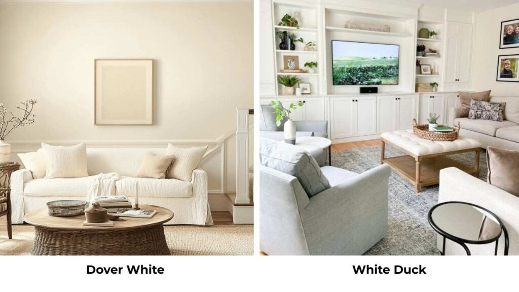
White Duck (SW 7010) is warm and creamier than Dover White.
If you thought Dover White was warm, White Duck takes it into cream territory.
It has strong yellow and beige undertones, which makes it less versatile but beautiful in traditional or rustic settings.
Not my first choice for modern spaces, but perfect if you’re going into warm, cozy vibes.
Dover White Vs Dove White
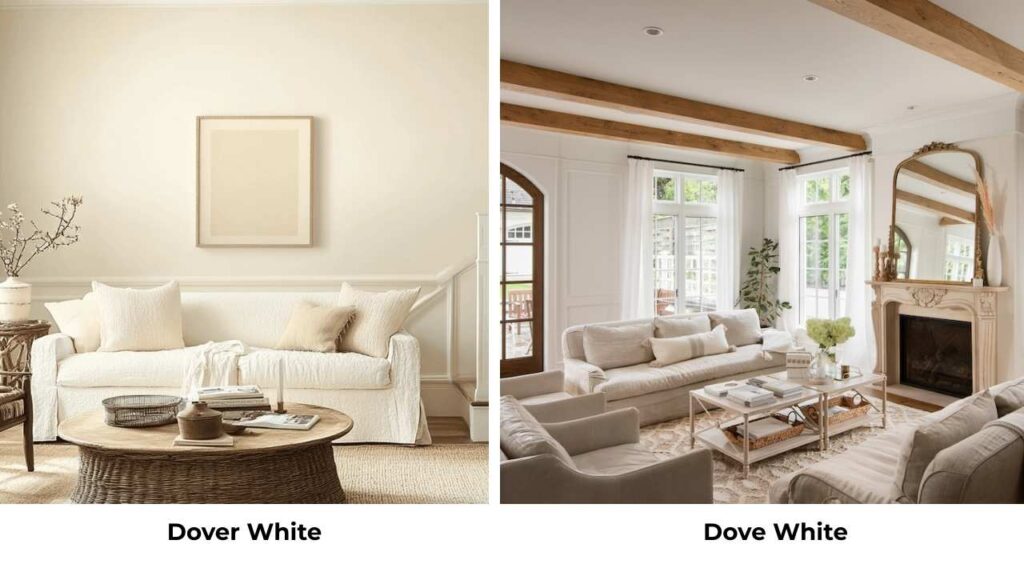
This one confuses people ALL the time.
Dove White is from Glidden, not Benjamin Moore or Sherwin Williams.
Dove White has cool and has blue undertones, basically the opposite of Dover White’s warm yellow.
The similar names create confusion, but these are not comparable to each other.
Dover White Vs Creamy
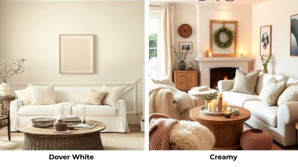
Creamy (SW 7012) is warmer than Dover White with yellow undertones.
It’s what it sounds like creamy.
If Dover White isn’t warm enough for you, Creamy can be your answer.
But be warned, it can look yellow in some lighting conditions.
Dover White Vs Swiss Coffee
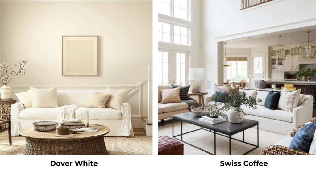
Swiss Coffee (SW 7012), actually, Swiss Coffee is Behr, not Sherwin Williams.
It’s similar warmth to Dover White but more beige.
The undertones are comparable, so it works as an alternative if you’re committed to using Behr paint.
Dover White Vs Shoji White
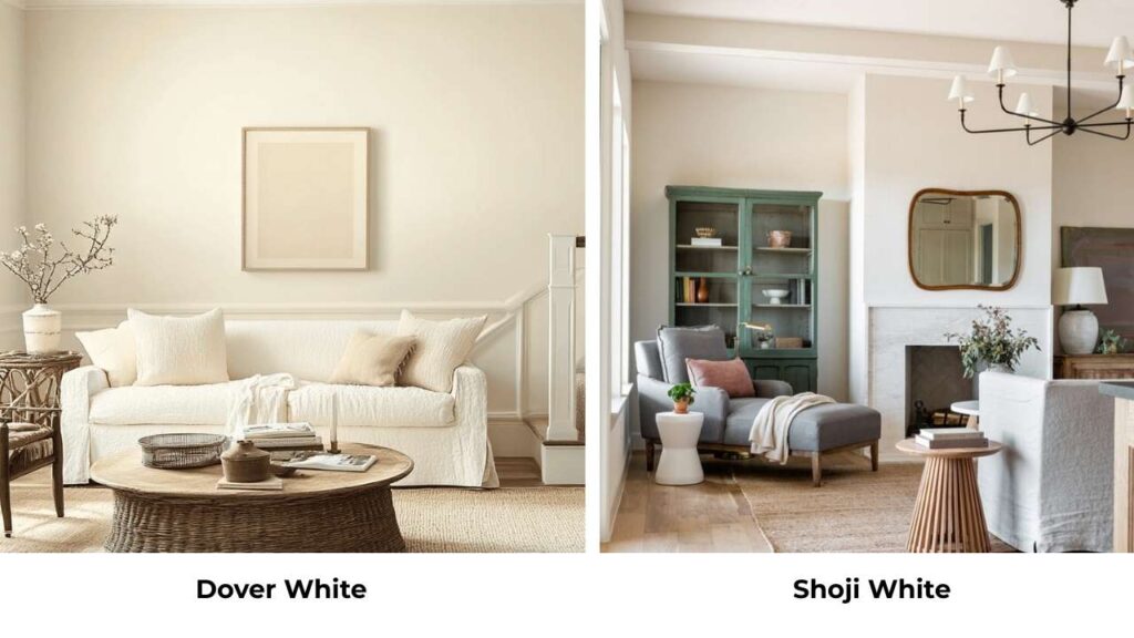
Shoji White (SW 7042) is bright and cooler than Dover White.
It’s a warm white but with less yellow undertone.
If you like the idea of Dover White but want something fresh and bright, Shoji White is worth considering.
It’s versatile with many different lighting conditions while maintaining warmth.
Comparison Table: Dover White & White Dove vs Other Whites
| Paint Color | Brand | LRV | Undertones | Warmth Level | Best For |
| Dover White | Sherwin Williams | ~82 | Yellow / beige | Warm | Traditional, cozy spaces |
| White Dove | Benjamin Moore | ~85.38 | Gray with subtle yellow | Warm-neutral | Versatile, most spaces |
| Alabaster | Sherwin Williams | ~82 | Neutral, minimal yellow | Neutral-warm | Modern, transitional |
| White Duck | Sherwin Williams | ~80 | Strong yellow / cream | Very warm | Traditional, rustic |
| Shoji White | Sherwin Williams | ~83 | Minimal yellow | Warm-neutral | Bright, airy spaces |
| Creamy | Sherwin Williams | ~81 | Strong yellow | Very warm | Cozy, traditional |
Conclusion
So here’s the bottom line after working with both colors: White Dove is more versatile, and that’s why I go for it.
The gray undertone makes it work with many styles, many lighting situations, and existing finishes.
It’s bright without being harsh, warm without being yellow.
Dover White has its place.
If you’ve got a traditional home with warm finishes and you want a cozy, classic look, Dover White gives you that.
But know what you’re getting into with the yellow undertones.
My honest recommendation is to sample them both.
I know everyone says that and it sounds generic, but it works.
Paint swatches on different walls in your room. Look at them for a few days.
Look at them in morning light, afternoon light, evening with lamps on. Look at them next to your floors, your furniture, your existing finishes.
The confusion between Dover White Vs White Dove will be solved and with this you can consider more white too according to your space.
FAQs On Dover White Vs White Dove
No, they’re completely different colors from different brands. Dover White is Sherwin Williams (SW 6385) with yellow and beige undertones. White Dove is Benjamin Moore (OC-17) with gray undertones. Dover White is warm and can look cream-colored, while White Dove is bright and neutral.
It can. Dover White has visible yellow undertones which become obvious in some lighting. In south-facing rooms with warm natural light or spaces with incandescent lighting, the yellow shows up. In north-facing rooms or with cool LED lighting, it can look flat or dull.
White Dove isn’t ideal if you want a very warm, creamy white, it’s too neutral. Also, if you have cool gray finishes and want something warm to balance, White Dove is what I prefer. And if you’re going for a modern, bright white look, White Dove is too warm.
No, Dover White is one of the warmer whites. If anything, people sometimes feel it’s TOO warm or creamy, not too white. It’s not harsh or sterile. If you’re worried about a color being “too white,” Dover White won’t be the problem because it has warmth and depth.
Dover White Vs White Dove: The Subtle Difference That Changes Everything