I’ve used Agreeable Gray many times. It became the default neutral that clients would request before we talked about their lighting or finishes or anything that matters.
But here’s what I learned that they’re not interchangeable, and picking the wrong one can make a room feel off.
Egret White vs Agreeable Gray is one of the comparisons that sounds simple but gets complicated when they are on walls.
Both are Sherwin-Williams colors. Both get labeled as warm neutrals. Both are on the “best greige paint colors” list.
But they behave differently when they’re on your walls. Agreeable Gray has the mid-tone depth that can either ground a space or make it feel heavy and drab depending on your light.
Egret White is light and soft but has undertones that can come without expecting.
The thing that confuses most people is that these undertones don’t sit there but they react to everything around them.
We’re going to break down how these two colors perform in real spaces. I’ll tell you about LRV, undertones, how lighting changes everything, then we’ll go room by room.
I’m also put in comparisons with other colors because you’re looking at more than these two. And we’ll talk about the pros and cons of both the colors.
Here are my other blogs that you can also read:
- Simply White Vs Alabaster
- Quite Moments Vs Sea Salt
- Pale Oak Vs Revere Pewter
- Cloud White Vs White Dove
- Alabaster Vs Shoji White
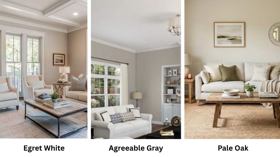
Color Overview of Sherwin Williams Egret White (SW 7570)
Egret White is a white, but that’s not true. It’s a warm off-white with visible greige undertones, has depth that doesn’t look like a true white but not so much that it feels like a full greige.
The LRV is 70, which means it reflects a bit of light but has presence. It is in between whites and light neutrals.
What makes Egret White tricky is the undertones. There’s a warm gray-beige base that can flash different colors depending on what’s around it.
Sometimes it is slightly green, sometimes it looks like a soft violet-taupe. The undertones become more visible when you put it next to a bright white.
On walls, it looks better than on cabinets or trim where the undertones come forward.
I used Egret White for a house color in a client’s ranch-style home that had natural light, and it was perfect. It is warm to not feel cold but light to keep the space feeling open.
The same color on another project’s kitchen cabinets paired with cool white subway tile, looks green and sad. It’s not the color’s fault but it’s how undertones work.
People love this color for living rooms, bedrooms, open-concept spaces, and exteriors.
It works well when you want something softer than Pure White or Extra White but you’re nervous about committing to a greige.
On exteriors, it looks like a clean white in the sun but keeps a softness which prevents the harsh, cold look.
Color Overview of Sherwin Williams Agreeable Gray (SW 7029)
Agreeable Gray is one of Sherwin-Williams’ best sellers, and I understand why. It’s a warm greige, the perfect blend of gray and beige with an LRV of 60.
It is a mid-tone depth, darker than Egret White but considered a light color. It’s not a white, not a true gray, not a beige. It’s in-between space that works with everything.
The color has warm undertones with subtle beige and soft taupe. Agreeable Gray can show a faint green undertone in some lighting conditions, mainly in north-facing rooms or spaces with cool blue-gray finishes.
I’ve seen it happen many times that I always warn clients about it. The green isn’t always there, but when it shows up, it changes the feel of the room.
Because it’s deeper than colors like Egret White, Agreeable Gray provides visible contrast against white trim. Others find it makes the room feel stuffed or darker than they wanted.
In big, open spaces with good light, it can feel warm and grounded. In small rooms with limited natural light it can look dull or muddy.
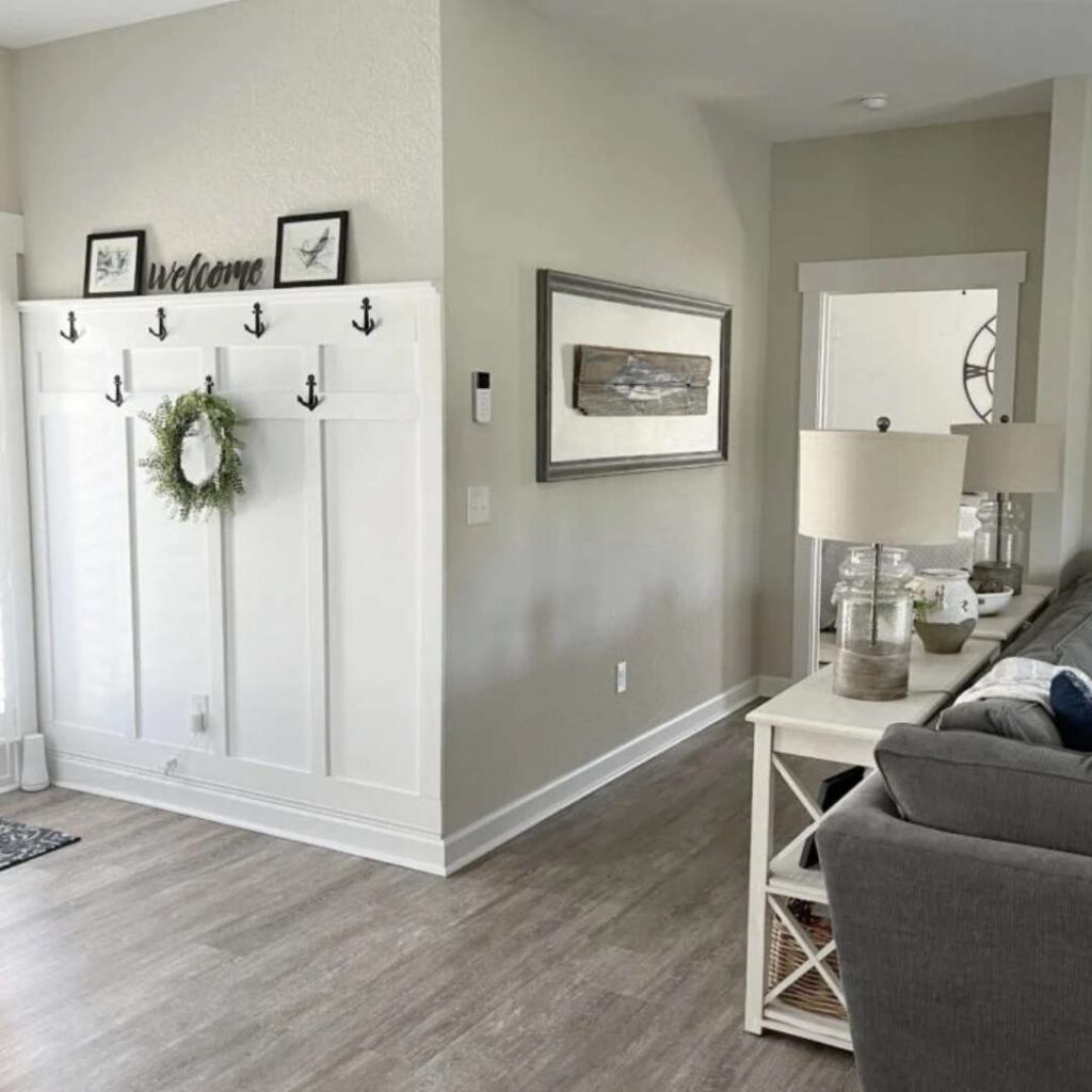
I’ve used Agreeable Gray in living rooms, hallways, bedrooms, and open-concept areas where clients wanted a cohesive neutral that flowed throughout the house.
It pairs well with warm woods and soft whites. When it works it looks versatile and adapts to both modern and traditional styles. But it’s not as flattering as its popularity.
The depth can be too much for some spaces, and the potential green undertone means you need to test it with your lighting and finishes before committing.
What is the Difference Between Egret White and Agreeable Gray?
These two get compared because they’re both warm Sherwin-Williams neutrals, but they have different purposes in a space.
The main difference comes to depth and how that affects everything else. I’ve worked with both to know they’re not substitutes for each other even if they’re in the same color family.
LRV
Light Reflectance Value is what tells you how much light a color reflects, from 0 (pure black) to 100 (pure white).
This number matters MORE than most people realize because it determines whether a room feels bright and open or closed in and heavy.
Agreeable Gray has an LRV of 60, putting it on the lower end of what’s considered a light color.
It absorbs more light than it reflects, which is why it can look flat in rooms without natural light. Egret White has an LRV of 70, it has a 10-point difference.
It bounces light around the room and maintains brightness better in spaces with limited windows or north-facing exposure.
I had a client insist on Agreeable Gray for a basement bedroom and with good artificial lighting, it felt cave-like. We ended up repainting with a high LRV color close to Egret White’s range and the room felt livable.
Undertones
Both colors have warm undertones, but they express differently. Agreeable Gray has a subtle beige and soft taupe base with a tendency to flash green in some conditions.
The green isn’t always there, but when your room comes up, you’ll know.
Egret White has a warm gray-beige undertone that can show both green and violet depending on what it’s next to. Because it’s light, the undertones are more visible than Agreeable Gray’s.
I’ve noticed Egret White’s undertones become obvious on trim and cabinets, less so on walls where the large surface area diffuses them.
The trick with both is testing them against your flooring, countertops, and tile. A color that looks perfect on the paint chip can look wrong when it’s reflecting off your red oak floors or next to cool gray quartz.
Lighting Affect
Lighting is where paint colors either make sense or fall apart. Agreeable Gray looks warm and beige in south and west-facing rooms with warm golden light.
It can look beautiful, soft, inviting and grounded. But put it in a north-facing room with cool blue daylight and you’re seeing that green undertone or it looks flat and gray.
Egret White responds to lighting too but looks more forgiving because the high LRV keeps it bright. It looks warm and creamy in warm lighting, neutral and soft white in cool light.
Because it’s not trying to be a color-color, it doesn’t shift dramatically. The undertones are there but they’re subtle on walls.
I’ve learned to test both colors on multiple walls in the room and look at them at different times of day.
Morning light, afternoon light, evening with artificial lights on. If you skip this step, you’re guessing, and paint is too expensive and time-consuming to guess.
Style and Best Uses
The styling around these colors changes how they perform. Agreeable Gray works best with white trim, Pure White or Extra White create the clean definition that keeps the color from feeling muddy.
Because it has depth, it shows contrast against light elements. I’ve seen it look great with warm wood tones, beige stone, and soft neutral furnishings. It looks traditional or transitional more than modern.
Egret White can handle white trim but doesn’t need it as desperately. Sometimes I’ll use it on both walls and trim when clients want a soft monochromatic look without harsh contrasts.
It pairs well with natural wood accents, warm metals, and both warm and cool grays for accent colors. It looks more modern and airy because of the lightness.
For whole-house color, Egret White works better because it maintains consistency in different lighting conditions across various rooms. Agreeable Gray can shift too much from space to space.
| Comparison Point | Egret White (SW 7570) | Agreeable Gray (SW 7029) |
| LRV | 70 | 60 |
| Color Classification | Warm off-white / light greige | Mid-tone warm greige |
| Undertones | Warm gray-beige; can flash green or violet | Subtle beige, soft taupe; can show green |
| Best Lighting | Works in low and high light; very adaptable | Needs good natural light; struggles in dim rooms |
| Trim Pairing | Pure White, Extra White (optional) | Requires white trim (Pure White, Extra White) |
| Contrast Level | Soft, minimal contrast | Visible contrast against trim |
| Best Room Types | Whole-house, bedrooms, low-light spaces | Open-concept, well-lit living areas, hallways |
| Overall Feel | Airy, soft, subtle | Grounded, warm, defined |
Egret White Vs Agreeable Gray: Room-By-Room Comparison
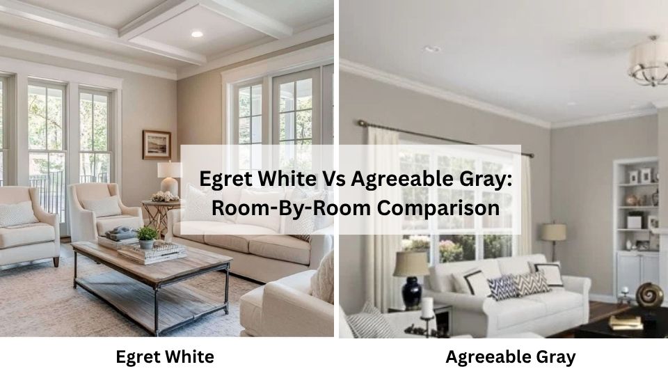
So, here’s where it meets reality. I’ve seen both Egret White and Agreeable Gray look great in some rooms and wrong in others.
The room matters as much as the color. Let me walk through how each one behaves in the spaces you’re considering them for, and I’ll be honest about where each one shines and where it doesn’t.
Living Room
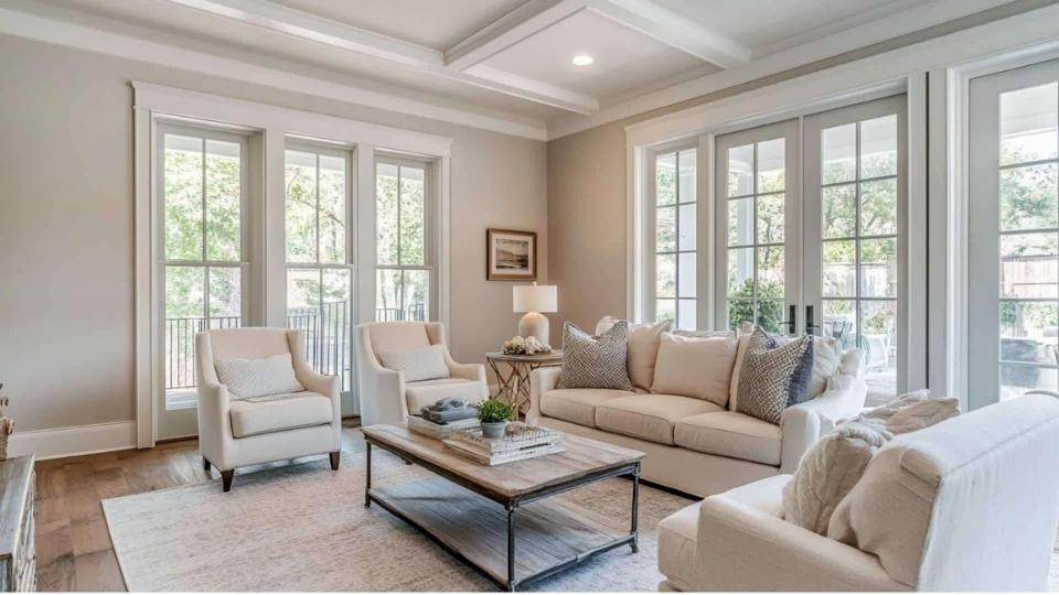
Egret White in a living room creates a soft, airy feeling that makes the space feel large and open.
If your living room has decent natural light, it looks like a warm white with color to not feel cold.
I used it in a client’s living room that had tan leather furniture and medium oak floors, and it was the perfect backdrop, warm to feel inviting but light to let the furniture and art shine.
Where it gets tricky is if you have cool-toned grays or blues in your furniture because the undertones show up.
Agreeable Gray in a living room gives you presence and definition. The deep tone creates a cozy, grounded feel, especially in large open spaces that need some visual space.
I saw it in a two-story living room with windows and it looked beautiful, warm and sophisticated.
But I’ve also seen it in average-sized living rooms with limited lighting where it made the room feel small and dark.
The contrast against white trim can look fresh and intentional, or it can make the room feel choppy if you have windows and doors.
Bedroom
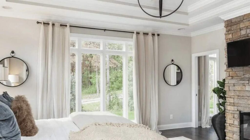
Egret White works beautifully in bedrooms, if you’re going for the calm, serene and spa-like feeling. It’s light to keep the room feeling fresh but warm to not feel cold.
I’ve used it in both master bedrooms and kids’ rooms with best results. The softness feels restful without being boring. In the north-facing bedroom, the Egret White is better.
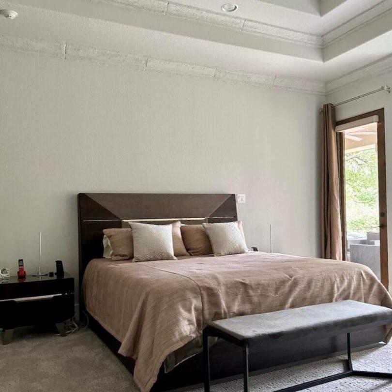
Agreeable Gray in bedrooms can go either way. In a large master bedroom with good light, it creates a cozy, sophisticated envelope of color that feels intentional.
But in small bedrooms or rooms with limited windows, it can feel too dark and heavy. I had a client paint their guest bedroom Agreeable Gray and it ended up feeling like a cave.
Bedrooms are tricky because you’re in them all day, so if the color doesn’t work in both natural and artificial light, you’ll see.
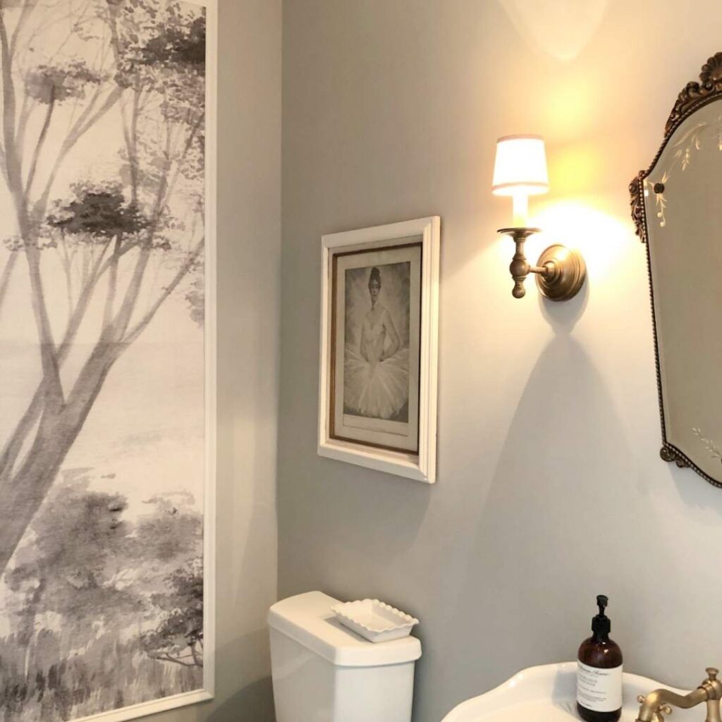
Bathroom
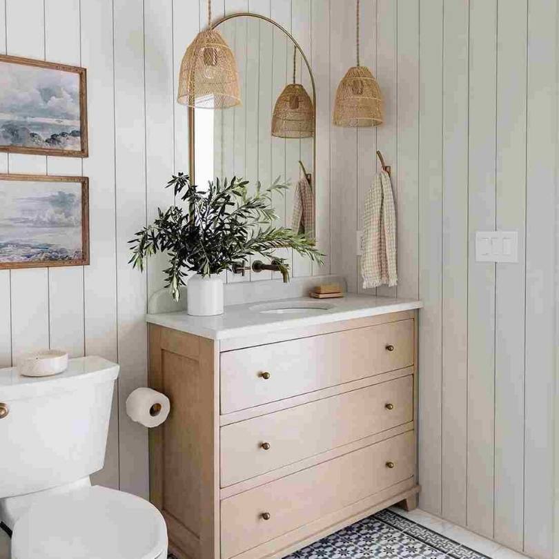
Egret White in bathrooms is my go-to suggestion. Bathrooms look small with less natural light, so the high LRV helps keep them feeling clean and bright.
It pairs beautifully with white fixtures, warm wood vanities, and both cool and warm tile. The warmth prevents the cold vibe but it’s fresh to feel clean. I’ve used it with marble, subway tile, and colorful accent tiles and it works.
Agreeable Gray in bathrooms needs planning. If you have a large bathroom with great natural light and you want a dramatic, sophisticated look, it can be gorgeous.
I’ve seen it work well with white marble and brass fixtures whereit created an elegant feeling. But in your average bathroom with one small window and limited lighting, it looked dull.
Kitchen
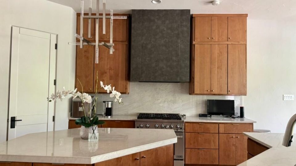
Egret White is popular for kitchen cabinets and walls because it’s soft to not feel harsh but looks white-ish. On cabinets, it gives you the off-white warmth without going cream or beige.
I’ve done entire kitchens in Egret White like cabinets, walls and everything with white quartz counters and it looks clean but not cold.
The thing to watch is if you have cool-toned backsplash tiles because that’s when the undertones start becoming visible.
Agreeable Gray works well on kitchen walls when you have white cabinets because it provides nice contrast and warmth.
It’s less common on cabinets because the depth can make a kitchen feel small, but I’ve seen it done in large kitchens with light.
It pairs well with white subway tile, warm wood floors, and stainless appliances. Where it struggles is in kitchens with limited natural light or upper cabinets that block light.
Exterior
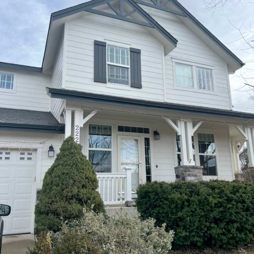
Egret White is one of my favorite exterior colors. On an exterior with sun exposure, it looks like a clean, soft white without that harsh brightness of Pure White or Extra White.
It has warmth to look inviting and pairs beautifully with brick, stone accents, and natural wood.
I’ve seen it on exteriors with black windows and Iron Ore trim and it looks good, modern but not cold.
Agreeable Gray on exteriors creates a warm, sophisticated neutral which is more interesting than white but not as heavy as true gray.
It’s popular for modern farmhouse and transitional style homes. The mid-tone depth gives the architecture some dimension.
It pairs well with white trim and dark accent colors. The thing about Agreeable Gray on exteriors is it can look different throughout the day as the light changes like warm and beige in morning and evening light, more gray at midday.
Comparing Egret White Vs Agreeable Gray With Other Colors
If you’re looking at Egret White and Agreeable Gray, you’re considering other neutrals because that’s how this goes.
Here’s how these two look against other popular options you’re hearing about. Some of these are Sherwin-Williams, some are Benjamin Moore.
I’ll mention when you’re crossing brand lines because you shouldn’t color-match between brands if you can avoid it.
Egret White Vs Pale Oak
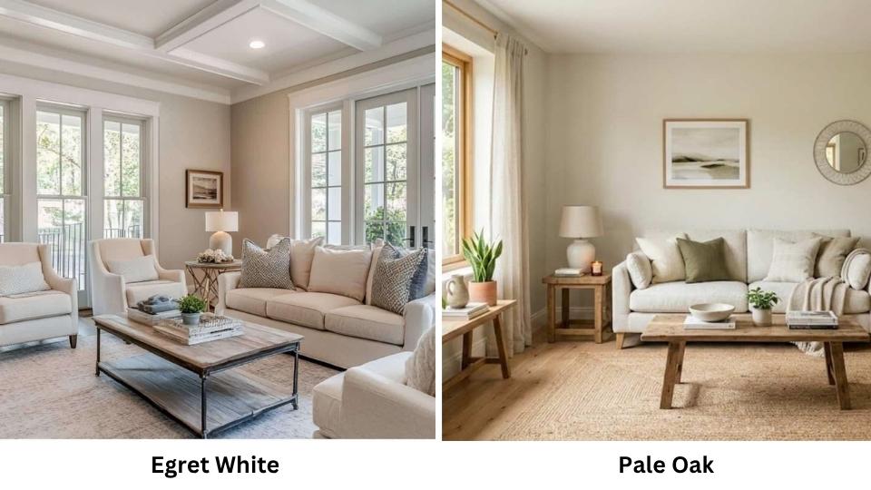
Pale Oak is Benjamin Moore’s version of a warm, light neutral and it gets compared to Egret White. Pale Oak has an LRV around 69-70, so they’re similar in lightness.
The difference is in the undertone, Pale Oak is more beige-taupe while Egret White has more gray in the mix.
Pale Oak looks warm and peachy in some lights, whereas Egret White stays neutral. If you’re working with warm wood tones and want something that is warmer.
Pale Oak is what you should consider. If you want something that feels modern and less beige, Egret White is better.
Egret White Vs Alabaster Vs Agreeable Gray
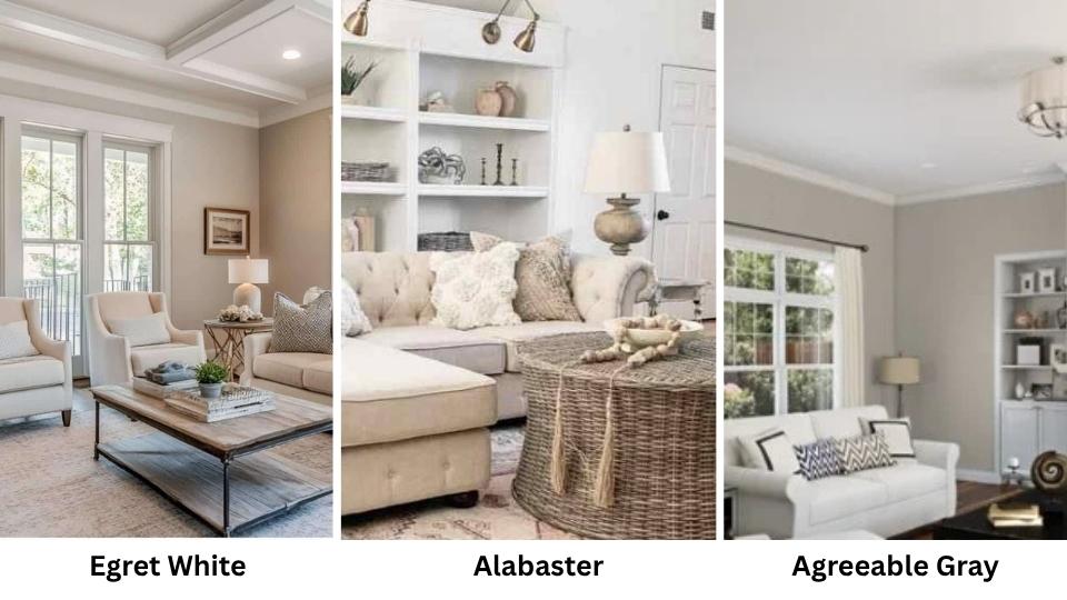
Alabaster (SW 7008) is between Egret White and Agreeable Gray in terms of depth, LRV of 82, so it’s light.
Alabaster is a true warm white with subtle beige undertones. It’s creamy and softer than Egret White, more white than greige.
Alabaster is the light and warmest, Egret White is in the middle with greige presence, and Agreeable Gray is the deep and gray-beige.
I use Alabaster when clients want white but are scared of it looking harsh. Egret White when they want white with depth. Agreeable Gray when they want a color, not a white.
Egret White Vs Edgecomb Gray
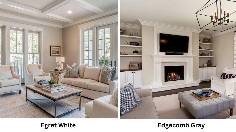
Edgecomb Gray is Benjamin Moore HC-173 and it’s a warm greige with an LRV around 63. It’s deeper than Egret White but lighter than Agreeable Gray.
The undertones can look beige, gray, or purple depending on lighting. Comparing it to Egret White, Edgecomb Gray has color and warmth and it’s a greige, not a white. It’s closer in vibe to Agreeable Gray but with a different undertone.
If you like the idea of Agreeable Gray but want something that is beige and less green-risk, Edgecomb Gray is worth considering.
Egret White Vs Taupe Of The Morning
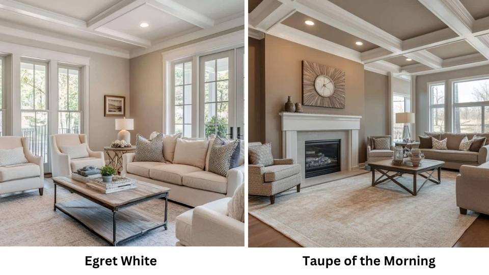
Taupe Of The Morning (SW 7695) is warm and has pink-beige in it than Egret White. It’s a bit light at LRV 71.
Where Egret White can flash green or violet, Taupe Of The Morning stays warm peachy-beige.
It’s a good alternative if you’re worried about Egret White’s undertones showing up weird with your finishes. The warmth can be beautiful with wood tones but feel too pink-beige.
Egret White Vs Repose Gray
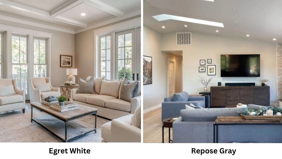
Repose Gray (SW 7015) is cooler than both Egret White and Agreeable Gray. LRV of 60 but it’s a true gray, not a greige and less beige, less warmth.
If you put Egret White and Repose Gray next to each other, the warmth difference is obvious, Egret White will look creamy and soft, Repose Gray will look fresh and cool.
They’re serving different aesthetics. Repose Gray works if you gray; Egret White if you want a warm neutral that looks white-ish.
Egret White Vs Shoji White
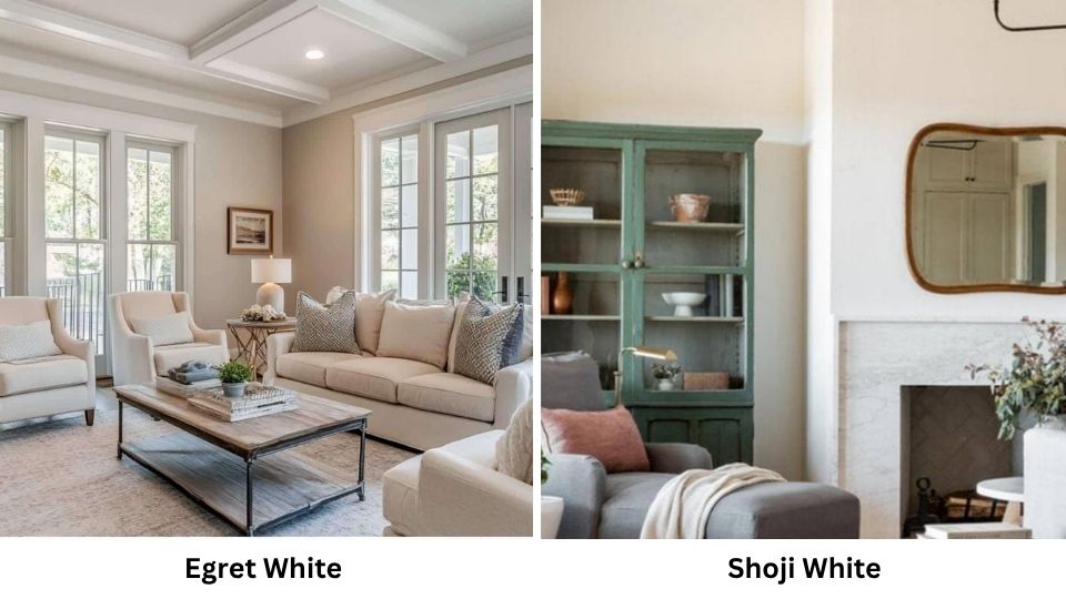
Shoji White (SW 7042) is lighter than Egret White at LRV 77 and it’s a warm white with more cream and less greige.
Shoji White feels more traditional white-white and warm. Egret White has gray and feels modern.
Shoji White is great if you want white but need to avoid anything that looks cold. Egret White is better if you want something more depth and contemporary feel.
Egret White Vs Aesthetic White
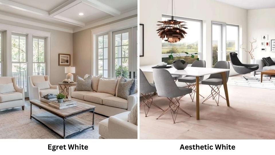
Aesthetic White (SW 7035) is one of the colors that’s trying to be everything, it has an LRV around 73, warm but not too warm, white but not too white.
It’s lighter than Egret White and has less undertone presence. Aesthetic White disappear more, it’s neutral and safe.
Egret White has more character and depth. If you want a color that fades into the background, Aesthetic White.
Agreeable Gray Vs City Loft
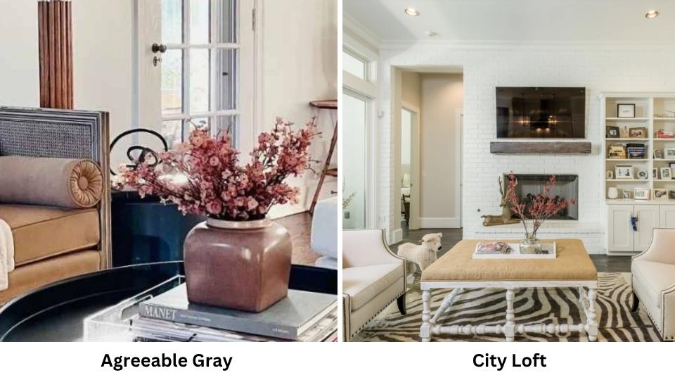
City Loft (SW 7386) has the same LRV as Egret White at 70, making it lighter than Agreeable Gray. But City Loft is hard to taupe/violet undertones where Agreeable Gray can be between green and taupe.
If you like the warmth of Agreeable Gray but need something light for a dark room, City Loft is worth considering.
The violet undertone is more, so if you have any cool blue or green in your finishes, they can clash.
Egret White Vs Agreeable Gray Vs Drift Of Mist
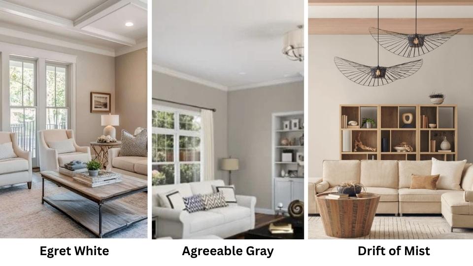
Drift Of Mist (SW 9166) is new and is between these two in depth and LRV around 66. It’s another warm greige but with more beige and less gray than Agreeable Gray.
If Agreeable Gray feels too gray and Egret White feels too white, Drift Of Mist can be your compromise. It has a soft, warm presence without being heavy.
Agreeable Gray Vs White Heron
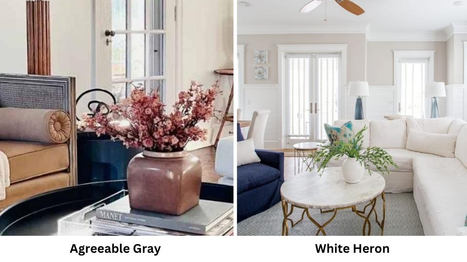
White Heron (Benjamin Moore OC-57) is a soft, warm white-gray with LRV around 75. It’s lighter than Agreeable Gray and has a gentle greige quality that’s similar in warmth but subtle.
White Heron is like a light, soft version of what Agreeable Gray is trying to do. If Agreeable Gray feels too heavy but you like the warmth, White Heron is a great option.
| Color Comparison | Key Difference from Egret White/Agreeable Gray | Brand |
| Pale Oak | Similar LRV to Egret White but warm, beige-peachy | Benjamin Moore |
| Alabaster | Lighter than Egret White (LRV 82), creamy true warm white | Sherwin-Williams |
| Edgecomb Gray | Between Egret White and Agreeable Gray in depth, more beige | Benjamin Moore |
| Taupe Of The Morning | Warm pink-beige than Egret White, less green risk | Sherwin-Williams |
| Repose Gray | Same LRV as Agreeable Gray but cool, true gray not greige | Sherwin-Williams |
| Shoji White | Lighter than Egret White, traditional warm white feel | Sherwin-Williams |
| City Loft | Same LRV as Egret White, strong violet-taupe undertone | Sherwin-Williams |
| Drift Of Mist | Between both in depth, soft beige-greige | Sherwin-Williams |
| White Heron | Lighter than Agreeable Gray, gentle greige warmth | Benjamin Moore |
Pros and Cons While Considering Egret White and Agreeable Gray
Look, both these colors are popular, but they’re not perfect for every situation. I’ve had projects where each one was right, and projects where we ended up repainting.
Being realistic about the limitations saves you time, money, and frustration. Here’s what you’re getting into with each.
Egret White Pros: The high LRV of 70 makes it versatile, it works in rooms with less-than-ideal natural light where deep colors look flat.
The warmth keeps it from feeling cold and basic. It’s light to use throughout a whole house without making spaces feel disconnected or too dark.
It works well on exteriors where sun exposure makes it look a soft, clean white. The undertones are there but manageable on walls. It feels modern and fresh without trying.
Egret White Cons: It’s not a true white, so if you’re looking for bright white walls. The greige undertones can flash green or violet depending on what finishes you have around it, and sometimes you don’t realize that’s happening after it’s painted.
Next to bright whites like Pure White or Extra White, Egret White can look dingy or gray that can bother you.
It doesn’t provide contrast, so if you like defined trim and architectural details, you may find it subtle. In bright spaces with sun, it can wash out and lose its warmth.
Agreeable Gray Pros: The mid-tone depth at LRV 60 gives you color and it’s not trying to be white, it’s a neutral that adds warmth and presence to a space.
It creates a nice contrast against white trim and makes architectural details shine. In the right room with good natural light, it’s beautiful, warm, sophisticated and grounding.
It’s popular which means it has good resale appeal, and it pairs well with a wide range of finishes and styles. The greige quality means it works with both warm and cool accent colors.
Agreeable Gray Cons: The low LRV is a problem in rooms with poor natural light because it can look dull, flat, muddy, or heavy.
The potential green undertone is real and I’ve seen it show up many times to consider it a legit concern, mainly in north-facing rooms or with cool-toned finishes.
It’s been popular for long that it’s starting to feel dated in some markets, not trendy but everywhere. The depth can make small rooms feel closed in.
It requires good lighting to shine, which means you need to invest in better light fixtures to make it work.
Conclusion
Choosing between Egret White Vs Agreeable Gray comes down to what your space needs and what you’re trying to achieve.
If you want something light, versatile, and safe for rooms with less-than-perfect lighting, Egret White’s high LRV and soft presence.
If you have great natural light and want a color with presence and definition.
Agreeable Gray’s warmth and depth can be beautiful. But both require testing in the space with the finishes and light.
Get samples, put them on multiple walls, look at them morning, noon, and night. See how they react to your floors, your furniture, your countertops.
The undertones will tell you which one works for you. And if neither feels quite right, don’t force it, there are other warm neutrals worth considering.
FAQs On Egret White Vs Agreeable Gray
Pure White (SW 7005) and Extra White (SW 7006) are the two most common trim colors paired with Agreeable Gray. Pure White has an LRV of 84 and provides clean, fresh contrast without being harsh. Extra White is bright at LRV 86 and creates definition. I go toward Pure White because the contrast feels balanced.
Egret White has gray in its undertones, so it looks as gray as true warm whites like Alabaster or Shoji White. But it doesn’t look like full gray but it’s more of a warm greige-white. On walls in decent light, it look lik a soft white with depth. Next to bright whites, the gray becomes obvious and it can look grayish or dingy. On trim or cabinets, the gray shows up more than on walls.
Egret White is a light warm off-white with greige undertones, it lives in the white-to-light-neutral range. Agreeable Gray is a mid-tone warm greige with beige and taupe undertones. Egret White is visibly light and looks closer to white, while Agreeable Gray has color presence and looks as a proper neutral, not a white.
Don’t use Egret White if you want a true white, it has too much greige undertone for that. Avoid it if you’re pairing it with bright white elements because the contrast will make it look gray and dingy. It’s also not ideal if you have cool-toned blue-gray finishes because it can pull green when surrounded by cool colors. Skip it for modern high-contrast spaces where you need pure white.
Egret White Vs Agreeable Gray: A Complete Paint Color Comparison Guide