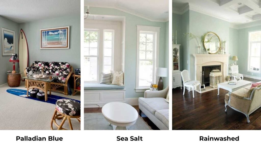
I’ve been working with Palladian Blue and Sea Salt and these two shades cause more confusion than any other paint colors.
Palladian Blue by Benjamin Moore and Sea Salt by Sherwin Williams are both light, airy paint colors that everyone wants for the calm, coastal and calm vibe.
But the Palladian Blue Vs Sea Salt confusion is REAL because I’ve seen it in homes.
Both colors have a soft blue-green thing. They look identical on the small paint samples at the store but on the walls they look completely different.
The undertones shift, the lighting plays, and the color you thought would be perfect looks wrong.
I’ve had clients repaint entire rooms because they didn’t understand how these colors behave.
So, we’re breaking down the color profiles of Palladian Blue Vs Sea Salt. The differences that matter like LRV, undertones, how lighting messes with them.
I’ll walk you through how each performs in different rooms. I’m also throwing in comparisons with other similar colors because if you’re considering these two, you have others in your list too.
Here are my other blogs that you can also read:
- Olive Green Vs Forest Green
- Dover White Vs White Dove
- Agreeable Gray Vs Accessible Beige
- Pale Oak vs Accessible Beige
- Ballet White Vs Swiss Coffee
Color Profile of Benjamin Moore Palladian Blue (HC-144)
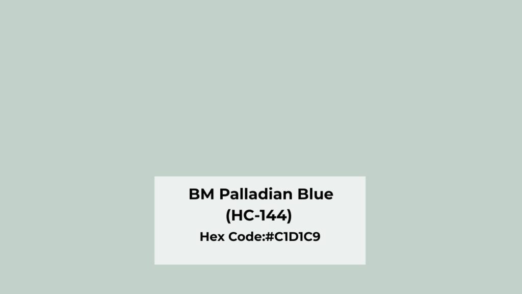
Palladian Blue is part of Benjamin Moore’s Historical Collection, which sounds fancy but means it’s been around forever and people keep coming back to it.
It’s a soft blue-green that is complicated. There’s a warm green presence hidden in it. When I first used it in my own bathroom, I expected it to look more blue.
But now the green showed up STRONG in the morning light.
This color feels colorful and rich compared to other blue-greens. It’s not washed out or wimpy but there’s pigment.
This is why everyone calls Palladian Blue a chameleon color because it changes throughout the day.
I had a client in a craftsman-style home who swore it looked completely blue in the afternoon and green at night and she wasn’t wrong.
The gray undertones in the color let it shift depending on what light hits it.
Designers and homeowners go with this for living rooms when they want something more interesting than gray but not as committed as a true blue.
It creates a calm feeling without being too matchy. I’ve used it on exteriors too. Once on a front door, once on the whole exterior and it looks bold.
The thing about Palladian Blue that I always warn people about that it’s not neutral. This color has PERSONALITY.
Color Profile of Sherwin Williams Sea Salt (SW 6204)
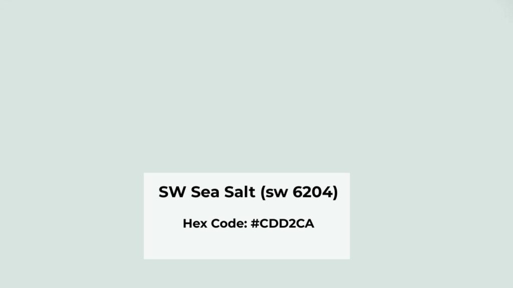
Sea Salt by Sherwin Williams is the color every person asks me about. It’s a soft green-gray paint color with subtle blue undertones. But that blue is so subtle.
Most of the time, Sea Salt looks more green than blue. Sometimes it looks gray. I used it in a client’s open-concept main floor, and in her kitchen area it looked like a greige.
Compared to colors like Rainwashed, Sea Salt is more muted and neutral. It doesn’t announce itself. It exists on your walls, which is why people love it.
This color shifts between green, gray, and blue depending on everything around it. Like on marble countertops, it’ll pull blue-gray and on oak floors, it shows green.
On the white cabinets, it softens into a gorgeous gray-green.
Sea Salt is known for its calm, cozy, relaxed feel. It doesn’t energize a space. It CALMS it. That’s why it’s considered in modern, transitional, and contemporary homes. Farmhouse people love it too.
Living rooms, bathrooms, bedrooms, kitchens, Sea Salt works in every room type. It works on exteriors too, if you want the soft coastal vibe without giving the whole beach vibe.
But Sea Salt can be boring. In a bright room with natural light, it can wash out so much that you notice it’s there.
I had a client with a south-facing living room and Sea Salt disappeared on the walls.
What is the Difference Between Palladian Blue and Sea Salt?
So here’s where we get into the stuff that matters when you’re standing in the paint store.
Palladian Blue Vs Sea Salt may look similar in the paint swatch but they do NOT look similar on walls. I’ve been in this situation more than I can count. Let me break down why.
LRV
Light Reflectance Value: The number tells you how much light a color reflects back into the room. High LRV means light and bright. Low LRV means dark and rich.
Palladian Blue has an LRV of around 60. This puts it in the medium-light range. It’s not going to feel dark or heavy, but it’s also not so light that it disappears.
Sea Salt has an LRV of about 63. A bit lighter than Palladian Blue. Three points doesn’t sound like much, but you CAN see the difference when they’re side by side.
What this means in real life: Sea Salt will reflect more light and feel airy. In a small, dark room, it can be the better choice.
But in a bright room, Sea Salt may wash out while Palladian Blue has depth to register as a color.
I always tell people to consider their lighting before getting obsessed with LRV numbers. A dark room needs a high LRV. A bright room can handle and NEEDS a lower LRV to avoid that washed-out look.
Undertones
Palladian Blue undertones: Blue-green base with visible gray softening. The blue is present here. It can look more blue in north-facing rooms.
In warm or south-facing light, it’ll shift green. Some people say there’s an aqua influence, I don’t see aqua, but I see where they’re coming from.
Sea Salt undertones: Green-gray is the dominant color. The blue is subtle and secondary and sometimes I don’t see it. Sea Salt looks more green than blue.
In low light, it goes gray-green. In bright natural light, you’ll get the blue-green vibe. But then, it’s muted and neutral than Palladian Blue.
The KEY difference: Palladian Blue has a clear blue presence. Sea Salt has strong gray and green dominance.
I’ve made the mistake of recommending Sea Salt to someone who wanted a “blue” room. She was NOT happy when it turned out green.
Learn from my mistake, if your client wants BLUE to show up, Palladian Blue is safe. If you want something that hovers between gray, green, and a hint of blue, Sea Salt gives it.
Lighting Affect
Both of these colors are majorly affected by lighting. Like, more than most colors I work with.
North-facing light is cool and blue-toned.
- Palladian Blue will look MORE blue, cool and even a touch darker
- Sea Salt will look gray and can feel muted or dull
I used Sea Salt in a north-facing bedroom once and my client complained it looked sad. We added warm lighting and it helped, but I should’ve chosen something with warmth to begin with.
The south-facing light is warm and bright.
- Palladian Blue gets green and bright, this is when I think it looks BEST
- Sea Salt softens into a green with slight warmth, but it can disappear if there’s too much light
East-facing rooms get the gorgeous yellow morning light, then cool down in the afternoon. Both colors will look warm in the morning and cool and dark in the afternoon.
West-facing rooms get the intense warm light in late afternoon and evening. Palladian Blue can look warm. Sea Salt benefits from the light, it’s when the color looks interesting.
Artificial lighting matters too. Warm bulbs will increase the green in both colors. Cool LED bulbs increase blue tones. I always test samples under both natural AND artificial light before committing.
Depth and Saturation
Palladian Blue is colorful and saturated. It has a strong blue-green vibe. It’s less neutral, more of a statement.
Sea Salt is muted, soft, calm, and gray. It leans more neutral.
What this means when you’re choosing: If you want your walls to have COLOR that you see, then go with Palladian Blue.
If you want something that feels like a barely-there neutral with a hint of color, then go with Sea Salt.
I think Palladian Blue has more personality. Sea Salt is safe. Both are valid choices depending on your goals but I get bored with safe ones, so I push clients toward Palladian Blue unless their space needs that neutral quality.
Style and Best Uses
Palladian Blue works best with:
- White trim
- Natural wood accents
- Traditional or historical interiors
- Coastal but not beach-themed
- Rooms where you want subtle color presence
Sea Salt works best with:
- White trim
- Light wood tones
- Marble or light stone countertops
- Modern farmhouse
- Whole-home color schemes
- Spaces where you want calm above all else
Here’s a comparison table:
| Feature | Palladian Blue HC-144 | Sea Salt SW-6204 |
| LRV | ~60 | ~63 |
| Depth | Mid-light | Light |
| Dominant Tone | Blue-green | Green-gray |
| Gray Content | Moderate | Higher |
| Saturation | More colorful | More muted |
| Neutral Level | Less neutral | More neutral |
| Best for | Traditional, coastal, colorful spaces | Modern, whole-home, maximum calm |
| Undertone Shift | Blue to green depending on light | Green to gray depending on light |
Benjamin Moore Palladian Blue Vs Sherwin Williams Sea Salt: How Do They Look In Different Rooms
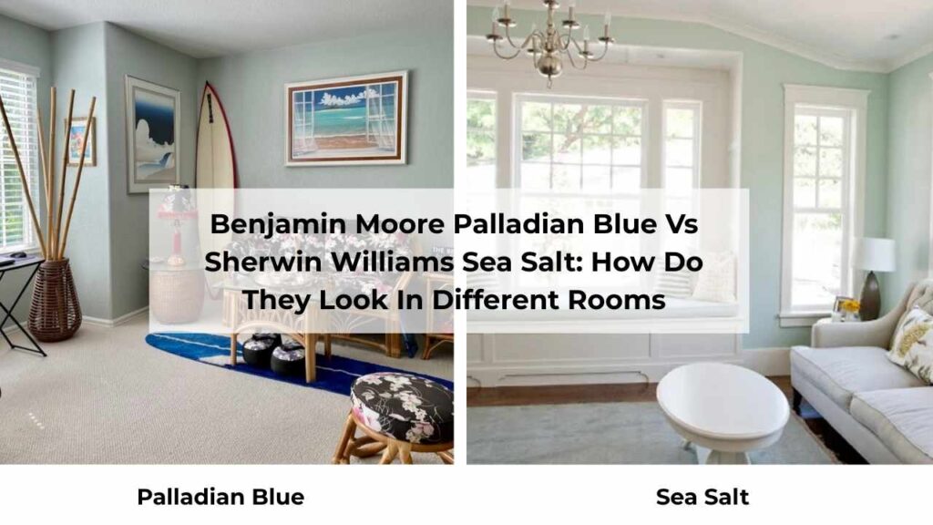
Palladian Blue Vs Sea Salt, I’ve used both many times that I’ve got opinions. Room orientation, natural light, and what you’re pairing these colors with makes a difference.
You can’t paint either one on any wall and expect it to work. Let me walk you through what I’ve seen happen in different spaces.
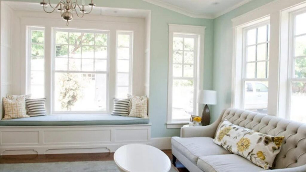
Living Room
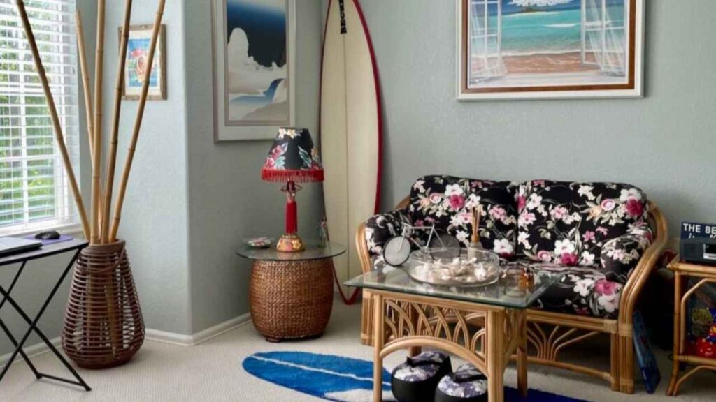
Palladian Blue in living rooms creates a colorful but sophisticated vibe. I used it in a client’s south-facing living room with windows, white trim, and medium-toned hardwood floors.
In the afternoon light, it looked fresh and green-leaning. And in the evening with lamps on, it looks more blue-gray and calm.
The thing about Palladian Blue in living spaces is that it SHOWS UP. Your guests will see it. If you’ve got other colorful elements then it can compete.
But if your style is neutral, Palladian Blue adds the pop of interest without going color.
I’d pair it with bright whites, natural textures and some navy or deep blue accents. Warm wood tones look gorgeous with it.
Sea Salt in living rooms is more subtle. I did an open-concept main floor in Sea Salt like in the living room, dining area, kitchen and it all flowed together.
It worked BECAUSE it’s neutral and adaptable. In the living room, it looked gray-green with their beige sectional and light oak floors.
But here’s my honest opinion, if your living room is your space where you entertain and want people to notice your design choices, Sea Salt can be too quiet.
If your living room is where you want to exhale after a long day and feel CALM, then it’s perfect.
Pair Sea Salt with warm whites, greenery and keep your accent colors soft.
Navy works here too, but so do warm terracottas and rust tones that play off that green undertone.
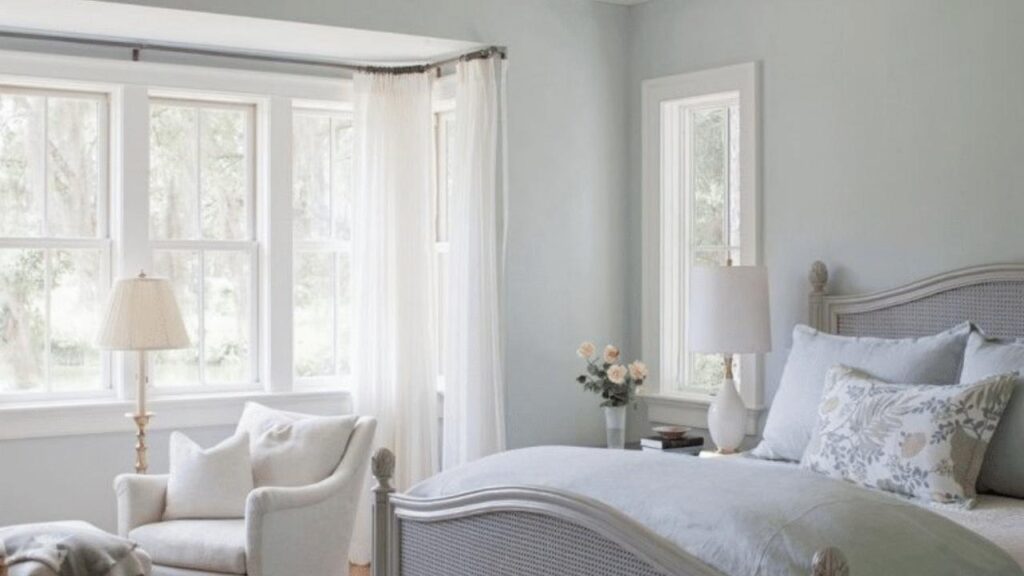
Bedroom
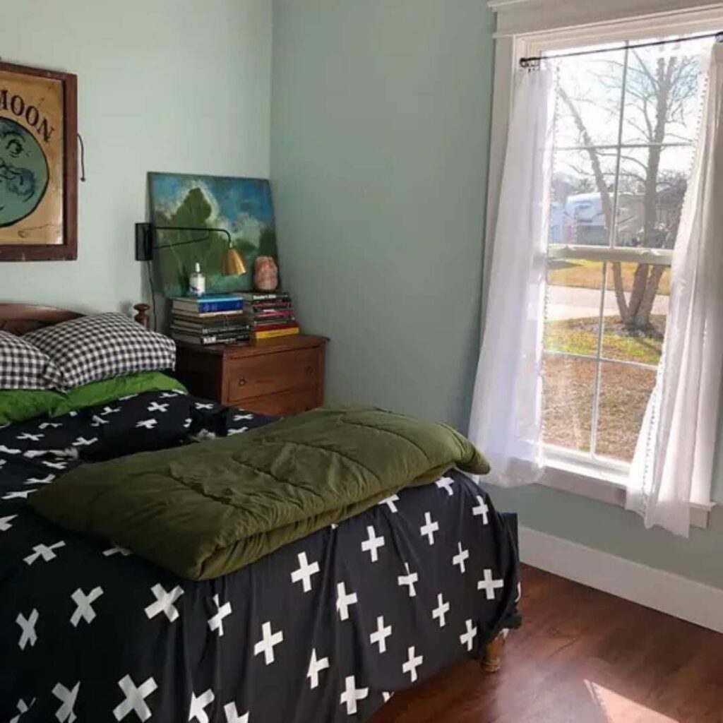
Palladian Blue in bedrooms is interesting because blue is supposed to promote rest and sleep. And Palladian Blue delivers the calming quality.
I have it in my own guest bedroom which is north-facing, so it looks more blue than green. With white bedding and warm wood furniture, it creates a peaceful vibe.
BUT if your bedroom doesn’t get great natural light, Palladian Blue can feel cold. I’d make sure you have warm lighting options to balance that cool blue undertone at night.
This color works for both adult and kid bedrooms. It is right for sleeping spaces where you want some color.
Sea Salt in bedrooms is my most-recommended bedroom color. It’s good for sleeping spaces. The soft green-gray creates a restful environment.
I’ve used it in primary bedrooms, kids’ rooms, guest rooms and it is being loved.
A client used it in her primary bedroom with white bedding, light wood furniture, and plants. She told me she sleeps better.
I don’t know if that’s the paint color or placebo effect, but it is working.
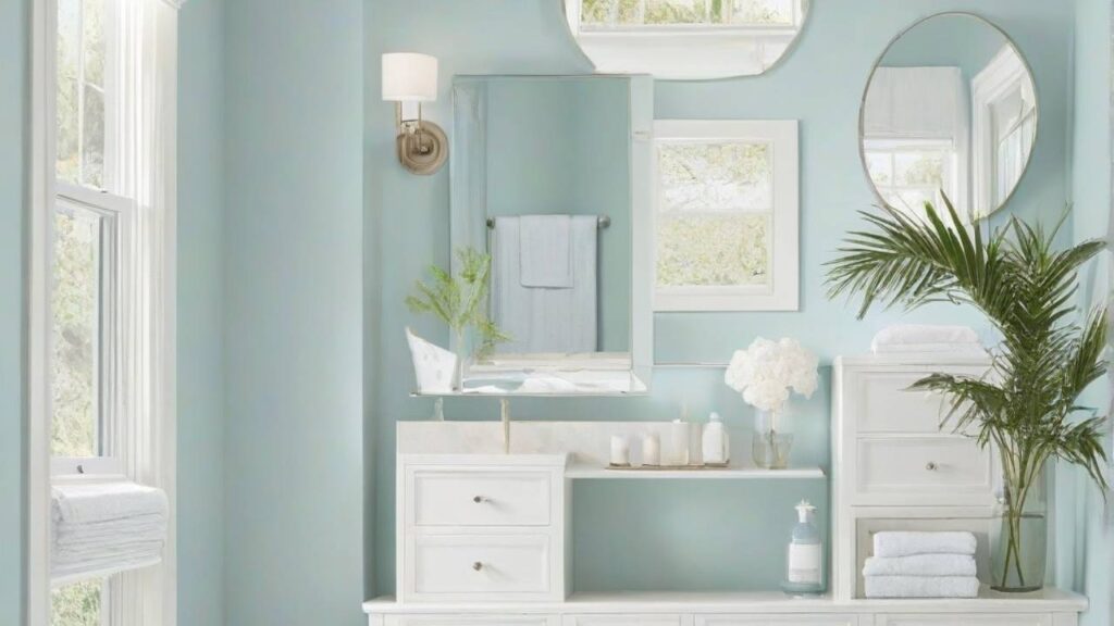
Bathroom
Bathrooms are where BOTH these colors shine. The calm quality everyone talks about, it creates that in it.
Palladian Blue in bathrooms gives you the rich, saturated blue-green that feels intentional.
I used it in a bathroom with white subway tile, marble countertops, and chrome fixtures and it looked expensive and pulled-together.
The color has depth that it doesn’t wash out with all the white tile reflecting light everywhere.
If you’re doing shiplap or board and batten in your bathroom, Palladian Blue is GORGEOUS.
The texture with the color is perfect. But watch your lighting in bathrooms.
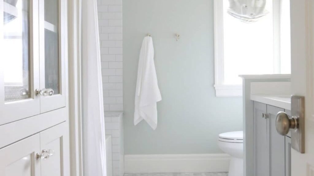
Sea Salt in bathrooms is the safe, pretty choice you can make. It’s MADE for bathrooms. I’ve done it in small powder rooms and huge primary bathrooms, it works every time.
With white tile, white vanities, and marble, it creates a calm and cozy feeling.
A bathroom I did last year used Sea Salt walls, white shiplap wainscoting, and matte black fixtures.
The green undertone in Sea Salt played well with the black hardware. Her kids take long showers now because they like the bathroom.
One warning, if your bathroom has zero natural light, Sea Salt can look gray and dull. Add plants, add warm lighting, add white elements to keep it from feeling dingy.
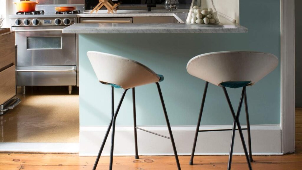
Kitchen
Kitchens are tricky with these colors. Both CAN work, but there are considerations.
Palladian Blue in kitchens works best on cabinets rather than walls.
I did a kitchen last year with Palladian Blue lower cabinets, white upper cabinets, and white walls and it looked fresh and interesting without being too bold.
On walls in kitchens, Palladian Blue can feel too saturated, especially with all the stuff.
If you’re doing it on walls, pair it with white or light cabinets and keep your backsplash simple. The color needs breathing room in a kitchen.
Sea Salt in kitchens is forgiving. I’ve done it on walls with white cabinets which are beautiful, soft, and don’t compete with the design elements. I’ve also seen it on cabinets themselves.
A client did Sea Salt walls in her kitchen with light wood cabinets and white quartz countertops.
The green undertone tied in with all her plants on open shelving and it is organic and current.
Both colors work in kitchens, but I’d give the edge to Sea Salt for versatility. Palladian Blue requires careful planning to not overwhelm the space.
Exterior
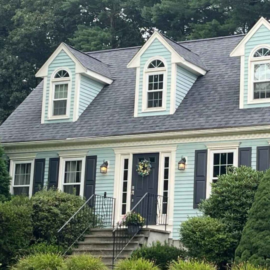
Palladian Blue on exteriors makes a STATEMENT. It’s not loud, but it’s visible. I’ve seen it on whole house exteriors, on front doors and on shutters.
The thing about Palladian Blue outside, the color shifts with weather and time of day MORE dramatically than inside.
Morning light makes it green. Overcast days pull out the gray and blue and in the golden hour, it glows.
I love it for front doors in homes that are neutral. White house, black shutters, Palladian Blue door, it looks classic and fresh. Works with any seasonal decor you want to put out there.
A whole house in Palladian Blue requires confidence. It’ll be a colorful house, not a neutral one. But if you’re going for coastal or historical vibes, it can be stunning.
Sea Salt on exteriors is subtle and blends better if you’re in a neighborhood with color restrictions or want to play it safe.
I’ve seen it on whole exteriors and it looks soft, barely-there green-blue. Some people love the subtlety. Some people feel like they painted their house gray.
For front doors, Sea Salt can feel underwhelming unless your house is a dark color. But on a brick home or a dark siding, a Sea Salt door can be pretty and unexpected.
Palladian Blue Vs Sea Salt Vs Other Colors
So, there are OTHER options I should consider. There are always more options. Let me break down how Palladian Blue and Sea Salt compare to a few other popular blue-greens that may also be considered.
Because knowing these differences will help you narrow down what you want.
Palladian Blue Vs Rainwashed
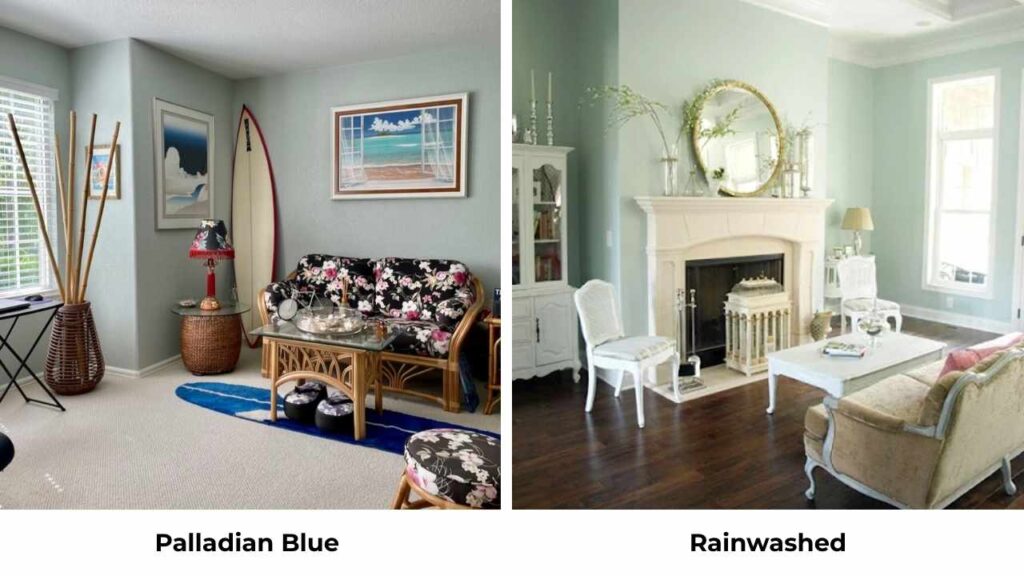
Rainwashed by Sherwin Williams is compared to Palladian Blue, and they’re similar. Rainwashed has an LRV of about 60, the same as Palladian Blue but looks slightly less gray and more blue-green.
Palladian Blue has more gray softening it. Rainwashed is clear and bright.
If you’re choosing between them, it comes down to brand preference or which one looks better in YOUR specific lighting.
I’ve used both and couldn’t tell you which is better because they’re different versions of the same vibe.
Palladian Blue Vs Quiet Moments
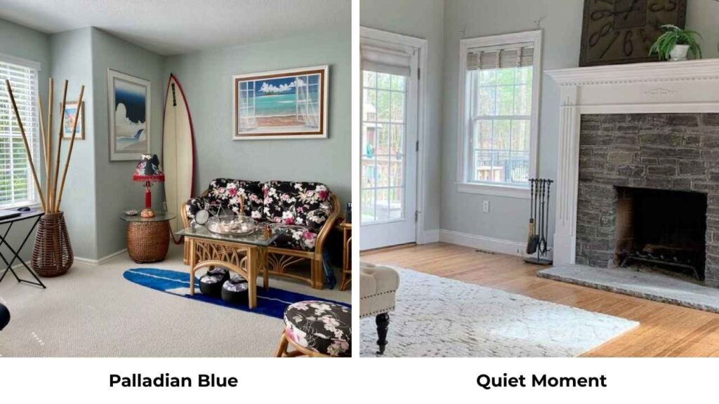
Quiet Moments by Benjamin Moore is light and softer than Palladian Blue. It has more green and less blue, and more gray.
Where Palladian Blue has personality, Quiet Moments has a hint of it. It’s pretty and calm but too subtle for my taste. If Palladian Blue feels saturated, Quiet Moments might be worth considering.
I used Quiet Moments in a hallway that connected to a room with Palladian Blue and they played together, similar to coordinate but different to define separate spaces.
Palladian Blue Vs Beach Glass
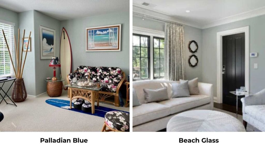
Beach Glass by Benjamin Moore has an LRV around 50, visibly darker than Palladian Blue. It has stronger gray undertones and looks more blue than green.
Beach Glass is for people who want a rich and dramatic blue-green.
If your room is REALLY bright and you’re worried about colors washing out, Beach Glass holds up better than Palladian Blue.
I love Beach Glass in rooms with less natural light where Palladian Blue may feel too cold and dark. The extra saturation makes it work in the conditions.
Palladian Blue Vs Woodlawn Blue
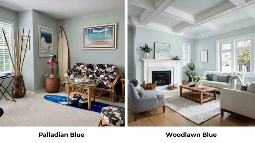
Woodlawn Blue by Benjamin Moore has the same LRV as Palladian Blue but is MORE blue and LESS gray. It’s a clear, more true blue-green without as much gray softening.
If you want blue to show up, Woodlawn Blue delivers better than Palladian Blue. But it also feels committed and less of a neutral color and more of a blue.
Here’s a quick comparison table:
| Color | Brand | LRV | Dominant Tone | Compared to Palladian Blue | Compared to Sea Salt |
| Palladian Blue | Benjamin Moore | ~60 | Blue-green with gray | – | More saturated, more blue |
| Sea Salt | Sherwin Williams | ~63 | Green-gray with blue hint | Less saturated, more neutral | – |
| Rainwashed | Sherwin Williams | ~60 | Blue-green | Slightly clearer, less gray | More blue, similar neutrality |
| Quiet Moments | Benjamin Moore | ~64 | Green-gray | Lighter, softer, more green | Similar mutedness, slightly less green |
| Beach Glass | Benjamin Moore | ~50 | Blue-gray | Darker, grayer, more blue | Much darker and richer |
| Woodlawn Blue | Benjamin Moore | ~60 | Blue-green | Clearer blue, less gray | More blue, less neutral |
Palladian Blue Complementary Colors
Colors that pair well with Palladian Blue and make it look better:
- White Dove – warm, creamy white that’s my go-to trim color with Palladian Blue walls
- Chantilly Lace – bright, cool white if you want contrast
- Hale Navy – deep navy that coordinates beautifully in the same color family
- Revere Pewter – the greige that works with everything, including Palladian Blue
- Classic Gray – another Benjamin Moore neutral with subtle green undertones that plays well
- Manchester Tan – beige with green undertones, great for adjacent rooms
- Aegean Teal – if you want a rich blue-green for accent walls or adjacent spaces
- Soft corals and warm pinks
- Warm wood tones like oak, walnut, natural woods with this color
- Blacks and dark charcoals for dramatic contrast
The key with Palladian Blue is to avoid purples and purple-based grays because they’ll clash with the green undertones. Stick with whites, warm neutrals, deep blues and greens, and it looks the best.
Sea Salt Complementary Colors
Colors that complement Sea Salt and enhance its soft vibe:
- Pure White – clean, bright white that’s popular with Sea Salt
- Alabaster – slightly warm white, very popular pairing
- Accessible Beige – warm beige that coordinates beautifully with Sea Salt’s green undertones
- Agreeable Gray – Sherwin Williams’ most popular gray, works well in adjacent rooms
- Repose Gray – another great gray that doesn’t fight with Sea Salt
- Naval – deep navy for accent walls or furniture
- Evergreen Fog – Sherwin Williams’ 2022 color of the year, great deeper green-gray companion
- Warm terracottas, rust, and burnt orange tones that play off the green
- Soft dusty blues
- Natural wood tones, especially lighter oak and whitewashed woods
- Matte black or oil-rubbed bronze metals
Sea Salt is easy to pair because it’s neutral. But avoid anything too cool or purple-toned because you want to enhance the soft green-gray quality.
Conclusion
I’ve painted rooms with both Palladian Blue Vs Sea Salt, so there’s no definitive “better” choice. It’s about what YOUR space needs and what vibe you’re going for.
Choose Palladian Blue if: You want visible color presence, you prefer blue showing up over green, you’re okay with something that shifts throughout the day, your room has decent natural light, and you want something that feels curated and less neutral.
Choose Sea Salt if: You want a soft, barely-there color that is almost a neutral, you prefer green undertones over blue, you need something that works home, your space is either REALLY bright or you’re willing to add warm lighting, and you prioritize calm and relaxation over personality.
Sample both and get samples on your walls, live with them for several days, watch them in different lighting. Don’t skip this step.
These colors look NOTHING like they do on small paint swatches because picking the wrong one can make your space feel flat and cold.
FAQs On Palladian Blue Vs Sea Salt
The main difference is Palladian Blue is blue, saturated, and looks more of an actual color, while Sea Salt is green-gray, muted, and acts like a neutral. Palladian Blue has an LRV of 60 and Sea Salt has an LRV of 63, so Sea Salt is lighter. For Undertone, Palladian Blue shows clear blue with gray softening, while Sea Salt is dominated by green-gray with hints of blue.
Sea Salt looks more green than blue. It’s described as a blue-green or green-blue, but that green-gray undertone is strong. In bright natural light, you see some blue come through, but most of the time it looks like a soft, muted green-gray. If you WANT a blue room, Sea Salt will disappoint you. If you want green-gray with a hint of blue, it’s perfect.
Palladian Blue is cool-leaning because of its blue base and gray undertones. It’s not ICY cool like some blues can be. The green presence in it adds slight warmth, so it doesn’t feel harsh or cold in most spaces. In south-facing or west-facing rooms with warm natural light, it can look warm.
Sea Salt is a Sherwin Williams color, not Benjamin Moore, small but important. And it’s a VERY good color if you want something soft, neutral, and calming. It’s one of Sherwin Williams’ popular colors because it’s versatile, works in multiple rooms, pairs easily with other colors, and creates a calm feel everyone wants. My only criticism is it can be boring in some spaces and wash out in bright rooms.