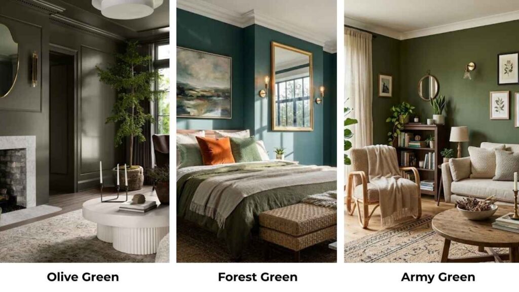
Olive Green vs Forest Green, both are green, both nature-inspired.
But here’s what I’ve learned after working with these colors in real spaces: they’re nothing alike when it comes to the vibe they create.
Olive green brings a warm, dusty earthiness that feels like a Mediterranean afternoon.
Forest green is a deep, moody drama.
And I’ve seen what happens when someone picks the wrong one.
A client once painted their north-facing living room in what they thought was olive green.
The whole room felt cold and uninviting, opposite of the cozy vibe.
We ended up repainting with a warm olive after testing samples.
The undertone difference between these greens isn’t only color theory but it changes how you feel in the room.
Here, I’m breaking down the color profiles of Olive Green Vs Forest Green, the undertones they have, how they look in different lights, and where they work best.
Then we’re comparing them because that’s what you need to see.
After that, I’ll show you how they look in different rooms.
Here are my other blogs that you can also read:
- Ballet White Vs White Dove
- Oatmeal Color Vs Beige
- Bm White Dove Vs Sw Alabaster
- Wythe Blue Vs palladian Blue
- Modern Gray Vs Agreeable Gray
Color Profile of Olive Green
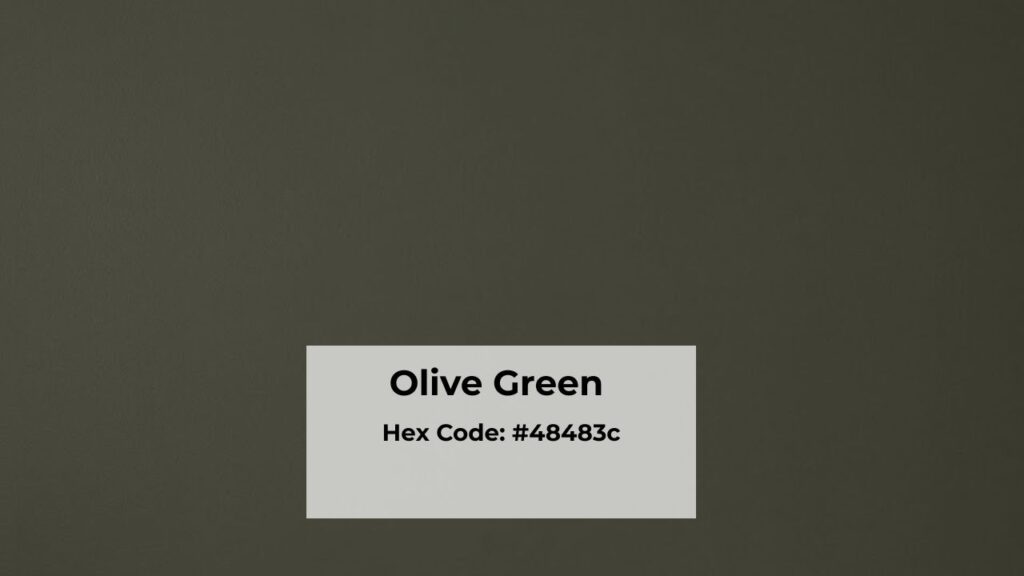
Olive green is a warm green with yellow or brown undertones.
It’s muted. It doesn’t scream at you from the wall.
There’s an earthiness to it that feels grounded like olives, or dried herbs, or the specific shade soil gets in late summer.
The yellow undertones are what make it warm.
Sometimes you’ll get olive greens that are brown, almost khaki.
They have gray or brown mixed in, which makes them more muted.
I’ve used RAL 6003 on exterior trim before, and in direct sunlight it looked tan.
Here’s what I love about olive green: it’s undemanding.
It was on your wall and exists peacefully.
It doesn’t compete with your furniture or your art or the vintage rug.
It works as a neutral, which is wild because it’s clearly green.
But that’s the magic of colored neutrals, they have saturation to add warmth and character.
In interiors, olive green creates a relaxed, organic aesthetic.
I’ve used it in bedrooms where people wanted something calming but were done with gray.
It works perfectly with warm woods like oak, walnut, and the orange-y pine if you balance it right.
Pair it with cream or off-white trim and you’ve got a Mediterranean or California thing.
The styling potential is forgiving.
Terracotta pots, natural linen, leather furniture, anything earthy plays nice with olive.
I’ve even seen it work with mustard yellow accents, though that’s warm tones in one space.
One thing though.
Olive green can look muddy if you’re not careful with lighting.
It needs either good natural light or warm artificial light.
Cool LED bulbs will make it look sad and brownish.
Color Profile of Forest Green
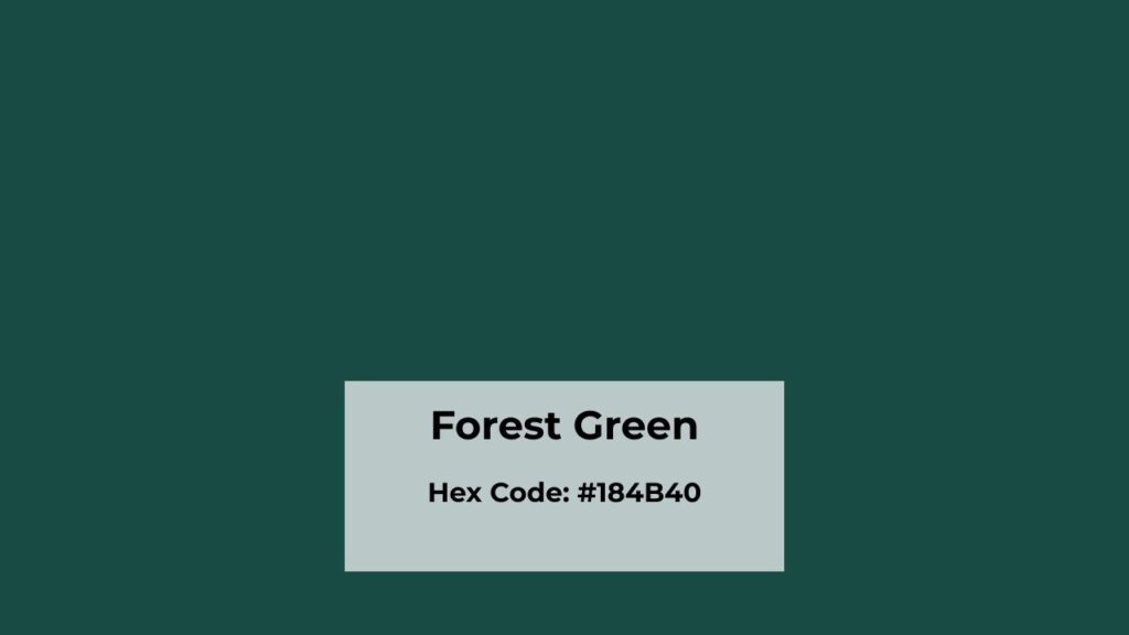
Now forest green is completely different.
This is a deep, cool green with blue undertones.
Like evergreen trees, pine needles, the specific rich green you see in dense woods.
It’s inspired by nature but it’s the dramatic, moody version of nature.
Benjamin Moore Forest Green 2047-10 is the well-known paint version of this color.
I’ve used it more times than I can count.
It’s saturated, it’s bold, and it makes a statement whether you want it to or not.
This isn’t a background color but it’s a feature color.
The cool undertones mean it looks completely different from olive.
Where olive feels warm and welcoming, forest green feels sophisticated and formal.
I had it in my own dining room for a while.
But when it was there, everyone who came over commented on it.
It’s darker than olive green. High saturation too.
In low light, it can look black with a green tint.
I’ve seen it in north-facing rooms where it becomes a navy-green hybrid.
That can be gorgeous if you’re going for a moody library or sophisticated bedroom vibe.
The boldness means you need to be careful with pairings.
Forest green works beautifully with bright white trim and the high contrast is stunning.
It also loves brass and gold accents.
I’ve used it with marble countertops in a bathroom and it felt like a luxury hotel.
But warm beiges or off-whites can go against the blue undertones.
It’s been used in formal spaces or exteriors.
But I’m seeing it in modern interiors too, used intentionally, like on a single accent wall or kitchen cabinets.
Olive Green Vs Forest Green: Key Differences
Okay, so Olive green Vs Forest Green both colors are green.
Both feel natural.
But the way they work in spaces is completely different, and it comes down to some specific characteristics that matter more than you think.
Undertones
Olive green has yellow or brown undertones which is what makes it look warm.
You’re getting green that looks toward the sunny, earthy side of the color wheel.
Think green with gold mixed in.
Forest green has blue undertones.
Sometimes some black depth to it.
This is what makes it cool and rich.
It’s green heading toward the shadowy, deep of the color wheel.
These undertones affect everything else about how the color performs.
And I mean everything like how it pairs with other colors, how it responds to light, what mood it creates.
Emotional and Visual Impact
Olive green feels calm, grounded, approachable.
When I walk into a room painted olive, my shoulders relax.
It’s not trying to impress anyone.
It’s there, being pleasant and natural.
Perfect for spaces where you want to unwind, relaxed and understated is the vibe.
Forest green hits differently.
It feels stable, sure, but dramatic and luxurious.
There’s a formality to it.
It commands respect.
I’ve seen people’s voices get quiet in forest green rooms, like they’re in a library or a fancy study.
It creates a bold impact rather than subtle background.
Brightness and Saturation
Olive green is muted, low saturation, medium value.
It reflects light in a soft, diffused way.
Nothing sharp or intense about it.
It’s like the difference between a sunny hazy day versus direct spotlight.
Forest green is saturated and darker in value.
It absorbs light rather than reflecting it.
This creates depth and richness but also makes spaces feel small and enclosed.
Lighting Effect
Olive green shifts in different lighting.
In south-facing rooms with warm sunlight, it glows, all the yellow undertones come alive.
But in north-facing rooms or under cool LEDs, it can look muddy, grayish, or a little sad.
I always test olive green samples in the room at different times of day.
Forest green is more consistent across lighting conditions.
It stays deep and rich.
However, in low light or small spaces, it can look almost black.
I’ve had clients panic because their forest green looked navy at night under warm bulbs.
It’s a great color, but you need to accept that it’s going to be dark and work with that.
North-facing rooms make forest green cool.
South-facing rooms can warm it up but it maintains its blue undertone.
Style and Best Uses
Olive green works best as:
- All-over wall color in cozy spaces
- Neutral base in casual interiors
- Cabinet color in kitchens with warm wood floors
- Exterior siding or trim
- Pair with: warm woods, cream, terracotta, brass, natural textures
Forest green works best as:
- Accent walls where you want drama
- Statement furniture pieces
- Traditional or modern luxury interiors
- Cabinetry with marble or white counters
- Pair with: bright white, cool gray, black, marble, gold
Let me put this in a table because seeing it side-by-side helps:
| Aspect | Olive Green | Forest Green |
| Undertone | Yellow / Brown | Blue / Black |
| Temperature | Warm | Cool |
| Saturation | Muted, low saturation | Rich, highly saturated |
| Mood | Relaxed, earthy, casual | Dramatic, formal, bold |
| Neutral Quality | High – functions like a true neutral | Medium – still makes a statement |
| Light Behavior | Shifts noticeably, shows warmth in sun | Consistent but can read almost black |
| Best Spaces | Everyday rooms, cozy spaces | Statement areas, accent features |
| Pairs With | Warm neutrals, wood, brass | Cool whites, grays, gold, marble |
How Do Olive Green and Forest Green Look In Different Rooms?
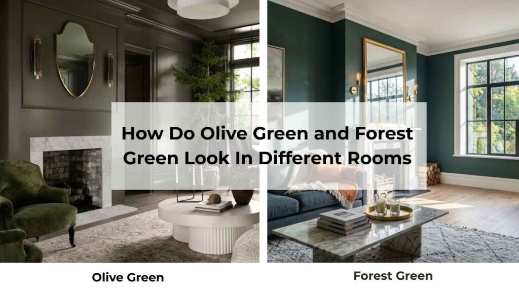
Color doesn’t exist in a small size.
I’ve seen the same shade look different in a bathroom versus a bedroom.
Room size, natural light, function because it all matters.
Let me walk you through how both colors look in specific spaces.
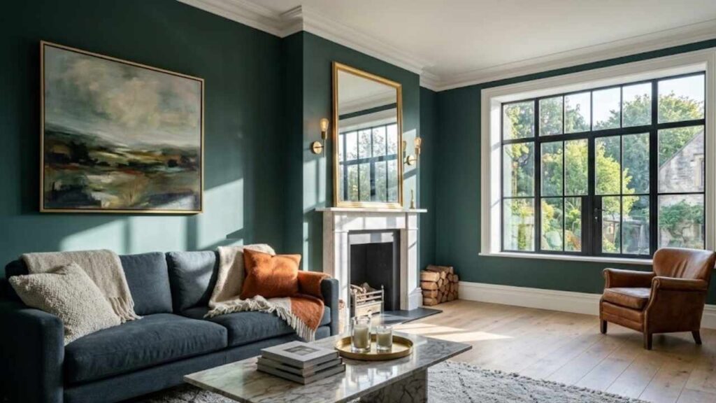
Living Room
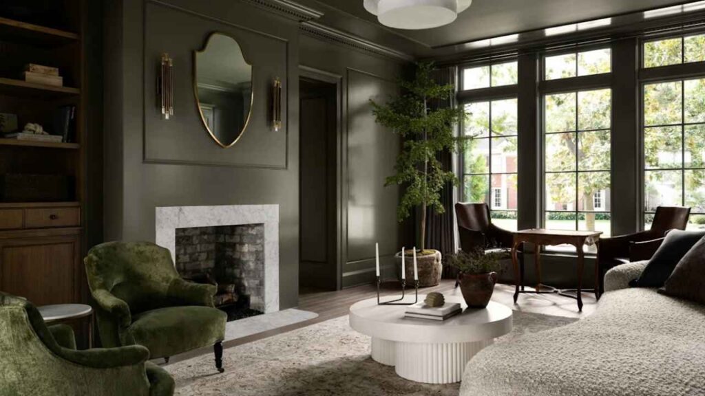
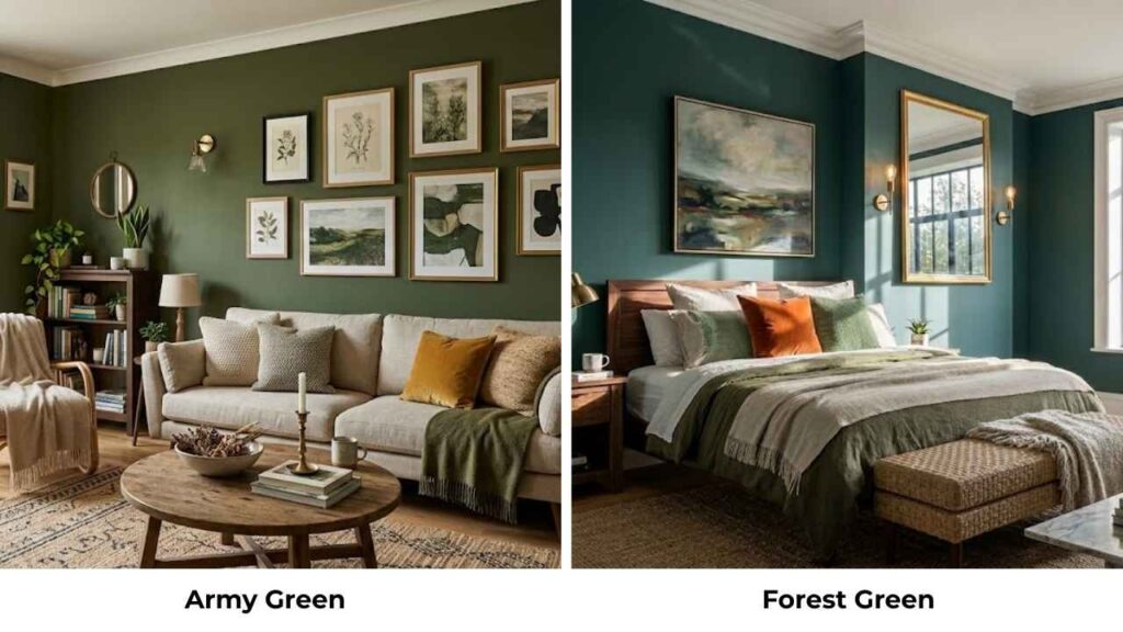
Olive green in a living room feels like an instant calm-down.
It’s warm that the space feels inviting, but muted that it doesn’t overwhelm your furniture or decor.
I used it in a client’s living room that had big south-facing windows and warm oak floors.
The whole room felt comfortable.
It worked as a full-wall color, and we paired it with a cream sofa, some vintage leather chairs, and terracotta plant pots.
Natural light made it glow during the day.
At night with warm lamps, it looks deep but stays cozy.
Forest green in a living room is a choice, a good choice if you want drama, but you need space for it.
I’ve used it on one accent wall behind a sofa in a bright, large living room.
The blue undertones made it feel sophisticated, library-like.
But you need light to balance the depth, otherwise your living room becomes a cave.
Pair it with white or light gray, keep your other walls neutral, add brass picture frames or light fixtures.
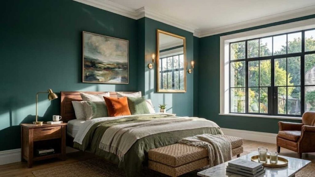
Bedroom
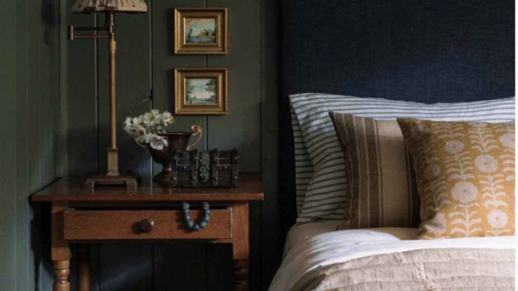
Olive green in bedrooms is one of my favorite moves.
Bedrooms should feel restful, and olive delivers that without being boring.
The warm undertones create this cocooning effect.
I painted my own bedroom olive a few years back and slept better.
Olive was right.
It works well if you have wood furniture.
And if you’re worried it’ll feel dark, keep your bedding light like white or cream linen looks gorgeous against olive walls.
Forest green in a bedroom can work but you need to commit to the moody vibe.
I’ve done it in large bedrooms with good light where the goal was sophisticated and dramatic. Like a boutique hotel, not a beach cottage.
It needs high-contrast elements to not feel oppressive like with white bedding, light wood or white furniture, or brass accents.
One client did forest green walls with a white ceiling and trim, with a huge brass chandelier and it was stunning.
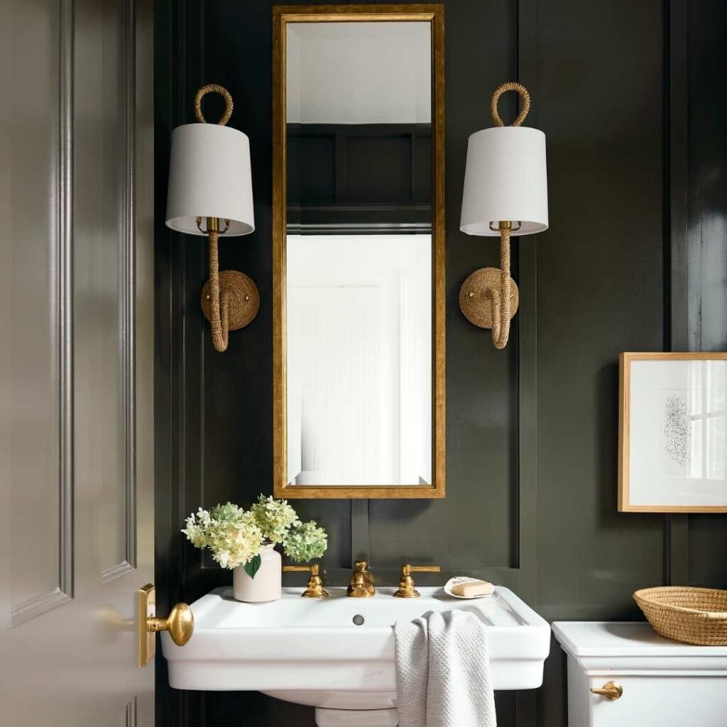
Bathroom
Olive green in bathrooms surprised me the first time I tried it.
I thought it would feel too earthy or muddy in a small space.
But now it feels spa-like, mainly with white fixtures and natural wood accents.
I did an olive bathroom with brass faucets, white subway tile, and concrete-look floors.
The muted quality works well in small bathrooms because it doesn’t close in on you.
But make sure you have decent lighting like bathrooms with no windows need warm LED bulbs with olive walls.
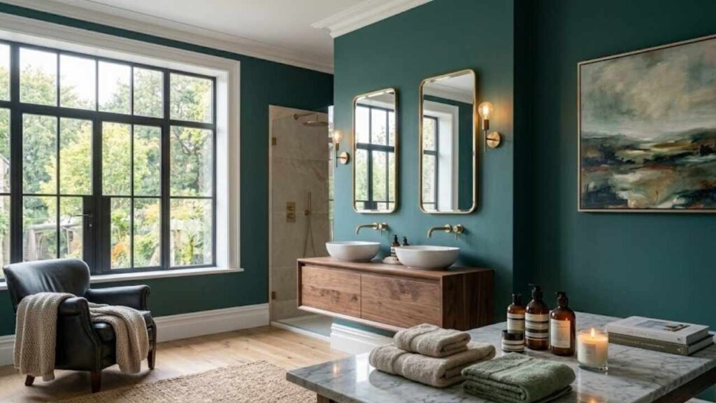
Forest green in a bathroom is chic if you do it right.
I’ve used it in powder rooms and larger primary bathrooms.
The deep, rich color with white marble or white tile is good.
It feels luxurious and a bit daring. But in a small bathroom with low light, it can feel claustrophobic.
I did a powder room in forest green Benjamin Moore Forest Green 2047-10 with brass mirror, white pedestal sink, and checkered black and white floor.
Kitchen
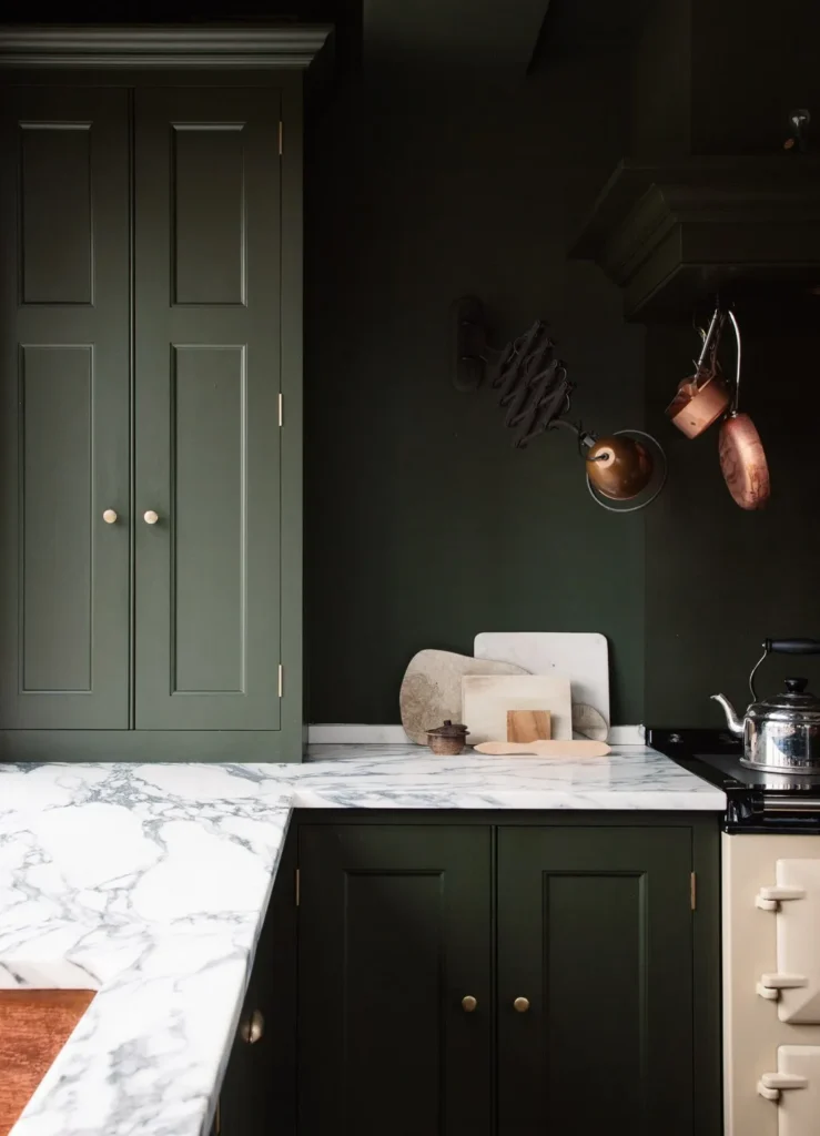
Olive green in kitchens works well on cabinets. It’s warm that the kitchen feels inviting but muted that it functions as a neutral base.
Pairs well with butcher block counters, brass hardware, white subway tile. One client did olive cabinets in a kitchen with white quartz counters and open wood shelving. The key is balancing it with light elements so the kitchen doesn’t feel heavy.
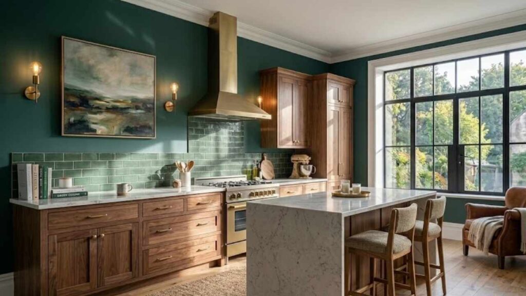
Forest green in kitchens is in trend.
It’s dramatic and different from the gray-and-white contrast everyone is doing, but it needs space and light.
I’ve used it on an island in an otherwise white kitchen which is a perfect amount of visual interest.
I’ve also done full forest green cabinets in a large kitchen with natural light, white marble counters, and brass everything, it is gorgeous but a statement.
In a small, dark kitchen, forest green cabinets will make the space feel small.
Olive Green Vs Forest Green Vs Other Colors
Olive and forest aren’t the only greens people confuse or compare.
Let me clear up some other common green color questions.
Army Green Vs Forest Green
Army green is basically olive green’s alternative.
It’s designed for a more brown, more muted and practical facade.
Forest green is cool, deep, and more saturated.
Army green works in casual, rugged spaces.
Forest green works where you want some sophistication.
Olive Green Vs Jungle Green
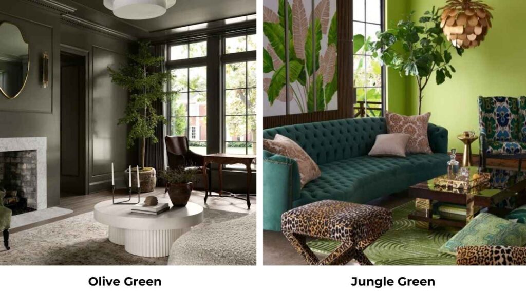
Jungle green is bright and more yellow than olive. It has tropical vibes like a lush rainforest rather than a dry Mediterranean landscape. Olive is muted and earthy. Jungle green is vibrant and energetic.
Olive Drab Vs Forest Green

Olive drab is the military version of olive green. Even more brown, even more muted. It’s designed to blend in with varied terrain. Forest green is cool, rich, not trying to hide at all. Olive drab is utilitarian. Forest green is decorative.
Olive Green Vs Moss Green
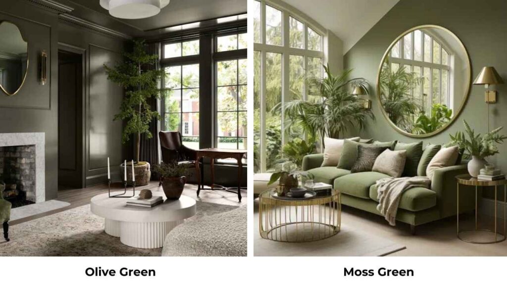
Moss green is between olive and forest on the temperature scale.
It’s cooler than olive but not as deep as forest.
More gray, soft, and more muted than forest.
Moss works well in modern minimalist spaces and it is Scandinavian.
Olive is warm and earthy.
Like moss green as a transitional neutral that can go either warm or cool depending on what you pair it with.
Olive Green Vs Army Green
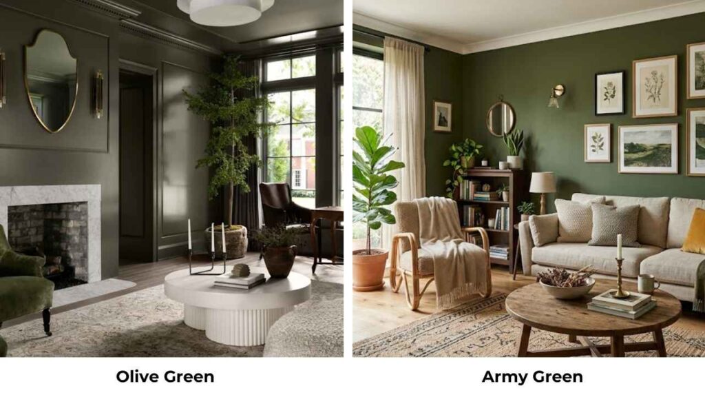
These are basically the same thing.
Army green is only the name used for olive green in military contexts.
Like some more brown in some versions, but they’re the same warm, muted, yellow-brown green.
Moss Green Vs Forest Green
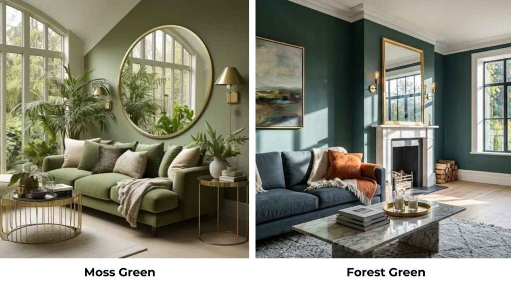
Moss green is soft, more gray-toned, and less saturated than forest green.
The forest green is bold and rich.
Moss is subtle and modern.
Forest makes a statement.
Moss whispers.
Both are cooler greens but different depth and intensity.
Here’s a comparison table:
| Color Comparison | Key Difference | When To Choose It |
| Army Green vs Forest Green | Army is brown and muted; Forest is cool and deep | Army for casual; Forest for sophistication |
| Olive Green vs Jungle Green | Olive is muted and earthy; Jungle is bright and tropical | Olive for calm spaces; Jungle for energetic accents |
| Olive Drab vs Forest Green | Olive Drab is military muted olive; Forest is decorative and rich | Drab for rugged looks; Forest for intentional drama |
| Olive Green vs Moss Green | Olive is warm with yellow undertones; Moss is cool with gray tones | Olive for warmth; Moss for modern minimalism |
| Moss Green vs Forest Green | Moss is soft and gray-toned; Forest is saturated and bold | Moss for subtle elegance; Forest for statement impact |
Which One To Choose Between Olive Green and Forest Green?
Alright, here’s how I help clients choose.
Choose olive green if:
- You want warmth without going beige or tan
- Your space has good natural light, especially warm south-facing light
- You’re creating a casual, livable, everyday space
- You want a color that functions as a neutral backdrop
- You love natural materials, wood tones, and earthy textures
- You’re decorating a bedroom, cozy living room, or casual kitchen
Choose forest green if:
- You want drama and sophisticated impact
- You have enough space and light to handle a deep, saturated color
- You’re creating an accent wall or statement feature
- You love high-contrast looks with whites and metallics
- You’re going for traditional elegance or modern luxury
- You’re decorating a powder room, accent wall, or spacious room with good light
Common Mistakes To Avoid While Going With Olive Green and Forest Green
I’ve made mistakes with both colors and also with my clients.
Here’s what to watch out for.
- Not testing samples in your lighting
- Using olive green in cool-toned spaces
- Painting forest green in small, dark rooms
- Ignoring undertones when choosing pairs
- Skipping proper wall prep for forest green
- Using cool LED bulbs with olive green
- Not balancing forest green with light elements
- Assuming they’re interchangeable because they’re both green
Conclusion
Olive green Vs forest green, both be nature-inspired greens, but they create different experiences in your space.
Olive brings warm, muted, earthy calm, it’s the color that makes you want to relax and stay a while.
Forest brings cool, rich, sophisticated drama, it’s the color that makes people pause and notice.
I’ve used both colors many times.
Neither is better, they’re different tools for different spaces.
Olive works where you want a livable, everyday neutral with organic warmth.
Forest works where you want intentional impact and elegant depth.
The key is understanding undertones, testing in your space, and being clear about what mood you’re trying to create.
Because picking the wrong one between Olive Green Vs Forest Green can make your space out of place.
FAQs On Olive Green vs Forest Green
They’re both green, but forest green is cool with blue undertones while olive green is warm with yellow or brown undertones. Forest Green is deep and saturated. They create different moods like olive feels casual and earthy, forest feels formal and dramatic.
Warm neutrals work well with cream, off-white, warm beige. Also with terracotta, brass, warm wood tones, and mustard. You can do purple or coral for contrast. But remember to keep everything on the warm side.
No. Olive green is a warm, muted green with yellow or brown undertones. Dark green is a general term for any deep green. Forest green is a dark green. Olive isn’t dark but it’s medium value and muted.
Bright white is the classic pairing, the high contrast is stunning. Also cool grays, black accents, marble, gold or brass metallics. Keep things cool-toned or high-contrast. Warm beiges go against forest green’s blue undertones.
Olive Green vs Forest Green: Calm Natural Tone Vs Rich Dramatic Shade