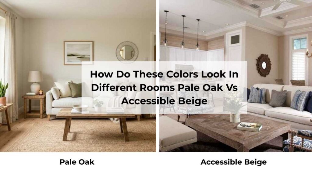
So here’s about Pale Oak and Accessible Beige, they’re two most compared neutral paint colors.
Pale Oak is Benjamin Moore’s best color OC-20 and Accessible Beige is Sherwin Williams’ blockbuster neutral SW 7036.
Both of these are into the greige territory, the beautiful gray and beige zone that works with everything.
The Pale Oak Vs Accessible Beige isn’t only about some paint thing but it’s a big deal.
These colors look similar on the small paint swatches but when they’re on the walls they are completely different.
The undertones shift, the depth changes depending on your lighting.
Accessible Beige may look perfect in your south-facing living room but turn green in your north-facing bedroom.
Pale Oak looks like a soft, dreamy neutral until it catches afternoon light and goes pink.
But choosing the wrong one can make your space flat.
So, I’m breaking down everything about Pale Oak Vs White Dove, the real stuff like LRV and undertones, how they behave in different lighting situations, which rooms look good in and where they fall flat.
We’re also comparing them to other popular neutrals because once you start looking at greiges you end up with many of them.
I’ll share what I’ve learned from using both colors in real spaces, the mistakes and more.
Here are my other blogs that you can also read:
- Wythe Blue Vs Palladian Blue
- Evergreen Fog Vs Dried Thyme
- Bm White Dove Vs Sw Alabaster
- Peppercorn Vs Iron Ore
- Ballet White Vs White Dove
What You Need To Know About Pale Oak (OC-20)

Pale Oak is one of the colors that looks like a dream but can be tricky in real life if you don’t understand what it’s doing.
It’s a light greige. The LRV is 69.89, which means it’s reflecting 70% of the light.
For context, pure white is 100, so this is bright.
Benjamin Moore puts it in their Off-White Collection, which I think is misleading because it looks like a color, not an off-white.
The base is this warm gray with subtle beige undertones.
Think of it like a gray that got softened and warmed up to not feel cold.
In some lighting and this is where it gets interesting, you’ll catch hints of pink or violet.
I’m not talking purple walls, but there’s this subtle shift that happens in rooms with cool natural light or north-facing exposure.
I used Pale Oak in a client’s bedroom and in the morning light it looked like this perfect warm gray but in the afternoon, it showed some pink.
She loved it, but I always warn people about that undertone situation because NOT everyone wants pink sneaking into their neutral.
The color can lean taupe depending on what you pair it with too.
Next to bright white trim, it looks gray and next to wood tones, the beige comes forward.
What I love about Pale Oak is how it handles low-light rooms.
The high LRV means it’s bouncing light around like crazy, so it WORKS in spaces that don’t get much natural light.
I’ve used it in a windowless hallway and it didn’t go dark or muddy and it stayed soft and airy.
It maintains a consistent warmth even in cool rooms, which is rare.
A lot of light grays will look cold and depressing in a north-facing space, but Pale Oak holds onto warmth to feel inviting.
I see it used in bedrooms because of the soft, calm vibe.
Living rooms too, especially if you’re going for a modern or minimalist look.
It’s subtle that it works as a whole-home color if you want that seamless flow through an open floor plan. Some people use it on trim, though I think it’s too rich.
I’d rather see it on walls with something light on the trim like White Dove or Simply White.
The thing about Pale Oak that makes it a designer favorite is that it is refined, almost sophisticated.
It’s not trying too hard.
What You Need To Know About Accessible Beige (SW 7036)

Accessible Beige is completely different even though people get confused between these two.
The LRV is 58, that’s 12 points lower than Pale Oak, which is a big difference.
This is a medium-light neutral, not a light one.
It has depth, presence and weight.
It’s going to feel more grounded and earthy in space.
The base here is beige with gray influence, but there’s also a subtle green undertone that can come and surprise you if you’re not expecting it.
I’ve seen Accessible Beige look different in three adjacent rooms in the same house.
In one room it’s a perfect warm greige, in another it’s showing green, in another it looks almost taupe.
It’s kind of a chameleon.
Sherwin Williams says this is a warm greige that balances beige and gray, and that’s accurate.
It’s not as gray-forward as something like Agreeable Gray.
Accessible Beige is in the beige category, tempered with gray so it doesn’t feel dated or yellowy.
This is one of Sherwin-Williams’ best-selling paint colors and I get why because it’s VERSATILE.
It works on interiors, it works on exteriors and it works in traditional homes and modern farmhouses and transitional spaces.
The vibe is cozy but not heavy but moderate warmth and grounded.
It doesn’t have that airy, floaty quality that Pale Oak has and that is more substantial.
For reference, it’s slightly darker than Manchester Tan but not as dark as Balanced Beige, which comes in at LRV 46 and is rich.
I love Accessible Beige in living rooms with warm wood floors, the color goes with oak or walnut.
I used it in my own kitchen a few years ago and in the morning when the light came through the window over the sink, I swear it looked like we’d painted the walls with pea soup.
I ended up repainting it with a different color.
BUT in the afternoon and evening with warm artificial light, it was GORGEOUS. So lighting is critical with this color.
Designers use it for bedrooms because it has the cozy, wrapped up feeling.
Bathrooms too, if you’ve warm-toned tile or wood vanities.
I’ve seen it used beautifully in open-concept spaces where you want a home neutral that has richness to not feel builder-grade boring.
The green undertone is likely to show up in north-facing rooms or anywhere with cool light.
In south-facing rooms, it warms up and gets rich and that’s where it looks its best.
Pale Oak Vs Accessible Beige: Key Differences
So you’re thinking Pale Oak Vs Accessible Beige, both colors are so close that it doesn’t matter which one you pick, but it is wrong.
The differences are subtle but they change how a room feels, and I’m going to break down where these two neutrals look good so you don’t end up repainting.
LRV
Light Reflectance Value sounds complicated but it’s simple, it’s a number from 0 to 100 which tells you how much light a color reflects.
A high number means light color.
Pale Oak is at 69.89, while Accessible Beige is at 58.
The 12-point difference is big, you think it won’t matter but it does.
Pale Oak is going to brighten a space more than Accessible Beige.
In a room with great natural light, both will look nice but Pale Oak will feel airy and open.
In a room with minimal light, Pale Oak is going to hold up better because it’s bouncing light around.
Accessible Beige in a dark room can go muddy and flat.
I’ve seen it happen many times. It needs adequate light to show its best self.
On the flip side, if you have a bright room like south-facing with huge windows then Pale Oak feels washed out.
Sometimes you want more depth and color saturation, and that’s where Accessible Beige shines.
I think of LRV as the foundation of every color decision.
You can love the color on a paint chip, but if the LRV doesn’t match your room’s lighting situation, you’re going to be disappointed.
Undertones
Pale Oak has a warm gray base with subtle beige undertones.
In some lighting, you’ll see hints of pink or violet come.
It’s not dramatic, but it’s there.
If you have cool-toned elements in your room like gray tile or cool-toned furniture then those pink and violet undertones get amplified.
Accessible Beige has a beige base with gray undertones, but it also has the subtle green undertone that can flash in some conditions.
The green is visible in north-facing rooms or anywhere with natural cool light.
Pair it with the wrong countertop or tile and your walls look like they’re trying to be sage green.
I made this mistake in my own kitchen.
It had Accessible Beige on the walls, white subway tile, and marble countertops with gray veining and the whole space looked OFF.
The green undertone was fighting with the cool gray in the marble.
Lighting Behaviour
Pale Oak in a north-facing room is going to look cool and the pink and violet undertones are going to be apparent.
It won’t look bad necessarily, but it will look more gray than beige.
In a south-facing room, it warms up beautifully and gets soft and cozy.
Artificial lighting, especially warm LED bulbs, will emphasize the warmth and bring out the beige.
Accessible Beige in a north-facing room can look gray and show the green undertone strongly.
This is NOT where this color looks its best.
In a south-facing room or with warm natural light, it gets rich and warm and gorgeous.
With warm artificial lighting in the evening, it feels cozy and grounded.
I always tell people to paint big poster boards with your color options and move them around your room throughout the day.
Morning light, afternoon light, evening with your lamps on.
Warmth
Both colors are considered warm neutrals, but they show warmth differently.
Pale Oak has a soft, subtle warmth.
It’s warm to not feel cold or flat, but it’s not but it’s gentle.
Refined. It creates a light, airy atmosphere that feels open and calm.
If you want cozy in a wrapped-up kind of way.
This is like spring morning warmth, not winter evening warmth.
Accessible Beige has more pronounced warmth.
It feels grounded and earthy and cozy.
This is the color that makes a room feel lived-in and comfortable.
It has richness that Pale Oak doesn’t have.
The warmth is traditional and embracing.
If your home has warm wood tones like oak floors or wood trim or wood furniture then Accessible Beige is going to harmonize better.
Pale Oak can sometimes feel disconnected from very warm wood because it has gray.
Styling and Best Uses
Styling these colors means thinking about trim, ceilings, furniture, and accent colors like everything else in the room.
Pale Oak looks amazing with fresh white trim.
I love it with White Dove, Simply White, or Chantilly Lace.
The contrast is soft but defined and not harsh. For ceilings, you can go with the same Pale Oak for a cocooning effect, or use a light white if you want contrast.
Furniture-wise, it works with anything like modern pieces, traditional wood, upholstered neutrals.
For accent colors, I love it with navy, soft blush, muted sage, or black for a modern look.
Best uses: Bedrooms, living rooms, whole-home neutral, small rooms or hallways.
Accessible Beige needs warm trim. Alabaster is my go-to pairing with Accessible Beige, it’s warm to coordinate without being too creamy or yellow.
Pure White can work too if you want more contrast.
Same deal with ceilings, you can do Alabaster or use ceiling white.
For furniture, this color LOVES warm wood tones.
Oak, walnut and light woods like pine or maple.
It’s also beautiful with earthy accent colors like terracotta, warm olive, rust, deep navy, charcoal.
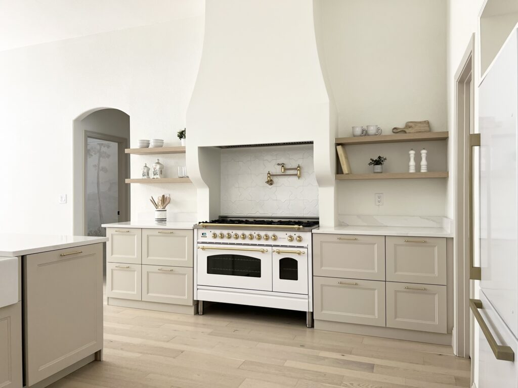
Best uses: Living rooms especially with wood floors and warm finishes, kitchens like cozy and inviting, open floor plans which is a great -home option if you have warm finishes, exteriors popular for this, it works beautifully with stone and brick.
Here’s a comparison table because I know some of you want the facts:
| Feature | Pale Oak (OC-20) | Accessible Beige (SW 7036) |
| Brand | Benjamin Moore | Sherwin Williams |
| LRV | 69.89 | 58 |
| Base | Warm gray | Beige with gray |
| Undertones | Beige, pink/violet hints | Gray, subtle green |
| Warmth | Soft, subtle | Richer, more pronounced |
| Best Lighting | Works in low light | Needs good lighting |
| Overall Feel | Light, airy, refined | Grounded, cozy, earthy |
| Best Trim | White Dove, Simply White | Alabaster, Pure White |
| Style Vibe | Modern, minimalist, transitional | Traditional, farmhouse, transitional |
How Do These Colors Look In Different Rooms? Pale Oak Vs Accessible Beige
So here’s the reality, a color that’s PERFECT in your living room may look wrong in your bedroom.
Light changes, function changes, the whole vibe shifts.
I’m going to walk through how both Pale Oak vs Accessible Beige perform in different spaces.
You need to know not what these colors ARE, but how they WORK in the rooms you’re painting.
Living Room
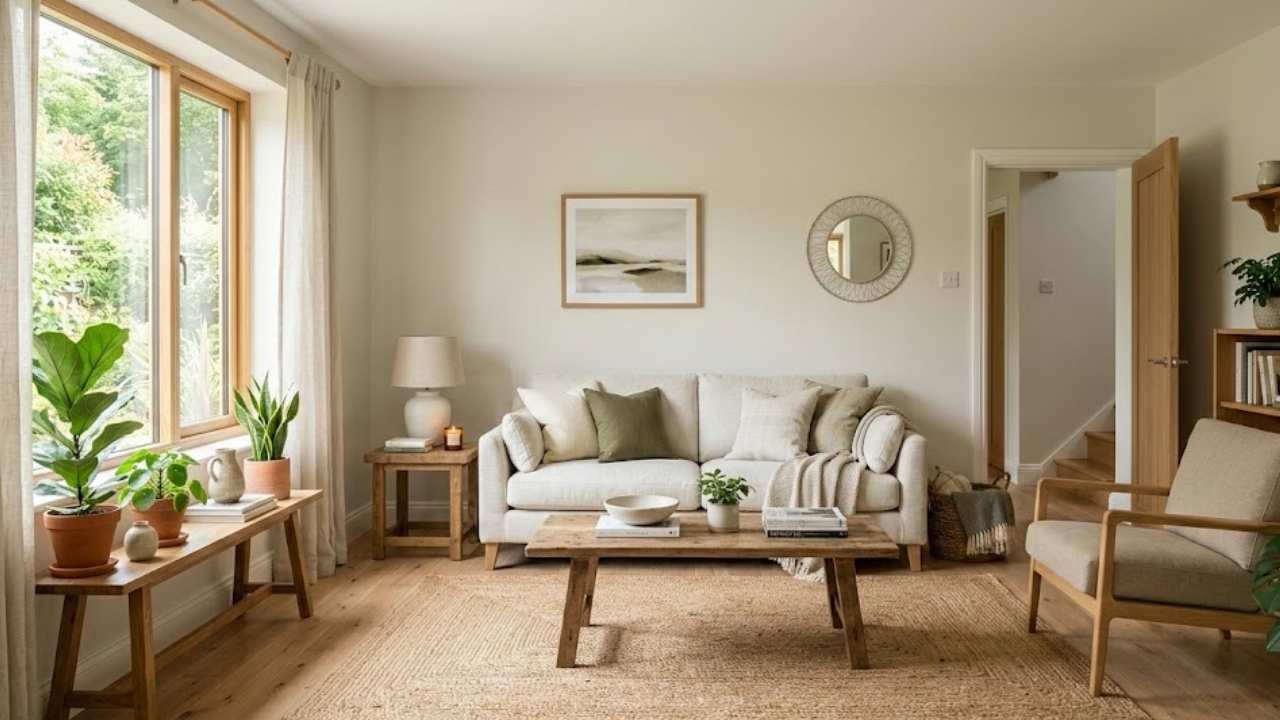
Pale Oak in a living room creates a sophisticated, calm backdrop.
It’s light that doesn’t overwhelm the space but it has presence to feel intentional.
I love it in living rooms that get decent natural light because it glows.
The color makes the space feel large and open, which is great if you’re working with a small living room or one with low ceilings.
Where Pale Oak shines is in modern or transitional living rooms.
If you’ve clean lines, minimal decor and some contemporary furniture, this color WORKS.
It’s not trying to compete with your design, it’s supporting it.
Pair it with white trim, some navy or charcoal accents and a jute rug and some warm wood coffee table, and you’ve got an effortlessly chic vibe.
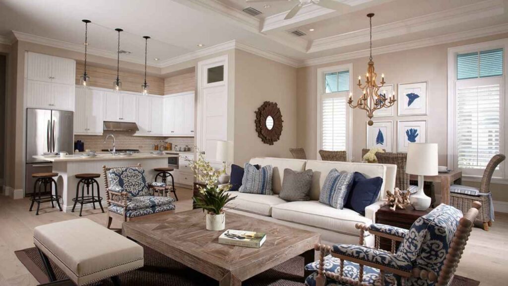
Accessible Beige in a living room feels different, warm, cozy and traditional.
This is the color for a living room where you LIVE.
Where you want to curl up on the couch with a book and a blanket.
It works beautifully in living rooms with warm wood floors, especially oak.
The color harmonizes with the golden-toned wood in a way that feels so natural.
I think Accessible Beige is perfect for farmhouse or transitional style living rooms.
It has that comfortable, approachable quality.
If you’ve a south-facing living room with good light, this color gets so rich and warm in the afternoon, it’s beautiful.
If your living room is small or doesn’t get light, Accessible Beige can make it feel closed in.
The low LRV means it’s not reflecting as much light, so the space feels smaller than it is.
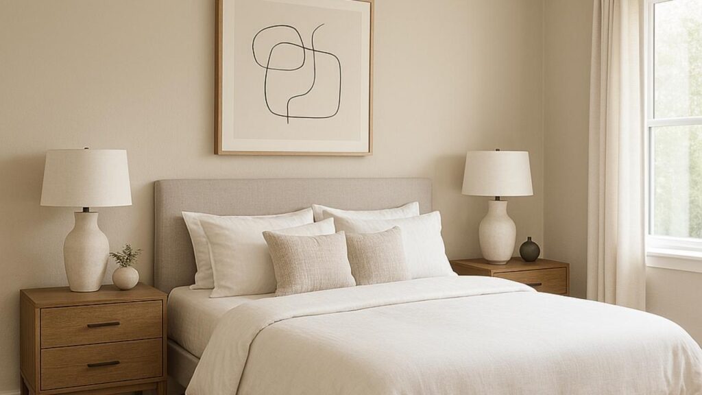
Bedroom
Pale Oak in the bedroom is sleeping in a cloud. It’s soft and serene.
The light quality of the color makes the room feel airy and open, which is great if you want your bedroom to feel like a peaceful retreat.
I used it in a guest bedroom and people always comment on how calming the space feels.
It works with any bedding style like white linens look bright and fresh against it, colored or patterned bedding comes without being overwhelming.
The warmth is subtle so that it doesn’t feel heavy or sleepy, but it’s inviting.
One thing I’ve noticed is that Pale Oak in bedrooms with east-facing windows can show the pink undertones in the hours.
Some people love the soft blush quality, others hate it.
Accessible Beige creates a different bedroom vibe like cozy, warm, wrapped-up feeling.
This is the color for people who want their bedroom to feel like a sanctuary that’s also comfortable and lived-in.
It’s not as ethereal as Pale Oak, but it’s grounding.
I think it’s good in master bedrooms where you want the rich, sophisticated warmth.
Pair it with white or cream bedding, some warm wood furniture and some texture through a chunky knit throw or linen curtains, it all comes together beautifully.
The key is making sure your bedroom gets decent light.
Accessible Beige in a dark bedroom can feel a bit too heavy and closed-in for something that’s supposed to be restful.
Bathroom
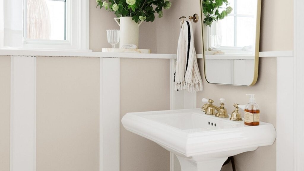
Bathrooms are tricky because the lighting is artificial and there’s a lot of white like in the tub, toilet, sink and tile that affects how you perceive wall color.
Pale Oak in a bathroom stays consistent because that high LRV keeps it bright even with just artificial lighting.
It’s a great choice for bathrooms without windows or with minimal natural light.
The color feels clean and fresh without being harsh white, and it plays nicely with white fixtures.
I’ve used it in bathrooms with white subway tile and it creates a classic, timeless look.
It also works well with marble or light gray tile, the subtle warmth keeps it from feeling too cold.
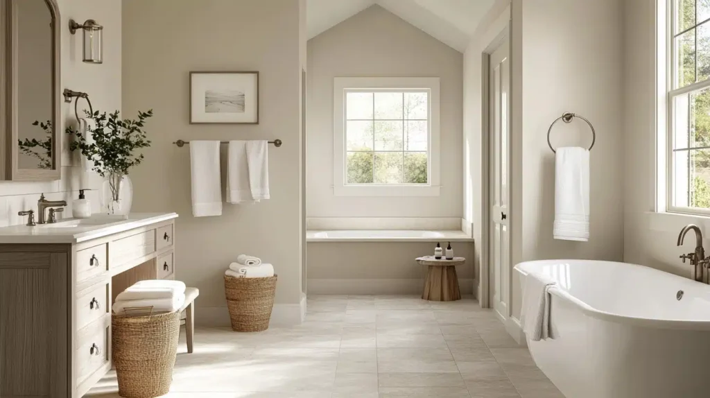
Accessible Beige in a bathroom can be stunning if you have warm-toned finishes.
Like wood vanity, travertine tile and warm brass or gold fixtures.
The color creates calm , earthy vibe that feels luxurious.
Where it doesn’t work as well is in bathrooms with cool gray tile or cool-toned marble.
The green undertone can come out and the whole thing feels off.
Also, if your bathroom is small and doesn’t have a window, Accessible Beige makes it feel small.
The lower LRV doesn’t reflect light to keep a tight space feeling open.
Kitchen
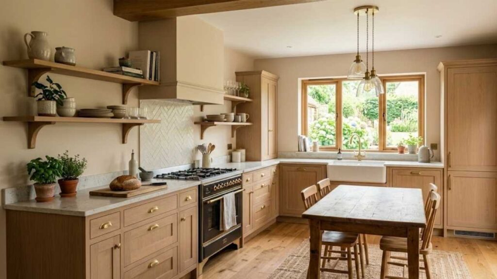
Kitchens are the most complex room to choose paint for because there are SO many other finishes like cabinets, countertops, backsplash, flooring.
Everything affects how the wall color looks.
Pale Oak in the kitchen feels fresh and clean.
It works well in kitchens with white or light-colored cabinets because it provides contrast to define the space without being too harsh.
I love it with white subway tile, marble countertops, and stainless steel appliances, it is classic and clean.
It’s also great in small kitchens because the high LRV keeps things feeling open.
If you’ve limited natural light, Pale Oak is definitely the safe choice between these two.
Accessible Beige in a kitchen, is where I have mixed feelings based on my own experience.
In the right kitchen, it looks GORGEOUS, with warm wood cabinets, wood floors, warm-toned granite or quartz counters, warm brass hardware, it all comes together.
The color feels cozy and inviting, which is great for a kitchen.
But if you have white cabinets and cool-toned countertops, Accessible Beige can look muddy or show the green undertone.
This is what happened in my kitchen and why I ended up repainting.
The color didn’t play well with the cool finishes I had.
Pale Oak Vs Accessible Beige Vs Other Colors
So when you start looking at neutrals, you end up comparing different colors because they all look a bit different and the slight difference matters.
Let me break down how Pale Oak Vs Accessible Beige look against some other popular neutrals so you don’t get confused.
Pale Oak Vs Accessible Beige Vs Agreeable Gray
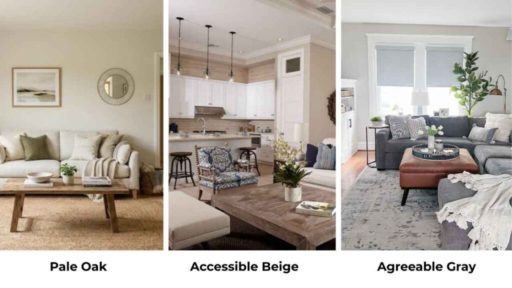
Agreeable Gray (SW 7029) is Sherwin Williams’ most popular neutral.
It has an LRV of 60, so it is right between Pale Oak and Accessible Beige in terms of lightness.
The difference is that Agreeable Gray has more gray in it.
It’s a warm gray but GRAY is the dominant player.
Pale Oak and Accessible Beige are more in the beige and Pale Oak is gray beige, Accessible Beige is gray-influenced beige, but they’re all beige.
If you put all three on the wall, Agreeable Gray is the coolest.
It doesn’t have the golden-beige warmth which Accessible Beige has, and it’s not as soft and refined as Pale Oak.
I think Agreeable Gray works best in modern spaces with cool finishes.
Pale Oak is versatile in many styles, and Accessible Beige is more into traditional and farmhouse.
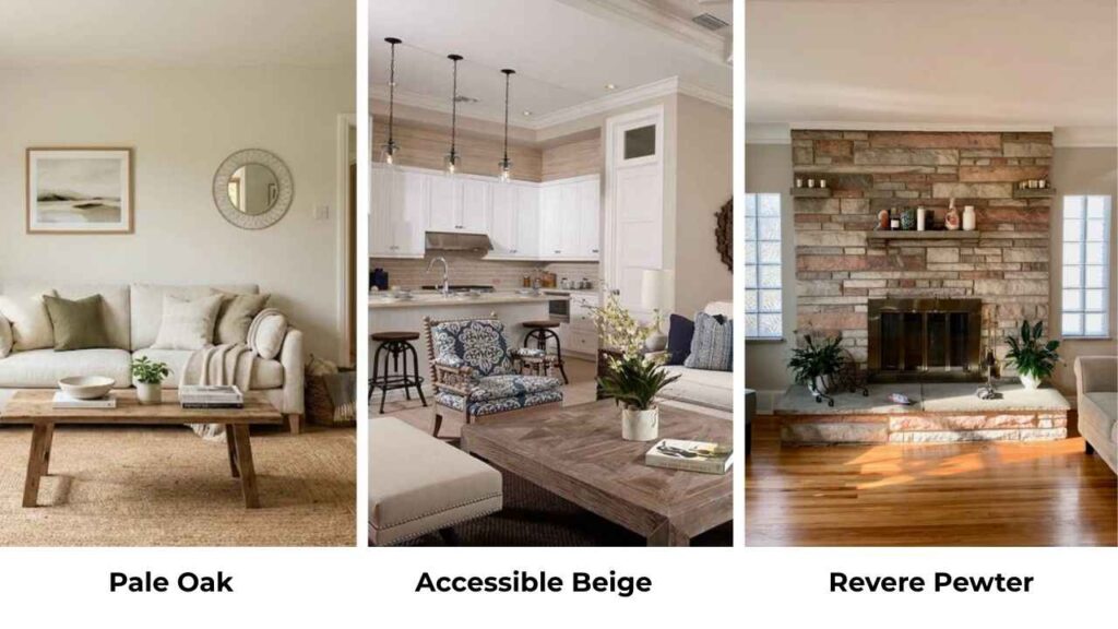
Revere Pewter Vs Accessible Beige
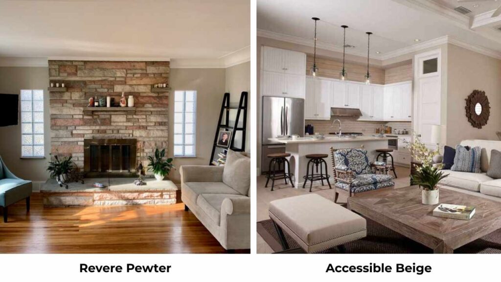
Revere Pewter Benjamin Moore HC-172 is the classic greige.
It has an LRV of 55, so it’s darker than Accessible Beige.
Revere Pewter is cool and can look green in natural light but more than Accessible Beige.
It also has more gray influence, so it looks like a true greige rather than a warm beige with gray.
Between these two, I’d say Accessible Beige is warm and approachable.
Revere Pewter is sophisticated and architectural, but it’s also tough to work with.
The green undertone can be STRONG depending on your lighting.
If you have warm wood and warm finishes, Accessible Beige is the safe one.
If you have cool and more contemporary finishes, Revere Pewter may work better.
Accessible Beige Vs Edgecomb Gray
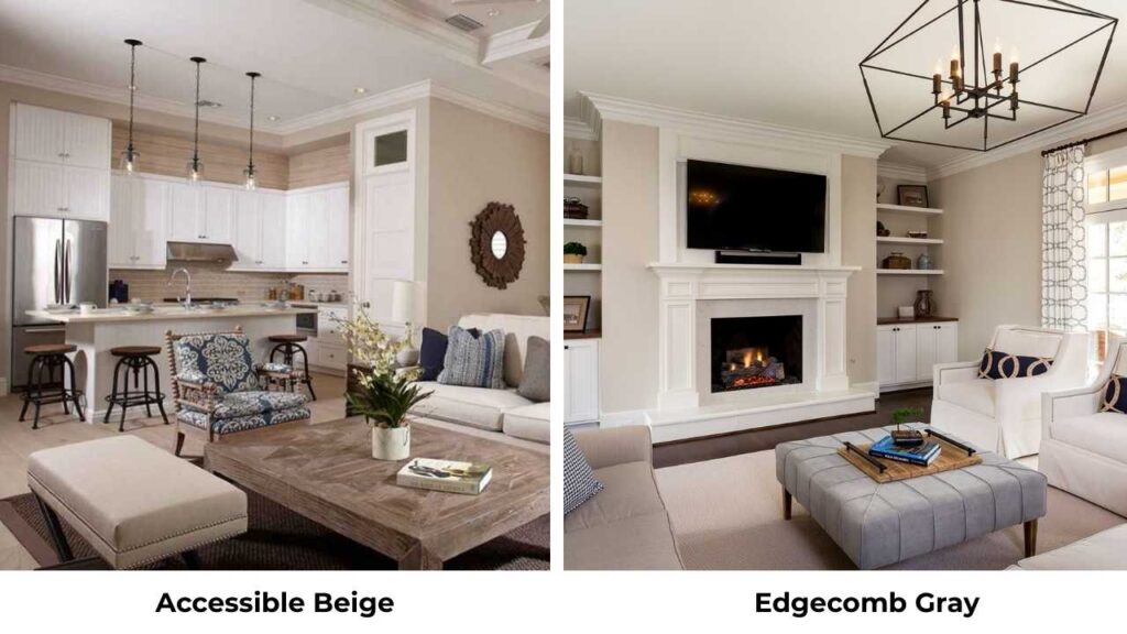
Edgecomb Gray Benjamin Moore HC-173 has an LRV of 63.09, so it’s visibly lighter than Accessible Beige.
It’s also cooler and it’s a greige-taupe that is in a cool zone.
Edgecomb Gray is flexible with different finishes because it’s less warm.
It won’t fight with cool grays the way Accessible Beige might, and it also works with warm woods.
The vibe is different too, Edgecomb Gray feels more refined and subtle, while Accessible Beige feels cozy and grounded.
Pale Oak Vs Shoji White
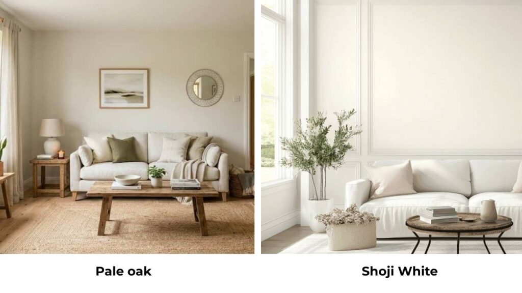
Shoji White SW 7042 is lighter than Pale Oak, it’s in the off-white category with an LRV around 73-74.
Shoji White is warm and more creamy than Pale Oak.
It doesn’t have the cool gray tones or the potential pink undertonesbut it’s a soft, warm off-white.
If you want something light and brighter than Pale Oak but has warmth, Shoji White is a good option.
But it looks more as an off-white, not a greige.
Pale Oak Vs Natural Linen
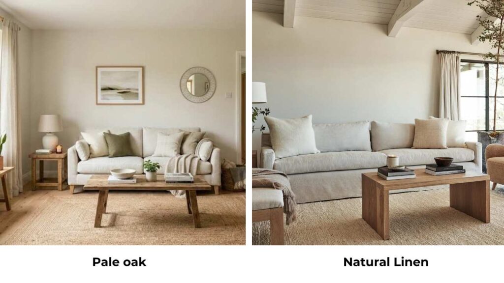
Natural Linen Benjamin Moore 966 is similar in lightness to Pale Oak but it’s warm and more beige.
It doesn’t have the gray influence that makes Pale Oak a greige.
Natural Linen has a soft and traditional vibe.
It’s a beautiful warm neutral but it’s not as versatile as Pale Oak.
Pale Oak works in many design styles because of the gray touch.
Here’s a comparison table:
| Color | LRV | Undertones | Warmth Level | Best For |
| Pale Oak | 70 | Beige, pink/violet | Subtle warm | Modern, transitional, small spaces |
| Accessible Beige | 58 | Gray, green | Warm | Traditional, farmhouse, warm finishes |
| Agreeable Gray | 60 | Warm gray | Moderate | Modern, versatile neutral |
| Revere Pewter | 55 | Gray-green | Cool-moderate | Sophisticated, architectural |
| Edgecomb Gray | 63 | Greige-taupe | Cool-moderate | Flexible, refined |
| Shoji White | 73-74 | Cream | Very warm | Soft off-white alternative |
| Natural Linen | ~70 | Warm beige | Warm | Traditional, beige lovers |
Which One to Choose Between Pale Oak Vs Accessible Beige?
So, which one should you pick, so here’s how I think about it:
Choose Pale Oak if:
- You want a LIGHT neutral that keeps spaces feeling open and airy
- Your room has limited natural light
- You prefer a subtle, refined warmth
- Your style is modern, minimalist, or transitional
- You want a home neutral that flows through open spaces without being too heavy
- You have a small room or low ceilings
- You like potential pink undertones in some lighting
Choose Accessible Beige if:
- You want DEPTH and richness in your neutral
- Your room gets good natural light, especially warm southern light
- You prefer a cozy,, more grounded feeling
- Your home has warm wood floors, warm finishes, or traditional elements
- You’re painting a large room that can handle a darker color
- Your style leans farmhouse, traditional, or transitional
- You’re considering exterior paint
- You’re okay with potential green undertones and you’re prepared to test it thoroughly
My honest opinion on this while choosing one is here:
I think Pale Oak is the safe, versatile choice for MOST people.
It’s light and it works in more lighting situations, and the pink undertones is less problematic than Accessible Beige’s green undertones.
Bt, if you have a home with warm wood and warm finishes and good lighting, Accessible Beige can be stunning.
It requires more consideration and testing.
The big mistake you can make is choosing based on a paint swatches but according to me you should get samples or paint big boards and move them around.
Live with them for a few days.
See them in morning light, afternoon light, evening light with your lamps on for the decision.
Conclusion
The Pale Oak Vs Accessible Beige decision isn’t as tough as it seems once you understand what these colors do.
They’re both beautiful warm neutrals in the greige category, but they create completely different atmospheres and they behave differently depending on your lighting and finishes.
Pale Oak is the light, airy, sophisticated one with the higher LRV at 70, subtle warmth, works in low light, potential pink undertones.
Accessible Beige is the rich, cozy, grounded one with the lower LRV at 58, has warmth, needs good lighting, potential green undertones.
The truth is there’s no better color is better than the other.
It’s about what YOUR space needs, what YOUR lighting situation is, what YOUR existing finishes are, and what vibe YOU want to create.
Test your samples and considering before going between Pale Oak Vs Accessible Beige.
FAQs On Pale Oak Vs Accessible Beige
No, they’re too similar in tone to create intentional contrast, but they’re different that using them together looks like a mistake rather than a design choice. If you used Accessible Beige in one room and Pale Oak in an adjacent room, it would look like you couldn’t decide. They’re both warm greiges, so they’d compete rather than complement.
There are many options depending on what qualities you want to keep. Aesthetic White (SW 7035) is light with an LRV of 73 and stays in a similar warm neutral zone. Natural Tan has an LRV of 65 and is light but more colorful with green inclinations. If you want something from Benjamin Moore to compare, Edgecomb Gray has an LRV of 63 and is light and cool.
Don’t use Accessible Beige in north-facing rooms with limited light because it will look muddy and flat and the green undertone will show up. Don’t use it with cool gray finishes, cool marble, or cool-toned tile because the undertones will fight and nothing will look cohesive. Don’t use it in small, dark spaces because the low LRV will make the room feel small and closed in.
Don’t use Pale Oak if you want a rich, cozy depth in your color, it’s too light for that. Don’t use it in bright rooms where you need color saturation because it can wash out and feel subtle. Be careful while using it in rooms with a lot of pink or mauve finishes because the pink undertones can get amplified.
Pale Oak Vs Accessible Beige: Best Rooms, Lighting, and Design Styles