So you’re stuck between Edgecomb Gray by Benjamin Moore and Accessible Beige by Sherwin Williams.
These two are the most talked-about warm neutral paint colors.
They look identical in the small paint swatches. But what looks similar on your screen can look different once it’s on your walls and it is completely different.
Edgecomb Gray Vs Accessible Beige is a comparison that matters.
Both of these colors are popular for good reason.
They’re warm, they’re versatile, and they work with every design style like modern farmhouse, traditional, transitional, every design.
But picking the wrong one can make your north-facing bedroom look like a sad, gray cave. It can make your beautiful oak floors look orange.
So, I’m walking you through everything about Edgecomb Gray Vs Accessible Beige.
The differences, how they look in rooms with lighting, which one works where. The undertones you need to look at.
Here are my other blogs that you can also read:
- Liveable Green Vs Softened Green
- Origami White Vs Shoji White
- Snowbound Vs White Dove
- Sherwin Williams Iron Ore Vs Tricorn Black
- Eider White Vs Repose Gray
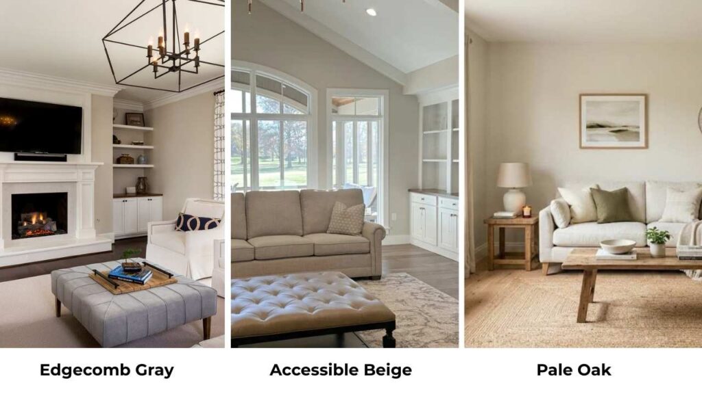
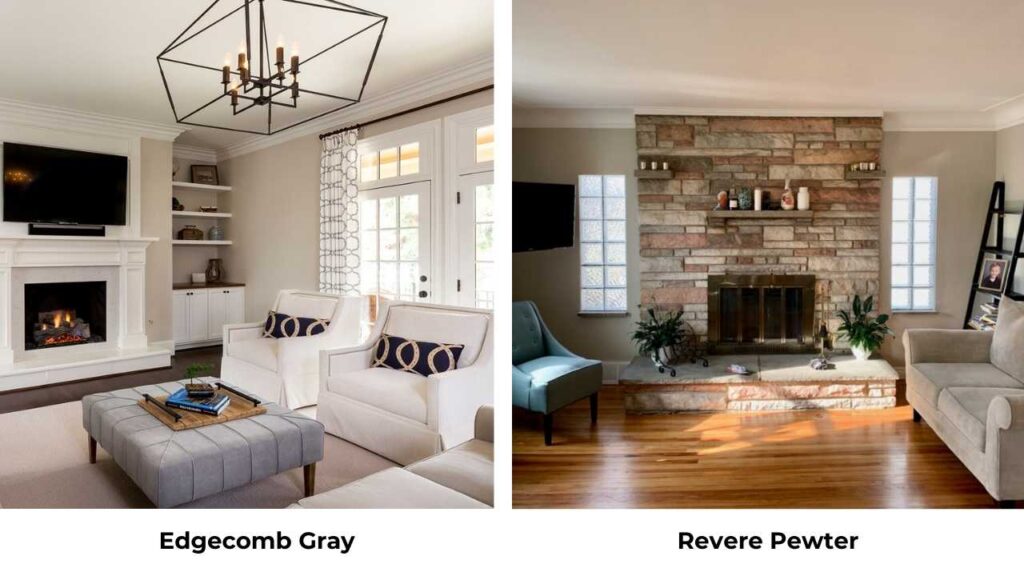
What You Need To Know About Edgecomb Gray (HC-173)
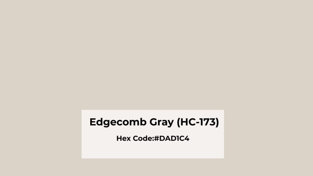
Edgecomb Gray by Benjamin Moore is classified as a warm greige that is more beige than gray.
The HC-173 code means it’s part of the Historical Collection, which makes it feel fancier.
What I love about this color is how soft it is. It has a light, airy thing on which it makes rooms feel big without that cold vibe you get from gray.
The LRV is 63, which means it reflects a good amount of light back into the room.
When you put Edgecomb Gray on the wall, it creates a calm, neutral backdrop that doesn’t fight with your furniture or decor and iIt works.
The living room is perfect. It gives you warmth to feel inviting but stays neutral that you can change your pillows, art, and accessories without clashing.
Bedrooms get a serene, restful quality with Edgecomb Gray.
Bathrooms are interesting with this color. If you have good natural light and white fixtures, Edgecomb Gray makes the space feel spa-like. But it can fall a bit flat.
The reason this color became a whole-house favorite is because it’s forgiving.
Different lighting throughout your home then Edgecomb Gray adapts better than many neutrals.
In the open floor plan where you can see multiple rooms, it maintains consistency without looking boring.
What You Need To Know About Accessible Beige (SW 7036)
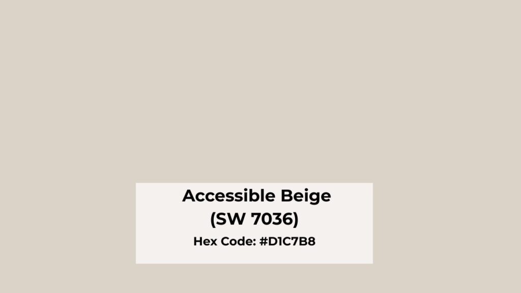
Now Accessible Beige is different. This is Sherwin Williams’ take on warm greige, but where Edgecomb Gray leans gray first, Accessible Beige is definitely beige-forward.
It’s one of their best-selling colors, and I see it everywhere.
The name is perfect. It’s accessible, most people feel comfortable with how warm and grounded it is.
With an LRV of 58, it’s deeper than Edgecomb Gray.
It may not sound like a big difference but you’ll see it on the wall.
Accessible Beige has richness and depth. It feels cozy.
This color has a moderate, grounded quality that makes rooms feel lived in.
It’s not trying to be airy or light. It’s warm, it’s enveloping, and it makes spaces feel finished and intentional.
Living rooms with Accessible Beige feel inviting.
If you have a family room where people hang out, this color makes it feel like a space you want to sink into.
Bedrooms get cozy with Accessible Beige. It can become too cozy if you’re someone who likes bright, fresh mornings.
But for people who want the warm, wrapped-up feeling then it’s good.
Bathrooms with this color feel warm and traditional.
If you’re going for the classic look with warm wood vanities and oil-rubbed bronze fixtures, Accessible Beige is what you should consider.
Kitchens are where Accessible Beige shines, especially if you have white or cream cabinets.
It adds warmth without going against your cabinetry.
And here’s something Edgecomb Gray doesn’t do, exterior applications.
Accessible Beige works well on home exteriors. It has depth to look clear outside, and it pairs well with white trim and dark shutters.
Edgecomb Gray Vs Accessible Beige: Key Differences, Undertones, and Uses
Okay, so Edgecomb Gray Vs Accessible Beige both colors are warm greiges.
Both are popular. Both work in multiple rooms. So why to think which one to go for because the differences are subtle until they’re not.
LRV
Light Reflectance Value is the most important number you need to understand when comparing these two. Edgecomb Gray is at 63. Accessible Beige is at 58.
The 5-point difference means Edgecomb Gray reflects more light back into your room.
In a small bedroom or a hallway without windows, that difference between feeling cramped from feeling spacious can come to the 5 LRV points.
Accessible Beige, being dark, can make a small room feel small if you’re not careful.
But in a large, open space with light, the depth is what keeps the room from feeling washed out.
Undertones
Edgecomb Gray has a warm gray base with beige undertones.
It depends on your lighting and surroundings like you may catch a slight green undertone.
It’s not obvious, but it’s there in some conditions.
The undertones stay clean and neutral. Accessible Beige has warm beige undertones and has gray mixed in secondarily.
In some lighting, you can see a mild green cast, but it’s subtle.
What you won’t see is pink or purple, which is a relief because the undertones can be sometimes out of place.
Lighting Effect
Edgecomb Gray in north-facing light maintains its softness without going cold.
North-facing rooms get the cool, indirect light that can make colors look sad and muddy.
Edgecomb Gray holds up well. In south-facing light, it looks gorgeous, bright, warm, and balanced.
Accessible Beige in north-facing light can get a flat and appear gray.
But you lose some of the cozy warmth you picked it for in the first place.
South-facing rooms bring the best beige warmth in Accessible Beige.
But low light makes it deepen and feel heavy. In a dark hallway or a room with only artificial light, Accessible Beige can feel closed in.
Both colors respond to artificial lighting. Warm bulbs enhance Accessible Beige’s beige qualities.
Edgecomb Gray stays neutral with both warm and cool artificial lighting.
Warmth
Accessible Beige is warm. It’s creamy, rich and enveloping. If you want your space to feel cozy and grounded, this is your color.
Edgecomb Gray is soft and refined. It has warmth, but it’s gentle, subtle. It creates warmth with its beige undertones without being warm.
When you put samples side by side, Accessible Beige looks deep and creamy. Edgecomb Gray looks bright and airy.
Styling and Best Uses
White trim is non-negotiable with both colors. For Edgecomb Gray, I pair it with Benjamin Moore White Dove or Simply White.
Both have warm undertones that complement the greige. Chantilly Lace works if you want a bright contrast.
Accessible Beige pairs best with Sherwin Williams Alabaster or Pure White.
Avoid cool whites with Accessible Beige, they’ll make your walls look muddy and sad.
Furniture and accent colors work differently with each.
Edgecomb Gray is flexible. You can go modern with cool metals and glass. You can go traditional with warm woods. You can mix both.
Accessible Beige wants warm wood tones, beige or cream upholstery, and traditional or transitional styling.
You can do modern with it, but it takes effort.
| Feature | Edgecomb Gray | Accessible Beige |
| LRV | 63 (light, bright) | 58 (deep, rich) |
| Primary Lean | Gray with beige undertones | Beige with gray undertones |
| Warmth Level | Soft, subtle warmth | Cozy, pronounced warmth |
| North-Facing Rooms | Maintains softness | Can appear flat and grayer |
| South-Facing Rooms | Bright and balanced | Warm and inviting |
| Small Spaces | Makes rooms feel large | Can feel heavy |
| Best Style | Transitional, modern, versatile | Traditional, casual, cozy |
| Trim Pairing | White Dove, Simply White | Alabaster, Pure White |
| Flooring Match | Light to medium woods, neutral stone | Warm woods, beige/warm tile |
How Do These Colors Look In Different Rooms? Edgecomb Gray Vs Accessible Beige
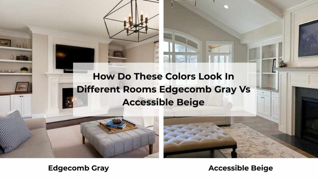
Room selection matters more than people think.
A color that’s perfect in your living room can be wrong in your bathroom. So, let me walk you through this.
Living Room
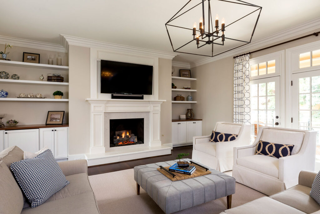
Edgecomb Gray in a living room creates a light, open feeling that makes the space feel big.
If your living room is part of an open concept, Edgecomb Gray maintains a consistent, clean look throughout.
It works well with both warm and cool accent colors.
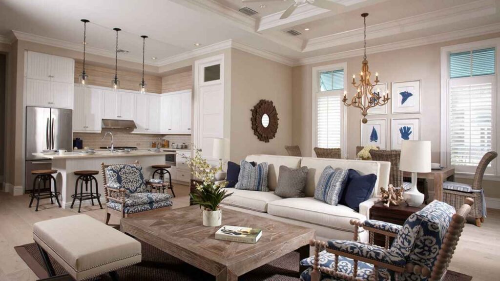
Accessible Beige makes a living room feel finished and cozy. You know the rooms that feel done and comfortable are Accessible Beige.
If you have warm wood floors, a fireplace, traditional furniture, Accessible Beige brings everything together.
It feels welcoming without trying too hard. But in a small living room with limited light, it can start to feel heavy.
Bedroom
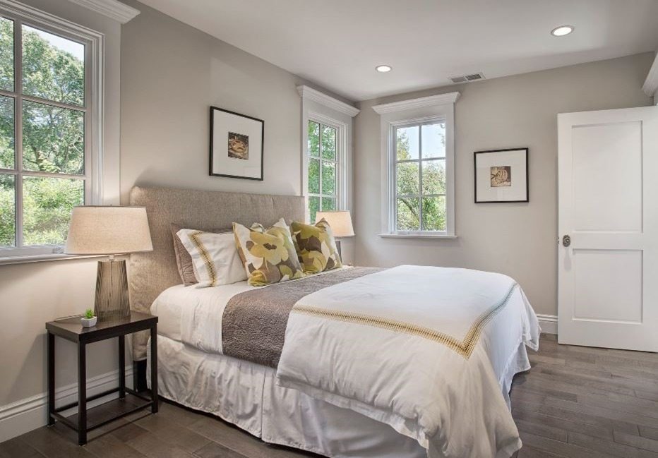
Edgecomb Gray creates a serene, spa-like bedroom. It’s calming without being cold.
If you like waking up to bright, fresh mornings, this is your color.
It pairs beautifully with white bedding, light wood furniture, and any accent color you’re into.
The room stays feeling open and restful. I used it in my bedroom, and I’m happy with it.
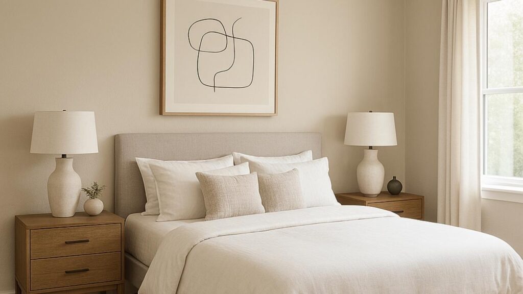
Accessible Beige makes bedrooms feel like a cozy retreat.
If you’re someone who wants your bedroom to feel like you’re being wrapped in a warm.
It’s nice in bedrooms with warm wood furniture and traditional styling.
Layer in cream and ivory bedding, some warm metallics, and it creates a hotel-suite feeling.
Bathroom
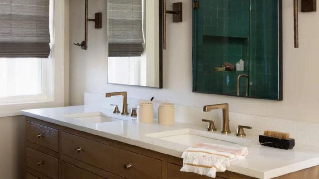
Bathrooms are tricky because lighting is terrible and you’re looking at yourself in a mirror.
Edgecomb Gray in a bathroom with good natural light and white fixtures feels clean and spa-like.
It’s fresh without being harsh. If you have marble or white quartz countertops, chrome or brushed nickel fixtures, and decent lighting, Edgecomb Gray is what you should go for.
But in a windowless powder room, it can fall flat.
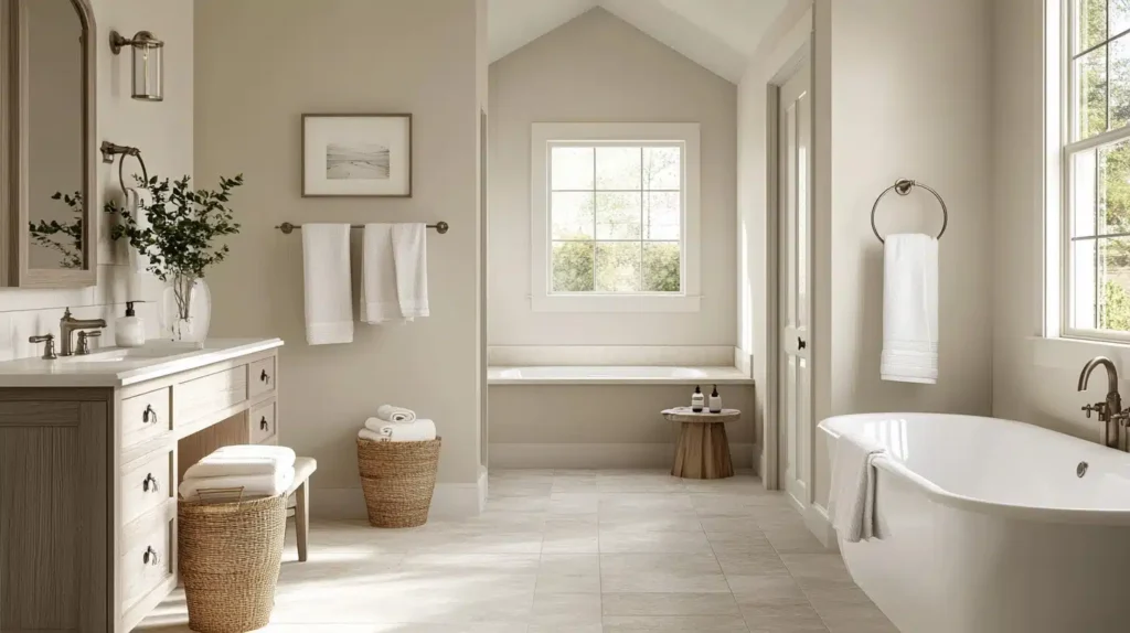
Accessible Beige warms up a bathroom. If you have warm wood vanities, bronze fixtures, or beige/cream tile, Accessible Beige ties everything together beautifully.
It feels traditional and classic in a bathroom.
The downside is it can make a small bathroom feel small. And if your lighting is warm-toned, everything can start to look too yellow.
Kitchen
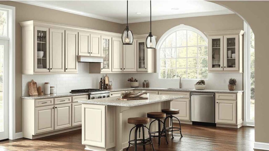
Kitchens are interesting because you have other finishes competing like cabinets, countertops, backsplash, flooring. Your wall color needs to play nice with all of them.
Edgecomb Gray is fantastic in kitchens with white or light-colored cabinets.
It adds warmth and background color without competing with your cabinetry.
If you have marble or quartz countertops like white, gray, or neutral tones, stainless appliances, and modern styling, Edgecomb Gray keeps everything feeling cohesive and intentional.
It also works well if your kitchen is part of an open concept where you can see the living and dining areas.
Accessible Beige is your better choice if you have warm elements in your kitchen.
If the cream or off-white cabinets, warm granite countertops, wood floors then Accessible Beige brings warmth without making things look orange or yellow.
It creates a more traditional kitchen feel.
Exterior
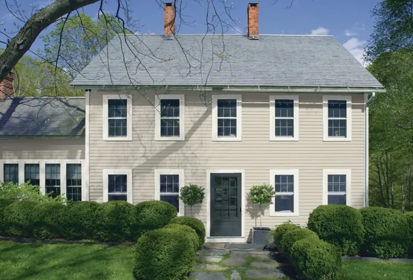
Edgecomb Gray can work on exteriors, but it’s not my first choice.
At LRV 63, it can look washed out on a large exterior surface, mainly in bright sunlight.
If you’re set on it, make sure you have strong contrast with your trim and dark accents.
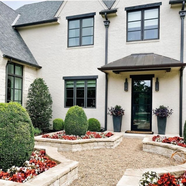
Accessible Beige is beautiful on exteriors. The LRV of 58 gives it depth to look clearly as a distinct color rather than “light beige.”
It pairs well with white trim, dark shutters, and a variety of roof colors.
It works on traditional homes, craftsman styles, and even some modern farmhouse exteriors.
I’ve seen it on many homes in my area, and it always looks warm and welcoming without being boring.
Edgecomb Gray Vs Accessible Beige Vs Other Colors
Because you’re also considering other colors. Nobody picks between two options anymore.
Let me help you through the most common comparisons.
Edgecomb Gray Vs Accessible Beige Vs Agreeable Gray
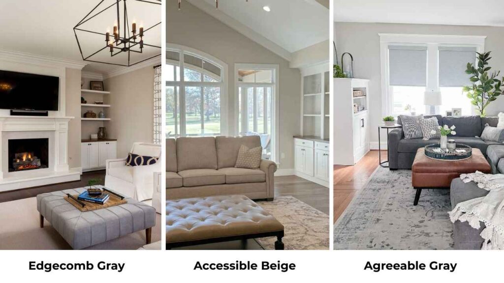
Agreeable Gray is Sherwin Williams’ mega-popular greige with an LRV of 60.
Agreeable Gray is cooler than both Edgecomb Gray and Accessible Beige.
It has subtle violet undertones that make it better for north-facing rooms where Edgecomb Gray can struggle.
But the coolness can feel less inviting. If warmth is your priority, stick with Edgecomb Gray or Accessible Beige.
Agreeable Gray is adaptable to cool-toned decor. The other two want warm or neutral tones.
Edgecomb Gray Vs Pale Oak
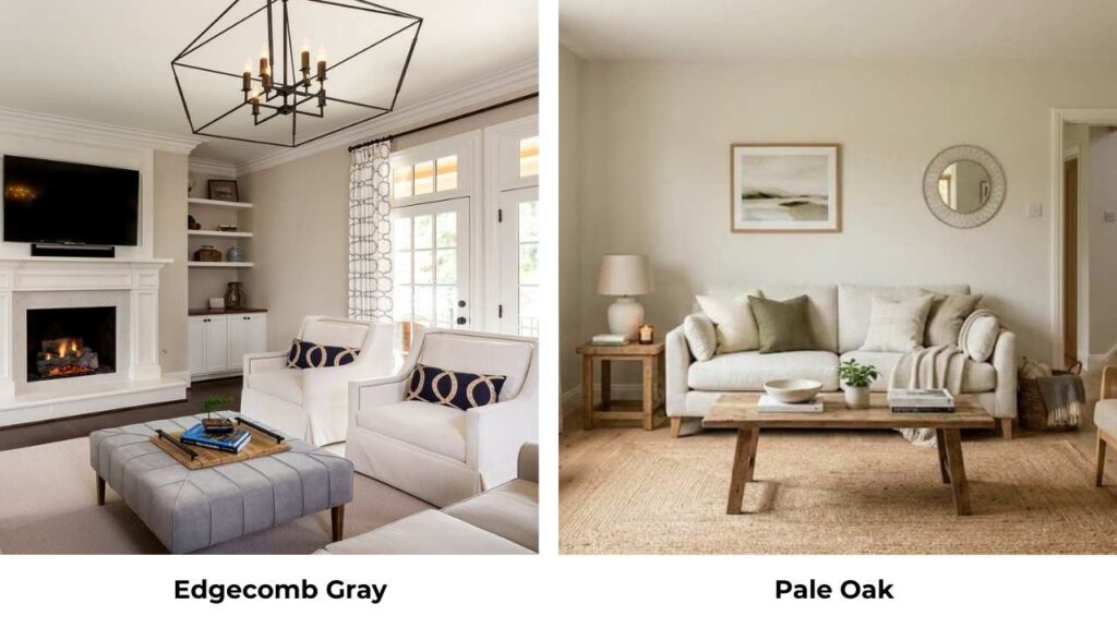
Pale Oak is another Benjamin Moore greige OC-20 with an LRV around 69, so it’s lighter than Edgecomb Gray.
Pale Oak leans more toward the soft, barely-there greige. It’s airy and light. If Edgecomb Gray feels too heavy, then try Pale Oak.
Pale Oak is neutral-cool, while Edgecomb Gray maintains that beige warmth.
Edgecomb Gray Vs Revere Pewter
Revere Pewter HC-172 is on the same Benjamin Moore paint strip as Edgecomb Gray, one shade dark.
It has an LRV of 55, so it’s deeper. Revere Pewter looks as a true greige, equal parts gray and beige. It’s moody and more grounded than Edgecomb Gray.
If Edgecomb Gray feels too light for your space, Revere Pewter is your next step.
They’re in the same color family, so they pair well together.
Accessible Beige Vs Revere Pewter
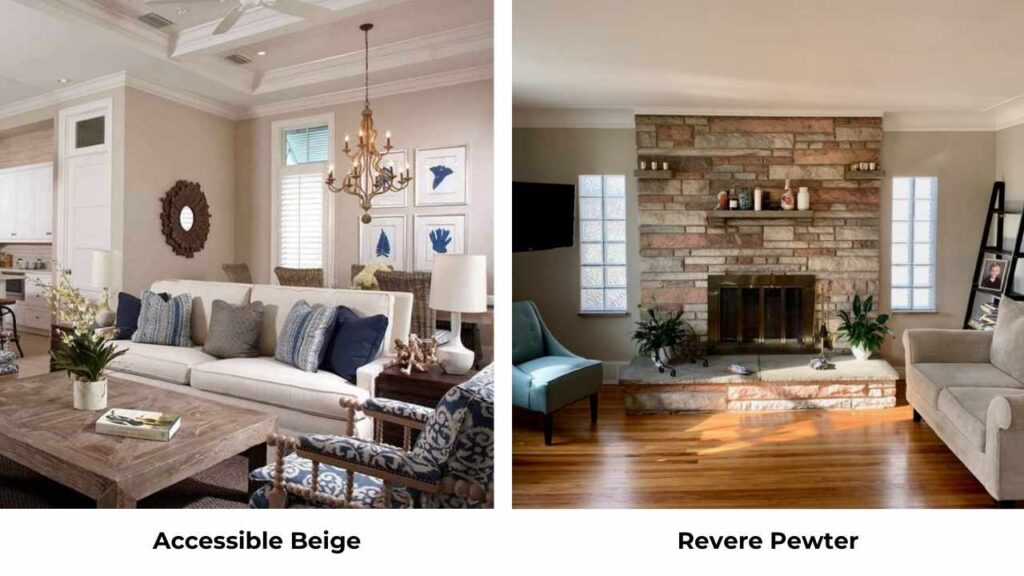
This is an interesting comparison because they’re from different brands but similar in depth.
Revere Pewter LRV 55 is darker than Accessible Beige LRV 58 and looks more gray. Accessible Beige is warmer.
If you want the depth of Revere Pewter but need warmth, Accessible Beige is what you should consider.
If you want something more neutral and sophisticated, Revere Pewter is what you should consider.
Accessible Beige Vs Natural Tan
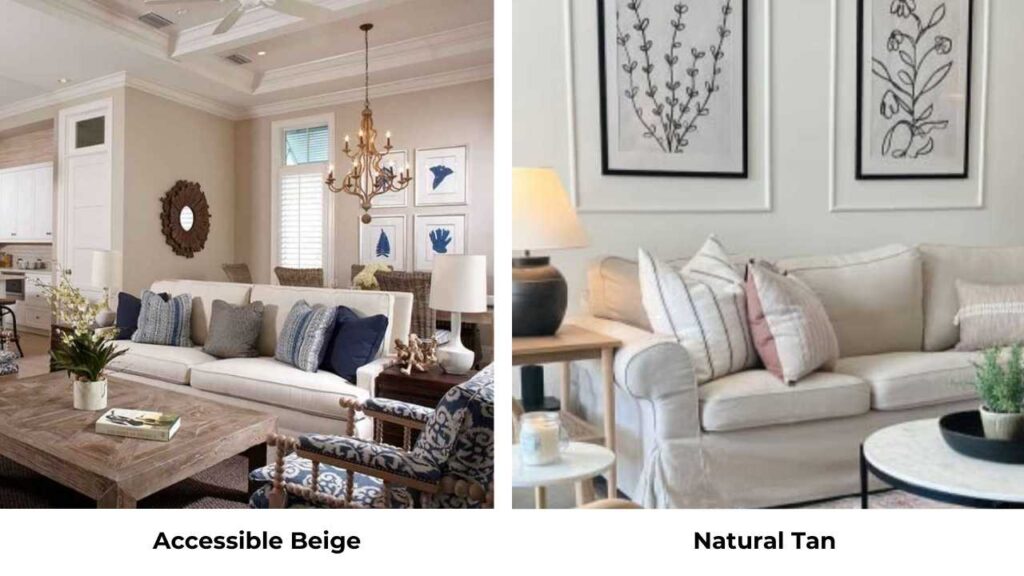
Natural Tan SW 7567 is warmer and more beige than Accessible Beige. It has less gray, so it looks like a truer beige.
If Accessible Beige feels too gray for you, Natural Tan can be better.
But you lose some of the modern greige quality. Natural Tan can start to feel outdated depending on your decor.
| Comparison | Key Difference | Choose This If… |
| Agreeable Gray vs Edgecomb Gray | AG is cooler with violet undertones | You need something for north-facing rooms |
| Pale Oak vs Edgecomb Gray | PO is lighter and more neutral | Edgecomb Gray feels too heavy |
| Revere Pewter vs Edgecomb Gray | RP is darker and moodier | You want more depth and true greige |
| Revere Pewter vs Accessible Beige | RP is grayer and more sophisticated | You want warmth with a grounded feel |
| Natural Tan vs Accessible Beige | NT is warmer, truer beige | Accessible Beige feels too gray |
Edgecomb Gray Coordinating Colors
If you’re going with Edgecomb Gray, here are the colors that pair beautifully with it.
Simply White or White Dove for trim, both have warm undertones that complement rather than fight with Edgecomb Gray.
Revere Pewter as an accent wall or for adjacent rooms.
They’re on the same paint strip, so they’re designed to work together.
Hale Navy for a dramatic accent. The deep navy plays well against the soft greige.
Kendall Charcoal if you want a dark neutral for built-ins or an accent wall.
For light coordinating colors, October Mist is a beautiful soft green that pairs well.
Pale Oak works if you want a lighter greige in adjacent spaces.
Accessible Beige Coordinating Colors
Accessible Beige pairs best with colors that enhances its warmth.
Alabaster or Pure White for trim. Both are warm whites that won’t make Accessible Beige look muddy.
Aesthetic White is another Sherwin Williams option that works well with Accessible Beige.
For deep coordinating colors, Urbane Bronze creates a stunning contrast.
It’s a deep, warm brown-gray that feels sophisticated next to Accessible Beige.
Anonymous SW 7046 is a gorgeous greige that’s darker than Accessible Beige but in the same warm family. Great for accent walls.
Kilim Beige is slightly warmer than Accessible Beige if you want variation but not contrast.
For color accents, warm tones work best like rust, terracotta, warm olive greens, deep navy with warm undertones.
Conclusion
So Edgecomb Gray Vs Accessible Beige. If you want light, airy, and versatile then go with Edgecomb Gray.
It’s the safe choice that’s not boring. It adapts, it flows, it works with everything.
It is perfect for whole-house applications and spaces where you need flexibility.
If you want warm, cozy, and grounded then go with Accessible Beige.
It’s the color that makes a house feel like a home. Perfect for living spaces where comfort is priority.
Get samples. Paint big poster boards and move them around your space. Look at them in morning light, afternoon light, evening light.
Look at them next to your floors, your furniture, your trim.
The color that makes you feel the way you want to feel in that space so choosing between Edgecom Gray Vs Accessible Beige will become easy.
FAQs On Edgecomb Gray Vs Accessible Beige
The main difference is that Edgecomb Gray is light (LRV 63) and has more gray with beige undertones, while Accessible Beige is deep (LRV 58) and has more beige with gray mixed in. Edgecomb Gray feels soft and neutral, while Accessible Beige feels warm and cozy.
Don’t use Edgecomb Gray in dark, north-facing rooms where it can appear muddy and lose its warmth. Also avoid it in small spaces with dark floors and minimal light because it can feel washed out.
They’re in the same greige family and look similar online, but they’re definitely different in person. Edgecomb Gray is light and gray-leaning, while Accessible Beige is warm and beige-forward.
Avoid Accessible Beige in small, dark rooms where the lower LRV will make the space feel small and heavy. Don’t use it in modern spaces with cool metals and harsh white because it’s too warm for that aesthetic. Also skip it in north-facing rooms where you need brightness.