So you’re staring at paint swatches thinking which black is right?”.
And I learned this when I painted a client’s front door what I thought was the perfect black.
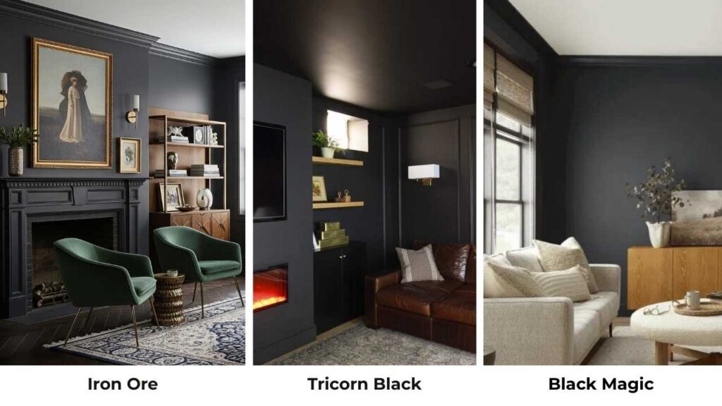
Sherwin Williams Iron Ore vs Tricorn Black, these two are the most popular “black” paint choices from Sherwin Williams, and they’re both labeled black.
But on the walls it looks different.
Iron Ore has a soft, approachable vibe while Tricorn Black is bold, true, unapologetic black.
These two colors vary in depth, undertone, and the mood they create in a space.
I’ve seen Iron Ore look greenish in bright sunlight, and I’ve watched Tricorn Black make a room feel half its size because it absorbs everything.
Knowing which black works best isn’t only about personal preference but it’s about understanding how your lighting, your trim color, and your furniture with these shades.
Here, I’m breaking down everything I’ve learned about Sherwin Williams Iron Ore Vs Tricorn Black.
We’re talking LRV, undertones, how they look in different rooms, and comparisons with other popular dark colors.
Here are my other blogs that you can also read:
- Clary Sage Vs Evergreen Fog
- Eider White Vs Alabaster
- Wythe Blue Vs Palladian Blue
- Quiet Moments Vs Sea Salt
- Pale Oak Vs Accessible Beige
Overview of Sherwin Williams Iron Ore (SW 7069)
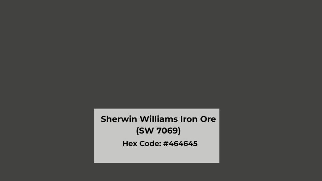
Iron Ore is what I call a soft black.
It’s a very dark charcoal that is closer to black than most grays, but it never commits.
This color has cool undertones with hints of blue and green depending on your lighting situation.
The green undertones are hidden.
You won’t always see them, but get a paint in bright natural light or on an exterior, and they show up.
It’s what makes Iron Ore feel warm and approachable instead of harsh.
The vibe is heavy and moody, but also livable.
I’ve used Iron Ore in modern spaces, transitional homes, and contemporary exteriors.
It works across the board because it has depth.
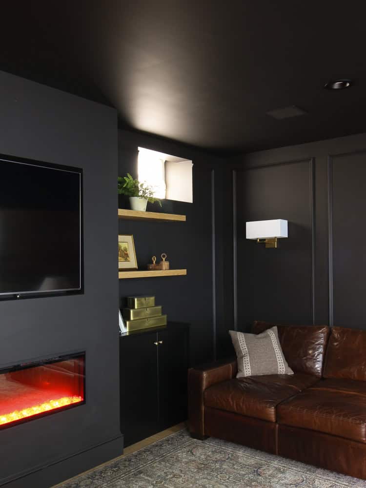
Homeowners love it for living rooms when they want a cocooning effect without feeling cave like.
Designers keep coming back to it for bedrooms because it’s restful.
And in bathrooms, if you’ve the natural light, Iron Ore makes a small bathroom feel expensive and intentional.
The LRV is 6, which means it reflects a bit more light than true blacks.
You can see the dimension in this color.
Overview of Sherwin Williams Tricorn Black (SW 6258)
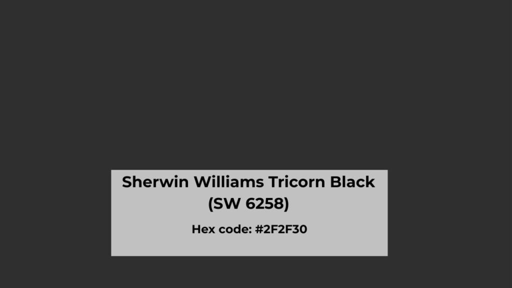
Tricorn Black is the paint color equivalent of that friend who always tells it like it is.
No softness, no visible undertones, just straight-up black.
This is what people mean when they say “true black.”
Sherwin Williams designed this to look black in any lighting condition like morning sun, evening artificial light, the overcast afternoon glow.
The undertone here is neutral, which sounds boring but it’s what makes Tricorn Black versatile.
It’s clean and bold. Some people describe it as flat-looking, and compared to Iron Ore it is flat.
Tricorn Black gives you maximum contrast and makes architectural details pop.
I see this color in modern and contemporary projects where the design is leaning into high contrast.
It’s popular for interior doors, trim work, kitchen cabinets when you want a statement.
The LRV is around 3, which is very low.
This paint absorbs light like it’s getting paid for it.
It is visually heavy, more saturated, and more dramatic than Iron Ore.
What is the Difference Between Sherwin Williams Iron Ore Vs Tricorn Black?
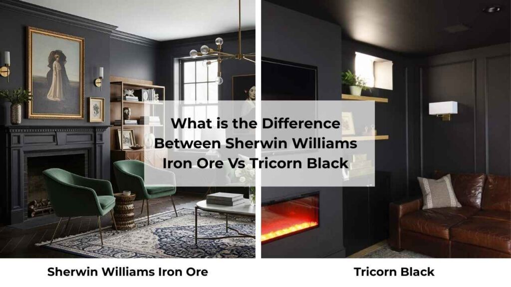
Okay, so they’re both dark, both called black, both from Sherwin Williams.
But the difference is big.
And I mean the kind that will make or break how you feel in your space.
LRV
Light Reflectance Value is the official measurement of how much light a color reflects, rated on a scale of 1-100. The lower number is darker in color.
Iron Ore has an LRV of 6, which means it’s reflecting a hint of light back into your room.
You get softness, dimension, and it doesn’t swallow your space.
Tricorn Black has an LRV of 3.
This paint is out here absorbing light like a black hole.
It looks dark, feels heavy on the walls, and creates more visuals in a room.
The three-point difference may not sound like much, but in real life, it’s the difference between moody and sophisticated.
Undertones
Iron Ore has warm gray undertones with subtle brown and occasional green showing through.
I mentioned green, it’s real and it’ll surprise you if you’re not expecting it.
Put Iron Ore next to bright white trim or get it outside in full sun, and the green undertones show.
The warmth in this color is what makes it feel softer and more forgiving than true black.
Tricorn Black is neutral.
No blue, no brown, no green, no purple. Nothing’s hiding in there.
It can appear warm or cool depending on what colors you put next to it, but it doesn’t have its own undertone agenda.
This makes it flexible but also means it can feel a bit harsh if you’re not pairing it accordingly.
Lighting Appearance
Iron Ore is moody about lighting.
In bright natural light, it looks more like a dark charcoal or deep gray.
You’ll see the undertones I keep talking about.
In low light or evening situations, it gets close to black but maintains softness.
Throughout the day, you’ll notice the changes, sometimes more gray, sometimes almost black.
Tricorn Black doesn’t play.
Bright light is black.
Low light is black.
Afternoon sun, still black.
Even in artificial evening lighting, it is black.
It’s consistent, which is either comforting or boring depending on your personality.
The lack of visible change throughout the day means what you see at the paint store is what you’re getting on your wall.
Depth and Saturation
Iron Ore has visible depth.
You can see shading and tonal variation across the wall, especially as light moves through the space.
It feels dimensional, like there’s something happening with the color.
It is less visually heavy, more approachable.
This is why it works on large wall areas.
Tricorn Black is saturated and solid.
It is on the wall like a bold graphic statement.
A little tonal variation, very flat appearance.
It’s visually heavy and dramatic, which means it’s perfect for creating strong contrast but can be overwhelming on large surfaces.
Style and Best Uses
Iron Ore works across multiple styles like modern farmhouse, transitional spaces, organic modern, Scandinavian-inspired rooms.
It plays well with warm wood tones, natural materials, and doesn’t compete with other design elements.
Use it on interior walls, kitchen islands, cabinets, built-ins, fireplaces, full bedroom walls because it’s forgiving and livable.
Tricorn Black is for the bold.
Modern, contemporary, minimalist, industrial, spaces where you want clean lines and high contrast.
It’s exceptional on interior doors, trim, window frames, accent features, and modern cabinetry.
Use it where you want to sharpen architectural details and create a graphic vibe.
Trim and accent pairings matter here.
Iron Ore goes well with warm whites like SW Alabaster or SW Shoji White because they prevent the green undertones from looking weird.
Tricorn Black can handle both warm and cool whites, but looks incredible with SW Pure White or SW Extra White for the fresh, clean contrast.
| Feature | Iron Ore (SW 7069) | Tricorn Black (SW 6258) |
| LRV | 6 | 3 |
| Color Type | Soft black/charcoal | True black |
| Undertones | Warm gray, subtle brown/green | Neutral |
| Light Sensitivity | High, changes throughout day | Low, stays consistent |
| Visual Weight | Softer, dimensional | Bold, saturated, flat |
| Best For | Walls, cabinets, exteriors, larger surfaces | Trim, doors, accents, statement features |
| Style Match | Transitional, modern farmhouse, organic modern | Modern, contemporary, industrial |
| White Pairing | Warm whites (Alabaster, Shoji White) | Both warm and cool (Pure White, Extra White) |
Sherwin Williams Iron Ore Vs Tricorn Black: Room-By-Room Comparison
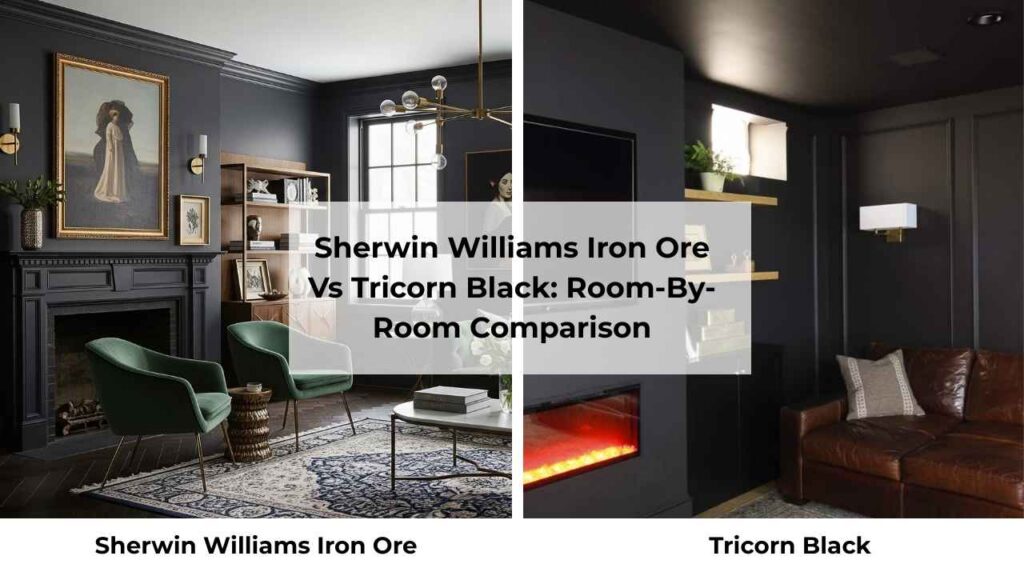
Alright, looking at them is great but let’s get into reality.
How do these colors work in real rooms where people live?
Living Room

Iron Ore in a living room is like a cozy space without making it feel small.
I used this on an accent wall behind a client’s TV, and it transformed the room, the space had depth and the picture-frame effect where your eye knows where to focus.
The softness means you can do a full room in Iron Ore if you’ve decent natural light and warm wood furniture.
One thing I learned: make sure your lighting is warm-toned.
Cool LED bulbs with Iron Ore look sad and muddy.
Tricorn Black in a living room is a commitment.
I’ve seen it work well on one accent wall in a modern space with tons of white and light wood to balance it out.
But a whole living room which takes confidence and understanding of your lighting situation.
Where Tricorn Black kills it in living rooms is on built-in shelving, fireplace surrounds, or architectural features.
It makes everything else in the room shine like your art, your furniture, your styled shelves.
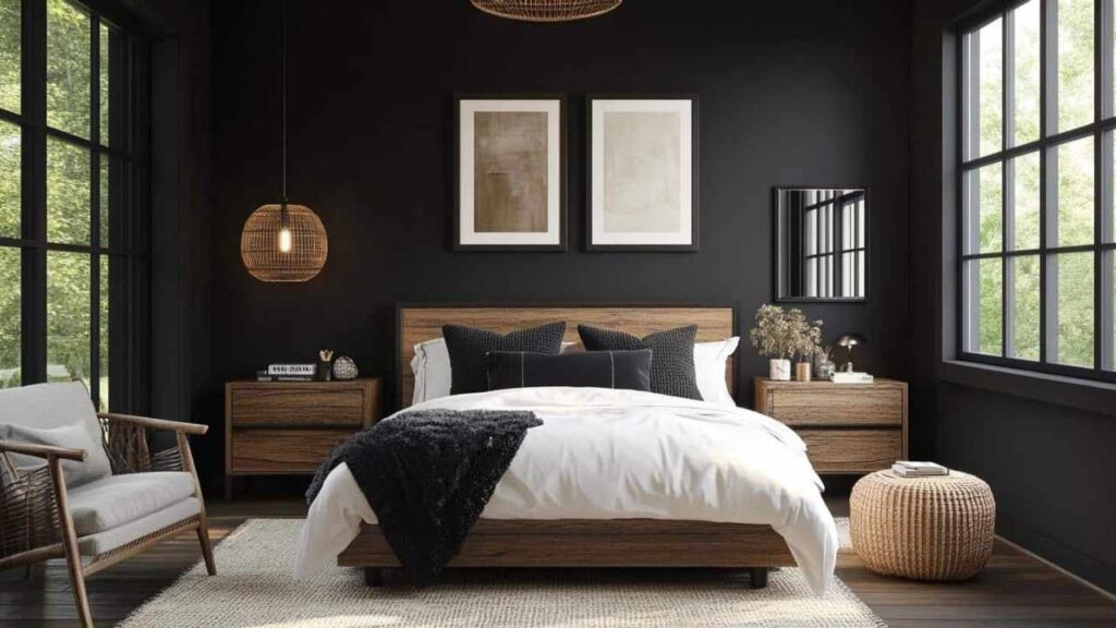
Bedroom
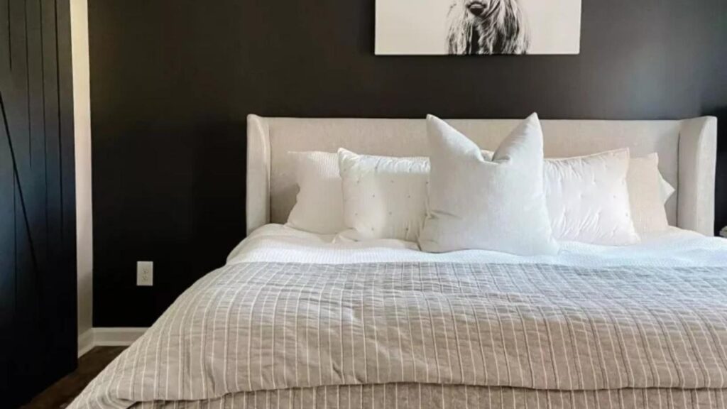
Iron Ore in bedrooms is my go-to recommendation when clients want dark and moody without the harshness.
Bedrooms are personal spaces where you’re spending time in all different lighting like morning sun, evening lamps, middle-of-the-night.
Iron Ore shifts with the light in a way that feels restful.
The cool undertones with the hidden warmth create this cocooning effect.
Pair it with warm white bedding and brass or warm metal fixtures, and you’ve a space that feels expensive and put-together.
Tricorn Black in bedrooms is for people who know they want true black.
I’ve done it twice, both times for clients with specific modern aesthetic goals.
It works if you have excellent lighting control like dimmers, multiple light sources, and thoughtful fixture placement.
Otherwise, it can feel heavy when you’re trying to wake up in the morning.
Tricorn Black on a single wall behind the bed with bright white or light gray on the other walls is nice.
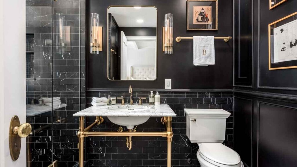
Bathroom

Iron Ore in bathrooms feels luxurious if you have natural light.
I painted a small powder room in Iron Ore with a large window, white subway tile, and brass fixtures. People loved it.
The same color in a windowless bathroom, needed more artificial light than expected.
The green undertones can look swampy in bathrooms with only yellow-toned builder lights.
But get your lighting right and Iron Ore makes tile, fixtures, and mirrors stand out.
Tricorn Black in bathrooms is dramatic and modern but shows every water spot, every dust, every fingerprint.
It looks incredible in photos and when it’s clean, but maintaining it is work.
I suggest Tricorn Black for powder rooms where it’s not getting the daily moisture and traffic of a main bathroom, or use it on vanities and accent areas rather than all four walls.
Kitchen
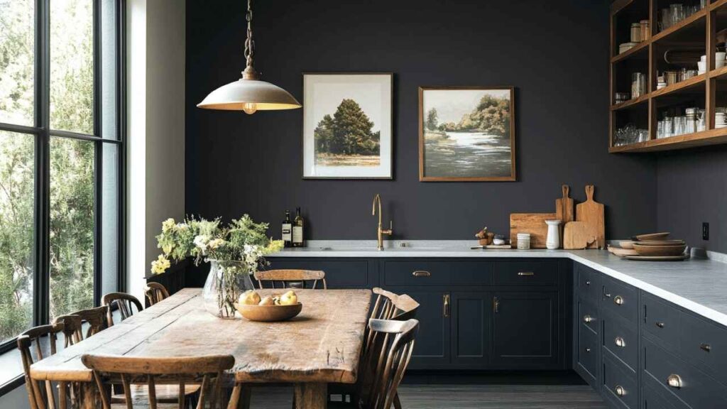
Iron Ore cabinets are having a moment, and I get why.
The color is dark to feel current and sophisticated but soft so that it doesn’t make your kitchen feel like a dungeon.
Lower cabinets in Iron Ore with white uppers works because Iron Ore grounds the space without overwhelming it.
I’ve also used it on kitchen islands as a statement piece because it anchors the room and hides wear better than light colors.
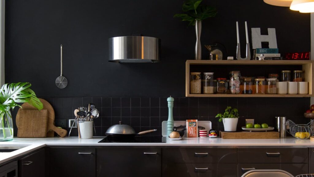
Tricorn Black in kitchens is for all-or-nothing people.
Black cabinets in Tricorn Black with white or light counters and backsplash creates the high-contrast modern look that photographs like crazy.
But you’re committing to wiping down cabinets because this color shows everything.
I recommend it more for folks who are neat or who have good ventilation so grease doesn’t build up on the dark surfaces.
Exterior
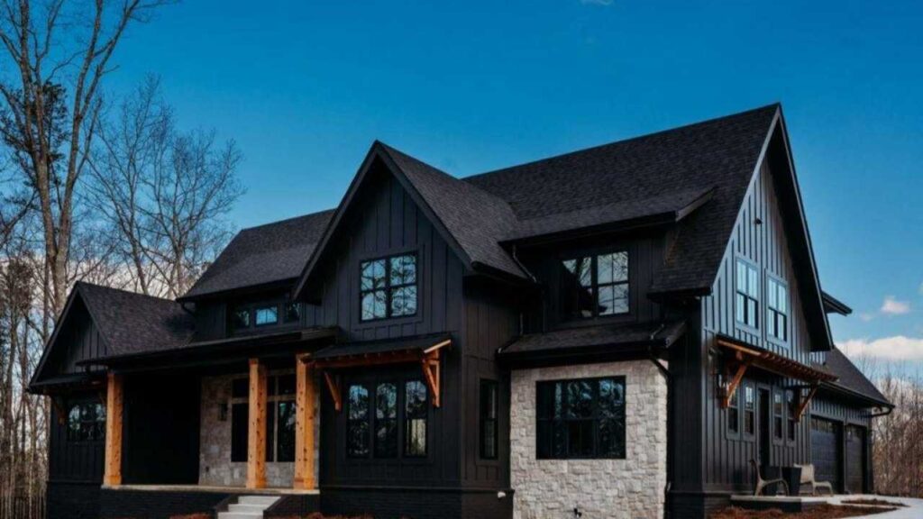
Iron Ore on exteriors is where this color shines.
It looks soft in full sunlight, which means it works well on siding, brick, and stucco without looking severe.
The green and brown undertones help Iron Ore coordinate with landscaping and natural materials better than true black.
It’s forgiving with dust and dirt, and any minor fading over time is less noticeable.
Pairs well with red brick, stone, and warmer wood tones.
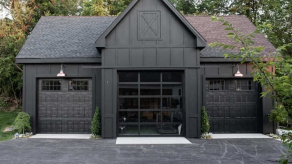
Tricorn Black exteriors make a statement but require maintenance awareness.
Front doors and shutters in Tricorn Black are Perfect. Sharp, bold, classic.
The entire house exterior in Tricorn Black, you can dust, pollen and cobweb.
It can look stunning on modern architecture with clean lines, but you’re signing up for upkeep than Iron Ore requires.
Sherwin Williams Iron Ore Vs Tricorn Black Vs Other Colors
Because we can’t pick between two blacks, we need to compare them to other almost-blacks too.
Black Magic Vs Iron Ore vs Tricorn Black
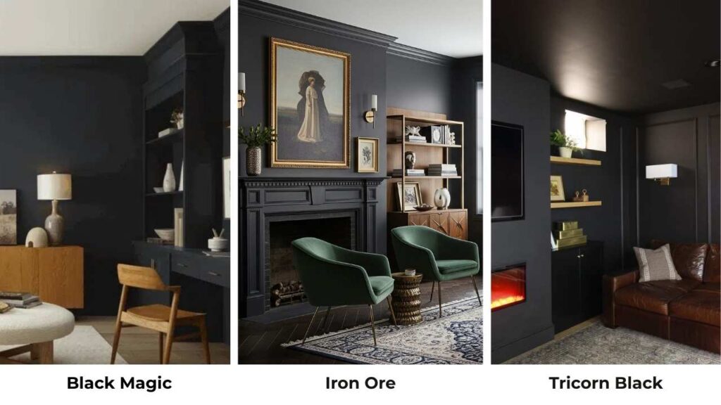
SW Black Magic is right between these two, darker than Iron Ore but softer than Tricorn Black.
It has a warmth that makes it less harsh than pure black but more committed than Iron Ore’s charcoal vibe.
If Iron Ore feels too gray and Tricorn Black feels too intense, Black Magic can be your option.
Tricorn Vs Iron Ore Vs Peppercorn
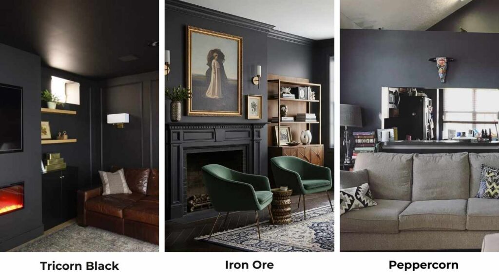
SW Peppercorn is lighter and grayer than both.
Where Iron Ore and Tricorn Black are firmly in black territory, Peppercorn looks a dark gray with warm undertones.
If you’re scared of going dark but want the moody vibe, Peppercorn is a safe to go with.
SW Black Magic Vs Iron Ore
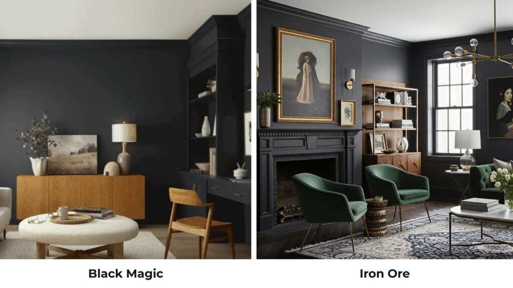
These two are similar but Iron Ore is lighter and cooler with the green undertones showing up.
Black Magic feels a touch warm and brown-leaning.
Both work great for interiors, but I reach for Iron Ore more because it has a better dimension on walls.
Tricorn Black Vs Urbane Bronze
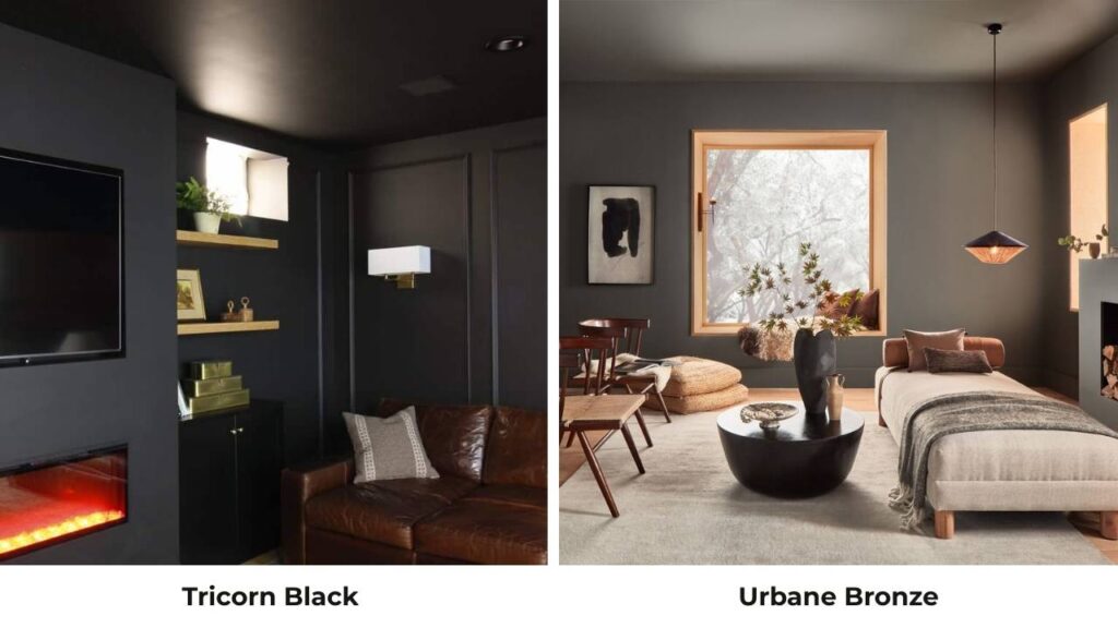
SW Urbane Bronze isn’t competing in the same category because it’s light, brown, and warmer than Tricorn Black.
Where Tricorn is neutral and bold, Urbane Bronze is soft and has visible brown warmth.
They both have dark sophistication but different personalities.
Urbane Bronze is friendly, Tricorn Black is architectural.
Caviar Vs Tricorn Black
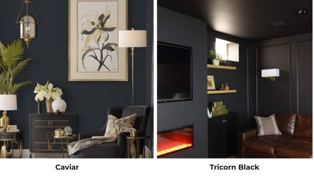
SW Caviar is another true black but with a softer feel than Tricorn Black.
It’s less harsh, though it is in the black category.
If you want true black but Tricorn feels too bold, Caviar offers a middle ground.
| Comparison | LRV Range | Undertone Character | Best Use Case |
| Black Magic vs Iron Ore vs Tricorn Black | Black Magic (middle), Iron Ore (6), Tricorn (3) | Black Magic: slight warmth; Iron Ore: cool with green; Tricorn: neutral | Black Magic for compromise, Iron Ore for soft black, Tricorn for true black |
| Peppercorn vs Iron Ore vs Tricorn | Peppercorn (lightest), Iron Ore (6), Tricorn (3) | Peppercorn: warm gray; others darker | Peppercorn for cautious dark, others for committed black |
| Black Magic vs Iron Ore | Similar, Black Magic slightly darker | Black Magic warmer/browner, Iron Ore cooler/greener | Iron Ore for dimension, Black Magic for warmth |
| Urbane Bronze vs Tricorn Black | Urbane Bronze much lighter (~11) | Urbane Bronze warm brown, Tricorn neutral black | Urbane Bronze for warmth, Tricorn for contrast |
| Caviar vs Tricorn Black | Both very low (true blacks) | Both neutral, Caviar slightly softer | Interchangeable for most; Caviar less harsh |
Which One To Choose Between Sherwin Williams Iron Ore and Tricorn Black?
Here’s where I tell you what I tell clients when they’re stuck between these two.
When To Choose Iron Ore
Pick Iron Ore if you want the vibe of black without the intensity.
If you’re painting large wall surfaces, multiple walls, or a whole room, Iron Ore is forgiving and livable.
Choose it when you have warm design elements like wood floors, wood furniture, brass fixtures because it plays nice with them.
It’s also your consideration when your lighting situation is inconsistent or you’re not sure how much natural light you’re working with.
Iron Ore works when you want moody and sophisticated but you want your space to feel approachable.
It’s black for people who maybe aren’t ready to commit to black, and that’s okay.
When To Choose Tricorn Black
Choose Tricorn Black when you know what you want and that thing is true black.
When you’re painting trim, doors, built-ins, or architectural features where you want maximum contrast and sharp definition.
When your design style is modern, contemporary, or minimalist and you want the graphic, clean aesthetic.
Pick it when you have good lighting both natural and artificial because Tricorn Black needs light to balance its weight.
It’s the right choice when you want consistency throughout the day rather than a color that shifts with the light.
And choosing Tricorn Black when you’re confident in your decision and ready to commit.
Conclusion
So after this, Sherwin Williams Iron Ore vs Tricorn Black comes down to soft sophistication versus bold statements.
Iron Ore gives you depth, warmth, and dimension with the approachable charcoal-black vibe.
Tricorn Black delivers pure, consistent, unapologetic blackness.
I’ve made mistakes with both that green undertone hint with Iron Ore taught me to ALWAYS test samples in lighting, and I’ve seen both colors creating stunning spaces when used right.
The answer is to get samples of both.
Paint them on poster boards or grab the peel-and-stick samples.
Look at them in morning light, afternoon light, evening artificial light.
See which one makes your space worth having.
Choosing between Sherwin Williams Iron Ore Vs Tricorn Black is quite simple but can be confusing too.
FAQs On Sherwin Williams Iron Ore Vs Tricorn Black
Iron Ore pairs well with warm whites like SW Alabaster, SW Shoji White, or SW Greek Villa for trim and ceilings. For wall colors adjacent to Iron Ore accent walls, go with SW Agreeable Gray or soft warm neutrals. Brass, warm metals, natural wood tones, and warm-toned textiles balance Iron Ore’s cool undertones perfectly.
Tricorn Black is a true, neutral black with an LRV of 3. It’s designed to look pure black in all lighting conditions without visible undertones. Unlike soft blacks or charcoal, Tricorn Black is bold, saturated, and maintains consistent darkness throughout the day.
Iron Ore is a soft black or deep charcoal with an LRV of 6. It has cool undertones with hints of green and subtle brown that become visible in bright natural light. It looks dark charcoal in bright conditions and close to black in low light.
No, they’re too similar in depth but different in character that using them together feels unintentional rather than designed. If you want to use two dark colors in the same space, pair Iron Ore with something light like SW Urbane Bronze or use Tricorn Black with a dark brown.