So you’re standing in the paint store and trying to pick the perfect warm white.
And you’ve narrowed it down to these two paint colors.
But Westhighland White vs Greek Villa isn’t only about picking the warm one or the bright one.
These two paints look almost identical on the small paint swatches, but on the walls they are not the same.
I’ve worked with both colors.
I used Westhighland White on a farmhouse exterior which turned out beautiful.
And Greek Villa is the one in a north-facing bedroom that feels like a cave. But I’ve also seen both colors go wrong when paired with the wrong undertones.
The thing about warm whites is that they’re warm until they’re not, and they’re either too creamy or too yellow or sometimes both.
Choosing between these two is about understanding how they look in YOUR space with YOUR lighting and YOUR existing elements.
In this post, I’m breaking down everything I’ve learned about Westhighland White Vs Greek Villa.
We’re talking LRV differences, undertone behavior in different lighting, which rooms they work in, and the situations where you’d pick one over the other.
I’m also looking at the comparisons with other popular whites for the consideration.
Here are my other blogs that you can also read:
- Wythe Blue Vs Palladian Blue
- Peppercorn Vs Iron Ore
- Snowbound Vs White Dove
- Shoji White Vs White Dove
- Alabaster Vs Shoji White
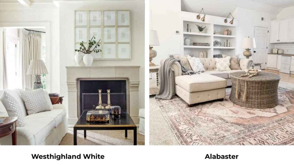
Overview of Westhighland White (Sherwin Williams SW 7566)

Westhighland White is what I call a “confidently warm” white.
It’s SW 7566, and it is at an LRV of 86, which means it’s reflecting light back.
But here’s the thing: it’s not trying to be neutral.
This color knows it’s warm and it’s not apologizing for it.
The undertones lean creamy with subtle yellow, not the yellow that makes you think of butter or mustard walls.
It’s soft, slightly muted, not bright white territory.
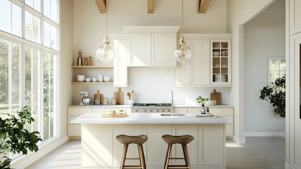
When I first used Westhighland White on an exterior, I expected it to be clean and fresh and it was.
In south-facing rooms, Westhighland White gets warm.
The creamy undertone shows up when natural light comes in.
I used it in a client’s living room and by mid-afternoon, it had a gorgeous warmth that made the whole room feel cozy.
The undertones are toward warm greige rather than straight yellow, which is why I love it.
It’s warm to prevent the sterile feeling, but it’s not going to clash with cool-toned elements if you have some in the room.
I’ve used it with both warm wood tones and cool gray furniture, and it was fine in both situations.
Best uses are in Exteriors.
This color works well on farmhouse styles, traditional homes, ranch houses.
It has a presence to look intentional but softness to not feel harsh against natural materials like stone or brick.
I’ve also used it in living rooms and bedrooms where we wanted warmth without going beige.
If your space has yellow or gold undertones in the flooring or counters, then look out.
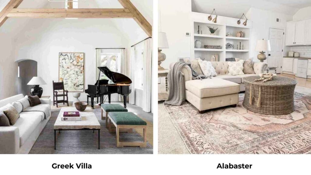
Overview of Greek Villa (SW 7551)

Greek Villa is at LRV 84, less reflective than Westhighland White but you’re not going to notice the 2-point difference until you put them side by side.
What you WILL notice is that Greek Villa feels fresh, more neutral-warm than creamy-warm.
The undertones here are beige-based with subtle cream, not yellow.
I specified Greek Villa for a home repaint thinking it would be similar to another warm white I’d used before.
When the first coat went up, I panicked because it looked flat, but then it dried, the second coat went on, and it turned out what the space needed.
Greek Villa performs well in bright spaces.
Open-concept layouts, rooms with good natural light, anywhere you’ve got mixed lighting situations.
I’ve used it in kitchens where you’ve recessed lights, pendant lights, and a window over the sink all doing different things to the color. Greek Villa stayed consistent.
Here’s what I tell people: if you want a warm white which feels calm and modern-friendly, Greek Villa is what you should go for.
It has warmth and you’ll feel it compared to something like Pure White or Extra White but it’s not creamy.
There’s a difference.
Creamy warm whites feel cozy and traditional.
Beige-warm whites like Greek Villa feel current.
Greek Villa fits modern farmhouse spaces, transitional homes, contemporary interiors that want warmth.
I’ve used it in living rooms where the furniture was a mix of modern and traditional pieces, and it acted like a good neutral backdrop instead of becoming a color statement.
Bedrooms love this color too because it’s warm to feel inviting when you walk in but not creamy that it feels heavy.
What is the Difference Between Westhighland White and Greek Villa?

OK so Westhighland White Vs Greek Villa, both warm whites from Sherwin Williams.
Both have similar undertones.
Both get recommended.
But they’re not interchangeable, and picking wrong means you’re living with a color that’s almost right, which is worse than picking a wrong color.
LRV
Light Reflectance Value is how much light a color throws back at you.
A high number is more light reflection and more bright space.
Westhighland White is at LRV 86. Greek Villa is at LRV 84.
The 2-point difference matters.
Westhighland White is going to feel bright and open, mainly in spaces that need the light they can get.
Greek Villa is bright, about an 84, not a 60, but it’s a touch depth to it.
If you’re trying to maximize brightness in a dark room, Westhighland White is what you should go for.
If you want brightness but also softness, Greek Villa is what you should consider.
I had a basement project last year where we went with Greek Villa instead of Westhighland because the high LRV felt bouncy with the artificial lighting setup.
Undertones
Westhighland White: creamy-yellow undertones.
It’s warm in a traditional, classic way.
When light hits it, you’re getting the soft cream color showing.
Greek Villa: warm beige undertones.
Less cream, more neutral-warmth.
The undertone is there but it’s not announcing.
Neither one has gray in it, which is great if you’re avoiding greige territory.
But Westhighland White will always look warmer because of the cream base.
Greek Villa looks balanced.
I saw Westhighland White next to cool gray tile and it looked fine.
Lighting Behaviour
Westhighland White loves south-facing light.
It gets warm, creamy and rich.
In north-facing spaces with cool light, it backs off and looks more neutral but maintains warmth.
I used it in a west-facing bedroom once and by evening, with the golden sunset light coming through, it was glowing.
Greek Villa is consistent in different lighting.
It doesn’t shift dramatically.
Morning light, afternoon light, evening artificial light, it stays true.
That’s why it works well for open-concept spaces where different areas get different light throughout the day.
One mistake I made: I used Greek Villa in a west-facing bathroom thinking it would stay neutral and fresh.
At 2 PM, it was perfect. By 5 PM when the golden hour light came, it wasn’t yellow, but it was warmer than I expected.
Warmth and Brightness
Westhighland White is warmer, brighter.
It has a high LRV with the creamy undertone, so you’re getting brightness WITH visible warmth.
Greek Villa is warm, bright but softer.
The warmth is there but it’s gentle.
The brightness is there but it’s not as punchy.
If you want a white that makes a space feel light and cozy, Westhighland White.
If you want a white that brightens the space but stays in the background, Greek Villa.
Style and Best Uses
Westhighland White:
- Traditional homes
- Farmhouse exteriors
- Spaces with warm wood tones
- Rooms that need maximum brightness
- Pairs beautifully with warm metals
- Works with earthy accent colors
Greek Villa:
- Modern farmhouse interiors
- Transitional spaces
- Whole-home color
- Open-concept layouts
- Pairs well with both warm AND cool accents
- Flexible for mixed metal finishes
For trim pairings, Westhighland White can handle warm trim or you can go bright with something like Pure White for contrast.
Greek Villa looks better with a bright trim like Pure White or Extra White because it creates definition without harshness.
| Feature | Westhighland White (SW 7566) | Greek Villa (SW 7551) |
| LRV | 86 (brighter) | 84 (slightly softer) |
| Undertones | Creamy-yellow, warm | Warm beige, neutral-warm |
| Warmth Level | Noticeably warm, traditional | Warm but balanced, modern |
| Lighting Response | Shifts warmer in south light | More consistent across lighting |
| Best Style | Traditional, farmhouse | Modern farmhouse, transitional |
| Depth | Less depth, more reflection | More visual depth |
| Best Trim Pairing | Pure White, warm whites | Pure White, Extra White |
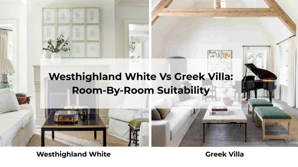
Westhighland White Vs Greek Villa: Room-By-Room Suitability
Picking a paint color without thinking about the room is like going with the shades without considering where we are putting them.
Context matters.
Living Room
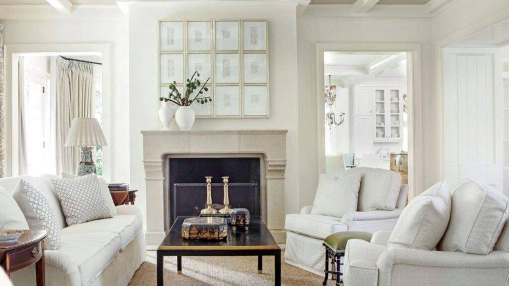
Westhighland White in the living room works when you want warmth and presence.
I used it in a living room with a big stone fireplace, warm wood built-ins, and south-facing windows.
The color held its own against all the strong elements and made the space feel pulled together.
But if your living room has cool elements like gray sectional, chrome fixtures, concrete finishes then Westhighland may feel like it’s going against the vibe.
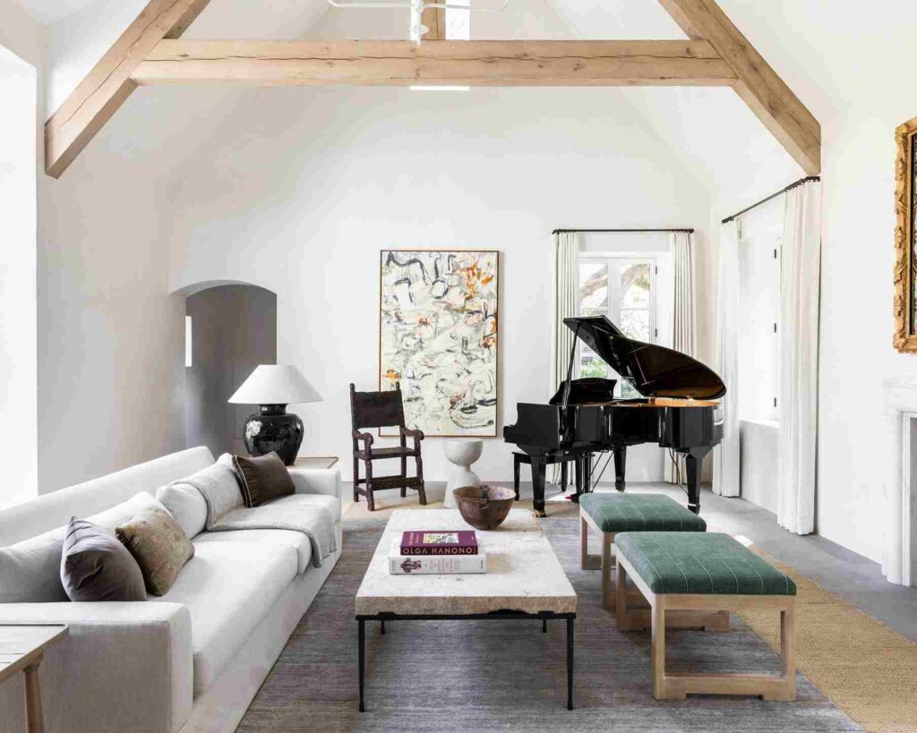
The Greek Villa in the living room is your safe for mixed styles.
I’ve used it in living rooms where the furniture was doing ALL kinds of things.
Greek Villa let everything coexist without adding another opinion to the mix.
It’s warm to feel inviting when you walk in but neutral to not clash with whatever is in the space.
Bedroom
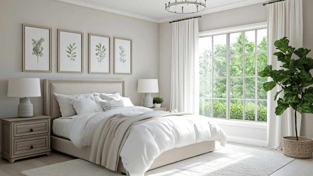
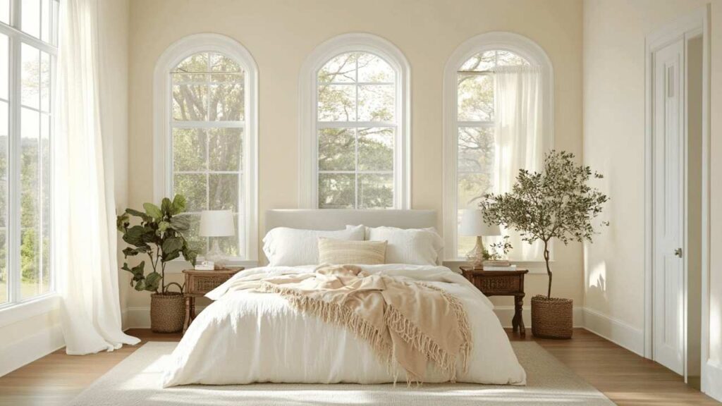
Westhighland White in bedrooms creates a cozy, wrapped-up feeling.
Especially in bedrooms with good natural light, it looks soft and restful.
I’ve used it in master bedrooms with warm wood furniture and creamy bedding, and it felt like the whole room was designed to help you relax.
But in small bedrooms or bedrooms with limited light, the warmth can make the space feel small.
Greek Villa in bedrooms is the color I reach for when someone says.
“I want warm white but I don’t want it to feel heavy.
” It has warmth to prevent the cold, off feeling but neutrality to keep the space feeling open and airy.
In the north-facing bedroom, go for Greek Villa.
A small bedroom that needs to feel big needs a Greek Villa.
Bathroom
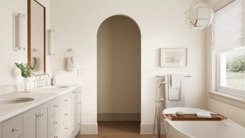
Westhighland White in bathrooms can be beautiful IF you’ve the right setup.
I used it in a bathroom with warm brass fixtures, marble counters with warm veining, and good natural light.
It felt spa-like and expensive.
But I’ve also seen it in bathrooms with cool white subway tile and chrome fixtures, and it looked confused.
Greek Villa in bathrooms is forgiving.
It works with white tile. It works with marble.
It works with fixture finishes.
I’ve used it in a bathroom with black matte fixtures and white subway tile, and it was fresh and clean but not cold.
Kitchen
Westhighland White in kitchens is a commitment to warmth.
If you’ve warm wood cabinets, butcher block counters, brass hardware.
But if your kitchen is cool, Westhighland can be too warm.
I’ve seen it work in farmhouse kitchens where everything is warm and traditional.
I’ve seen it look off in modern kitchens where the warmth didn’t fit the aesthetic.
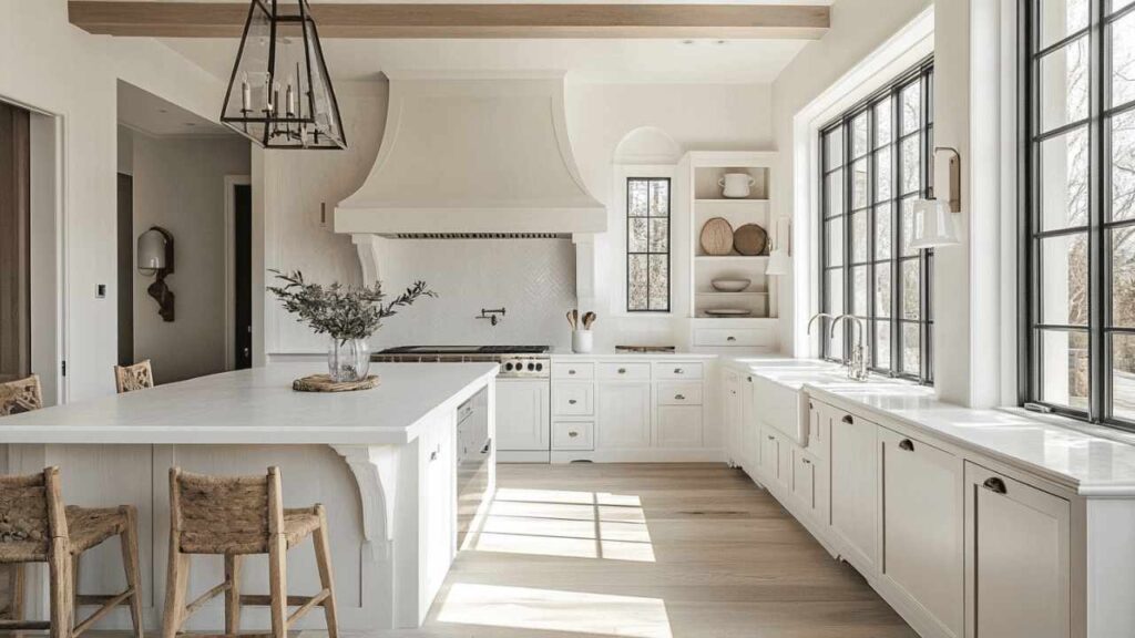
Greek Villa in kitchens is versatile.
White cabinets work.
Wood cabinets also work.
It’s warm to prevent the all-white kitchen from feeling like a lab but neutral to let your cabinet color be the main character.
I used it in a kitchen with white cabinets, black counters, and gold hardware, and it acted like the perfect neutral backdrop that made everything else look intentional.
Exterior
Westhighland White on exteriors is where this color shines.
It has warmth to look classic and timeless without being yellow.
I’ve used it on farmhouse exteriors, traditional colonials, and ranch houses.
It pairs well with natural materials like stone, brick, wood shakes.
Greek Villa on exteriors works but it’s less common for exterior use, because designers reach for it as an interior color first.
It’s a great choice for modern exteriors or homes where you want a fresh, clean look with subtle warmth.
I’ve used it on a contemporary home with black windows and doors, and it looked current and intentional.
Westhighland White Vs Greek Villa Vs Other Colors
Because you’re not only comparing these two.
You’re also wondering about Alabaster and White Dove and Pure White and every other white paint color that exists.
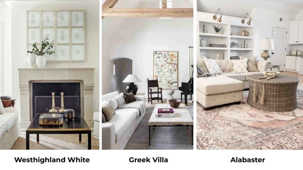
Westhighland White Vs Alabaster
Alabaster (SW 7008) is everywhere right now.
It’s warm, it has creamy undertones, it’s Joanna Gaines’ favorite.
But compared to Westhighland White, Alabaster is warm and creamy.
Westhighland has brightness and a clean look.
If you love Alabaster but want something that feels more modern and less creamy, Westhighland White is what you should go for.
Greek Villa Vs Alabaster
Greek Villa is bright and more neutral than Alabaster.
Both are warm whites, but Greek Villa doesn’t have cream in the undertone.
Alabaster can look peachy-cream in the right light.
Greek Villa stays beige-neutral.
If you want warmth without creaminess, Greek Villa is what you should consider.
Westhighland White Vs White Dove
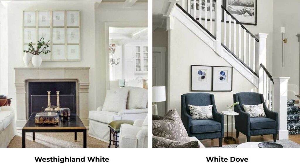
White Dove (BM OC-17) is Benjamin Moore’s most popular white, and it’s soft and more muted than Westhighland White.
Westhighland has brightness and more visible warmth.
White Dove is quiet and subtle.
If you want a warm white that makes a statement, Westhighland.
If you want a warm white that whispers, White Dove.
Sherwin Williams Westhighland White Vs Pure White
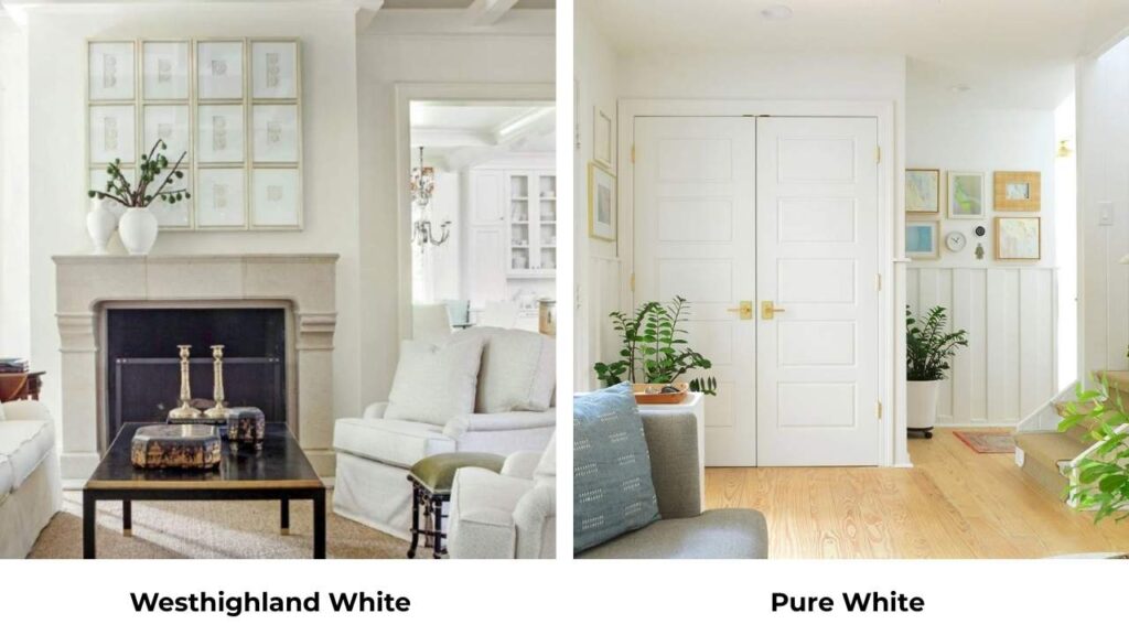
Pure White (SW 7005) is a fresh, clean white with any warmth.
Compared to Westhighland White, it’s like comparing cream to skim milk.
Pure White works as a trim color WITH Westhighland White on the walls.
Using Pure White on walls when you want Westhighland’s warmth will leave you feeling like the space is too cold.
Westhighland White Vs White Flour
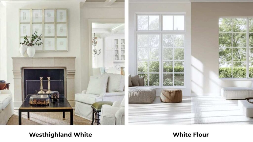
Haven’t worked with White Flour (SW 7102) as much, but it’s warm and softer than Westhighland White. Low LRV, more muted, more cream-forward.
If Westhighland feels too bright for your space, White Flour is what you can go for.
| Color | LRV | Undertone | Warmth Level | Best For |
| Westhighland White | 86 | Creamy-yellow | Medium-warm | Exteriors, traditional spaces |
| Greek Villa | 84 | Warm beige | Neutral-warm | Whole-home, versatile |
| Alabaster | 82 | Creamy | Very warm | Traditional interiors |
| White Dove (BM) | 83 | Soft warm | Subtle warm | Soft, understated spaces |
| Pure White | 84 | Minimal | Cool-neutral | Trim, modern spaces |
| White Flour | 80 | Cream | Warm | Softer, more muted look |
When to Choose Westhighland White?
Choose Westhighland White when you want brightness AND warmth and you’re not afraid of your white looking warm.
It’s perfect for exteriors where you want a classic, timeless look.
Choose it for spaces with warm wood tones, brass or bronze fixtures, and traditional or farmhouse styles.
If your room gets great south-facing light and you want to play that up rather than tone it down, Westhighland is your color.
Also choose it when you’ve got a darker space that needs light reflection but you don’t want to go cool white and make it feel cold.
And if your existing finishes lean warm like wood floors, beige tile, warm stone then Westhighland will tie everything together.
When to Choose Greek Villa?
Choose Greek Villa when you want a warm white that plays well with everything.
If you’re doing a whole-home repaint and need one color that’ll work in rooms with different lighting and different styles, Greek Villa is the best.
Pick it when you want warmth but you don’t want creamy warmth.
Greek Villa is your choice for open-concept spaces where you need color consistency across different lighting situations.
It’s the right move when your finishes are a mix of warm and cool.
And if you’re unsure about undertones or worried about going too warm or too neutral, Greek Villa is right in the spot where it’s warm to feel inviting but balanced to not limit your design choices.
Conclusion
Westhighland White vs Greek Villa comes down to, do you want warmth that’s noticeable and traditional, or warmth that’s present but balanced and versatile.
Both are excellent warm whites.
Neither is going to give you the cold, sterile feeling. But they’re not the same color.
Test them both in your space.
Get samples, paint big sections, look at them at different times of day.
What looks perfect at noon may look different in the evening, and you need to know that before you commit.
Pay attention to your undertones like in your floors, counters, tile, furniture.
And, If you’re torn after testing, Greek Villa is the safe choice for most people.
It’s forgiving, versatile and likely to work in multiple spaces.
Westhighland White is beautiful but it’s specific and it needs the right context to shine.
FAQs On Westhighland White Vs Greek Villa
Greek Villa (LRV 84) has warm beige undertones and is more neutral-warm and fresh. Westhighland White (LRV 86) is bright with creamy-yellow undertones and is warm and traditional. Greek Villa is versatile in different lighting and styles.
Yes, Greek Villa is a warm white. But it’s a balanced warm white with beige undertones rather than creamy or yellow undertones. It doesn’t look as warm as some other popular warm whites, which makes it more versatile and less to look yellow
No, Greek Villa isn’t yellow. The undertones are warm beige, not yellow. That’s one of the reasons it’s so popular, you get warmth without the risk of your white looking dingy or dated or yellow.
Westhighland White is a warm white paint color with creamy-yellow undertones. It has an LRV of 86, which makes it quite bright and reflective. It looks like a soft, classic warm white rather than harsh or cool.
Westhighland White Vs Greek Villa: Choose the Right Warm White