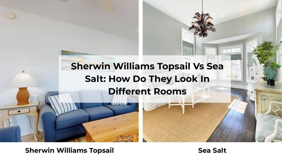
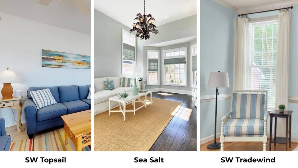
Sherwin Williams Topsail and Sea Salt are in the trend. Both are the soft, muted coastal-inspired colors that work for calm, airy interiors.
I’ve been working with Sherwin Williams Topsail Vs Sea Salt for a while now and they’re not interchangeable.
Sea Salt SW 6204 is into the green-gray spa vibe, while Topsail SW 6217 is clean, fresh and more blue.
Here’s the thing about these two that both colors are chameleons. I’m talking about personality shifts depending on whether you’ve natural light or artificial light.
The undertones in these paints are hidden. Sea Salt may look like a perfect soft green in the paint store, then you get it home and it looks gray in your bedroom.
Topsail looks like a light, breezy blue, but in the wrong room with warm light bulbs and the subtle gray-green undertones comes.
So, I’m breaking down the color profiles of Sherwin Williams Topsail Vs Sea Salt.
We’re talking LRV, undertones, how lighting messes with them, where they work in your home.
I’ll show you how they look in different rooms, how they compare to other similar Sherwin Williams colors, and what coordinating colors work with them.
Here are my other blogs that you can also read:
- Maroon Vs Crimson
- Oyster White Vs Shoji White
- Prefect Greige Vs Agreeable gray
- Chantilly Lace Vs Alabaster
- Eider White Vs Repose Gray
Color Profile of Sherwin Williams Topsail (SW 6217)

Topsail is a cool, breezy, blue-leaning color, it is not bright blue, not tropical, but clean.
The LRV is around 61, which means it’s light but has pigment to look as a color on your walls.
What I love about Topsail is it has these subtle gray and slight green undertones, but they don’t dominate. The blue stays in charge.
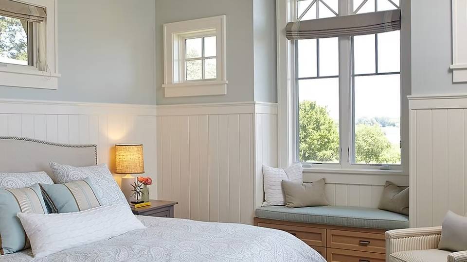
I used it in a client’s bedroom, in the north-facing room, with minimal natural light and it looked like a proper blue. It maintains its identity.
This appears clean and cooler than Sea Salt. When you put Topsail on the wall, it feels fresh.
It feels intentional. Sea Salt can sometimes feel washed out, like it can’t decide what it wants to be.
It feels consistently blue across different spaces, which is rare for the light coastal colors.
I’ve used it in a south-facing living room with massive windows and in a windowless hallway, and sure, the intensity changes, but it doesn’t do the thing where it looks like a different color.
You’re getting blue but it can be light, maybe a touch of gray in dim areas.
Topsail is popular for modern, transitional, and contemporary interiors and it looks sophisticated.
Homeowners pick it for living rooms when they want color but don’t want to commit to anything bold.
Designers love it for bathrooms because it gives you the spa feeling without going to Sea Salt.
In the bedrooms, it looks perfect. It’s calm without being boring, cool without being cold.
Color Profile of Sherwin Williams Sea Salt (SW 6204)
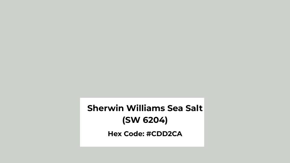
Sherwin Williams Sea Salt is a soft green-gray paint color with subtle blue undertones.
Sea Salt looks green first, especially in natural daylight. The LRV is around 63-64, so it’s close to Topsail in terms of how much light it reflects.
Sea Salt is muted and neutral than Topsail. If you’re the type of person who gets nervous about color, Sea Salt feels safe.
It blends into the background. That’s both its strength and its weakness, depending on what you’re going for.
The thing about Sea Salt is how much it shifts between green, gray, and blue depending on surroundings.
I painted a bathroom with Sea Salt. It has bright white subway tile, chrome fixtures and natural light from a skylight and it looked minty green during the day.
Then at night with warm LED bulbs, it looked gray with a hint of blue.
It’s known for its calm, spa-like, and relaxed feel. Sometimes I wish people would branch out because I’ve seen many Sea Salt because it works.
The green-gray mix creates a serene and meditative vibe. Pair it with natural materials like a wood vanity or some jute baskets and it creates spa vibes.
Sea Salt is popular for modern, transitional, and contemporary interiors like Topsail, but it looks more traditional.
I see it in farmhouse-style homes, coastal cottages, and some transitional spaces that are trying to look both traditional and modern.
Homeowners love it because it feels less risky than committing to a true blue. Designers go for it constantly for primary bathrooms, bedrooms, living rooms.
I used it in an open-concept kitchen and living room and it worked well as a whole-home color because it’s adaptable.
But you need to be okay with the fact that it’s going to look different throughout the day.
Sherwin Williams Topsail Vs Sea Salt: Key Differences
Okay, so both are light, both are coastal, both have a breezy vibe. But they are NOT the same paint color.
I’ve had clients ask if they can use them interchangeably and the answer is not.
The differences are subtle if you’re looking at a paint chip, but get them on a wall and you’ll see what I’m talking about.
Let me break down what separates these two from considering the same.
LRV
Light Reflectance Value tells you how much light a color reflects on a scale from 0 pure black to 100 pure white.
It’s not some random number but it impacts how bright or dark your room feels, how large or small the space appears, and how much the color will shift in different lighting.
Topsail has an LRV of 61 and Sea Salt is at 63-64. So Sea Salt is lighter and reflective.
Both are in the range where they’ll brighten a space without washing out. Neither is going to make your room feel dark or cave-like.
In a dim room, like a north-facing bedroom with one small window, it would go for Sea Salt because the LRV points do make a difference when you’re starved for light.
But in a south-facing room with good natural light, then Topsail’s lower LRV works better.
Undertones
Undertones are the secondary colors hiding underneath the main color, and they’re what cause paint to look different depending on lighting and surroundings.
Topsail’s undertones are mainly blue with subtle gray and a hint of green and the blue dominates.
That’s why it looks like a true light blue. The gray keeps it from looking too saturated or childish, and the barely-there green that adds a touch of complexity.
Sea Salt’s undertones are green and gray with blue as the secondary color. The green shows up, mainly in natural daylight.
The gray mutes everything and gives it the soft, neutral quality. The blue only shows up in cool lighting or next to warm-toned materials.
Here’s how I explain it to clients: if you want people to walk in and say nice blue, pick Topsail.
If you want them to say this color is calming, then go with Sea Salt.
Lighting Affect
Topsail in bright natural light looks like a proper light blue, almost aqua-toned but not tropical.
In low light or with warm bulbs, the gray-green undertones come and it looks soft, muted, but blue..
Sea Salt in bright natural light leans GREEN. Sometimes visible green depending on what else is in the room.
In low light or with warm artificial light, it shifts to gray with a hint of blue-green. At night, in a room with warm lighting, Sea Salt can look completely gray.
North-facing rooms will make both colors feel cool and more gray.
Topsail handles this better and stays blue. Sea Salt can look a bit sad and flat.
South-facing rooms bring out the true version of both colors.
Topsail glows and looks gorgeous. Sea Salt will show you the green.
East and west-facing rooms shift throughout the day. Morning light in an east-facing room will make Sea Salt look fresh and green.
Evening light in a west-facing room adds warmth, which can make Topsail look slightly less bright.
And don’t get me started on the light bulb Kelvin temperature. If you’re using warm bulbs, Sea Salt will shift gray or beige-gray.
Topsail stays stable but can be warm. If you’re using cool bulbs, both colors will look fresh and closer to their true hue, but Sea Salt may feel gray and cold.
Style and Best Uses
Topsail looks best with bright white trim, something like SW Extra White or Snowdrop. The contrast highlights the blue without overwhelming it.
For furniture, light wood tones work, like natural oak, light maple or whitewashed finishes. Avoid heavy, dark woods because they’ll make Topsail feel cold.
For accent colors, you can go with deep blues like SW Bravo Blue if you want energy, or soft neutrals like SW Agreeable Gray.
Sea Salt also loves white trim, but it can handle SW Pure White which is soft and creamy.
This keeps the vibe muted and spa-like.
Natural materials look best with Sea Salt like jute rugs, rattan baskets, linen curtains, and raw wood.
For accent colors, you can go with deep greens, soft grays like SW Repose Gray, or a bold navy like SW Hale Navy.
Here’s the comparison in a table because sometimes you need to see it side by side:
| Aspect | Topsail SW 6217 | Sea Salt SW 6204 |
| LRV | 61 | 63-64 |
| Dominant Color | Blue | Green-gray |
| Undertones | Gray, slight green | Green, gray, blue |
| Color Stability | Consistent across lighting | Shifts significantly |
| Best Lighting | Any, handles low light well | Bright natural light |
| Feeling | Crisp, fresh, clean | Soft, muted, spa-like |
| Best Trim | Extra White, Snowdrop | Pure White |
| Style | Modern, coastal, airy | Neutral, calming, versatile |
| Risk Level | Low – reads blue reliably | Medium – can look gray or green |
Sherwin Williams Topsail Vs Sea Salt: How Do They Look In Different Rooms
These colors don’t look the same in every room. A bathroom is humid, usually has specific lighting, often smaller.
The living room has furniture, rugs, and natural light changing. A bedroom needs to feel restful but not depressing.
I’m walking you through how both Topsail Vs Sea Salt look and feel in the rooms.
Living Room
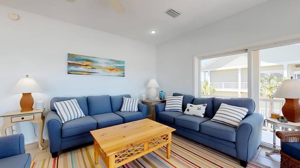
Topsail in a living room works well when you’ve good natural light.
I used it in an open-concept space with south-facing windows and a vaulted ceiling, and it made the room feel big and airy without going cold.
The blue stayed true throughout the day, only shifted in intensity.
The morning light made it feel breezy and fresh. The afternoon sun warmed it.
The key with Topsail in living rooms is keeping your furniture and decor from looking too cool.
If you go with gray furniture, chrome accents, cool-toned everything, it can start feeling cold.
Bring in warm wood, some texture with linen or cotton, or a jute rug, and it balances perfectly.
Sea Salt in a living room gives you a calm, neutral backdrop that lets your furniture and decor shine.
I’ve used it in living rooms that connect to kitchens and dining areas because it blends and doesn’t fight with other colors.
But if your living room doesn’t get much natural light, Sea Salt can look gray and sad.
I had a client with a west-facing living room and in the mornings it looked flat.
Sea Salt works best in living rooms when you’re okay with it being a backdrop, not a statement.
Bedroom
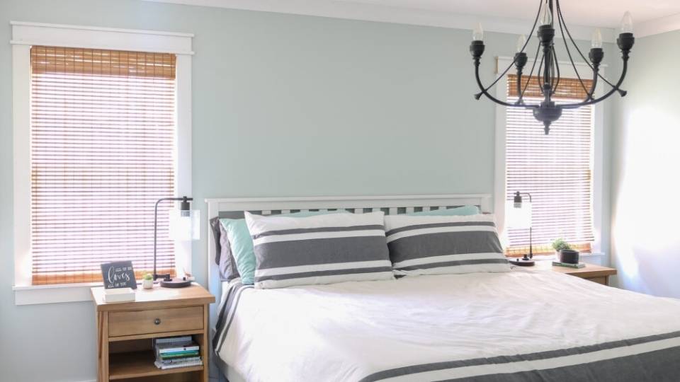
Topsail in a bedroom is good. Bedrooms need to feel restful but not depressing, and Topsail goes with the balance.
I painted my own bedroom Topsail and I love it. It’s cool and calming without feeling cold.
It doesn’t shift to gray and sad like Sea Salt would have in the same space.
The trick with Topsail in bedrooms is your bedding. Keep it simple with whites, light grays and some soft blues or greens.
Don’t match everything with blue bedding because that makes it overwhelming.
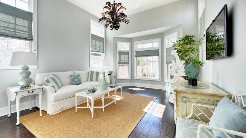
Sea Salt in a bedroom is where this color shines, if you’ve good natural light.
It creates a cocooning, spa-like feel that makes you want to go to bed. I used it in a primary bedroom with an east-facing window and white shiplap on one accent wall.
In the morning, it was this soft green-gray that felt peaceful.
At night with warm bedside lamps, it shifted to a soft gray-blue.
But if your bedroom is north-facing or doesn’t get light, don’t go with Sea Salt. It’ll look flat and gray.
Bathroom
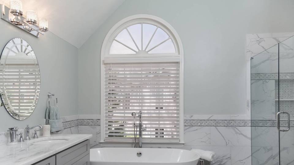
Topsail in a bathroom feels fresh and clean without being harsh.
I used it in a guest bath with white subway tile, chrome fixtures, and a marble-look porcelain floor. It looked fresh and modern without being cold.
The humidity in bathrooms doesn’t affect how the color looks, but the lighting does.
One thing I learned after this is that if you’re doing a small powder room with no windows, Topsail can feel intense.
Sea Salt can be better for tiny, windowless bathrooms.
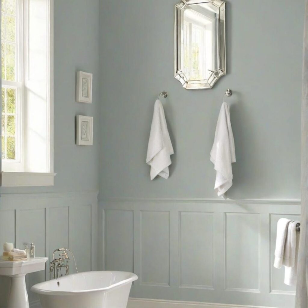
Sea Salt in a bathroom is the bathroom color because it works. I’ve used it in many bathrooms and it creates the spa vibe with white tile, natural wood vanity, and some plants.
The best Sea Salt bathroom I did was a primary bath with a huge window, freestanding tub, and white fixtures.
During the day it looked soft and green-gray. At night with the warm lights, it shifted to the cozy gray-blue.
Sea Salt in bathrooms has been done so that it’s starting to feel predictable.
If you want something that has the calm coastal vibe but feels fresher.
Kitchen
Topsail in a kitchen needs to be considered carefully.
Kitchens have cabinets, countertops, backsplash, appliances and Topsail’s blue can either look amazing or feel out of place depending on the finishes.
I used it in a kitchen with white shaker cabinets, marble countertops, and stainless appliances.
It worked because everything else was neutral and let the wall color breathe.
Also, kitchens have warm lighting, and that can make Topsail look more gray than you want.
Sea Salt in a kitchen is more forgiving because it’s neutral.
I’ve used it in kitchens with white cabinets, gray cabinets and light wood cabinets, and it works with all of them.
It blends in, doesn’t fight with your finishes, and gives you the soft, airy feel.
In a kitchen with limited natural light, like a galley kitchen with one small window, Sea Salt can look gray and boring. It needs light to show its personality.
Sherwin Williams Topsail Vs Sea Salt Vs Other Colors
Both Topsail and Sea Salt are great, but if you want something different, then here’s how Topsail and Sea Salt look against other alternative colors.
Sherwin Williams Topsail Vs Tradewind
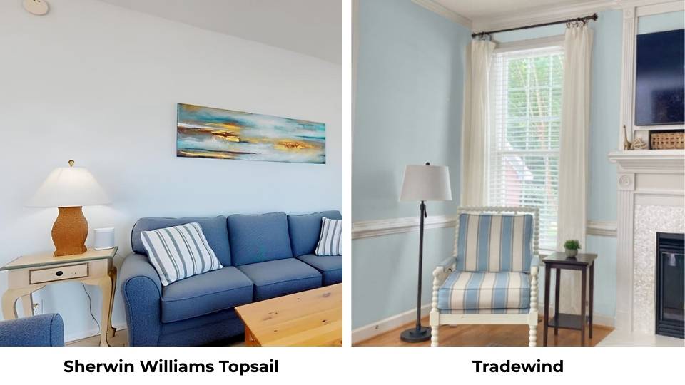
SW Tradewind (SW 6218) is more Topsail moody. It’s deep, saturated, and looks like a true coastal aqua.
The LRV is around 60.7, barely darker than Topsail, but it feels more colorful on the wall.
Where Topsail is soft and breezy, Tradewind has a presence. It’s not a background color but it’s the main color.
I used Tradewind in a coastal-themed bedroom and it was gorgeous, but it needed intentional styling.
White bedding, natural wood, nothing competing. Topsail is forgiving.
Sherwin Williams Topsail Vs Mountain Air
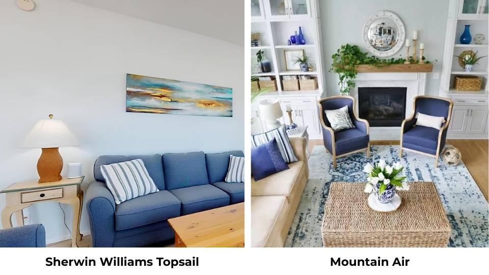
SW Mountain Air SW 6224 is so close to Topsail that I’ve seen designers mix them up.
Mountain Air is deeper and cooler than Topsail, with more gray in the mix. It has a light blue, but it is more toward the dusty, sophisticated blue.
The LRV is similar around 60-61, so they perform about the same in terms of brightness.
The difference is in the undertones. Mountain Air pulls more gray-blue, Topsail is more pure blue with a hint of green.
I’ve used Mountain Air in a modern living room with concrete floors and gray furniture, and it was perfect for the cool and industrial vibe. Topsail looks cheerful and coastal.
Sherwin Williams Topsail Vs Rainwashed
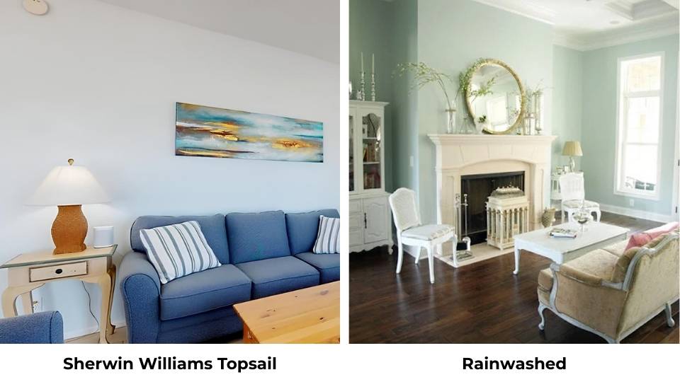
SW Rainwashed (SW 6211) is one of the most-compared colors. It’s deeper than both, moody, and is more blue-green than straight blue.
The LRV is around 60, so it’s in the same color wheel, but it feels dark on the wall because of the extra color saturation.
Where Topsail is light and airy, Rainwashed has depth. It’s calming and coastal, but it makes more sense.
I used it in a bathroom with black fixtures and white marble tile, and it was stunning.
Sherwin Williams Topsail Vs Snowdrop
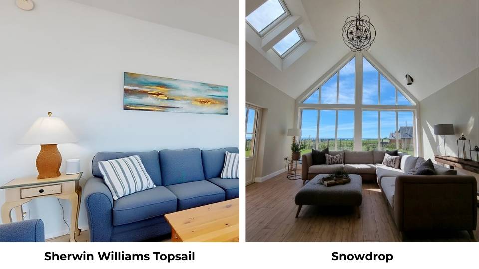
SW Snowdrop SW 6511 is not a blue-green but it’s a fresh, clean white with the hint of cool undertones.
I’m including it because it’s one of the best trim colors to pair with Topsail, but some people consider painting whole rooms in Snowdrop instead of Topsail when they get confused.
Snowdrop has an LRV in the high 80s, so it’s lighter than Topsail.
It’ll make a room feel big and bright, but you’re not getting any color because it’s white.
Here’s a table to make the comparisons easy to understand:
| Color | LRV | Dominant Tone | Undertones | Feeling | Best For |
| Topsail SW 6217 | 61 | Blue | Gray, slight green | Crisp, airy, coastal | Bedrooms, bathrooms, versatile |
| Sea Salt SW 6204 | 63-64 | Green-gray | Green, gray, blue | Soft, spa-like, muted | Bathrooms, calm spaces |
| Tradewind SW 6218 | 60.7 | Aqua blue-green | Deeper, more saturated | Bold coastal, vibrant | Statement rooms, good light |
| Mountain Air SW 6224 | 60-61 | Cool blue | Gray-blue | Sophisticated, modern | Contemporary spaces |
| Rainwashed SW 6211 | 60 | Blue-green | Deeper, moodier | Calming but present | Bathrooms, accent walls |
| Snowdrop SW 6511 | High 80s | White | Minimal cool hint | Clean, crisp, safe | Trim, cautious color users |
Sherwin Williams Topsail Coordinating Colors
Topsail is beautiful on its own, but the colors you pair with it will either go well or make it fall flat.
You can’t go with any random gray or white next to it. The wrong coordinating color will make Topsail look washed out, cold, or off.
The right ones bring the fresh, breezy blue and make the space feel intentional and pulled together.
SW Extra White is my go-to trim color for Topsail. It’s a true, bright white with barely any warmth, and that contrast makes Topsail’s blue come without overwhelming it.
I used it in a bedroom with Topsail walls and Extra White on all the trim, doors, and ceiling, and it looked clean and fresh.
SW Snowdrop is another best white trim option, similar to Extra White but with a hint of more coolness. Either one works beautifully.
Avoid warm whites like Alabaster because they’ll make Topsail look muddy.
For accent colors, SW Bravo Blue (SW 6784) is a vivid, energizing blue that works if you want to add some personality.
I used it on built-in shelves in a living room with Topsail walls and it created contrast without feeling chaotic.
SW Iceberg (SW 6798) is a crisp sky blue which is brighter than Topsail. It works as an accent or on a ceiling if you want to keep the whole room in the blue family.
If you want to bring in some depth and calm down the brightness, SW Undercool (SW 6957) is a deep teal that pairs well with Topsail.
I used it for an accent wall in a coastal-themed office and it created a rich, layered look.
For neutrals, SW Agreeable Gray works well. It’s a greige that’s warm to keep Topsail from feeling too cold, but neutral not to clash.
Sherwin Williams Sea Salt Coordinating Colors
Sea Salt is more neutral and muted than Topsail, so it’s easy to coordinate because it doesn’t demand attention.
But that also means the colors you pair with it need to be thoughtful or the whole space can end up feeling bland and forgettable.
SW Pure White is the popular trim color for Sea Salt, and for good reason.
It’s a soft white with a hint of warmth, and it keeps the whole vibe calm and spa-like without contrast.
I’ve used Pure White trim with Sea Salt walls in many bathrooms.
If you want a cool white for trim, SW Extra White works too, but I find it can make Sea Salt feel more gray and less green.
For coordinating wall colors in adjacent rooms, SW Agreeable Gray is best. It’s the most popular greige for a reason because it goes with everything, including Sea Salt.
I used Sea Salt in a primary bedroom and Agreeable Gray in the hallway and bathroom, and the whole space felt cohesive and calm.
SW Repose Gray is another great neutral that emphasizes Sea Salt’s green side.
It’s a true gray with a touch of warmth, and it works well in open floor plans where you need colors to flow.
For accent colors, SW Hale Navy SW 6490 is my favorite. It’s a deep, charcoal navy that grounds Sea Salt and calms down any green.
I used it on built-in cabinets in a living room with Sea Salt walls and it looked SO good. Rich and layered without being dark or heavy.
SW Iron Ore is another deep accent option because it is almost black, but soft. It works for trim, doors, or accent furniture and gives Sea Salt needed contrast.
If you want to stay light, SW Rainwashed can work as an accent wall or in an adjacent bathroom.
It’s deep and more saturated than Sea Salt, so it creates interest without clashing.
Conclusion
Sherwin Williams Topsail (SW 6217) is the consideration when you want a light, fresh, blue color that feels fresh and coastal without going to a beach look.
It’s predictable, stable across different lighting, and easy to live with if you’re someone who needs your paint color to look the same.
I’d choose Topsail for bedrooms, bathrooms, any space where you want calm but you also want color on the walls.
Sherwin Williams Sea Salt (SW 6204) is the consideration when you want something soft, muted, and a neutral backdrop that shifts and changes throughout the day.
It’s less blue and calming presence. If you’re okay with a color that looks green in the morning, gray in the evening, and blue in between, Sea Salt is beautiful and versatile.
Neither is better, they’re different. Topsail is the clear, fresh and stable choice. Sea Salt is the soft, adaptable and neutral choice.
Pick according to your lighting, your style, and how much you want to let your paint color change personality.
FAQs On Sherwin Williams Topsail Vs Sea Salt
Sea Salt is a green-gray with blue undertones that shifts between green, gray, and blue depending on lighting. Topsail is a true light blue with subtle gray and green undertones that stays blue across different lighting conditions.
Sea Salt is a cool-toned color despite having gray undertones. The green and blue base keep it in the cool category. It won’t add warmth to a room, but the gray softens it.
Sea Salt is a soft green-gray paint color with subtle blue undertones. It’s not a true green, not a true gray, and not a true blue, it’s all three depending on lighting and surroundings.
Topsail is blue. It has subtle gray and slight green undertones, but the main color is blue and that’s what you’ll see on the wall. In dim lighting or with warm bulbs it may show more gray-green.