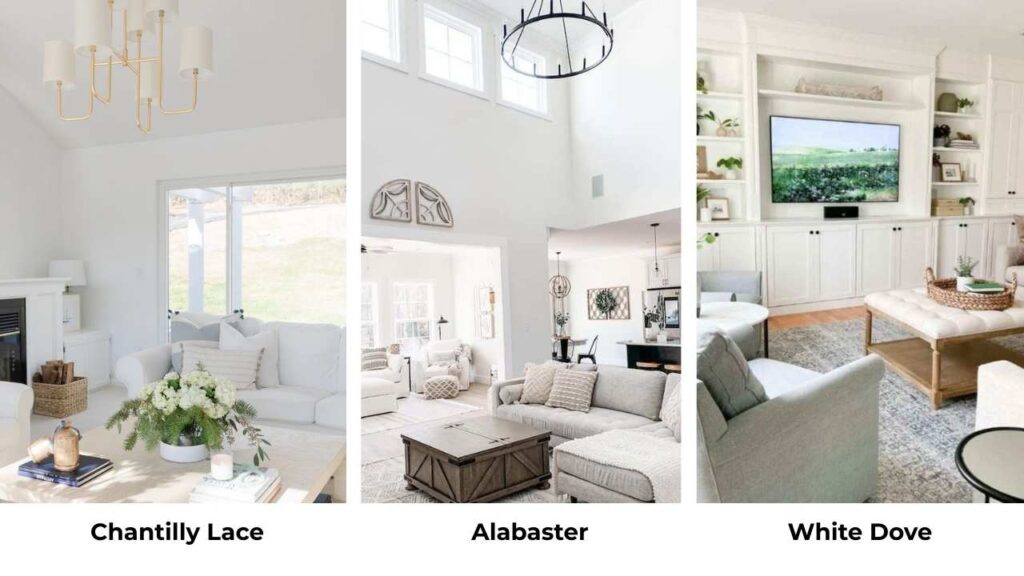
So you’re staring at paint swatches, Chantilly Lace vs Alabaster, two whites which everyone loves, but they couldn’t look more different when they’re on your walls.
I’ve been working with both of the colors.
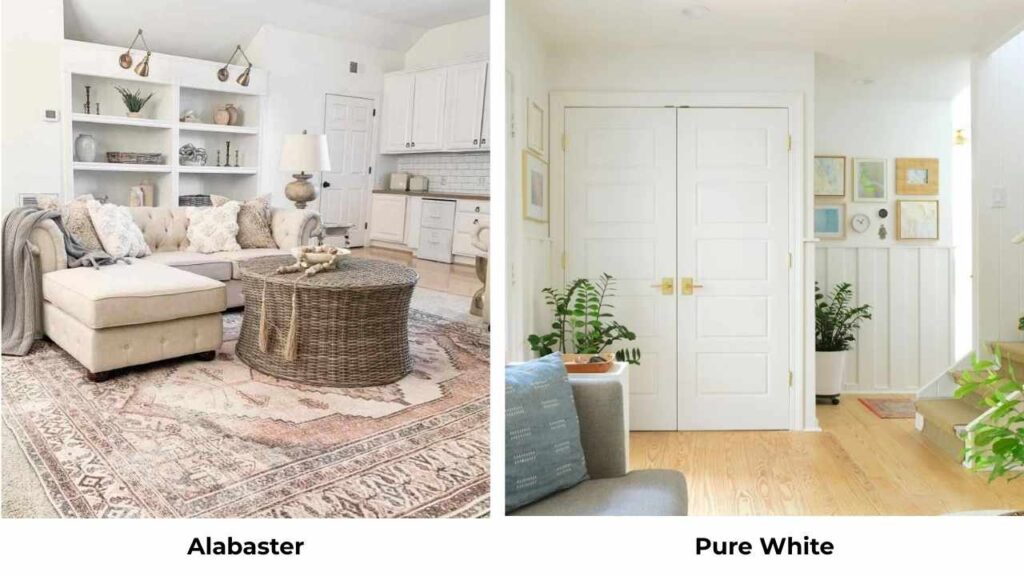
Chantilly Lace Benjamin Moore OC-65 and Alabaster Sherwin Williams SW 7008 are considered top-tier white paint colors, but here’s what nobody tells you that they differ in undertones, warmth.
How they reflect light, and the vibe they create in a space.
I’ve watched people stand in their half-painted living rooms looking stressed because they picked what they thought was a “safe white” and it’s wrong.
Most people don’t realize that white paint isn’t only white.
Undertones are sneaky that show different depending on your lighting, your flooring, your cabinets, and what direction your windows face.
Pick the wrong undertone and your space can feel cold when you want cozy, or dingy when you are going for fresh air.
Here’s what we’re covering, I’m breaking down what makes Chantilly Lace Vs Alabaster worth having, how their Light Reflectance Values (LRV) matter, why lighting will make or break your choice, and which rooms these colors work in.
We’ll compare them at how they look against other popular whites.
Here are my other blogs that you can also read:
- Light French Gray Vs Agreeable Gray
- Eider White Vs Alabaster
- Ballet White Vs White Dove
- Dove White Vs White Dove
- Liveable Green Vs Softened Green
Benjamin Moore Chantilly Lace Paint Color Overview (OC-65)

Chantilly Lace Benjamin Moore is one of the true, clean whites and they’re not wrong.
When I first started using it, I was working on a modern townhouse with big south-facing windows.
The homeowner wanted bright, fresh and gallery-like walls. I suggested Chantilly Lace and it delivered what they wanted.
The thing about Chantilly Lace is that it has minimal undertones, the barely-there cool, not blue, not gray but only clean.
Some people describe it as having a faint gray or violet cast in some lighting.
What it doesn’t have is any warmth like it is zero cream, zero beige, zero yellow.
It’s only WHITE.
The LRV is around 90 means it reflects a good amount of light back into your room.
I’m talking almost paper-white in bright conditions.
This makes it good for modern spaces, minimalist designs, or anywhere you’ve cool-toned materials like marble countertops, chrome fixtures, or concrete floors.
I’ve used it on trim many times when I want the sharp, clean contrast.
But here’s where people go wrong, they use it in a north-facing room with minimal natural light and then think why it feels cold or a bit grayish.
I did this once in a bedroom that had one small north-facing window.
My client called me after we painted and said, “It looks sad” She wasn’t wrong.
In low light or cool conditions, the subtle cool undertone becomes visible.
Homeowners and designers love Chantilly Lace for living rooms that get natural light, for bathrooms with white marble or subway tile, for bedrooms in modern homes, and for trim work.
Sherwin Williams Alabaster Paint Color Overview (SW 7008)

Alabaster color won Sherwin Williams’ Color of the Year back in 2016 and I swear it hasn’t left a single paint consultation.
It’s part of their “Top White Paint Colors” lineup for a reason because it’s forgiving.
Alabaster is an off-white with warm, creamy undertones.
But it doesn’t look yellow in most spaces. The warmth is gentle, almost soft.
It has an LRV of about 82, which is bright but softer than Chantilly Lace.
It absorbs light, which creates a relaxed, cozy feel instead of harsh, sharp vibe.
I remember the first time I used Alabaster, I was in doubt.
The homeowner kept saying she wanted “white but not white white”.
So, I suggested Alabaster for her main floor like in the living room, kitchen, hallways and it was perfect.
Warm to feel inviting but reads as white next to bright white trim or fixtures.
It plays well with warm wood tones, beige elements, and traditional hardware.
The beige undertone becomes obvious in south-facing rooms or with warm lighting, but it doesn’t go into out of place territory like some warm whites can and that is the reason this is special.
I’ve seen it in transitional homes, modern farmhouses, traditional spaces and it’s versatile.
People choose Alabaster for living rooms because it doesn’t feel sterile.
In bedrooms, it creates a soft, comfortable backdrop without being dark.
Bathrooms with brass or bronze fixtures are what we call Perfect.
Kitchens with warm wood cabinets are better.
Chantilly Lace Vs Alabaster: Key Differences
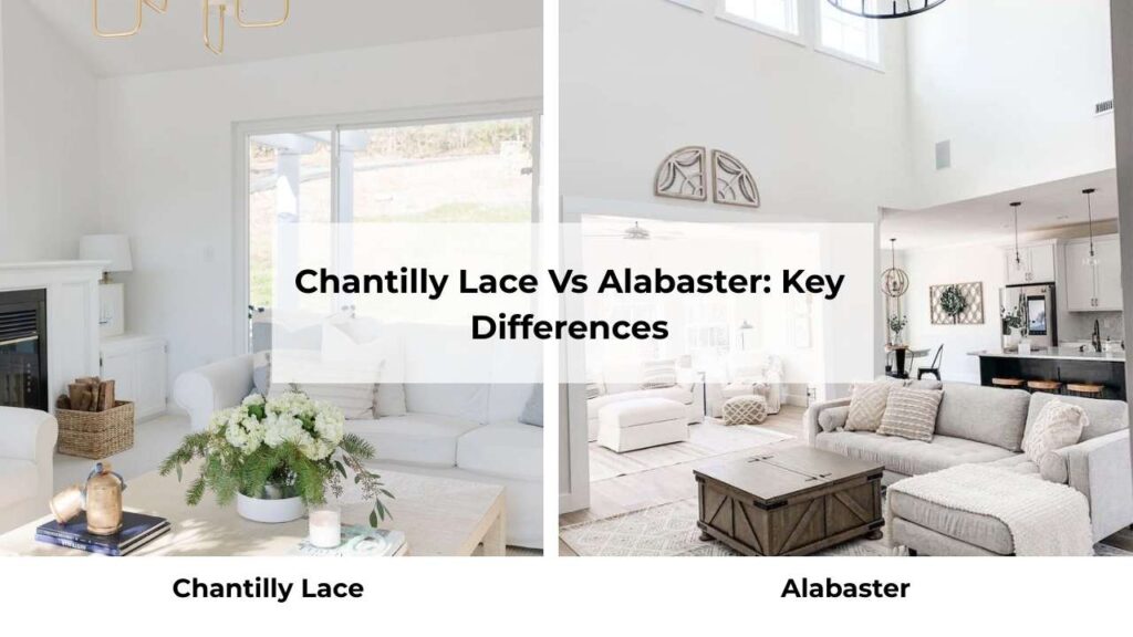
Okay, let’s get into the real comparison because this is where it matters.
These two colors may both be called “white” but they’re doing different things in your space.
LRV (Light Reflectance Value)
Chantilly Lace is at an LRV of about 90 which is quite high.
It’s bouncing all the light back into your room, which makes spaces feel big, bright, and open.
But the same reflectivity can make it feel harsh or clinical if you don’t have warmth from other elements.
Alabaster comes in around 82 LRV, which is bright but in a soft way.
It absorbs more light, which gives it a relaxed quality.
In small rooms or spaces with less natural light, Alabaster won’t feel as harsh as Chantilly Lace.
Here’s the thing nobody tells: LRV numbers are helpful but they don’t tell the whole story.
I’ve had clients get fixated on LRV and forget about undertones.
The undertone is what you’ll see on your wall.
Undertones
Chantilly Lace is neutral to subtle cool.
In many lighting, it looks pure white. But in north-facing rooms, shadowed areas, or with cool artificial lighting, you can see the faint gray or slightly blue-violet undertone.
It’s not warm, there’s no cream, no beige hiding in there.
Alabaster is warm with creamy, soft beige undertones. It never looks as pure white when you put it next to something like Chantilly Lace.
The warmth is what gives it the inviting, soft feel.
In warm lighting or south-facing rooms, the undertones come out, but it doesn’t look yellowish.
I learned this on a whole-house project.
When I used Chantilly Lace in the main living areas and Alabaster in the bedrooms thinking they were close.
But they looked different where the spaces connected.
Lighting Effect
Natural lighting changes everything with these colors.
Chantilly Lace in bright, direct sunlight looks incredible, clean, fresh and almost glowing.
But put it in a room with northern exposure or minimal windows and it can look gray or feel flat.
I’ve also seen it look cold in spaces with cool-toned materials around it.
Alabaster handles tricky lighting.
In the North-facing room, it stays soft and warm.
In the low light it looks like white and gentle.
South-facing with the sun, the warmth comes through beautifully without looking creamy or off-white in a bad way.
Artificial lighting matters too.
Cool LED bulbs will emphasize Chantilly Lace’s cool undertone.
Warm bulbs help but won’t make it feel cozy.
Alabaster performs better with warm bulbs; they bring out the soft, inviting quality.
Style Compatibility and Uses
Chantilly Lace works best in:
- Modern or contemporary interiors where you want the fresh, clean aesthetic
- Minimalist spaces with light
- As trim color when you want sharp contrast against warm walls
- Homes with cool-toned fixed elements like marble, chrome fixtures, concrete
Alabaster shines in:
- Traditional, transitional, or modern farmhouse styles
- As a whole-house wall color because it’s forgiving in different rooms
- Spaces with warm wood tones, beige or tan finishes
- Kitchens with natural wood cabinets or warm countertops
- Any room where you want comfortable
Here’s a comparison table because seeing it side-by-side helps:
| Feature | Chantilly Lace OC-65 | Alabaster SW 7008 |
| Brand | Benjamin Moore | Sherwin Williams |
| LRV | ~90 | ~82 |
| Undertone | Neutral to cool | Warm, creamy |
| Brightness | Very bright, almost stark | Soft bright, more relaxed |
| Best Lighting | Abundant natural light | Forgiving in all lighting |
| Style Match | Modern, minimalist, contemporary | Traditional, transitional, farmhouse |
| Risk Factor | Can feel cold/gray in low light | Can feel too warm in ultra-modern spaces |
| Best Use | Trim, bright rooms, cool-toned spaces | Whole-house color, warm spaces |
How Do Chantilly Lace and Alabaster Look in Different Rooms?
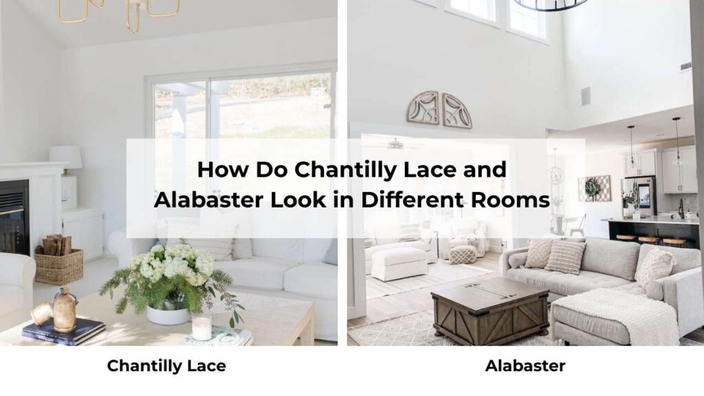
Room selection matters with these two. I’ve seen both colors look amazing and awful in the same room type depending on the specifics of the space.
Living Room
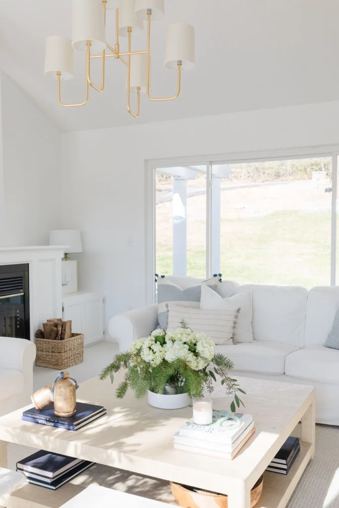
Chantilly Lace in a living room is gorgeous if you’ve big windows and natural light coming in.
I used it in a modern living room with floor-to-ceiling windows facing south and it looked fresh, clean and gallery-like.
The homeowner had cool gray furniture and black accents which worked beautifully.
But the same color in a living room with one west-facing window and beige carpet, felt cold and unwelcoming.
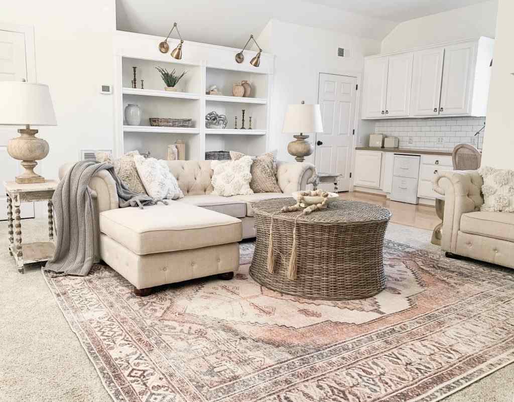
Alabaster in a living room creates a warm, inviting atmosphere which makes people want to sit down and stay a while.
I’ve used it in traditional living rooms with warm wood floors, transitional spaces with mixed materials, in a contemporary living room where the client wanted modern but not cold.
It plays well with any furniture style.
The soft, creamy undertone makes the space feel finished and comfortable.
Bedroom
Chantilly Lace in bedrooms can go either way.
In a bright master bedroom with great natural light and modern furnishings, it looks fresh and clean.
But bedrooms are where people want to feel comfortable and relaxed, and Chantilly Lace becomes too harsh for that.
I’ve had clients say it feels “too awake” for a sleeping space.
Alabaster in bedrooms is best, this is where it shines.
The soft warmth creates a cozy, restful vibe you want in a bedroom.
It works with any bedding color, doesn’t compete with furniture, and feels fresh to not be boring.
I’ve used it in master bedrooms, guest rooms, kids’ rooms and it’s consistent.
The warm undertone helps the space feel restful.
Bathroom
Chantilly Lace in bathrooms works well when you’ve white subway tile, marble countertops, chrome fixtures because of all the cool, clean materials.
It creates a spa-like, fresh feeling.
I used it in a bathroom renovation with white marble and it was perfect. The high LRV also helps small bathrooms feel large because it’s reflecting light.
But if your bathroom has warm wood vanity, brass fixtures, or beige tile, then Chantilly Lace can create out of place contrast.
It’ll look too harsh against the warm materials.
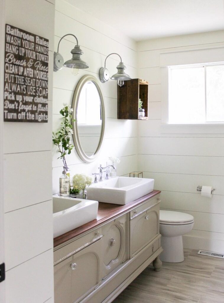
Alabaster in bathrooms is forgiving.
It works with white fixtures, but also plays well with brass, bronze, warm wood vanities, and beige tile if you’re stuck with it.
The warmth keeps it from feeling sterile but it’s bright to make the space feel clean and fresh.
I default to Alabaster for bathroom projects unless the client wants the fresh, modern look.
Kitchen
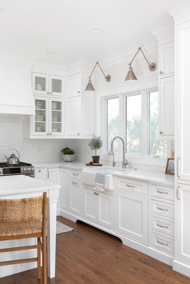
Chantilly Lace in kitchens looks phenomenal with white cabinets, if you’re going for the clean, modern aesthetic.
I’ve used it on walls with white shaker cabinets and marble countertops and it was stunning.
But here’s where I messed up when I used it in a kitchen with warm oak floors and beige granite countertops.
The white looked blue-ish against thE warmth.
Alabaster in kitchens is my most-used kitchen wall color.
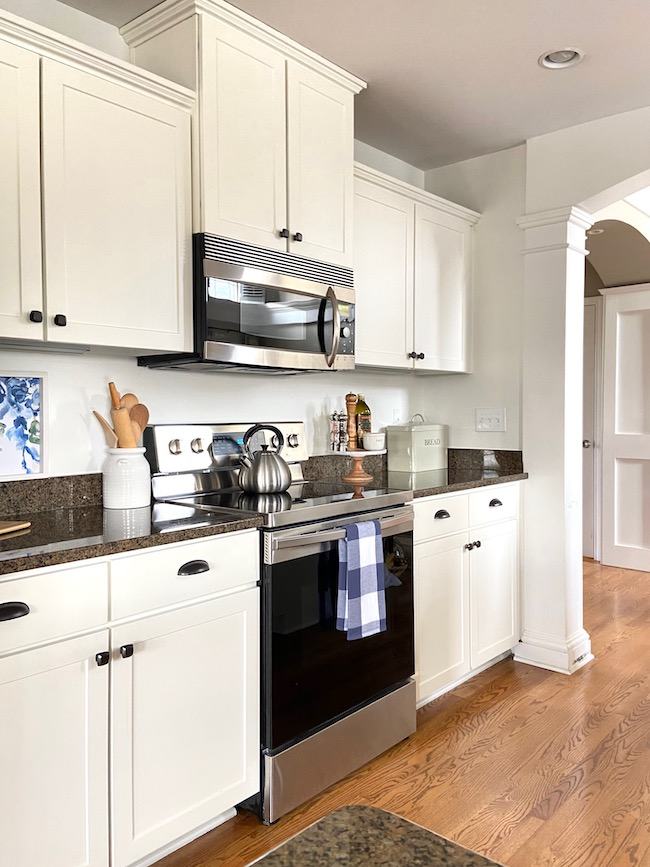
It works with white cabinets but adds warmth so the space doesn’t feel cold.
It’s PERFECT with natural wood cabinets, warm countertops, and mixed metal finishes.
I’ve used it as a cabinet color for clients who want soft white cabinets instead of bright white.
The creamy undertone makes kitchens feel welcoming.
Chantilly Lace Vs Alabaster Vs Other Colors
Because these two whites never exist together.
You’re always comparing them to other colors you’ve heard about or seen somewhere.
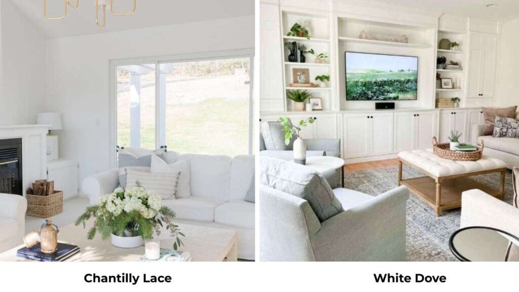
Alabaster Vs White Dove
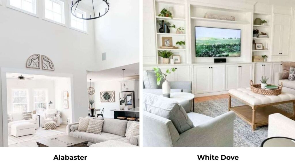
White Dove (BM OC-17) is Benjamin Moore’s to Alabaster in some ways.
It’s a warm white but has gray in its undertones compared to Alabaster’s beige-cream.
White Dove is softer and more muted than Alabaster.
I prefer White Dove when clients want warmth but have cool fixed elements.
Chantilly Lace Vs Greek Villa
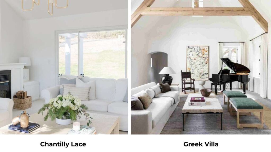
Greek Villa (SW 7551) is Sherwin Williams’ attempt at a clean white similar to Chantilly Lace.
It’s warmer than Chantilly Lace but not much, very bright, very clean.
They’re close enough that I choose based on which brand I’m using for other colors in the house.
Greek Villa is more forgiving in less-than-ideal lighting.
Snowbound Vs Chantilly Lace
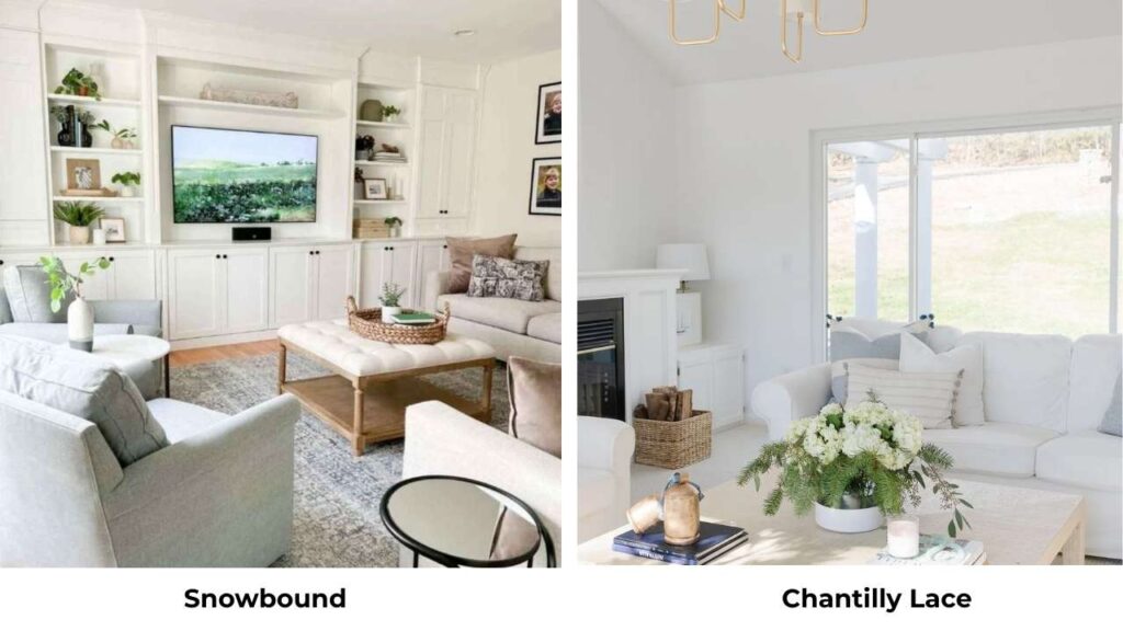
Snowbound (SW 7004) has a gray-blue undertone that’s more visible than Chantilly Lace’s subtle cool lean, it’s cool.
I use Snowbound when clients want a white with visible cool undertones for the modern, Nordic feel.
Chantilly Lace is clean and neutral.
Chantilly Lace Vs Swiss Coffee
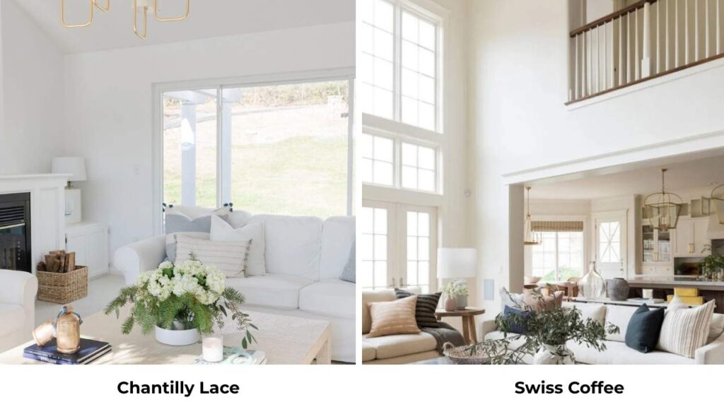
Swiss Coffee (BM OC-45) is warm and creamy, not in the same category.
It’s an off-white with yellow-beige undertones, kind of like Alabaster but warm.
If you’re comparing these two, you’re deciding between true white (Chantilly Lace) and warm off-white (Swiss Coffee).
Chantilly Lace Vs White Dove
White Dove is warmer and softer than Chantilly Lace.
White Dove has the subtle gray undertones with warmth, while Chantilly Lace is clean and cool.
I use White Dove more for whole-house projects because it’s forgiving in varied lighting.
Chantilly Lace is for when clean, fresh white is non-negotiable.
SW Pure White Vs Chantilly Lace
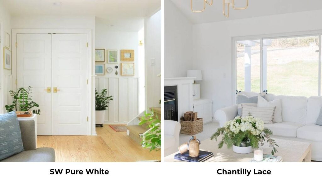
Pure White (SW 7005) is Sherwin Williams’ clean white option.
It has a subtle warm undertone, not as much as Alabaster but more than Chantilly Lace.
It’s a nice middle ground.
I’ve used Pure White on trim with Alabaster on walls and it works great.
Pure White vs Chantilly Lace comes down to whether you want a hint of warmth (Pure White) or clean neutrality (Chantilly Lace).
Alabaster Vs Pure White
Pure White is brighter and cleaner than Alabaster, high LRV, less obvious undertone.
Alabaster is visibly warm and soft.
Pure White works better in modern spaces, Alabaster better in traditional or transitional.
I use them together sometimes like Pure White on trim, Alabaster on walls.
Here’s a comparison table:
| Color | Brand | LRV | Undertone | Compared To Chantilly Lace | Compared To Alabaster |
| White Dove | Benjamin Moore | ~85 | Warm with gray | Warmer, softer | Less creamy, more gray |
| Greek Villa | Sherwin Williams | ~89 | Neutral-slight warm | Very similar, slightly warmer | Much cooler, crisper |
| Snowbound | Sherwin Williams | ~86 | Cool gray-blue | Cooler, more gray-blue | Much cooler |
| Swiss Coffee | Benjamin Moore | ~80 | Warm yellow-beige | Much warmer, creamier | Similar warmth, slightly more yellow |
| Pure White | Sherwin Williams | ~84 | Slight warm | Slightly warmer | Cooler, cleaner, brighter |
Which One to Choose Between Chantilly Lace Vs Alabaster?
So here’s how I make this decision when working with clients:
Choose Chantilly Lace if:
- You want a true, clean, fresh white
- Your space has natural light, mainly south or east-facing windows
- You’re going for modern, contemporary, or minimalist style
- Your fixed elements are cool-toned
- You’re using it for trim work and want sharp contrast
- You’re not afraid of white that looks as white
Choose Alabaster if:
- You want white but with warmth and softness
- Your space has varied lighting or isn’t bright
- You’re working with traditional, transitional, or farmhouse style
- Your fixed elements include warm wood tones, beige, or tan materials
- You’re painting a whole house and need forgiving in different rooms
- You want white that feels inviting and comfortable
Real talk: Most people are happy with Alabaster.
It’s forgiving, works in many situations, and doesn’t risk feeling cold or harsh.
But if you want the fresh, clean, modern white look, Chantilly Lace delivers it better than anything else.
My biggest advice is to get samples of both and paint them on your walls.
Not on small paint swatches but on 2×2 foot sections on different walls in the room.
Look at them at different times of day.
Look at them next to your floors, your cabinets, your countertops.
The difference will be in YOUR space with YOUR lighting and YOUR fixed elements.
Conclusion
The difference between Chantilly Lace Vs Alabaster comes down to undertones and how they perform in your space.
Chantilly Lace gives you a clean, neutral-to-cool white which is perfect for modern spaces with great light and cool-toned materials.
Alabaster gives you warm, soft, forgiving off-white that works in many situations and creates comfortable, inviting spaces.
I’ve used both colors many times.
I’ve messed up with both by using them in the wrong situations.
So, pay attention to your lighting because it changes everything.
Look at your fixed elements like your floors, cabinets, and countertops, so your wall color needs to work with them.
And don’t assume white is only white because these two colors prove that undertones matter more.
Test them both and test them on big samples, on multiple walls, observed at different times of day.
The money you spend on samples will save you from repainting your rooms.
Your lighting will decide which one works.
Because comparing Chantilly Lace Vs Alabaster can make your decision a bit confusing.
FAQs on Chantilly Lace Vs Alabaster
The main difference is undertones and brightness. Chantilly Lace is a clean, neutral-to-cool white with an LRV of about 90 which is very bright and fresh with minimal undertones. Alabaster is a warm off-white with creamy, soft beige undertones and an LRV around 82 which is soft and forgiving.
Chantilly Lace is popular because it’s one of the true, clean whites. It doesn’t have yellow, beige, or cream undertones that make whites look off. The high LRV makes spaces feel bright and open, which is what people want from white paint. It’s consistent, predictable, and has a modern, fresh look.
Alabaster is special because it’s versatile and forgiving. The warm, creamy undertones make it feel inviting without looking yellow or dingy in lighting conditions. It won Color of the Year for Sherwin Williams in 2016 and hasn’t stopped being recommended since. It works in almost any style like traditional, transitional, farmhouse, and contemporary spaces.
Alabaster stays soft and warm without crossing into dingy territory. But if you put it in a space with minimal natural light, next to bright cool whites, or in a room with cool-toned materials, the warm undertones can be dingy or too yellow by comparison.