So here’s the thing about Olive Green Vs Army Green that they look identical in the small paint swatches at the store.
These two earthy green shades are so close that even I had to learn what separates them.
Both pull from the military heritage, both feel grounded and muted, and both show up EVERYWHERE in interiors, fashion, branding, and design work.
What makes this choice tricky is that both shades are in the muted, neutral-toned zone.
They’re both alternatives to standard greens, both feel organic and grounded, both pair well with wood tones and natural materials.
So, the confusion makes sense. Choosing the wrong one doesn’t change your paint color but it changes the feel of your space.
So, I’m going to walk you through everything I’ve learned with Olive Green Vs Army Green.
We’ll break down what each shade IS, how their undertones are, where they work best in your home, how they show up in fashion and styling, and how they compare to other greens you are considering.
Here are my other blogs that you can also read:
- City Loft Vs Alabaster
- Pale Oak Vs Revere Pewter
- Classic Gray Vs Pale Oak
- Cloud White Vs White Dove
- Eider White Vs Alabaster
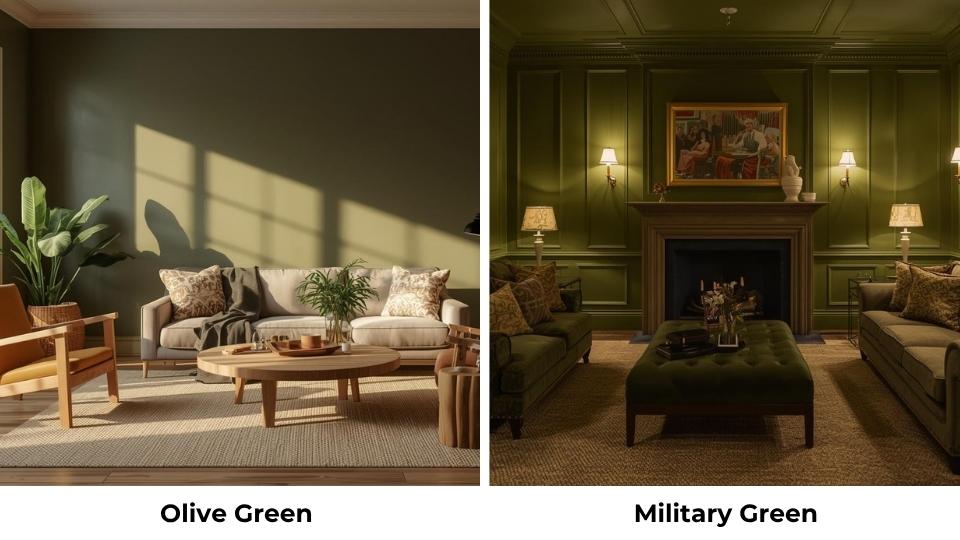
Overview of Olive Green
Olive Green is the yellowish-green you see on olive trees before the fruit ripens. It’s earthy but it also has warmth to it that I love.
When I describe it to clients, I say it’s a muted green with yellow or brown undertones. Compared to the deep forest green or emerald, olive looks WARM.
It doesn’t have the cool, jewel-tone intensity but it’s relaxed.
The historical roots are interesting too. The name comes from the unripe olives, but the color became popular in military uniforms and camouflage because it blends well with natural environments.
Different from Army Green, olive was common in European armed forces and had that light and more yellowish quality.
I’ve used Olive Green in many projects and what I keep coming back to is how soft it feels and it’s not dramatic and doesn’t demand attention. It is there looking good and making everything around it feel natural.
In interiors, this is big. I once painted a living room in a warm olive and paired it with cream trim and medium-toned wood furniture. The room exhaled, felt comfortable, like you could relax there.
For fashion, Olive Green works because it’s versatile without being boring.
Olive cargo pants, olive jackets, olive accessories, they all work across casual and more polished looks. The warmth keeps it from feeling too utilitarian.
In exterior applications, I’ve seen olive used on Craftsman-style homes and modern farmhouses.
It looks organic and understated, which is what you want when you’re trying not to overpower your landscaping.
Overview of Army Green
Army Green is different. This is the color of U.S. military uniforms, tactical gear, and that heavy-duty canvas bag.
It’s dark, cool, and more muted than olive. Where olive has warmth, Army Green has authority and strength.
Army Green is a dark, muted green that is into gray and brown undertones. Some versions pick up a slight blue cast depending on the light.
But what it does NOT have is that yellow warmth you get with olive.
This shade became a standard issue during World War II and stuck around because it WORKS.
It’s practical, it hides dirt, it blends into a variety of terrains, and it doesn’t show like light colors.
Army Green intimidated me for a long time. It felt heavy, serious and trying to make a statement for most projects.
But then I used it in a home office for a client who wanted something bold and masculine without going black or navy.
The result was incredible. The room felt grounded and focused. It had a quiet intensity that made you want to sit down and get work done.
That’s what Army Green does. It adds weight, depth. It’s not soft or easygoing like olive but it’s deliberate.
In fashion, Army Green shows up in military-inspired jackets, utility wear, and outdoor clothing.
It pairs beautifully with black, tan, and cream, but it’s not as easy to style as olive. You have to lean into the utilitarian vibe or it looks off.
For exteriors, I’ve seen Army Green work on modern builds and industrial-style homes. It’s bold without being loud. But again, it needs the right setup.
One mistake I made: I used Army Green in a small, poorly-lit bathroom thinking it would feel cozy but it did not.
It felt like a cave, dark, oppressive, borderline depressing. I ended up repainting in a light sage, and the space opened up.
What is the Difference Between Olive Green and Army Green?
So, the key differences between Olive Green Vs Army Green are close enough to confuse but different to change your design outcome.
I’ve seen people choose one thinking they’re getting the other, and the results were not great. So let’s break this down, because the details matter.
Color Code
Let’s start with the numbers, because sometimes that’s the only way to see what’s different.
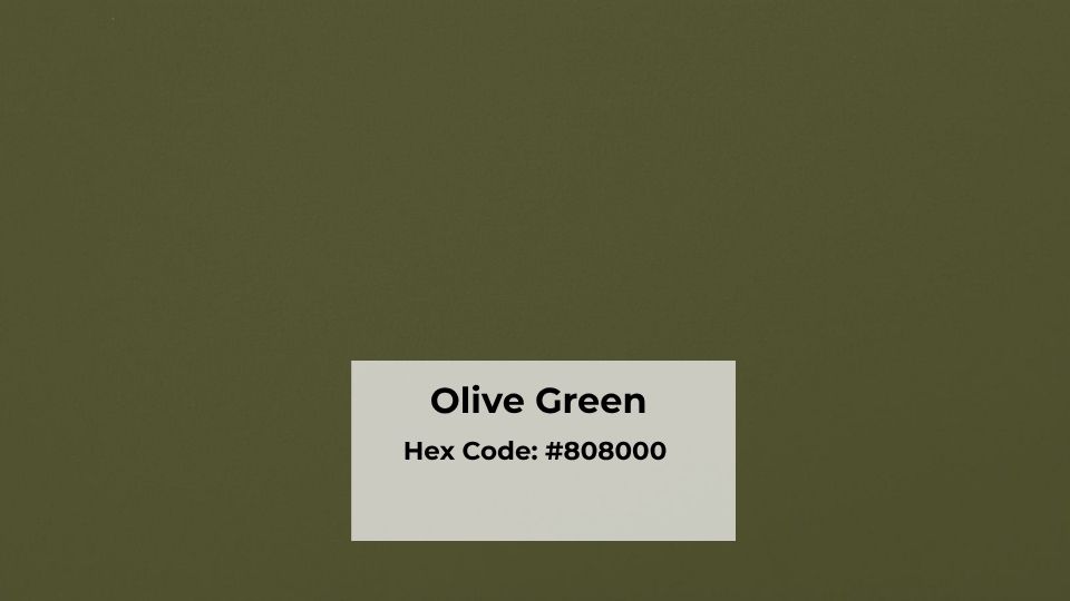
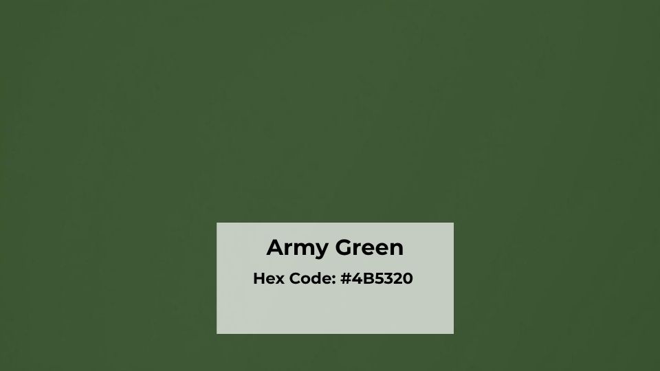
Army Green: HEX #4B5320 | RGB 75, 83, 32
Olive Green: Doesn’t have one universal code because “olive green” is more of a range, but most true olives are around HEX #808000 or #6B8E23, which are visibly light and yellow.
When I’m specifying paint for a project, I don’t always rely on these codes because paint brands interpret them differently.
But the RGB breakdown for Army Green shows you the red and green values are close (75 and 83), while blue is LOW (32). The low blue keeps it earthy and grounded but also dull.
Olive Green, by contrast has high green and red values with moderate blue, which is what gives it the warm and more vibrant feel.
Undertones
Army Green has gray and brown undertones. Sometimes you’ll catch a hint of blue depending on your lighting.
It’s a COOL green, or at least neutral-cool. The gray influence makes it feel subdued, serious and militant.
Olive Green has yellow and brown undertones. This makes it a WARM green. It feels organic, connected to nature, less tactical and lived-in.
Remember, undertones will make or break your design. I once repainted a kitchen backsplash area because I didn’t account for how the gray undertones in Army Green would clash with the warm oak cabinets. The space looked muddy and disconnected.
Visual Impact
Army Green is hard, dark, rich and more commanding. When you walk into a room painted Army Green, you see what it is looking like. It doesn’t fade into the background but it anchors the space.
Olive Green is gentle. It’s present, but it’s not demanding your attention. It feels soft, welcoming and easy to live with long-term.
If I’m working with a client who wants a bold statement, I’ll consider Army Green. If they want something calming and versatile, then I recommend to go with Olive Green.
Brightness and Depth
Olive Green is lighter and more vibrant and not BRIGHT in the neon way, but it has more life to it and energy.
Army Green is deep and more muted. It absorbs light rather than reflecting it, which gives it the heavy, grounded quality.
In practical terms: olive works better in small spaces or dark rooms because it won’t close them in. Army Green needs room to breathe or it’ll overwhelm.
Lighting Effect
Lighting is where people mess this up commonly.
Army Green in natural daylight looks rich and sophisticated. In warm artificial light, it can go muddy and brown. In cool LED light, it picks up the slight blue-gray cast I mentioned earlier.
Olive Green loves natural light. It gets warm and golden during the day. Under warm artificial light, it stays true. Under cool light, it can look washed out or too yellow.
I always tell clients to test BOTH colors in their space at different times of day. Paint a big poster board, move it around the room, look at it in morning light, afternoon light, and evening light with your lamps on.
I skipped this step once on a dining room project. Choose an olive in the store under fluorescent lighting. Got it on the walls and realized it looked different under the client’s warm pendant lights.
Style and Best Uses
Olive Green works best when you want:
- Warm, organic interiors
- Nature-inspired spaces
- Casual, relaxed fashion
- Versatile accent color that plays well with creams, tans, terracotta, blush pinks
Army Green works best when you want:
- Bold, structured interiors
- Masculine or industrial spaces
- Tactical, utilitarian fashion
- Accent color that pairs with black, white, concrete gray, natural wood
Here’s a comparison table I refer:
| Aspect | Olive Green | Army Green |
| Undertone | Yellow/Brown (warm) | Gray/Brown (cool-neutral) |
| Depth | Medium, lighter | Dark, deeper |
| Feel | Soft, organic, relaxed | Bold, structured, authoritative |
| Best Light | Natural daylight, warm artificial | Bright natural light, needs space |
| Interior Use | Living rooms, bedrooms, kitchens | Offices, accent walls, modern spaces |
| Fashion Use | Casual jackets, versatile basics | Military-style wear, utility pieces |
| Pairs With | Cream, terracotta, blush, gold | Black, white, tan, concrete |
Olive Green Vs Army Green: For Interiors
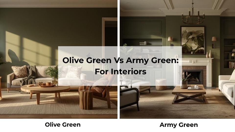
So you’re choosing between these colors for your home. Both are more interesting than another gray room.
But they behave differently depending on where you use them, and opinions based on what I’ve seen work and what I’ve seen crash and burn. So, let’s get into it and see what will work.
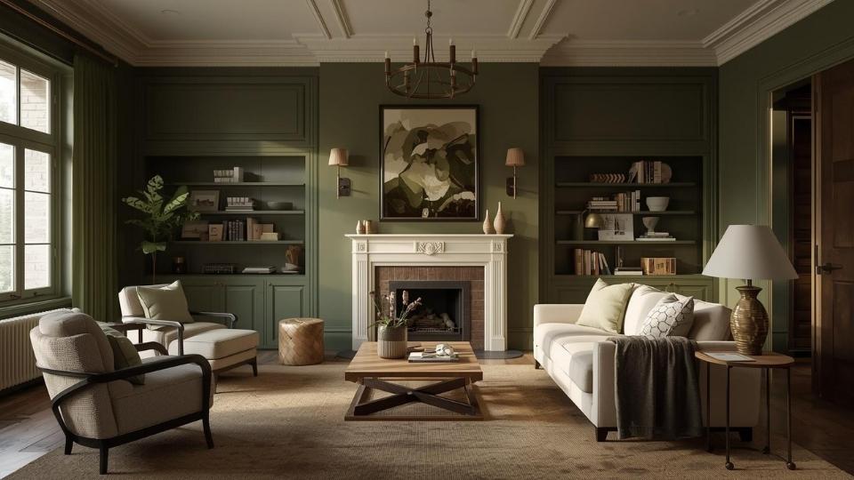
Living Room
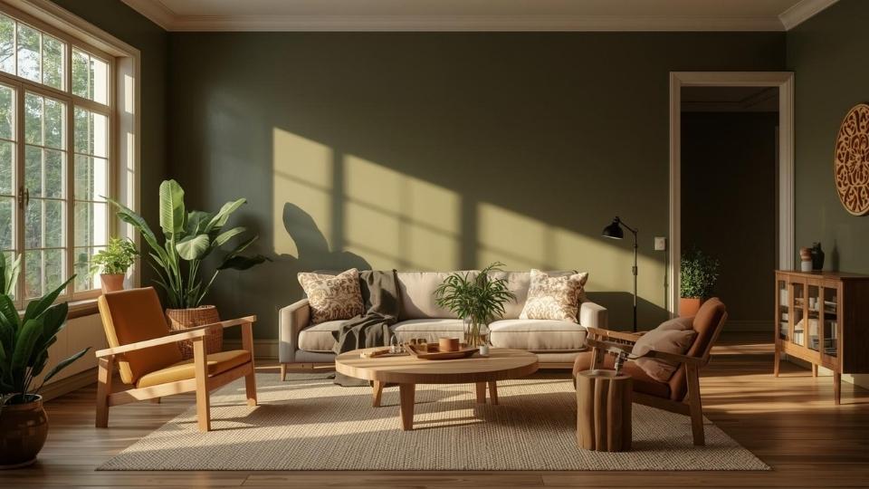
Olive Green in the living room is good.
I used a warm olive on the walls of a south-facing living room and it transformed the space.
The yellow undertones picked up the natural light during the day and made the room feel warm.
Paired it with a cream sectional, some terracotta throw pillows, and mid-century wood furniture.
The key with olive in a living room is that it creates an effortless, laid-back vibe.
One trick I love is to use olive on three walls and keep your big wall in a soft cream or warm white.
This keeps the room from feeling too enclosed while getting the rich color experience.
Army Green in a living room is a bit tough but rewarding when you get it right.
I spec’d Army Green for an accent wall behind a leather sofa in a modern industrial loft.
The rest of the walls were white, floors were polished concrete, and we brought in black metal shelving.
The Army Green added an incredible depth and masculinity without making the space feel dark.
But here’s the mistake, people paint ALL the walls in Army Green and then wonder why their living room feels like a bunker.
Unless you have massive windows and natural light, keep Army Green to ONE wall max.
Also, Army Green with traditional furniture looks weird. It needs modern or industrial pieces to make sense. Put it behind your grandmother’s floral couch and you’ll regret it.
Bedroom
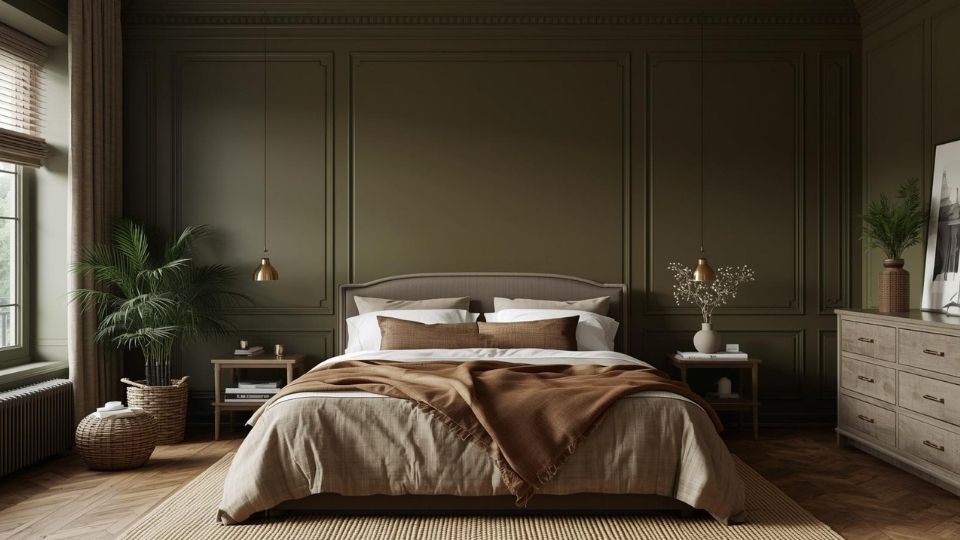
Olive Green in a bedroom is where I think this color shines.
Bedrooms need to feel restful and Olive delivers that WITHOUT being boring. I painted my own bedroom in a soft olive three years ago and I’m not tired of it.
It’s warm to feel cozy, muted not to be stimulating, and natural to work with any bedding or decor I throw at it.
One thing I learned is to pair olive walls with warm wood tones and natural linen bedding.
The room feels cohesive and organic. Avoid cool-toned grays or silvers because they clash with olive’s warmth.
Also, olive looks AMAZING with plants. And I mean real plants, not the sad fake ones. The yellow-green undertones complement greenery in a way that feels intentional.
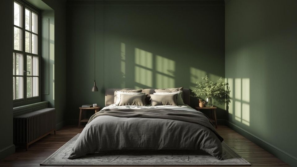
Army Green in a bedroom is a commitment.
I’ve only done it twice, and both times were for clients who wanted a dramatic, moody bedroom.
One was a bachelor who wanted his bedroom to feel like a modern retreat. We did Army Green on all four walls, white ceiling, black-framed bed, bright white bedding, and brass accents.
It was STUNNING, dark, cozy, enveloping but in a good way.
Army Green in a bedroom only works if you have good natural light OR you’re going for a dark, cocoon-like space. And you need to commit to the mood with your furniture and bedding.
Bathroom
Bathrooms are interesting because they’re small spaces where you can take risks you wouldn’t take anywhere else.
Olive Green in a bathroom can feel calm and organic, only if you style it right.
I used olive in a powder room with white subway tile, brass fixtures, and marble countertops. Added some eucalyptus in a vase and vintage-style mirrors. The space felt elevated but warm and welcoming.
Key for olive in bathrooms, keep your surfaces light and bright. White tile, light wood vanity, plenty of mirrors.
The olive becomes an accent that ties everything to nature without overwhelming.
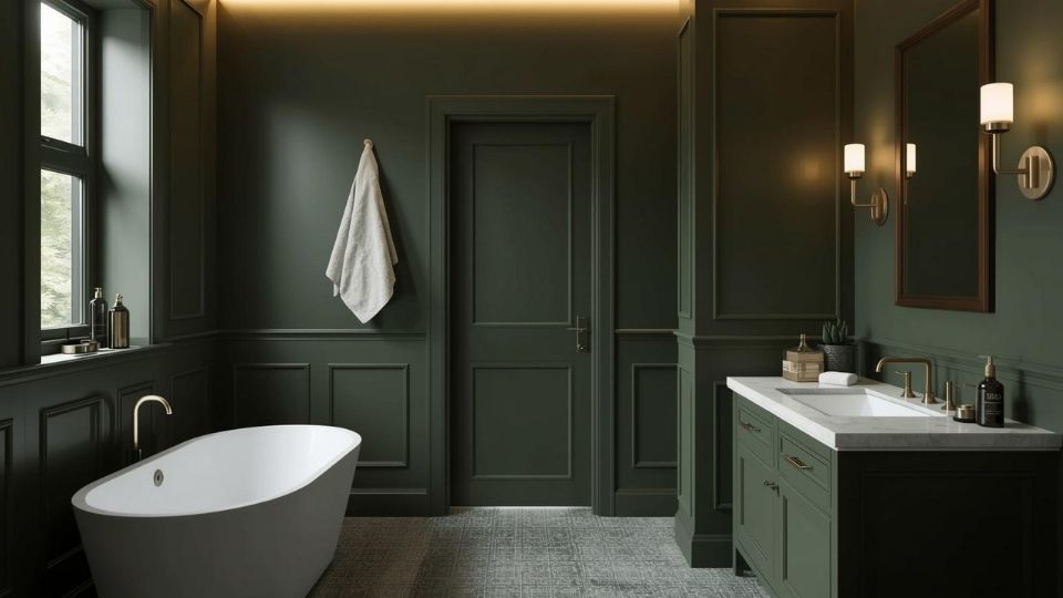
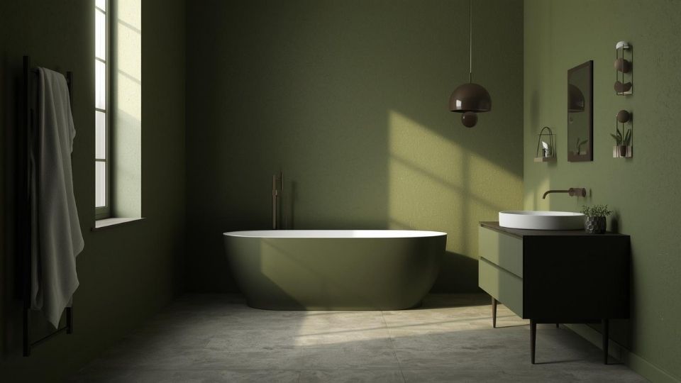
Army Green in a bathroom is hit or miss.
I tried it once in a primary bathroom and it was a mistake. The space wasn’t huge, the natural light was limited, and the Army Green made everything feel heavy and closed in.
We corrected it by painting the lower half Army Green and doing white shiplap on the upper half, which helped, but I think olive would’ve been better.
Where Army Green CAN work in a bathroom, large spaces with great light, especially if you’re going for an industrial or modern aesthetic.
Pair it with concrete or cement tile, black fixtures, and white to break it up.
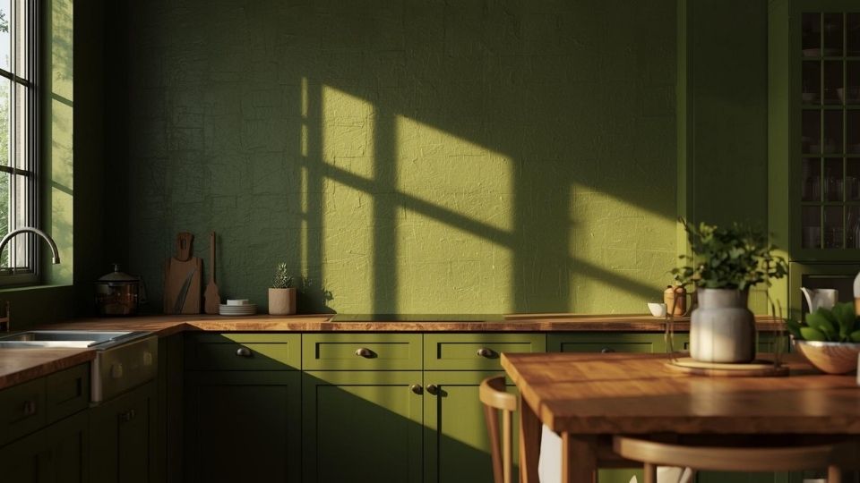
Kitchen
Kitchens are where I’ve experimented the most with both colors, and I have THOUGHTS.
Olive Green cabinets are in trend right now, and for good reason. They’re warm, they’re interesting, and they work with many different styles.
I designed a kitchen with olive green lower cabinets and white uppers. Brass hardware, white quartz counters, white subway tile backsplash, and light wood open shelving.
The olive grounded everything and added personality without feeling trendy or like it would look outdated.
Another approach: olive walls with white or wood cabinets. I’ve done this in many kitchens and it always feels fresh and organic.
The key is balancing the green with white and natural materials so that it doesn’t look muddy.
Army Green in a kitchen is BOLD, and you have to own it.
I did Army Green cabinets in a modern kitchen with concrete countertops, black hardware, and white walls. The appliances were stainless, and the floors were light oak.
The Army Green cabinets became the statement piece, and the kitchen felt confident and architectural.
But, Army Green cabinets aren’t for everyone. They’re dark, they make a strong statement, and if you’re not into the moody, modern vibe then you’ll not like it.
One mistake I made: I used Army Green on uppers AND lowers in a kitchen with limited natural light and it was too much.
The space felt oppressive. We repainted the uppers in white and it opened up. If you’re going Army Green in a kitchen, use it strategically, not everywhere.
Olive Green And Army Green In Fashion and Outfit Inspiration
I’m not a fashion expert, but I’ve worked with stylists and been involved in photo shoots for design projects to have opinions about how these colors show up in clothing. And honestly, they behave similarly to how they work in interiors.
Olive Green is the easy and versatile option. It’s warm, friendly and works with many different styles and skin tones.
Clothing
Olive Green shows up in casual wear. Olive cargo pants, olive utility jackets, olive t-shirts, they’re wardrobe staples for a reason.
I own an olive green field jacket that I’ve had for many years. It goes with everything. Black jeans, blue jeans, white t-shirt, navy sweater, doesn’t matter. The warmth of the olive makes it easy to pair with both cool and warm tones.
For women, olive works beautifully in flowy tops, linen pants, casual dresses. It’s earthy without being boring, and it pairs well with gold jewelry, tan leather accessories, and neutral shoes.
The key with olive in fashion: it enhances an outfit by being a grounded neutral. It’s not THE statement, it’s the thing that makes everything else work.
Army Green in clothing is specific. It’s utilitarian, structured, it’s got the military-inspired edge.
I’ve seen Army Green jackets styled well like in bomber jackets, parkas, structured blazers. They work when you’re leaning into the tactical, put-together vibe. Pair with black pants, white tee, boots.
Army Green cargo pants or utility pants can work too, but they’re harder to style than olive because they’re cool and serious. You have to balance them with soft pieces or it will not look good.
One observation: Army Green looks better on people with warm skin tones or those who can handle cool colors. Olive’s warmth is universally flattering.
Accessories
Olive Green accessories are subtle and versatile.
I’m talking olive bags, scarves, hats and sneakers. Because the olive is warm and muted, it acts like a neutral. An olive leather bag works with tan, black, navy, cream and almost with everything in your closet.
I bought an olive canvas tote thinking I’d use it for grocery runs. Turns out I use it for EVERYTHING. It’s neutral not to clash but interesting not to be boring.
Army Green accessories is a statement.
An Army Green backpack or duffel bag has the tactical, outdoor vibe. It works if that’s your aesthetic, but it’s not as versatile as olive.
Army Green scarves or hats can work in fall and winter, if you’re styling them with blacks, grays, and other neutrals but they’re more niche.
Olive Green Vs Army Green Vs Other Colors
Alright, so now you’re probably wondering how these two stack up against the OTHER greens you’re seeing everywhere.
Because let’s be honest, the green family is HUGE and confusing, and paint companies aren’t helping by naming seventeen different shades “sage” or “moss” or “forest.”
Let me break down the comparisons that actually matter based on what I see people confuse most often.
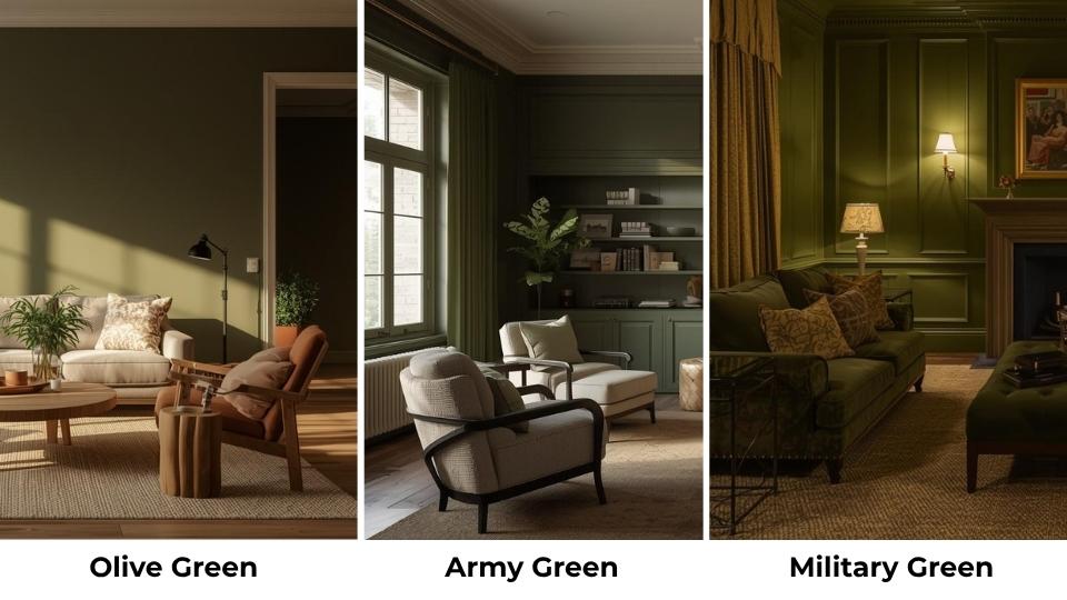
Military Green Vs Army Green
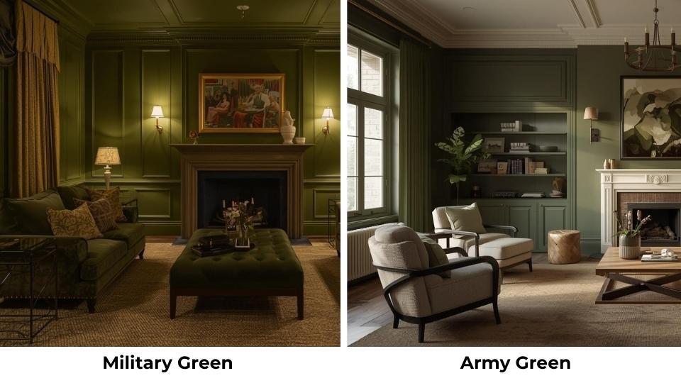
Military Green is an umbrella term. It refers to ANY green shade used by armed forces which means it INCLUDES Army Green, but also Olive Drab, Ranger Green, and other tactical variants.
So when someone says “military green,” they mean a bunch of different things. Army Green is ONE specific military green, the dark, gray-brown version.
The difference matters in design because “military green” isn’t specific. If you tell a painter “military green,” you may get Army Green, you may get OD Green, you may get something different.
Army Green Vs Dark Olive Green
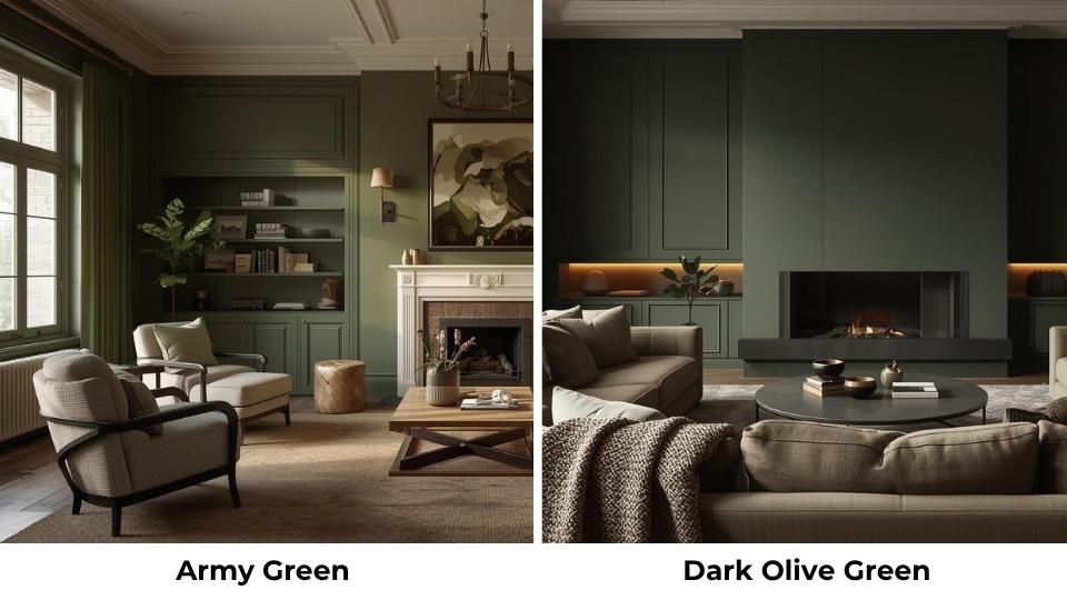
Dark Olive Green is a deep, rich version of standard olive.
It keeps the yellow-brown undertones that make olive warm, but it’s got depth and saturation. So it is somewhere BETWEEN regular olive and Army Green.
Army Green is cool and gray-based.
If you like the warmth of olive but want something bold and dramatic, dark olive is the middle ground. I’ve used it on accent walls where regular olive felt light but Army Green felt heavy.
Olive Green Vs Dark Green Vs Army Green
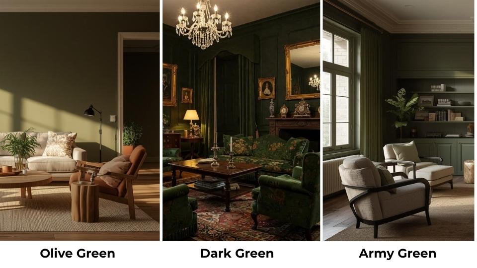
Dark Green refers to deep forest greens or emerald tones which are cool, rich, jewel-like colors like evergreen trees or deep jade. These are COOL greens with blue undertones.
Olive Green is warm, light and muted with yellow-brown undertones.
Army Green is darker than olive but not as saturated as true dark greens. It’s muted and earthy with gray-brown undertones.
If you want DRAMA and jewel-tone richness which is dark green. If you want WARMTH and organic feel which is olive green. If you want STRUCTURE and tactical edge which is Army Green.
Moss Green Vs Olive Green
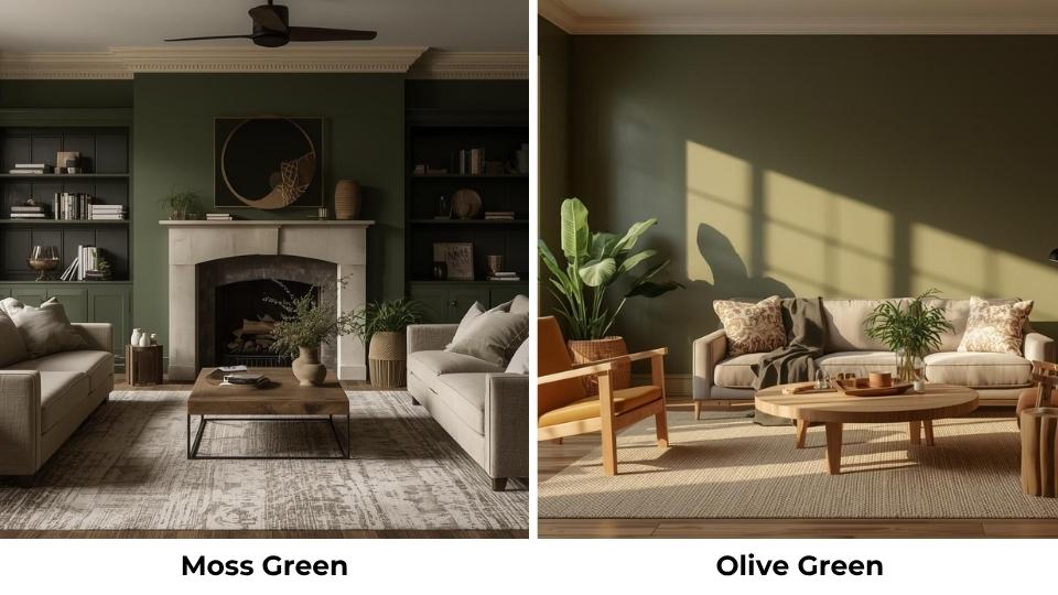
Moss Green is light, soft, and yellow-green than olive.
It has a fresh, natural vibe like moss growing on rocks or trees. It’s bright without being neon, and it works beautifully in spaces where you want a nature connection without going too bold.
Olive Green is deep, rich, and more muted.
I use moss green in spaces where I want lightness and airiness like kids’ rooms, sunrooms, bathrooms. It’s cheerful without being childish.
Olive I use when I want sophistication and grounding.
They’re both nature-inspired, but moss skews light and fresh while olive feels mature and earthy.
Olive Green Vs Army Green Vs Sage Green
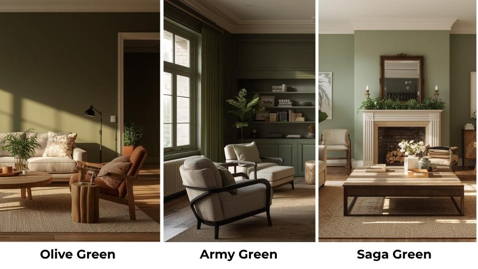
Everyone’s obsessed with sage right now because it is trending.
Sage Green is a soft, muted green with gray undertones. It’s cooler than olive, lighter than Army Green, and more subdued than both.
It’s the “safe” choice and it is also pretty and versatile, easy to live with, and pairs well with almost everything.
Olive Green is warm and more yellow. Army Green is dark and more structured. Sage Green is light and more gray.
If I’m working with a client who’s nervous about color, I’ll suggest sage because it’s forgiving.
But if they want personality and aren’t afraid of commitment, olive or Army Green gives more impact.
Olive Green Vs Military Green
Military green is vague. It’s a category, not a specific color.
Olive Green is ONE type of military green, associated with European armed forces and characterized by its warm, yellowish tones.
Other military greens include Army Green, OD Green (Olive Drab) which is dull and brown, and Ranger Green which is neutral and modern.
When choosing paint or fabric, don’t rely on someone saying “military green.” Get the actual swatch, check the undertones, test it in your space.
Here’s a comparison table because visuals help:
| Color | Undertone | Lightness | Feel | Best Use |
| Olive Green | Yellow/Brown (warm) | Medium | Organic, relaxed | Versatile interiors, casual fashion |
| Army Green | Gray/Brown (cool) | Dark | Bold, structured | Statement walls, utility wear |
| Dark Olive Green | Yellow/Brown (warm) | Dark | Rich, sophisticated | Accent walls, dramatic spaces |
| Moss Green | Yellow/Green | Light | Fresh, natural | Bright spaces, casual rooms |
| Sage Green | Gray/Green | Light | Soft, calming | Safe choice, versatile spaces |
| OD Green | Brown/Gray | Dark, dull | Traditional military | Tactical gear, vintage military |
| Ranger Green | Minimal brown, neutral | Medium-dark | Modern tactical | Modern tactical gear, outdoor equipment |
Conclusion
Look, choosing between Olive Green Vs Army Green isn’t about picking a color you like in the store but it’s about understanding undertones, lighting, and the FEEL you want in your space or your wardrobe.
I’ve seen both colors work beautifully, and I’ve seen both miss the mark when used in the wrong space.
Olive Green is the choice when you want warmth, versatility, and the organic, nature-connected vibe.
It’s forgiving, it’s easy to live with, and it works with many different styles. But make sure you have decent light and pair it with warm-toned materials.
Army Green is the choice when you want boldness, structure, and that confident, tactical edge. It’s dramatic, it’s sophisticated, but it NEEDS space and light or it’ll overwhelm.
Both have military roots, both feel grounded and earthy, but they’re NOT interchangeable. Test them in your space. Live with the samples for a few days.
See how they look in morning light, afternoon light, evening light before committing.
FAQs On Olive Green Vs Army Green
No, Olive Green has yellow-brown undertones and looks warm, while Army Green has gray-brown undertones and looks cool and dark. They’re related but create different moods in a space.
Olive Green is universally flattering because of its warm undertones. It works across different skin tones better than cool greens. If you have cool undertones, you find that Army Green or sage works better for you in fashion. For interiors, olive works almost anywhere with the right light.
Bright, warm colors tend to clash with Army Green. Like with hot pink, bright orange, sunny yellow, they fight with Army Green’s cool, muted nature. Also avoid pairing it with other cool, dark colors like navy or charcoal unless you WANT a heavy, dark space.
Depends on what “green” you mean. Olive Green is darker than lime or kelly green, but lighter than forest green or hunter green. It’s a MUTED green, so it’s not about brightness but it’s about saturation. Olive is in the medium range, depth, but feels dark than it is because it’s muted.