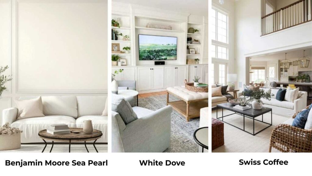
So, Benjamin Moore Sea Pearl vs White Dove, both of these colors are in the soft, livable white category that everyone wants right now, but they’re NOT the same.
Sea Pearl OC-19 and White Dove OC-17 may look the same on a small paint swatch, but on walls the difference is visible.
I’ve used both many times and picking the wrong one can change how a room feels.
What most people don’t realize is that these two shades can look different depending on your lighting situation.
I’m talking about the direction your windows face, whether you’re using warm or cool bulbs and what time of day you’re in the room.
The undertones shift, the brightness changes, and the “perfect white” looks too gray or too creamy and the finish also makes an impact on your space.
Choosing the wrong one can make your space washed out.
So, I’m breaking down everything I’ve learned about Benjamin Moore Sea Pearl Vs White Dove.
We’ll get into the stuff like LRV and undertones, how each one performs in different rooms, what lighting does to them, and how they compare to other popular whites.
I’ll also share which mistakes I made and how you can avoid them.
Here are my other blogs that you can also read:
- Ballet White Vs White Dove
- Manchester Tan Vs Accessible Beige
- Snowbound Vs White Dove
- Onyx Color Vs Black
- Sherwin Williams Retreat Vs Evergreen
Benjamin Moore Sea Pearl (OC-19)
Sea Pearl is one of the colors that looks simple when you use it.
It’s a soft off-white, but calling it that doesn’t do it justice.
The thing about Sea Pearl is it has a balanced mix of warm and cool undertones that makes it feel grounded.
The LRV is around 76, which means it reflects less light than brighter whites.
When I first started using Sea Pearl, I thought it was another greige.
But then I painted it in a north-facing bedroom and realized it has these subtle green undertones that show up depending on the light.
Not like lime green or anything more like a hint of sage that gives it depth.
There’s also a beige influence in there that keeps it from feeling cold.
I use this color in living rooms that get natural light.
Because the low LRV means it won’t create a blinding glare you get with bright whites.
It also works beautifully in bedrooms where you want something soft but not too creamy.
The gray-beige base keeps it sophisticated.
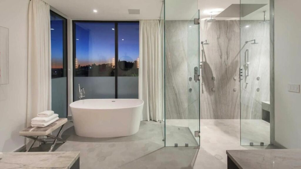
Bathrooms are interesting with Sea Pearl, it can look flat if you don’t have light, so be careful.
But in a bathroom with good lighting and white fixtures, it creates a serene backdrop.
Designers love it because it’s versatile for whole-house color schemes without feeling boring.
Homeowners love it because it doesn’t compete with their furniture or art.
The one mistake I made is that I used Sea Pearl in a basement with limited windows and it looked too gray and dingy.
Benjamin Moore White Dove (OC-17)
Now White Dove is the celebrity of the Benjamin Moore lineup.
Everyone knows it, everyone wants it, and it delivers.
This is a soft, creamy white with subtle gray undertones and an LRV around 83, which makes it visibly brighter than Sea Pearl.
Here’s what I’ve seen White Dove in different lighting, in natural light, it glows.
Like glows in a way that makes rooms feel big and airy.
But on artificial warm light at night it gets creamy and more golden.
I’ve had clients freak out when they see it under their warm Edison bulbs for the first time because it looks more yellow than they expected.
What I love about White Dove is that it’s less yellow than other creamy whites, which is why it stays feeling fresh and clean in warm light.
It works in many different spaces like trim, cabinets, walls, ceilings and exteriors.
In living rooms, White Dove creates a classic, timeless look.
Especially if you’re going for that modern farmhouse or transitional style.
It pairs beautifully with natural wood, which is why it’s popular.
For bedrooms, it’s soft without being flat.
I prefer it in bedrooms that get good light because it shines there and makes the space feel calm and open.
Bathrooms are where White Dove excels, according to my opinion.
The creamy warmth works perfectly with white tile and chrome fixtures.
It doesn’t feel cold or flat like some whites can.
And for exteriors, White Dove is a go-to for traditional homes.
It pairs perfectly with black shutters for the classic look.
The one thing I tell people is that exterior White Dove looks brighter outside than inside and sometimes looks almost pure white.
The big mistake I see with White Dove is people using it in rooms with cool northern light expecting it to stay creamy and warm but it doesn’t.
It’ll be warmer than harsh whites, but that cool light washes out some of the creaminess.
What is the Difference Between Benjamin Moore Sea Pearl and White Dove?
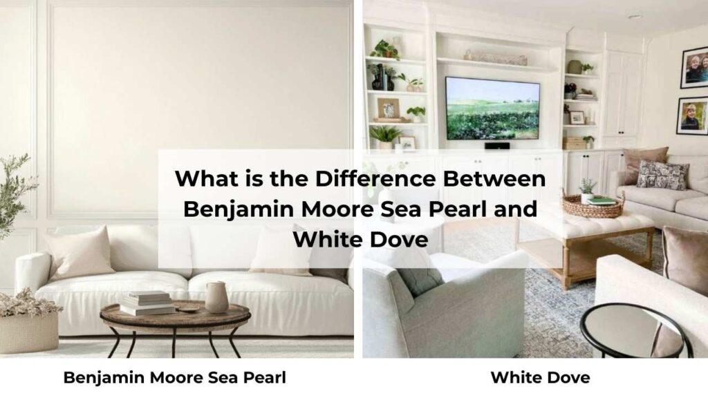
So here’s the comparison between Benjamin Moore Sea Pearl Vs White Dove, because one is warm and one is bright and doesn’t help when you’re trying to pick between them.
These colors have different personalities and understanding the differences.
I’ve learned this through where I thought the colors would be interchangeable but they are not.
Let me break down what matters when you’re comparing Sea Pearl and White Dove.
LRV
Light Reflectance Value is one of the things that sounds technical and boring until you realize it’s the reason your room feels either bright and open or dark and cave-like.
White Dove has an LRV of around 83, which puts it in this will brighten your space category.
It reflects a lot of light back into the room.
Sea Pearl is at about 76, which is light but visibly less reflective.
The 7-point difference, it’s more visible than you’d think.
What this means in real life, White Dove will make a dark room feel bright.
Sea Pearl will make a bright room feel less harsh.
I use White Dove when clients need to maximize light, mainly in small spaces or rooms with limited windows.
Sea Pearl is my choice when there’s natural light and we don’t want the blinding white-white look.
Undertones
White Dove has warm undertones with a yellow-cream base and a touch of gray that keeps it from being too buttery.
In most lighting, it looks soft, warm white, clean but not harsh.
Sea Pearl is complex, it has a greige foundation with subtle green undertones that appear depending on your light source.
The green notes are what give it that sophisticated, modern feel but they can also make it look gray in the wrong conditions.
I’ve put these two colors next to each other and the difference is clear, White Dove looks creamy and warm, Sea Pearl looks neutral and earthy.
If you want warmth, White Dove is best.
If you want something contemporary and grounded, Sea Pearl is the best.
Lighting Affect
White Dove in north-facing rooms will lose some of its creaminess but feel warm.
In south-facing rooms, it gets creamy and more golden.
Under warm artificial light, it can start to look a bit yellow and not in a bad way, but it’s there.
Sea Pearl in north-facing light will pull more gray and the green undertones become obvious. Not ideal if you’re trying to warm up a cool room.
In south-facing light, it warms up and the green settles down.
Under cool LED lights, it can look flat and gray.
Under warm lights, it gains warmth but never gets as creamy as White Dove.
The mistake I made is that I used Sea Pearl in a windowless hallway with only overhead lighting and it looked AWFUL, flat and lifeless.
White Dove would’ve been better there because it has inherent warmth.
Style and Best Uses
The way you style around these colors matters as much as the colors themselves.
For trim, White Dove works beautifully as both wall AND trim color, or as trim against deep wall colors.
Sea Pearl on trim I used it, but it needs high sheen and good natural light or it disappears.
Ceilings: White Dove is classic for ceilings because it reflects light back down.
Sea Pearl on ceilings can work in rooms with tall ceilings and light, but it’ll make a standard-height ceiling feel low.
Furniture and accent pairings: White Dove looks gorgeous with natural wood tones, warm metals like brass, and traditional furniture.
Sea Pearl pairs better with cool metals, concrete or stone elements, and modern furniture pieces.
For accent colors, White Dove works with warm accent palettes like terracotta, warm blues, greens.
Sea Pearl pairs beautifully with cool accents, blacks and deep greiges.
| Feature | Sea Pearl (OC-19) | White Dove (OC-17) |
| LRV | ~76 | ~83 |
| Brightness | Slightly dark, more muted | Bright, more reflective |
| Undertone | Greige with subtle green | Warm creamy with yellow/gray |
| Temperature | Neutral-warm | Clearly warm |
| Best Lighting | South-facing, bright rooms | Most lighting conditions |
| Style | Modern, contemporary | Traditional, transitional |
| Best For | Walls, exteriors, cabinets in modern spaces | Trim, walls, cabinets, whole-house |
| Pairs With | Stone, concrete, cool metals, modern pieces | Wood tones, warm metals, classic furniture |
Benjamin Moore Sea Pearl Vs White Dove: Room-By-Room Comparison
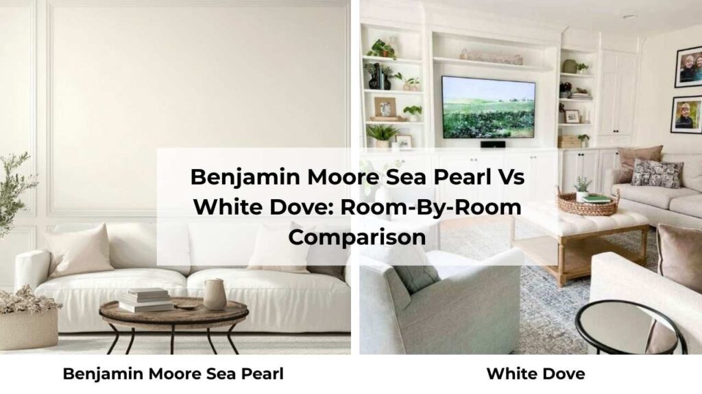
This is where theory meets reality because I don’t care how good a color looks on a paint swatch but what matters is how it performs in rooms where you’re living.
I’ve used both Sea Pearl and White Dove in every room and they each have their strengths and weaknesses depending on the space.
Let me walk you through how Benjamin Moore Sea Pearl Vs White Dove behaves in different spaces.
Living Room
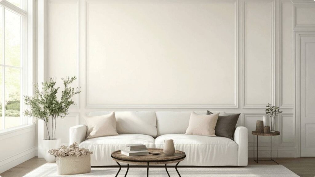
Sea Pearl in a living room creates a sophisticated, calm backdrop that doesn’t compete with your furniture or art.
I love it in living rooms with windows and natural light because it prevents the harsh bright-white glare while feeling light and open.
The greige base works well with modern furniture, and the subtle green undertones add depth.
The one time Sea Pearl didn’t work in a living room is when the room faced north and had dark hardwood floors.
It looked gray and cold and lifeless.
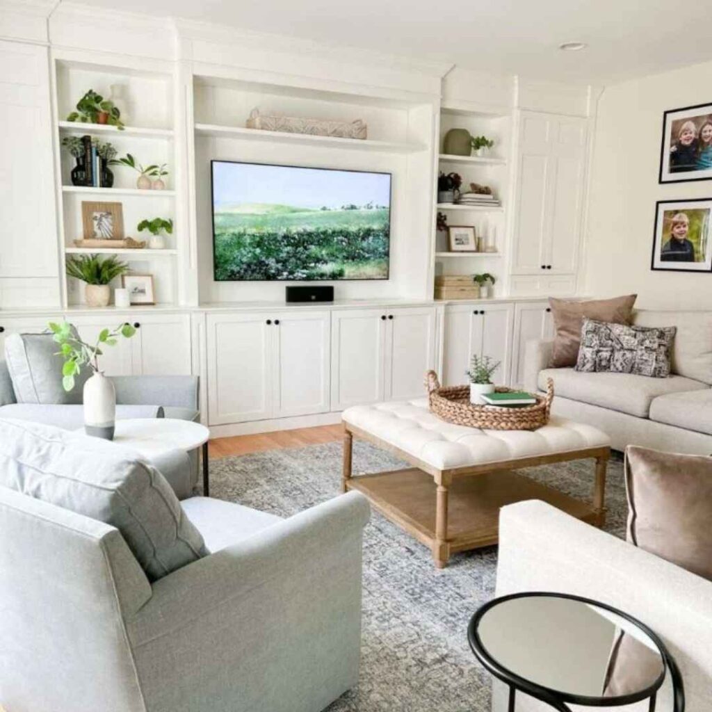
White Dove in the living room is safe.
It creates a classic, warm, inviting space which works with any style.
I use it in living rooms that need brightening or when clients want that traditional farmhouse look.
The creamy warmth makes the room feel cozy without being dark.
It reflects light beautifully, which is perfect for small living rooms or without great natural light.
The impact is timeless and versatile, you can’t go wrong unless you’re going for a modern aesthetic, in which case it may feel too soft and traditional.
Bedroom
Sea Pearl in bedrooms is interesting because it can either feel serene or kind of flat depending on the light.
In a bedroom with good natural light, mainly in morning light, it creates a peaceful, calm atmosphere.
The muted quality works in bedrooms because you don’t want it too bright in a sleep space.
Pairs beautifully with white bedding and natural wood furniture.
I used it in my own bedroom and loved it until I stayed up late reading one night and realized under only lamplight it looked dingy.
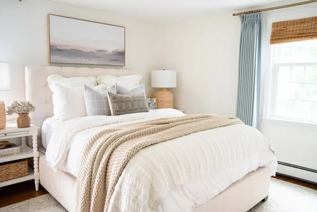
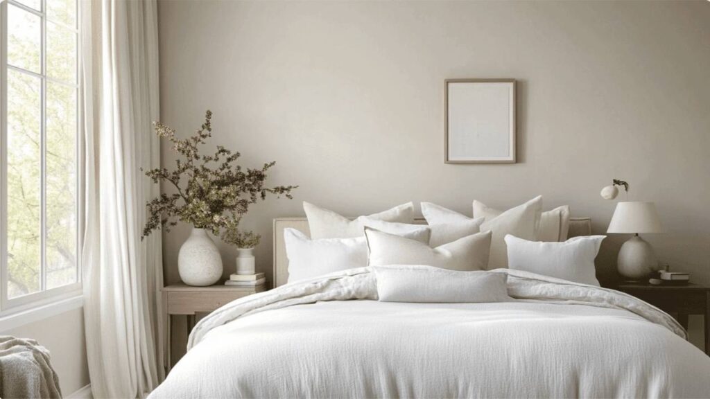
White Dove in bedrooms feels soft and cozy.
The creamy warmth creates a welcoming space that feels restful without being harsh.
I use it all the time in master bedrooms, kids’ rooms, guest rooms, it’s flattering.
The warmth helps balance out if you have white bedding and keeps the room from feeling cold.
The impact is a bedroom that feels like a retreat which is calm, clean, comfortable.
Bathroom
Sea Pearl in bathrooms can be tricky.
If you have a bathroom with good lighting and white fixtures, it creates a modern, clean look. The muted quality looks sophisticated.
But if your bathroom has limited natural light or warm-toned finishes, Sea Pearl can look flat or slightly gray-green.
I made the mistake of using it in a small powder room with no window and bronze fixtures and it looked OFF.
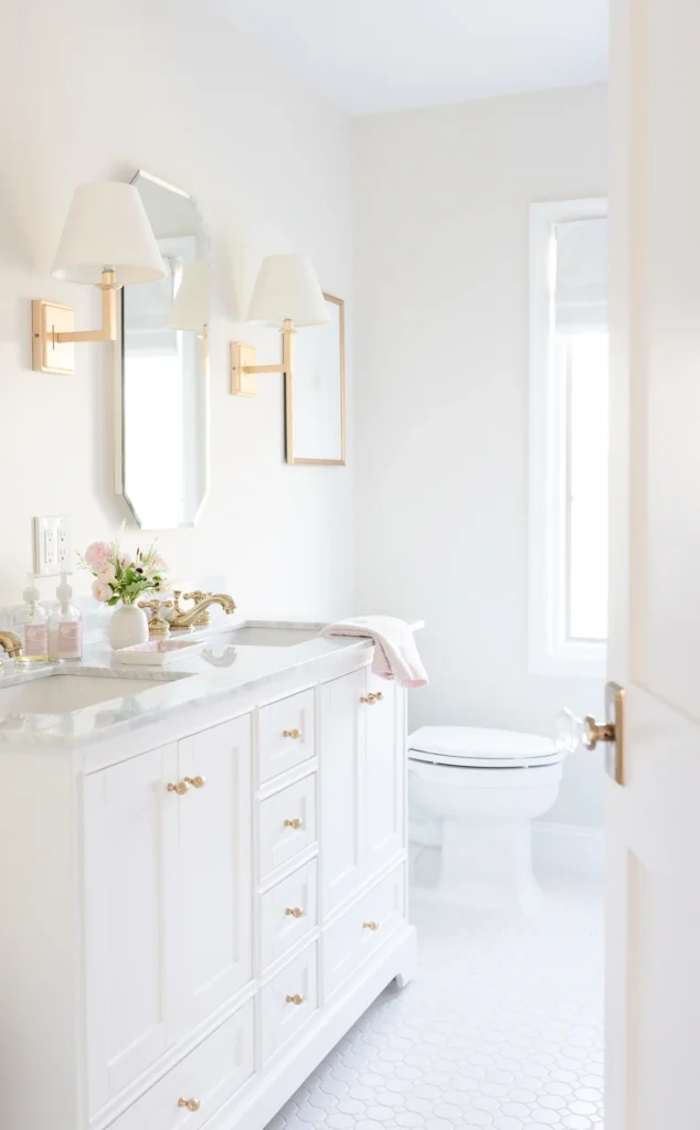
White Dove in the bathroom is perfect.
The creamy warmth works beautifully with white tile, marble, chrome fixtures.
It doesn’t feel cold like some whites can in bathrooms.
Reflects light well which is important in bathrooms for getting ready.
The impact is a fresh, clean bathroom that feels expensive and calm.
Kitchen
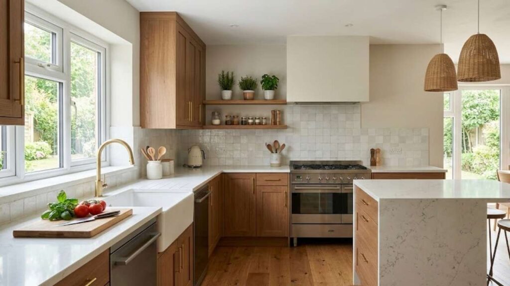
Sea Pearl in kitchens works when you have white or very light cabinets and want the walls to provide depth without going dark.
It’s lovely with marble or quartz countertops, stainless appliances, and modern hardware.
The muted greige keeps the kitchen from feeling too harsh white-on-white.
It’s also popular for kitchen cabinets in modern spaces where you want soft color without going gray.
The impact is a sophisticated, contemporary kitchen that doesn’t feel cold or flat.
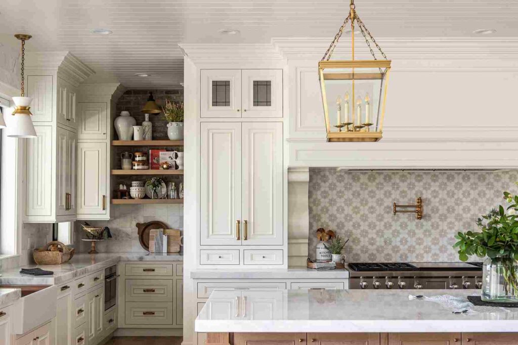
White Dove on kitchen walls creates a classic, timeless backdrop that works with any cabinet color like white, wood, navy and more.
It’s bright to keep the kitchen feeling clean and open but warm to feel inviting.
I’ve also used White Dove ON cabinets countless times, it’s one of the most popular cabinet whites because it’s not harsh but looks white, not cream.
The impact is a kitchen that feels clean, bright, and welcoming and it works for any style from traditional to transitional.
Exterior
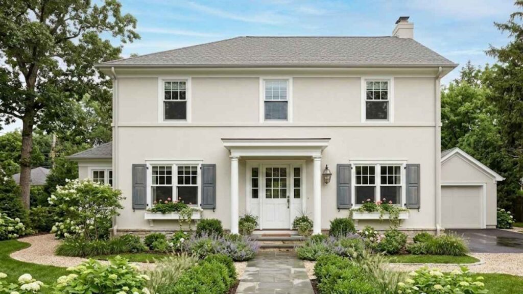
Sea Pearl on exteriors is becoming really popular, especially for modern farmhouse styles.
It reads as a soft, warm white outside without being stark.
The muted quality gives it a sophisticated look that pairs beautifully with natural stone, brick, and wood accents.
I’ve used it with black windows and trim and it’s stunning.
The impact is a contemporary exterior that feels fresh and current.
One thing to remember, it’ll look brighter on the exterior than the interior because of the direct sunlight.
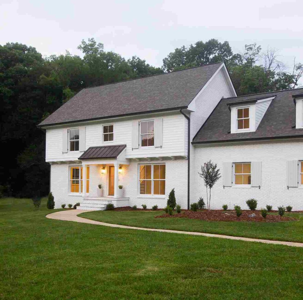
White Dove on exteriors is a classic choice. It creates a traditional white house look with warmth, not the harsh bright white that can feel cold. Pairs perfectly with black shutters, wood doors, brick foundations. It’s timeless and adds visual appeal without trying too hard.
The impact is a home that looks clean, classic, and well-maintained.
Benjamin Moore Sea Pearl Vs White Dove Vs Other Colors
So, once you start looking at Sea Pearl and White Dove, you start wondering about the other similar whites and off-whites and there are MANY.
I get asked how these two compare to other popular colors because people want to make sure they’re picking the right one.
So I’ll tell you what I’ve seen rather than what the paint swatches suggest.
Some of these differences are subtle, others are obvious once you see them side by side.
Benjamin Moore Sea Pearl Vs Swiss Coffee
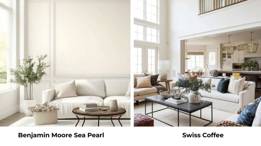
Swiss Coffee has a higher LRV than Sea Pearl and is more creamy-warm with the same subtle green undertones.
The big difference is Swiss Coffee looks more of a warm off-white while Sea Pearl is neutral greige.
Swiss Coffee will feel creamy and warm.
I’ve used both and Swiss Coffee works better when you want warmth but Sea Pearl is the best for a more modern, grounded look.
Benjamin Moore Sea Pearl Vs Sherwin Williams Alabaster
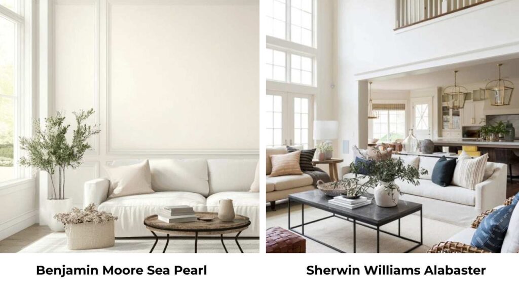
Alabaster is warmer and more yellow than Sea Pearl.
Alabaster has a creamy quality that’s similar to White Dove.
Sea Pearl is cool and gray-beige.
If you’re choosing between these, do I want warm and creamy like Alabaster or neutral and sophisticated like Sea Pearl.
Benjamin Moore Sea Pearl Vs Pale Oak
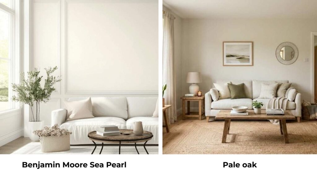
Pale Oak is warm and more beige than Sea Pearl.
It has a similar greige quality but Pale Oak has more taupe-beige while Sea Pearl has the green undertones.
Pale Oak feels earthy and warm.
I use Pale Oak when I want warmth than Sea Pearl provides but want the greige vibe.
Benjamin Moore White Dove Vs White Down
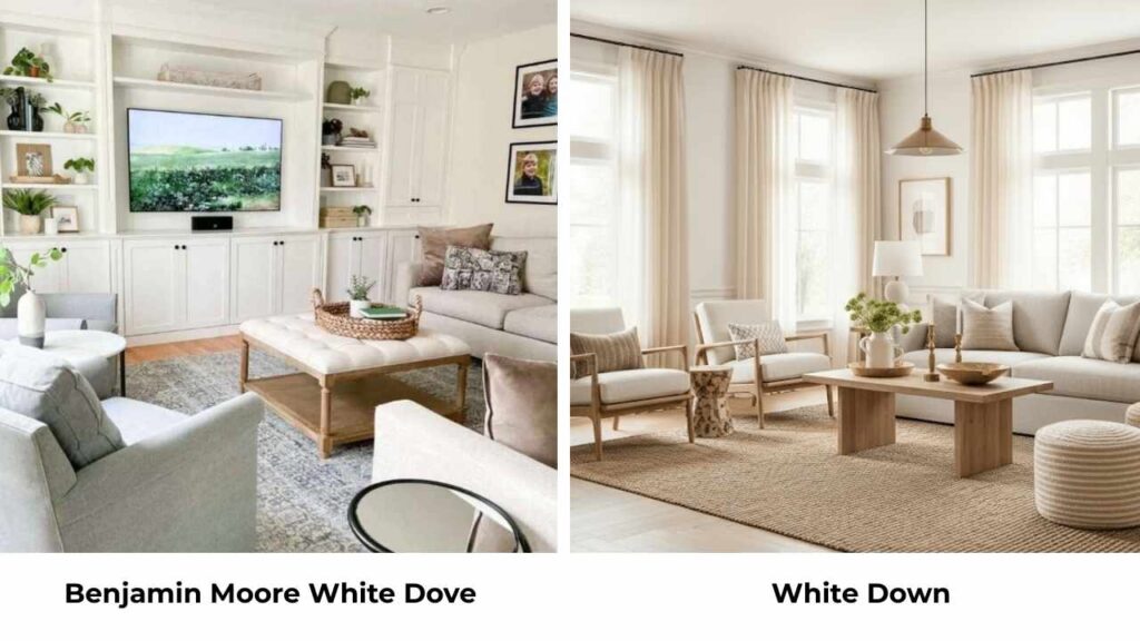
White Down is soft and has more beige than White Dove.
White Dove is bright and cooler in comparison.
White Down can look almost tan in some lights while White Dove stays white-white.
I prefer White Dove for most applications because it’s versatile, but White Down works if you want something soft and warm.
Benjamin Moore White Dove Vs Super White
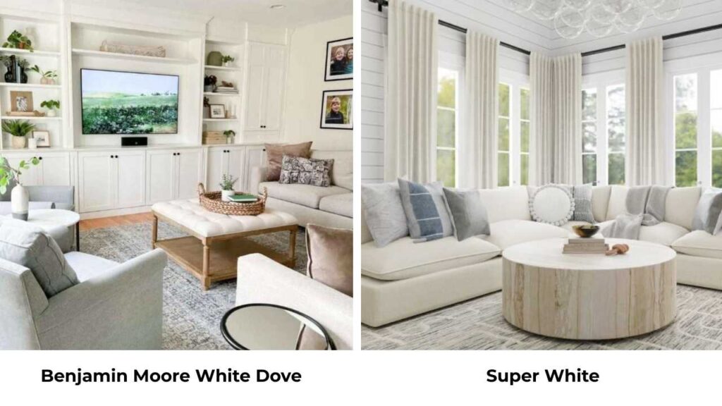
Super White is bright white with minimal undertones.
White Dove by comparison looks creamy and warm.
Super White is what you use for trim against colored walls or when you want fresh brightness. White Dove is what you use for walls, cabinets, or whole-house color.
They’re not interchangeable.
Benjamin Moore White Dove Vs White Heron
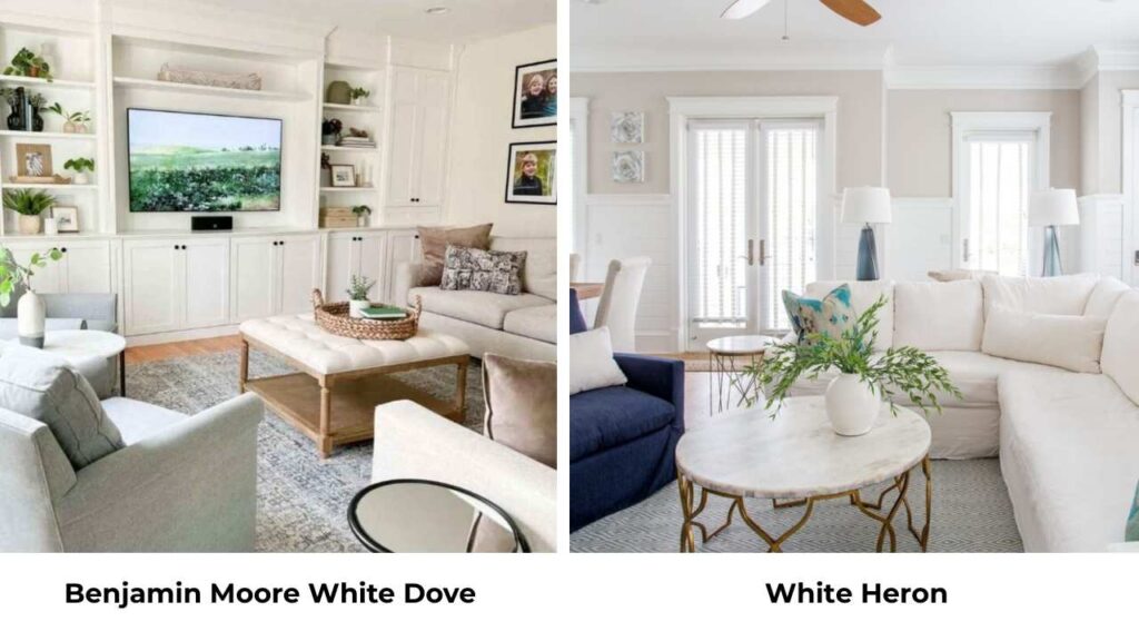
White Heron is cooler than White Dove with gray undertones that are obvious.
White Dove is warm and creamy.
White Heron can look flat or slightly blue-gray in cool light while White Dove maintains warmth.
I use White Heron in modern spaces where I want cool tones, White Dove when I want warmth.
Benjamin Moore White Dove Vs Creamy White
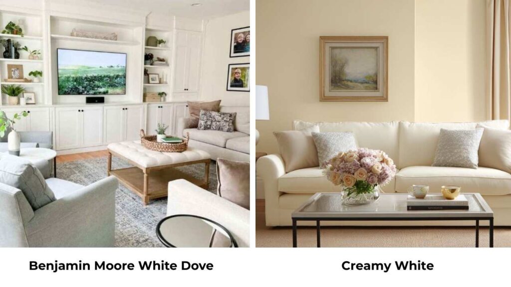
Creamy White is creamy, more yellow undertones and warmer.
White Dove has cream but it’s balanced with gray so it doesn’t look yellow.
Creamy White can look dated or too buttery in some situations.
White Dove is more flattering and current.
Benjamin Moore White Dove Vs Simply White
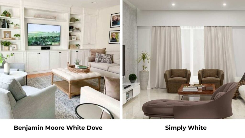
Simply White is cooler and fresher than White Dove.
Simply White has a slight gray-blue undertone that makes it look cool.
White Dove is warm and soft.
Simply White works better for trim or in spaces where you want brightness without warmth.
White Dove works better for walls and house applications where you want the soft warmth.
Benjamin Moore Sea Pearl Vs Dove Wing
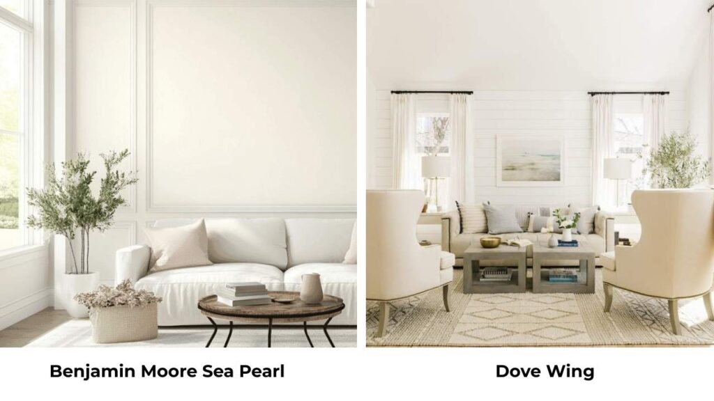
Dove Wing is close to Sea Pearl, light and warm.
Dove Wing may be the better choice if you’re testing Sea Pearl and finding it too cool or gray in your space.
The difference is subtle but it’s there.
Both have that sophisticated greige quality but Dove Wing is just a touch softer.
| Comparison | Key Difference | When to Choose the Alternative |
| Sea Pearl vs Swiss Coffee | Swiss Coffee is warmer, more creamy | Want more warmth and cream, less gray |
| Sea Pearl vs Alabaster (SW) | Alabaster more yellow-cream | Prefer SW brand or want warmer tone |
| Sea Pearl vs Pale Oak | Pale Oak warmer, more beige-taupe | Want warmer greige with less green |
| White Dove vs White Down | White Down softer, more beige | Want very soft, warm almost-tan look |
| White Dove vs Super White | Super White much brighter, crisper | Need bright trim or crisp brightness |
| White Dove vs White Heron | White Heron cooler with gray | Want cooler tones for modern space |
| White Dove vs Creamy White | Creamy White more yellow | Want traditional very creamy look |
| White Dove vs Simply White | Simply White cooler, crisper | Want brightness without warmth |
| Sea Pearl vs Dove Wing | Dove Wing slightly lighter, warmer | Finding Sea Pearl too cool/gray |
Benjamin Moore Sea Pearl Color Palette
When you’re using Sea Pearl, the colors you pair with it make a difference in how it looks in the space.
Because Sea Pearl has that greige base with subtle green undertones, it works beautifully with a specific palette that enhances it.
Chantilly Lace is my go-to trim color with Sea Pearl walls.
It’s a fresh, clean white that provides contrast without being too harsh.
The brightness of Chantilly Lace makes Sea Pearl’s soft greige quality stand out in a good way.
For accent colors, I love pairing Sea Pearl with sage greens, soft blacks, and deep greiges.
The green in Sea Pearl plays nicely with green accents like muted sage, eucalyptus, olive tones. Not bright greens but subtle.
Black accents like matte black hardware, black window frames look sophisticated against Sea Pearl.
And deep greiges or taupes create a tonal, layered look that feels current.
Warm wood tones also work beautifully like natural oak, walnut and light woods.
The neutral quality of Sea Pearl doesn’t compete with the wood.
I’ve also paired Sea Pearl with warm terracotta or rust tones for accent pieces and it’s gorgeous.
The warmth of the terracotta balances the cool greige of Sea Pearl.
For a whole color scheme, think Sea Pearl on walls, Chantilly Lace trim, natural wood floors, black matte hardware, sage green and rust accents.
Benjamin Moore White Dove Color Palette
White Dove’s creamy warmth means it pairs well with a different palette than Sea Pearl.
Because it has the warm, soft quality, you want colors that complement that rather than introducing too much cool contrast.
Simply White or Chantilly Lace work as trim colors if you want bright trim against White Dove walls.
The contrast is subtle but creates definition.
I’ve also done White Dove walls AND trim and it’s beautiful in a monochromatic way.
For accent colors, White Dove loves warm tones.
Soft blues like navy or warm slate blue, warm greens like sage, olive, terracotta, rust, warm grays.
These colors all work because they share that warm base with White Dove.
I’ve used White Dove with navy accents many times, it’s classic and never looks outdated.
Warm wood tones are perfect with White Dove.
Natural oak, honey-toned woods, warm maple, they glow against White Dove’s creamy backdrop.
Brass and warm gold hardware and light fixtures look amazing with White Dove.
The warmth-on-warmth creates a cohesive, inviting feel.
For a classic whole color scheme, like White Dove walls, Simply White trim, warm oak floors, brass hardware, navy and sage accents.
That’s timeless and works in traditional or transitional spaces beautifully.
Conclusion
Benjamin Moore Sea Pearl Vs White Dove, both are incredible whites, but they’re not interchangeable.
Sea Pearl gives you the sophisticated, modern greige quality with subtle green undertones and a muted feel that works beautifully in bright spaces or contemporary designs.
White Dove gives a classic, warm, creamy white that’s versatile, bright, and works in any lighting condition or style.
The choice comes down to what your space needs.
If you need to brighten a dark room then go with White Dove or if you have great natural light and want something grounded then go with Sea Pearl and in many more situations.
And remember to TEST THEM.
I can describe these colors but nothing replaces seeing them in YOUR space with YOUR lighting and YOUR finishes.
Get samples, paint big swatches, look at them at different times of day before committing because choosing between Benjamin Moore Sea Pearl vVs White can be tough but not that much.
FAQs On Benjamin Moore Sea Pearl Vs White Dove
Sea Pearl has a greige undertone with subtle green notes that become obvious in some lighting, especially cool northern light. The green is what gives it depth and keeps it from being a flat gray or beige. In warm southern light, the green undertones settle down and it looks more as a warm neutral greige.
White Dove has warm creamy undertones with a yellow-gray base, but I wouldn’t call it “too yellow” in many situations. It looks like a soft, warm white rather than a yellow white. Under warm artificial light or in rooms with intense warm southern light, it CAN look more yellow-cream.
Sea Pearl pairs beautifully with Chantilly Lace or Simply White for trim, sage greens, muted olives, soft blacks, deep greiges, and warm wood tones. For accents, like terracotta, rust, matte black hardware, and natural materials like stone and concrete. The key is pairing it with colors that complement its sophisticated greige base.
Yes, Sea Pearl is neutral, mainly a warm neutral greige. It functions as a neutral backdrop that works with multiple accent colors and styles. It’s a complex neutral with the subtle green undertones, so it has more personality than a true beige or true gray. It’s neutral to use throughout a house but interesting to not feel boring.