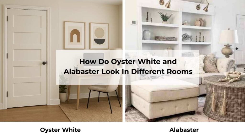
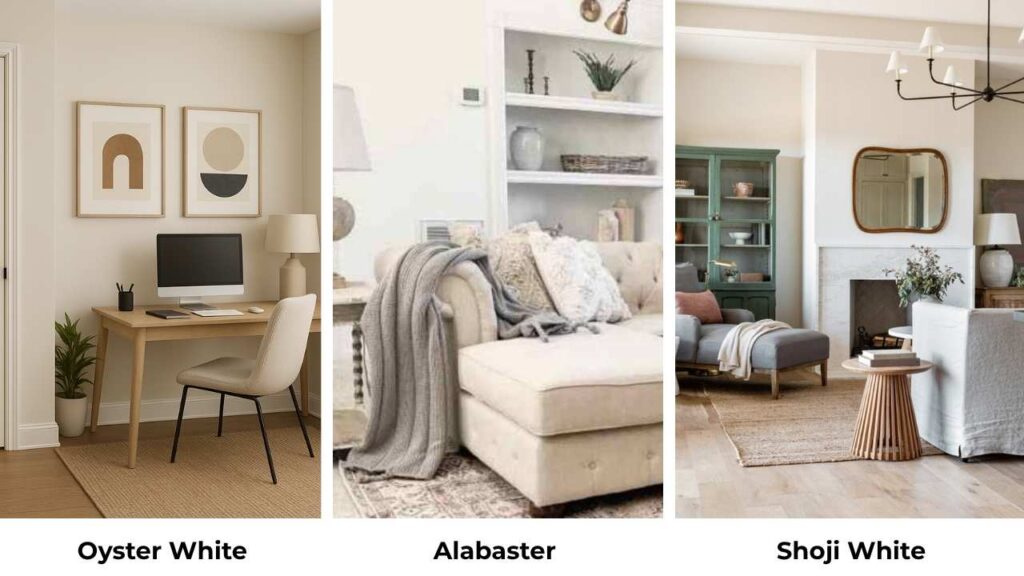
Oyster White and Alabaster both are Sherwin Williams colors, both are in the soft white category.
Oyster White vs Alabaster isn’t about picking between two whites, because they’re different and live in the same warm-white color wheel.
Oyster White SW 7637 is into this muted greige territory with subtle green undertones, while Alabaster SW 7008 is a creamy-warm.
The thing about these colors comes to undertones, brightness, and how your lighting situation plays.
I’ve seen Oyster White look gorgeous on a sunny exterior and wrong in a north-facing bedroom.
Alabaster is foolproof, but pair it with the wrong flooring and your whole room feels yellow.
Lighting changes everything with these two, your furniture, your floors and your countertops.
Homeowners get confused between them because they both have the perfect soft-white vibe, but picking the wrong undertone makes it look flat.
So, I’m breaking down about Oyster White Vs Alabaster, what they look like, where they work, where they do not work.
Then we’re doing a side-by-side on undertones, Light Reflectance Value and how they show up in different rooms.
I’m mentioning the comparisons with other colors, coordinating colors, and the answers to questions I get asked.
Here are my other blogs that you can also read:
- Edgecomb Gray Vs Accessible Beige
- Dover White Vs White Dove
- Anew Gray Vs Agreeable Gray
- Sherwin Williams Natural Tan Vs Accessible Beige
- White Dove Vs Chantilly Lace
What You Need To Know About Sherwin Williams Oyster White (SW 7637)

Oyster White is basically a warm off-white that is cozy with greige and decided to stay there. It’s not trying to be a true white, and that’s its personality.
The color has a beige-greige influence, creamy without going into yellow territory. The LRV is at 72, which means it’s reflecting more light.
The green undertones are what people worry about.You won’t see them at first, but put Oyster White next to a cool white or get it in some lighting, and there’s a subtle green.
It has a soft, muted appearance compared to bright whites, which is why it works so well on exteriors.
I’ve used it on a Tudor-style home in a bright climate and it looks as a perfect soft white.
On interiors, it shows more as a light muted beige, especially in rooms without natural light.
The greige quality means it shifts between looking more gray or more beige depending on what’s around it.
For living rooms with warm wood furniture and beige-toned fabrics, Oyster White creates a cohesive backdrop that doesn’t compete.
It’s good in spaces where you don’t want harsh contrast. I’ve specified it for bedrooms when clients want warmth without going beige, and for bathrooms when there’s warm marble or travertine.
Kitchen cabinets in Oyster White are in trend, when you want an alternative to the white-kitchen-everything trend.
It works when your walls are light like Alabaster or Pearly White, so you get contrast without drama.
What You Need To Know About Sherwin Williams Alabaster (SW 7008)

Alabaster is popular with off-whites. It won Color of the Year in 2016, it’s in the Sherwin-Williams “Top White Paint Colors”.
The hype is real, but it is earned. This color is a warm off-white with creamy undertones.
What makes Alabaster different from Oyster White is the LRV of 82. That’s light, which means light reflection and a bright appearance.
It’s not a true white, but it’s close to the end of the color wheel.
The warmth comes from beige and yellow influences, but it manages to stay inviting without looking like your walls look yellow which is impressive.
The undertones are warm and creamy without any green. Where Oyster White comes with the subtle green cast, Alabaster stays warm.
The slight beige-yellow influence gives it a cozy quality that makes spaces feel finished and put-together without trying hard.
I’ve used Alabaster in many living rooms. It works well with both warm and cool accent colors, which is rare for a warm white.
Traditional spaces love it because it has the soft, established feeling. Modern farmhouses require it by law. It’s one of the colors that looks well too.
For bedrooms, Alabaster creates a restful backdrop that works with white bedding, wood furniture and with everything.
It’s warm to feel cozy but light to keep the space bright. Bathrooms with white subway tile and Alabaster walls are a classic combo for a reason, the cream undertone complements most tones which matters.
The reason designers and homeowners keep coming back to Alabaster is consistency. It looks nice with different lighting conditions.
It looks warm in south-facing light and cool in north-facing rooms, but it’s not going to look green or gray or different from what you expected.
Oyster White Vs Alabaster: Undertones, LRV, and Best Uses
Both of these colors live in warm territory, but they are different. Understanding the differences matters because it’s the difference between loving your paint and tolerating it.
The undertones, brightness levels, and how light plays with each color, that’s where the decision is.
I’m breaking this down into the comparisons that impact how these colors look in your space.
LRV
Light Reflectance Value is how much light a color bounces back at you, measured on a scale from 0 (absolute black) to 100 (pure white).
Oyster White is at an LRV of 72, while Alabaster comes in at 82.
The 10-point difference is visible, it’s the difference between a color that looks as light gray indoors and one that looks true off-white.
Oyster White at 72 is between off-white and light neutral territory. In bright exterior conditions, that 72 LRV lets it wash into soft white.
Inside, it shows a greige personality because there’s less light to reflect. Alabaster at 82 stays bright in many conditions.
It reflects more light, which is why it maintains the off-white appearance.
If you’re painting a north-facing room or a space with small windows, the 10 points of LRV from Alabaster matters.
Your room will feel visibly bright. But if you’ve got south-facing windows flooding the space with light, Oyster White’s lower LRV helps prevent the blown-out, bright situation.
Undertones Comparison
This is where these two colors diverge. Oyster White has green undertones with a greige base, gray-beige hybrid is slightly toward that subtle green cast.
You won’t see “green” when you look at it, but in some lighting or next to cool colors, it comes.
The greige quality means it can look more gray or more beige depending on your lighting and what’s in the room.
Alabaster’s undertones are warm cream with beige and slight yellow influences. The warmth is consistent and predictable.
It’s the safe choice if you’re worried about unexpected color shifts. The creamy quality stays present across different lighting conditions.
Where Oyster White is hidden, Alabaster stays in its lane.
I had a client who got both colors in her living room, and the difference was visible. Oyster White looked beautiful but more gray-green against her cream sofa.
Alabaster looked like it was designed to coordinate with the sofa.
Brightness and Reflection
Alabaster appears visibly light and bright in most conditions. The high LRV combined with warm undertones creates a luminous quality.
It opens up spaces and reflects light around the room in a way that makes everything feel airy.
Oyster White has a muted, soft appearance. It’s not trying to maximize brightness but it’s creating a subtle, understated backdrop.
On exteriors in the sun, it has a soft white look. On interiors, it looks like a light neutral that’s NOT trying to be white.
For spaces where you want maximum brightness like small rooms, basements, north-facing spaces, then go with Alabaster.
For spaces where bright white feels too harsh or you’re dealing with natural light that would make true white feel cold, Oyster White’s soft reflection is preferable.
Lighting Appearance
Lighting conditions will make or break these colors, and they respond differently to the same light. In north-facing light, Oyster White’s gray undertones come and the subtle green can become visible.
It’ll look cool and muted. Alabaster in the same light maintains warmth but appears less creamy, it stays recognizable as the same color.
South-facing light is where both colors bloom. Oyster White’s greige base warms up and looks more beige, less gray.
The green undertone backs off. Alabaster gets creamy and luminous and this is where it shines and earns popularity.
East and west-facing rooms give you the color. Morning light in east-facing spaces is warm and golden, making Alabaster look gorgeous and brings out Oyster White’s warm side.
Afternoon in the same rooms looks cool and flatter because Alabaster holds up better, Oyster White can start looking drab.
West-facing rooms do the opposite like cool morning shifts to warm afternoon glow.
Artificial lighting matters too. Warm LED bulbs or incandescent lighting will emphasize the warmth in both colors.
Alabaster can start looking yellow if you’ve warm bulbs. Oyster White’s greige quality helps it stay balanced. Cool LED lighting makes Oyster White look gray and make Alabaster dingy.
Style and Best Uses
Oyster White works best in transitional, modern farmhouse, and soft modern spaces, mainly on exteriors.
It’s fantastic on brick, stucco, and siding where you want soft white in bright conditions.
For interiors, it shines in rooms with earthy finishes, warm wood, and spaces where you want a neutral backdrop.
Kitchen cabinets in Oyster White paired with light walls create subtle depth.
Alabaster dominates in traditional, transitional, and modern farmhouse interiors. It’s the house color that everyone uses because it works in different rooms and lighting.
Trim and ceilings in Alabaster are classic.
It pairs beautifully with both warm woods and cooler gray tones. For furniture and built-ins, it creates a soft white look without harsh contrast.
The best trim pairing for Oyster White walls is something like Pure White, you need that bright contrast or everything gets muddy.
With Alabaster walls, you can go bright with Extra White trim or keep it monochromatic with Alabaster on both.
| Feature | Oyster White (SW 7637) | Alabaster (SW 7008) |
| LRV | 72 | 82 |
| Undertones | Green-influenced greige, beige-gray base | Warm cream, beige with slight yellow |
| Brightness | Muted, softer appearance | Noticeably lighter and brighter |
| Best Light | South-facing, bright exteriors | Works in most lighting, especially south-facing |
| Interior Use | Accent walls, cabinets, spaces with warm finishes | Whole-house color, trim, any room |
| Exterior Use | Excellent – reads as soft white in sun | Good but can look too bright in intense sun |
| Style Match | Transitional, soft modern, exterior-focused | Traditional, modern farmhouse, versatile |
| Common Issues | Green undertones surprise people, looks gray in cool light | Can look yellow in warm light |
How Do Oyster White and Alabaster Look In Different Rooms?
The same paint color acts differently depending on where you put it. Room size, natural light direction, existing finishes, furniture, everything impacts how these whites show up in real life.
Understanding how each color looks room-by-room helps you a lot. Both colors have spots where they excel and situations where they struggle, so let’s see through the rooms.
Living Room
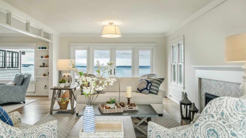
Oyster White in a living room works when you’ve good natural light and warm-toned furniture.
I used it in a client’s south-facing living room with oak floors, a beige sectional, and warm gray accent chairs.
The greige quality tied everything together without competing. The space felt cohesive and calm, not flat or cold.
Where Oyster White struggles in living rooms is north-facing spaces or rooms with cool-toned gray furniture and cool wood floors.
I saw it turn sad and lifeless in a living room with gray-washed oak and blue-gray sofas. The green undertones started showing up against all the cool gray.

Alabaster in living rooms is foolproof. The warm creamy undertone works with traditional furniture, modern pieces, warm wood, cool gray and with everything.
It’s bright to feel fresh but warm to feel inviting. I’ve specified it for living rooms with huge windows where Oyster White would’ve been perfect too, but the client wanted something light, Alabaster is what we considered.
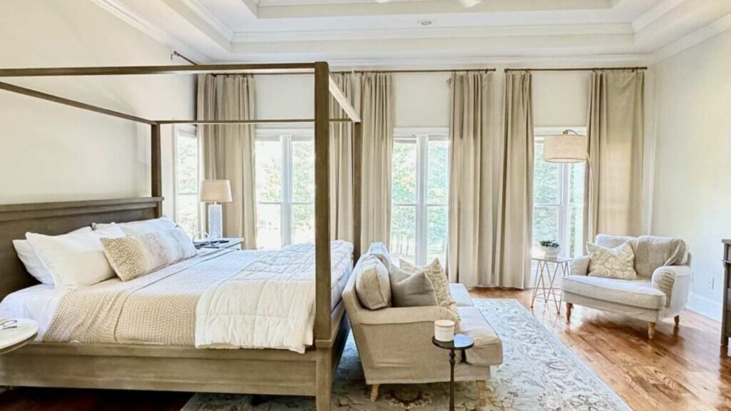
Bedroom
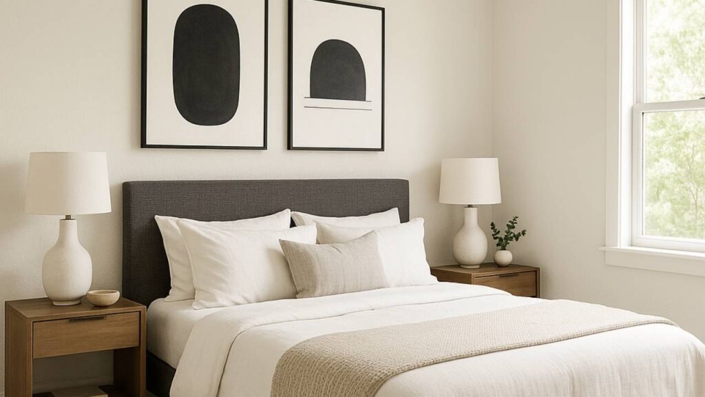
For bedrooms, Oyster White creates a muted, restful backdrop that works if you’re going for a cocoon-like feel.
I used it in a master bedroom with linen bedding, natural wood furniture, and warm brass fixtures. The room felt wrapped and peaceful, not bright and energizing.
The problem with Oyster White in bedrooms is if you’ve limited light or you’re trying to make a small bedroom feel large.
The lower LRV and muted quality can make the space feel small and darker than you want.
I made that mistake in my guest bedroom, it was north-facing, one window, Oyster White walls, it felt like a cave.
Alabaster in bedrooms is the safe choice that works. The warmth makes the space feel cozy without sacrificing brightness.
It works with white bedding and you get contrast without the bedding looking harsh against the walls. It also photographs well if that matters to you.
I’ve used it in both large master bedrooms and small secondary bedrooms, and it performs consistently.
Bathroom
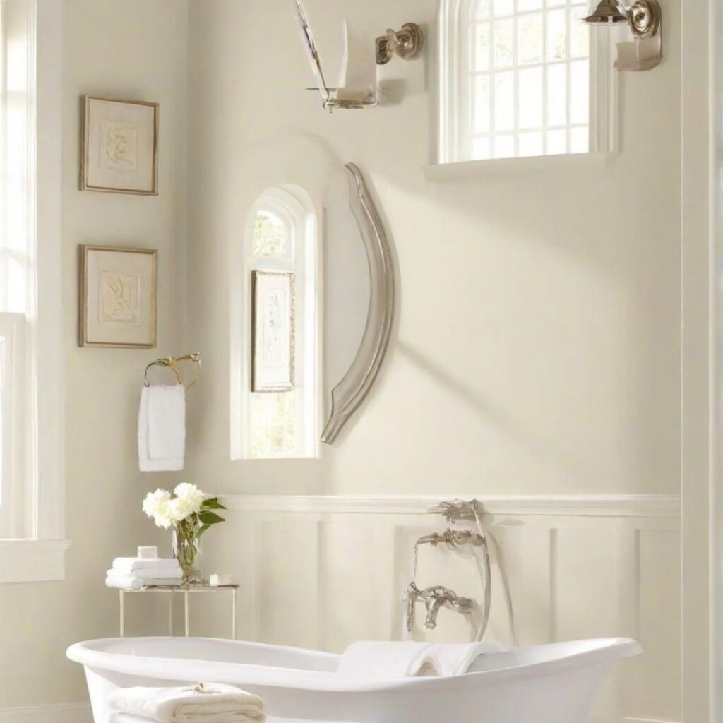
Oyster White in bathrooms is tricky. If you’ve warm-toned marble, travertine tile, or beige stone, it can work. The greige quality complements the warm natural stones.
I specified it for a bathroom with beige marble countertops and warm brass fixtures and it looked cohesive and intentional.
But most bathroom fixtures come in white-white, and Oyster White looks NOT white next to them.
The lighting in bathrooms matters with Oyster White. If you’ve windows and natural light, you have a better chance of success.
If you’re going with artificial light, especially cool LED bulbs, Oyster White can look gray and unwelcoming.
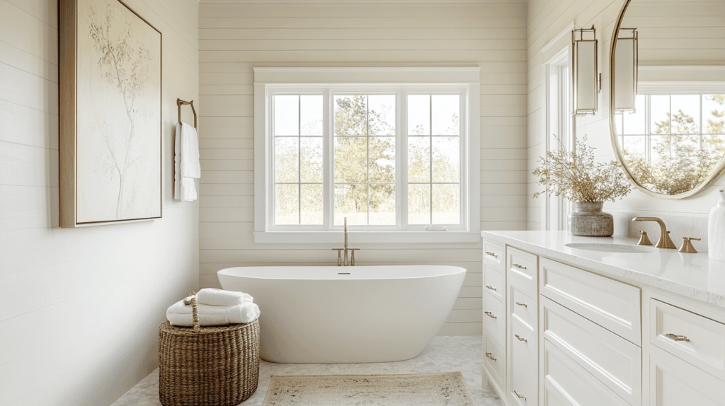
Alabaster in bathrooms is the standard for good reason. The warm cream undertone is flattering, it looks clean without being harsh.
White subway tile with Alabaster walls is a classic combination. It works with both warm and cool bathroom fixtures. The brightness helps bathrooms feel fresh and clean.
Kitchen
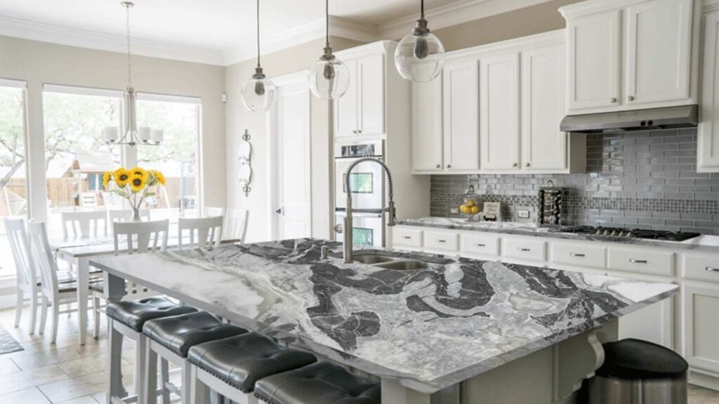
Oyster White for kitchen cabinets is where this color found its purpose. When you want warm cabinets that aren’t harsh white but aren’t brown either, Oyster White is perfect.
Pair it with light walls like Alabaster, Pearly White, or Pure White and it creates a soft contrast that feels modern but not cold.
I did a kitchen with Oyster White lowers, open upper shelving, and Alabaster walls. The subtle difference created depth without drama.
Oyster White on kitchen walls is less common but can work with white cabinets if you want to flip it. The issue is it can make white cabinets look bright and harsh.
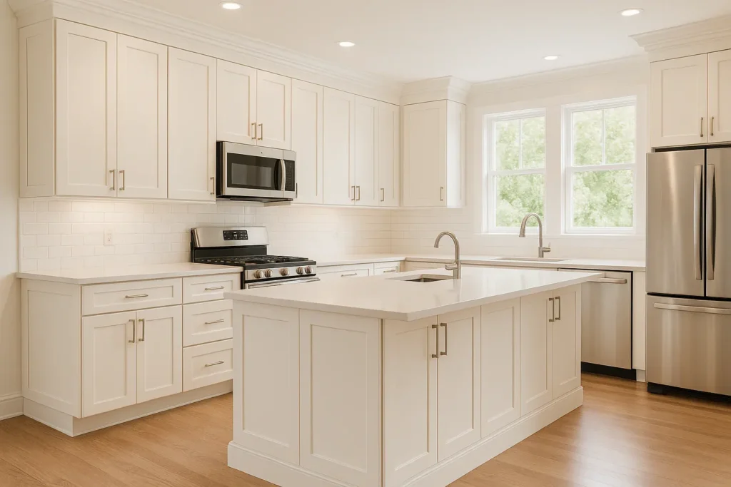
Alabaster is the default kitchen color. Cabinets, walls, trim, it works everywhere.
Alabaster cabinets with white subway tile backsplash and marble countertops is the Pinterest kitchen.
It’s popular because it delivers the soft, warm, inviting kitchen without feeling dated or yellow. I’ve specified Alabaster for kitchen cabinets and it’s been the right choice.
Exterior
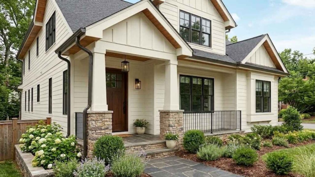
Oyster White on exteriors is where this color shines. The LRV of 72 is perfect for bright outdoor light, it washes out to look as soft white instead of looking too dark or yellow.
I’ve used it on brick homes, stucco, and siding. Works well with red brick where you want to soften the exterior without going harsh white.
On painted brick, it creates a cohesive look that feels intentional and updated.
The greige undertones that cause problems indoors disappear outdoors in bright sun.
Oyster White handles intense sunlight better than true whites that can look blue-white in certain conditions.

Alabaster on exteriors is good but less common because it can look bright and harsh in intense sunlight.
The LRV of 82 means it’s reflecting light, which works better in moderate climates or shaded exteriors.
I’ve seen it work well on homes with trees providing shade and it was glowing.
Alabaster works well as exterior trim paired with dark siding. The warm cream undertone complements siding colors without feeling harsh.
It’s also good for front doors or accent areas where you want the soft white.
Oyster White Vs Alabaster Vs Other Colors
Comparing paint colors side-by-side is how you figure out what works for your space. You’re never only choosing Oyster White or Alabaster.
Understanding how Oyster White and Alabaster compare with other colors that always come up helps to go with the right choice.
These are the comparisons I deal with in consultations.
Oyster White Vs Shoji White
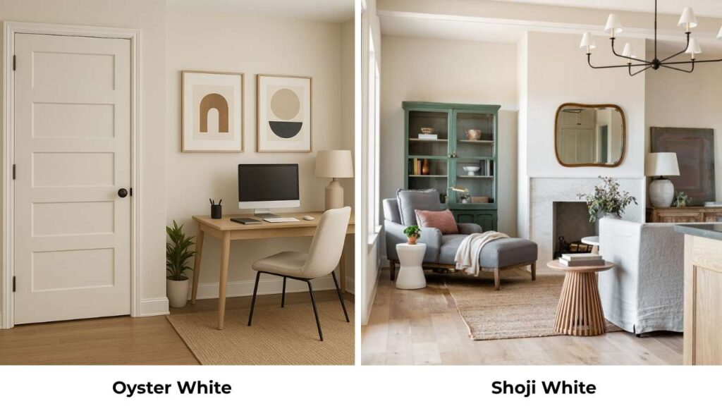
Shoji White is warm and more beige than Oyster White. It has taupe undertones where Oyster White has green-greige undertones.
Shoji White is warm in different lighting, while Oyster White is between warm and cool.
If you’re trying to neutralize green foliage on an exterior, Shoji White works better because the warm undertones counteract the green instead of echoing it like Oyster White’s green undertones do.
Oyster White Vs White Duck
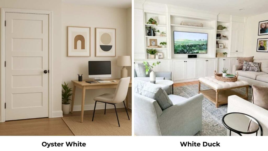
This comparison is unfair because White Duck and Oyster White are very similar. White Duck has the same LRV and the same warm green undertones.
The difference is subtle, White Duck looks slightly warm and less gray than Oyster White,
But in most conditions, they’re identical. If you can’t decide between them, test both and go with whichever you like better, because they perform the same.
Oyster White Vs Natural Linen
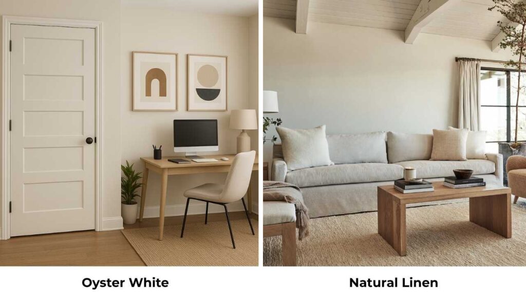
Natural Linen is warm with more beige undertones and no green. It’s also more light and where Oyster White looks greige, Natural Linen looks beige-cream.
Natural Linen feels traditional and established; Oyster White feels transitional and modern.
For interiors, Natural Linen is easy to work with because the undertones are predictable.
Oyster White gives you the interesting color-shifting quality that’s either a pro or a con depending on your tolerance for uncertainty.
Oyster White Vs Accessible Beige
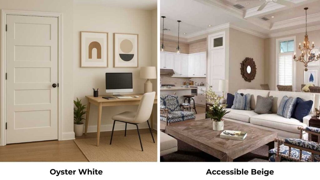
Accessible Beige is dark, it is an LRV around 58 and more beige. This isn’t a close comparison, they’re in different categories.
Accessible Beige is a true neutral beige; Oyster White is a light greige trying to pass as off-white. Use Accessible Beige when you want beige walls.
Use Oyster White when you want the light neutral that has warmth and complexity.
Oyster White Vs Swiss Coffee
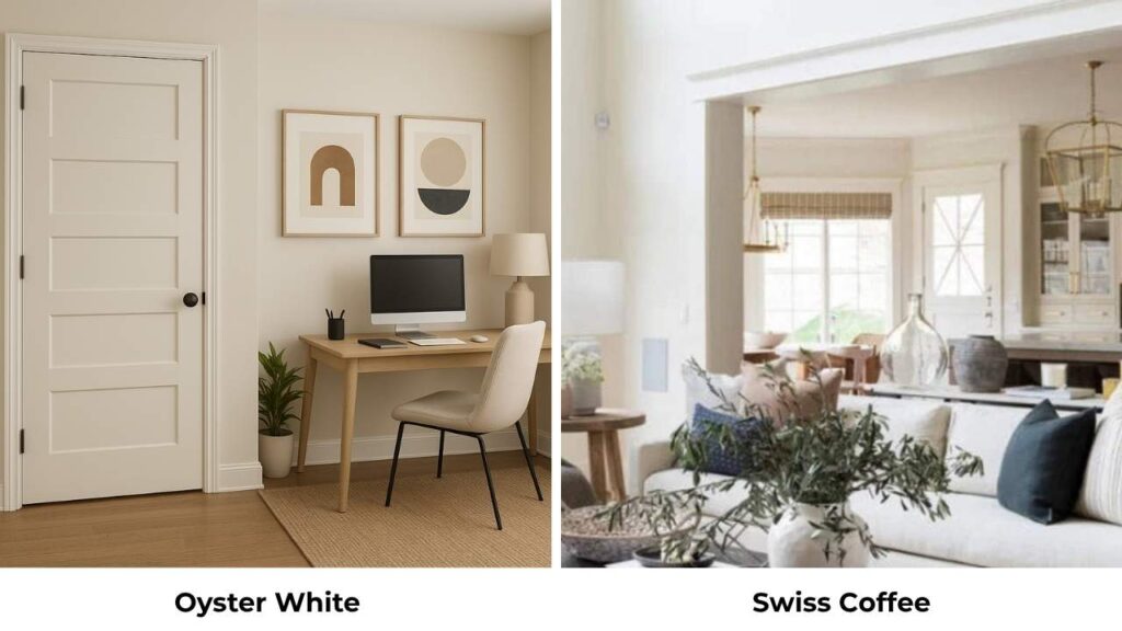
Swiss Coffee is creamy and warmer than Oyster White, with yellow influence and zero green. It’s also darker. Swiss Coffee feels traditional and cozy; Oyster White feels restrained and modern.
If you’re worried about Oyster White looking too gray or you hate the idea of green undertones, Swiss Coffee is a warmer alternative.
But Swiss Coffee can look quite yellow in warm light, which Oyster White doesn’t.
Oyster White Vs Natural Choice
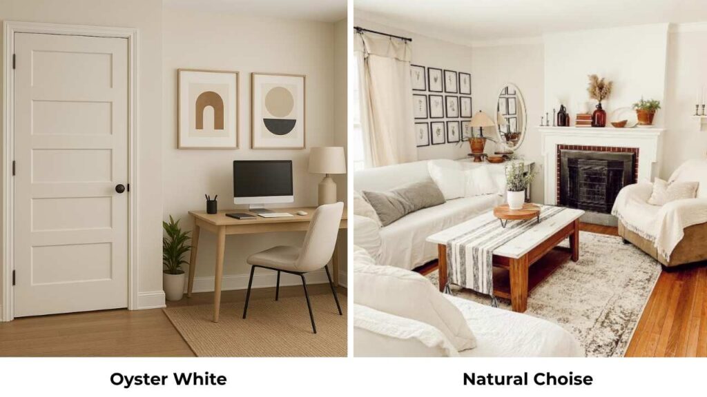
Natural Choice is similar in LRV but warmer. It has the same general greige-with-green-undertones situation, but the warmth is present.
Natural Choice may work better with green foliage on exteriors because it counteracts the green instead of echoing it.
Indoors, the difference is subtle, Natural Choice feels warm and more inviting; Oyster White feels cool and more neutral.
| Color Comparison | LRV | Undertones | Warmer/Cooler than Oyster White | Best Use vs Oyster White |
| Alabaster | 82 | Warm cream, slight yellow | Warmer and brighter | Choose for interiors, more versatile |
| Shoji White | Similar | Warm taupe-beige | Warmer | Choose for traditional spaces, exterior green foliage |
| White Duck | 72 | Warm green | Nearly identical, slightly warmer | Interchangeable |
| Natural Linen | Slightly higher | Warm beige-cream | Warmer | Choose for predictable warmth, traditional style |
| Accessible Beige | 58 | True beige | Much warmer and darker | Choose when you want actual beige, not off-white |
| Swiss Coffee | Slightly lower | Cream with yellow | Warmer | Choose for cozy traditional spaces |
| Natural Choice | 73 | Warm greige-green | Slightly warmer | Nearly interchangeable, marginally better with greenery |
Oyster White Coordinating Colors
The right coordinating colors make Oyster White work well in your space. Because of the green-greige undertones, Oyster White pairs best with colors that either complement or contrast the subtle complexity:
- Pure White (SW 7005): The go-to trim color for Oyster White walls; provides clean contrast without looking harsh
- Rosemary (SW 6187): Muted sage green that echoes Oyster White’s green undertones; creates cohesive earthy palette
- Dried Thyme (SW 6188): Another soft green that works beautifully with the greige base
- Blustery Sky (SW 9140): Mid-toned soft blue that contrasts nicely without clashing with undertones
- Debonair (SW 9139): Slightly deeper blue that adds sophistication against Oyster White’s softness
- Malabar (SW 9110): Warm deeper beige for accent walls or furniture when you need depth
- Agreeable Gray (SW 7029): Popular greige that shares similar undertones; works as coordinating wall color in adjacent rooms
- Iron Ore (SW 7069): Deep charcoal for exterior shutters or interior accents; provides strong contrast
- Pewter Green (SW 6208): Deep muted green for cabinets or built-ins against Oyster White walls
- Natural Linen (SW 9109): Warm companion for adjacent rooms when you want variation
The key with Oyster White is avoiding colors that are too cool or blue-toned because they’ll emphasize that green undertone in a bad way.
Alabaster Coordinating Colors
Alabaster is easy to coordinate because the undertones are straightforward.
The warm cream base works with both warm and cool accent colors, which makes it the versatile choice for house color:
- Pure White (SW 7005) or Extra White (SW 7006): Bright trim options that provide fresh contrast with Alabaster walls
- Alabaster on Alabaster: Monochromatic look with same color on walls and trim; subtle and sophisticated
- Cyberspace (SW 7076): Deep charcoal for front doors, though it needs careful consideration for interiors
- Uncertain Gray (SW 6234): Soft blue-gray for shutters or accent walls
- Repose Gray (SW 7015): Popular gray that pairs well as accent wall color
- Worldly Gray (SW 7043): Warm gray-beige for adjacent rooms
- Tricorn Black (SW 6258): Classic black for window frames, doors, or dramatic accents
- Mindful Gray (SW 7016): Medium warm gray that coordinates beautifully
- Comfort Gray (SW 6205): Soft warm gray for bedrooms or secondary spaces
- Naval (SW 6244): Deep navy for accent walls or cabinetry; provides strong warm contrast
The cream undertones in Alabaster mean it works well with most color families like greens, blues, grays, deep beiges, and blacks.
It’s harder to make Alabaster look bad with coordinating colors than it is with Oyster White.
Conclusion
Choosing between Oyster White Vs Alabaster isn’t about which color is better, it’s about which one matches your situation.
Oyster White brings the muted greige complexity with green undertones that either elevates your space or causes problems depending on your lighting and finishes.
It’s the exterior best choice and when you want subtle sophistication over brightness.
If you’ve bright natural light, warm finishes, and you’re drawn to colors with depth and complexity, Oyster White is what you should consider.
Alabaster brings reliable warm cream that works almost everywhere, stays predictable, and makes decorating easy because it coordinates with everything.
If you want a versatile warm white that works in multiple rooms and makes other design decisions easier, Alabaster is the best choice.
Sample both in your space, live with them for a few days, look at them in morning and evening light. The right choice will feel best when you see them in your conditions.
FAQs On Oyster White Vs Alabaster
Yes, Pure White and Alabaster work well together, this is the classic combination for Alabaster walls with Pure White trim. Pure White is bright and fresh, which provides a nice contrast against Alabaster’s warm cream without feeling harsh. The warmth in Alabaster prevents Pure White trim from looking cold or blue-white. I’ve used this combination many times for house color.
The main differences are LRV, undertones, and brightness. Alabaster has an LRV of 82 with warm cream undertones and no green, it’s bright, consistently warm, and looks true off-white in most conditions. Oyster White has an LRV of 72 with green-influenced greige undertones, it’s dark, muted, shifts between warm and cool depending on lighting, and looks as light greige indoors. Alabaster is the versatile interior choice.
Oyster White works for interiors in specific situations but isn’t as versatile as Alabaster. It’s excellent for rooms with warm wood, beige stone, and earthy finishes where you want a muted neutral backdrop. Kitchen cabinets in Oyster White paired with lighter walls are best. The challenges come in north-facing rooms or spaces with cool-toned finishes where the green undertones can make it look gray and flat.
Alabaster is popular because it delivers what people want from a warm white, it’s bright to feel fresh, warm to feel inviting, and versatile to work across different rooms and styles. The cream undertones are predictable and flattering. It won Color of the Year in 2016 which created awareness, but it stayed popular because it performs well.