Here’s what I learned, Behr Even Better Beige Vs Accessible Beige are NOT the same color, they look identical on the paint swatches.
Both are popular, go-to neutral choices for modern homes. They’re safe, warm and work with everything. But choosing between beige paint shades online, it’s confusing.
These two shades have similar names, similar depth, and they look similar. But they behave differently in real spaces.
I’ve watched homeowners decide with this because they look identical online.
One friend painted her entire living room in what she thought was a warm beige, only to realize in her north-facing room it looked gray.
Choosing the wrong undertone can mess up your whole space.
So, I’m breaking down the differences between Even Better Beige Vs Accessible Beige.
We’re talking undertones, LRV, how lighting affects each one, and which rooms they work in.
I’ll also compare them to other beiges you are considering, and share coordinating colors that look good.
Here are my other blogs that you can also read:
- Hunter Green Vs Emerald Green
- Anew Gray Vs Agreeable Gray
- Drift Of Mist Vs Alabaster
- Simply White Vs Alabaster
- Wythe Blue Vs Palladian Blue
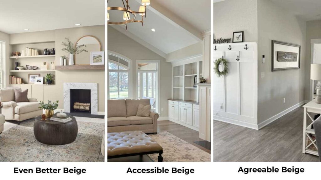
Color Summary of Behr Even Better Beige (DC-010)
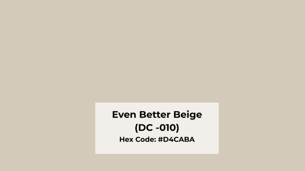
Even Better Beige is a warm beige with subtle greige influence. I painted my hallway this color and I love it.
It’s a soft, balanced, neutral-leaning warm beige that doesn’t look yellow but also doesn’t go cold on you. The greige influence is subtle.
This color is in the spot between traditional beige and soft greige. It’s warmer than greiges but cooler than classic contractor beige.
That’s why homeowners and designers keep coming back to it for living rooms, bedrooms, bathrooms and others.
It’s part of Behr’s Designer Collection, and it was their Paint Color of the Month in 2022.
I’ve used it on interior walls and I’ve seen it on exteriors. I think it shines inside where you can control the lighting.
The LRV is around 60, so it reflects a decent amount of light without being bright.
It has a creamy, soft vibe compared to gray-based neutrals. In low light, it looks rich.
The undertones are where it gets interesting. You’ve a warm beige base with subtle taupe and soft gray mixed in..
Color Summary of Sherwin Williams Accessible Beige (SW 7036)
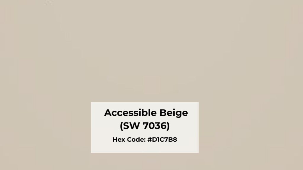
Accessible Beige is one of Sherwin-Williams’ best-selling paint colors. It’s a warm greige that balances beige and gray in a grounded, calm way.
But it has subtle green undertones with a gray base. In some lighting, that green can show up.
I’ve seen it in a friend’s kitchen where the morning light brings the mossy vibe.
The LRV is 58, deeper than Even Better Beige. It feels cozy and moderate, but it’s more neutral than traditional beige.
Some people describe it as greige with beige dominance. It doesn’t look warm, but it’s not cold either.
Designers love this color for house schemes. I’ve seen it used in modern homes, transitional spaces, contemporary builds, it’s versatile.
It works with white trim, gray accents, stone, tile, it’s a neutral bridge between warm and cool finishes.
In living rooms, it creates a calm backdrop. In bedrooms, it’s soothing without being boring. Bathrooms and kitchens benefit from how well it pairs with different materials.
And in exteriors, I’ve seen gorgeous homes painted in Accessible Beige with white or cream trim.
Behr Even Better Beige Vs Accessible Beige: Undertones, LRV & Best Uses
THIS is where the differences show. I’m breaking down the stuff that matters when you’re standing in the paint aisle overwhelmed.
Behr Even Better Beige Vs Accessible Beige colors are into the “safe neutral” category, but the subtle differences can make or break your room.
LRV
Light Reflectance Value is how much light a paint color reflects on a scale of 0-100. Even Better Beige has an LRV of around 60 and Accessible Beige is at 58.
Even Better Beige is light and reflects more light back into the room. It’s not a huge difference but it is subtle.
But in a small room or one without great natural light, those extra ones can make the space feel bright.
I used Even Better Beige in a small bedroom and it helped the room feel less cave-like. Accessible Beige, being darker, can feel rich and grounded.
It is great for large spaces or rooms with windows.
Undertones
Even Better Beige has warm beige undertones with subtle taupe and soft gray mixed in and it has no strong yellow. It stays warm without going peachy or cream-soup on you.
Accessible Beige has greige undertones, the beige and gray blend with occasional green undertones that show up in some lighting. The gray base makes it neutral.
Here’s what you should know, the green undertones in Accessible Beige are REAL. My friend painted her bathroom this color and in the morning light, it looked greenish-gray.
She didn’t hate it, but it wasn’t what she expected. Test it in lighting before committing.
Lighting Affect
Even Better Beige:
- Bright light: warm and inviting
- Low light: rich, deep beige
- Artificial lighting: maintains warmth without yellowing
I love how it behaves at night. It doesn’t go dull or flat under lamps.
Accessible Beige:
- Bright light: reads as neutral greige
- Low light: can lean gray or green
- North-facing rooms: appears cooler than you’d expect
Warmth
Both colors create warmth, but in different ways. Even Better Beige is warm. It’s creamy, soft and traditionally beige-warm.
It creates a cozy, inviting vibe without trying hard. If you want a room to feel warm then go with it.
Accessible Beige creates warmth through balance. It’s warm, but it’s also grounded and neutral. It doesn’t embrace as much as it looks peaceful.
It sounds weird but I don’t know how else to describe it. It’s warm but restrained.
Styling and Best Uses
Trim and ceiling coordination:
Both colors pair beautifully with white trim. I used warm whites with Even Better Beige and it looked gorgeous.
With Accessible Beige, you can go with bright white or soft whites because it handles both.
Furniture and accents:
Even Better Beige works well with:
- Warm browns
- Wood tones
- Cream and beige palettes
- Traditional and transitional furniture
Accessible Beige works well with:
- Gray accents
- Stone and tile finishes
- Modern and contemporary pieces
- Mixed warm and cool finishes
Best uses:
Even Better Beige is perfect for bedrooms, living rooms, hallways, open floor plans needing warmth.
Accessible Beige shines in house color schemes, modern spaces, homes bridging warm and cool styles.
Comparison Table
| Feature | Even Better Beige (DC-010) | Accessible Beige (SW 7036) |
| LRV | ~60 | 58 |
| Undertones | Warm beige, subtle taupe/gray | Greige with green undertones |
| Warmth | Warmer, creamier | Neutral, more balanced |
| Best Lighting | Works in most lighting | Best with good natural light |
| Depth | Mid-light | Slightly deeper |
| Brand | Behr (Home Depot exclusive) | Sherwin-Williams |
| Overall Feel | Cozy, soft, inviting | Grounded, calm, neutral |
Even Better Beige Vs Accessible Beige: Room-By-Room Suitability
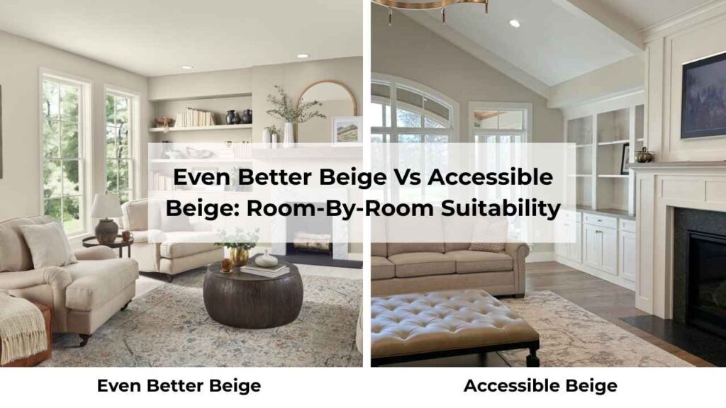
I’ve tested both these colors in different rooms. Here’s what worked and what didn’t. Every room has different lighting, different purposes, different vibes.
What works in a living room can feel wrong in a bathroom. I’m giving you the breakdown here.
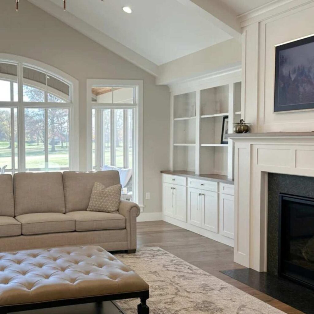
Living Room
Even Better Beige in the living room:
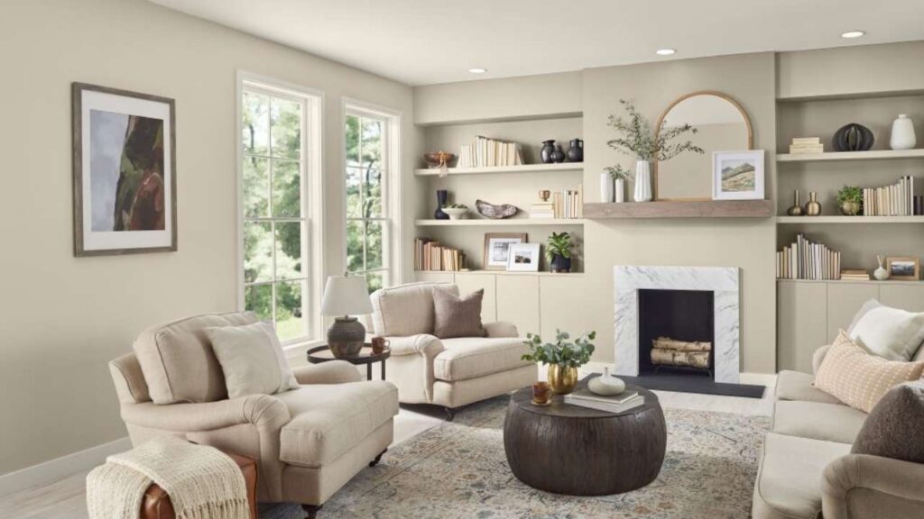
I used this in my living room and I’m obsessed with how it looks. The warmth makes the space feel inviting without being cozy.
It works well with wood furniture, warm metals, and with any style. In bright daylight, it’s soft and fresh.
At night with lamps on, it gets the gorgeous depth that makes the room feel expensive.
It pairs well with warm whites on the trim. I used a creamy white and the combo feels seamless.
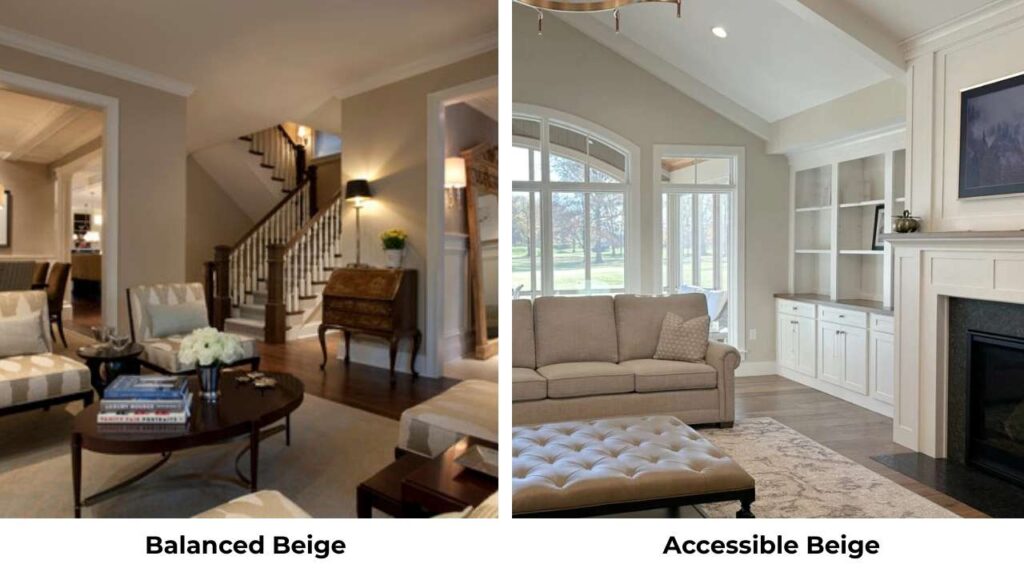
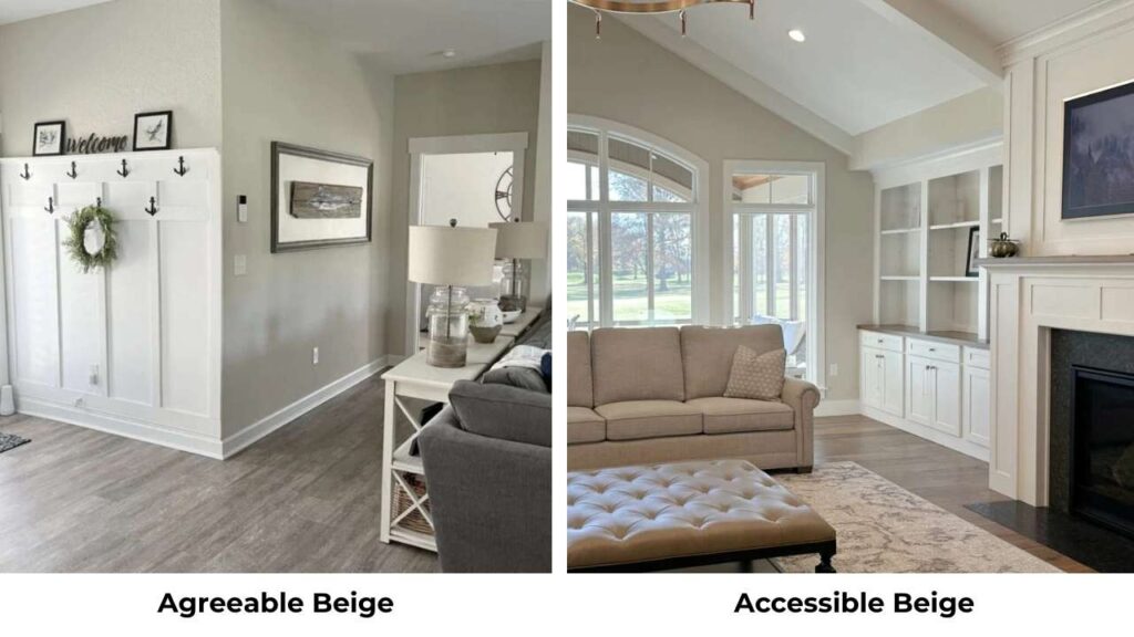
Accessible Beige in the living room:
My sister used this in her living room and it’s perfect for her modern style. It creates a calm, grounded backdrop that doesn’t compete with her furniture or art.
It’s neutral than Even Better Beige, so if you’ve mixed finishes, this handles it better.
But her living room is south-facing with windows. In a dark living room, I think it feel too muted.
Bedroom
Even Better Beige in the bedroom:
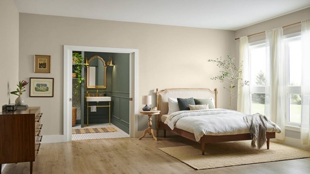
I painted my bedroom this color and It feels nice and cozy. It’s warm to feel cozy but not so warm that it feels heavy.
In the morning, it looks soft and fresh. At night, it creates a peaceful vibe that’s perfect for winding down. I paired it with white bedding and warm wood furniture and it’s perfect.
Accessible Beige in the bedroom:
A friend used this in her bedroom and loves it, but her room gets amazing natural light.
The neutral, grounded vibe works for her modern minimal style.
She wanted calm and neutral, not cozy and warm, so Accessible Beige was the right one.
If you want your bedroom to feel more like a spa retreat than a cozy nest, go with Accessible Beige.
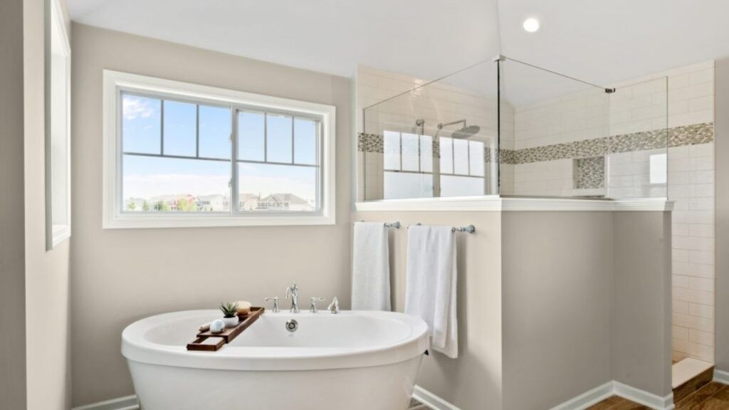
Bathroom
Even Better Beige in the bathroom:
I tested this in a guest bathroom and it was fine, but not the favorite one. Bathrooms need more with beiges because the lighting is often artificial and weird.
Even Better Beige held up okay, but I think it works better in bathrooms with good natural light. With just overhead lighting, it can feel flat.
Accessible Beige in the bathroom:
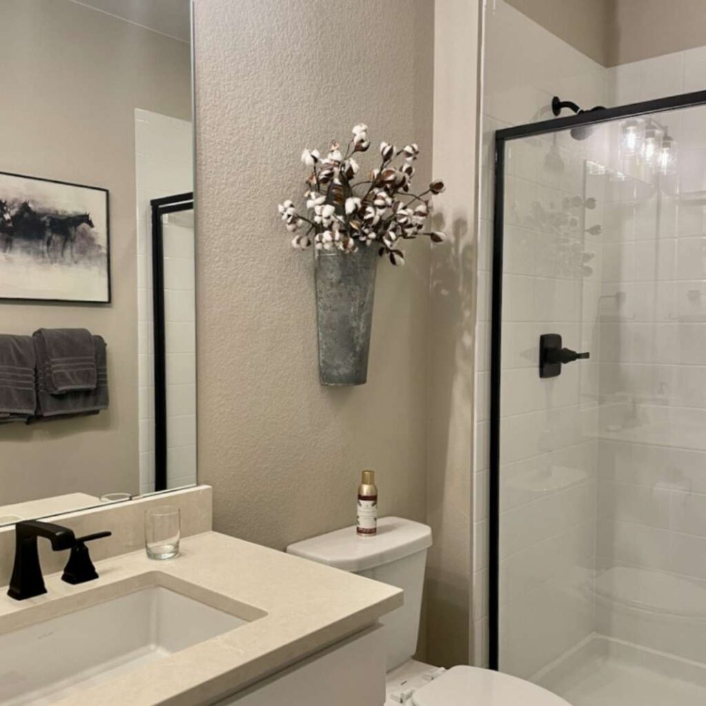
This works better in bathrooms, in my opinion. The neutral greige vibe pairs beautifully with white fixtures, tile, stone, the bathroom materials.
It doesn’t compete with finishes the warm beiges do. I’ve seen it in bathrooms with marble tile and it looks good.
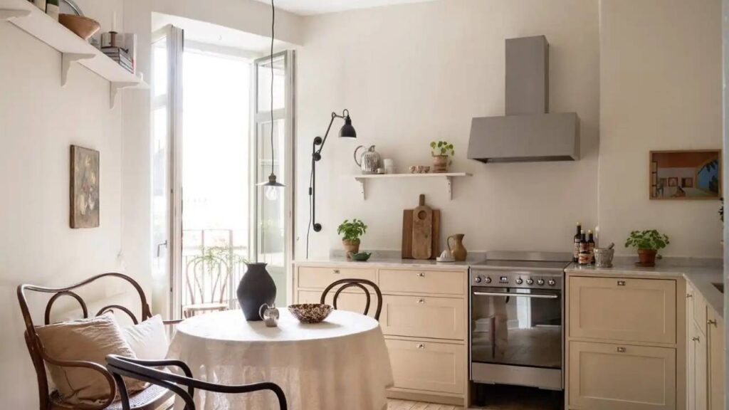
Kitchen
Even Better Beige in the kitchen: I painted my kitchen this color but chickened out.
Kitchens have going on like cabinets, countertops, backsplash, appliances. Even Better Beige’s warmth could clash if your finishes lean cool.
But if you have warm wood cabinets or warm countertops, it could be gorgeous.
Accessible Beige in the kitchen:
This is a safe choice for kitchens. The neutral greige works with white cabinets, gray cabinets, wood, tile, granite, quartz, basically everything.
I’ve seen it in modern kitchens, transitional kitchens and slightly traditional spaces. It works.
Exterior
Even Better Beige on exteriors:
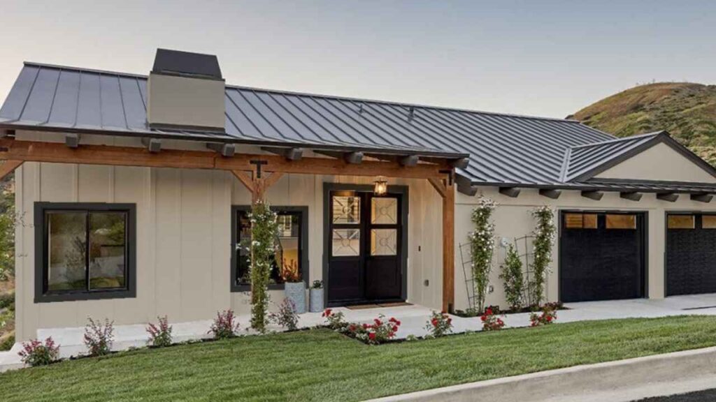
I’ve seen this on a few houses in my neighborhood and it looks nice. The warmth creates great visual appeal without being bold.
It pairs well with white or cream trim and works with different architectural styles. One house has dark shutters and it’s gorgeous.
Accessible Beige on exteriors:
This is more popular for exteriors because of its neutrality. It works with stone, brick, different roof colors, different trim options.
It’s the safe vibe that makes it easy to coordinate with everything else. I like it, but I think Even Better Beige has personality on the outside.
Behr Even Better Beige Vs Accessible Beige Vs Other Colors
Let’s be honest, you’re not looking at these two colors. You’ve many paint swatches, Here’s how some other popular beiges look against Accessible Beige.
I’m focusing on Accessible Beige for these comparisons because it’s the popular neutral.
Natural Linen Vs Accessible Beige

Natural Linen is warm and has a cream influence than Accessible Beige.
If Accessible Beige feels neutral or gray for you, Natural Linen can be better. It’s soft, inviting, with less gray undertone.
Balanced Beige Vs Accessible Beige
Balanced Beige is well balanced. It’s warmer than Accessible Beige with less gray.
The green undertones are less visible. If you want beige that feels BEIGE, Balanced Beige is an option.
Agreeable Beige Vs Accessible Beige
Wait, Agreeable Gray is what people compare. Agreeable Gray is cooler with gray undertones than Accessible Beige.
It’s less warm, more versatile with cool finishes, but can feel less cozy.
Diverse Beige Vs Accessible Beige
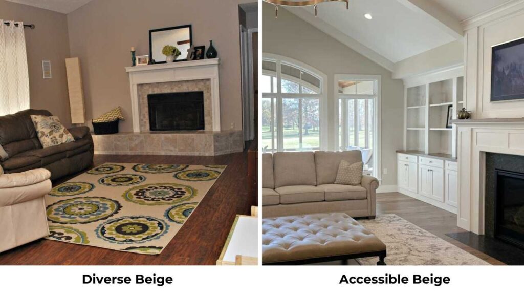
Diverse Beige has more yellow and warmth than Accessible Beige. If Accessible Beige feels too muted, Diverse Beige brings personality.
But watch out, that yellow can be a lot in certain lighting.
Comparison Table
| Color | LRV | Undertones | Warmth Level | Best For |
| Even Better Beige | ~60 | Warm beige, taupe | Warm | Cozy spaces, traditional/transitional |
| Accessible Beige | 58 | Greige, green hints | Neutral-warm | Whole-house, modern spaces |
| Natural Linen | ~62 | Cream, soft beige | Warmer | Bedrooms, living rooms |
| Balanced Beige | ~59 | True beige | Medium-warm | Versatile, most rooms |
| Agreeable Gray | 60 | Gray-beige | Cool-neutral | Modern, cool finishes |
| Diverse Beige | ~61 | Yellow-beige | Warm | Bold, personality-driven spaces |
Behr Even Better Beige Coordinating Colors
Here’s what looks good with Even Better Beige based on real rooms, not only theory.
Trim colors:
Warm whites work best like creamy, soft whites but NOT harsh bright white.
I used a warm white trim and it’s seamless. If you use bright white, the contrast can feel harsh.
Accent colors:
Warm browns, soft pinks, muted blues, cream tones. I added some dusty rose pillows in my bedroom and they look beautiful against the walls. The Navy also works but keeps it muted, not bright.
Coordinating neutrals:
Pair it with other warm beiges, taupes, soft grays. Avoid cool grays because they’ll clash with the warmth.
Ceiling color:
I kept my ceiling white and it looks great. You could also go with a light version of Even Better Beige if you want a cozy vibe.
Sherwin Williams Accessible Beige Coordinating Colors
Accessible Beige is versatile with coordinating colors because of its neutral nature.
Trim colors:
Bright white OR warm whites both work. Sherwin Williams Alabaster is a popular choice. White Dove from Benjamin Moore also pairs beautifully.
Accent colors:
You have more range here like grays, blues, greens and some warm tones.
The neutrality means it plays well with both warm and cool accents. I’ve seen it with sage green accents and it’s STUNNING.
Coordinating neutrals:
Other greiges, soft grays, and cool beiges. Agreeable Gray is a common pairing. You can also go with whites, creams, and light taupes.
Ceiling color:
White is standard and works great. Some people extend Accessible Beige to the ceiling for a cocooning effect, but I prefer the contrast with white.
Conclusion
So, Behr Even Better Beige Vs Accessible Beige. Even Better Beige if you want warmth and coziness. It’s creamy, soft, and traditionally beige without being outdated.
Perfect for bedrooms, living rooms, spaces where you want the warmth feeling.
Accessible Beige if you want versatile neutrality. It’s greige, grounded and handles mixed finishes better.
It is perfect for house schemes, modern spaces, or if you’re not sure whether you lean warm or cool.
Both are beautiful. Neither is wrong. But swatch them in your space before painting. The green undertones in Accessible Beige are real.
The warmth in Even Better Beige can be too much for some rooms. Test in your lighting.
FAQs On Behr Even Better Beige Vs Accessible Beige
Even Better Beige is the closest Behr match to Accessible Beige. Both are warm neutrals with similar LRV, but Even Better Beige is warm and creamy while Accessible Beige is more greige.
Even Better Beige is WARM. It’s a warm beige with subtle taupe and soft gray influence, but it leans warm. It’s not as warm as traditional peachy beiges, but it’s warmer than most greiges.
Accessible Beige is one of the most popular neutrals and it’s not going anywhere. Warm neutrals and greiges are in trend. It’s a classic neutral that works with current trends without feeling trendy.
No, but it CAN look greenish in some lighting. The green undertones are more common than yellow. In warm, direct sunlight, any beige can take on a warmer or yellower cast.