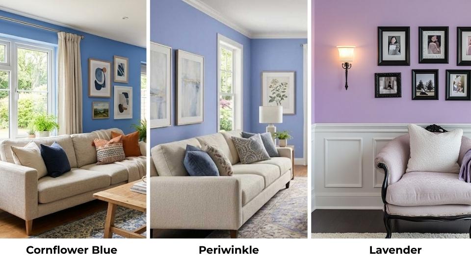
Cornflower Blue Vs Periwinkle, these two shades can confuse you because they’re close but also different when they’re on your walls.
Choosing the perfect shade of blue for your walls, wardrobe, or design project can be tough when you’re dealing with colors that are almost the same.
These two colors matter more than you can imagine in interior design, fashion, art, and any design.
Go with cornflower blue when you need periwinkle, then it can make your room feel off.
The wrong color doesn’t look different but it changes the mood, makes your furniture look off, and can make you question every design decision.
Here in this post, I’m going to walk you through everything from Cornflower Blue Vs Periwinkle.
We’ll talk about what makes each color unique, how they look in different lights, which rooms they work best in, and how to pair them without making your space.
Here are my other blogs that you can also read:
- Oatmeal Color Vs Beige
- Modern Gray Vs Agreeable Gray
- Cloud White Vs White Dove
- Greek Villa Vs Snowbound
- Eider White Vs Alabaster
What You Need To Know About Cornflower Blue
Cornflower blue name is derived from the Centaurea cyanus plant, the gorgeous wildflowers that grow in wheat fields in Europe.
The color has a beautiful history. During World War I, soldiers sent cornflowers in letters as symbols of hope.
There’s something about that backstory that makes me love this color more.
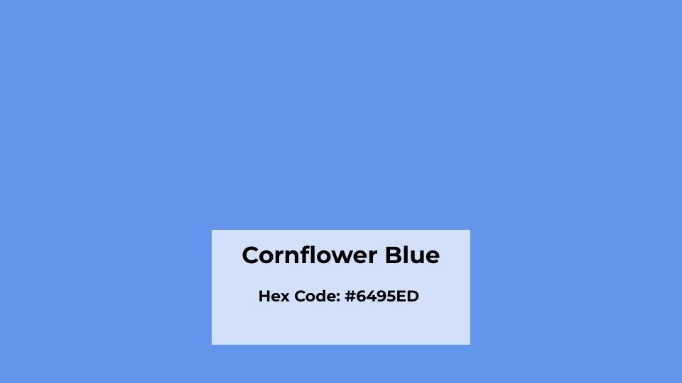
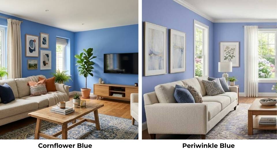
Cornflower blue is a medium-light blue with hints of lavender, like true blue but with softness.
It has a hex code of #6495ED and an LRV of around 54, which means it’s not too bright but not dark either.
What I love about this shade is the moderate saturation. It has more blue in it than periwinkle, which means it doesn’t get washed out.
When I painted my living room accent wall with it, the color went together with my white furniture around it.
The purplish undertones are barely there but the undertones are what make cornflower blue feel calm instead of cold.
Homeowners and designers keep choosing this shade because it creates impact without looking for attention.
Warm lighting can make cornflower blue appear a bit muted. I learned this when I put it in a room with yellow-toned bulbs and it looked flat.
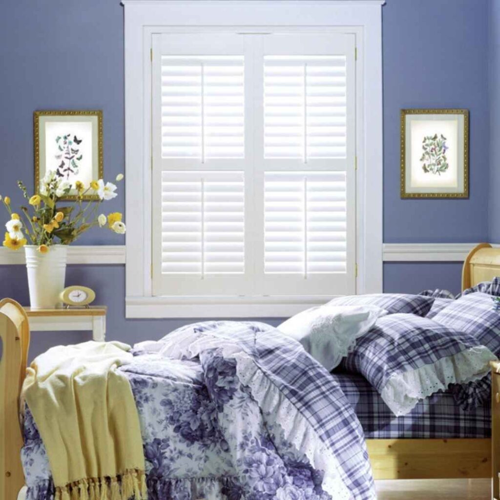
What You Need To Know About Periwinkle
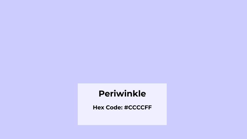
Periwinkle is named after the Vinca minor plant, the little sprawling flowers with delicate bluish-purple petals. Periwinkle is a pale bluish-purple with a visible blue base.
It’s described as a soft blend of blue, lavender, and gray, but it is closer to blue than true purple.
The hex code is around #CCCCFF and the LRV is about 75, making it lighter than cornflower blue. It has low pigment concentration compared to cornflower blue.
This makes it light and airy, but also means it can get overwhelmed by bold colors around it and it makes it look washed out.
The cool temperature of periwinkle feels airy, calm, and muted. It’s commonly associated with dusk, quietness, nostalgia, and introspection.
I painted my bedroom periwinkle and I love it till now. Waking up in the color feels like being wrapped in a soft cloud. It’s gentle without being boring, soothing too.
Designers and homeowners love periwinkle because it’s easy to find commercially.
Whether you need periwinkle throw pillows, bedding, curtains, you’ll find many options.
Periwinkle is pickier than cornflower blue about where it works.
It shines in nurseries, spring-themed designs, feminine spaces, and as accent colors.
Natural daylight enhances the lavender undertone, but in rooms with limited light or warm bulbs, periwinkle can look gray and depressing.
Cornflower Blue Vs Periwinkle: Key Differences
So, Cornflower Blue Vs Periwinkle, both are gorgeous light blues, both make you feel calm, both work in homes.
I’m going to break this down the way it should be explained and understood.
These differences may look small on a paint swatch but they make an impact on the walls.
Undertones
Cornflower blue has a true medium blue character with slight purple undertones, the blue dominates and the purple has a hint in it.
Periwinkle has lavender and gray undertones mixed with blue. The purple is more visible and competes with the blue for attention.
This is why periwinkle looks like blue-purple while cornflower looks like purple-blue.
I tested this by painting poster boards of each color and looking at them in different rooms.
The cornflower looked blue but periwinkle shifted between looking blue, purple, or gray depending on what was around it.
Lighting Behaviour
This is where you should pay attention before committing to the one because it matters more than you think.
Cornflower blue has moderate saturation and holds its color well in different lights. Warm light mutes it but it looks visibly blue.
Natural daylight makes it look fresh and true to the paint swatch. In low light, it doesn’t transform into a different color.
Periwinkle is sensitive to lighting, in natural daylight, the lavender undertone comes out and the color looks soft, airy and dreamy.
But in warm artificial light it can look muddy or gray and in low light and also it loses its personality.
I had periwinkle in a north-facing room with minimal windows and it looked sad but when.
I painted that same color to a south-facing room with light and it looked perfect.
Visual Impact
Cornflower blue creates a strong visual impact because of its rich saturation and visible pigment.
It can hold its own as a main wall color and doesn’t disappear next to whites, grays, or other colors.
When I use cornflower blue, the room has a presence and the color makes a statement without being loud.
Periwinkle creates soft visual impact, it blends, creates warmness, and a gentle atmosphere.
It’s less saturated, pale, and works best when you want the color to support other design elements.
My periwinkle bedroom lets my colorful artwork and bedding shine and the walls don’t compete instead they create a backdrop.
Styling and Best Uses
Cornflower blue styling:
- It works beautifully with white trims and ceilings
- It pairs nice with whites, grays, taupes, soft neutrals, mustard, beige, charcoal
- Furniture in natural wood tones looks amazing against it
- Accent colors can be bold or soft
I have cornflower walls with white trim, a gray couch, and mustard throw pillows. It’s calming but has energy.
Periwinkle styling:
- Needs white or cream trims to keep it from looking muddy
- Pairs with soft whites, creams, blush pinks, light grays, lavender, soft greens
- Furniture should be light to medium tones
- Accent colors need to stay in the soft, pastel family
My periwinkle bedroom has white furniture, blush pink accents, and cream curtains because dark colors will kill the vibe.
| Aspect | Cornflower Blue | Periwinkle |
| Hex Code | #6495ED | #CCCCFF |
| LRV | ~54 (moderate) | ~75 (light) |
| Saturation | Moderate | Light, soft |
| Undertones | Slight purple | Significant lavender + gray |
| Lighting Sensitivity | Moderate, stays true | High, shifts dramatically |
| Visual Impact | Strong, visible | Soft, gentle |
| Best Trim Color | White, cream, or gray | White or cream only |
| Furniture Pairing | Any tone works | Light to medium tones |
| Accent Colors | Bold or soft | Soft pastels only |
| Commercial Availability | Harder to find decor | Easy to find everywhere |
Cornflower Blue Vs Periwinkle: Room-By-Room Comparison
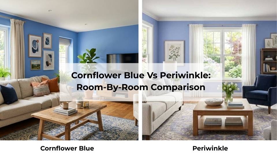
Choosing between Cornflower Blue Vs Periwinkle gets easier when you think room by room. What works in a bedroom may not look good in a kitchen.
Let me walk you through how each color looks in different spaces.
So, let’s get into it and find out which color compliments best which room and in what conditions.
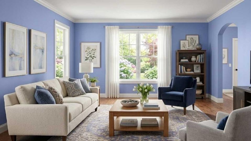
Living Room
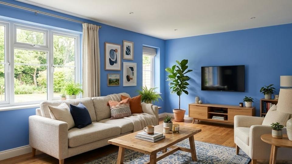
Cornflower blue in living rooms:
This color WORKS in living spaces. I used it on one accent wall behind my couch and it became the anchor for the whole room.
The moderate saturation means it can handle the activity and energy of a living room.
It pairs well with gray couches, natural wood coffee tables, and white shelving.
I added some mustard yellow throw pillows and a beige rug, and the room feels calm but lived-in.
The medium brightness means it works even if your living room doesn’t have much natural light.
My living room is on the east side so it gets morning sun but becomes dark in the afternoon, and the cornflower blue stays true the whole day.
Periwinkle in living rooms:
I tried periwinkle in my living room and it didn’t work because living rooms need colors that can handle visual competition.
It has furniture, electronics, books, and people. Periwinkle is soft for that chaos, it looked washed out.
But, if you have a small, light-filled living room with minimal furniture and want an airy, feminine, peaceful vibe then periwinkle can work.
But keep everything else in soft, light tones.
Bedroom
Cornflower blue in bedrooms:
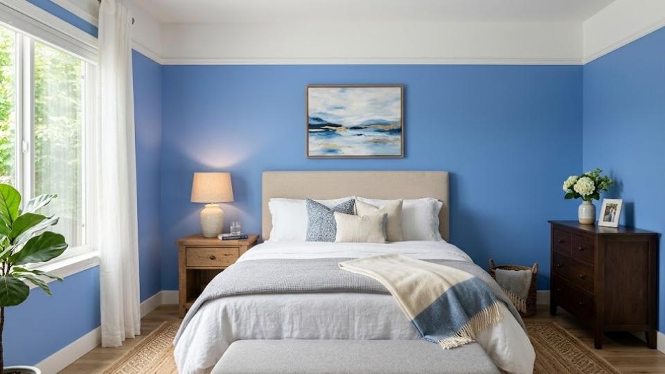
It works great if you want a bedroom that feels calm but not too soft.
I used it in my son’s room and it created the perfect balance which was peaceful for sleep, strong to not feel like a baby.
The subtle purple undertones make it feel warmer than a true blue, which is important in bedrooms.
It pairs well with white bedding, gray or navy accents, and wooden furniture. The room feels put-together and serene.
Periwinkle in bedrooms:
THIS is where periwinkle works the best. My bedroom is periwinkle and I love it more than any other color I’ve used.
The pale, airy quality makes the room feel big and light.
Imagine waking up surrounded by the soft blue-lavender that is calming without being sedated, is like sleeping inside a spring sky.
I paired it with white furniture, blush pink bedding, and cream curtains and the whole room feels gentle.
Remember that your bedroom gets decent natural light. My friend tried periwinkle in a basement bedroom and it looked gray and depressing.
Bathroom
Cornflower blue in bathrooms:

I love this combo because bathrooms benefit from cornflower blue’s ability to stay true in different lighting conditions, and bathrooms have different lighting.
The color works with white fixtures, chrome or brushed nickel hardware, and white or light gray tiles.
I did cornflower walls with white subway tile and it looks clean, fresh, and spa-like.
The moderate saturation means it doesn’t feel overwhelming in a small space. It feels intentional.
Periwinkle in bathrooms:
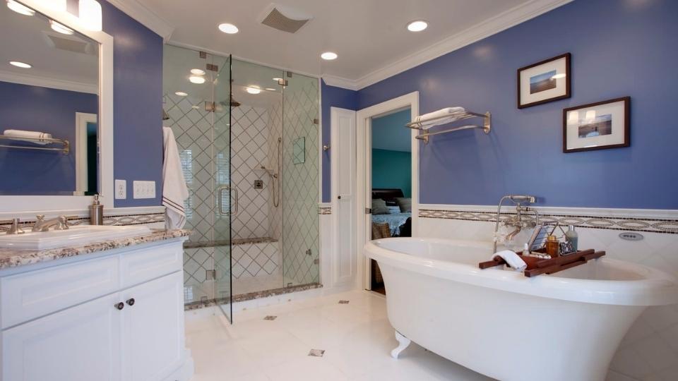
This can work but you need to be careful.
I tried periwinkle in my powder room and it looked amazing during the day when light came through the windows and at night with the vanity lights it looked muddy and sad.
The solution was better bulbs and adding more white like white vanity, white mirror frame, white accessories, because the periwinkle needed support.
if your bathroom has good natural light and you keep everything else light and bright, periwinkle creates a soft, spa-like feeling.
Kitchen
Cornflower blue in kitchens:
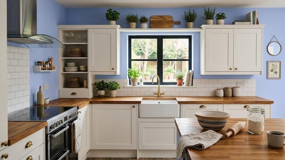
I’ve seen this but I haven’t tried it myself. The color works as either cabinet color or wall color in kitchens with white countertops and natural light.
It pairs with white cabinets, stainless appliances, light wood, and neutral backsplashes, creating a calm cooking space.
The versatility of cornflower blue means it can handle the space of a kitchen and all the stuff, appliances, food, activity.
Periwinkle in kitchens:
Kitchens are active spaces with visual competition and complicated lighting and periwinkle is delicate for this type of environment.
I’ve seen periwinkle kitchen accessories work like dish towels, small appliances, decorative items but on walls or cabinets, it gets overwhelmed and looks washed out.
Cornflower Blue Vs Periwinkle Vs Other Colors
Let’s talk about how these two compare to other same shades because the blue-purple color family has many options.
When I started getting into color theory for my design projects, I realized there are like fifty shades that look similar but look different. So, here are some of them.
Lavender Vs Periwinkle
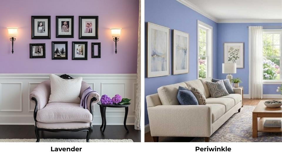
Lavender is more purple than periwinkle, it is that simple.
Periwinkle leans blue, it’s a blue with lavender undertones. Blue is the dominant color here.
Lavender leans purple, it’s a purple with some blue mixed in and the purple dominates.
Lavender looks more purple-pink while periwinkle looks more blue-purple.
I tested this by painting samples side by side and the difference was visible.
Lavender feels warm, and pink meanwhile periwinkle feels cool and airy.
In terms of use, lavender works better when you want something floral, spring-like, and a hint of purple.
Periwinkle works when you want to stay in the blue family but with a soft version.
Periwinkle Vs Indigo
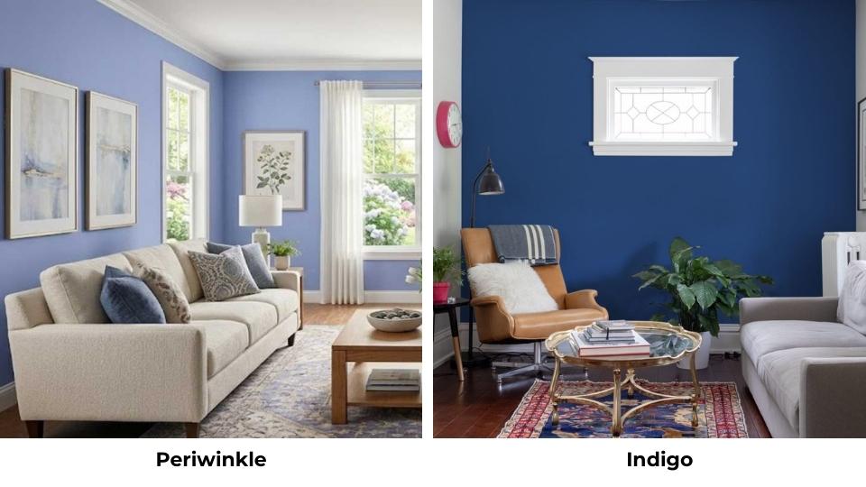
Indigo is dark, rich, saturated, and intense. It’s a deep blue-purple that makes dramatic statements.
Periwinkle is pale, soft, light, and gentle. It’s a hint compared to the indigo’s statement.
I have both in my home, indigo in my home office and periwinkle in my bedroom.
They’re both blue-purple color wheels but the mood is different.
Indigo feels sophisticated and moody and periwinkle feels peaceful and dreamy.
Cornflower Blue Vs Periwinkle Blue
Here’s where it gets confusing.
Some paint brands have a color called “periwinkle blue” that’s different from standard periwinkle.
It means a periwinkle that is MORE blue and less lavender. Standard periwinkle is the soft blue-lavender blend.
Periwinkle blue is more saturated and blue than regular periwinkle, bringing it close to the cornflower blue category.
Cornflower blue remains the most saturated and true-blue of the three.
Here’s the comparison table to consider:
| Comparison | Color 1 | Color 2 | Main Difference |
| Lavender vs Periwinkle | More purple-pink, warmer | More blue-purple, cooler | Purple dominance vs blue dominance |
| Periwinkle vs Indigo | Pale, soft, light | Dark, rich, saturated | Intensity and depth |
| Cornflower Blue vs Periwinkle Blue | More saturated, true blue | Slightly less saturated, more lavender | Saturation and undertone strength |
What is the Difference Between Behr Cornflower Blue and Behr Periwinkle?
Behr Cornflower Blue is the version of the classic medium blue with slight purple undertones. It’s moderately bright, has decent saturation, and looks as true blue on the wall.
The color holds well in different lighting and doesn’t shift.
Behr Periwinkle is light, lavender-leaning, and has a soft appearance. It’s visibly paler than their cornflower blue and has visible purple undertones.
The difference between these two Behr versions follows the same pattern like cornflower is rich and blue, periwinkle is light and purple-tinted.
BUT different paint brands have different versions of “cornflower blue” and “periwinkle.
” Behr’s cornflower can be different from Benjamin Moore’s or Sherwin Williams’.
Conclusion
Here’s what it comes to after comparing between cornflower blue vs periwinkle: Choose cornflower blue when you want, strong visual impact, versatile color mixing and pairing options and a color that stays true in different lighting and has medium saturation that works in active spaces with a hint of purple.
Choose periwinkle when you want a soft, airy, gentle space and a color that blends and supports rather than dominates, dreamy, whimsical, or feminine vibes and it creates light walls that make rooms feel big and has purple influence in your blue.
Both are beautiful, create calm, peaceful spaces and both work in homes but they’re not interchangeable.
I keep both in my house in different rooms because they serve different purposes. Cornflower blue in active, social spaces, periwinkle in personal, quiet spaces.
Test your paint samples in the room at different times of day and live with them for a few days before deciding and don’t be afraid to repaint if you choose wrong.
FAQs On Cornflower Blue Vs Periwinkle
Periwinkle blue is a pale bluish-purple color with a visible blue base. It’s a blend of blue, lavender, and gray that is closer to blue than true purple. The hex code is around #CCCCFF with an LRV of about 75.
The Vinca minor flower is the namesake. You’ll also see this color in spring designs, nursery decor, feminine fashion pieces, and home decoration items like throw pillows, bedding, and curtains.
Periwinkle is more blue than purple, but it has some purple undertones. It is in the in-between zone where a blue with lavender mixed in. The blue is dominant, which is why it’s categorized as a light blue color rather than a purple.
Cornflower blue pairs well with whites, grays, taupes, soft neutrals, mustard yellow, beige, and charcoal. It works with both bold and soft accent colors because it has saturation. Natural wood tones look amazing with it, and you can add warm colors like mustard or coral to make it versatile.