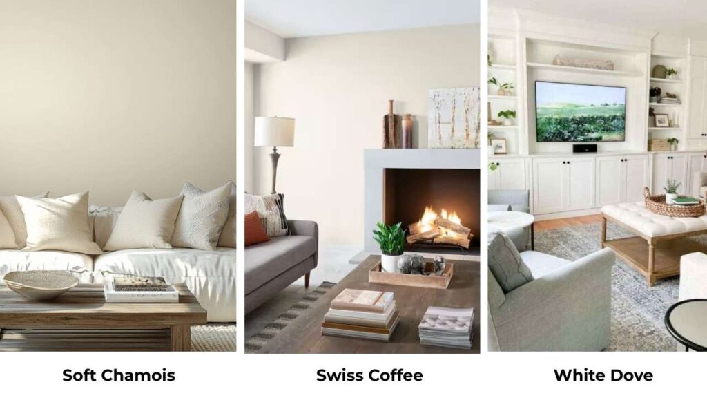
Here’s the thing about Soft Chamois and Swiss Coffee that they look almost identical on the small paint swatches.
Both are soft, inviting, and versatile.
And they’re both Benjamin Moore colors, which puts them in the “designer-approved” category.
I’ve used both of them many times but the Soft Chamois Vs Swiss Coffee confusion is one I have with myself on every project.
But the subtle undertone differences, they’re not subtle when the paint on your walls.
I learned this on a bedroom project where I thought Swiss Coffee would work, painted the whole room, and then stood there realizing it felt bright against the warm oak floors.
That’s when I started paying attention to how room orientation and existing finishes change everything.
A north-facing living room will make Swiss Coffee look different than a south-facing kitchen.
So, I’m breaking down about Soft Chamois Vs Swiss Coffee, its undertones, how LRV affects your space, what happens in different lighting situations, and which rooms these colors work in.
I’ll also compare them to other popular off-whites because options matter.
Here are my other blogs that you can also read:
- Chantilly Lace Vs Alabaster
- Alabaster Vs Shoji White
- Modern Gray Vs Agreeable Gray
- Ballet White Vs White Dove
- City Loft Vs Alabaster
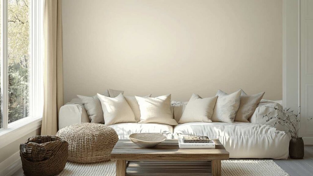
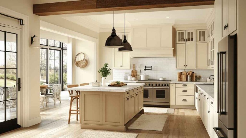
About Soft Chamois (OC-13)

Soft Chamois is what I call a “cozy off-white”.
It’s a warm off-white with creamy beige undertones that has a muted, sophisticated warmth but not the kind of warmth that looks yellow, but the kind that makes a room feel inhabited.
The LRV is around 77.4, which puts it in off-white territory but not near true white.
It means it reflects about 77% of the light that hits.
What it means is, your room will feel bright without the harsh, sterile thing that happens with pure white.
I used Soft Chamois in my own dining room, and the thing I noticed was how rich and deep it looks compared to the popular off-white.
It has a substance to it. In morning light, the yellow undertones come through beautifully, making the space feel sunny on overcast days.
But here’s what I love, the gray undertones keep it from going beige.
It works well in traditional interiors and anything leaning modern farmhouse or transitional.
I’ve specified it for living rooms where clients wanted warmth but sophistication, bedrooms which need to feel restful without being cold, and a few bathrooms where the natural light was limited and we needed something with inherent warmth.
Modern spaces with cool metals and concrete.
It doesn’t vibe with the aesthetic.
Soft Chamois wants warm wood, brass fixtures, cream-colored furniture and some terracotta accents.
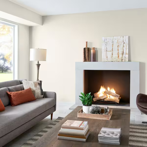
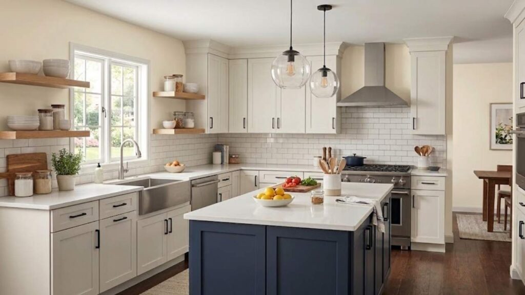
About Swiss Coffee (OC-45)

Swiss Coffee is the color I recommend when someone wants warmth but I don’t want to see any color.
It’s a warm off-white but it is more restrained than Soft Chamois.
The undertones are soft creamy with subtle beige warmth, but they hide better.
The LRV is 83.93, higher than Soft Chamois which means it’s reflecting light back into your room.
What Swiss Coffee doesn’t have are strong yellow or pink undertones.
I’ve used it in many homes, and it consistently looks clean, but warm to not feel harsh, light to not look as beige, and neutral that it works with anything.
I had a home repaint project last year where the client wanted one color.
Every room has different lighting situations, different purposes, different existing finishes.
Swiss Coffee handled it without looking anywhere.
The north-facing guest bedroom feels warm and inviting.
The south-facing kitchen, bright but not washed out.
The depth and richness everyone talks about with Swiss Coffee is real, but it’s quieter than Soft Chamois.
It’s there in the way the color doesn’t become flat.
I specify it for kitchens, open-concept spaces where the paint needs to flow through multiple functions, and homes where the client is modern-leaning or wants flexibility with decor changes. It’s the safe choice.
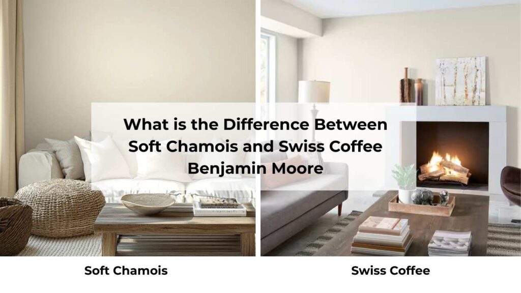
What is the Difference Between Soft Chamois and Swiss Coffee Benjamin Moore?
Okay, so they’re both warm off-whites from Benjamin Moore, both popular, both get recommended.
But trust me, put them side by side on a wall and the differences become obvious.
LRV
Light Reflectance Value is how bright a color appears, measured on a scale from 0 (black) to 100 (white).
Soft Chamois has an LRV of 77.4 which puts it in the mid-range off-white space.
It’ll brighten your room without making it feel like a cold vibe.
I always tell clients this is “bright but cozy.”
Swiss Coffee comes in at 83.93 which is visibly high, which means it’s reflecting more light.
A room painted with Swiss Coffee will feel spacious and bright.
The difference of about 6.5 points may not sound like much, but it’s visible in person.
When I’m working with a small room or one with limited natural light, the LRV difference matters.
Swiss Coffee will keep things airy, but if the room is with south-facing light then Soft Chamois won’t look bad like Swiss Coffee.
Undertones
This is where it gets interesting and where most people make mistakes.
Soft Chamois has prominent yellow and gray undertones, with hints of green in some lighting.
The yellow gives it the creamy warmth, but the gray is what saves it from looking like a mistake.
In north-facing light, the gray undertones are loud and the color can shift toward pale greige.
In the east-facing morning light, the yellow comes out and it looks properly creamy.
Swiss Coffee has soft, restrained undertones but creamy and beige-adjacent and the warmth is there.
And it lacks the strong yellow or pink undertones that can make a white paint feel off in the wrong lighting.
The practical difference is that soft Chamois undertones are visible and present.
Swiss Coffee undertones are like a suggestion.
Lighting Affect
I cannot stress how much natural lighting exposure changes these colors.
I’ve had clients call me saying the color “looks wrong” and 99% of the time it’s a lighting issue, not a paint issue.
Soft Chamois is lighting-sensitive in some ways:
- North-facing rooms: The cool, gray-tinted light brings out the gray undertones hard. The color looks dark, greige, and less creamy. I love this effect, but it surprises people.
- South-facing rooms: Consistent warm light throughout the day means the natural warmth shines, but too much direct sun can wash it out to nothing. You lose the richness.
- East-facing rooms: Warm and creamy in the morning, shifts gray in the afternoon.
- West-facing rooms: Starts looking light and neutral in morning, then gets warm and almost golden in the late afternoon light. It can be stunning or overwhelming depending on your tolerance for warmth.
Swiss Coffee handles lighting changes gracefully:
- North-facing rooms: Stays warm and inviting without going too gray. This is where it outperforms Soft Chamois if you ask me.
- South-facing rooms: Gets bright and airy without disappearing. Holds its warmth better than cooler whites.
- East and west-facing rooms: Stays consistent. The warmth adjusts but it doesn’t have the dramatic shifts Soft Chamois does.
I always recommend peel-and-stick paint samples before committing.
Put them up, look at them for a full day, see how they change. Morning, noon, afternoon, night.
Artificial light vs natural light.
Style and Best Uses
How you style around these colors changes everything about how they perform.
Soft Chamois wants:
- Warm white or creamy trim colors (Chantilly Lace can work but feels contrasted, White Dove or Simply White are better)
- Warm wood furniture – oak, pine, anything with honey or amber tones
- Brass, gold, or bronze hardware and fixtures
- Furniture in warm neutrals – camel, tan, warm grays, terracotta
- Accent colors: sage green, warm blues, rich browns, taupes
Swiss Coffee is flexible:
- Can handle bright white trim without looking dingy next to it
- Works with both warm and medium-toned woods
- Accepts mixed metals better than Soft Chamois
- Furniture: basically anything except super cool-toned grays
- Accent colors: there are options like blues, greens, grays, warmer tones, all work
| Aspect | Soft Chamois (OC-13) | Swiss Coffee (OC-45) |
| LRV | 77.4 (Moderate reflection) | 83.93 (High reflection) |
| Undertones | Yellow, gray, hint of green | Soft creamy, subtle beige |
| Warmth Level | Noticeably warm and creamy | Warm but restrained |
| Brightness | Deeper, more muted | Brighter, more airy |
| Lighting Sensitivity | Shifts significantly with light | More stable across conditions |
| Best Trim Pairing | Warm whites (White Dove, Simply White) | Flexible (bright whites to matched tones) |
| Ideal Style | Traditional, farmhouse, transitional | Versatile across styles |
| Best Rooms | Bedrooms, living rooms, low-light spaces | Whole-home, kitchens, open-concept |
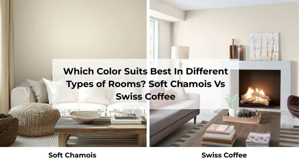
Which Color Suits Best In Different Types of Rooms? Soft Chamois Vs Swiss Coffee
Room function and existing elements matter more than people think when choosing between these two.
I’ve seen both colors look excellent and also wrong depending on context.
Living Room
Soft Chamois in living rooms is my go-to when the space has good natural light but needs to feel inviting and warm.
I used it in a client’s living room that had large east-facing windows, warm oak floors, and a brick fireplace.
The morning light made the walls look creamy and glowing, and in the afternoon when the light cooled down, the room felt cozy.
Where it struggles, bright south-facing living rooms with windows.
Too much direct light and Soft Chamois can look washed out and lose the richness that makes it special.
Swiss Coffee in living rooms works when you want warmth but also need the space to feel open and bright.
I specified it for a living room that flowed into a dining area and kitchen and needed to feel cohesive.
The high LRV kept the whole space feeling airy, and the subtle warmth prevented the cold, sterile thing that happens with cool whites.
It’s good in north-facing living rooms where Soft Chamois looks too gray and heavy.
Bedroom
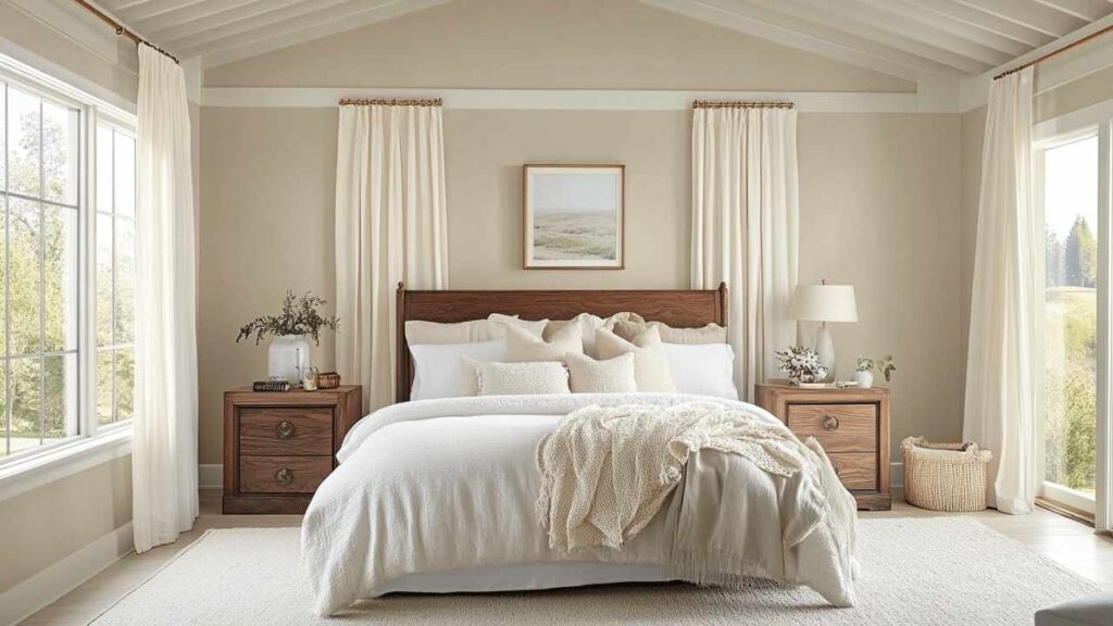
Soft Chamois in bedrooms is one of my favorite applications.
Bedrooms should feel restful and cozy, and the creamy warmth delivers that.
I painted my own bedroom this color and it’s perfect for the morning coffee moment when the light is soft and the walls look gentle and warm.
At night with warm lamp lighting, it gets better, calming and enveloping.
One note though: if your bedroom has cool gray carpeting or blue-toned bedding, Soft Chamois may not vibe.
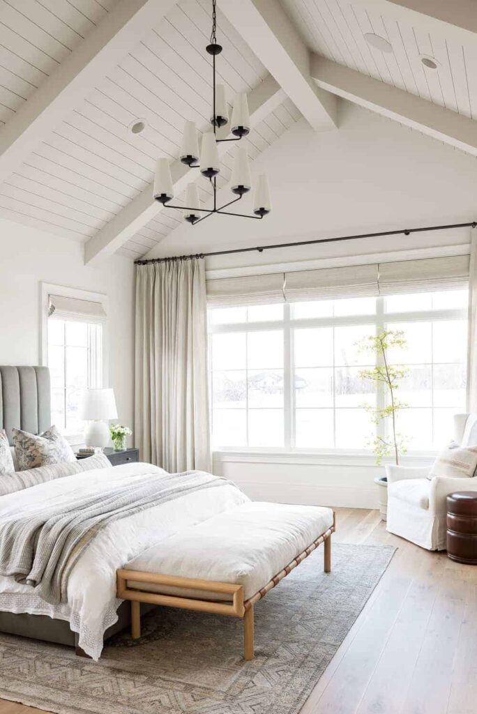
Swiss Coffee in bedrooms is better when you want serene and clean rather than cozy and warm.
I’ve used it in primary bedrooms which needed to feel spa-like and restful without going cold.
The light, bright quality works well in small bedrooms or ones without great natural light, it keeps things from feeling cave-like.
And it’s forgiving if your bedding and decor style changes.
Bathroom
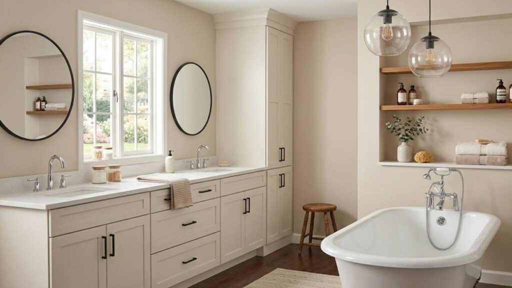
Soft Chamois in bathrooms is tricky and depends on the finishes.
I used it in a bathroom with warm marble countertops, oak vanity, and brass fixtures.
It looked incredible.
The inherent warmth made the space feel like a room rather than a sterile bathroom.
But I’ve also seen it in bathrooms with cool white subway tile and chrome fixtures where it looked confused.
The best application is in powder rooms or bathrooms with warm finishes and decent natural light.
Use it in satin or semi-gloss sheen for durability.
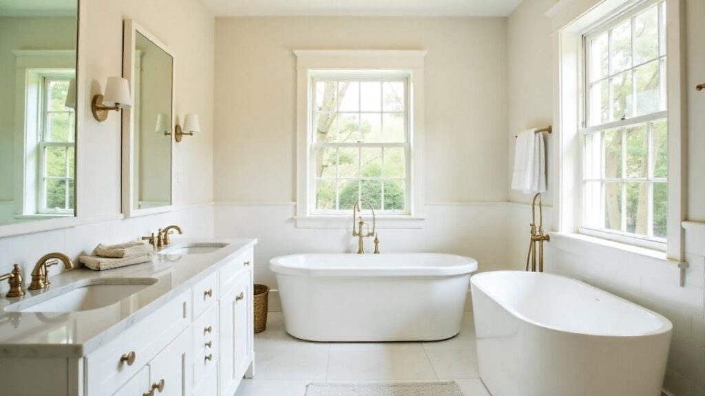
Swiss Coffee in bathrooms is more versatile.
I’ve specified it with white tile, marble, quartz, warm wood, cool fixtures, warm fixtures, it cooperates with all of it.
The high LRV is great for bathrooms that are darker or smaller.
And because it looks cleaner than Soft Chamois, it maintains the fresh bathroom
It’s my default bathroom color when I’m not sure which direction the space needs to go.
Kitchen
Soft Chamois in kitchens works when your cabinets are warm wood or cream-colored.
I did a kitchen with natural oak cabinets and Soft Chamois walls and the combination was beautiful.
The warmth tied everything together and made the kitchen feel homey rather than show-room.
Where it doesn’t work, kitchens with bright white cabinets and stainless appliances.
Too much contrast with the cool elements and the walls looking more beige than off-white.
Swiss Coffee in kitchens is my most-specified kitchen wall color.
It works with white cabinets, works with wood cabinets, works with gray cabinets and handles all the stainless steel and mixed finishes that end up in kitchens.
The brightness keeps kitchens feeling clean and functional, which matters for a work space.
Also, if you’re doing Swiss Coffee on walls, you can use it on cabinets too in a different sheen for a look.
Try with Soft Chamois and it creates warmth.
Soft Chamois vs Swiss Coffee Vs Other Colors
Context is everything when choosing paint colors.
Seeing how these two look against other popular Benjamin Moore off-whites helps clarify what makes them unique.
Soft Chamois Vs White Dove
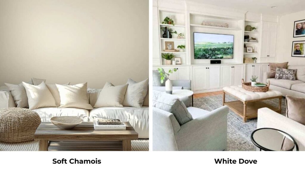
White Dove (OC-17) has an LRV of 83.16, which is identical to Swiss Coffee and brighter than Soft Chamois.
The undertones are the key difference.
White Dove has softer yellow undertones than Soft Chamois, as more traditionally white rather than creamy.
It’s warmer than pure white but nowhere near rich.
I use White Dove as a trim color with Soft Chamois walls.
The pairing works because White Dove provides contrast without going harsh white.
But as a wall color comparison, White Dove is light, bright, and less committal than Soft Chamois.
If you’re hesitating about whether Soft Chamois is warm or creamy, White Dove is safe.
Soft Chamois Vs Pale Oak
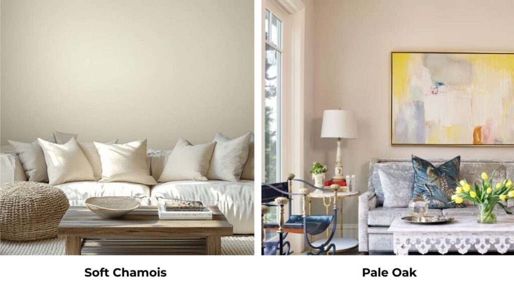
Pale Oak is more of a greige than an off-white, it’s darker and has stronger gray undertones that can shift dramatically in different lighting.
Compared to Soft Chamois, Pale Oak is cool, gray, and looks as a color rather than a neutral backdrop.
The warmth in Soft Chamois is yellow-beige; the warmth in Pale Oak is balanced with gray.
I’ve used them together in the same home and they coordinate well because they share similar depth despite different undertones.
Choose Pale Oak when you want more color presence.
Choose Soft Chamois when you want warm neutrality.
Soft Chamois Vs Ballet White
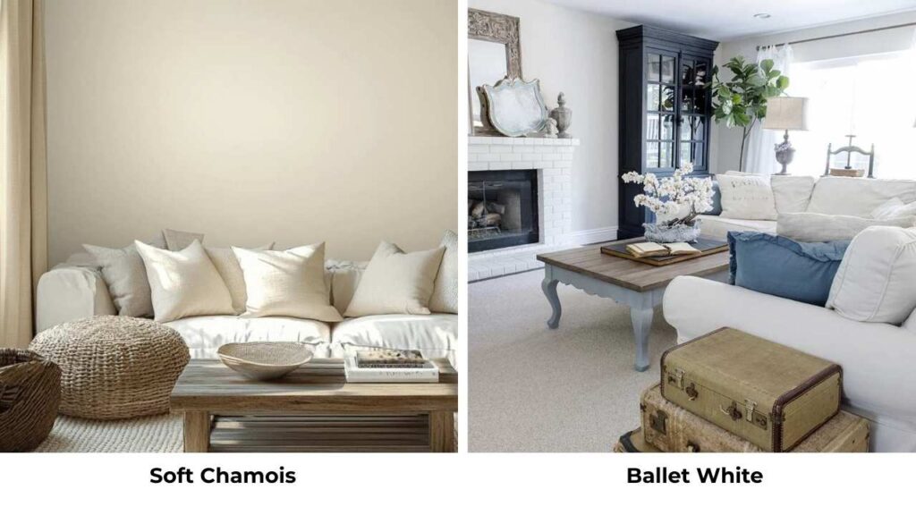
Ballet White (OC-9) is darker than Soft Chamois with an LRV of 71.97.
It has more yellow and brown, almost khaki or beige in some lights.
Where Soft Chamois has the gray undertones keeping it, Ballet White goes into warm beige territory.
I’ve had mixed results with Ballet White.
It can look beautiful and rich in the right space, but it can also look as beige.
Not off-white but beige. Soft Chamois gives you warmth while maintaining the off-white identity.
If you’re looking at Soft Chamois thinking “I wish it were warmer,” go for Ballet White.
If you’re looking at Ballet White thinking “that’s too beige,” Soft Chamois is what you should consider.
Soft Chamois Vs Creamy
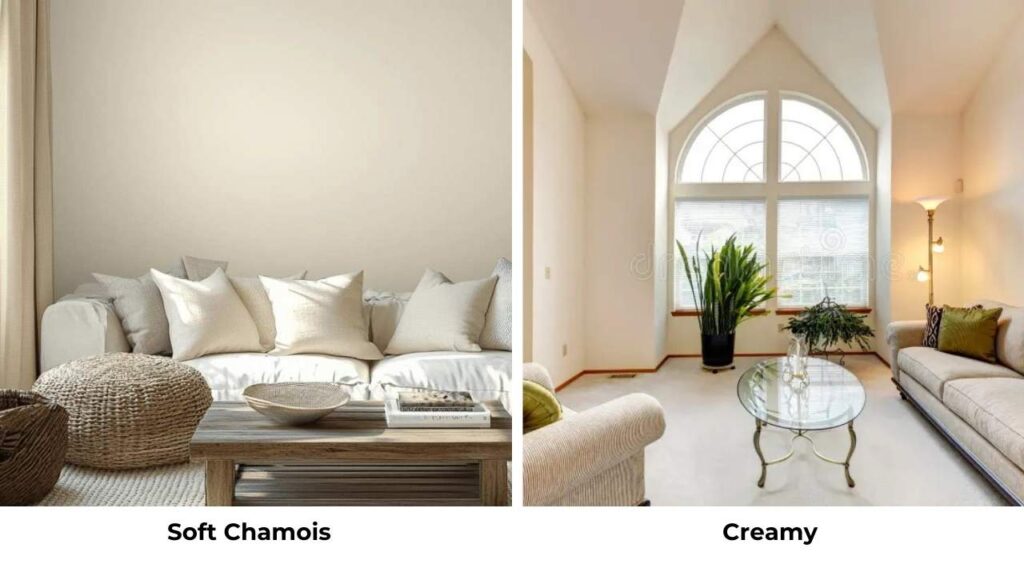
Sherwin Williams Creamy is compared to both Soft Chamois and Swiss Coffee.
It is somewhere between them in terms of warmth, warmer than Swiss Coffee but not as rich as Soft Chamois.
The LRV is similar to Swiss Coffee.
But here’s my opinion, don’t try to match colors across brands.
The formulations are different, the undertones behave differently, and you’ll end up with something that’s what you wanted but not quite.
If you love Creamy but want Benjamin Moore, Swiss Coffee is closer.
| Color | Brand | LRV | Undertones | Warmth | Best For |
| Soft Chamois | Benjamin Moore | 77.4 | Yellow, gray, green | Noticeably warm | Cozy spaces, traditional homes |
| Swiss Coffee | Benjamin Moore | 83.93 | Soft creamy, subtle beige | Warm but restrained | Whole-home, versatile |
| White Dove | Benjamin Moore | 83.16 | Soft yellow | Moderately warm | Trim, lighter alternative |
| Ballet White | Benjamin Moore | 71.97 | Yellow, brown/beige | Very warm | Traditional, rich depth |
| Pale Oak | Benjamin Moore | ~70s | Greige (gray-beige) | Balanced | More color presence |
When to Choose Soft Chamois?
Pick Soft Chamois when you want cozy and inviting more than bright and airy.
If your design goal is “warm hug in paint form,” this is it.
It’s perfect for creating spaces that feel inhabited and comfortable.
Your home has warm wood tones everywhere.
Oak floors, pine trim, warm cabinets, Soft Chamois plays with all of it.
The yellow undertones coordinate rather than clash.
You’re working with traditional or transitional design styles.
Modern farmhouse, French country, traditional then these styles want the richness and warmth that Soft Chamois provides.
It is timeless, sophisticated.
Your room has good natural light but isn’t flooded with direct sun.
The east-facing bedrooms, north-facing living rooms with decent window size, spaces with indirect light then Soft Chamois will glow without washing out.
You’re planning to style with warm neutrals and brass fixtures.
If your vision includes camel leather, warm textiles, brass hardware, terracotta accents, Soft Chamois is your consideration.
You’re tired of harsh white but don’t want to go full beige.
It’s the middle ground.
Warmth and color without committing to color.
When to Choose Swiss Coffee?
Go with Swiss Coffee when you need one color for the whole house.
Its versatility across different lighting conditions and room types makes it perfect for open-concept homes or when you want flow.
You want warm but not creamy.
The distinction matters.
Swiss Coffee gives you warmth without the visible creaminess that can look as beige.
Your room is north-facing or has limited natural light.
The high LRV (83.93) will keep things bright, and the warm undertones prevent it from going cold and gray like cool whites do.
You’re working with mixed finishes and metals.
Swiss Coffee plays well with warm brass, cool chrome, mixed woods, white cabinets, wood cabinets like it’s cooperative.
You want flexibility with accent colors and decor.
Because Swiss Coffee is neutral and less committed to warmth, you can style it with cool blues, warm terracotta, greens, grays, basically anything.
Your style is modern or transitional leaning contemporary.
Swiss Coffee has the clean, fresh quality that works with modern aesthetics while providing warmth for transitional spaces.
You’re painting kitchens or bathrooms where you want warm but clean.
Swiss Coffee maintains the fresh, functional feeling while adding subtle warmth.
Conclusion
So here’s where I land after using Soft Chamois Vs Swiss Coffee: Soft Chamois is the choice when you’re chasing warmth and richness.
It has personality and presence, the yellow and gray undertones create something more interesting than basic off-white.
But it’s also particular.
It wants warm finishes, specific lighting conditions, and styling the leans traditional.
Swiss Coffee is the reliable choice.
It delivers warmth without drama, brightness without harshness, and versatility across in any situation you throw at it.
It’s less interesting on paper but successful in practice if your needs are varied.
The truth is that I keep both in my regular rotation because they solve different problems.
A small north-facing bedroom which needs to feel cozy is Soft Chamois.
The whole-home repaint with mixed lighting and modern finishes is Swiss Coffee.
Test them in your space, look at them throughout the day, see them against your existing finishes.
The “right” choice depends on your lighting, your style, and whether you want the creamy richness or clean warmth.
FAQs On Soft Chamois Vs Swiss Coffee
The main differences are brightness and undertone intensity. Swiss Coffee is bright ,LRV 83.93 vs 77.4 and has soft, restrained undertones. Soft Chamois is deep, creamy, with visible yellow and gray undertones. Swiss Coffee looks warm white; Soft Chamois looks creamy off-white.
Skip Swiss Coffee when you want richness and depth, it can look washed out in bright south-facing rooms with direct sunlight. It’s not the best choice if you’re going for a cozy, traditional aesthetic where you want visible warmth. And if your space has warm wood tones and brass fixtures with a traditional vibe.
Soft Chamois loves warm company. Pair it with White Dove, Simply White, or Alabaster on trim for subtle contrast without going harsh. For coordinating wall colors in adjacent rooms, Edgecomb Gray and Agreeable Gray work beautifully. Accent colors that shine include sage green, warm blues, rich browns, and taupes. Hardware-wise, brass, gold, and bronze fixtures are perfect. Furniture in camel, tan, warm grays, and terracotta complement the yellow-gray undertones.
Because it solves the warm-white problem without causing new problems. People want warmth but they’re terrified of their walls looking yellow or beige. Swiss Coffee delivers warmth with restraint, the undertones are there but they don’t come up by themselves. The high LRV keeps spaces bright and airy, making it perfect for home applications across rooms with different lighting.