I’m seeing these colors everywhere from kitchen cabinets to the bedroom.
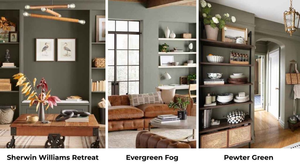
Sherwin Williams Retreat and Evergreen Fog are two paint colors that are popular and I get it why.
They’re moody, sophisticated, and manage to feel both calming and interesting.
If you’re trying to figure out sherwin williams retreat vs evergreen fog, you’re not alone in this confusion.
Choosing between these two isn’t as simple as it looks.
I’ve tested both colors in different spaces, and they’re more complicated than they look.
They have a modern, nature-inspired vibe that makes a room feel pulled together.
They both work with warm woods and brass hardware, but the walls are different.
The wrong undertone can make your cozy bedroom feel like a cave.
So, I’m breaking down everything I’ve learned about Sherwin Williams Retreat Vs Evergreen Fog, the color profiles, how they look in different lighting, which rooms they work best in, and the mistakes I’ve made so you don’t have to.
I’m also putting in some comparisons with other greens too for consideration.
Here are my other blogs that you can also read:
- Light French Gray Vs Agreeable Gray
- Anthracite Colour Vs Black
- Quiet Moments Vs Sea Salt
- Eider White Vs Repose Gray
- Bm White Dove Vs Sw Alabaster
Color Profile of Sherwin Williams Retreat (6207)
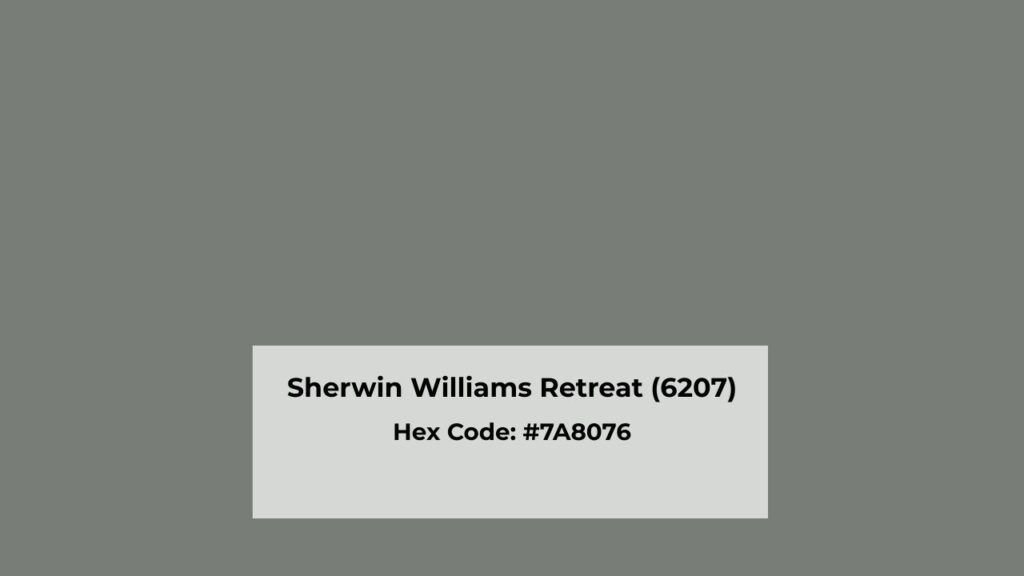
Retreat is a deep, muted green with gray undertones.
When I first painted a sample board with it and thought it was green.
In some lights, it looked charcoal-green, which sounds different but this is what makes it interesting.
The LRV (Light Reflectance Value) is 21, which means it absorbs light.
For reference, pure black is 0 and pure white is 100, so Retreat is in the medium-dark range.
It’s not moody to be known as dramatic, but it has presence.
What defines Retreat is that it is cool but has a grounded, earthy depth that keeps it from feeling cold.
There’s a subtle blue influence in it, but the gray is carrying the heaviness.
It doesn’t look bright or fresh like some greens.
This is a sophisticated, subdued color.
I used Retreat on an accent wall in my office and here’s what I noticed, it looks different depending on your light source.
In my north-facing room, it went full gray-green and looked somber on cloudy days.
When I tested it in a south-facing bedroom, it warmed up but maintained the muted and grounded quality.
Modern, transitional, and contemporary spaces enhance this color.
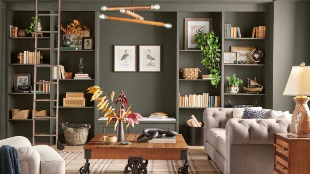
I’ve seen it work well on kitchen cabinets, as a moody bedroom color for people who want the cocooning effect, and on bathroom vanities where you want more interesting than navy but not as expected as white.
The thing about Retreat is it needs commitment.
This isn’t a “test it and forget it” color.
You need to understand your lighting situation before you go for it.
In a small, poorly lit room, it can feel heavy and overwhelming.
But in the right space with good natural light or warm artificial lighting, it looks good.
Color Profile of Evergreen Fog (SW 9130)
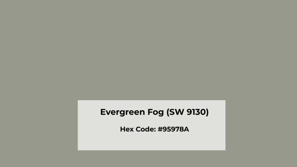
Evergreen Fog is well-behaved green.
It was Sherwin Williams’ 2022 Color of the Year, which is unexpected to me at first because it’s calm, but that’s the reason why it works.
With an LRV of 30, Evergreen Fog is lighter than Retreat.
It has a muted, sophisticated quality, but it brings airiness to a space.
The gray undertones are strong, but there’s subtle blue AND a hint of yellow which makes it more complex than it first appears.
Here’s where Evergreen Fog gets interesting, it has more gray in it than green in some conditions.
I painted my bathroom with it thinking I was getting a soft green, and on overcast days, it looks almost gray.
The green comes out in bright natural light, mainly in southern exposure.
The color has a modern, calming aesthetic which makes it versatile.
I’ve used it in a living room where it created a serene backdrop that didn’t compete with artwork or furniture.
It works as a house color, and I’ve seen it look stunning on exteriors too.
Both homeowners and designers consider Evergreen Fog more for bedrooms because it’s restful without being boring, for living rooms because it adds color without overwhelming, and for kitchens because it brings in the nature-inspired look.
The subtle yellow undertone is what separates it from cool greens like Acacia Haze.
The small warmth makes it more approachable and easier to live with.
It’s reliable, easy to be around, and makes everything around it look better.
What is the Difference Between Sherwin Williams Retreat and Evergreen Fog?
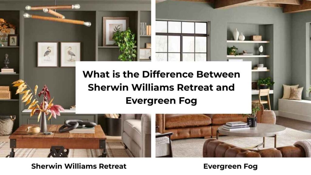
Okay, so Sherwin Williams Retreat Vs Evergreen Fog, both are green, both have gray undertones, both work in modern spaces, but there is a lot of difference than you think.
LRV (Light Reflectance Value)
This is where things get different because LRV is the most important number you need to know when choosing paint.
Retreat is at LRV 21, the medium-dark range absorbs a bit of light.
Evergreen Fog is at LRV 30, making it light and reflective.
The 9-point difference matters when you see them side by side.
I made the mistake by not considering the LRV difference and it changed the vibe of the room.
It looked different when I painted sample boards next to each other.
A retreat makes a room feel small and cozy.
Evergreen Fog maintains a sense of space and light.
If your room gets limited natural light, that LRV difference is important.
Retreat will go dark and moody. Evergreen Fog will stay balanced and calm.
Undertones
Retreat’s undertones are primarily gray with a hint of blue.
It’s cool-leaning but the earthiness keeps it from feeling cold or off.
There’s no yellow in Retreat, which is why it can look serious and dramatic.
Evergreen Fog has gray undertones but there’s both blue AND subtle yellow in there.
The competing undertones are what make it a chameleon.
The yellow warms it up to keep it approachable.
The blue keeps it from going sage or olive.
Lighting Effects
Can we talk about how much lighting changes these colors? Because it matters how much they shift.
Retreat in north-facing light goes cool and gray.
The green disappears and you’re left with a sophisticated charcoal-gray-green that can feel somber.
In south-facing light, it warms up, the green becomes visible, but it’s subdued.
Also, under warm artificial lighting, Retreat softens and the depth becomes apparent.
Evergreen Fog is more light-sensitive.
North-facing rooms give the gray-blue undertones.
I’ve seen it look like a cool gray with barely any green.
South-facing light is where Evergreen Fog shines, the warmth brings both the green and the subtle yellow undertone.
It gets bright and colorful without being loud.
Testing both colors in your space with your lighting is non-negotiable.
The peel-and-stick samples are considered for this.
Style and Best Uses
Both colors work in modern, transitional, and contemporary interiors, but they create different moods.
Retreat works best when:
- You want drama and depth
- You’re doing an accent wall, not whole room
- You’re painting cabinetry
- The room has good natural or warm artificial light
- You’re pairing it with warm whites like Alabaster or Creamy
Evergreen Fog works best when:
- You want a whole-house color
- You need something that flows with open floor plans
- You’re painting exteriors
- You want color that’s calming but not boring
- You’re pairing it with whites like Alabaster or Pure White for contrast
For trim colors, both work well with warm whites.
I prefer Sherwin Williams Alabaster with either one, it’s warm to soften the coolness but bright to define edges.
Pure White works too if you want contrast, mainly with Evergreen Fog.
Coordinating colors for both include warm wood tones like walnut, oak, natural finishes, soft beiges and greiges, and hardware in brass, black, or bronze.
Stay away from cool grays or you’ll amplify the coolness in both colors.
| Feature | Retreat (SW 6207) | Evergreen Fog (SW 9130) |
| LRV | 21 (medium-dark) | 30 (medium) |
| Primary Undertone | Gray | Gray |
| Secondary Undertone | Slight blue | Blue and subtle yellow |
| Overall Feel | Moody, dramatic, grounded | Calm, modern, airy |
| Best Application | Accent walls, cabinetry, moody spaces | Whole house, main walls, open spaces |
| Light Sensitivity | Goes dark and cool in low light | More forgiving across lighting |
| Room Size Impact | Makes spaces feel small, cozy | Maintains sense of space |
Sherwin Williams Retreat Vs Evergreen Fog: Room-By-Room Comparison
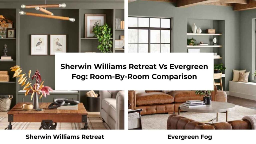
Let me walk you through how these colors look in different rooms because theory is great but reality is where things get interesting.
Living Room
Retreat in a living room is a commitment to a moody and intimate space.
I tested this in a medium-sized living room with west-facing windows and mornings felt cave-like, but in afternoons and evenings, it looks stunning.
The color created a cozy, enveloping atmosphere that made the room feel like a retreat.
If you’re doing a Retreat in a living room, I’d suggest an accent wall rather than all four walls unless you’ve HIGH ceilings and light.
Pair it with light furniture and warm wood tones to keep it from feeling heavy.
Brass or gold accents look incredible against Retreat.
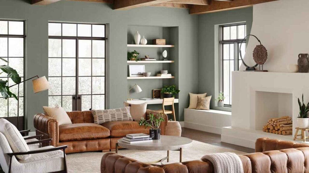
Evergreen Fog in a living room is the easy choice.
It brings in color without making bold statements.
I’ve used it in open-concept spaces where the living room flows into the kitchen and dining area, and it works well because it’s neutral to not compete with other spaces.
It creates a calm, collected vibe that makes the room feel current without being trendy.
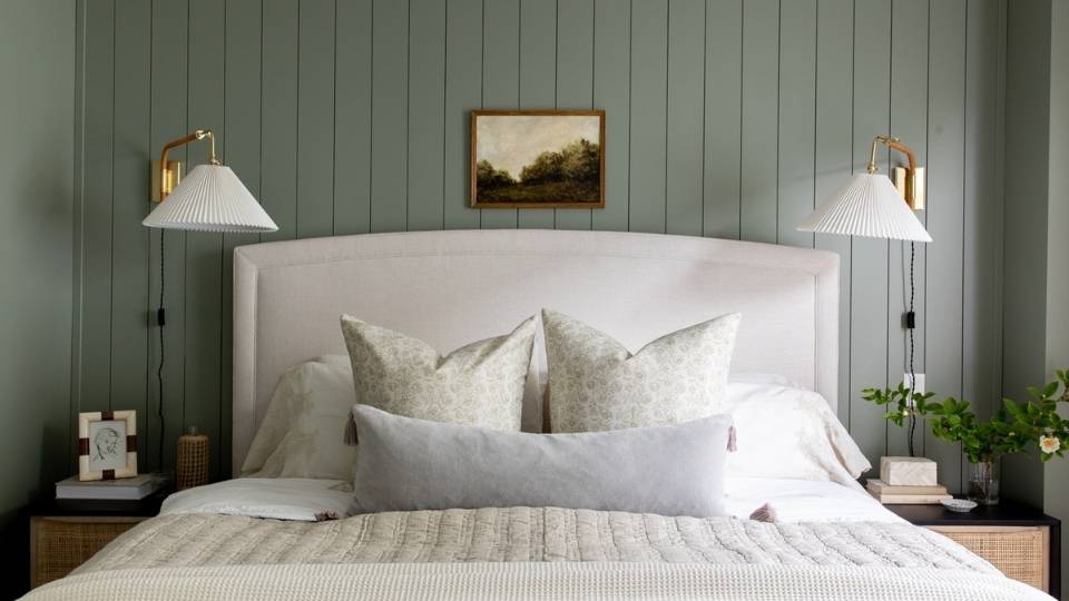
Bedroom
Retreat in a bedroom is PERFECT if you want the cocooning effect.
Bedrooms are made to be restful, and the deep, moody green creates the restful space.
I painted my guest bedroom in Retreat and people comment on how well they sleep in there.
The key is making sure you have good bedside lighting because Retreat absorbs light.
And maybe don’t do it in a bedroom with only north-facing windows unless you’re really into that moody aesthetic.
Pair it with warm white bedding and natural wood furniture.
Evergreen Fog in a bedroom is safe for many people.
It’s calming and restful but doesn’t create the dramatic effect.
I used it in my main bedroom and it’s perfect for a space I want to feel serene but light and airy.
It works well if you like bright white bedding because the contrast is softer than Retreat.
Bathroom
Bathrooms need more consideration with color because they’re small and have different lighting.
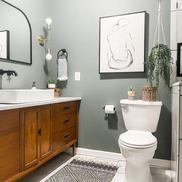
Retreat in a bathroom works best on vanity cabinetry rather than walls, in my opinion.
I’ve seen it on bathroom walls in large bathrooms with windows and it looked great, but in a standard bathroom with no windows, it felt dark and heavy.
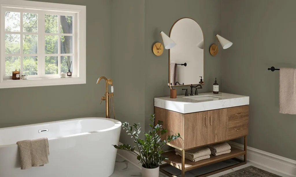
Evergreen Fog in a bathroom is versatile.
I painted my powder room in Evergreen Fog and even though it’s a small, no window space, it doesn’t feel closed in.
The light LRV makes a difference in small spaces.
It feels spa-like and calm and works with white subway tile, marble, or warm beiges and tans.
Kitchen
Kitchens are where both these colors shine, but in different applications.
Retreat in a kitchen is BOLD, I almost always recommend it for islands rather than cabinetry.
Dark green islands are having a moment and Retreat creates the look without being saturated or bright.
Pair it with white upper cabinets, warm wood or butcher block countertops, and brass hardware.
The depth of Retreat makes a kitchen feel custom and expensive.
I’ve seen Retreat on kitchen cabinetry and it can work, but you need good lighting and white or light countertops and backsplash to balance it.
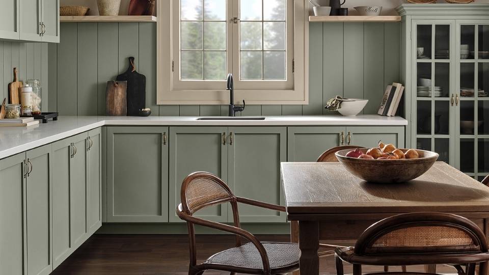
Evergreen Fog in a kitchen is easy to live with long-term.
It’s colorful to be interesting but neutral so that you won’t get sick of it.
It works well on full kitchen cabinetry, mainly in modern or transitional kitchens.
I’ve used it on uppers and lowers with white quartz countertops and a warm wood floor and the space looks put together.
Sherwin Williams Retreat Vs Evergreen Fog Vs Other Colors
Because you’re also looking at other greens.
So, let me help to narrow it down and choose the best one for your space and also look at other options too.
Sherwin Williams Retreat Vs Pewter Green
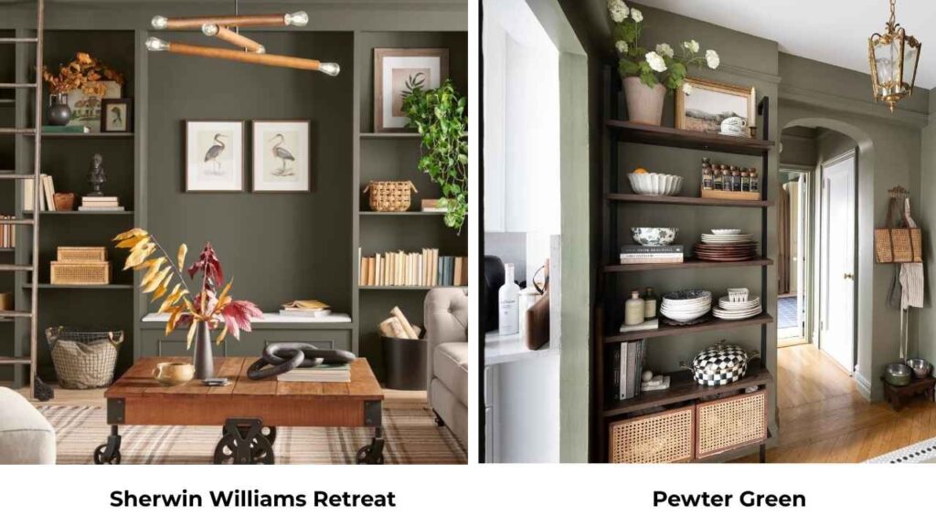
Pewter Green (LRV 12) is darker than Retreat, it has depth and color saturation.
If you thought Retreat was moody, Pewter Green is more MOODY.
It’s a dark green option which provides richness.
Retreat is the better choice for people because it’s dramatic without being overwhelming.
Pewter Green requires some conditions like good light, large spaces, commitment to dark colors, to work well.
Evergreen Fog Vs Acacia Haze
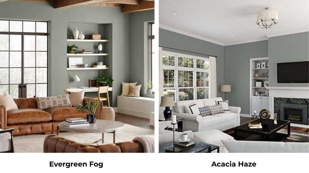
Acacia Haze (SW 9132) is close to Evergreen Fog, the LRV is 32 compared to Evergreen Fog’s 30, so they’re identical in lightness.
The big difference is Acacia Haze is cool and blue.
It lacks the subtle yellow undertone that warms up Evergreen Fog.
I tested them side by side and Acacia Haze felt sterile and cool, while Evergreen Fog felt livable.
If you want maximum coolness and don’t want ANY warmth, go Acacia Haze.
Sherwin Williams Retreat Vs Acacia Haze
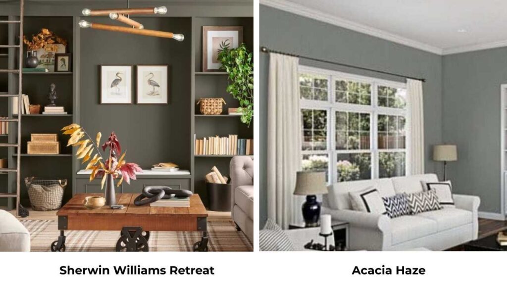
Retreat is darker (LRV 21 vs 32) and has more green presence than Acacia Haze.
Acacia Haze can look almost gray in some lights, while Retreat maintains its green identity better.
If you want visible color, Retreat is what you should go for.
If you want something that barely looks green, then go for Acacia Haze.
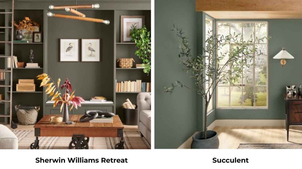
Sherwin Williams Retreat Vs Succulent
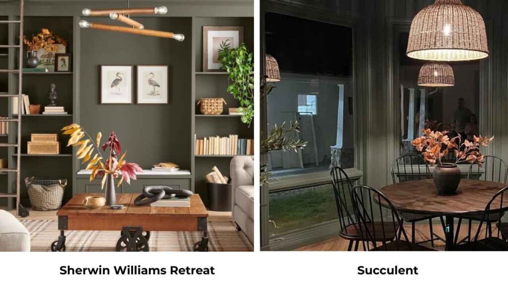
Succulent is bright and has more yellow undertones, and it looks more traditional sage.
Retreat is sophisticated and muted.
Succulent is the friendly and approachable option.
Retreat is the cool one.
Sherwin Williams Retreat Vs Rosemary
Rosemary is warm and more herbaceous.
Retreat is cool and more gray-influenced.
If you want warmth, Rosemary.
If you want cool sophistication, Retreat.
| Comparison | Key Difference | Best For |
| Retreat vs Pewter Green | Pewter Green is dark (LRV 12) with color saturation | Choose Pewter Green only if you want dark, dramatic spaces |
| Evergreen Fog vs Acacia Haze | Acacia Haze is cool and blue without yellow undertones | Choose Acacia Haze for cool aesthetic, Evergreen Fog for versatility |
| Retreat vs Acacia Haze | Retreat is dark with visible green | Choose Retreat for color presence, Acacia Haze for barely-there green |
| Retreat vs Succulent | Succulent is bright with more yellow/traditional sage | Choose Succulent for warm, bright spaces |
| Retreat vs Rosemary | Rosemary is warm and more herbaceous | Choose Rosemary for warmth, Retreat for cool drama |
When to Choose Sherwin Williams Retreat?
Go with Retreat when you want depth and drama without going dark.
It’s perfect for creating intimate and cozy spaces that feel sophisticated.
Choose Retreat if you’re painting an accent wall and want something more interesting than navy but not as expected as sage green.
It works well behind a bed, in a dining room, or in an office where you want the color to create focus.
Kitchen or bathroom cabinetry is where Retreat looks best.
The medium-dark depth makes cabinets feel custom and high-end.
You can pair it with warm whites, natural stone, and brass or black hardware.
Consider Retreat for rooms with good natural light or warm artificial lighting.
This color needs light to perform well.
In a dark room, it’ll make the space feel small and dark.
If your style is modern, transitional, or contemporary with moody elements, Retreat is what you should consider.
It doesn’t work well in traditional or farmhouse styles unless you’re going for the updated, less-sweet version.
When to Choose Evergreen Fog?
Choose Evergreen Fog when you want a full house color or open floor plan.
It’s neutral to flow through multiple spaces without feeling repetitive.
Consider Evergreen Fog if you want a color that’s calming but not boring.
It brings nature-inspired tones into your space without making statements.
Perfect for people who are nervous about color but sick of beige and gray.
Exteriors love Evergreen Fog, it looks fantastic on house exteriors with white trim.
Colors always are light outside, so Evergreen Fog has the spot of visible color without being dark or dramatic.
Go with Evergreen Fog for bedrooms, living rooms, or any space where you want a serene, collected atmosphere.
It’s versatile to work in any room.
If you have challenging lighting situations, Evergreen Fog is more forgiving than Retreat.
Choose Evergreen Fog if your style is modern, contemporary, Japandi, or minimalist.
It has that soft, sophisticated vibe that works well in clean-lined, uncluttered spaces.
Common Mistakes to Avoid When You Are Going With Sherwin Williams Retreat and Evergreen Fog
Let me save you from the mistakes I’ve made with these colors:
- Not testing in your space with your lighting. These colors are chameleons. The small paint swatches or a sample board photographed in someone else’s house will NOT show you how it’ll look on your walls. Get peel-and-stick samples, put them up, look at them morning, noon, and night for several days.
- Painting all four walls in Retreat in a small or dark room, unless you’re going for moody drama and understand the commitment, stick to an accent wall or choose Evergreen Fog.
- Pairing with cool whites or cool grays, both colors have coolness on their own. Pair them with warm whites or warm neutrals to balance the temperature.
- Ignoring undertones, people get so focused on whether they want light or dark that they forget about undertones. Retreat has no yellow. Evergreen Fog has a subtle yellow.
- Using glossy finish on walls, stick with eggshell or satin on walls. Matte or flat can work in low-traffic areas like bedrooms. Save semi-gloss and gloss for cabinetry and trim.
- Expecting Evergreen Fog to look green in all lighting, in low light and north-facing spaces, it’ll look more gray. If you want visible green, you need good light.
- Choosing based on trends instead of your space, Evergreen Fog was Color of the Year, which means it’s everywhere. This doesn’t mean it’s right for YOUR home. Consider your lighting, your existing finishes, your furniture, and your lifestyle.
- Painting without samples because “it’s a different shade”, the LRV difference of 9 points, it’s not easy.
Conclusion
So after that,Sherwin Williams Retreat Vs Evergreen Fog, which one should you choose? If you want drama, depth, and intimate spaces, go with Retreat.
If you want versatility, calmness, and color that works throughout your home, go with Evergreen Fog.
Both are beautiful, sophisticated greens which bring nature-inspired tones into modern spaces.
The decision comes down to how much depth you want, how your lighting behaves, and whether you’re painting one accent wall or your main floor.
Test them both in your space.
Live with the samples for a few days.
Pay attention to how they make you feel in different lighting.
Because choosing between Sherwin Williams Retreat Vs Evergreen Fog depends on your space and what you have in your space.
FAQs On Sherwin Williams Retreat Vs Evergreen Fog
Evergreen Fog SW 9130 is a soft green-gray paint color with subtle blue undertones and a hint of yellow. It has an LRV of 30, making it a medium-toned color that is more gray than green in low light but shows its green side in natural light.
Retreat works best in modern, transitional, and contemporary interiors. It’s perfect for spaces where you want moody, sophisticated depth like accent walls, cabinetry, and rooms with good lighting. The cool, grounded nature of Retreat makes it ideal for updated, less-traditional spaces.
Evergreen Fog was Sherwin Williams’ 2022 Color of the Year, and what makes it special is its versatility. It’s one of the colors that acts as a neutral while providing color. The balance of gray, green, blue, and subtle yellow undertones means it works in any lighting condition and pairs well with both warm and cool elements.
Retreat is a green paint color with strong gray undertones. The gray influence is enough that in some lighting, it can look almost as dark gray-green. But the green is there, muted and sophisticated rather than bright or saturated.
Sherwin Williams Retreat Vs Evergreen Fog: Choosing the Right Green for Your Home