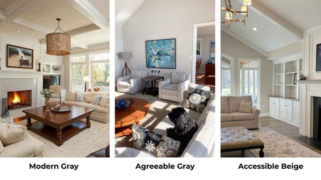
I’ve been working with Sherwin Williams neutrals, and if I had a dollar for someone who asked me about modern gray vs agreeable gray.
I could afford to repaint my house.
These two colors are talked about together because they look similar in the small paint swatches, but they look different when they’re on your walls.
Modern Gray (SW 7632) and Agreeable Gray (SW 7029) are both warm grays with this chameleon quality.
Here’s the thing that comes with any homeowners and some designers, both colors are in the greige family, and both have warmth.
so they won’t make your space feel cold.
But pick the wrong one for your lighting situation or existing finishes, and your “perfect neutral” looks muddy, flat, or off.
People love Agreeable Gray because it’s one of Sherwin Williams’ best-selling colors.
So, I’m breaking down the color profiles of both Modern Gray Vs Agreeable Gray, what they look like apart from the paint swatch, their LRV, their undertones and how they perform room by room.
We’ll also compare them against other popular Sherwin Williams colors because the answer isn’t choosing between these two.
Here are my other blogs that you can also read:
- Oyster White Vs Shoji White
- Wythe Blue Vs Palladian Blue
- Clary Saga Vs Evergreen Fog
- Orange Peel Vs Knockdown
- Woodlawn Vs Palladian Blue
Color Profile of Sherwin Williams Modern Gray (SW 7632)
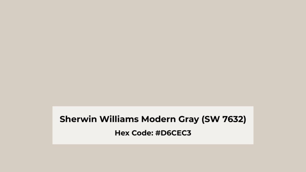
Modern Gray is one of the colors that people think is a “true gray” until they live with it because it’s not.
It’s a soft, warm gray with subtle taupe undertones that is a bit pink or rosy depending on your light.
With an LRV of 62, it reflects a decent amount of light, a bit more than Agreeable Gray which makes it airy without being harsh.
What I love about Modern Gray is how muted it is.
It’s not trying to be the star of the show.
It is on your walls like a quiet, calming presence that makes everything else in the room look better.
But it’s cooler than Agreeable Gray but it’s warm.
If that sounds confusing, welcome to the world of paint undertones where nothing makes sense until you see it in your space.
I’ve used Modern Gray in bedrooms more than anywhere else, and it works well there.
It has a serene quality that doesn’t feel cold but also doesn’t feel too cozy-warm where it gets stuffy.
Bathrooms are another consideration for this color, especially if you have white fixtures and want something softer than bright white walls.
In living rooms, it can work, but here’s where you need to be careful.
If your living room gets natural light, Modern Gray will glow with this subtle warmth.
But stick it in a north-facing room with limited light, and it can look dusty and muted in a bad way.
The thing about Modern Gray that makes it different from Agreeable Gray is that it’s lighting-sensitive.
Morning light versus evening light will change how it looks.
In east-facing spaces, it can be more pink in morning light.
West-facing rooms in the evening and the rosy undertone comes out.
You need to test this one at different times of day.
For exteriors, Modern Gray can work if you want something understated and sophisticated, but it’s not my first choice.
It can look a bit flat on large exterior surfaces unless you have strong trim colors and landscaping to give it contrast.
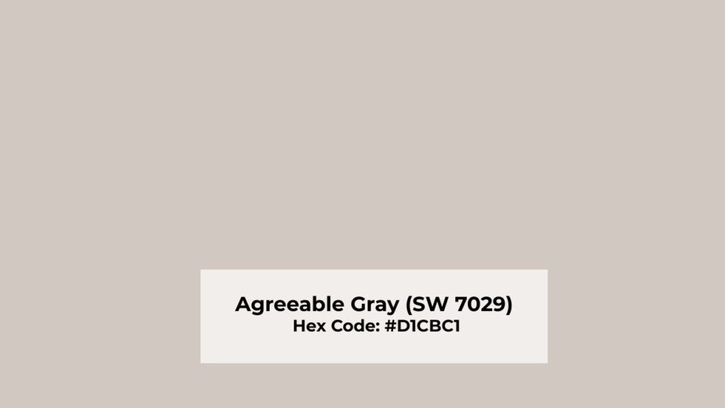
Color Profile of Agreeable Gray (SW 7029)
If Modern Gray is the quiet, Agreeable Gray is the popular one which everyone wants.
I have seen this color everywhere, and there’s a reason it’s been one of Sherwin Williams’ top sellers.
It’s a warm greige which is leaning more toward the gray side than beige, but with beige undertones to keep it from feeling cold.
With an LRV of 60, Agreeable Gray is darker than Modern Gray.
It reflects good light but not as much as you expect from something that looks this soft and airy in the space.
What makes Agreeable Gray versatile is how predictable it is.
It is not like Modern Gray with its mood swings, Agreeable Gray looks like Agreeable Gray no matter what you add to it.
In the north-facing room, it’ll look cooler but has its warmth.
In the south-facing room, it glows and feels cozy without getting too dark.
This consistency is why builders love it, why designers go for it, and why it works in open-concept homes.
I’ve used Agreeable Gray in every room type like living rooms, bedrooms, kitchens, bathrooms and it looks well.
In living rooms, it creates a modern, neutral backdrop which lets your furniture and art shine.
It doesn’t go against with warm wood tones, it plays nice with both warm and cool accent colors, and it doesn’t make bold choices.
Bedrooms feel fresh and airy with Agreeable Gray, not cold but not cozy either.
It’s a middle ground where you can layer in warm textiles and it feels inviting, or keep it minimal and it works.
Kitchens with white or cream cabinets look fantastic with Agreeable Gray wallsm it adds enough color without competing with your finishes.
But here’s my advice that Agreeable Gray can look drab in low-light conditions.
If you have a room with minimal natural light and not artificial lighting, Agreeable Gray can fall flat.
It’s not dark to feel intentionally moody, and it’s not light to brighten the space.
For exteriors, Agreeable Gray is lovely.
It has warmth to feel inviting on a house without being beige, and it pairs well with white trim, black windows, and natural wood accents.
Modern Gray Vs Agreeable Gray: Key Differences
Let’s get into the differences about Modern Gray Vs Agreeable Gray, which matters when you’re standing in the paint aisle trying to decide which one goes home with you.
These colors look similar that make people confuse, but the details make the difference in how they’ll perform in your space.
LRV (Light Reflectance Value)
Light Reflectance Value is how much light a color throws back at you, measured on a scale from 0 (pure black, absorbs all light) to 100 (pure white, reflects all light).
This matters more than people think because it affects how bright or dark a color feels.
Modern Gray has an LRV of 62, which puts it in the light-to-medium range.
It’s going to reflect a good amount of light and feel airy in spaces.
Agreeable Gray is at LRV 60, which is lower, which means it’s darker and will reflect a bit less light.
Now, here’s what’s funny about this.
Even though Modern Gray has the high LRV, Agreeable Gray feels light and bright in real spaces because of its warm undertones.
I’ve had rooms where Agreeable Gray made the space feel open than Modern Gray did.
If you have a dark room that needs the light reflection it can get, the 2-point LRV difference may push you toward Modern Gray.
But honestly, those two points is nothing.
The undertones and how each color plays with your finishes.
Undertones
This is where the real difference lives.
Undertones are the sneaky secondary colors hiding underneath the main color that comes depending on lighting and what’s around them.
Getting the undertones wrong is how you end up with a color that looks different.
Modern Gray has taupe undertones with a pink/rosy lean.
In some lights, the subtle pink comes through.
It’s not Pepto-Bismol pink or anything but it’s a soft, warm glow that can feel pretty or maybe annoying depending on your finishes.
If you have cool-toned grays or blue-based colors, the pink undertone will stick out.
Agreeable Gray has beige undertones that keep it in the greige category.
It’s warmer and creamier than Modern Gray, leaning more toward the beige side.
In most lighting, Agreeable Gray looks as a warm, soft gray-beige.
It doesn’t flash weird colors, which is part of why it’s popular.
Here’s what I tell people: if your home has warm wood floors, cream cabinets, or beige-toned tile, Agreeable Gray will go right in and feel cohesive.
Modern Gray can work but feel slightly disconnected because of the cooler taupe/pink.
If your home has more contemporary with cool finishes, Modern Gray may be the better fit.
Lighting Impact
Both colors are sensitive to lighting, but Modern Gray is more dramatic about it.
I’ve seen Modern Gray look like three different colors in the same room depending on time of day.
In north-facing rooms, Modern Gray can lose its warmth and look dusty or muted.
That subtle pink undertone gets muted by the cool natural light, and you’re left with something that feels flat.
Agreeable Gray handles north light better, it’ll look cooler and grayer.
South-facing rooms are where both colors shine.
Modern Gray gets a soft, glowing warmth where the rosy undertone becomes pretty.
Agreeable Gray looks balanced and warm, like it’s supposed to.
East and west-facing rooms are interesting.
Morning light in east-facing spaces can make Modern Gray look cooler and more gray.
Evening light in west-facing rooms brings out pink and rosy warmth.
Agreeable Gray stays consistent in both.
Artificial lighting matters too.
Warm LED bulbs or old-school incandescent lighting will make Agreeable Gray feel cozy and warm.
Modern Gray can go either way, warm artificial light brings out a pink undertone, while cooler LED lighting keeps it neutral and soft.
Style and Best Uses
The way you style around these colors like your trim, ceiling color, furniture, and accent pairings, completely changes how they perform.
Modern Gray pairs well with soft white trim like Alabaster or similar.
You don’t want harsh, bright white trim with Modern Gray because the contrast can make the walls look out of place.
Stick with warm, soft whites.
For ceilings, I go with light, sometimes white ceiling paint or a light version of Modern Gray.
According to the furniture, Modern Gray works with both warm and cool tones, but it shines with muted, sophisticated palettes.
You can go with soft blush pinks, muted blues, warm grays, natural wood tones.
Agreeable Gray is more flexible with trim colors.
You can go with creamy whites like Pure White or Dover White without it looking off.
Some people use Agreeable Gray on walls and trim for a monochromatic look.
Ceilings can be bright white, or you can do the same trick of going lighter.
For furniture and accents, Agreeable Gray is best because it works with everything.
Warm wood tones, cool metallics, bold accent colors, soft neutrals.
It’s the best go-to neutral backdrop.
Pair it with black or dark accent colors like Iron Ore for contrast, or keep it soft with whites and creams.
| Feature | Modern Gray (SW 7632) | Agreeable Gray (SW 7029) |
| LRV | 62 | 60 |
| Undertones | Taupe with pink/rosy lean | Warm beige |
| Temperature | Cool | Warm, creamy |
| Lighting Sensitivity | High, changes significantly | Medium, stays consistent |
| Best Rooms | Bedrooms, bathrooms, south-facing spaces | Living rooms, open concepts, versatile |
| Trim Pairing | Soft whites (Alabaster) | Warm or bright whites (Pure White) |
| Style | Muted, sophisticated, calm | Versatile, modern, neutral |
Modern Gray Vs Agreeable Gray: Room-by-Room Comparison
Let’s get specific about how Modern gray vs Agreeable gray looks in different rooms because theory is great, but real application is what matters when you’re living with a color every single day.
Living Room
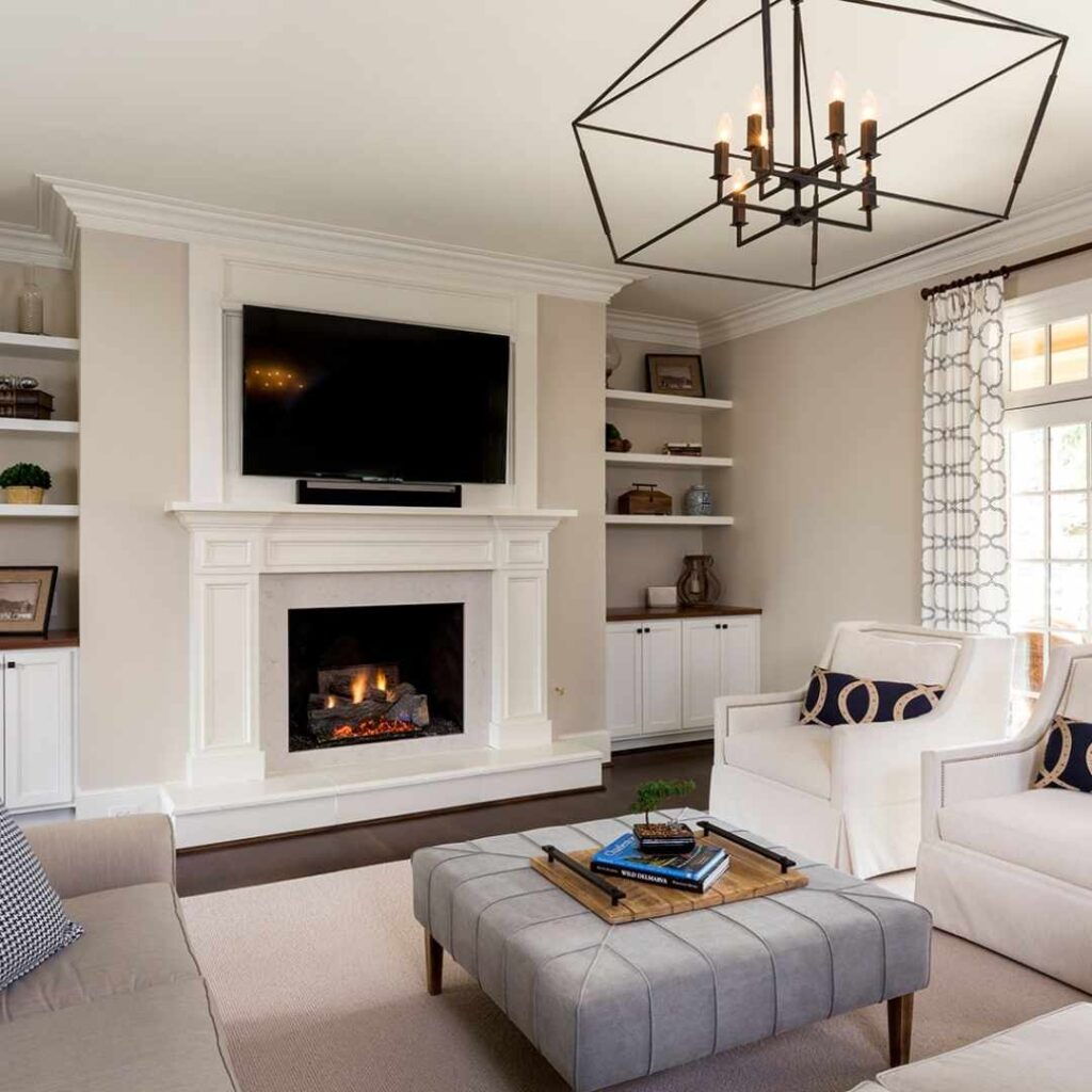
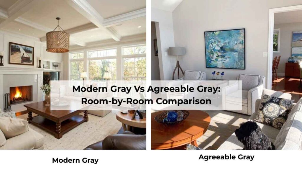
Modern Gray in a living room works best when you are searching for a sophisticated, calming space that doesn’t look for attention.
If your living room has good natural light, Modern Gray will have a soft, warm glow throughout the day that feels inviting.
It makes the space feel put-together without being stuffy.
But here’s where it goes wrong, when your space has limited natural light.
If your living room is dark or north-facing, Modern Gray can fall flat and look dull.
If it doesn’t have warmth or depth to carry a dark space, and it’s not light to brighten things up.
You end up with walls which only exist.
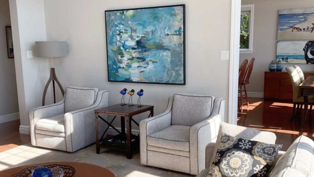
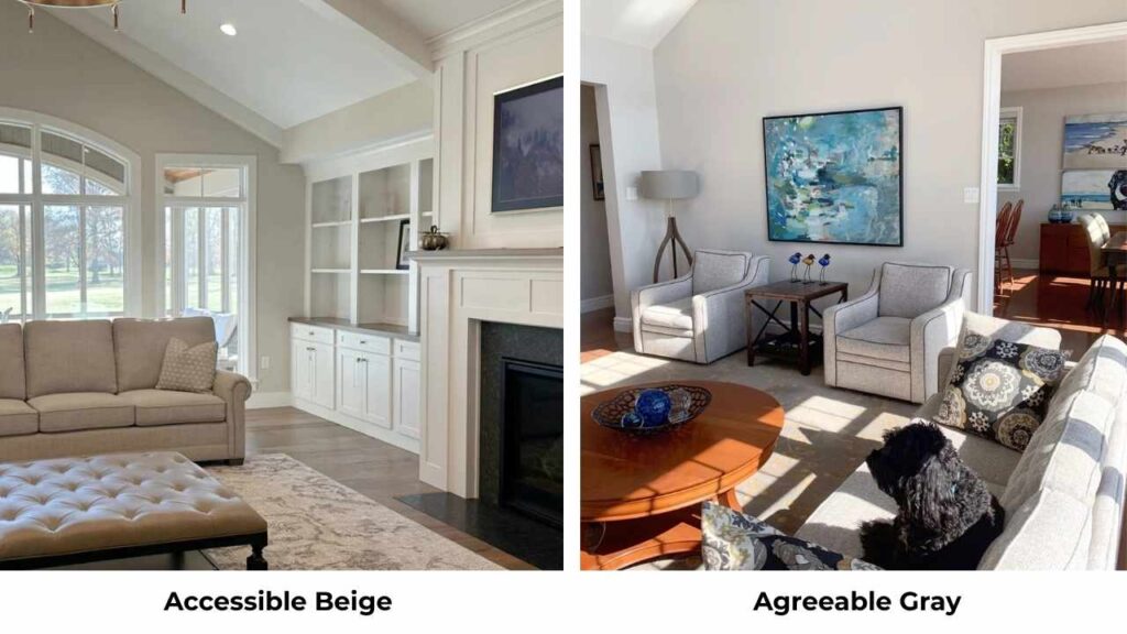
Agreeable Gray in the living room is foolproof.
It works in bright spaces, dark spaces, and everything in between, because it’s a versatile greige.
it creates a neutral backdrop that lets your furniture, art, and textiles shine.
If you’re decorating a living room and want to experiment with different accent colors or styles, Agreeable Gray gives you the flexibility.
I’ve used Agreeable Gray in open-concept living rooms which connect the area into kitchens and dining areas, and it’s perfect for that.
One color throughout keeps the space cohesive without feeling boring.
Modern Gray can work for open concepts, but you need to be careful with the lighting changes.
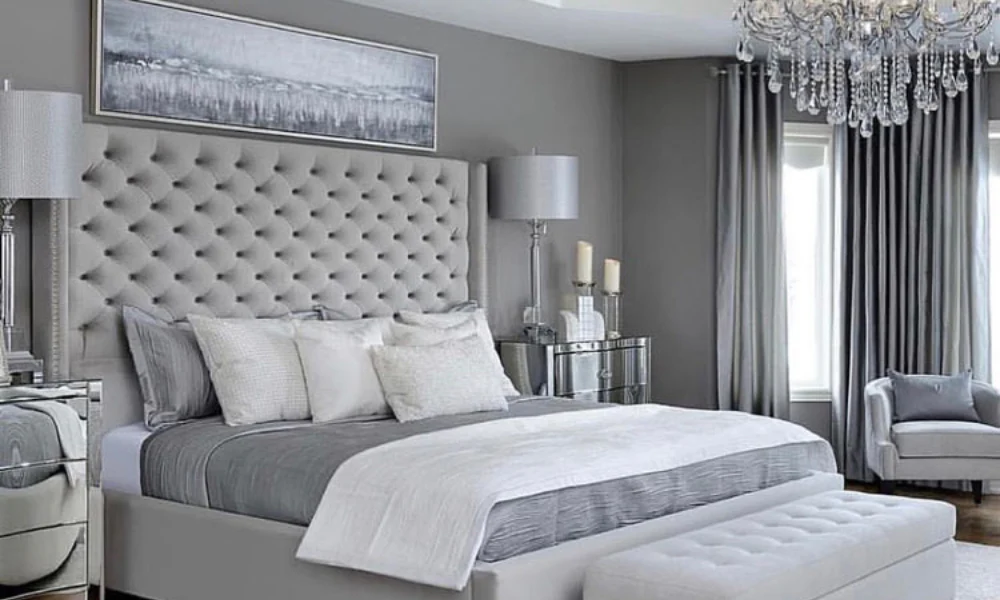
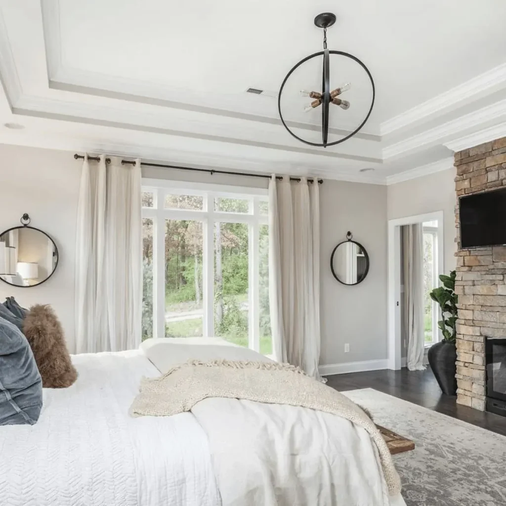
Bedroom
Modern Gray in a bedroom is where this color shines.
Bedrooms are supposed to feel calm and restful, and Modern Gray’s soft, muted quality creates the vibe.
The subtle pink and rosy undertone may feel out of place in a living room works in a bedroom, because it’s soft and a bit cozy without being too warm.
I’ve painted several bedrooms Modern Gray, and people say it feels serene.
It’s not cold to feel uninviting, and it’s not warm to feel heavy.
It is in a nice middle ground that makes you want to relax.
You can pair it with white bedding, some warm wood furniture, and soft textiles, to get a space like retreat.
Agreeable Gray in a bedroom is also great but in a different way.
It’s warm and cozier than Modern Gray, which some people love for a bedroom and others find warm.
If you’re someone who wants your bedroom to feel like a warm hug, Agreeable Gray is what you should go for.
If you want it to feel spa-like and calm, Modern Gray is the better choice.
I think north-facing bedrooms do better with Agreeable Gray because it holds its warmth even in cool light.
Modern Gray in a north-facing bedroom can feel too muted and cold.
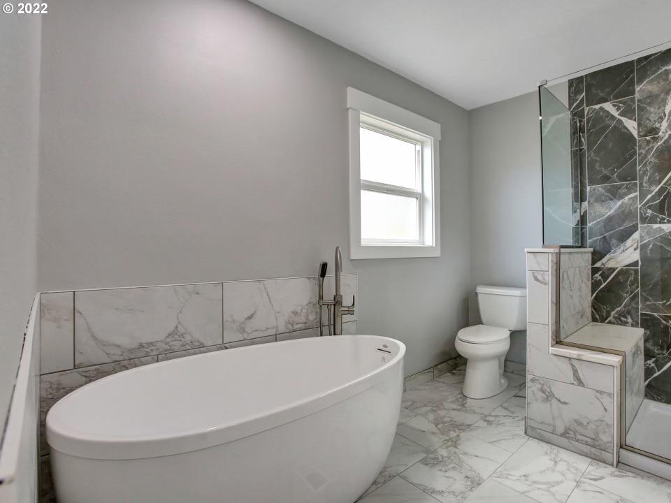
Bathroom
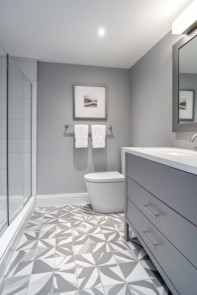
Modern Gray in a bathroom creates a clean, fresh feeling without being harsh white.
If you have white fixtures, Modern Gray gives you color to make the space feel designed without overwhelming the small space.
The thing I like about Modern Gray in bathrooms is it doesn’t fight with chrome, brushed nickel, or matte black fixtures.
It’s neutral to let your hardware choices shine.
But if your bathroom has limited natural light, you need to make sure you have good artificial lighting.
Agreeable Gray in a bathroom is warm and cozy, which can feel nice in a bathroom where you’re getting ready in the morning or unwinding at night.
It pairs well with both modern and traditional bathroom styles.
If you have beige or cream tile that you’re stuck with, Agreeable Gray will work better than Modern Gray.
because it won’t highlight the temperature difference between cool gray walls and warm beige tile.
Kitchen
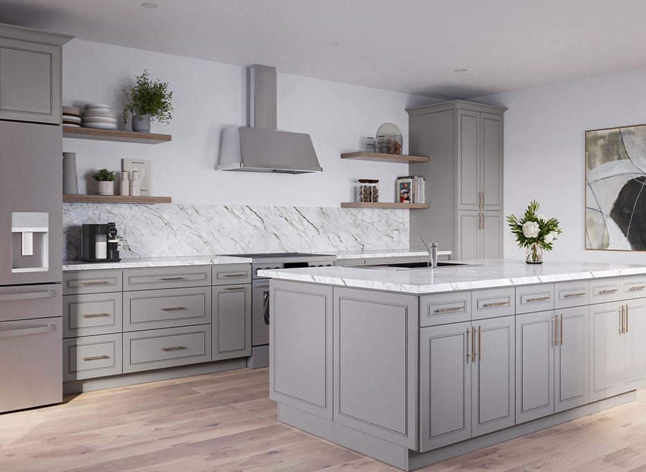
Modern Gray in a kitchen can work but needs the right appliances.
If you have white or light-colored cabinets, Modern Gray walls create a soft contrast which will look pretty.
It’s modern and clean without being cold.
But if your kitchen has limited natural light or dark cabinets, Modern Gray can make the space feel small and closed in.
I’ve seen Modern Gray work well in kitchens with natural light, white shaker cabinets, and marble or quartz countertops.
It creates a sophisticated, cohesive look that feels current.
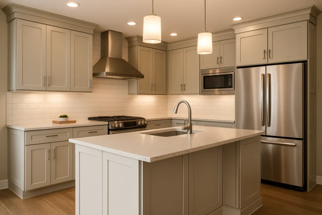
Agreeable Gray in a kitchen is versatile.
It works with warm wood cabinets, white cabinets, cream cabinets, darker cabinets if you have light.
If you have granite countertops with warm undertones, Agreeable Gray ties everything together better than Modern Gray.
The warmth in Agreeable Gray makes kitchens feel inviting, which matters since kitchens are where people gather.
Modern Gray can feel too cool and formal in a kitchen.
Exterior
For exteriors, both colors can work, but I have preferences.
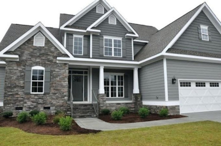
Modern Gray on an exterior creates a soft, understated look that feels sophisticated.
It works best on houses with strong architectural details like with interesting trim work, nice windows, good landscaping because the color itself isn’t doing the heavy lifting.
If your house is a basic box, Modern Gray makes it look plain.
You can pair Modern Gray exteriors with white trim and black or dark windows for contrast.
It can handle bold front door colors if you want to add personality.
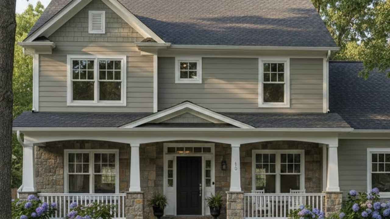
Agreeable Gray on an exterior is warm and approachable.
It works on a wide variety of house styles like modern farmhouse, traditional, craftsman, contemporary.
Because of the beige undertones, it doesn’t feel cold or gray-gray from the street.
I think Agreeable Gray is the safe exterior choice for most homes.
Modern Gray can look beautiful but needs the right house and the right surrounding can pull it off.
Modern Gray Vs Agreeable Gray Vs Other Colors
Sometimes the answer isn’t choosing between Modern Gray and Agreeable Gray.
Sometimes it’s realizing that one of these other Sherwin Williams or Benjamin Moore colors is what you need.
Let me break down how these two compare against other popular neutrals.
Modern Gray Vs Accessible Beige
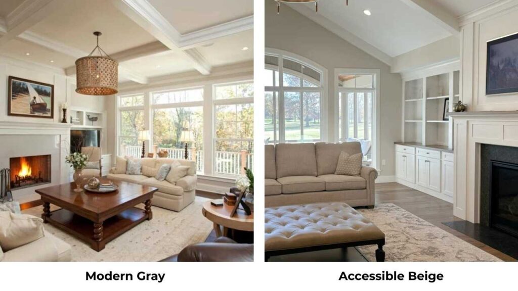
Accessible Beige (SW 7036) is warmer and beige than Modern Gray.
If Modern Gray feels cool or gray for your space, Accessible Beige is the warm alternative.
It has an LRV of 58, so it’s darker than Modern Gray, and it looks as a true warm beige-greige rather than a gray with undertones.
Accessible Beige works better if you have warm finishes in your home and Modern Gray feels disconnected.
Modern Gray Vs Worldly Gray
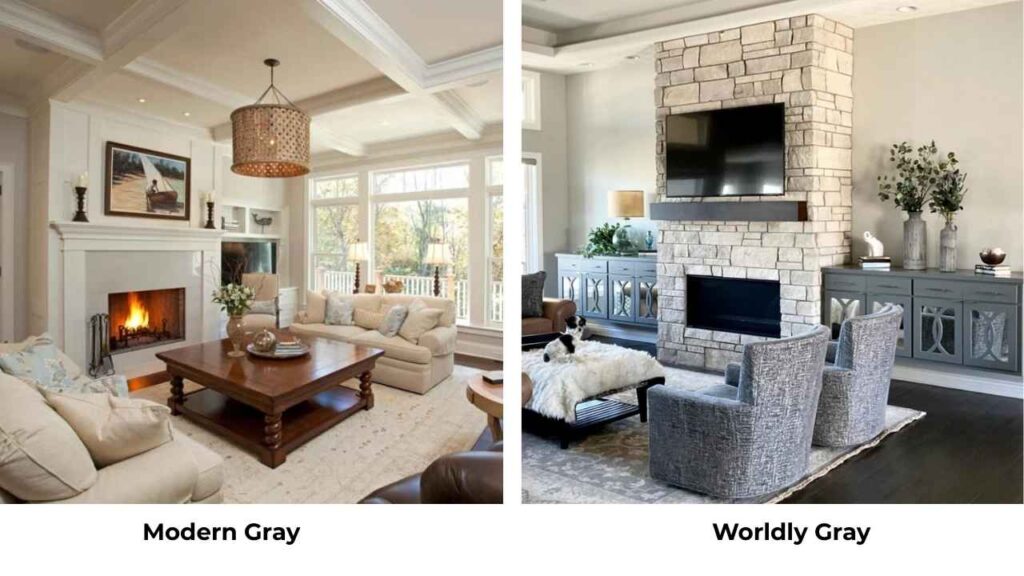
Worldly Gray (SW 7043) is similar in temperature to Modern Gray but is darker with the LRV around 57.
It has more taupe depth and looks as a true greige rather than a soft gray.
If you like Modern Gray but want something with more presence and depth, Worldly Gray is worth considering.
It is warm to work in most spaces but has more color to it.
Modern Gray Vs Edgecomb Gray
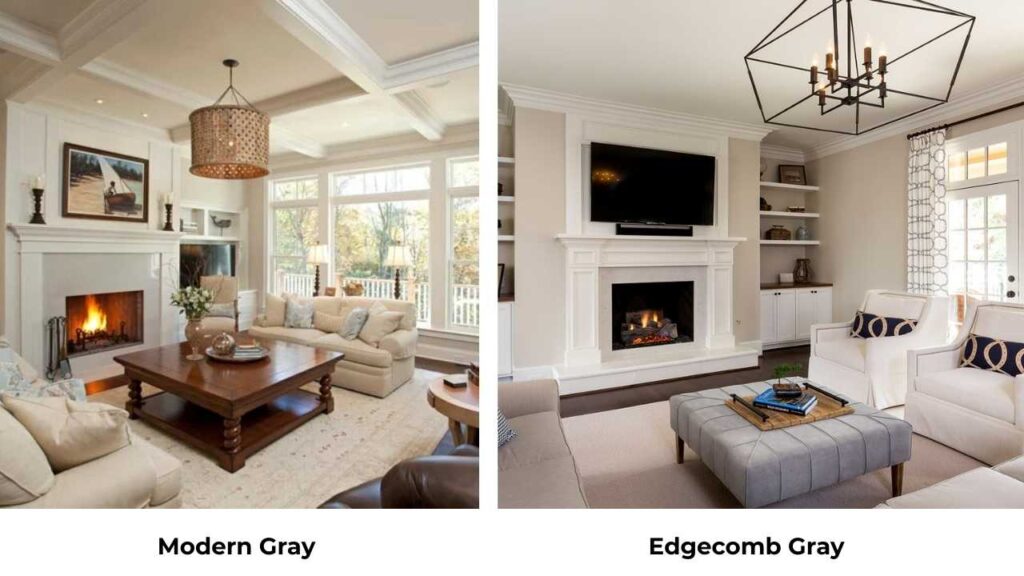
Edgecomb Gray by Benjamin Moore is warmer and creamier than Modern Gray.
It’s more in the realm of Agreeable Gray territory but lighter.
If Modern Gray feels gray and Agreeable Gray feels too muted, Edgecomb Gray can be your Goldilocks option.
It has beautiful warm undertones that work in a variety of lighting conditions.
Modern Gray Vs Drift of Mist
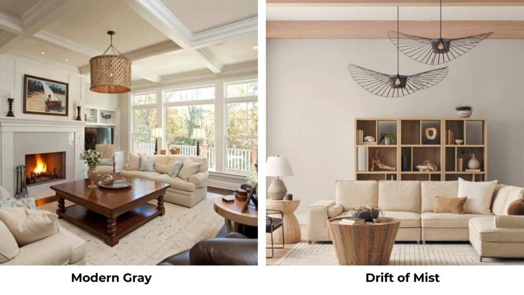
Drift of Mist (SW 9166) is lighter and softer than Modern Gray with an LRV around 70.
It’s part of Sherwin Williams’ newer neutrals and has an airy, almost-white quality while being a soft greige.
If you like the idea of Modern Gray but if you need something light for a dark space, Drift of Mist is a great choice.
Modern Gray Vs City Loft
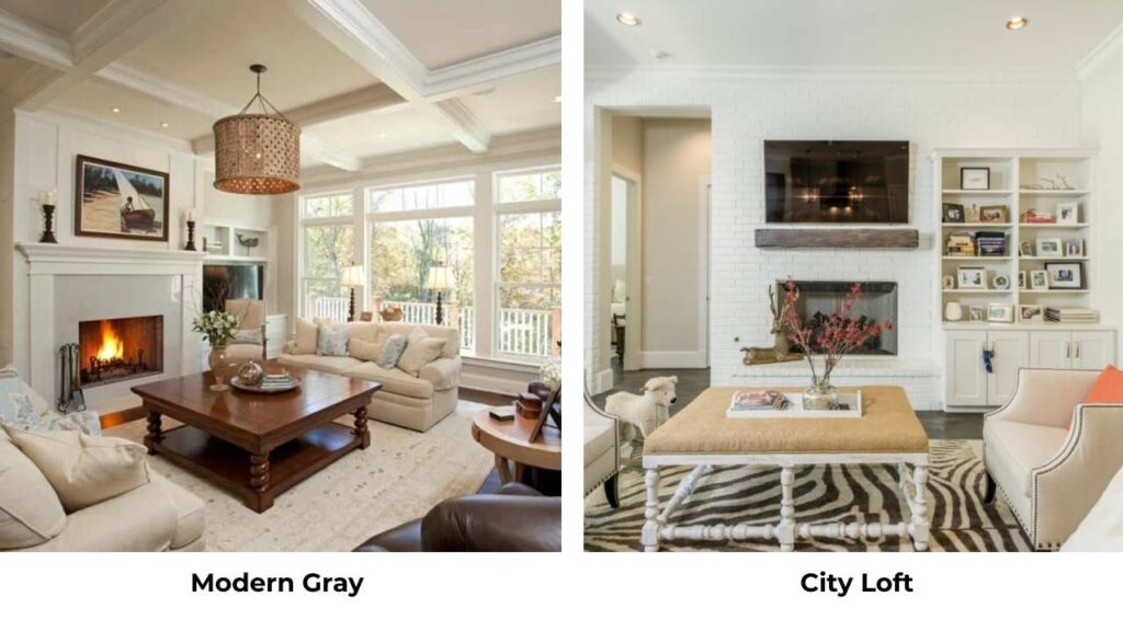
City Loft (SW 7631) is similar to Modern Gray in terms of LRV, it is around 62, but it has strong taupe undertones and commits to being a greige rather than a soft gray.
If Modern Gray’s pink and rosy undertone bothers you, City Loft provides depth.
Agreeable Gray Vs Egret White
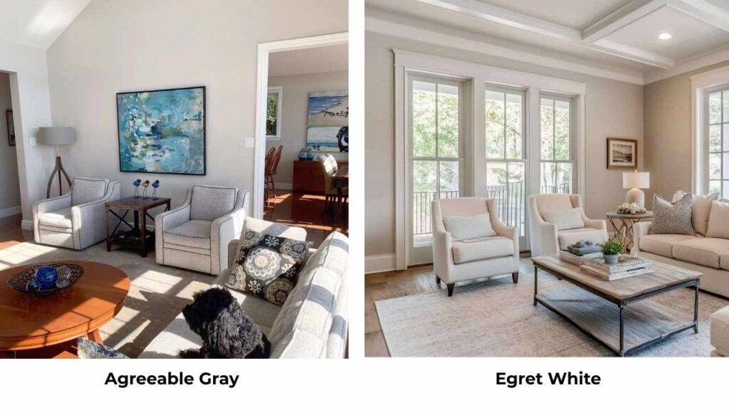
This is a big one. Egret White (SW 7029) is lighter than Agreeable Gray with an LRV of 70.
It has warm taupe undertones that are similar in temperature to Agreeable Gray but without the gray depth.
If you like Agreeable Gray but your space needs something light and bright, Egret White is the best alternative.
Sherwin Williams Modern Gray Vs Repose Gray
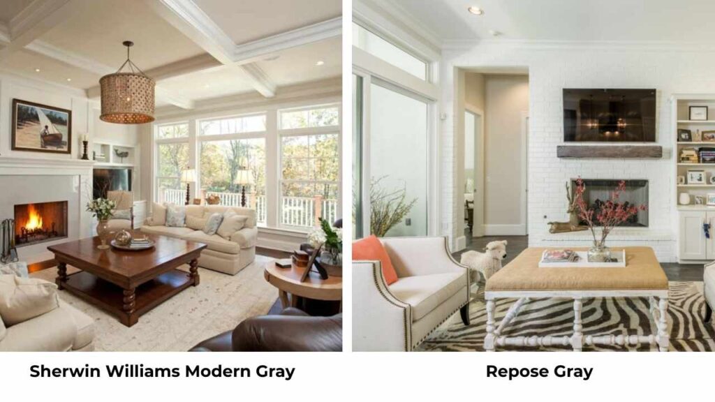
Repose Gray (SW 7015) is cooler than Modern Gray. It’s more of a true gray without the warm taupe and pink undertones.
If Modern Gray feels too warm for your space or you’re going for a cool, contemporary look, Repose Gray is a popular choice.
But now that it will feel visibly cool, it doesn’t have the soft warmth which Modern Gray maintains.
Modern Gray Vs Mindful Gray
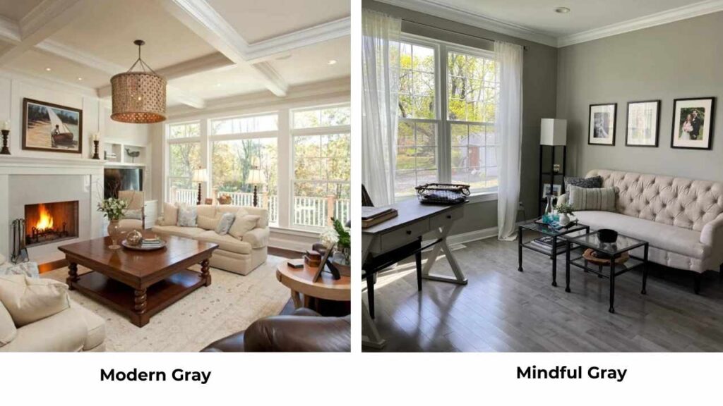
Mindful Gray (SW 7016) is darker and saturated than Modern Gray, LRV around 53.
It has more color presence and looks as a definite gray rather than a soft greige.
If Modern Gray feels too light or washed out in your space, Mindful Gray gives you depth while staying in the warm gray family.
Accessible Beige Vs Agreeable Gray

Accessible Beige is warm and more beige than Agreeable Gray.
If Agreeable Gray feels gray for your space or you want something that is more toward traditional warm neutrals, Accessible Beige is a good alternative.
It works well with warm wood tones and traditional decor styles.
Classic Gray Vs Agreeable Gray
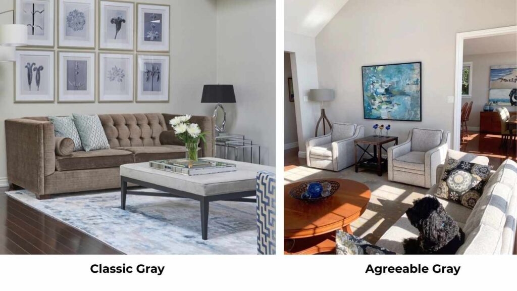
Classic Gray by Benjamin Moore is light with the LRV 74 and fresher than Agreeable Gray.
It’s less muted, less muddy, and has a clean, airy quality that Agreeable Gray can’t achieve.
If Agreeable Gray feels heavy or dull in your space, Classic Gray provides a light, bright alternative that maintains warmth.
Popular Gray Vs Agreeable Gray
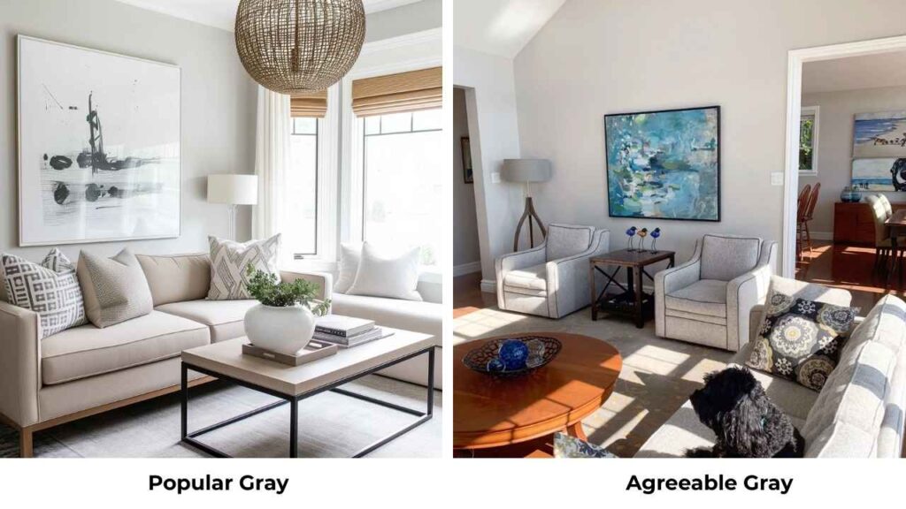
Popular Gray (SW 6071) is cooler than Agreeable Gray.
It’s a true gray without the beige undertones, sitting in that cool-toned gray family.
If Agreeable Gray feels too warm or you want something more contemporary and cool, Popular Gray is an option.
Just know it will feel significantly different, no warmth or greige qualities.
Modern Gray vs Agreeable Gray vs Other Popular Neutral Paint Colors
| Paint Color (Brand) | LRV (Approx.) | Undertone Profile | Warmth Level | Best Used In |
| Modern Gray (Sherwin Williams) | 62 | Warm gray with subtle taupe / pink | Warm-leaning gray | Open floor plans, transitional homes |
| Agreeable Gray (Sherwin Williams) | 60 | Greige with balanced beige and gray | Warm | Whole-house color, resale-friendly spaces |
| Accessible Beige (Sherwin Williams) | 58 | True beige-greige | Warm | Homes with warm wood tones and finishes |
| Worldly Gray (Sherwin Williams) | 57 | Taupe-leaning greige | Warm-neutral | Living rooms, bedrooms |
| Edgecomb Gray (Benjamin Moore) | 63 | Creamy beige-greige | Warm | Traditional and transitional interiors |
| Drift of Mist (Sherwin Williams) | 69–70 | Very soft greige | Warm-neutral | Small rooms, low-light spaces |
| City Loft (Sherwin Williams) | 62 | Taupe-forward greige | Warm | Warmly lit living spaces |
| Egret White (Sherwin Williams) | 70 | Warm taupe | Warm | Dark rooms, whole-house light neutrals |
| Repose Gray (Sherwin Williams) | 58 | True gray | Cool-neutral | Contemporary interiors |
| Mindful Gray (Sherwin Williams) | 53 | Warm gray | Warm | Feature rooms, accent walls |
| Classic Gray (Benjamin Moore) | 74 | Soft warm gray-greige | Warm | Small spaces, trim-adjacent walls |
| Popular Gray (Sherwin Williams) | 61 | Cool gray | Cool | Sleek, contemporary homes |
Conclusion
After all this, here’s my honest review about Modern Gray Vs Agreeable Gray.
Agreeable Gray is the safe choice for many people.
It’s popular for a reason because it works in many lighting situations, pairs with finishes, and doesn’t surprise you with undertone shifts.
If you’re painting an entire open-concept home and need one color to flow through multiple spaces, Agreeable Gray is what you should consider.
Modern Gray is the better choice if you want something cool and more muted, you have great natural light, and your space leans contemporary or sophisticated.
It’s beautiful in the right setting, but it needs the right setting.
But in my advice, when choosing between Modern Gray Vs Agreeable Gray, you should try sampling both.
Take the peel-and-stick samples or paint large swatches on your walls.
Look at them in morning light, afternoon light, and evening light.
Look at them with your floors, your cabinets, your furniture.
What looks good on the paint swatch or in someone else’s house may look different in your space.
FAQs
What is the difference between modern gray and agreeable gray?
Modern Gray (LRV 62) is cool and muted with taupe and pink undertones, while Agreeable Gray (LRV 60) is warm with beige undertones and looks a true greige. Modern Gray is lighting sensitive and works best in bedrooms and south-facing rooms, while Agreeable Gray is versatile in different spaces and lighting conditions.
When not to use agreeable gray?
Don’t use Agreeable Gray in rooms with limited natural light and poor artificial lighting because it can look drab and flat. Also avoid it if you have finishes with green undertones because Agreeable Gray can have a slight green cast.
What color goes with modern grey?
Modern Gray pairs best with soft whites like Alabaster for trim, warm wood tones, muted blues, soft blush pinks, and warm grays. For accents, go with deep colors like Urbane Bronze or keep it light with whites and creams. Avoid bright whites or very cool-toned colors.
Why is agreeable grey so popular?
Agreeable Gray is popular because it’s versatile and predictable. It works in most lighting conditions, pairs with both warm and cool finishes, flows through open-concept homes, and doesn’t have undertone shifts. It’s warm to feel inviting but neutral to work with any decor style.