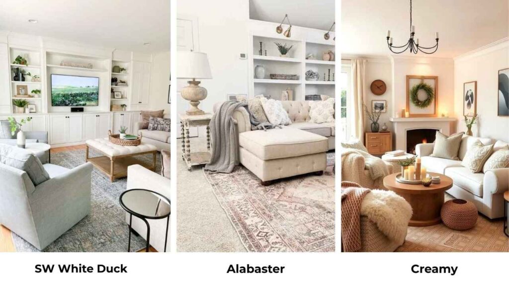
Whenever someone asks me about Sherwin Williams White Duck vs Alabaster, I get what they are looking for because these two are everywhere.
Both are popular warm whites from Sherwin-Williams that look identical on the small paint swatches at the store.
But they look completely differently when they’re on your walls.
The confusion makes sense because Undertones are hidden in it so that it shifts depending on your lighting, your floors, your furniture and what time of day it is.
Natural light from the north is where your paint color changes personality.
The south-facing room with the sun is a different color.
And when you pick the wrong undertone for your space, it feels off.
Here in this post, I’m breaking down everything about Sherwin Williams White Duck Vs Alabaster.
The stuff like LRV, the undertones, how they look in different rooms, and which one deserves a spot in your home.
We’re also looking at how they compare to other whites, what colors pair well with them and other important considerations.
Here are my other blogs that you can also read:
- Modern Gray Vs Agreeable Gray
- Classic Gray Vs Pale Oak
- Eider White Vs Alabaster
- SW Iron Ore Vs Tricorn Black
- Sw Retreat Vs Evergreen Fog
What You Need To Know About Sherwin Williams White Duck (SW 7010)
White Duck is not a white. I’m going to say it because this is where most of the disappointment comes.
It’s a warm off-white with visible beige and greige undertones, and when I say visible, it means you will see them on your walls.
The paint swatch may look as soft white, but once it’s on the walls, it looks creamy, sometimes greige, sometimes a bit taupe.
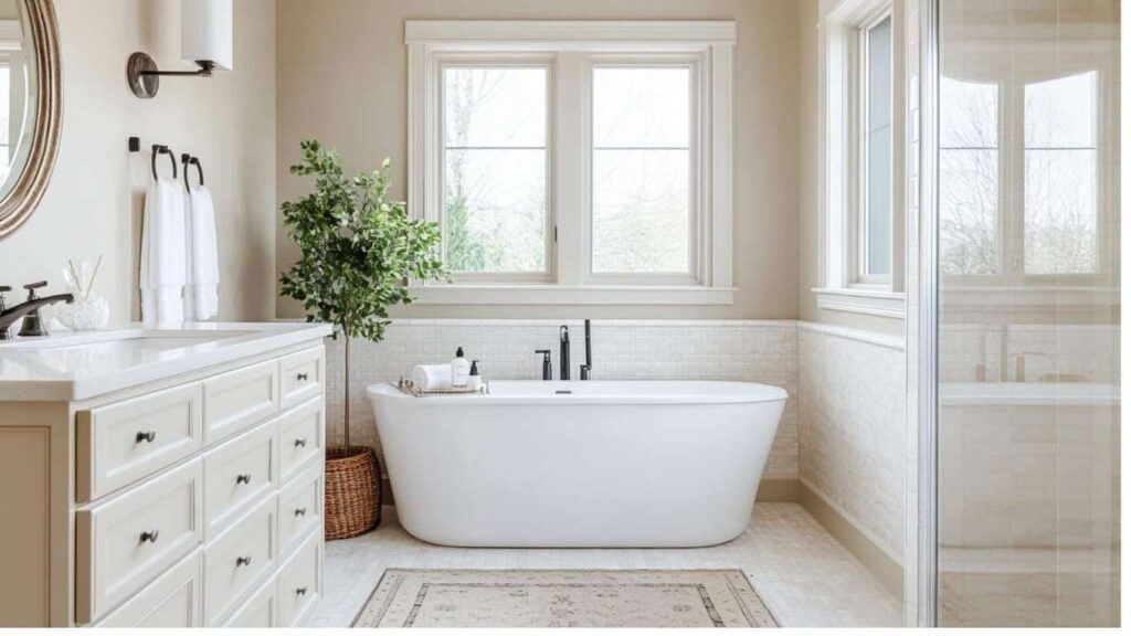
I used White Duck in a client’s dining room.
The room had warm oak floors, natural wood trim they wanted to keep, and big south-facing windows.
In that space, the White Duck was perfect.
The LRV is at 74, which means it absorbs more light than bright whites.
In a room with great natural light, it gives you a soft, muted look that’s popular.
In a dark room or a space with limited windows, it can look heavy.
The subtle green undertones keep it from looking a bit yellow.
Many warm neutrals will look like you painted your walls with warm lighting when they light them wrong, but White Duck doesn’t do that.
The green keeps it balanced, which is why color experts call it a “complex cream” or a “light greige”.
But you cannot use White Duck as your trim color.
I’ve seen people try and it disappears.
You need a bright white for trim to create contrast.
I pair it with Pure White (SW 7005) or Extra White (SW 7006) on the trim and ceiling.
The thing is, White Duck works best when you want the soft neutral look.
When you’re going for warm, cozy, lived-in.
It’s gorgeous with natural materials, wood tones, and spaces that have texture.
It’s a “soft neutral” rather than a true white.
What You Need To Know About Alabaster (SW 7008)

Now Alabaster, Sherwin-Williams named Alabaster their Color of the Year in 2016, and it’s stayed in their “Top White Paint Colors” list.
There’s a reason it became one of the most versatile warm whites because it works in most spaces.
Alabaster has warm creamy undertones but they’re soft.
There’s a slight beige or yellow influence, but it never feels too yellow the way some warm whites do.
It is in a spot where it’s warm and more inviting than the harsh, cold whites, but it looks a white color.
The LRV is 82, which is higher than White Duck.
The 8-point difference may not sound like much, but when you see it.
Alabaster reflects more light, looks bright, and feels clean on the walls.
It has a fresh quality that White Duck doesn’t have.
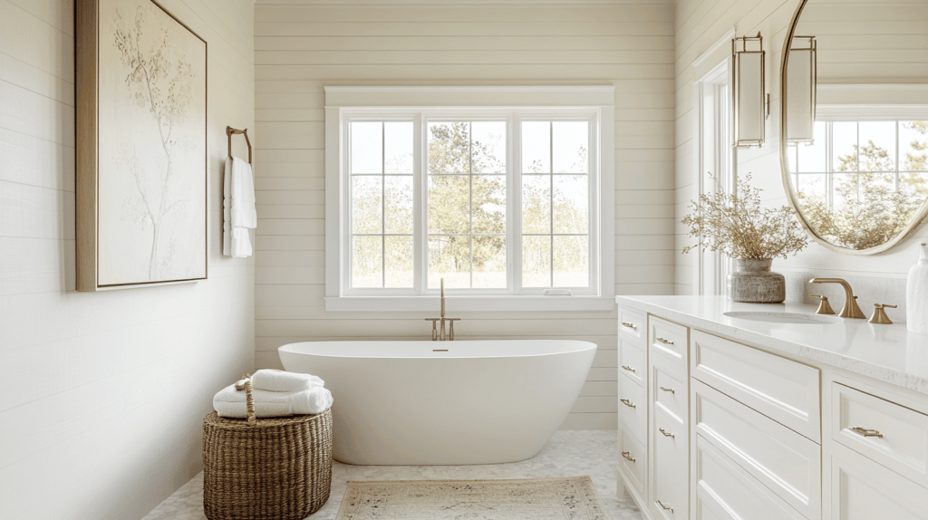
I’ve used Alabaster many times.
Whole house projects, single rooms, exteriors, kitchen cabinets, it’s my go-to when someone wants a warm white that won’t cause problems.
It’s forgiving, which is why it is not the most exciting thing to say about a paint color, but it matters.
Actually, I painted my own bedroom in Alabaster and it has made me happy since then.
The room gets morning light from the east and it glows.
At night with lamps on, it stays soft and warm without looking out of place.
What makes Alabaster special is that it’s soft and inviting without losing the clean white appearance.
You can use it on walls, on trim, on cabinets because it’s versatile to handle different applications.
Some people use it as a whole-house color with the same shade on walls and trim, but only in different sheens.
Flat on walls, semi-gloss on trim, and it creates a subtle, sophisticated look.
Difference Between Sherwin Williams White Duck Vs Alabaster
Okay, so White Duck Vs Alabaster both are warm whites from Sherwin-Williams, both popular, both get recommended.
But they’re different when you get into the specifics.
The LRV difference means one reflects more light.
The undertones shift in opposite directions.
And how they handle different lighting situations is not close to the same.
LRV
Light Reflectance Value is how much light a color reflects back, measured on a scale of 0 (absolute black) to 100 (pure white).
It’s one of the things that matters a lot in real life.
White Duck has an LRV of 74, which puts it moderately bright, it’s a light color, but it absorbs more light than it reflects.
On a wall, it creates depth and softness.
It doesn’t bounce light around the room like bright whites.
Alabaster has an LRV of 82.
The more 8 points means Alabaster reflects more light, making rooms feel bright and open.
If you’re working with a small space or limited natural light, the difference becomes obvious.
I always tell people to think about what their room needs.
A dark room that feels cave-like wants the high LRV to maximize light you’ve got.
A bright room with windows has more flexibility.
White Duck’s low LRV has a soft, more muted look.
Undertones
White Duck’s primary undertones are beige and greige with subtle gray mixed in.
But what saves it from looking yellow are the green undertones in it.
The green keeps it complex and prevents the yellow looking situation.
In some lights, White Duck can look taupe, not full but that you notice it’s not white.
In low light or rooms with low natural light, the gray undertones can make it look muddy or heavy. It looks earthy, which is great.
Alabaster’s undertones are creamy warmth with a soft yellow-beige influence.
Alabaster stays warm without committing to yellow the way something like Creamy does.
It has a neutral warmth that works with both warm and cool elements in a room.
The big difference is Alabaster’s undertones are more stable.
They don’t shift dramatically from room to room or lighting to lighting.
White Duck is moody, it shows different parts depending on conditions.
Lighting Affect
Light changes everything with paint colors, but these two look different in the same light conditions.
White Duck in north-facing rooms can be a little tough.
Northern light is cool and indirect, and it brings out gray undertones.
White Duck has gray in its undertones, so in north light it can look dull, flat, or can look out of place.
In south-facing rooms, White Duck warms up and becomes balanced.
All the bright, warm natural light brings the beige and cream notes while the green undertones keep it from going yellow.
This is where White Duck shines.
With artificial lighting, warm bulbs enhance the beige tones, and cool LED lighting can emphasize the gray and muddy undertones.
You’ve to test it with your light sources.
Alabaster handles north-facing rooms way better.
It looks warm and soft with the cool northern light.
It doesn’t get flat or gray but it only becomes a cooler version but looks as a warm white.
In south-facing rooms, Alabaster gets bright, creamy, and inviting. It glows without looking yellow or intense.
And it works well with both warm and cool artificial lighting, which makes it easier to work with.
Style Compatibility and Uses
Both colors work for different aesthetics and pair differently with other elements.
White Duck loves natural materials.
Pair it with wood tones, stone, warm hardwood floors, and it feels cohesive and intentional.
It works well in spaces that have texture and warmth.
Like modern farmhouses with reclaimed wood, transitional spaces with warm finishes, or traditional homes with molding and wood trim.
For trim with White Duck walls, you need something bright.
Pure White or Extra White create that contrast that keeps White Duck from looking muddy. The ceiling should be a bright white too.
Alabaster is flexible style-wise.
It goes for modern farmhouses, traditional, contemporary and transitional.
It pairs well with both warm and cool accent colors, works with various wood tones, and doesn’t go against the design choices.
You can use Alabaster on both walls and trim for a monochromatic look, or pair it with Pure White trim for subtle contrast.
It also looks great on kitchen cabinets and when you want white cabinets it looks nice and doesn’t feel cold.
| Feature | White Duck (SW 7010) | Alabaster (SW 7008) |
| LRV | 74 (absorbs more light) | 82 (reflects more light) |
| Primary Undertones | Beige, greige, gray with green | Creamy warmth, soft yellow-beige |
| Overall Appearance | Earthy, muted, soft neutral | Clean, soft white, brighter |
| Best Lighting | South-facing, bright rooms | Works in most lighting conditions |
| Style Compatibility | Warm, natural, textured spaces | Versatile across styles |
| Trim Pairing | Needs crisp white (Pure White, Extra White) | Can be same color or Pure White |
| Risk Level | Higher (can look muddy in wrong conditions) | Lower (more forgiving and consistent) |
Sherwin Williams White Duck Vs Alabaster: Room-By-Room Comparison

The room matters.
The same paint color can look best in your bedroom and weird in your bathroom.
Light direction, size, function, it all affects how these colors look.
Let me walk you through how White Duck and Alabaster handle different spaces.
Living Room
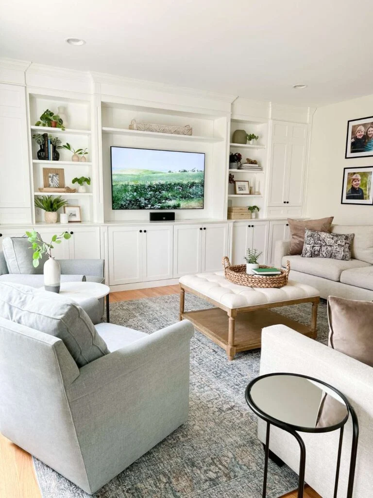
White Duck in a living room works when you’ve good natural light and warm elements to play with.
I’ve seen it look beautiful in living rooms with hardwood floors, wood furniture, and warm-toned textiles.
It creates a cozy, inviting atmosphere that makes you relax.
But you need the light.
In a living room with small windows or north-facing exposure, White Duck can make the space feel small and darker than it is.
The beige-greige undertones get heavy without light to balance them.
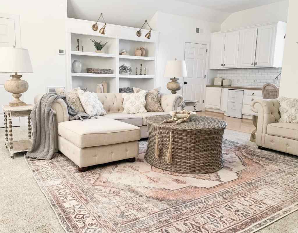
Alabaster in the living room is always safe.
It keeps the space feeling open and bright while having the warmth that makes a living room feel lived-in rather than cold.
It works well in open floor plans where the living room flows into other spaces.
I painted my living room in Alabaster and it handles everything.
Morning light, afternoon light, lamps at night and it stays pleasant and warm without any weird shifts.
Bedroom
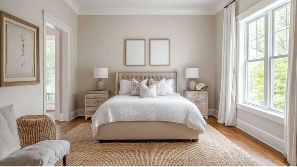
White Duck in bedrooms can look lovely.
Bedrooms benefit from the soft, cozy feeling, and White Duck delivers.
If your bedroom has decent light during the day, White Duck creates a calm, restful environment.
I’m careful with White Duck in a small bedroom or one without great light.
You don’t want your bedroom to feel cave-like unless that’s your vibe.

Alabaster in bedrooms is my favorite use for this color.
It’s warm to feel relaxing but bright to not feel oppressive when you’re getting dressed in the morning.
It makes white bedding look white instead of dingy.
And it works for both adults’ bedrooms and kids’ rooms.
Bathroom
Bathrooms are tricky with paint colors because of the lighting, the size, and the finishes you’re working with.
White Duck in bathrooms needs to be careful.
If you’ve a bathroom with a window and natural light, it can work.
But bathrooms are interior rooms with artificial light, and White Duck can look dull or slightly dirty in this condition.
I tried White Duck in a powder room once and had to repaint.
It looked fine during the day but at night with the vanity lights, it looked muddy and sad.
Alabaster in bathrooms is reliable.
It stays clean-looking, which is important in a bathroom.
It works with white tile, subway tile, marble and with any bathroom finish.
And it handles bathroom lighting without getting weird.
If you’re doing a bathroom renovation with white elements, Alabaster keeps everything cohesive.
If you’ve warm tile or wood elements, it works.
Kitchen
Kitchens have so much like cabinets, countertops, backsplash, appliances, flooring.
Your wall color needs to go well with all of it.
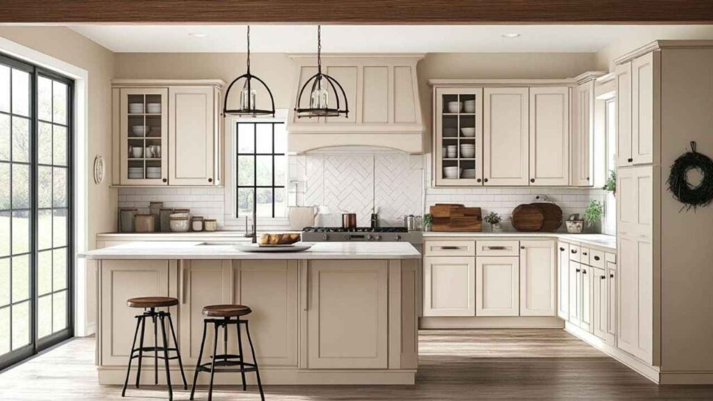
White Duck in kitchens works if you’ve warm wood cabinets or warm-toned countertops.
It can create a cohesive, warm kitchen environment.
But if you’re pairing it with white cabinets, then the cabinets are going to make your White Duck walls look beige by comparison.
Some people use White Duck on kitchen cabinets when they want a white kitchen that’s not bright white.
That can be pretty if you pair it with the right wall color.
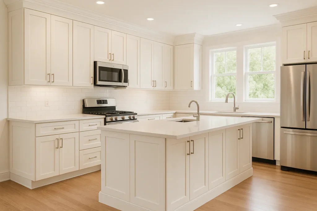
Alabaster in kitchens is popular, and for good reason.
It works as a wall color with any cabinet color.
And it’s one of the popular cabinet colors because Alabaster cabinets with a darker or contrasting wall color look fresh and classic.
I’ve gone with Alabaster cabinets many times.
With white subway tile backsplash, with colorful backsplash, with marble, with quartz, it all works.
It’s a warm white cabinet that doesn’t feel cold or too modern.
Exterior

Exteriors are a whole different situation because you’re dealing with outdoor light, which is bright and intense than indoor light.
White Duck on exteriors can appear dark.
The beige undertones become visible outside, and depending on your other exterior elements, it may look more beige than white.
If you’ve bright white trim or cool-toned stone, White Duck can look muddy or dirty next to them.
It needs strong sun exposure to look balanced, so it works better in sunny climates.

Alabaster on exteriors is popular and for good reason.
It’s one of the exterior whites that maintains its color well, looks soft and warm without looking beige or yellow, and pairs well with different trim colors.
Black trim with Alabaster siding is a classic and gorgeous.
Bronze or dark brown trim is also beautiful.
I’ve seen many houses painted in Alabaster in the last few years.
It works with traditional architecture, modern farmhouse, craftsman style and with almost every style.
Sherwin Williams White Duck Vs Alabaster Vs Other Colors
These two aren’t your only options for warm whites.
There’s a lot of off-whites and warm neutrals, and comparing them to other popular colors helps you figure out what you want.
Let me walk through how White Duck and Alabaster compare against some other colors.
Sherwin Williams White Duck Vs Creamy
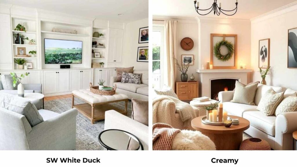
Creamy (SW 7012) is warmer than White Duck, with yellow undertones.
Where White Duck has the green undertones keeping it from looking yellow, Creamy embraces the warmth.
If you’re comparing these two, Creamy will look golden, especially in bright light.
White Duck is more muted and neutral.
I’d pick Creamy for spaces where you want warmth and you’re pairing it with warm wood tones.
White Duck is better when you want warmth but want neutrality.
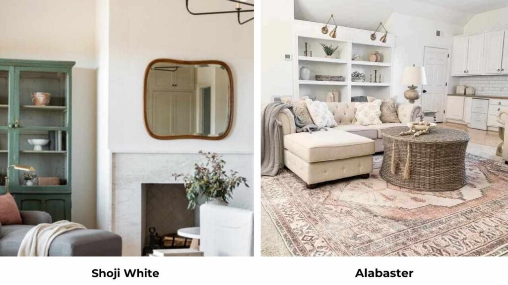
White Duck Vs Shoji White
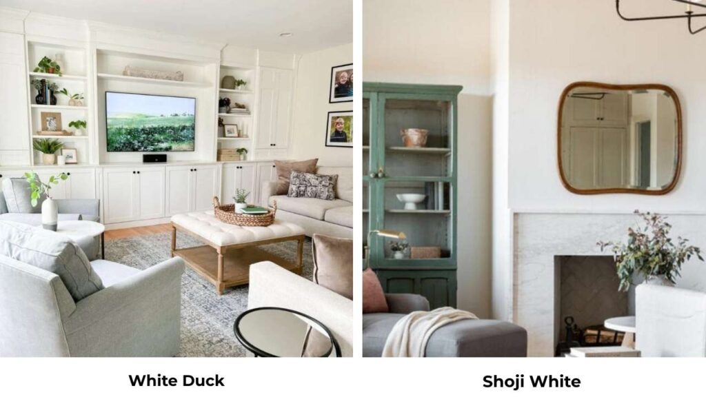
Shoji White (SW 7042) has the same LRV as White Duck, but the undertones are different.
Shoji White is more toward warm taupe while White Duck has the greige-green undertones.
Shoji White is warm. In the same room, White Duck will look neutral and cooler by comparison.
Both are soft neutrals rather than true whites, so this choice comes down to whether you want taupe warmth or greige neutrality.
White Duck Vs Greek Villa
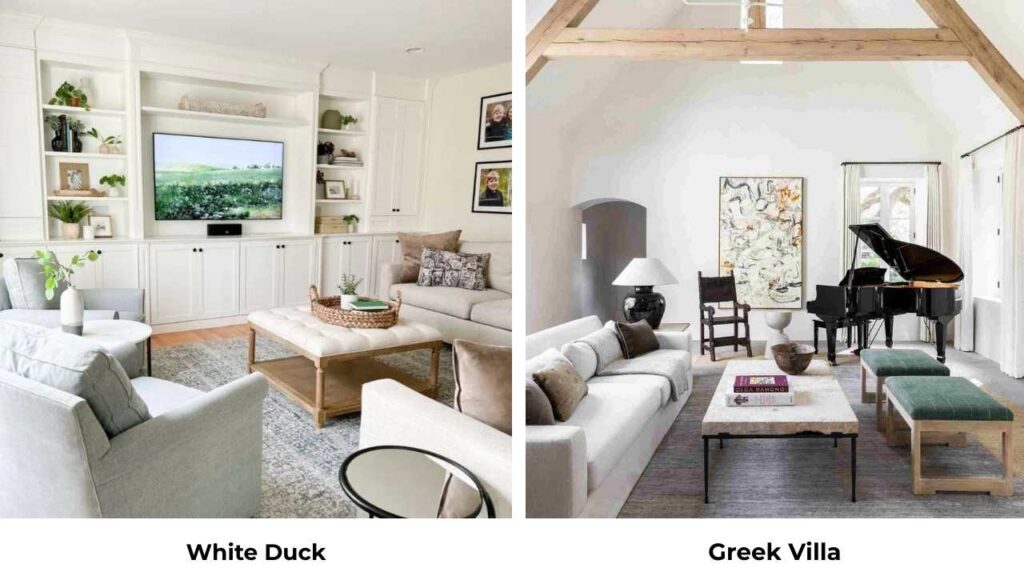
Greek Villa (SW 7551) is another warm white option, and it’s lighter than White Duck with an LRV around 78.
But it doesn’t have a contrast with White Duck to use them together.
Greek Villa is warm and light, but if you’re trying to use it as trim with White Duck walls, you won’t get the difference between them.
It’ll look like you picked the wrong white.
If you’re choosing between them for walls, Greek Villa is bright and works better in low light situations.
Shoji White Vs Alabaster
Between these two, Alabaster is light and bright with an LRV of 82 vs Shoji White’s 74.
Shoji White has beige-taupe warmth while Alabaster keeps the creamy softness without going too warm.
If you love the idea of Alabaster but want something with warmth and depth, Shoji White could work.
But you’re giving up some of the light-reflective quality that makes Alabaster versatile.
Sherwin Williams White Flour Vs Alabaster
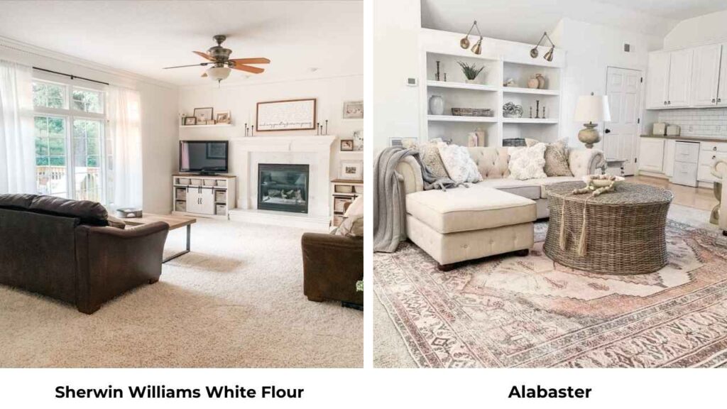
White Flour (SW 7102) is similar to Alabaster because they’re both soft warm whites in the same family.
White Flour is lighter with an LRV of 83 vs Alabaster’s 82.
Most people wouldn’t be able to tell them apart on the wall.
White Flour looks more neutral-warm where Alabaster has a touch of cream.
This is one of the “split hairs” comparisons.
| Color | LRV | Undertones | Best For |
| White Duck | 74 | Beige-greige with green | Warm spaces with good light |
| Alabaster | 82 | Soft creamy warmth | Versatile, most spaces |
| Creamy | 72 | Yellow-beige warmth | Very warm, traditional spaces |
| Shoji White | 74 | Warm taupe-beige | Warm neutrals with depth |
| Greek Villa | 78 | Warm white | Medium brightness, warm spaces |
| White Flour | 83 | Soft neutral-warm | Very similar to Alabaster |
Sherwin Williams White Duck Color Palette
White Duck is a neutral, so it plays well with many colors.
But some pairings make it shine.
Green hues are natural partners because of the green undertones in White Duck.
Sage greens, olive tones and deep forest greens, they feel cohesive with White Duck walls.
The green undertones create a subtle connection that makes the whole palette feel intentional.
Gray and greige colors work beautifully as accents.
White Duck is a greige, deep grays or greiges for accent walls, furniture, or cabinetry create depth without clashing.
Go for Chelsea Gray for cabinets with White Duck walls.
Black accents provide bright contrast against White Duck’s softness.
Tricorn Black or Iron Ore both work well for doors, window frames, or accent elements.
For trim and ceilings with White Duck walls, go with Pure White or Extra White.
This isn’t a “palette”, it’s a necessity, White Duck needs the brightness to not look muddy.
Warm wood tones, natural materials, brass or gold fixtures, all enhance White Duck’s warm, earthy quality.
Sherwin Williams Alabaster Color Palette
Alabaster is versatile with pairings because of its neutral warmth.
Darker neutrals like Agreeable Gray, grays with warmth, or light taupes create beautiful contrast without being harsh.
Alabaster walls with gray-blue cabinets or furniture feels collected and sophisticated.
Navy or deep blue accents look gorgeous with Alabaster.
The warmth of Alabaster softens the coolness of navy, and the combination feels classic.
Consider a navy island with Alabaster perimeter cabinets, or navy accent wall with Alabaster on the other walls.
Black trim or accents create a modern farmhouse look everyone loves.
Alabaster walls with black windows or black doors are having a moment, and it’s having that moment because it looks good.
For trim with Alabaster walls, you’ve options.
You can go monochromatic with Alabaster in a different sheen, or use Pure White for more contrast.
Warm wood tones look beautiful with Alabaster, but so do cool-toned woods and painted furniture.
Alabaster doesn’t demand warmth the way White Duck does.
Soft greens, warm grays, or blush or terracotta accents all work with Alabaster walls.
It’s hard to make Alabaster look bad with your accent color choices.
Conclusion
So after all that, which one should you choose between Sherwin Williams White Duck Vs Alabaster.
If you want safe, versatile, and beautiful, go with Alabaster.
It’s popular for a reason. It works in most rooms, with any lighting, with any style of interior and exterior.
If you want something with personality and depth, and you’ve got the right conditions for it, White Duck can be beautiful.
But always know what you’re getting, it’s a soft neutral, not a white, and it needs the right environment to shine.
I’ve used both many times, and I keep coming back to Alabaster because it doesn’t cause problems.
White Duck is gorgeous when it works, but when it doesn’t, it looks flat.
Test samples in your space.
The peel-and-stick paint samples make this easy because it depends on your lighting, your finishes, and your furniture.
Choosing between Sherwin Williams White Duck Vs Alabaster according to your space can be simple but a bit confusing if you don’t know the important details about it.
FAQs On Sherwin Williams White Duck Vs Alabaster
Alabaster is a warm white, not a pure white. It has soft creamy undertones with a beige influence, but it looks as white on the wall, not harsh, cold white. It’s in the off-white category where it’s warm and inviting but looks a white color in your space.
Yes, White Duck has an LRV of 74 while Alabaster is 82, which is a significant difference. White Duck absorbs more light and appears deep, muted, and more beige-greige. Alabaster is visibly bright and reflects light.
No, White Duck has beige and greige undertones, but it has subtle green undertones that prevent it from looking yellow like most beige-based colors do. The green undertones keep it neutral and complex.
They can work together, but you need contrast. Alabaster as trim with White Duck walls provides decent contrast because Alabaster is bright. But they’re similar enough that in some lighting they may not feel different.