I’ve been working with soft purples for a while and periwinkle vs lilac is the conversation that comes up in every client consultation.
Both are gorgeous but they are not interchangeable and homeowners pick one thinking it’ll give them the dreamy, soft vibe and then the paint puts up on the wall and the room feels off.
I’ve repainted bedrooms because someone confused these two shades.
Periwinkle and lilac are right in the zone between blue and purple on the color wheel.
The difference isn’t about one’s bluer but it’s about the mood of your space, how your furniture looks against the walls, whether your lighting.
Because the wrong choice can make your room feel cold when you want cozy, or too sweet when you want calm.
Here in this post I’m breaking down everything about Periwinkle Vs Lilac.
The color profiles, the key differences you NEED to know, how they work room by room, and how they look against other purples.
So, let’s get into it and learn about the differences and the things you should know about them.
Here are my other blogs that you can also read:
- Shoji White Vs White Dove
- Acacia Haze Vs Evergreen Fog
- Classic Gray Vs Pale Oak
- City Loft Vs Alabaster
- Bm White Dove Vs Sw Alabaster
Color Profile of Periwinkle

Periwinkle is a pale bluish-purple with a dominant blue base.
When I describe it to clients, I tell them to imagine dusk like when the sky isn’t quite blue but isn’t purple yet.
It’s a soft mix of blue, lavender, and gray all mixed together.
The key thing is that it leans closer to blue than true purple.
It is named after the Vinca minor flower which has the little blue-violet blooms, periwinkle has a specific character, it’s not bright.
It’s not saturated but it’s muted and the temperature is COOL.
When I painted my own guest bedroom in a periwinkle shade, I expected soft and calming but it was TOO airy.
The room felt big, but also kind of distant.
I added warm wood tones and some cream textiles to balance it out.
Periwinkle needs warming up unless you’re specifically going for the fresh, Scandinavian feel.
Here’s what I love about periwinkle is that it has a nostalgic, introspective quality.
Clients who pick it want a quiet space.
A room for reading, thinking, winding down.
I’ve used it in home offices where people need to concentrate without feeling cold.
In nurseries where parents wanted something soothing.
In bathrooms where they wanted calm but not cold.
The gray undertone is what makes or breaks it.
Some periwinkles have more gray, some have less.
The ones with MORE gray can look almost dusty in low light which isn’t bad but if your room doesn’t get natural light then you end up with walls that feel sad.
Designers and homeowners are choosing periwinkle when they want calmness without being boring.
It’s softer than navy, interesting than plain blue, and less committed than a true purple.
Color Profile of Lilac
Lilac is a light purple with strong pink or red undertones and it has a different personality.
It’s inspired by the lilac flower and when you look at it on the color wheel, it is closer to true violet.
The temperature is warm, bright and alive.
Where periwinkle feels like dusk, lilac feels like spring morning.
It has a fresh, cheerful quality that periwinkle doesn’t touch.
The pink undertones do the heavy lifting, they push the color into romantic, youthful and floral territory.
I used lilac in a client’s powder room.
She wanted something fun but not loud.
The lilac WORKED. With white trim and brass fixtures, the room felt like a jewelry box.
Feminine without being overly sweet, bright without being aggressive.
But here’s my opinion on lilac, it’s not for everyone.
If you’re not into pink undertones, lilac is not what you should go for.
I’ve had clients who said they loved purple, picked a lilac, then called me saying it looks too pink because it is pink-purple.
Lilac is associated with femininity, youthfulness, and romance.
Which is great when that’s what you want for wedding decor, teen girl’s bedroom or a soft, dreamy guest room.
But if you’re trying to create a space that feels neutral or you’re worried about it looking girly, then lilac is not what you should go for.
Lilac appears fresh and more cheerful than periwinkle, which means it can energize a space.
I’ve used it in dressing rooms and closets where clients wanted to feel happy because it WORKS like that.
But in a bedroom where someone has trouble sleeping because they’re sensitive to color, then don’t go for it because it creates visual energy.
Designers pick lilac when they want warmth, softness, and a color that feels pretty.
It pairs beautifully with blush, cream, soft greens, and gold accents.
But it’s harder to style than periwinkle because it’s specific in its mood.
Periwinkle Vs Lilac: Key Differences
So, this is where I want you to pay attention because it is important to understand the difference between these two.
Someone picks a “light purple” without understanding these differences and then wonders why their planned room feels off.
Let me walk you through what matters when you’re choosing between periwinkle vs lilac.
LRV
Light Reflectance Value tells you how much light a color reflects.
High LRV is light and more reflective. Low LRV is dark and more absorbing.
Periwinkle is around an LRV of 60-70 depending on the shade.
Lilac is similar but can sometimes be lower, around 55-65.
Here’s what that means, both colors are light to keep a room feeling open, but neither is going to bounce light around like a white or cream would.
If you’re working in a dark room, BOTH of these feel moody.
I always tell clients to test the LRV in their space because numbers lie.
A periwinkle with LRV 65 can look different in a sun-drenched south-facing room than a basement with one small window.
Undertones
Periwinkle has blue and sometimes gray undertones like cool, fresh and slightly distant.
Lilac has pink and red undertones which are warm, soft, and more intimate.
The undertone is what determines whether you’ll love or hate the color.
Undertones are hidden, they don’t show on the small paint swatch.
They show up when the whole wall is painted and the light comes and your “soft purple” looks like bubblegum pink which is lilac or baby blue which is periwinkle.
I learned this on my first big residential project.
The client wanted a light purple for her living room.
I showed her options, she picked what I thought was periwinkle but was closer to lilac and when we painted, she HATED it.
We repainted in a true periwinkle and she was happy.
Lighting Effect
Natural light vs artificial light will change these colors.
Periwinkle in cool daylight looks fresh and true to color.
In warm artificial light, it can shift warmer but stays in the blue-purple zone.
In low light or north-facing rooms, it can look flat or a bit gray-lilac.
Lilac in natural light shows the pink undertones beautifully. It brightens up, feels fresh.
In warm artificial light, it gets PINK, like visibly pinker.
If you have warm-toned lighting in your home, your lilac walls will look warmer in the evening than the day.
I always do the paint swatch test where you tape large swatches to the wall and look at them at different times of day.
Morning light, afternoon light, evening with your lamps on.
Do this for a few days. I know it feels excessive but trust me, it’s not.
Depth
Periwinkle has more depth because of the gray undertone.
It’s muted, slightly dusty in some variations.
This gives it a sophisticated, layered quality but also means it can feel less vibrant.
Lilac is bright and has less depth, it’s straightforward in its appearance.
What you see is what you get which is less complexity and more cheerful clarity.
Neither is better but they are different.
If you want your walls to have that “I’ve been here for decades and I’m full of character” vibe, periwinkle is what you should go for.
If you want “fresh, happy, uncomplicated,” lilac is what you should go for.
Style and Best Uses
Periwinkle works well with:
- White or cream trim
- Navy or darker blue accents
- Gray furniture
- Silver or chrome finishes
- Natural wood tones
- Soft greens
It’s perfect for spaces where you want calm, focus, or a moody atmosphere.
Think bedrooms, reading nooks, bathrooms, home offices.
Lilac works well with:
- White or cream trim
- Blush or soft pink accents
- Gold or brass finishes
- Light wood or white furniture
- Soft greens and yellows
It’s perfect for spaces where you want warmth, cheerfulness, or a romantic feel.
Like powder rooms, dressing areas, feminine bedrooms, creative spaces.
Here’s a comparison table:
| Feature | Periwinkle | Lilac |
| Base Tone | Blue-purple | Pink-purple |
| Undertone | Blue, gray | Pink, red |
| Temperature | Cool | Warm |
| LRV Range | 60-70 | 55-65 |
| Mood | Calm, introspective, airy | Cheerful, romantic, fresh |
| Best Lighting | Natural daylight, cool LED | Warm natural or artificial light |
| Pairs With | Navy, gray, white, green | Blush, gold, cream, soft green |
| Best Rooms | Bedroom, office, bathroom | Powder room, closet, guest room |
Periwinkle Vs Lilac: Room-By-Room Comparison
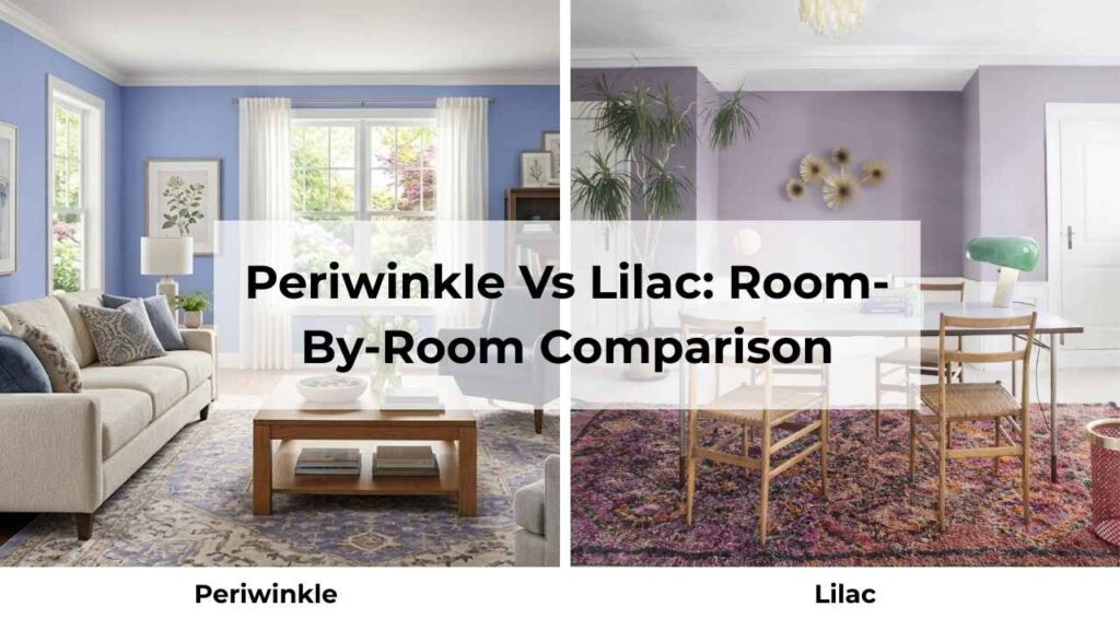
I’ve painted these colors in every room type, and they behave differently depending on the space.
The same periwinkle that’s perfect in a bedroom may look cold in a kitchen.
The lilac that’s gorgeous in a powder room may be too much in a living room.
Let me walk you through what I’ve learned from it.
Living Room
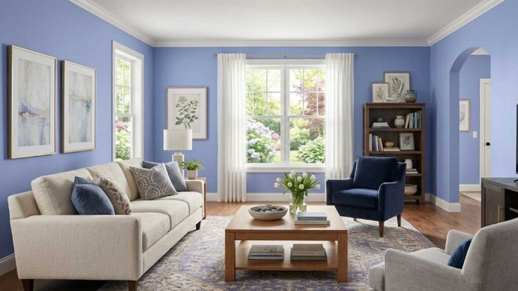
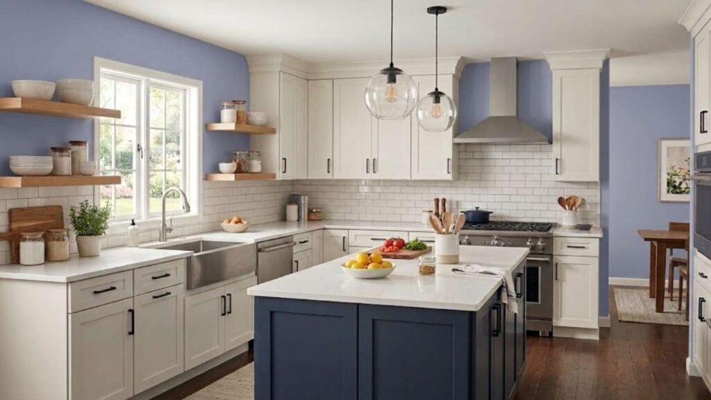
Periwinkle in a living room creates a calm, ethereal atmosphere that I love when done right.
The cool blue undertones make the space feel large and open, which is perfect if you’re working with a small living area.
I used it in a client’s living room that faced north and got limited direct sunlight.
The periwinkle HELPED, it didn’t try to fight the cool natural light, it worked with it.
BUT periwinkle can feel too detached in a living room if you don’t warm it up with the furniture and textiles.
You need warm wood tones, cream or beige upholstery like some rust or terracotta accents.
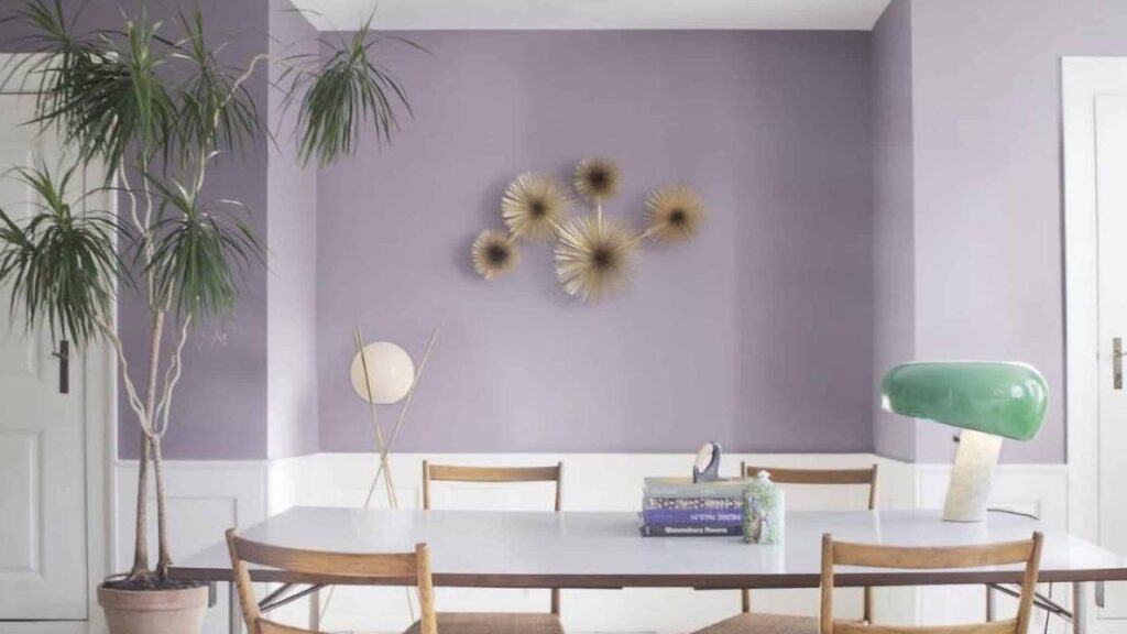
Lilac in the living room is tough to understand.
It can be stunning, but it’s specific.
I did a lilac living room ONCE.
The client was a young woman living alone who wanted a feminine, romantic space.
We went with lilac walls, white trim, a cream sofa, and gold accents and it was BEAUTIFUL but not versatile.
Lilac in living rooms works if you’re committed to the aesthetic.
If you have any hesitation, go with periwinkle or pick a different color family.
Bedroom
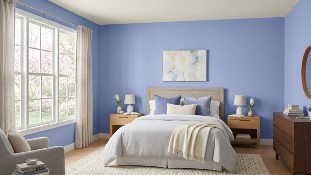
Periwinkle in bedrooms is something I recommend.
The cool, calm quality is PERFECT for sleep.
It lowers the visual energy of the room, creates a dusk-like atmosphere, and pairs well with white bedding and soft lighting.
I painted my own primary bedroom in a periwinkle-adjacent shade and I think I sleep better because it works
The key with periwinkle bedrooms is to not let them get too cold.
Add some warm metallics like brass or copper, use cream or ivory bedding instead of harsh white, and bring in wood furniture.
I made the mistake of doing an ALL-COOL-TONES periwinkle bedroom and the client said it was looking like sleeping in a cloud but not in a good way, it was too airy, too detached.
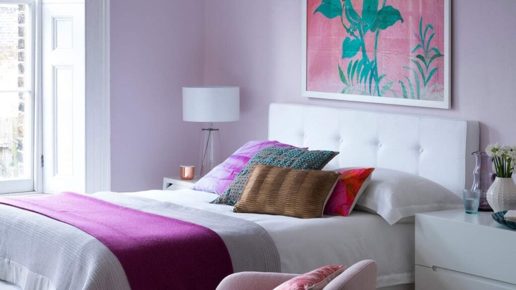
Lilac in bedrooms is lovely if you want something more energizing.
I know that sounds counterintuitive for a sleep space, but some people don’t want their bedroom to feel like a cave.
They want to wake up to something cheerful and Lilac does that.
The pink undertones add warmth and softness without being aggressive.
I used lilac in a teen bedroom and it was PERFECT.
She wanted something fun but not childish, feminine but not over-the-top.
Lilac walls, white furniture, gold accents, some greenery and she loved it.
For adult bedrooms, lilac works if you’re pairing it with the right style like romantic, soft or vintage or cottagecore.
If your style is modern or minimalist, lilac may feel too fussy.
Bathroom
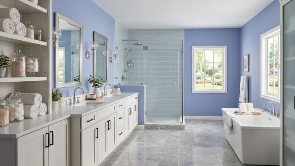
Bathrooms are interesting because the lighting is artificial and the spaces are small, so color has a BIG impact.
Periwinkle in bathrooms creates a calm feeling everyone wants but people can’t figure out how to get.
The cool blue undertones with white fixtures and chrome or brushed nickel hardware looks really good.
I did a periwinkle bathroom in my own house and it’s my favorite room.
White subway tile, periwinkle walls, white ceiling, chrome fixtures, and plants.
It feels clean, calm, and expensive.
The trick is to keep everything else simple.
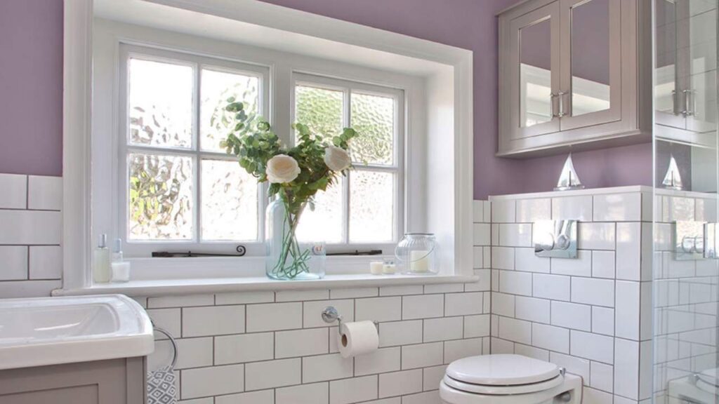
Lilac in bathrooms can be fun, especially in powder rooms where you want something personality-driven.
I did a lilac powder room with white wainscoting, brass fixtures, and a vintage mirror.
Every guest who uses the bathroom comments on it.
It’s unexpected and pretty and works.
But in a PRIMARY bathroom you should be careful with lilac.
If it’s a large bathroom with good natural light, sure.
If it’s a small, windowless bathroom with builder lighting, the lilac feels too pink and too bright.
Kitchen
Periwinkle in kitchens can work if you’re doing it as an accent like on an island, or in a butler’s pantry, or on lower cabinets with white uppers.
I’ve seen it done beautifully.
But periwinkle kitchen walls, it can feel cold and uninviting, especially because kitchens have hard surfaces.
I had a client INSIST on periwinkle kitchen walls.
I tried to talk her into a warm neutral with periwinkle accents.
She wanted the walls.
We did it. She repainted because the kitchen felt “too blue” and “not cozy.”
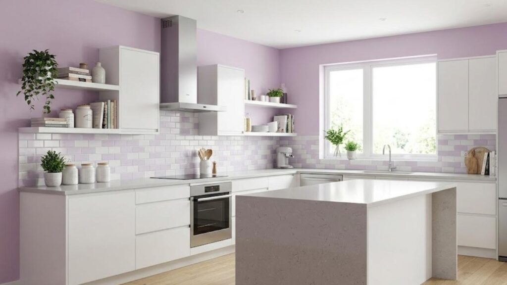
Lilac in kitchens is risky.
The pink undertones can clash with the wrong countertop or backsplash.
If you have any yellow or orange tones in your stone or tile, lilac can look off.
I’ve never done a full lilac kitchen and don’t want to.
Both colors CAN work in kitchens but only as accents or in specific design situations.
Periwinkle Vs Lilac Vs Other Colors
If you’re not sure whether periwinkle or lilac is right, it might help to see how they compare to some other purples in the same family.
I get asked about these comparisons, and there’s a lot of confusion out there.
Let me clarify based on what I’ve seen in real spaces and not on paint chips.
Periwinkle Vs Lilac Vs Lavender
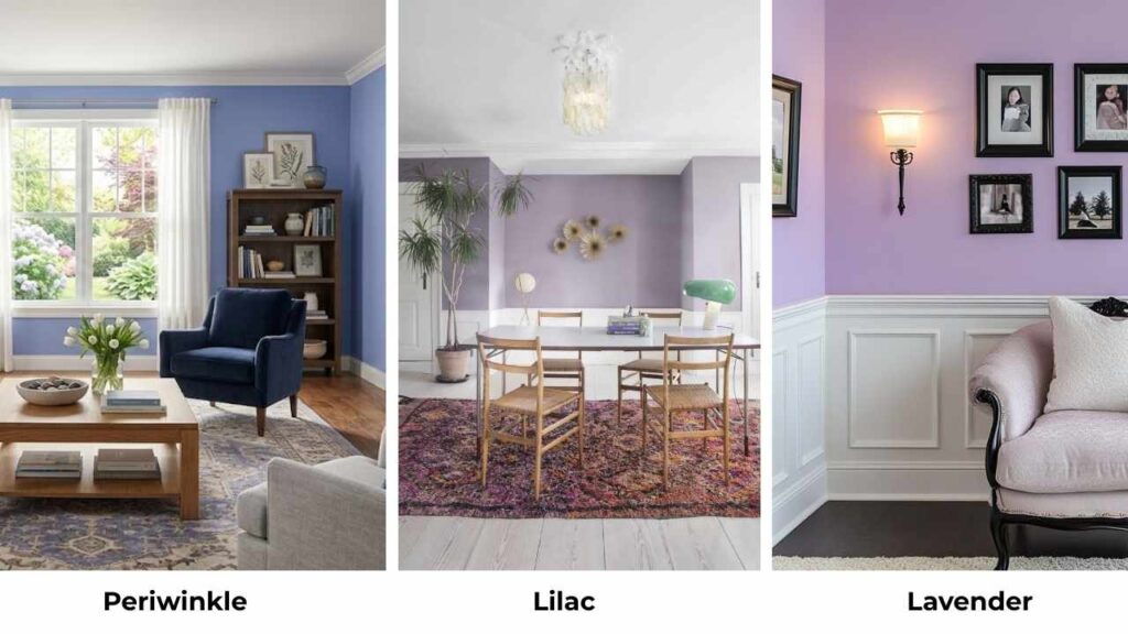
Lavender is between periwinkle and lilac, but it’s its own thing.
It’s more purple than periwinkle, less pink than lilac.
Lavender has a balanced mix of blue and red, so it looks like a true light purple.
It’s soft and more muted than lilac, but warmer than periwinkle.
I use lavender when clients want “purple” but periwinkle feels too blue and lilac feels too pink.
Lavender is also versatile, it works in more room types and with more decor styles.
If you’re between all three, lavender can be the best.
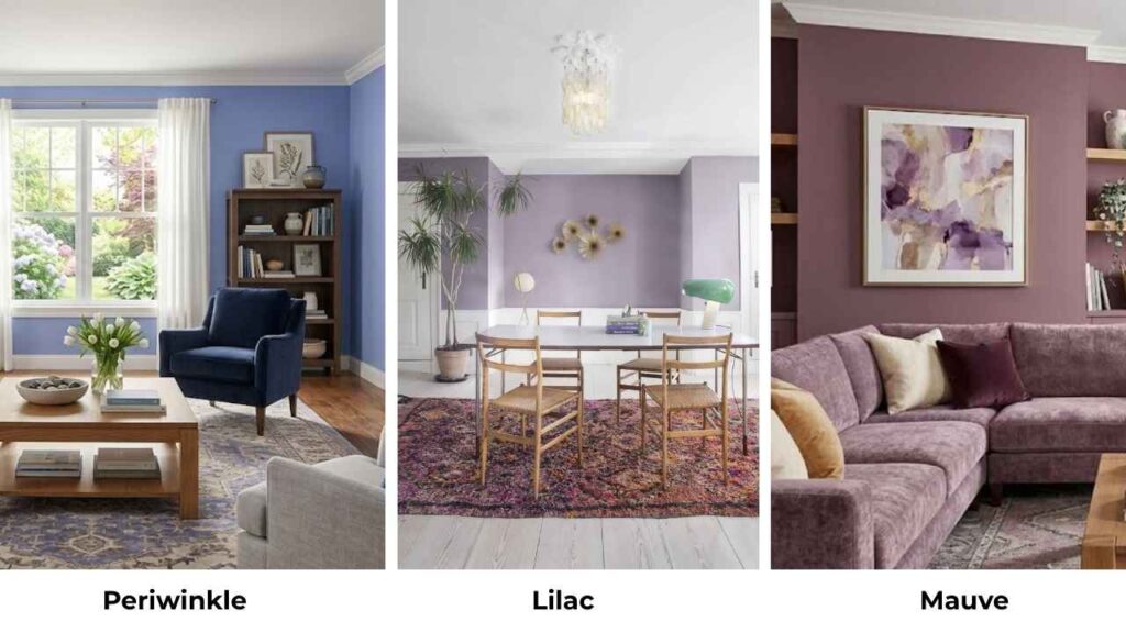
Periwinkle Vs Mauve
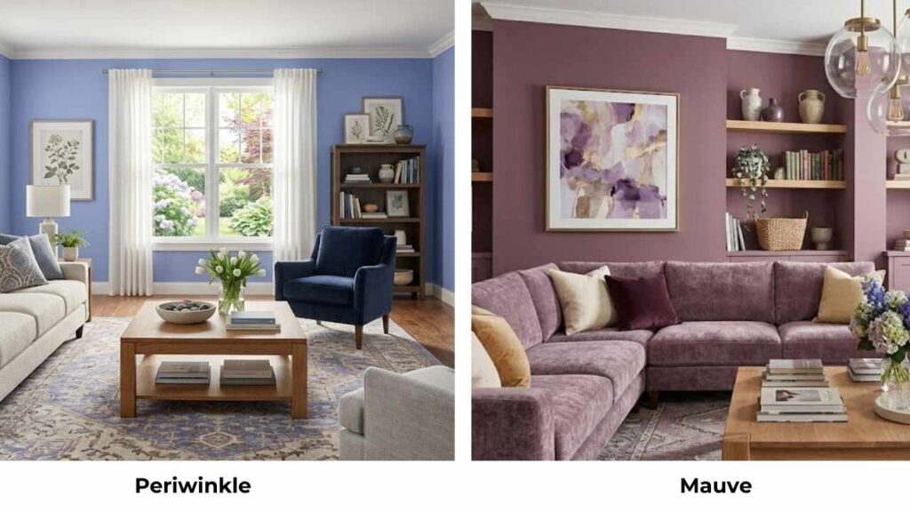
Mauve is a dusty, grayed-out purple with brown undertones.
It’s more muted than periwinkle.
Periwinkle is bright, clear, and looks more blue-purple.
Mauve can look taupe in some lights.
I love mauve for vintage or moody spaces, but it’s not giving you the same fresh, airy quality the periwinkle does.
If you want something subtle and earthy, mauve is what you should go for.
If you want something that looks like a COLOR, periwinkle is what you should go for.
Periwinkle Blue Vs Lilac
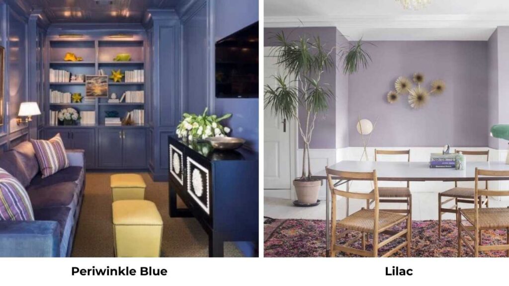
Sometimes people talk about “periwinkle blue” to emphasize the blue-leaning version of periwinkle.
It’s the same color family, making it clear we’re talking about the cool, blue-forward end of the periwinkle spectrum.
As compared to lilac, periwinkle blue is cool, fresh, and lacks any pink.
This is the comparison to make if you KNOW you don’t want warmth or pink tones in your purple.
Periwinkle Purple Vs Lilac
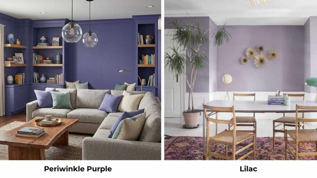
Periwinkle purple means the slightly more purple-leaning periwinkle shades, less blue, more balance between blue and purple.
These are warmer than true periwinkle but cooler than lilac.
If you like the calmness of periwinkle but want a TOUCH of warmth, a periwinkle purple can be perfect.
It’s not as pink or warm as lilac, but it’s soft and less harsh than blue-heavy periwinkle.
Conclusion
So here are the last words after working with Periwinkle Vs Lilac.
Choose periwinkle if you want cool, calm, and slightly moody.
If you love blue but want something soft.
If your space has warm elements that need balancing.
If you’re designing a bedroom, bathroom, or office where tranquility matters.
Choose lilac if you want warm, cheerful, and romantic.
If you love purple and pink tones.
If your space needs more energy and personality.
If you’re designing a powder room, closet, or feminine bedroom where matters more than neutral.
Do the swatch test and take samples.
Paint big sections on your wall.
Live with them for a few days.
See them in different lights.
I’ve repainted rooms to know that the “right” color is the one that makes you happy when you walk in.
Both periwinkle and lilac are beautiful.
FAQs On Periwinkle Vs Lilac
Periwinkle is BOTH, which is why it’s confusing. It’s a blue-purple or blue-violet, but the blue dominates. If you had to pick one, I’d call it blue with purple undertones. On the color spectrum, it is between blue and violet, leaning toward blue rather than true purple.
Periwinkle is blue and cool. Lavender is balanced between blue and red, so it looks true purple. Periwinkle appears brighter than lavender because lavender is more muted. Lavender is also warmer than periwinkle because it has red in the mix.
Periwinkle has blue undertones and feels cool; lilac has pink undertones and feels warm. Periwinkle is better for calm, serene spaces. Lilac is better for cheerful, romantic spaces. Periwinkle pairs with blues and grays. Lilac pairs with pinks and golds.
Navy blue, soft greens, gray, white, cream, and deep plum work beautifully with periwinkle. I also love it with natural wood tones and metallic accents like brass or copper to warm it up. Avoid pairing it with too many other cool tones or it’ll feel cold.