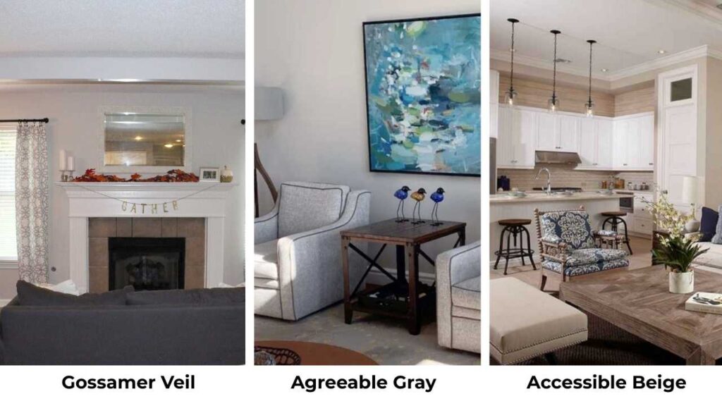
Gossamer Veil vs Agreeable Gray, if you’ve spent time scrolling through paint color reviews or looking at Sherwin-Williams samples, you’ve looked at these two.
They’re both popular neutrals, and I get why people like them.
But here’s the thing that makes choosing between Gossamer Veil vs Agreeable Gray confusing, that they look different depending on your lighting.
I’ve worked with both colors many times and what I’ve learned is that undertones aren’t some fancy design term but they’re the main reason a paint color either works or not in your space.
Gossamer Veil is warm with the green undertones that can look violet, while Agreeable Gray has more pink and tan.
Sounds simple but in a north-facing room and in a south-facing room, they’re two different colors.
The wrong undertone can make your whole space feel off.
So here, I’m breaking down what makes Gossamer Veil Vs Agreeable Gray different, how lighting makes them different, which rooms they work in, and when you should pick one.
I’ll also put in some comparisons with other colors.
Here are my other blogs that you can also read:
- Peppercorn Vs Iron Ore
- Light French Gray Vs Agreeable Gray
- Sherwin Williams Natural Tan Vs Accessible Beige
- Quite Moments Vs Sea Salt
- Perfect Greige Vs Agreeable Gray
What You Need To Know About Gossamer Veil (SW 9165)
Gossamer Veil is one of the colors that looks like an off-white but then you get it on your walls and it is more than that.
It’s a warm greige, the gray-beige hybrid which everyone wants, but it is lighter than greiges.
The LRV is 62, which is reflective.
For context, anything above 60 is bouncing a good amount of light back at you.
What makes Gossamer Veil interesting is the undertones.
It has primarily green undertones with occasional violet flashes depending on your light.
I know it shows green AND violet sometimes, but in some rooms, mainly north-facing ones with cool light.
This is more of a very light greige than a true gray.
In rooms with natural light, it can look almost beige.
Put it in a dark space and it shifts gray, which is why it works as a whole-house color, it transitions between bright and dim rooms without looking different.
I’ve used it in living rooms where people wanted something lighter than greige but didn’t want all white.
The green undertones are the key.
They make it feel warm and less sterile than cool grays.
If you’ve natural wood trim or earthy stone anywhere, Gossamer Veil plays well with that.
Sometimes you don’t need to paint trim white because the color works with wood.
What You Need To Know About Agreeable Gray (SW 7029)
Agreeable Gray is the most famous paint color by Sherwin-Williams.
It’s one of their best-selling colors and I see it EVERYWHERE.
It’s a medium-light greige which balances gray and beige almost perfectly, which is why it’s versatile.
The LRV is 60, slightly darker than Gossamer Veil but it is more saturated and present on walls.
The undertones here are different.
Agreeable Gray has pink, yellow, and tan undertones rather than green.
In low light, it can look fleshy.
In bright light, it stays neutral and balanced.
That’s part of why people love it because it doesn’t shift as some neutrals do.
I’ve recommended Agreeable Gray for clients who want a dependable, modern neutral that works with any decor style.
It feels airy but grounded.
It’s popular in living rooms, bedrooms, kitchens and anywhere.
Bathrooms too, but you need to be careful with your lighting in there because the pink undertones can get out of place with some lights.
The reason it’s considered versatile is because it works with both warm and cool accent colors.
You can pair it with warm wood, cool metals and colorful furniture because it adapts.
That’s why builders and flippers use it, because it’s a safe choice that looks intentional.
Gossamer Veil Vs Agreeable Gray: Key Differences
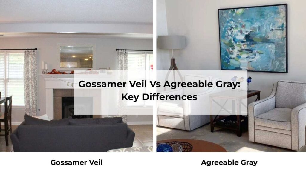
Gossamer Veil Vs Agreeable Gray are warm greiges from Sherwin-Williams, but they’re not interchangeable.
So, let’s look at the key differences which make them different from each other.
The Light Reflectance Value difference looks small, Gossamer Veil at 62 and Agreeable Gray is at 60, but the two points matter.
Gossamer Veil reflects more light and can disappear into an off-white in bright rooms.
Agreeable Gray holds its presence better and is more clearly a color rather than almost-white.
Undertones
This is where they split.
Gossamer Veil has the green undertones with violet flashes.
It’s warm but clean. The green keeps it from looking too beige or creamy.
Agreeable Gray has pink, tan, and yellow undertones.
It’s warm in a different way, soft and a little cozy.
But in the wrong light, the pink can come stronger than you want.
If you put them side by side, Gossamer Veil looks fresh and Agreeable Gray looks soft.
Lighting Affect
Light is everything with these two.
Gossamer Veil in north-facing rooms stays soft and neutral.
It leans more gray and you may see the violet flash.
In south-facing rooms with warm, direct sunlight, it warms up and looks beige.
It’s adaptable though, I’ve used it in dark entryways and bright kitchens and it works in both.
Agreeable Gray handles lighting more consistently.
It doesn’t shift as much between north and south light.
It stays stable, which some people prefer.
But if you’ve cool lighting like some LEDs, then the pink undertones can get pronounced.
Here’s what I tell people through my experience: if your room gets natural light and you want something that almost looks white but isn’t, go with Gossamer Veil.
If you want a neutral with visible depth and consistency in different lights, go with Agreeable Gray.
Style and Best Uses
For trim, Gossamer Veil pairs well with bright whites like Extra White or Pure White.
You can use soft off-whites like Alabaster or Greek Villa.
What you don’t want is creamy whites, because they’ll clash with the green undertones.
I learned that one on a project where the existing trim was Westhighland White (creamy) and Gossamer Veil walls looked wrong next to it.
Agreeable Gray also works with Pure White, Extra White, and Alabaster for trim.
It’s a little forgiving with warmer whites than Gossamer Veil is.
For accent colors, I’ve used Fawn Brindle as an accent wall color with Gossamer Veil walls to give a cohesive look.
With Agreeable Gray, you’ve more flexibility because it’s neutral.
| Feature | Gossamer Veil (SW 9165) | Agreeable Gray (SW 7029) |
| LRV | 62 | 60 |
| Undertones | Green with violet flashes | Pink, tan, yellow |
| Appearance | Very light greige, almost off-white | Medium-light greige, more saturated |
| Best Lighting | Works in both bright and dim, shifts more | Consistent across lighting conditions |
| Warmth | Warm but clean | Warm and soft |
| Best Trim | Extra White, Pure White, Alabaster | Pure White, Extra White, Alabaster |
| Style | Modern, Scandinavian, coastal, minimal | Transitional, farmhouse, contemporary |
Gossamer Veil Vs Agreeable Gray (Room-By-Room Comparison)
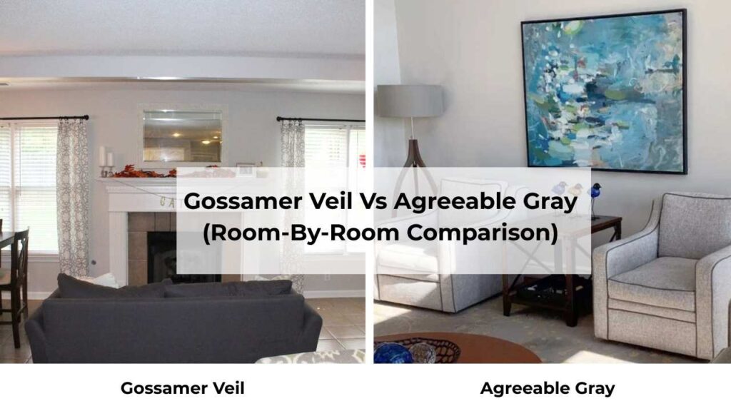
Okay, theory is great but let’s talk about real rooms.
Because how these colors look in a space is what matters.
Living Room
Gossamer Veil in a living room feels light and open.
If you’ve big windows and natural light, it’s gorgeous like airy without being harshly white.
It works well in modern or Scandinavian-style living rooms where you want a soft backdrop for furniture and art.
Agreeable Gray in a living room gives you presence.
It’s neutral but it feels intentional, more like a color choice rather than “almost white.”
I’ve used it in traditional and transitional living rooms where people wanted warmth but also wanted the walls to have some depth.
It’s nice if you’ve dark furniture or you’re trying to create contrast with white trim.
Bedroom
Gossamer Veil in bedrooms are soft.
It’s calming without being cold, and it shifts throughout the day which can be nice, cool and more gray in morning light, warm and beige in the evening.
I’ve done it in master bedrooms and guest rooms and it worked well.
Agreeable Gray is popular in bedrooms, and it’s hard to go wrong.
It’s cozier than Gossamer Veil because of the warm undertones.
If your bedroom doesn’t get natural light, Agreeable Gray can be the better shade because Gossamer Veil can look flat in dim spaces.
Bathroom
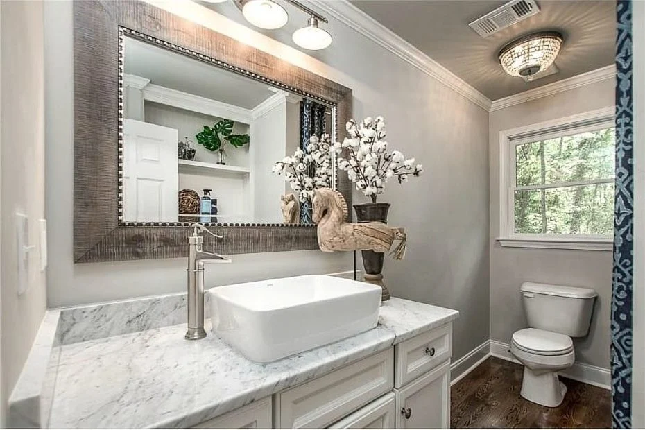
Bathrooms are tricky because lighting is artificial and not great.
Gossamer Veil in a bathroom can look clean and spa-like, if you’ve good natural light from a window.
But check your vanity lighting.
If you’ve got warm bulbs, it’ll look beige and with cool bulbs, it’ll look gray.
Agreeable Gray in bathrooms is popular but watch the pink undertones.
I’ve seen it look off with some lighting.
If you’re doing Agreeable Gray in a bathroom, test it with your light fixtures before committing.
Use Samplize peel-and-stick samples or paint a poster board and move it around the room at different times of day.
Kitchen
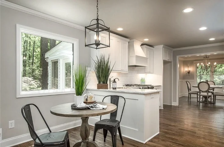
Gossamer Veil in kitchens works best if you’ve white or light cabinets and want the walls to almost recede.
It’s clean and fresh.
I used it once in a kitchen with white cabinets and a Retreat-colored island and it was perfect, the walls didn’t compete with the island color.
Agreeable Gray is common in kitchens.
It’s neutral to work with most cabinet colors like white, gray and some wood tones.
It gives you more warmth than other grays, which can feel cold in a kitchen.
Exterior
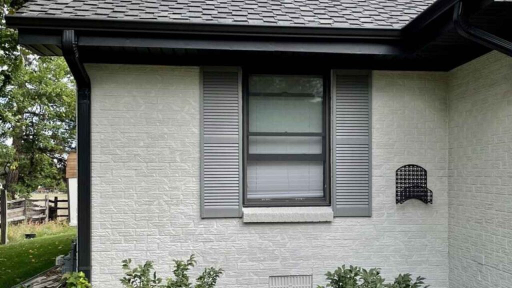
Gossamer Veil on exteriors can look almost white in direct sunlight.
Exterior light is brighter than interior, so colors can appear lighter outside.
Gossamer Veil becomes a soft, warm near-white on siding or painted brick.
It’s fresh and clean without being harsh.
I’ve seen it paired with Fawn Brindle or Iron Ore for trim and shutters look gorgeous.
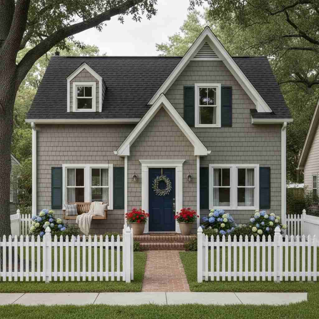
Agreeable Gray on exteriors gives you more color presence.
It looks like a definite greige rather than almost-white.
It’s a safe, modern choice that works on various architectural styles.
It pairs nicely with white trim (Extra White) or you can go bold with dark trim like Iron Ore or Classic French Gray for shutters.
Gossamer Veil Vs Agreeable Gray Vs Other Colors
Because you’re wondering about other options too.
Gossamer Veil Vs Accessible Beige
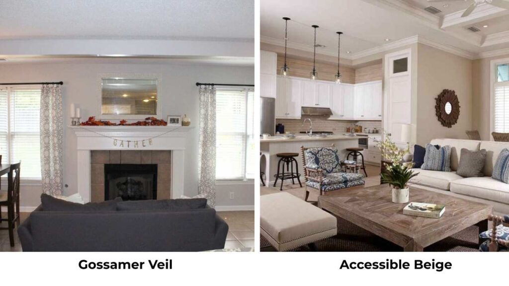
Accessible Beige is warm and more beige than Gossamer Veil.
If Gossamer Veil is a greige leaning toward gray, Accessible Beige is a greige leaning toward beige.
It has more tan and less green undertone.
Pick Accessible Beige if you want warmth; pick Gossamer Veil if you want something light and clean.
Gossamer Veil Vs Repose Gray
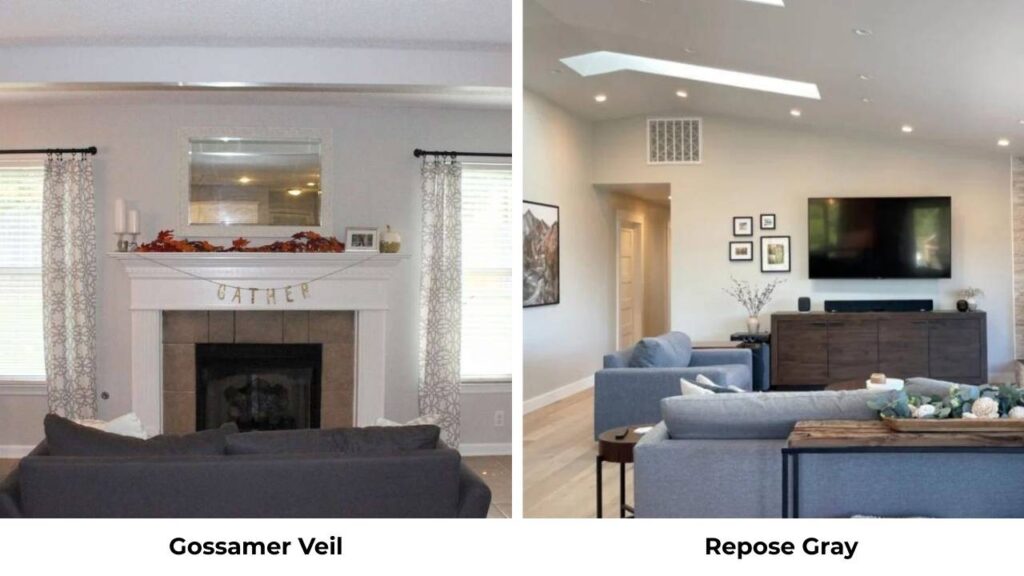
Repose Gray is cooler with strong violet undertones.
Do NOT use these two together because they can clash.
Repose Gray is a cool gray; Gossamer Veil is a warm greige.
They don’t play nice.
I’ve seen people try to use Repose Gray trim with Gossamer Veil walls and it looks wrong.
Gossamer Veil Vs Drift of Mist
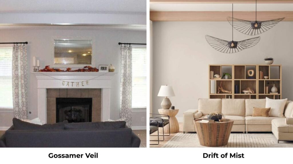
Drift of Mist is light in LRV but feels heavy because it has cool violet undertones.
Gossamer Veil feels airy and warm.
They’re not good substitutes for each other.
Gossamer Veil Vs Edgecomb Gray
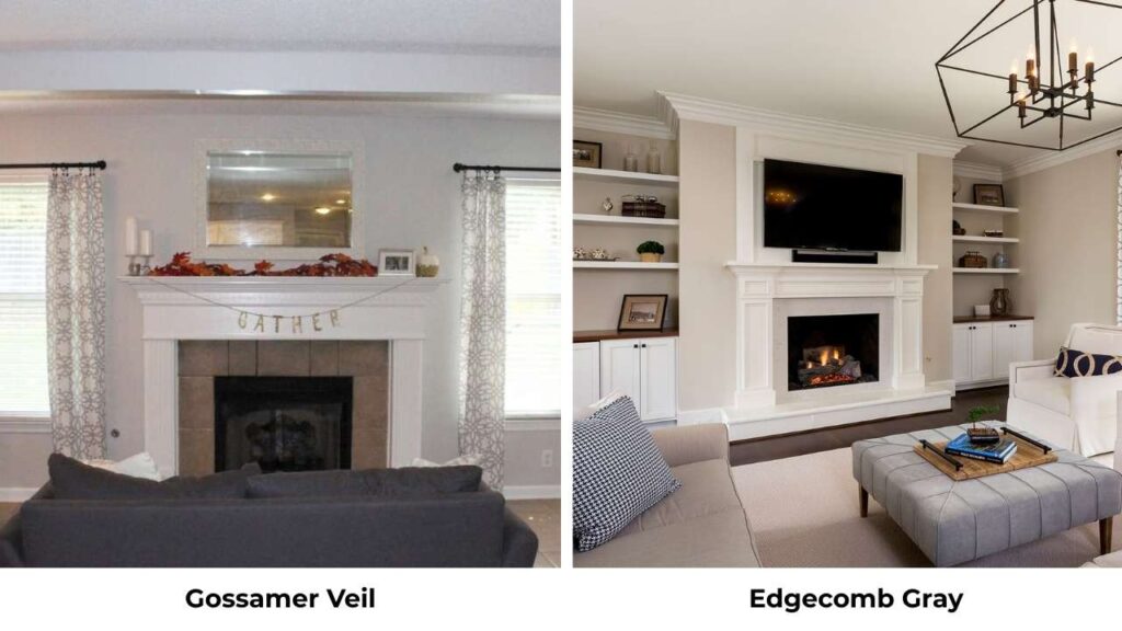
Edgecomb Gray (Benjamin Moore) is warm and more yellow-beige.
Gossamer Veil is light and has green undertones instead of yellow.
Edgecomb looks as a true beige-greige; Gossamer Veil reads light and gray.
Gossamer Veil Vs Alabaster
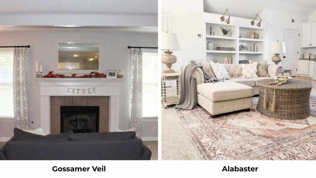
Alabaster is an off-white, not a greige.
It’s light with the LRV in the 80s and has warm undertones but it’s white.
Use Alabaster if you want white; use Gossamer Veil if you want a light greige that gives you a bit of color.
Gossamer Veil Vs Pale Oak
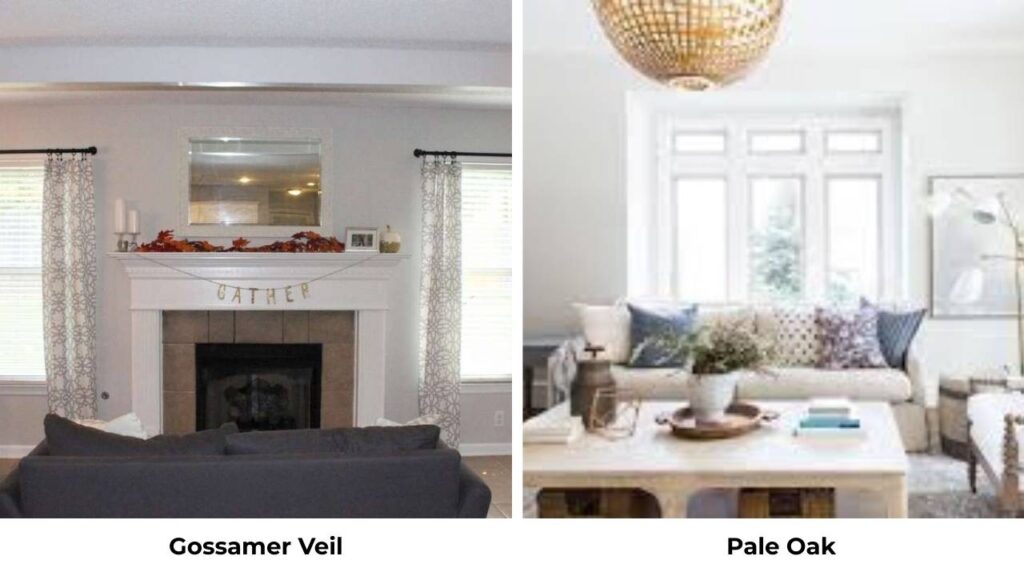
Pale Oak Benjamin Moore is the same in lightness but has more beige and less green.
Pale Oak is warm.
If you want a clean, green-toned look, Gossamer Veil is what you should go for.
Gossamer Veil Vs Revere Pewter
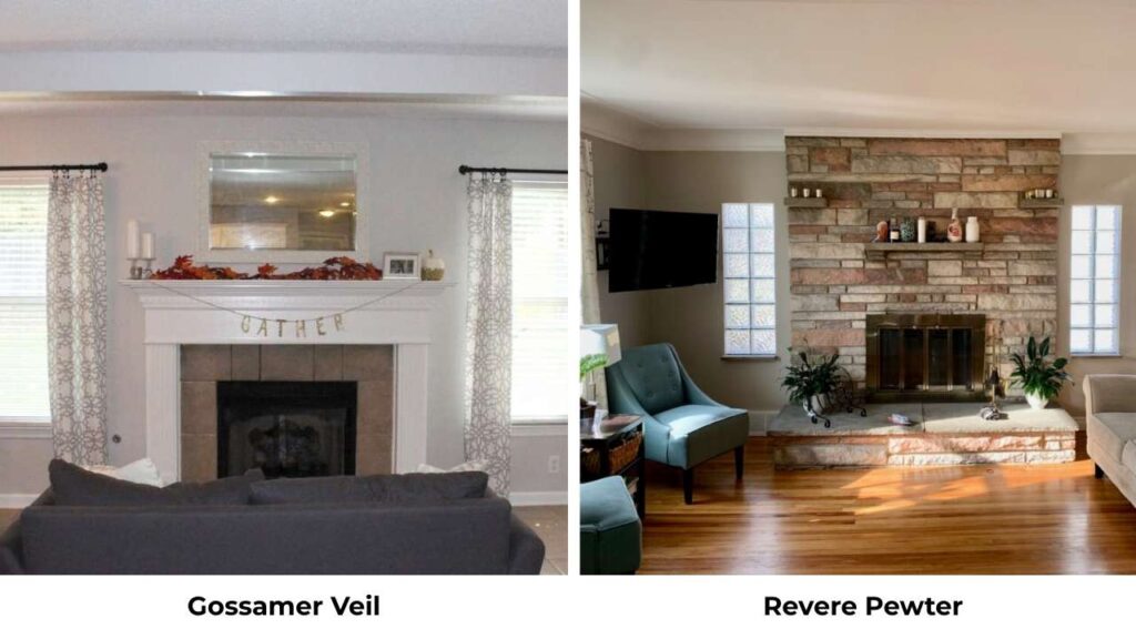
Revere Pewter Benjamin Moore is darker and has a gray presence.
It’s got green undertones too but is much more gray rather than an almost-white.
Revere Pewter is for when you want a true greige with depth; Gossamer Veil is for when you want light and airy.
Gossamer Veil Vs City Loft
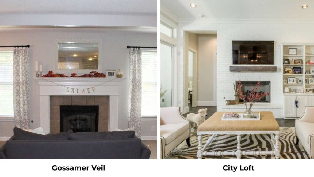
City Loft (SW) is cool and more gray, but less warmth, less beige.
If you want cool modern gray, go with City Loft.
If you want warm greige, Gossamer Veil.
Gossamer Veil Vs Mindful Gray
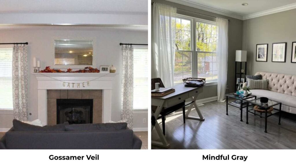
Mindful Gray (SW) is a true medium gray with taupe undertones.
It’s dark and more saturated than Gossamer Veil.
Different category, Mindful Gray is for when you want gray on the walls, not a light neutral.
| Color | Brand | LRV | Undertones | Comparison to Gossamer Veil |
| Agreeable Gray | SW | 60 | Pink, tan, yellow | Slightly darker, warmer, more saturated |
| Accessible Beige | SW | 58 | Warm beige | More beige, less gray, warmer |
| Repose Gray | SW | 58 | Violet | Cooler, clashes with Gossamer Veil |
| Drift of Mist | SW | 67 | Cool violet | Lighter LRV but feels heavier, cooler |
| Alabaster | SW | 82 | Warm white | True off-white, much lighter |
| Revere Pewter | BM | 55 | Green-gray | Darker, more gray presence |
| Pale Oak | BM | 69 | Warm beige | More beige, less green |
When To Choose Gossamer Veil and Agreeable Gray?
Choose Gossamer Veil when:
- You want a light, airy neutral that looks almost white
- Your rooms get lots of natural light and you want softness
- You’re going for modern, Scandinavian, coastal, or minimal style
- You want a house color that stays light and cohesive
- You prefer clean undertones green over pink or tan
- You’re pairing with bright white trim and want subtle contrast
Choose Agreeable Gray when:
- You want a neutral with presence and depth
- You need something versatile that works with different styles
- You want a color that’s consistent in various lighting
- You’re doing a rental or resale and need broad appeal
- You prefer a cozy, warm feel
- You want the popular, safe neutral available
But honestly, both are solid choices.
You can’t go wrong with either.
But they’re different in that one will feel right for your space than the other.
Test them both with samples in your rooms before deciding.
Conclusion
Gossamer Veil Vs Agreeable Gray are both popular for good reason because they’re versatile warm greiges that work in spaces.
But they’re not the same.
Gossamer Veil is light, has green undertones, and looks almost like an off-white in bright spaces.
Agreeable Gray has depth, pink and tan undertones, and gives you a visible neutral on the walls.
The important factor is lighting.
Test these in your space with your light.
What looks perfect in a south-facing living room may not look wrong in a north-facing bedroom.
I’ve used both colors many times and here’s my honest reaction, Gossamer Veil is my consideration when someone wants light and modern.
Agreeable Gray is my consideration when someone wants dependable and warm with more presence.
Grab some Samplize samples, stick them on your walls, and live with them for a few days.
Watch how they change from morning to evening.
It’ll tell you which one is right for your space way better than the other one.
FAQs On Gossamer Veil Vs Agreeable Gray
Gossamer Veil is lighter (LRV 62 vs 60), but other lighter options include Alabaster (LRV 82), Pure White (LRV 84), Drift of Mist (LRV 67), and Pale Oak (LRV 69). If you want to stay in the greige family but go lighter, Gossamer Veil or Pale Oak are what you should consider.
Yes. Warm greiges like Gossamer Veil are very popular and aren’t going anywhere. The trend has shifted away from cool grays toward warm neutrals, and Gossamer Veil fits perfectly in the category.
For Gossamer Veil: Extra White, Pure White, or Alabaster for trim. Fawn Brindle for accents. Avoid creamy whites like Shell White or cool grays like Repose Gray.
Green is the primary undertone, with occasional violet flashes in some lighting conditions. The green undertone is what makes it feel warm but clean, different from grays with pink or beige undertones.