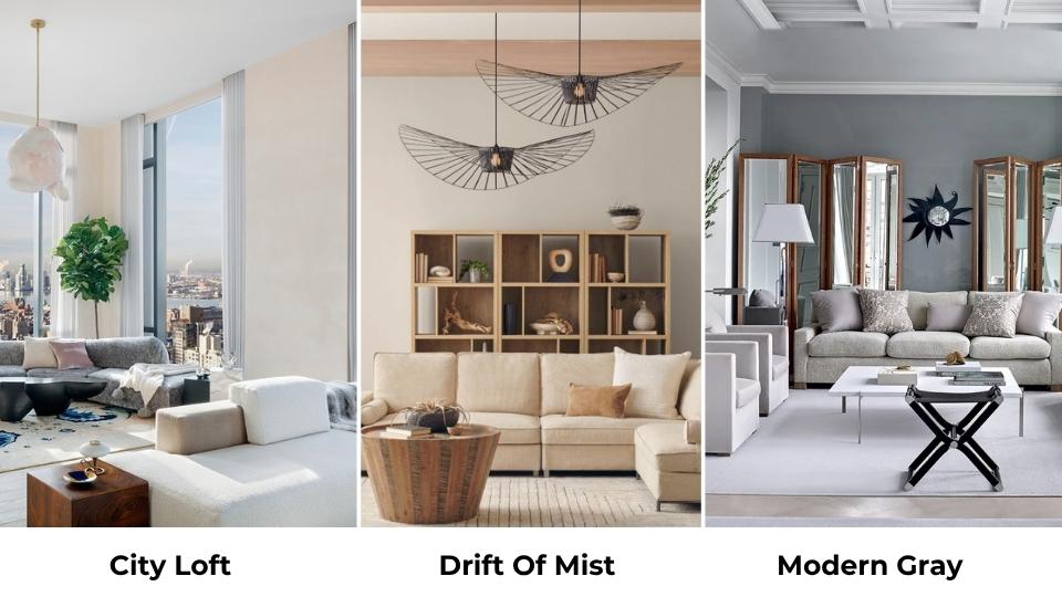
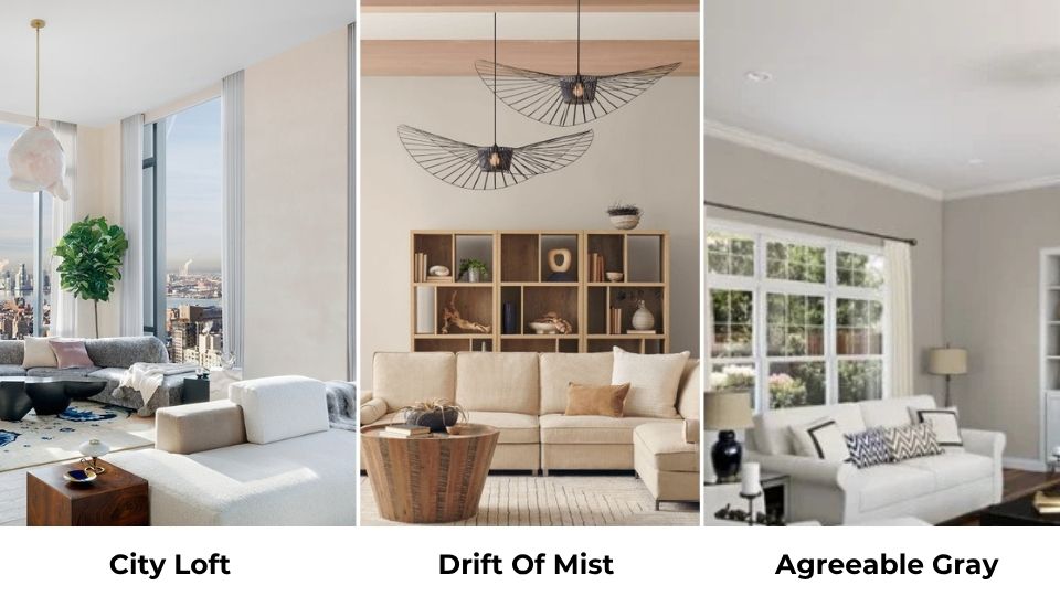
City Loft and Drift of Mist are two Sherwin Williams paint colors. Both are light neutrals that look identical in the small paint swatches, but here’s what nobody tells you, City Loft Vs Drift of Mist is not only about picking the lighter one or the one with the good name.
These colors have different personalities when they are on your walls, and I’ve seen many homeowners repaint their rooms because they didn’t catch the undertone differences.
The thing about subtle undertones is they’re only subtle. I’ve worked with both the colors in bedrooms, bathrooms, living rooms, kitchens, and exteriors, and the lighting in each space can make City Loft look like a different color.
Same goes for Drift of Mist, though it’s more forgiving. Choosing the wrong neutral isn’t annoying but it impacts how your space feels, how your furniture looks against the walls, and whether your trim looks dingy or bright.
So, we’re breaking down the color profiles of City Loft Vs Drift of Mist, comparing their LRV, their undertones, and walking through how each color looks in different rooms.
I’m throwing in comparisons with other popular neutrals like Agreeable Gray and Modern Gray because if you’re considering these two, you’re looking at these too.
With coordinating colors, styling tips, and the mistakes I’ve seen.
Here are my other blogs that you can also read:
- Crimson Vs Burgundy
- Clay Saga Vs Evergreen Fog
- Sw Extra White Vs Pure White
- balanced Beige Vs Accessible Beige
- Quite Moments Vs Sea Salt
Color Profile of Sherwin Williams City Loft (SW 7631)
City Loft is a bit tricky, soft, warm off-white with subtle greige undertones, and that sounds perfect for about everything. The reality is complicated. HEX code: #DFDAD1 and RGB value: 223 / 218 / 209.
The base is greige, the gray-beige hybrid that’s been everywhere but City Loft is more toward a muted beige with gray to keep it from looking tan.
What makes it interesting is the violet-pink undertone that shows up when you least expect it.
I used City Loft in a client’s bedroom that faced north, and in the morning light, it was a beautiful soft greige and by the afternoon it was slightly lavender.
We ended up switching to Pure White for the trim, which is a soft white that goes better with City Loft’s violet tendencies.
The LRV of 70 means City Loft reflects light. It’s bright without being harsh, which is great for rooms that need to feel airy and open.
But in bright spaces with south-facing windows, City Loft can wash out. It loses its character and becomes flat.
Where City Loft works well is in modern and transitional interiors that want the soft, subdued vibe without going white.
It pairs well with warm wood tones, mainly with light oaks and white-washed finishes. It’s also good on kitchen cabinets if you’re careful about your countertop choices.
Designers and homeowners pick City Loft when they want something lighter than Agreeable Gray but not as bright as a true white. It is in an in-between zone that can be perfect or problematic.
Color Profile of Sherwin Williams Drift of Mist (SW 9166)
Drift of Mist is the stable one. If City Loft is the friend who changes their personality depending on who they’re around, Drift of Mist is the one who stays consistent.
HEX code: #DCD8D0 and RGB value: 220 / 216 / 208.
This color is a soft, light greige with a balanced mix of gray and beige that is slightly warm.
The base is more gray than City Loft, which gives it a calm and neutral presence.
But Drift of Mist has a subtle green undertone. Not always visible, but there when you put it next to cool whites or in rooms with specific lighting.
I tested Drift of Mist in my own living room and that green undertone stayed quiet.
It looks lovely, muted greige that feels warm without being creamy. But I’ve seen it in north-facing rooms where that green gets obvious, if you have cool-toned flooring or gray countertops.
The LRV is 69, identical to City Loft, so they’re equally bright on paper. But Drift of Mist feels deeper because it has more gray pigment.
It doesn’t wash out as easily in bright spaces, and it holds its color better across different times of day.
What makes Drift of Mist popular is its versatility. It works in modern, transitional, and contemporary interiors without feeling too trendy or too safe.
It’s calm and muted for bedrooms where you want the serene vibe, but it has presence for living rooms and open-concept spaces.
Homeowners and designers choose Drift of Mist when they want a home color that won’t fight with existing finishes.
It pairs well with wood tones, that slight warmth in the base prevents the cool clash you get with straight grays. It’s also fantastic in bathrooms where you want something soft but not cold.
City Loft Vs Drift of Mist: Key Differences, Undertones and Uses
Here’s where we get into the details that matter when you’re standing in the paint aisle with sample cards, squinting at colors that look exactly the same under fluorescent lights.
They’re not the same. Not even close once they’re on your walls. So, let’s get into the main differences of City Loft Vs Drift of Mist and look at what will enhance it more.
LRV
City Loft has an LRV of 70. Drift of Mist has an LRV of 69. On the surface, the one-point difference is nothing.
Both colors reflect nearly the same amount of light, both qualify as light neutrals, and both will brighten a space without going white.
But City Loft feels lighter because it has less gray pigment. It’s closer to an off-white, mainly in well-lit spaces.
Drift of Mist holds its color depth more because of the gray base, so though the LRV is identical, it looks slightly more grounded.
If you’re working with a room that has limited natural light, both colors will work, but Drift of Mist will give you a soft vibe without going dingy.
City Loft looks too cool in low light, especially if the violet undertones start showing up.
Undertones and Color Depth
City Loft has violet-pink undertones with a warm greige base. The undertones are subtle but they’re there, and they become visible in some lighting conditions.
North-facing rooms bring them out. Artificial lighting can make them obvious. If you have cool-toned finishes, the undertones may clash.
Drift of Mist has green undertones with a gray-beige base. The green is quiet, but it can emerge when you don’t expect it, especially next to pure whites or in rooms with natural greenery outside the windows reflecting in.
I’ve had clients panic about the green, but it’s less problematic than City Loft.
City Loft is bright and fresh. Drift of Mist is warm and muted. If you paint them side by side, City Loft looks like the light, cool option, and Drift of Mist looks settled and neutral-warm.
Aesthetic and Lighting
Lighting changes everything with these colors. You HAVE to test these in your space at different times of day.
City Loft in north-facing light: Cool, the violet undertone becomes more visible, can feel flat.
City Loft in south-facing light: Light, warm, soft, almost washes out if there’s too much direct sun.
City Loft under artificial lighting: Depends on your bulbs, but warm yellow lighting can bring out the beige, while cooler LED lighting emphasizes the gray and violet.
Drift of Mist in north-facing light: Stays neutral, shows a hint of green, but doesn’t go cold.
Drift of Mist in south-facing light: Warm and soft without losing its character or washing out.
Drift of Mist under artificial lighting: More stable, warm lighting keeps it cozy, cool lighting keeps it neutral.
City Loft looks more modern and minimal, it’s the almost-white neutral that works in contemporary spaces with clean lines and not visual clutter.
Drift of Mist feels more livable and grounded, it works in family homes, transitional spaces, and rooms where you need the color to be a background, not a statement.
Styling and Best Uses
Styling these colors means understanding what plays well with their undertones. For City Loft, you want Pure White or Snowbound on the trim.
Pure White is soft and won’t create a harsh contrast. Your furniture should lean warm, cool gray sofas emphasize the violet undertones.
Accent colors that work are soft blues, muted greens, warm beiges, and blush tones that echo the pink undertone.
For Drift of Mist, Pure White or Alabaster on the trim both work beautifully. Alabaster has more warmth, which plays nicely with Drift of Mist’s character.
For furniture, you have flexibility like warm woods, cool grays and black accents look good because the base is balanced.
Accent colors like deep greens, warm terracotta, soft navy, and natural linen tones.
I keep them white with both colors either Pure White or whatever your builder white is if it’s not too yellow. The contrast helps define the space without feeling harsh.
| Feature | City Loft (SW 7631) | Drift of Mist (SW 9166) |
| LRV | 70 | 69 |
| Base Color | Soft off-white with greige | Light greige with gray-beige |
| Undertones | Violet-pink, taupe | Green, warm gray |
| Best Lighting | South-facing, bright spaces | Versatile, all exposures |
| Aesthetic | Modern, crisp, minimal | Warm, grounded, transitional |
| Trim Pairing | Pure White, Snowbound | Pure White, Alabaster |
| Best For | Bright rooms needing softness | Whole-home color, versatile spaces |
City Loft Vs Drift of Mist: Room-By-Room Comparison
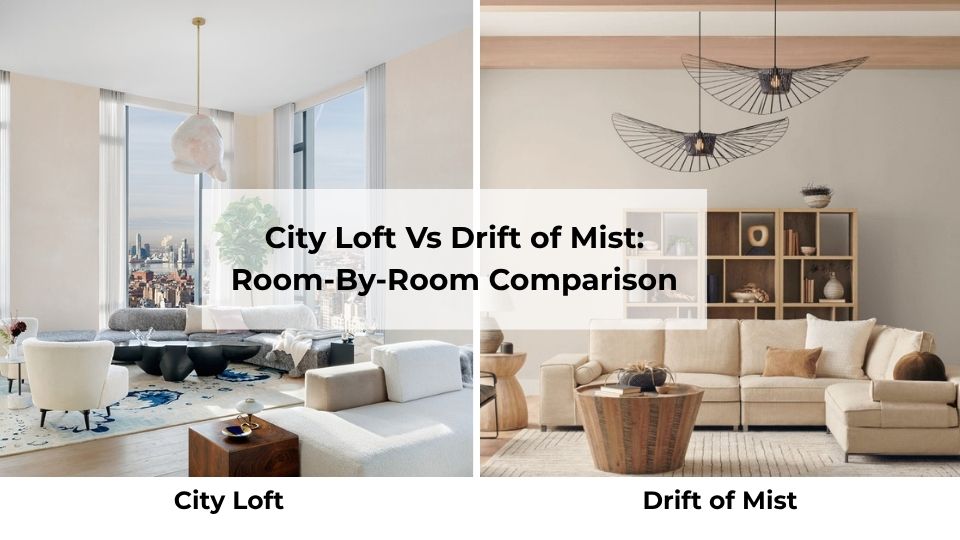
Let’s talk about how these colors look in real rooms because that’s where theory meets reality, and sometimes reality is not pretty.
Living Room
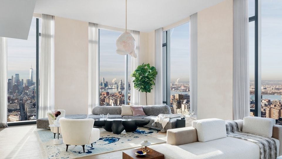
City Loft in a living room works best when you have great natural light and a modern aesthetic.
I used it in an open-concept living room with 10-foot ceilings and huge south-facing windows, and it was perfect, bright, airy, and made the space feel big.
The homeowner had light oak floors and a cream sofa, so everything stayed in the same warm-but-not-too-warm zone.
Where it didn’t work, a client’s north-facing living room with dark wood floors. City Loft went cool and flat, and the violet undertones made the space feel cold instead of cozy.
We ended up switching to Drift of Mist, which brought warmth back in.
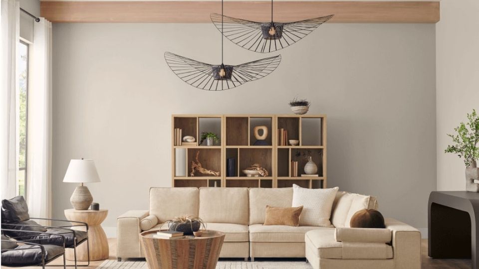
Drift of Mist in a living room is flexible. It works in bright spaces without washing out, and it works in low-light spaces without feeling dingy.
I’ve used it in many open-concept spaces where the living room flows into the kitchen and dining area, and it carries beautifully without feeling different in each zone.
Bedroom
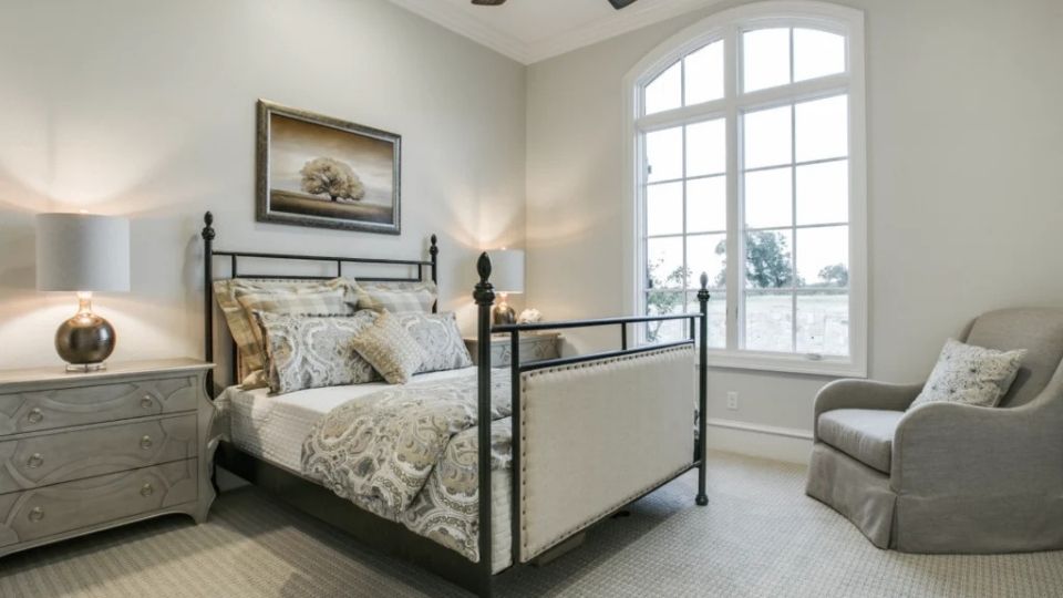
City Loft in a bedroom is lovely if your room gets morning light and you want the fresh, airy wake-up vibe.
But if your bedroom is your sanctuary and you want cozy, City Loft can feel too light and too cool, especially at night under artificial lighting.
I’ve had clients tell me their City Loft bedrooms feel “too awake”.
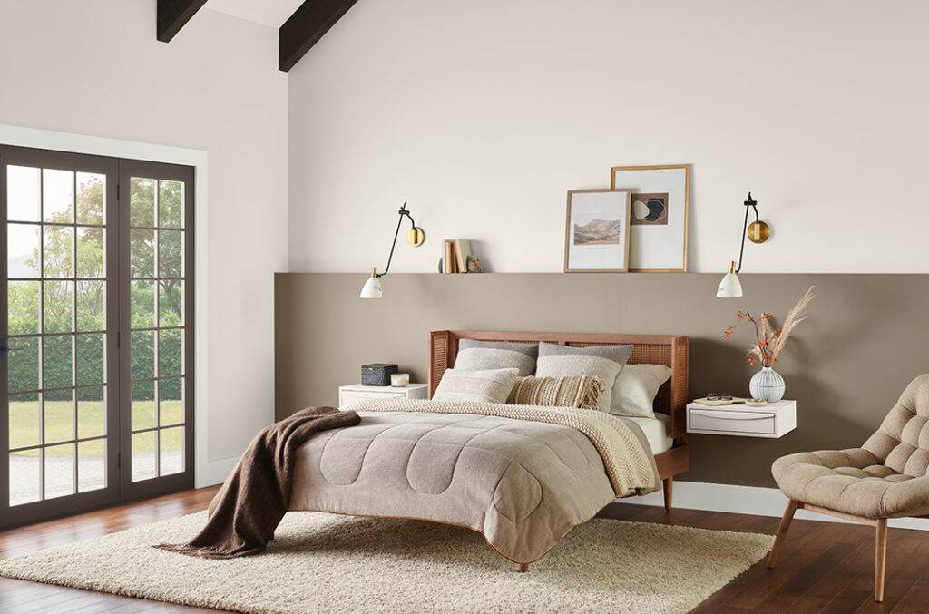
Drift of Mist in a bedroom is where this color shines. It’s soft without being cold, warm without being creamy, and it creates a wrapped feeling that bedrooms need.
I used it in my own bedroom, and it’s perfect. Morning light, evening light, middle of the night it stays calm and neutral.
Bathroom
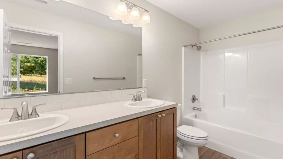
City Loft in a bathroom can work if you have good natural light and warm-toned fixtures.
I’ve seen it look great in bathrooms with brass or gold hardware, warm wood vanities, and windows.
But in a windowless bathroom with standard lighting, it looks flat or emphasizes the violet undertones. Your white fixtures may look dingy against it.
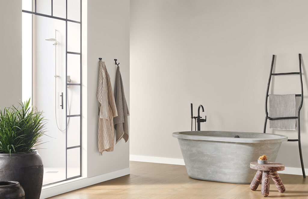
Drift of Mist in a bathroom is reliable. It stays soft and neutral in bad lighting, and it doesn’t fight with white fixtures the way cool grays do.
I used it in a bathroom renovation with white subway tile and matte black fixtures, and it was the perfect backdrop and not competing but complementing.
Kitchen
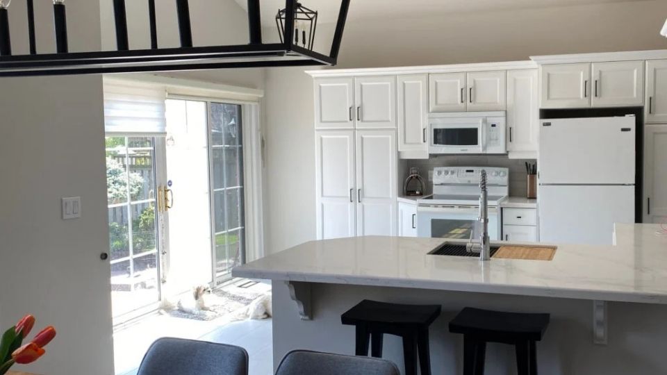
Kitchens have many finishes going on that your wall color needs to play nice with counters, cabinets, backsplash, and flooring.
City Loft in a kitchen works as a wall color if your cabinets are white or light wood and your counters are warm-toned.
It’s popular for painting cabinets, but you need to be careful, the violet undertones can look strange against some stone patterns.
I saw it on cabinets paired with white quartz counters with gray veining, and the clash was subtle but annoying.
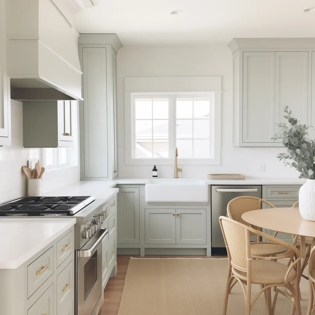
Drift of Mist in a kitchen is fantastic as a wall color in kitchens with white cabinets. It adds warmth without going beige, and it doesn’t compete with busy backsplashes or patterned counters.
I’ve also used it on kitchen islands as a cabinet color, paired with white perimeter cabinets, and it’s that perfect “different but not too different” contrast.
Exterior
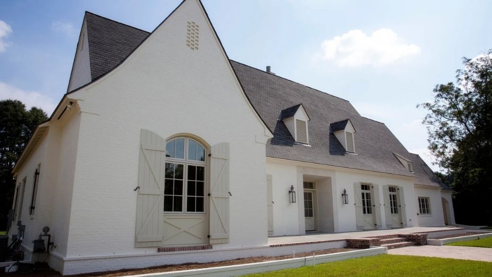
City Loft on an exterior is risky. The LRV of 70 is light for exterior use, and depending on your home’s architecture and surrounding landscape, it may disappear or look chalky.
I’ve seen it work on modern farmhouse exteriors with dark trim; it creates contrast to make the color visible. But in a traditional home with white trim, it fades into nothing.

Drift of Mist on an exterior is better because it holds its color depth, but both these colors are better for interiors.
If you’re set on a light neutral exterior, I’d go with something with pigment.
But if you’re doing Drift of Mist, pair it with a bright white trim like Pure White and consider dark accents on the door and shutters.
Comparing City Loft Vs Drift of Mist With Other Colors
Let’s put these colors in context with other popular Sherwin Williams neutrals because chances are, you’re looking at more than only these two.
City Loft Vs Drift of Mist Vs Agreeable Gray
Agreeable Gray (SW 7029) has an LRV of 60, so it’s visible darker than both City Loft and Drift of Mist.
It’s also a true greige with violet or green undertones depending on the light, it’s moody and unpredictable.
If you want depth than City Loft or Drift of Mist provide, Agreeable Gray is the best. But if you want something light and bright, stick with the other two.
City Loft Vs Modern Gray
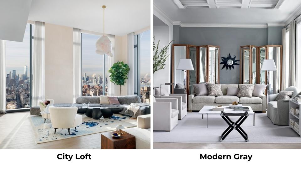
Modern Gray (SW 7632) is another light neutral with an LRV around 63-64. It’s cooler than City Loft, less beige and straight gray.
If City Loft’s warmth isn’t working for you, Modern Gray can be the answer, but it will feel cooler and less cozy.
City Loft Vs Pale Oak
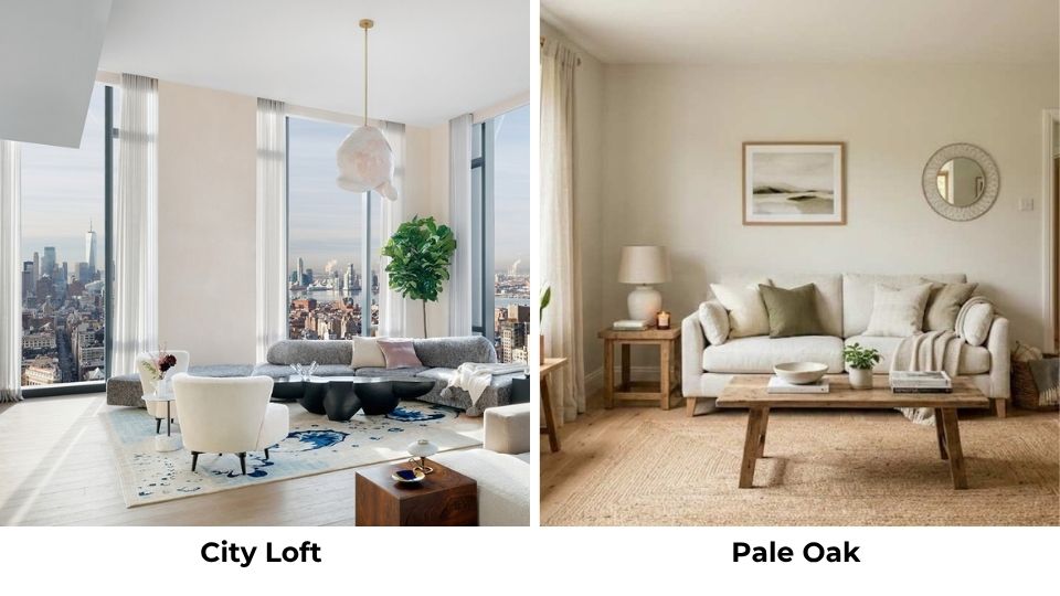
Pale Oak (Benjamin Moore) is warm and more beige than City Loft. If you’re finding City Loft too cool or too violet, Pale Oak gives you the light neutral without the hidden undertones.
It’s a safe, warm, slightly beige off-white that doesn’t surprise you.
City Loft Vs Shoji White
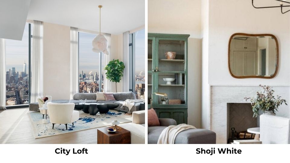
Shoji White (SW 7042) is a true warm white with a peachy undertone. It’s light and warmer than City Loft.
If you want white with a hint of warmth, go with Shoji White. If you want a neutral with depth, City Loft is grayer.
City Loft Vs Egret White
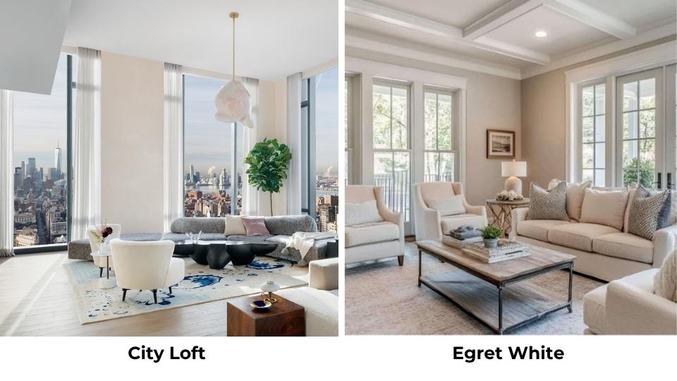
Egret White (SW 7570) is a soft white that’s brighter than City Loft but warm. It’s a good middle ground if City Loft feels too gray but you don’t want harsh white.
City Loft Vs Repose Gray
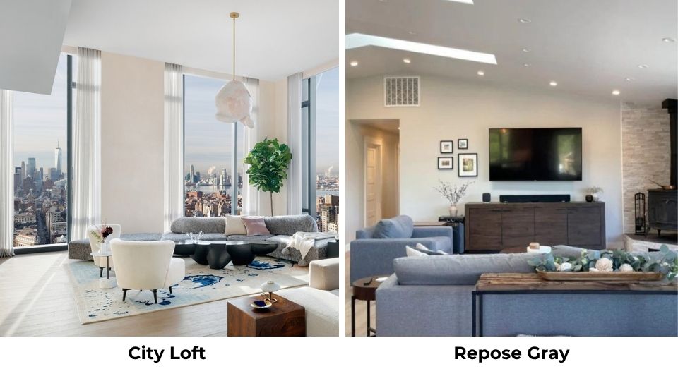
Repose Gray (SW 7015) is cooler and grayer than City Loft. If City Loft’s warmth isn’t your choice, Repose Gray is a popular alternative, though it can feel cold in some spaces.
City Loft Vs Aesthetic White
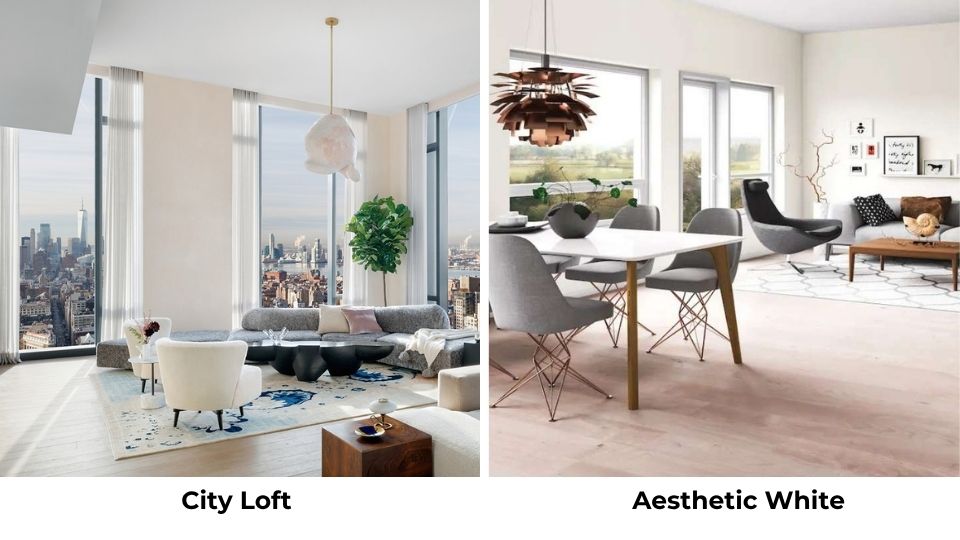
Aesthetic White (SW 7035) has an LRV of 73, so it’s lighter than City Loft. It has a subtle beige backdrop and may be the next big neutral. If City Loft feels too gray, Aesthetic White is warm and bright.
| Color | LRV | Undertones | Comparison |
| City Loft | 70 | Violet-pink, greige | Base comparison |
| Drift of Mist | 69 | Green, warm gray | Nearly identical LRV, warmer and more stable |
| Agreeable Gray | 60 | Violet or green | Much darker, more depth, less predictable |
| Modern Gray | 63-64 | Cool gray | Cooler, less beige than City Loft |
| Pale Oak | ~69 | Warm beige | Warmer, no violet undertone |
| Shoji White | ~72 | Peachy-warm | True white with warmth |
| Egret White | ~72 | Soft warm | Brighter, less gray |
City Loft Coordinating Colors
City Loft plays well with colors that acknowledge its warm greige base and don’t go against the violet-pink undertones.
Pure White (SW 7005) is the go-to for trim because it’s soft and warm without going yellow. Snowbound (SW 7004) is another excellent trim option, it is cool but harmonious.
For accent walls or furniture, consider Repose Gray for a deep neutral, Naval (SW 6244) for a rich navy that contrasts beautifully, or Evergreen Fog (SW 9130) for a soft green that feels modern.
Warm woods in light tones like oak, maple, birch, all look great against City Loft without creating color clashes.
Drift of Mist Coordinating Colors
Drift of Mist is versatile with coordinating colors because its base is so balanced. Pure White and Alabaster (SW 7008) both work well for trim.
For deep neutrals, Urbane Bronze (SW 7048) is stunning, the dark charcoal-brown against Drift of Mist’s softness is good.
Evergreen Fog works here too, playing into the subtle green undertone. Cascade Green (SW 0066) is a rich option if you want a jewel-tone accent.
Warm terracotta tones and natural linens in decor create a cozy, layered look that feels current without being trendy.
Conclusion
So here’s the last thing. City Loft Vs Drift of Mist, both are identical in lightness but completely different in character.
City Loft is bright, cool, and has violet-pink undertones that can be beautiful or problematic depending on your space.
Drift of Mist is warm, grounded, and has subtle green undertones that stay quiet and cooperative.
If you have great natural light, modern finishes, and you want something fresh and airy, City Loft can be your choice.
But test it because the undertones can come up anytime. If you want a versatile, home neutral that works in different lighting conditions and plays nice with both warm and cool finishes, Drift of Mist is a safe choice.
Get samples and test them in your space. Live with them for a few days.
These colors look similar on paint swatches but behave differently on your walls, and the only way to know which one is right for your space is to see them in your lighting with your finishes.
FAQs On City Loft Vs Drift of Mist
Drift of Mist is warm. It has a gray-beige base with subtle green undertones, and it leans warm without being creamy or beige. It’s a warm neutral that stays balanced.
The main difference is in undertones, City Loft has violet-pink undertones and looks cool and fresh, while Drift of Mist has green undertones and looks warm and more grounded. City Loft is bright, but Drift of Mist is versatile.
Drift of Mist is greige, a balanced mix of gray and beige. It is slightly more gray than beige, but it has beige warmth to keep it from feeling cool or flat.
City Loft is warm with a greige base, but it can look cooler than expected because of its violet-pink undertones. It’s warmer than true grays but cooler than beiges. It’s the in-between neutral that shifts depending on lighting.
City Loft Vs Drift of Mist: A Complete Side-by-Side Comparison