Sherwin Williams Creamy and Alabaster, both are warm whites, both are popular, but both are not interchangeable.
The SW Creamy Vs Alabaster confusion is reliable, and I’ve made the mistake of thinking of them the same but they’re different versions that look similar on paint swatches but are different on walls.
Creamy is into the rich, yellow-based warmth that looks traditional and cozy, while Alabaster looks cool with greige undertones.
They can transform how a space feels. I used Creamy in a north-facing bedroom thinking it was warm things and ended up with walls that looked like butter in the morning light.
Choosing the right warm white matters because it affects everything.
The wrong shade can make your gray sofa look out of place, your white cabinets look off, and your whole mood about the room shifts.
So, I’m breaking down everything about Sw Creamy Vs Alabaster, the Light Reflectance Value (LRV) and undertones, how lighting changes, which rooms each color works in and how they compare to other popular whites you’re also considering.
Here are my other blogs that you can also read:
- Peppercorn Vs Iron Ore
- Soft Chamois Vs Swiss Coffee
- Eider White Vs Repose Gray
- Ballet White Vs Swiss Coffee
- Cloud White Vs White Dove
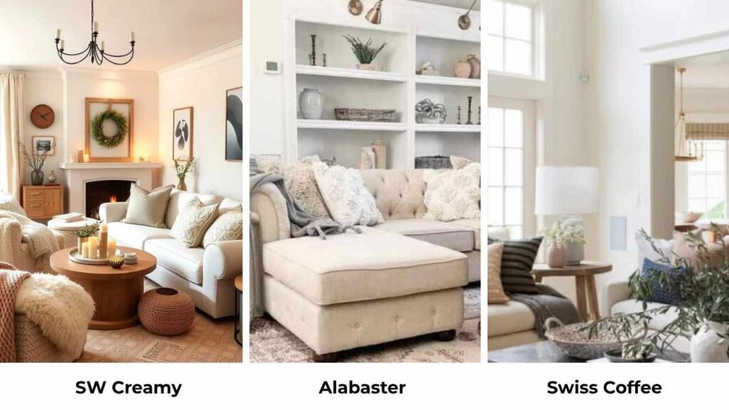
About Sherwin Williams Creamy (SW 7012)

Creamy is warm, REALLY warm. This isn’t one of the ” warm but looks neutral” whites that designers love to recommend.
SW 7012 has visible yellow undertones that give it a soft, classic and vintage feel.
The first time I used it was in a client’s dining room, I remember thinking it would be a perfect soft white but it was not.
It’s a warm off-white with yellow influence, and that’s not a bad if you’re going for traditional or farmhouse vibes.
The LRV of 81 means it reflects light, it’s on the bright end of the off-white spectrum. But even though it’s bright, it feels cozy and inviting instead of flat.
What Creamy doesn’t have is gray or greige undertones, which is why it looks full and old-school compared to modern soft whites.
I’ve used Creamy on both interiors and exteriors. It’s popular for living rooms, bedrooms, hallways and anywhere you want. Some people love it for their main floor.
But I need to be honest, it’s not for everyone. If your home has cool-toned finishes, modern gray floors, or you’re into the Scandinavian look, Creamy is not what you should consider.
About Sherwin Williams Alabaster (SW 7008)

Alabaster is the people’s champion of warm whites. It won Sherwin-Williams Color of the Year back in 2016, and it deserved it.
This color is part of their “Top White Paint Colors”, it’s versatile without being boring.
Where Creamy goes all-in on yellow warmth, Alabaster has these warm creamy undertones with a greige base.
There’s a slight beige or yellow influence, but it’s subtle that it doesn’t look yellow in lighting situations.
I’ve used Alabaster in north-facing rooms where Creamy would’ve looked sick, and it worked. It’s soft and more inviting than bright whites like Pure White.
What I love about Alabaster is that it works with many design styles. I’ve seen it used in living rooms with cool gray sofas, bedrooms with white oak floors, kitchens with both warm and cool countertops, and bathrooms with marble tile.
It’s the warm white you choose when you want warmth but also want options for the rest of your finishes.
Homeowners and designers pick Alabaster for main living spaces because it creates a soft, welcoming backdrop without demanding that everything else in the room match its warmth.
SW Creamy Vs Alabaster: Key Differences
Okay, so you’re looking at SW Creamy Vs Alabaster and thinking they’re close that it doesn’t matter and the difference becomes obvious under the vanity lights.
These colors may sit next to each other on the paint swatch, but they look different in real spaces. Let me break down where these two diverge.
LRV
Light Reflectance Value is one of the things that sounds boring but matters a lot. Creamy has an LRV of 81, which means it reflects more light that hits it. Alabaster comes in at 82, so it’s the same.
On paper they’re identical in brightness. In real life, they feel different because of their undertones.
Creamy’s yellow base makes that 81 LRV feel warm and heavy, mainly in rooms without natural light.
Alabaster’s 82 LRV looks soft and open because the greige undertones don’t absorb light the same way.
I’ve tested both in the same hallway, and though the LRV difference is only 1 point, Alabaster felt light and airy.
Undertones
Creamy is yellow-dominant. The warmth comes from a clear yellow base with a touch of beige. There’s no gray in there. When you put Creamy on the wall, you’re getting warm.
Alabaster is greige-leaning, which means it has a mix of beige and subtle gray that creates a more neutral-warm.
The yellow influence exists, but it’s muted. This is why Alabaster can handle cool AND warm finishes while Creamy only wants to go with warm stuff.
I learned this the hard way when I used Creamy in a kitchen with white quartz countertops that had gray veining.
The Creamy walls made the countertops look dingy and the room felt off. Switched to Alabaster and everything balanced out.
The undertones have to work with what’s already in your space, and Creamy’s yellow is way less flexible.
Lighting Effect
North-facing rooms are where the difference between these two becomes obvious. Creamy in north light is where the yellow undertones get LOUD.
The cool gray light from northern exposure brings out every yellow warmth.
Alabaster in the north light stays calm. The greige base absorbs some of the coolness and you end up with a soft, warm neutral that doesn’t swing yellow.
South-facing rooms are forgiving for Creamy, the warm light enhances the yellow but in a glowy, inviting way. Alabaster in southern light gets creamy and soft, which is lovely.
Artificial lighting changes things too. Warm LED bulbs will push Creamy warm. Cool LED lights can make Alabaster look gray-neutral, which may or may not be what you want.
Style Compatibility and Uses
Creamy works best with:
- Traditional or farmhouse interiors
- Warm wood tones
- Beige or tan tile, countertops, finishes
- Brass, gold, or warm bronze hardware
- Spaces where you want warmth
Creamy struggles with:
- Modern or contemporary styles
- Cool gray anything
- Marble with gray veining
- Chrome or brushed nickel finishes
- Trim use
Alabaster works with:
- With almost every design style
- Warm AND cool wood tones
- Gray, beige, greige, taupe finishes
- All metal finishes
- Trim, walls, cabinets, ceilings
I’ve used Alabaster on trim with Creamy walls once and it looked fine but not great. The contrast was weird because Alabaster is lighter than Creamy.
For trim with Creamy walls, you’d want something like Pure White or Cloud White.
| Feature | SW Creamy (7012) | SW Alabaster (7008) |
| LRV | 81 | 82 |
| Undertone | Yellow-dominant, warm | Greige with soft yellow |
| Versatility | Limited to warm palettes | Works with warm + cool |
| Best for Trim | Not recommended | Excellent choice |
| Best for Walls | Traditional/farmhouse spaces | Any style, any room |
| North-Facing Rooms | Can look too yellow | Stays balanced |
| Cabinet Use | Risky unless very traditional | Very popular, works well |
SW Creamy Vs Alabaster: Room-By-Room Comparison
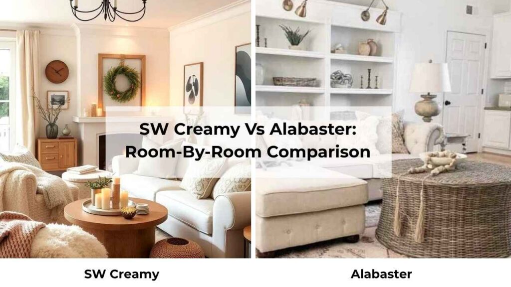
I’ve used both of these colors in every room type, and they perform differently depending on the space. What works beautifully in a bedroom may look off in a bathroom.
I’m going to walk through how each color behaves in specific rooms based on real experience.
Living Room

Creamy in a living room can be gorgeous if you have the right setup. I used it in a south-facing living room with warm hardwood floors and a beige sectional, and it created a cozy, wrapped kind of atmosphere.
The yellow undertones felt rich instead of overwhelming because of the warm southern light balanced everything out. But you need warm finishes to support it.

Alabaster in a living room is safe for most people. I’ve used it in living rooms with mixed metals, rooms with both warm and cool furniture, open-concept spaces that flow into kitchens with white cabinets and it works.
The greige undertones mean it plays nice with you’ve got going on. It feels warm and inviting, not warm like Creamy.
Bedroom
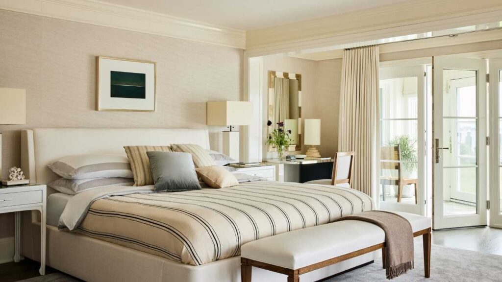
Creamy bedrooms are more controlled environments, you can pick warm bedding, warm wood furniture, warm-toned art, and create a cohesive cozy feeling.
I painted my own bedroom Creamy and loved how soft and restful it felt.
The morning light made it glow without going too yellow, and at night with warm lamps it was perfect.
But I used Creamy in a north-facing guest bedroom and it looked sallow and sad.
The cool light brought out the yellow and none of the warmth. I ended up repainting it and the difference was night and day.
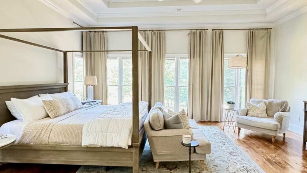
Alabaster in bedrooms is foolproof. North-facing, south-facing, east, west and it works. It creates a soft, calm and warm neutral that feels restful without being boring.
I’ve used it in bedrooms with white bedding, gray bedding, navy bedding, all different furniture finishes, and it always looks good.
. Bathroom
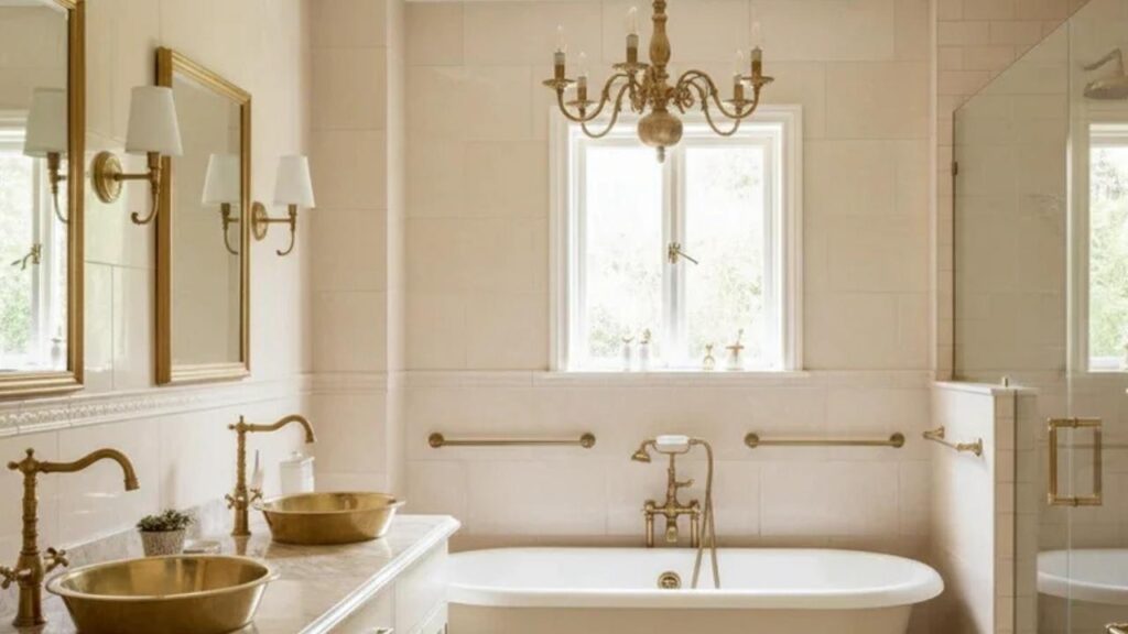
Creamy in bathrooms is tricky. I’ve seen it work in powder rooms with warm brass fixtures and beige tile, where it feels vintage and charming.
But in the main bathroom with standard chrome fixtures and white tile, it looks yellow and dirty.
Bathroom lighting is harsh and direct, and it brings out Creamy’s yellow undertones in ways that aren’t always flattering.
I tried Creamy in a bathroom with marble tile once and the Creamy walls made the white parts of the marble look blue by comparison. It was a weird color clash that I didn’t predict.
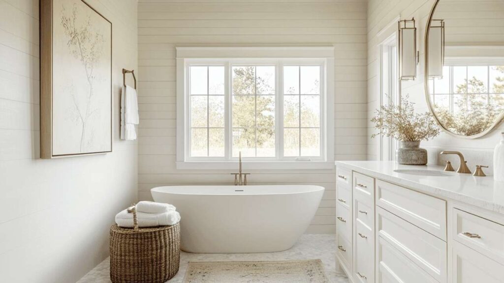
Alabaster in bathrooms is safe. The greige base handles bright bathroom lighting without going too yellow or too warm.
It works with white tile, marble, chrome, nickel, brass and with any finish. I’ve used Alabaster in many bathrooms and it’s never looked bad. It’s warm and inviting.
Kitchen
Creamy in kitchens depends on your cabinet and countertop situation.
If you’re going for a traditional farmhouse kitchen with warm wood cabinets or creamy/beige cabinets, and you’ve warm countertops, then Creamy walls can work.
I’ve seen it look beautiful in that specific traditional kitchen setup.
But in modern kitchens with white cabinets, gray countertops, stainless appliances, creamy looks OUT OF PLACE.
It fights with the cool tones and feels wrong. I made this mistake in my kitchen before I understood undertones.
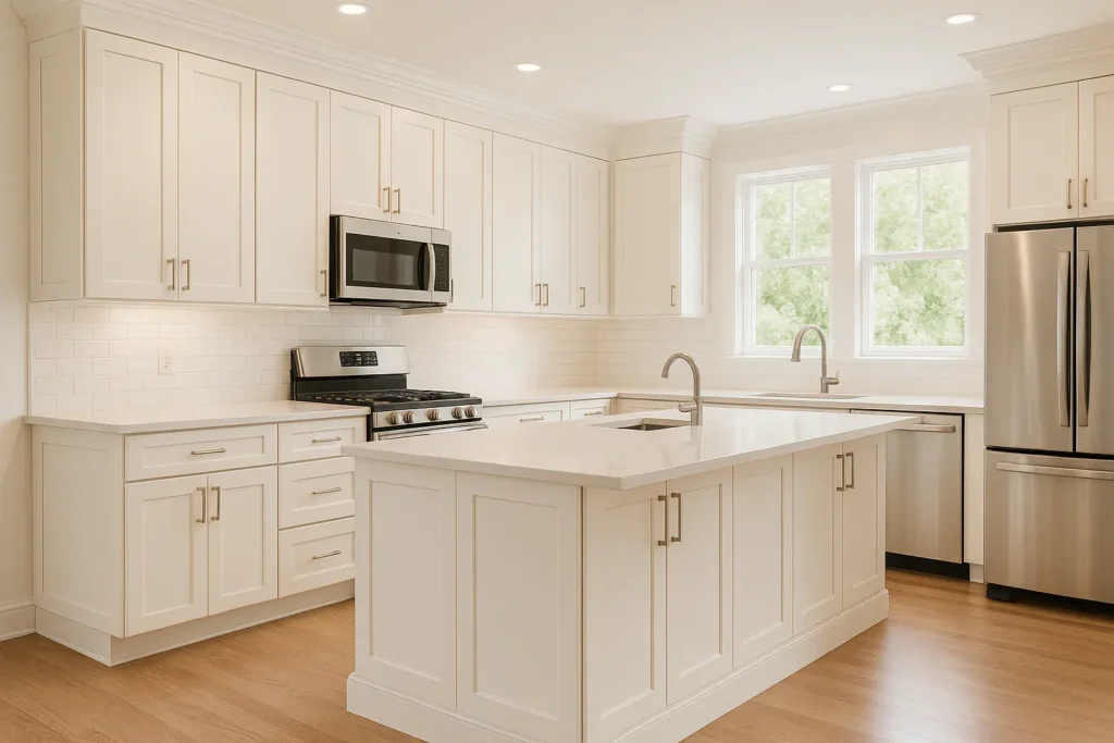
Alabaster in kitchens is popular for a reason. You can use it on walls, cabinets, it’s versatile to handle it. White cabinets with Alabaster walls look beautiful.
Gray cabinets with Alabaster walls are also beautiful. It’s become the go-to warm white for kitchen cabinets because it’s not harsh white but it’s also not so creamy that it looks yellow.
The greige undertones give it depth to feel intentional but lightness to keep the kitchen bright.
Exterior
Creamy on exteriors is something I approach with planning. I’ve seen it look gorgeous on traditional homes with warm brick, stone, or wood accents.
The yellow undertones can feel classic and charming in the right house style. But on south or west-facing exteriors, that yellow can intensify in direct sunlight.
What looks like soft cream on the paint swatch can look buttery yellow on a house in bright sun.
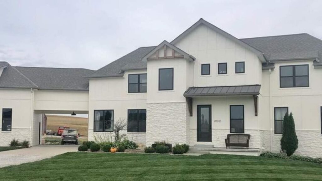
Alabaster on exteriors has become popular, especially for modern farmhouse or transitional style homes.
The greige base keeps it from looking too yellow in bright sunlight, and it pairs well with both warm and cool accent colors.
Black windows with Alabaster siding look great. White trim with Alabaster walls also works.
SW Creamy Vs Alabaster Vs Other Colors
Here, comparing Creamy and Alabaster to other popular colors helps clarify what makes each one special.
I’m going to take you through the comparisons that I get asked about, the ones I’ve tested myself, and the ones where the difference matters.
SW Creamy Vs BM Swiss Coffee
Benjamin Moore Swiss Coffee is darker and more saturated than Creamy. Swiss Coffee has an LRV around 78-79, so it feels like a true cream versus Creamy’s light off-white situation.
The yellow undertones in Swiss Coffee are rich and deep. I’ve used both, and if you think Creamy may be too light but you like the warmth, Swiss Coffee could be the one.
SW Creamy Vs Greek Villa

Greek Villa (SW 7551) is bright, fresh, and less yellow than Creamy. It has warm undertones but they’re subtle.
If Creamy feels too yellow or too rich for your space, Greek Villa is worth going for.
I find it works better on exteriors than Creamy because it doesn’t go as golden in direct sun. For interiors, it’s cool and clean.
SW Creamy Vs Accessible Beige
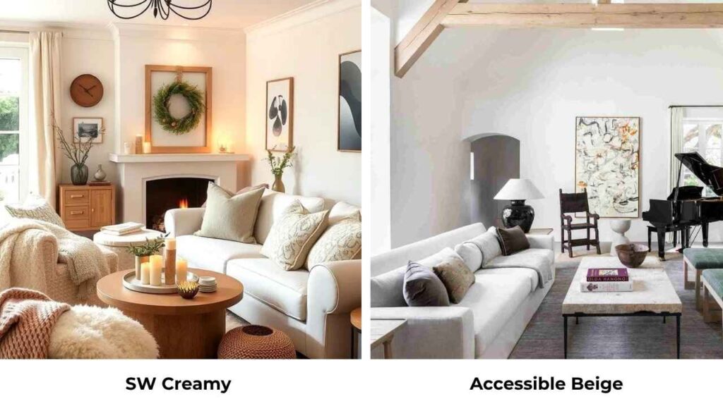
Okay this is comparing a warm white to a greige, so they’re not the same category. Accessible Beige (SW 7036) is warm, dark and more beige than Creamy.
If you’re comparing these two, you’re trying to decide between a light warm white and a true neutral. They serve different purposes.
SW Creamy Vs Shoji White
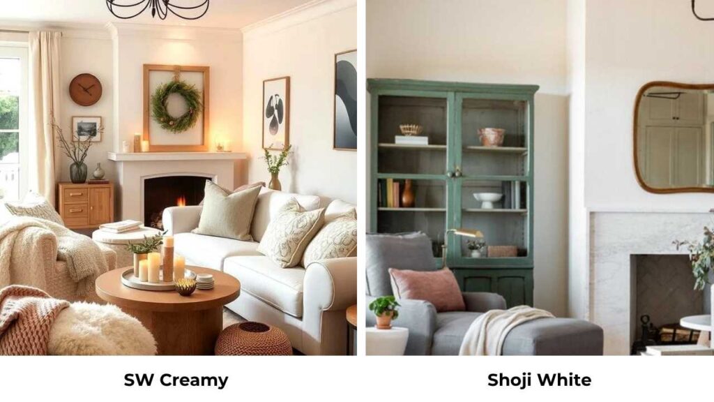
Shoji White (SW 7042) is bright and fresher than Creamy. It has minimal yellow and looks like a true white with barely warm undertones.
I go for Shoji when I want bright white trim or when Creamy feels too creamy. They’re not close to being confused, but they pair well together.
SW Creamy Vs Neutral Ground
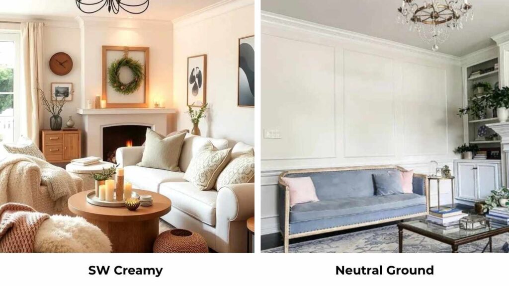
Neutral Ground (SW 7568) is dark and more beige-tan than Creamy. It has greige qualities that Creamy doesn’t have.
This is another situation where you’re comparing different color depths, Neutral Ground is midtone, Creamy is light.
Not comparable, but Neutral Ground can be a good coordinating color WITH Creamy if you need a dark warm neutral.
SW Creamy Vs Dover White
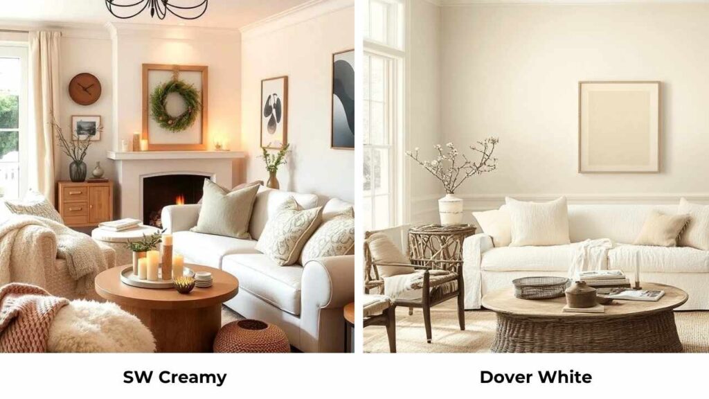
Dover White (SW 6385) is one of the close comparisons. It’s bright and has MORE pronounced yellow undertones than Creamy.
If you think Creamy isn’t yellow, Dover White goes more golden. I find Dover White works better in spaces that get cool northern light and need extra warmth.
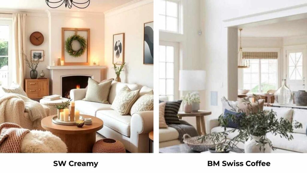
Alabaster SW Vs White Dove BM
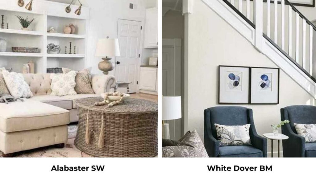
Benjamin Moore White Dove is similar, both are warm whites with greige influence. White Dove looks slightly softer and a touch grayer than Alabaster in some lights.
They’re close that I choose based on which brand I’m using for other colors in the house. Both are excellent warm whites that work anywhere.
SW Alabaster Vs Aesthetic White
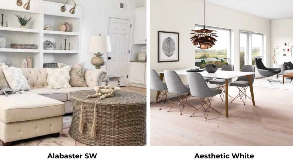
Aesthetic White (SW 7035) is warm and darker than Alabaster. It’s more of a warm greige than a warm white.
If Alabaster feels too white or bright for your space, Aesthetic White has color and depth. They coordinate well together but aren’t interchangeable.
| Comparison | Key Difference | When to Choose the Alternative |
| Creamy vs Swiss Coffee (BM) | Swiss Coffee is darker, richer cream | Want more color depth, true cream feel |
| Creamy vs Greek Villa | Greek Villa is crisper, less yellow | Modern spaces, exteriors, cooler look |
| Creamy vs Accessible Beige | Accessible Beige is true greige, much darker | Need midtone neutral, not light white |
| Creamy vs Shoji White | Shoji is brighter, cleaner white | Want crisp trim color or brighter walls |
| Creamy vs Dover White | Dover White is more golden yellow | North rooms needing extra warmth |
| Alabaster vs White Dove (BM) | Extremely similar, White Dove slightly softer | Either works – brand preference |
| Alabaster vs Aesthetic White | Aesthetic is darker warm greige | Want more color, less white |
Sherwin Williams Creamy Coordinating Colors
Creamy needs colors that match its energy like warm, traditional, not trying to be cool-toned. I’ve learned through mistakes that fighting Creamy’s yellow warmth never works.
Colors that work beautifully with Creamy:
- SW Pure White (7005) – for trim when you need contrast
- BM Cloud White – soft trim option that doesn’t fight the warmth
- SW Accessible Beige – deep warm neutral for accent walls
- SW Pavestone – warm greige that coordinates without clashing
- SW Urbane Bronze – dark dramatic accent that grounds the warmth
- Warm wood tones – oak, pine, cherry, walnut all look gorgeous
- Warm brass and gold metals – fixtures and hardware in warm metallics
- Beige, tan, cream, caramel tones – for furniture, rugs, accessories
- Warm terracotta, rust, burnt orange – accent colors that enhance the warmth
- Sage green, olive, warm forest greens – bring in natural warmth
What DOESN’T work with Creamy: cool grays, blue-grays, icy whites, chrome finishes, cool-toned marble, anything trying to be modern and cool.
Alabaster Coordinating Colors
The beautiful thing about Alabaster is that your coordinating color options are many. It plays well with warm AND cool, which gives you flexibility.
Colors that coordinate well with Alabaster:
- SW Pure White – classic white trim
- BM White Dove – soft warm white trim alternative
- SW Snowbound – another excellent trim option
- SW Repose Gray – cool-toned gray that actually works
- SW Agreeable Gray – warm greige for coordinating walls
- SW Tricorn Black – dramatic black accents and trim
- SW Naval – deep navy for doors, cabinets, accent walls
- Both warm and cool wood tones – white oak, walnut, maple, all good
- All metal finishes – brass, chrome, nickel, bronze, black
- Sage, eucalyptus, forest green – on-trend green tones
- Terracotta, rust, warm earth tones – if you want warmth
- Cool blues, grays, greiges – if you want modern
- Blush, mauve, warm pinks – for soft feminine spaces
Conclusion
Look, here’s what it comes down by comparing SW Creamy Vs Alabaster: Creamy is beautiful but particular.
It wants a specific aesthetic like traditional, warm, cozy, surrounded by warm finishes and warm light.
When you give it the things, it’s gorgeous and creates an inviting atmosphere that feels classic and comfortable.
Alabaster is the reliable choice that works in many situations. It’s warm to feel inviting, neutral to pair with anything, and versatile to use on walls, trim, cabinets and everywhere.
Get samples of BOTH and live with them in your space for a few days. Watch them in morning light, afternoon light, evening with your lamps on.
See which one makes you feel good when you walk in the room. See which one makes your existing furniture and finishes look better.
FAQs On SW Creamy Vs Alabaster
The main difference is undertones. Creamy has dominant yellow undertones that create a rich, traditional warm white. Alabaster has greige undertones that make it neutral-warm and more versatile. Creamy looks warm and yellow, Alabaster looks soft and balanced.
It depends on your lighting and finishes. In north-facing rooms or spaces with cool light, Creamy can look very yellow, sometimes uncomfortably. In south-facing rooms with warm light and warm finishes around it, the yellow feels like warmth and less yellow.
Creamy is WARM. There’s nothing cool happening with this color. The yellow undertones create warmth, and there are no gray or blue undertones to cool it down. It’s a warm off-white that is on the warm side.
No, Alabaster is not too yellow for many people. It has a slight yellow influence in the undertones, but the greige base keeps it from looking yellow. In most lighting situations, Alabaster looks like a soft warm white or creamy white without yellow. It CAN look warmer in warm southern light.