Revere Pewter by Benjamin Moore and Accessible Beige by Sherwin-Williams are the two most talked-about neutral paint colors.
Both are described as neutral and versatile, but here’s what you should know, Revere Pewter Vs Accessible Beige creates different moods depending on your lighting, room size, and what finishes you’ve.
They’re not interchangeable because they’re both greige.
I don’t know how many times I’ve watched homeowners struggle between these two shades.
The panic is real when you’re standing in the paint aisle trying to choose the right greige.
Benjamin Moore HC-172 versus Sherwin-Williams 7036.
The confusion is understandable since they both exist in the gray-beige spot, but picking the wrong undertone can make your bright living room look like a sad, muddy cave.
So, I’m breaking down everything about Revere Pewter Vs Accessible Beige, the real LRV and what they look like in your space, the undertones, how they perform in different rooms from kitchens to exteriors, and what colors they compare to when you start second-guessing.
Here are my other blogs that you can also read:
- Soft Chamois Vs Swiss Coffee
- Benjamin Moore Sea Pearl Vs White Dove
- Swiss Coffee Behr Vs Benjamin Moore
- Snowbound Vs White Dove
- Greek Villa Vs Snowbound
Color Summary of Revere Pewter (Benjamin Moore HC-172)
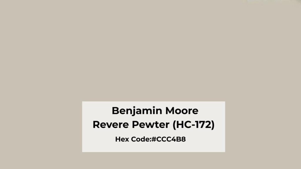
Revere Pewter is classified as a warm greige, but it doesn’t tell the whole story.
It’s a balanced mix of beige and gray that is right in the middle zone where it could tip either direction depending on what’s around it.
What I’ve noticed after using this color many times is that it’s deeper and more saturated than Accessible Beige.
When you put it on the wall, it feels grounded and kind of traditional in a good way, but not modern minimalist either.
The LRV is around 55, which puts it in mid-tone territory. It means it’s not reflecting light back at you.
I learned this on a north-facing bedroom project where I thought Revere Pewter “warm things up” but it looked heavy.
Here’s the thing about Revere Pewter that makes it both interesting and sometimes frustrating that it has this subtle green undertone.
You won’t see it in the paint store. You won’t see it on the sample card. But when it is on your walls then it is visible.
Designers and homeowners keep coming back to this color for living rooms, bedrooms, and even exteriors because when it works.
It creates a sophisticated, timeless backdrop that feels expensive. I’ve used it on exteriors with dark shutters and white trim and it looks like a dream.
But it needs decent light to show its best self.
Color Summary of Accessible Beige (Sherwin-Williams 7036)
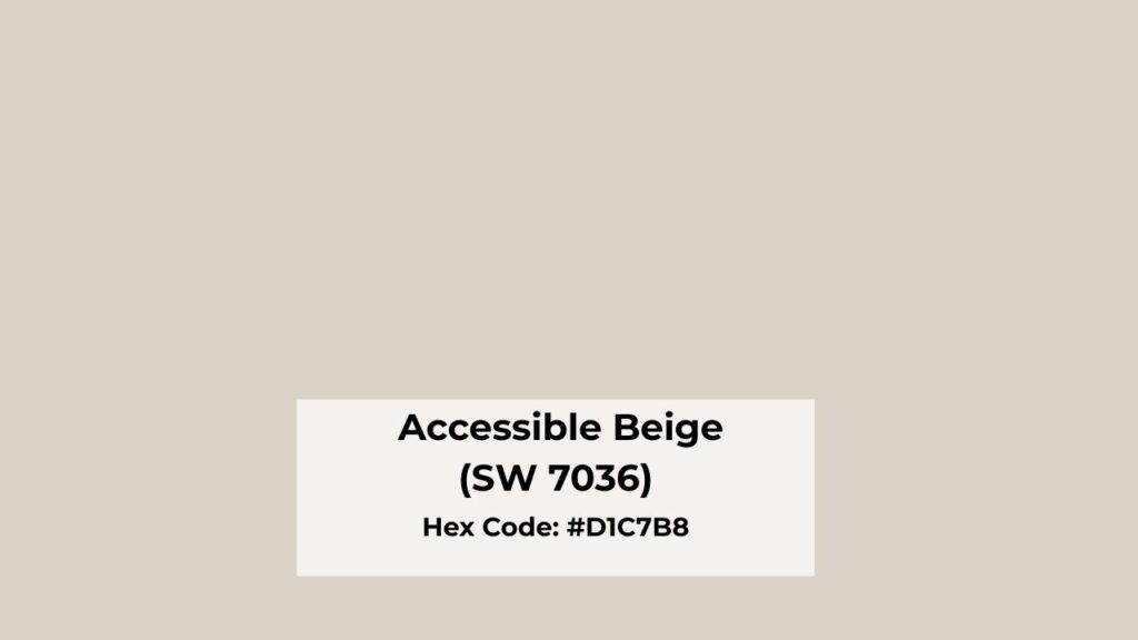
Accessible Beige is Sherwin-Williams’ warm neutral. This color is a light warm greige with beige dominance.
While Revere Pewter is more in the gray, Accessible Beige is warm and soft.
It has a gray base that keeps it from looking like builder beige from 2003, but the beige is running the show.
There’s also a subtle green undertone situation, though it’s less aggressive than what you get with Revere Pewter.
The LRV is around 58, which makes it visibly brighter and airy than Revere Pewter.
The three points matter. It means Accessible Beige reflects light, performs better in rooms that don’t get much natural light, and feels less heavy on your walls.
What makes this one of Sherwin-Williams’ best-selling paint colors is how forgiving it is.
It doesn’t freak out in north-facing rooms. It plays nice with warm wood tones, honey oak which is having a comeback.
It doesn’t clash with existing finishes the way some neutrals do.
I’ve gone for Accessible Beige for house projects where the client needed one color that could flow from room to room without looking different in every space.
It’s reliable and cozy but not too beige, grounded but not dark.
Homeowners love it for living rooms, bedrooms, kitchens like everywhere including exteriors when paired with the right trim color.
The thing about Accessible Beige that I appreciate is that it doesn’t try to be something it’s not. It’s a warm, soft neutral that does what it promises.
Revere Pewter Vs Accessible Beige: Key Differences, Undertones and Uses
Okay, so they’re both greige and both popular, but if they were the same, we wouldn’t be having this conversation.
Let me break down where they differ and why it matters for your space.
LRV
Light Reflectance Value is one of the things that sounds boring until you paint your room too dark and can’t figure out why it feels like a dungeon.
Revere Pewter is at LRV 55 while Accessible Beige is at 58. Revere Pewter is the darker of the two, and you’ll feel the difference in rooms that don’t get strong natural light.
The mid-tone depth can work well in bright, south-facing spaces or large rooms with windows.
Accessible Beige has high LRV means it bounces light around, which is why it handles low-light situations better.
I’ve used it in basements and it doesn’t look sad. Revere Pewter in a basement would need some lighting.
Undertones
Revere Pewter has a warm gray base with beige warmth, but that secondary green undertone comes in.
Place it next to warm whites or creamy finishes and the sophisticated greige looks soft.
I’ve had to explain this to clients who swear the color “changed” after they installed cream cabinets.
The color didn’t change, the undertones got out.
Accessible Beige is primarily beige with soft gray and more muted green undertone. The green is there, but it’s less moody about making an appearance.
The undertones stay predictable in different lighting, which is part of why it’s easier to work with for whole-home applications.
Lighting Affect
Revere Pewter in north-facing rooms looks dark, cool, and gray, sometimes sad if I’m being honest.
The green undertone can also get strong in cool northern light. In south-facing rooms with warm natural light, it looks balanced and beautiful.
Under artificial lighting, warm bulbs help reduce the gray-green tendency, but cool LED bulbs will emphasize it.
Accessible Beige maintains its warmth better in north-facing rooms, though it will look cooler than in southern light.
South-facing rooms make it look soft and warm and what you want from a neutral.
The best part is it’s more forgiving under both warm and cool artificial lighting.
Warmth
Revere Pewter is cool because it has a strong gray presence. It has warmth, but it’s a restrained, sophisticated warmth.
The depth and that gray base give it visual weight on the walls, it feels grounded, substantial and a little serious.
If your space is modern or transitional and you want a neutral with gravity,this works.
Accessible Beige is warm and more beige-forward. It’s light, relaxed, and less visually heavy. The warmth is soft and approachable.
It doesn’t demand attention like Revere Pewter can. This makes it better for creating cozy, inviting spaces where you want people to feel comfortable.
Styling and Best Uses
Revere Pewter pairs beautifully with bright, clean whites like Benjamin Moore’s White Dove or Simply White.
You need the contrast to keep it from looking muddy. It loves dark woods, black or charcoal accents, and cool countertops with gray veining.
If you’re going for the classic, formal look with white cabinets and gray-veined quartz.
Accessible Beige wants warm whites like Sherwin-Williams Alabaster or Greek Villa.
Creamy trims, warm wood tones, beige and taupe finishes, it all works together.
This is your whole-house-color, your open-floor-plan solution.
| Attribute | Revere Pewter (BM HC-172) | Accessible Beige (SW 7036) |
| LRV | ~55 (darker, mid-tone) | ~58 (lighter, brighter) |
| Overall Tone | Greige (gray-dominant) | Warm beige |
| Warmth Level | Medium, reads cooler | Medium-warm |
| Gray Presence | Stronger | Softer |
| Green Undertone | More noticeable, can appear unexpectedly | Very subtle, less obvious |
| Best Lighting | South-facing, strong natural light | More forgiving in various lighting |
| Best Trim Colors | Crisp whites (White Dove, Simply White) | Warm whites (Alabaster, Greek Villa) |
| Best With | Dark woods, cool countertops, modern/transitional | Warm woods, cream finishes, traditional |
| Common Mistake | Using in low-light or north-facing rooms | Pairing with cool grays or very modern spaces |
| Best Use | Statement neutral, accent walls, well-lit spaces | Whole-house color, open floor plans, lower-light rooms |
How Do These Colors Look In Different Rooms? Revere Pewter Vs Accessible Beige
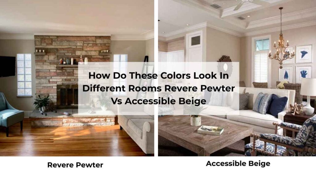
Talking about paint colors in theory, but how they look in real rooms with real furniture and real lighting is completely different.
Let me walk you through what I’ve seen of Revere Pewter Vs Accessible Beige in different spaces.
Living Room
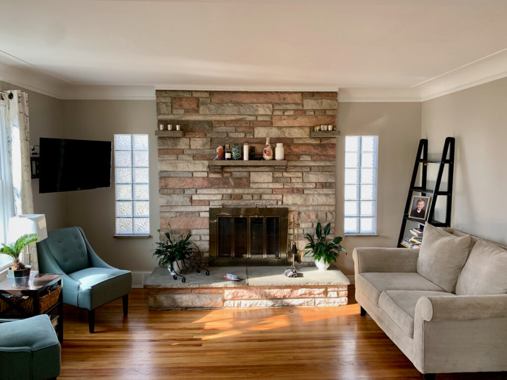
Revere Pewter in a living room is where it shines. I used it in a south-facing living room with large windows and it created a sophisticated, pulled-together look that felt both modern and timeless.
The gray influence kept it from reading too traditional, and paired with white trim and dark furniture, it was perfect.
But the same color in a living room with one small north-facing window is different.
It looked flat and uninspired, and the client kept asking if we’d used the wrong color.
We hadn’t. The room didn’t have the light to support Revere Pewter’s depth.
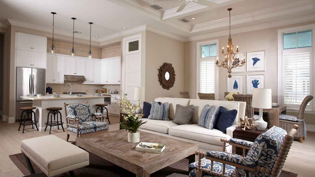
Accessible Beige in a living room is safe if you’re not sure about your lighting situation.
It creates a warm, inviting atmosphere without trying hard.
I’ve used it in living rooms that flow into kitchens and dining areas in open floor plans, and it works.
It doesn’t compete with your furniture or your art but it supports everything else in the room.
Bedroom
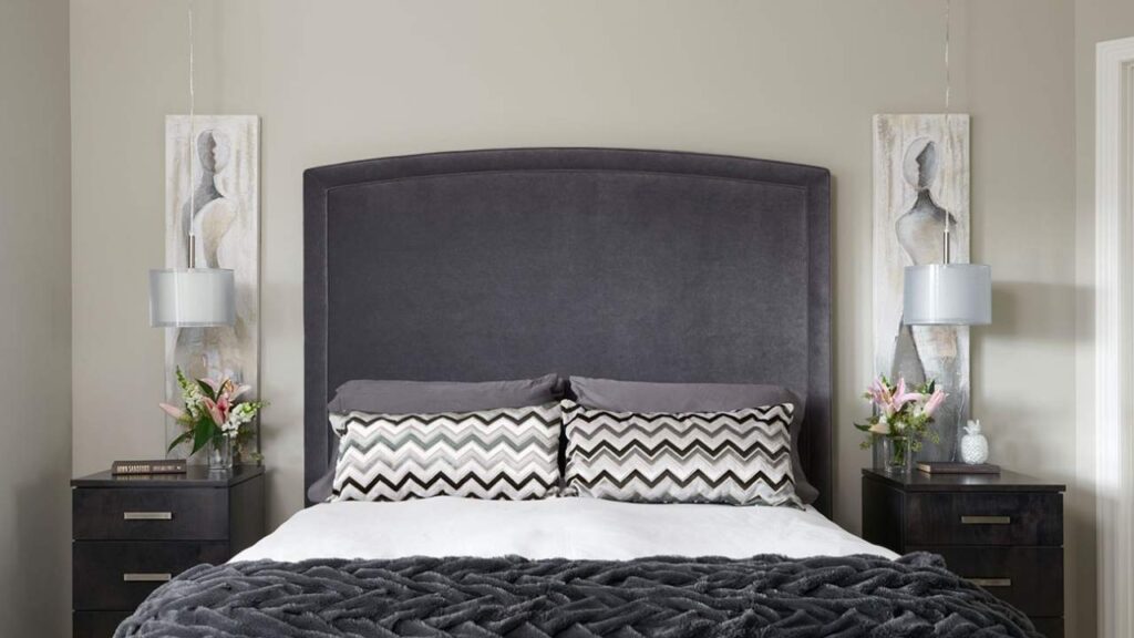
Revere Pewter in a bedroom can be beautiful if you want something sophisticated and less typical builder-beige.
I’ve done primary bedrooms with Revere Pewter walls, white bedding, and dark wood furniture, it feels expensive and restful.
But if your bedroom doesn’t get natural light or if you’re someone who keeps rooms dark with blackout curtains, it may feel heavy for a sleep space.
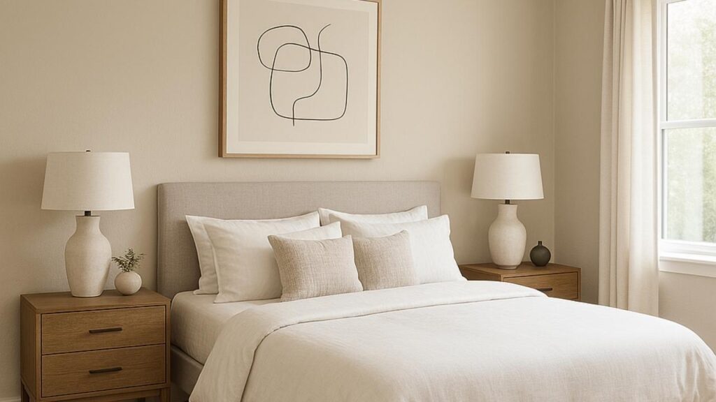
Accessible Beige in a bedroom creates a cozy, warm environment that makes you want to be in bed.
The light LRV and warm undertones make it feel soft and relaxing.
I’ve used this in guest bedrooms, kids’ rooms, and primary suites, and it gets positive feedback.
Bathroom
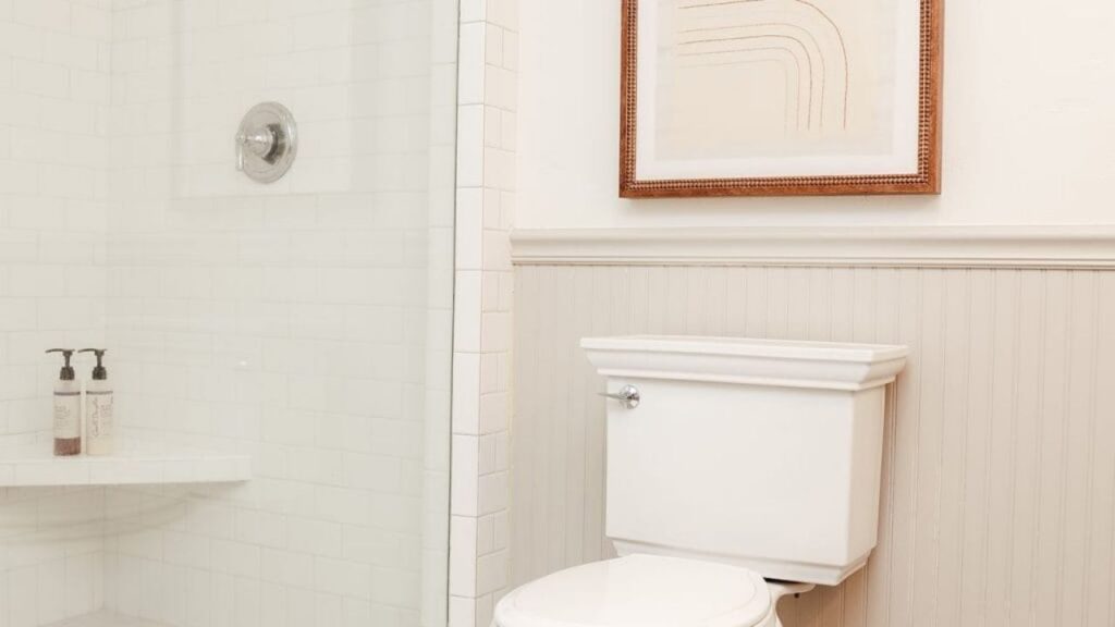
Revere Pewter in a bathroom works best in large bathrooms with natural light.
I’ve done it with white subway tile, marble countertops, and chrome fixtures, and it looks clean and classic.
But in a small powder room with no windows then that green undertone can get weird with artificial lighting, if you have warm brass fixtures.
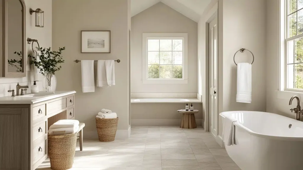
Accessible Beige in a bathroom is reliable, especially in bathrooms with warm wood vanities or beige tile.
It coordinates beautifully with cream subway tile, warm countertops, and doesn’t freak out under bathroom lighting.
I’ve used it in windowless bathrooms with good artificial light and it maintains its warmth without looking muddy.
Kitchen
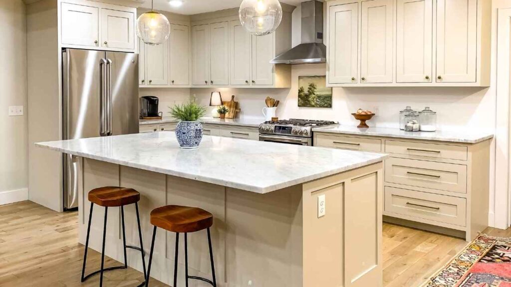
Revere Pewter in kitchens is gorgeous with white cabinets, gray countertops, and cooler backsplash tiles.
It provides that neutral backdrop without disappearing.
I’ve also seen it work well in kitchens with dark navy or charcoal cabinets where you need something light on the walls but substantial.
Where it struggles is with cream or warm wood cabinets.
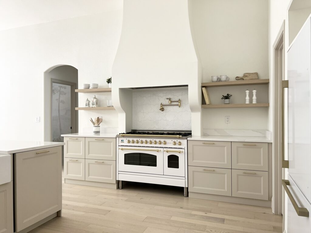
Accessible Beige in kitchens is fantastic if you have warm wood cabinets, honey oak or cream cabinetry.
It works well as a whole-house color that flows from your open-concept living space into the kitchen.
The warmth coordinates beautifully with butcher block, warm quartz, and beige backsplash options.
Exterior
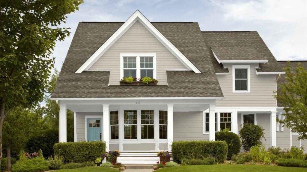
Revere Pewter on exteriors looks classic and sophisticated, especially with white trim and dark shutters or doors.
I’ve seen it on traditional colonials and craftsman-style homes where it works.
The gray influence keeps it from looking too brown or tan, and it looks well.
But you need to consider your roof color, if you have a warm brown or terracotta roof, then the green undertone can create a clash.
Accessible Beige on exteriors is a safe, warm neutral that coordinates well with a wide range of roof colors, brick, and stone.
It’s light and reflective, which can help in sun situations where dark colors may look heavy.
I’ve used it on exteriors with warm stone accents and brown roofs, and it ties everything together without competing.
It’s not going to make a bold statement, but that’s what you want.
Revere Pewter Vs Accessible Beige Vs Other Colors
Because choosing paint colors means you’ll start comparing many other options and questioning everything, let’s look at how these two look against other popular neutrals.
Revere Pewter Vs Accessible Beige Vs Agreeable Gray
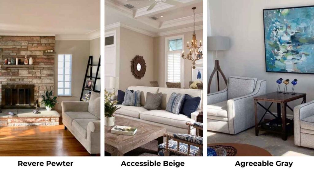
Agreeable Gray (SW 7029) is Sherwin-Williams’ other popular neutral with an LRV around 60.
It’s grayish than Accessible Beige, sitting in the warm gray category without beige influence.
Revere Pewter has the most gray presence with the green undertone. Accessible Beige is the warm and beige-forward.
Agreeable Gray is between them but is cool and gray. They rarely compete for the same space because they serve different purposes.
Agreeable Gray is modern gray that has warmth, Accessible Beige is warm neutral for traditional spaces, and Revere Pewter is sophisticated greige for spaces with good light.
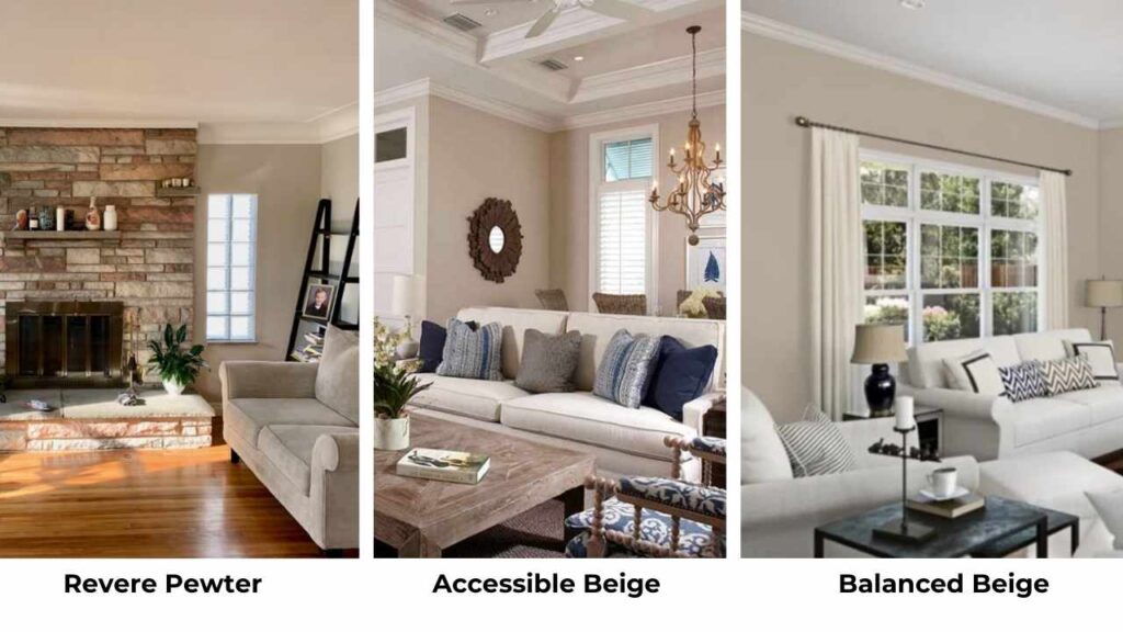
Revere Pewter Vs Balanced Beige
Balanced Beige SW 7037 is warm and more beige than Revere Pewter. Where Revere Pewter gives you the gray influence and potential green undertone, Balanced Beige is warm beige with taupe undertones.
It’s closer to Accessible Beige in warmth but deep.
If Revere Pewter feels too gray or moody for your space, Balanced Beige can be your answer.
Pale Oak Vs Accessible Beige
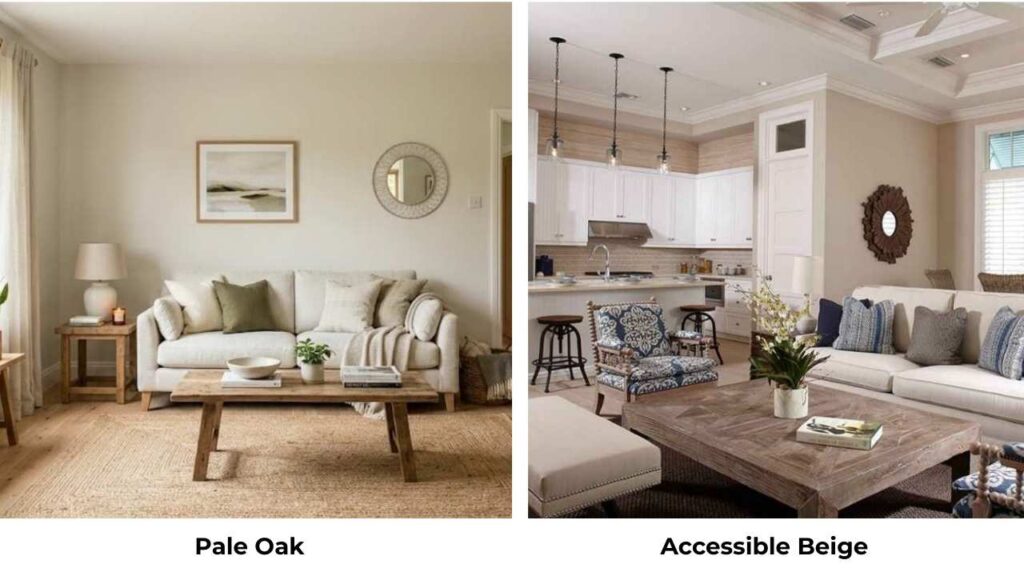
Pale Oak (BM OC-20) is Benjamin Moore’s light, soft greige with an LRV around 69.
It’s lighter than Accessible Beige and looks more gray-taupe than beige.
Where Accessible Beige gives you warmth and beige dominance, Pale Oak is cool and subtle.
I use Pale Oak when clients want something barely-there and neutral, while Accessible Beige is for when they want warmth and presence.
Revere Pewter Vs Colonnade Gray
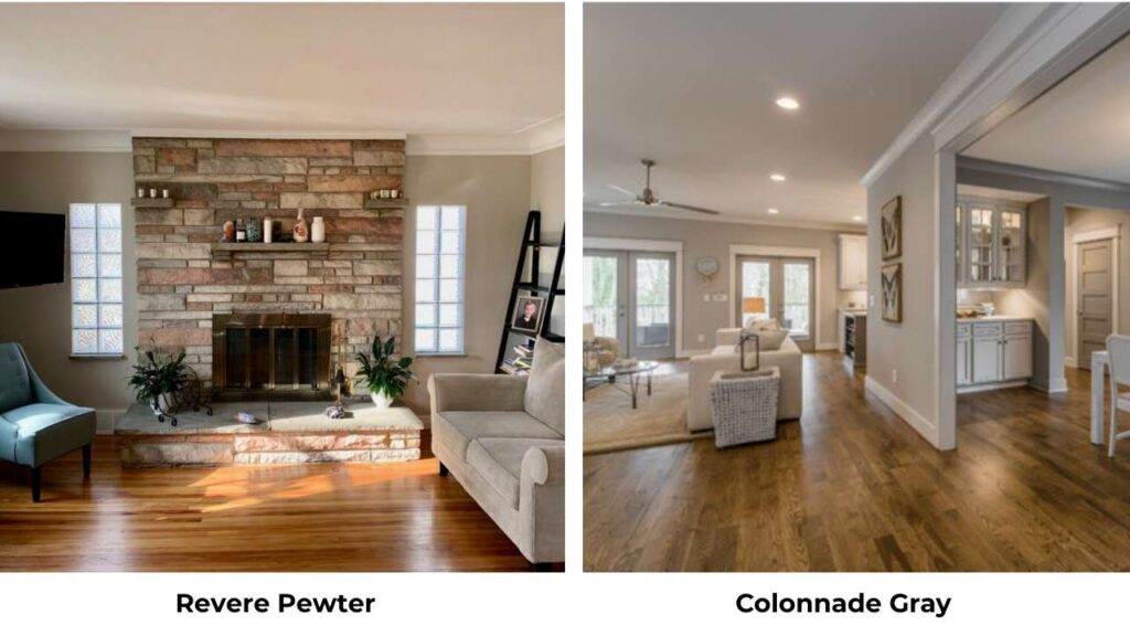
Colonnade Gray (SW 7641) is cool and more gray than Revere Pewter with an LRV around 53.
It has the same sophisticated, grounded quality but without the beige warmth.
If you’re comparing these two, you’re trying to decide how cool you want to go.
Revere Pewter maintains warmth and versatility, while Colonnade Gray is in the gray family.
I reach for Colonnade Gray in modern spaces with cool finishes where Revere Pewter feels too warm.
Edgecomb Gray Vs Accessible Beige
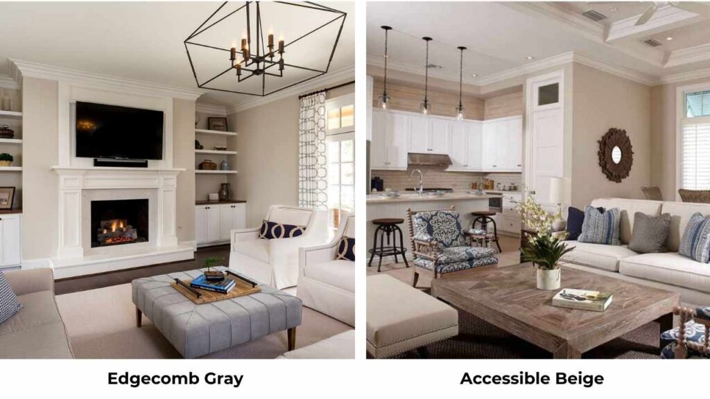
Edgecomb Gray BM HC-173 is Benjamin Moore’s preference in this category with an LRV around 63.
It’s lighter than Accessible Beige and cooler, more as a greige-taupe.
Both are excellent house colors, but Edgecomb Gray feels soft and less beige-dominant.
If Accessible Beige feels warm or beige in your space, Edgecomb Gray can be what you need.
| Comparison | Key Differences | When to Choose What |
| Revere Pewter vs Accessible Beige vs Agreeable Gray | RP: most gray, green undertone; AB: warmest, most beige; AG: gray-centric, modern | RP for sophisticated/traditional, AB for warm whole-home, AG for modern gray |
| Revere Pewter vs Balanced Beige | RP has gray influence + green undertone; BB is warmer, straightforward beige-taupe | RP if you want greige complexity, BB if you want reliable warm beige |
| Pale Oak vs Accessible Beige | PO is lighter (LRV 69), cooler gray-taupe; AB is warmer, more beige | PO for subtle barely-there neutral, AB for warmth and presence |
| Revere Pewter vs Colonnade Gray | RP maintains warmth; CG is cooler, more firmly gray | RP for warm-neutral versatility, CG for modern cool gray |
| Edgecomb Gray vs Accessible Beige | EG is lighter (LRV 63), cooler greige-taupe; AB is warmer, more beige | EG if AB feels too warm/beige, AB if you want more warmth |
Which One to Choose Between Revere Pewter and Accessible Beige?
After all this, you’re standing in the paint aisle wondering which one to buy. Let me make this simple.
When to choose Revere Pewter:
Choose this when you have south-facing rooms or spaces with strong natural light.
Pick it if you’re working with cooler finishes like white cabinets, gray countertops, cool-toned tile.
Go with Revere Pewter if you want something sophisticated and grounded with visual weight and presence.
It’s your choice for modern or transitional spaces where you want a neutral that feels intentional and pulled-together.
When to choose Accessible Beige:
Choose this for house color in open floor plans where you need something that flows nicely. Pick it if you have warm wood tones, honey oak cabinets, or cream finishes.
Go with Accessible Beige if your rooms don’t get natural light or if you have north-facing spaces.
Choose it if you want something warm, cozy, and reliably predictable that won’t surprise you at different times of day.
Conclusion
Look, both Revere Pewter Vs Accessible Beige are popular for good reasons, they’re beautiful, versatile neutrals that can work in many different spaces.
But they’re not the same color wearing different brand names.
Revere Pewter brings depth, sophistication, and a cool gray influence that needs good lighting to shine.
Accessible Beige delivers warmth, reliability, and the soft beige-forward quality that makes spaces feel cozy.
The right choice depends on your lighting, your existing finishes, and what feeling you want to create.
Sample both colors on your walls, look at them at different times of day, and trust what you see in the space with the lighting.
What works in someone else’s room may look different in your north-facing living room.
Choosing between Revere Pewter Vs Accessible Beige after understanding these can become easy.
FAQs On Revere Pewter Vs Accessible Beige
Revere Pewter is more gray, though it has beige warmth to keep it from being a true gray. The gray influence is dominant, which is why it looks as a greige with cool undertones compared to something like Accessible Beige.
The big differences are in tone, depth, and undertones. Revere Pewter (LRV 55) is dark, gray-dominant, and has a visible green undertone. Accessible Beige (LRV 58) is light, warm, beige-forward, and predictable across different lighting conditions. Revere Pewter needs better lighting to look good.
It’s popular because when it works, it creates a sophisticated, timeless look that feels both traditional and current. It’s complex to be interesting but neutral to work as a backdrop. The balanced mix of gray and beige appeals to people who want to move away from harsh gray but don’t want traditional beige either.
Not currently, any color can start to feel dated as trends shift. Right now Accessible Beige feels current because warm neutrals are in demand. It’s also versatile enough that it doesn’t scream any decade or trend.
Revere Pewter Vs Accessible Beige: Compare What Designers Want You to Know