I’ve been working with Benjamin Moore whites for a decade, like Simply White vs Swiss Coffee.
Both are in Benjamin Moore’s Off-White Collection, both have the warm, inviting quality people crave, and both are safe white choices.
But they’re NOT interchangeable.
I’ve seen homeowners pick the wrong one and end up with walls that feel out of place when they wanted fresh, or harsh when they were going for cozy.
Lighting conditions change everything.
The way Simply White looks in a south-facing living room or in a north-facing bedroom is different paint color.
Same is for Swiss Coffee, it can look creamy and warm, then look muddy and tired in another.
Your surrounding finishes matter too.
The gorgeous white quartz countertop you installed makes Swiss Coffee look yellowed and sad.
Pick the wrong one and you’re either repainting or living with regret.
So, I’m breaking down the real differences between Simply White Vs Swiss Coffee, the LRV numbers that matter, the undertones and how each one looks room by room.
We’re talking living rooms, bedrooms, kitchens, bathrooms, and exteriors.
I’ll also compare them against other popular whites like White Dove, Chantilly Lace, and Alabaster.
Here are my other blogs that you can also read:
- Peppercorn Vs Iron Ore
- Light French Gray Vs Agreeable Gray
- Tricorn Black Vs Black Magic
- Swiss Coffee Vs Shoji White
- Oatmeal Color Vs Beige
Color Summary of Benjamin Moore Simply White (OC-117)
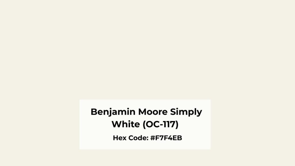
Simply White is a “high-performer” in the warm white category.
It has an LRV of about 89, which is bright, which means it’s reflecting almost 90% of the light.
When you’re standing in a room painted Simply White with good natural daylight, it looks clean white.
Not harsh but fresh and bright with a subtle warmth underneath without feeling cold.
The undertones are soft yellow.
They’re gentle.
I’ve used Simply White in modern farmhouse kitchens, transitional living rooms and contemporary bedrooms, and it works.
It’s one of the rare whites that plays well with both warm and cool finishes, though it is warm.
Simply White doesn’t shift on you.
Some whites get moody depending on the light, they flash green or gray or look cream.
Simply White is consistent.
Morning light, afternoon light, overcast days, it maintains the bright and little warm vibe.
I’ve painted homes in this color.
Walls, trim, ceilings, the whole color thing is everywhere.
It creates a seamless, airy feeling that makes spaces feel big and clean without coldness.
Also a note: there’s also a Behr Simply White (BWC-01).
It has a different formula, and a different brand.
If you’re going with Simply White, stick with Benjamin Moore.
The Behr version doesn’t have the same undertone balance.
Color Summary of Benjamin Moore Swiss Coffee (OC-45)
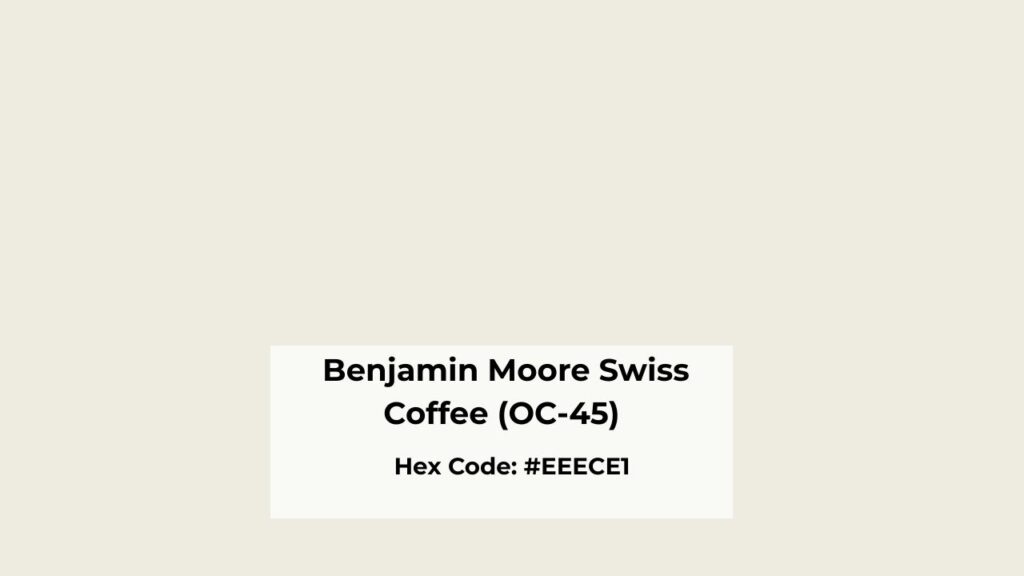
Swiss Coffee is the soft, creamy version.
It has an LRV around 81, it’s visibly less reflective than Simply White.
This may not sound like a difference, but in a space, you feel it.
Swiss Coffee has more body, more visual weight.
The undertones are where Swiss Coffee gets complicated.
The primary notes are yellow and beige and cream, but there’s a green undertone that comes when you least expect it.
I’ve seen Swiss Coffee look beautiful and warm in a south-facing room with light, then turn into a greenish-beige situation in a north-facing bedroom.
Swiss Coffee works beautifully with warm finishes.
Like with dark hardwood floors, cream subway tile, warm wood cabinetry, traditional trim work.
It’s popular in Tuscan-style homes and spaces with the 90s/early 2000s warmth.
But here’s where I’ve seen it fail: pairing Swiss Coffee with white quartz countertops.
The quartz is bright white, Swiss Coffee is creamy and warm, and your walls look out of place or yellow.
The same thing happens with marble finishes, Swiss Coffee is too warm and makes the marble look off.
There’s also a Behr Swiss Coffee (12) if you’re shopping at Home Depot, but it has a different formula.
What is the Difference Between Simply White and Swiss Coffee?
These two get confused, but they’re solving different problems.
Simply White gives you brightness and versatility.
Swiss Coffee gives you warmth and softness.
Where one works beautifully, the other may feel flat.
LRV
Light Reflectance Value is the first thing I check when comparing whites, and it’s the big differentiator.
Simply White’s LRV is 89, that’s the bright whites Benjamin Moore makes.
High LRV means high light reflection.
Your room feels bright, walls feel fresh, and you’re getting a fresh, clean look.
Swiss Coffee’s LRV is 81, which is decent, but lower.
It absorbs more light, which gives it the soft, creamy appearance.
In a room with great lighting, this can feel cozy and inviting.
In a room with poor lighting, it can look dull or muddy.
If you’re working with a north-facing room or a space with limited windows, the 8-point LRV difference matters.
Simply White will feel bright. Swiss Coffee may feel depressing.
Undertones
Simply White has a soft yellow undertone.
It’s warm, it’s gentle, it doesn’t go green or gray and it is predictable.
I can specify Simply White on a project without thinking about how it’s going to look.
Swiss Coffee has yellow and cream as the primary undertones, but with a hidden green that shows up in some lighting.
North-facing rooms bring it out.
Rooms with green landscaping outside are when green light bounces in and amplifies the green in Swiss Coffee.
It can also flash gray when paired with cool whites or cool-toned finishes.
I’m not saying Swiss Coffee’s undertones are not good but they’re more complex and environment-sensitive.
Lighting Affect
Simply White in different lighting:
- South-facing rooms: Bright, warm, fresh. This is where Simply White shines.
- North-facing rooms: Looks good. The warmth prevents it from going flat or cold.
- Artificial light: Handles both warm and neutral bulbs well.
Swiss Coffee in different lighting:
- South-facing rooms: Warm and creamy in a good way. This is Swiss Coffee’s happy place.
- North-facing rooms: Undertones intensify. Can look yellow-green or muddy.
- Artificial light: Warm bulbs amplify the cream and yellow. Cool bulbs can make it look off.
I once painted a client’s north-facing bedroom Swiss Coffee against my own recommendation and when I came back to check on it, the room felt heavy.
Style and Best Uses
Both colors work for traditional, farmhouse, and transitional styles, but Simply White has more range.
Simply White is the versatile choice for:
- Whole-home color like walls, trim, ceilings
- Modern and contemporary spaces
- Kitchens and bathrooms where you want brightness
- Pairing with white quartz, marble, or bright tile
- Mixed material palettes
Swiss Coffee works better for:
- Spaces with abundant warm natural light
- Homes with warm wood tones and traditional finishes
- Creating a cozy, soft look
- Tuscan or traditional style homes
- Rooms where you want visual warmth than brightness
Here’s a comparison table:
| Feature | Simply White | Swiss Coffee |
| LRV | ~89 | ~81 |
| Brightness | Very high | Medium |
| Warmth | Warm but clean | Strong, creamy |
| Undertones | Soft yellow | Yellow, cream, green |
| Consistency | Stable across lighting | Reactive to environment |
| Modern spaces | Excellent | Limited |
| Trim use | Excellent | Moderate |
| Versatility | High | Moderate |
Simply White Vs Swiss Coffee: Room-By-Room Comparison
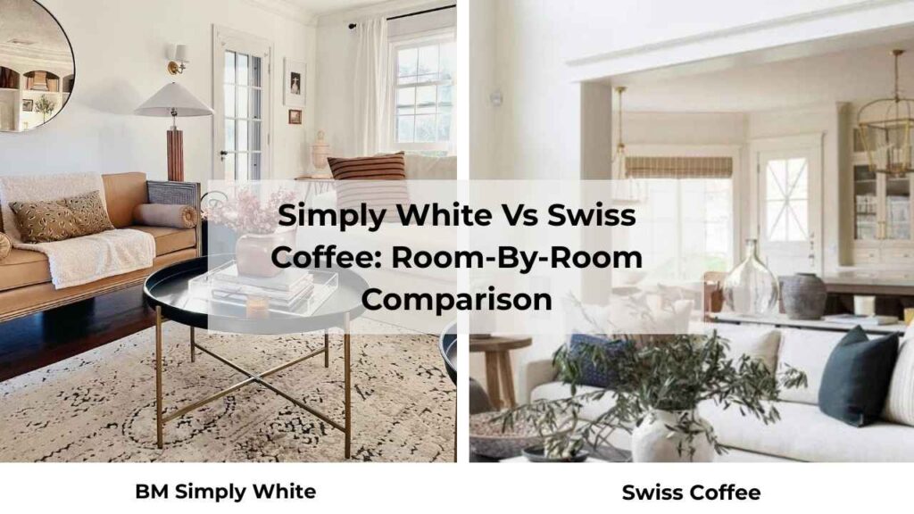
Choosing between these two isn’t only about the color but it’s about where you’re using it.
Each room has different lighting, different functions, different vibes.
Let’s break it.
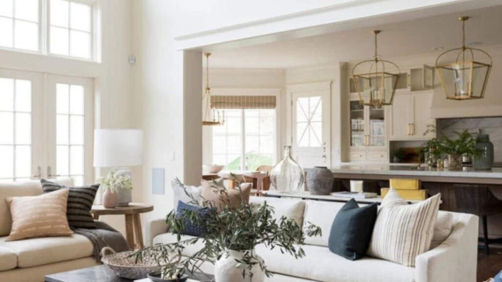
Living Room
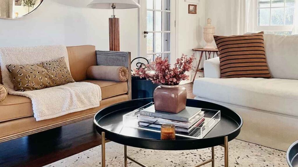
Simply White in the living room: If you want a bright, fresh space that feels open.
Simply White keeps living rooms feeling airy and modern without going cold.
It works well with both warm wood furniture and cool gray sofas.
I’ve used it in open-concept living spaces where the room flows into the kitchen and dining area, and it ties everything together without feeling heavy.
If your living room gets good natural light, south or west-facing then Simply White will look incredible.
Swiss Coffee in the living room: If your living room has a traditional vibe with warm wood tones, dark hardwood floors, or cream upholstery, Swiss Coffee can create a cozy, inviting atmosphere.
But you need abundant light.
A living room with limited windows and Swiss Coffee on the walls can feel closed-in and dull.
I’d also skip Swiss Coffee if you’re going for a modern look or if you have cool-toned furniture.
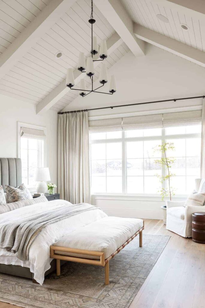
Bedroom
Simply White in the bedroom: Bedrooms are not easy to go with because you want them to feel restful, not harsh.
Simply White manages to be bright without being energizing, if that makes sense.
It’s warm to feel comfortable but clean to feel fresh.
North-facing bedrooms benefit from Simply White’s high LRV, you need the light reflection when natural light is limited.
I’ve painted my own bedroom Simply White and I love it.
Swiss Coffee in the bedroom: Here’s where I’ve seen Swiss Coffee fail.
Bedrooms don’t have as much natural light as living spaces, and Swiss Coffee in low light can look flat and depressing.
The green undertone can get out of place in the morning light, too.
Bathroom
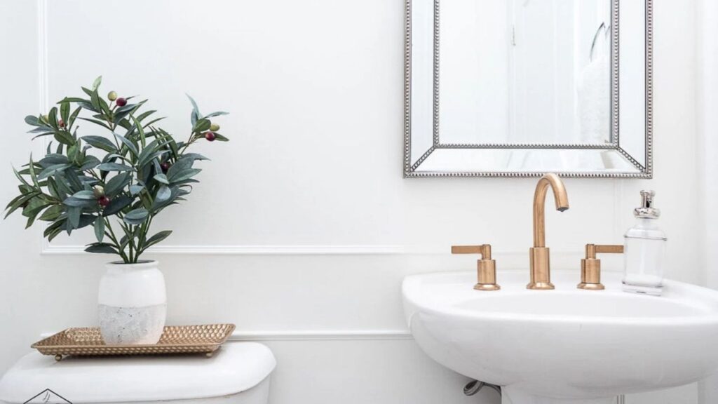
Simply White in the bathroom: Bathrooms need to feel clean, and Simply White delivers.
It pairs well with white subway tile, marble, quartz vanities, chrome fixtures, all the classic bathroom finishes.
The brightness makes small bathrooms feel big and keeps the space feeling fresh.
If you’re using warm Edison bulbs or something, Simply White picks up a yellow tone, but it’s subtle.
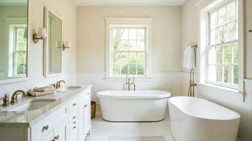
Swiss Coffee in the bathroom: I recommend Swiss Coffee for bathrooms, mainly modern ones.
If you have a bathroom with cream or beige tile from a renovation and you’re trying to work with existing finishes, Swiss Coffee may bridge the gap.
But if you’re going for a clean, spa-like bathroom then don’t go with it.
Swiss Coffee can make white fixtures look extra white, which makes your walls look out of place.
Kitchen
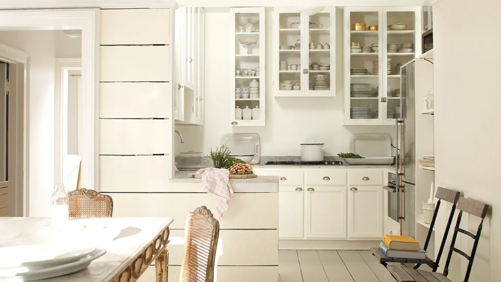
Simply White in the kitchen: This is where Simply White is used most, and for good reason.
It’s a go-to for white kitchen cabinets.
It’s bright to feel clean, warm to feel inviting, and it pairs well with white quartz countertops, marble backsplashes, stainless appliances and with everything.
I’ve specified Simply White on many kitchen projects and it goes with almost everything
Swiss Coffee in the kitchen: Swiss Coffee can work in a kitchen, but you need the right setup.
If you have warm wood cabinets, cream countertops, or a traditional kitchen with lots of warm tones, Swiss Coffee creates a cohesive look.
But if you have modern white cabinets and white quartz, don’t do it.
Swiss Coffee will look yellow and aged next to the bright whites.
Exterior

Simply White on exteriors: Exterior Simply White looks fresh and classic.
It’s bright to have presence and visual appeal without being harsh white.
It works on traditional homes, farmhouses, contemporary builds and it looks versatile.
The warmth keeps it from looking too modern or cold, but it’s bright to feel fresh and updated.
Swiss Coffee on exteriors: Exterior Swiss Coffee gives you a soft, understated look.
It’s lovely on traditional homes, especially with warm brick, stone, or wood accents.
The cream warmth feels established and elegant.
But be careful with the undertones, in some light, especially under heavy tree cover or with surrounding greenery.
Simply White Vs Swiss Coffee Vs Other Colors
Context is everything when choosing whites.
Here’s how Simply White and Swiss Coffee looks against other popular options.
Simply White Vs Swiss Coffee Vs White Dove
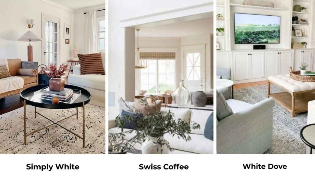
White Dove (LRV 83.16) is between Simply White and Swiss Coffee in terms of brightness.
It’s the most popular of all three because it has predictable, soft warm undertones without Swiss Coffee’s hidden green or Simply White’s high brightness.
White Dove is the safe choice, it works everywhere.
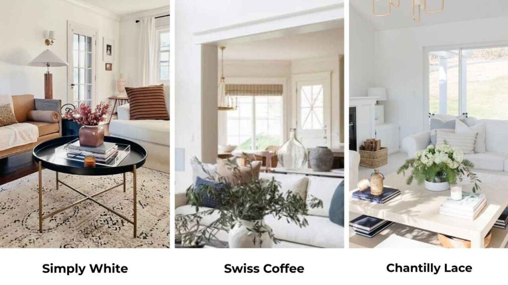
Swiss Coffee Vs Chantilly Lace
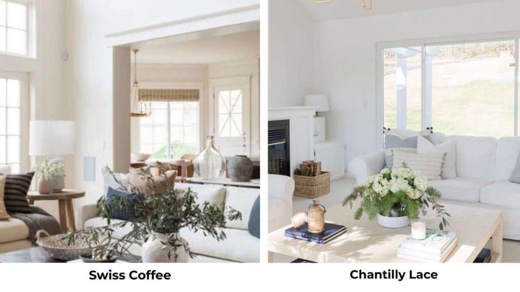
Chantilly Lace LRV 90.4 is Benjamin Moore’s brightest white, and it makes Swiss Coffee look cream by comparison.
If you put them side by side, Swiss Coffee will appear yellow and heavy.
These two are opposites.
Chantilly Lace is for when you want TRUE white with minimal warmth.
Swiss Coffee is for when you want visible warmth and cream tones.
Don’t use them in the same space because the contrast will emphasize Swiss Coffee’s undertones in a bad way.
Swiss Coffee Vs Alabaster
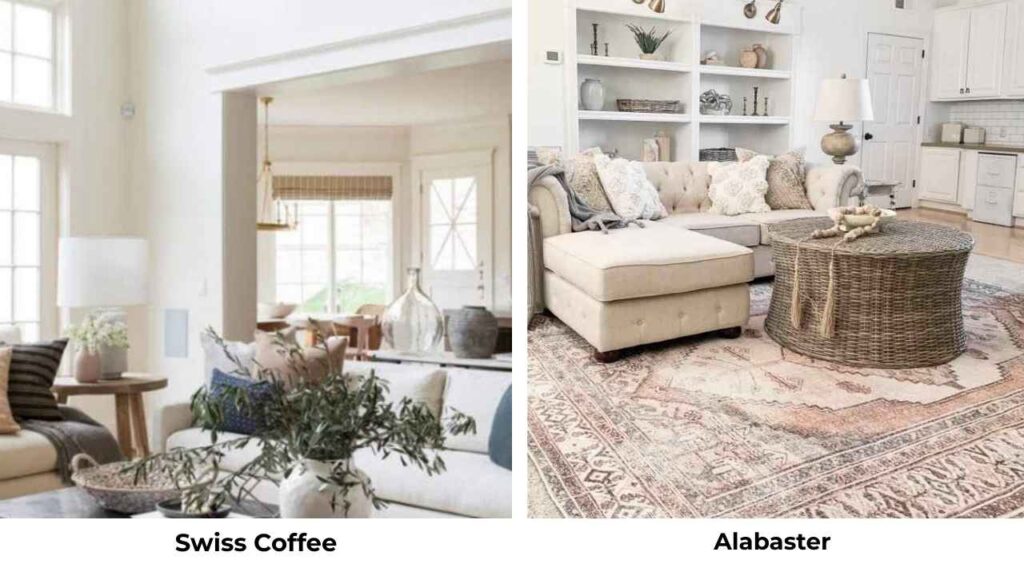
Sherwin Williams Alabaster is warmer than Swiss Coffee with visible creamy yellow undertones, but it’s popular because people trust Sherwin Williams’ color consistency.
Both Swiss Coffee and Alabaster work in Tuscan-style homes and spaces with warm finishes from the 90s-2000s.
I recommend Alabaster more than Swiss Coffee because it’s less reactive.
Swiss Coffee Vs Shoji White
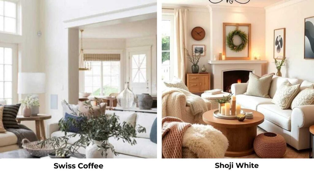
Sherwin Williams Shoji White is a warm white similar to Simply White, bright but with warmth.
It’s more consistent than Swiss Coffee and doesn’t have the green undertone.
If you like the idea of Swiss Coffee but you’re nervous about the undertones, Shoji White is better.
Swiss Coffee Vs Linen White
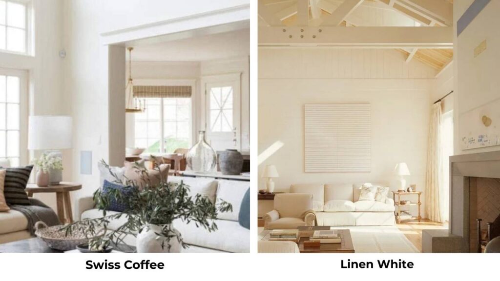
Linen White is another warm, creamy white.
It’s close to Swiss Coffee in warmth but with more yellow, less green.
Both are tricky in north-facing rooms and both work better with abundant natural light.
Swiss Coffee Vs Creamy

Sherwin Williams Creamy is visibly warmer and more yellow than Swiss Coffee.
If Swiss Coffee feels too subtle, Creamy gives you warmth.
But it’s also easy to get wrong, Creamy can look straight-up yellow in the wrong light.
Behr Simply White Vs Behr Swiss Coffee
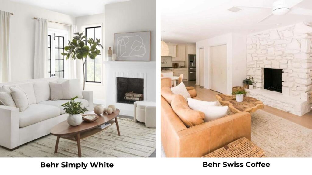
The Behr versions are different formulas with different undertones.
Behr’s color matching isn’t as precise as Benjamin Moore’s, so if you’re committed to the specific colors, I’d stick with Benjamin Moore.
The Behr versions may look similar on the swatch but look different on the wall.
Here’s a comparison table:
| Color | LRV | Warmth | Best For |
| Simply White | 89 | Warm but clean | Versatile, modern, whole-home |
| Swiss Coffee | 81 | Creamy, soft | Traditional, warm finishes |
| White Dove | 83 | Soft warm | Most reliable, safe choice |
| Chantilly Lace | 90 | Minimal | True white, bright spaces |
| Alabaster (SW) | Similar to Swiss Coffee | Creamy yellow | Warm traditional spaces |
Which is One Shade Darker than Swiss Coffee?
If you’re looking for something dark and warmer than Swiss Coffee, Benjamin Moore Cloud White is a good next step.
It’s warmer with visible creamy yellow undertones.
Another option is White Dove if you want something which is darker than Simply White but not as creamy as Swiss Coffee, it has the perfect middle ground.
Conclusion
After working with Simply White Vs Swiss Coffee, here’s my advice: Simply White is the safe and versatile choice for homes.
It’s bright, it’s fresh, it’s predictable, and it works in almost any room with any lighting situation.
Swiss Coffee has its place, it’s beautiful in the right setting with warm finishes and abundant light but it’s picky and undertones may appear.
If you want a warm white that won’t have regret, go with Simply White.
If you want visible cream tones and you’ve tested it in your space with your lighting, Swiss Coffee is perfect.
Test it and live with samples for a few days.
Watch how it looks morning, noon, and night.
Choosing between Simply White Vs Swiss Coffee can be a bit confusing for your space but once you understand how to go with it then it’ll become nice and beautiful.
Living with these paint colors is important to understand and also there are other whites too that you can consider.
FAQs On Simply White Vs Swiss Coffee
Skip Simply White if you want a true off-white with visible cream depth because it’s too bright. Also avoid it if you’re trying to match existing cream or beige finishes because Simply White will make them look outdated.
No, Simply White has soft yellow undertones, but they’re subtle. It doesn’t look yellow the way Swiss Coffee can. In lighting, Simply White looks clean and bright with a hint of warmth.
Sherwin Williams Alabaster is the closest cross-brand match, it is warm, creamy, soft. Benjamin Moore Cloud White is similar but warmer. White Dove is a good alternative if you want something predictable with less green undertone.
The main differences: Simply White is bright LRV 89 vs 81, has consistent undertones, and works in more varied lighting conditions. Swiss Coffee is soft, creamy, and reactive to lighting and surrounding finishes.
Simply White Vs Swiss Coffee: The Best Choice For Every Room