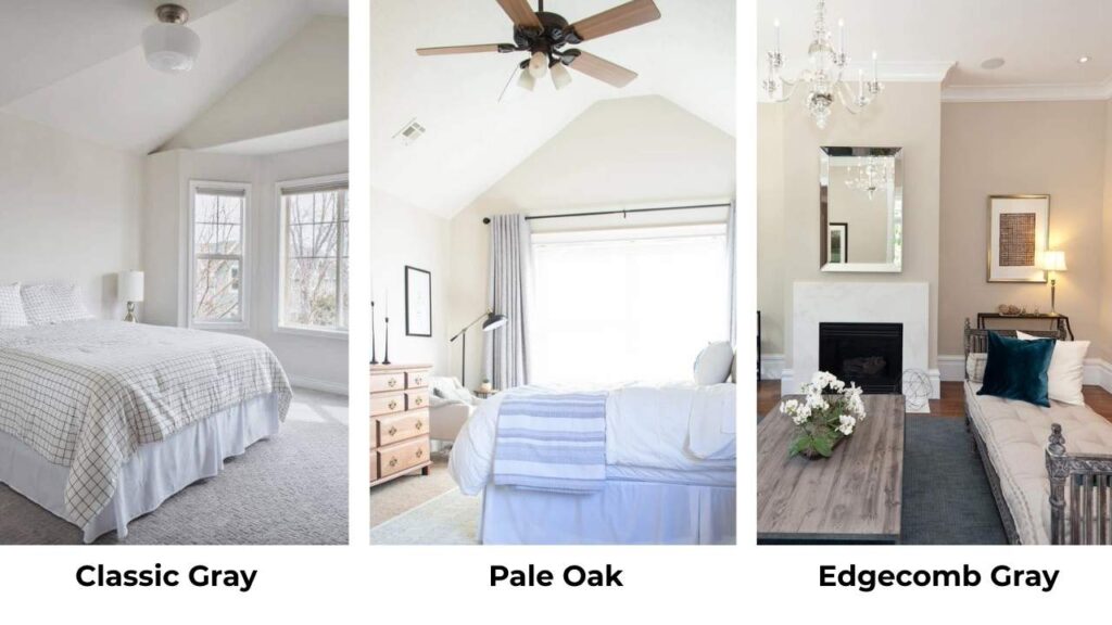
I’ve tested Benjamin Moore Classic Gray and Pale Oak on walls than I can count. Both are popular Benjamin Moore neutrals that people look at.
They’re soft without being bland, versatile to work in homes, and they have a timeless quality. But choosing between Classic Gray vs Pale Oak isn’t as picking the light or the warm.
Both colors are in the warm-leaning off-white or light greige category.
They appear the same in brightness when you look at the paint swatches but they’re not interchangeable.
The way they behave in different lighting conditions is where everything changes.
The undertones are different directions depending on whether you have southern exposure flooding your living room or a north-facing bedroom that never feels bright.
So, I’m breaking down the color profiles of Classic Gray Vs Pale Oak, how they look on walls. The LRV, undertones, how lighting affects, and which rooms these colors work best in.
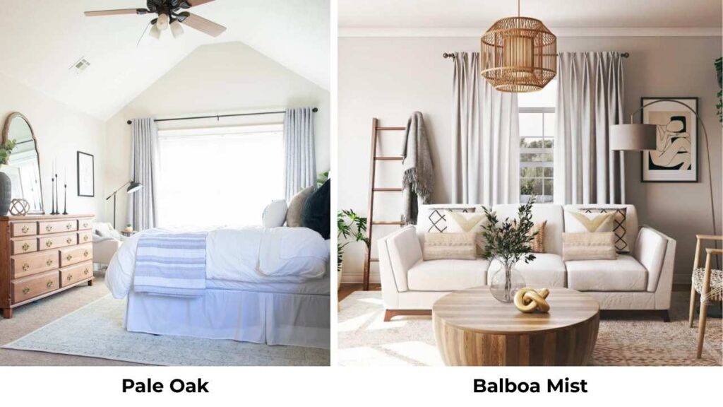
I’ll show you how they compare to other popular neutrals like Balboa Mist and Edgecomb Gray and others too.
Here are my other blogs that you can also read:
- Oyster White Vs Shoji White
- Bm White Dove Vs Alabaster
- Woodlawn Blue Vs Palladian Blue
- Peppercorn Vs Iron Ore
- Manchester Tan Vs Acceccible Beige
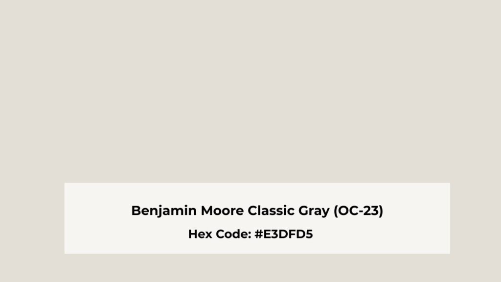
Color Profile of Benjamin Moore Classic Gray (OC-23)
Classic Gray has a reputation for being the “safe” choice, and I used to think that was boring.
The color is a very light greige that is an off-white.
The LRV is around 74, which means it reflects light back into the room. It was my own hallway, because I wasn’t about to test it on someone else’s house.
The color looked white in the afternoon when sun bounced through from the adjacent rooms.
But Classic Gray has warm undertones with a subtle violet or purple touch that keeps it from going cold and builder-grade.
You won’t always see it, but at some times, like late afternoon or under warm artificial lighting, there’s a purple cast that shows up.
The thing about Classic Gray is cooler than Pale Oak in many lighting situations. What I mean is it has more gray than beige, so it feels cool if it’s not a cold gray.
In bright natural light, mainly southern exposure, it can appear pure white.
I’ve used it in living rooms where there’s a mix of natural and artificial light. It creates a clean, calm backdrop.
Bedrooms are another win, if you want an airy, peaceful vibe without going bright white.
It works well in open concept homes because it’s neutral to flow from room to room.
For exteriors, I’ve seen it on modern farmhouse builds and it’s stunning with white trim.
Though I’d recommend testing it on your exterior wall because outdoor light behaves differently than indoor.
Designers and homeowners keep coming back to Classic Gray for bathrooms too because it’s light to make small bathrooms feel big but has color to not look sterile.
Color Profile of Benjamin Moore Pale Oak (OC-20)
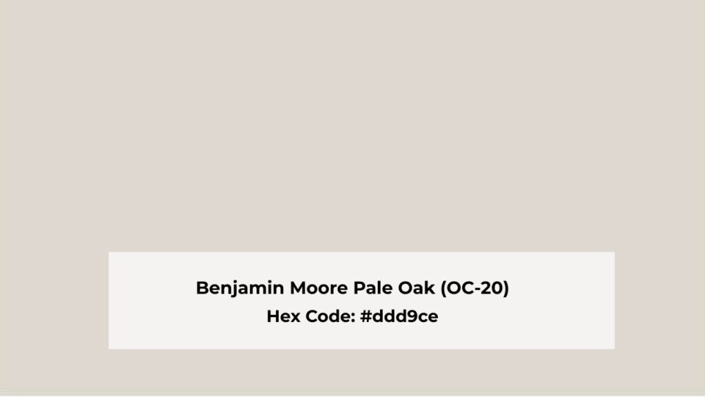
Pale Oak is warm. It is a light greige but it is more into the beige-taupe base than Classic Gray. The LRV is around 69, so it’s darker and shows more visible color saturation.
You’ll see this as a COLOR on your walls, not only “light neutral paint.” The warm undertones come through with hints of pink and violet.
I made a mistake with Pale Oak. Painted a north-facing bedroom thinking it would warm up the space. Instead, it looked flat and kind of grayish-greige without any of the beautiful warmth.
It’s because Pale Oak needs light to show its best qualities. In a south-facing room with strong sunlight is perfect.
The color is richer and darker than Classic Gray.
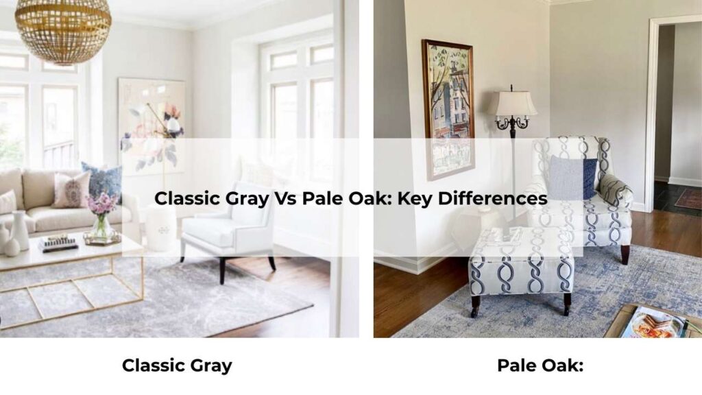
When people say they’re similar, I want to show them my comparison wall where I painted them side by side. Pale Oak has depth.
Classic Gray floats on the wall but Pale Oak has presence.
Where Pale Oak shines is in living rooms with warm finishes. If you have wood floors, mainly honey oak or walnut tones, Pale Oak picks up the warm notes and creates a cohesive, pulled-together look.
I’ve used it in bedrooms where clients wanted the soft, enveloping feeling.
Kitchens with Pale Oak walls are gorgeous, and if you pair it with navy cabinets or chocolate brown accents, it looks beautiful.
And in hallways or transitional spaces, it maintains that warmth in lower light conditions.
Classic Gray Vs Pale Oak: Key Differences
Okay so they’re both light neutrals, both called “greige” by people, both from Benjamin Moore’s Off-White collection.
But they’re not similar once you get past the surface level.
LRV
Light Reflectance Value is how much light a color reflects back.
High numbers mean light and bright.
Classic Gray is at LRV 74 which makes it light and reflective.
It bounces light around your room, which is great for dark spaces but can look washed out in bright rooms.
Pale Oak is at LRV 69, not a huge difference, but you notice it on walls. It absorbs more light, so it shows more color and depth.
In rooms with abundant light, this is an advantage because Pale Oak holds its color instead of disappearing.
Undertones
Classic Gray has gray as the dominant player with beige influence and the subtle violet undertones.
It is cool and neutral. The violet shows up, mainly in afternoon light or with warm wood tones.
Pale Oak is beige and taupe dominant with soft pink and purple undertones. It’s the warmer of the two.
The pink undertone can be lovely in the right light but it can also turn too pink if you’re not careful.
Lighting Behaviour
If I could make people understand ONE thing about paint, it’s that lighting changes everything.
Classic Gray in northern exposure: Can look cool, gray, sometimes flat. Not terrible, but not exciting.
Classic Gray in southern exposure: May wash out and look almost white. This isn’t always bad, sometimes you want the barely-there color.
But it can also look dull or lack dimension.
Pale Oak in northern exposure: Loses some warmth and can lean grayish. This is what happened in my bedroom.
The taupe-beige magic didn’t show up.
Pale Oak in southern exposure: THIS is where it’s meant to be.
The warmth comes alive, the beige is beautiful, and it looks like what you thought you were getting when you picked up that paint swatch.
Warmth and Depth
Classic Gray creates a clean, calm, neutral backdrop. It’s not trying to add warmth to your space, it’s being a nice, quiet, agreeable color that lets your furniture and decor shine.
The depth is minimal, which is fine if that’s the look you want. Modern, minimalist, Scandinavian-ish spaces.
Pale Oak brings warmth and coziness. It has depth and your walls don’t look flat or one-dimensional.
If you want your room to feel warmer, Pale Oak is what you should consider. Classic Gray won’t change the temperature of your space.
Styling and Best Uses
Classic Gray pairs beautifully with Simply White or Chantilly Lace for trim. The bright white contrast keeps it from looking muddy.
For accent colors, I love it with Hale Navy or Smoke. Works best in: modern spaces, rooms with cool finishes like marble or stainless steel, minimalist aesthetics, bright rooms that can handle a light color.
Pale Oak looks gorgeous with White Dove trim, the warm white plays well with the beige undertones.
For drama, pair it with navy cabinets or Middlebury Brown accents.
Works best in: traditional or transitional spaces, rooms with warm wood floors, cozy bedrooms, south-facing rooms, homes with brass or gold fixtures.
| Feature | Classic Gray | Pale Oak |
| LRV | 74 | 69 |
| Undertones | Gray with violet | Beige-taupe with pink |
| Warmth | Cool neutral | Warm neutral |
| Best Light | Mixed or low light | Bright, southern exposure |
| Reads As | Off-white / light gray | Greige / light beige |
| Depth | Minimal | More visible |
| Style | Modern, minimal | Traditional, cozy |
Classic Gray Vs Pale Oak: Room-by-Room Comparison
Let me walk through how these look in real rooms, because theory is nice but application is where the truth comes.
Living Room
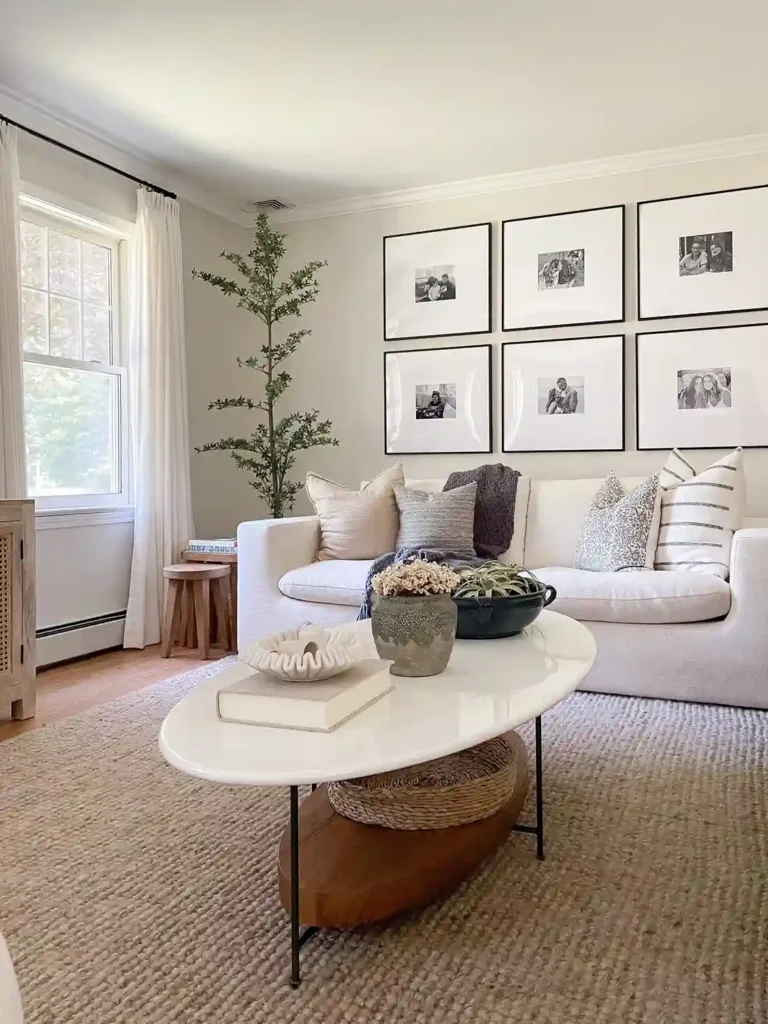
Classic Gray in a living room creates a peaceful, blank canvas vibe. It’s perfect if you have colorful furniture or bold art that needs to shine.
I used it in an open-concept living room that flowed into a white kitchen, and it created a seamless transition without being boring.
The trick is making sure you have contrast with your trim and light to keep it from looking flat.
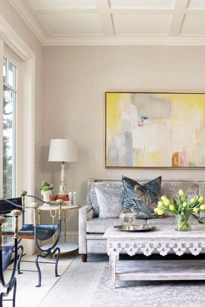
Pale Oak in a living room feels inviting. It’s beautiful in living rooms with wood floors, the warmth plays off the wood tones and everything feels cohesive.
I’ve seen it work well in traditional living rooms with upholstered furniture and soft textures. The depth means your walls have dimension and interest before you add decor.
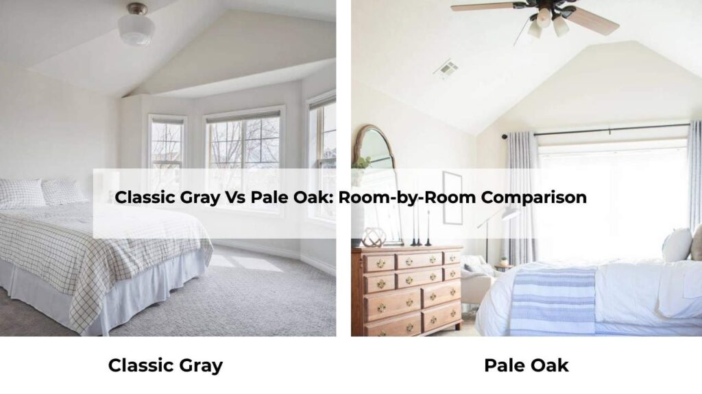
Bedroom
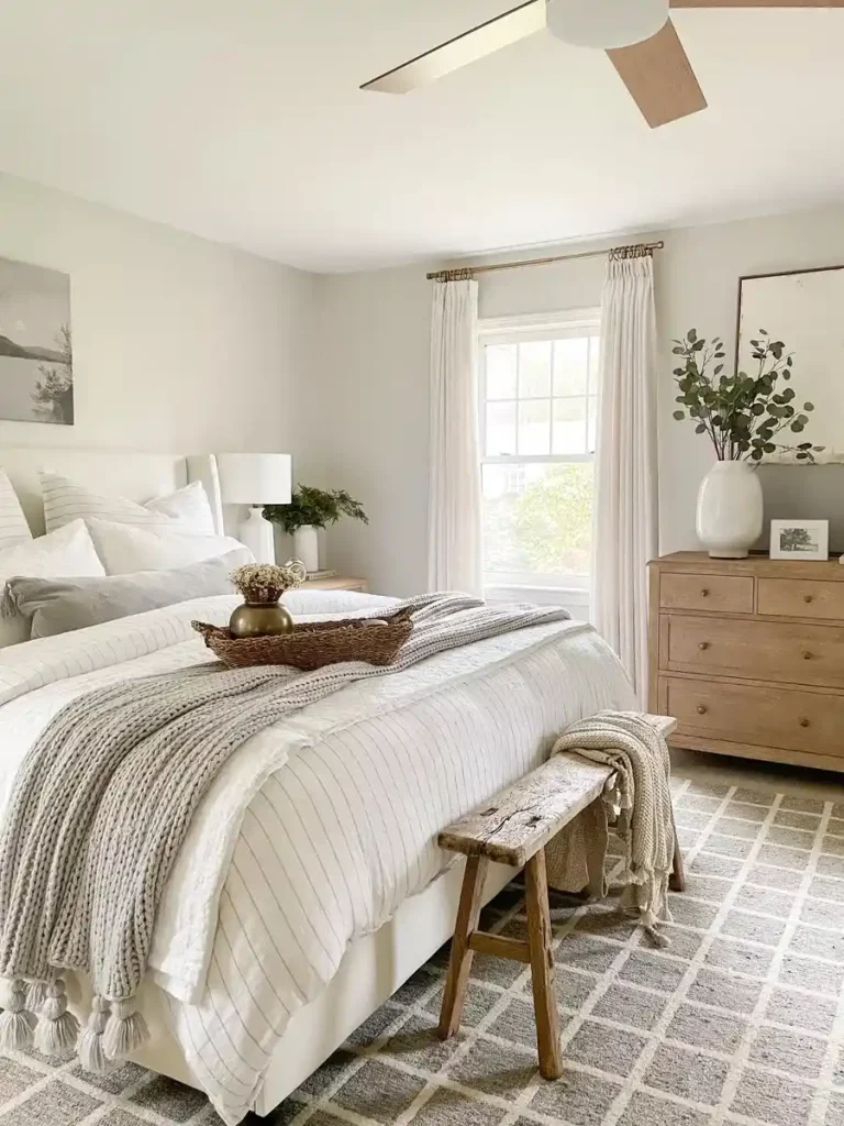
Classic Gray in bedrooms is a clean, hotel-esque look.
Peaceful, calm, not demanding anything from you at the end of a long day. It works great in bright bedrooms where you want to keep things airy.
But if you’re someone who wants your bedroom to feel cozy and cocoon-like, Classic Gray might be too cool for you.
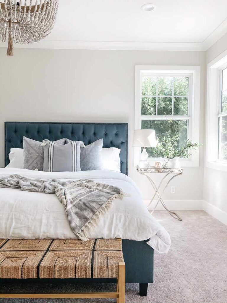
Pale Oak is my preference for bedrooms. Unless you have a bright, sunny bedroom. The warmth feels right at night when you’re winding down.
Under the lamplight, it gets warm and enveloping.
The beige undertones create a soft, restful atmosphere that works for sleep spaces.
Bathroom
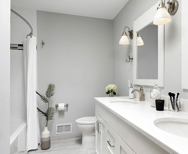
Classic Gray in bathrooms is fresh and clean without being sterile. It’s light for small bathrooms to not feel cramped.
Pair it with white subway tile and chrome fixtures and you’ve a modern bathroom that’ll age well. I like it in bathrooms with white.
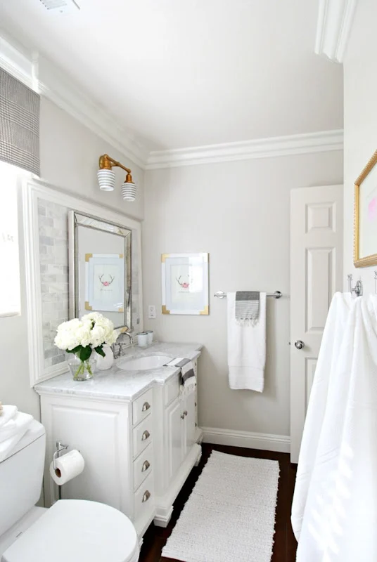
Pale Oak in bathrooms is lovely if you have natural light.
The warmth feels spa-like and soft. But in a windowless bathroom or powder room. Test it because it can look dingy or muddy without light.
I’ve seen it look amazing in primary bathrooms with big windows.
Kitchen
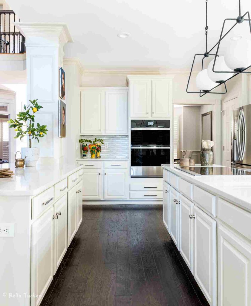
Classic Gray in kitchens is having a moment.
It’s light to keep kitchens feeling bright and clean, and it pairs well with white cabinets, marble countertops, and stainless appliances.
It’s a good choice if your kitchen has cool finishes and you don’t want to go against the vibe.
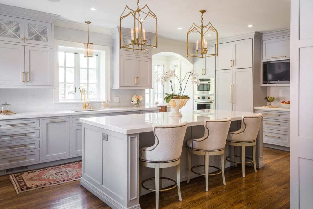
Pale Oak in kitchens with warm elements is stunning.
Wood cabinets, butcher block countertops, brass hardware, it all comes together.
I’ve also seen it used as a wall color with navy or dark cabinets and the contrast is beautiful.
Classic Gray Vs Pale Oak Vs Other Colors
You’re also looking at other popular Benjamin Moore neutrals because why wouldn’t you look to yourself with more options.
Classic Gray Vs Edgecomb Gray
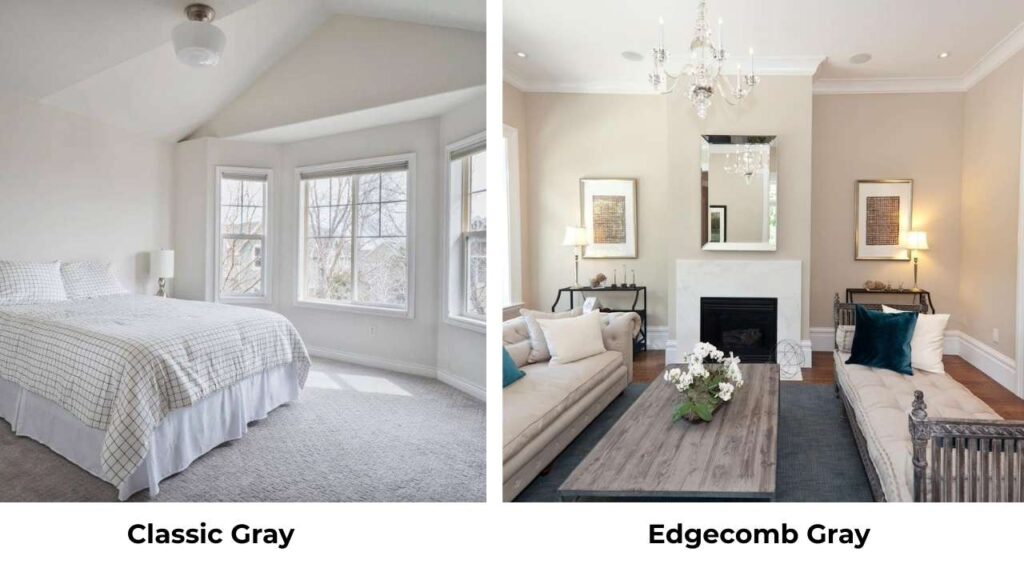
Edgecomb Gray (HC-173) is warmer and darker than Classic Gray and it has an LRV of about 63.
It’s a true greige that shows visible warmth, whereas Classic Gray is lighter and cooler.
If you want color and warmth, go Edgecomb.
Classic Gray Vs Balboa Mist
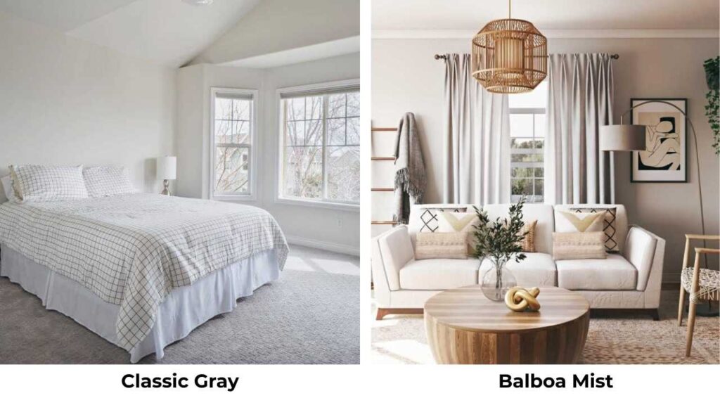
Balboa Mist (OC-27) is between these two with an LRV around 67.
It’s darker than Classic Gray but similar in tone, the soft gray with warm undertones.
Balboa Mist is a great middle ground if Classic Gray feels too light but you don’t want Pale Oak’s beige warmth.
Classic Gray Vs White Dove
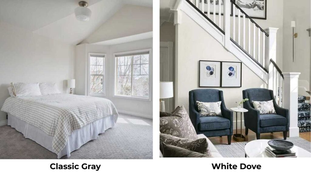
White Dove (OC-17) is a white. It has warm undertones but it’s whiter and crisper than Classic Gray.
If you’re debating between them, ask yourself if you want a true white with warmth or a very light gray.
They serve different purposes like White Dove is better for trim or for people who want white walls, Classic Gray is for people who can’t commit to pure white.
Pale Oak Vs Balboa Mist
Balboa Mist is cool and grayer than Pale Oak. Pale Oak is beige, Balboa Mist is gray. Both are beautiful but different vibes.
Balboa Mist is versatile in different lighting; Pale Oak is specific about where it looks best.
Edgecomb Gray Vs Pale Oak
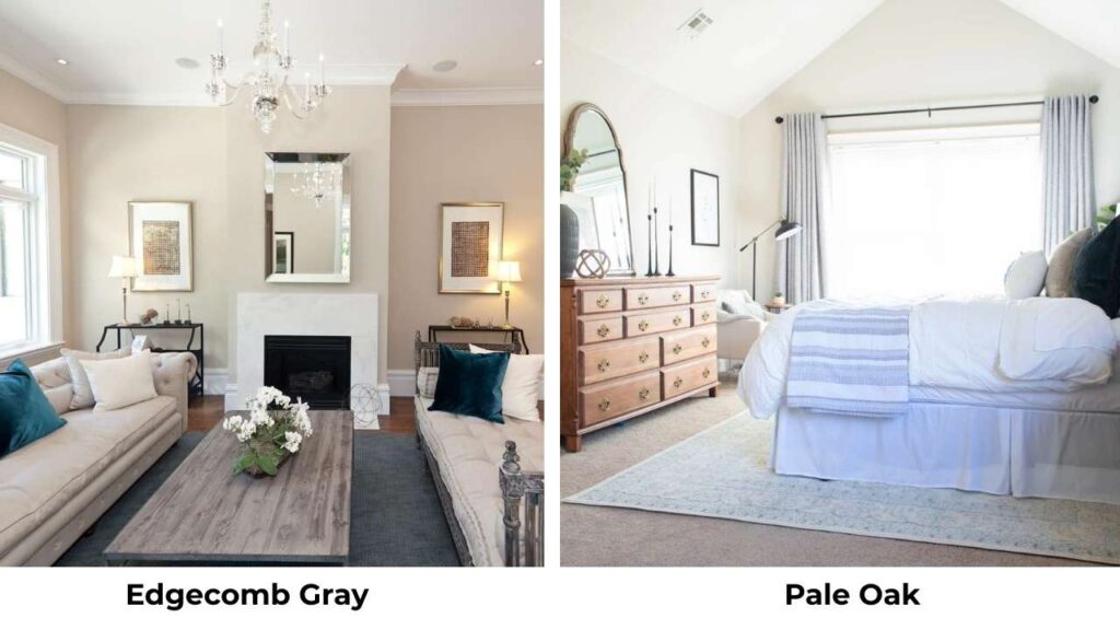
These are similar in warmth level. Edgecomb Gray is dark and shows greige color. Pale Oak is light and soft.
If you love Pale Oak but want more presence and don’t have amazing light, Edgecomb is better.
Worldly Gray Vs Pale Oak
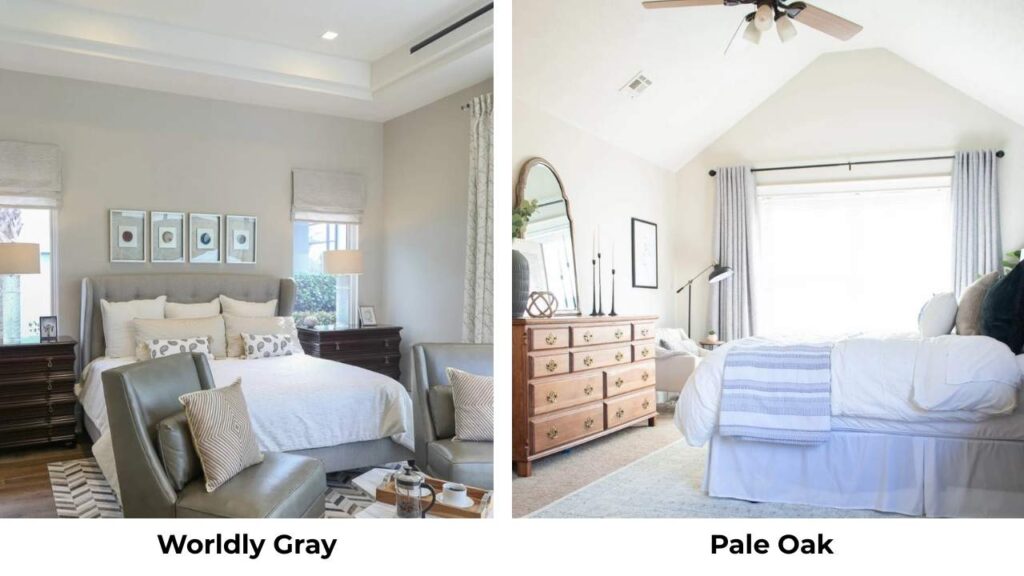
Worldly Gray is a Sherwin-Williams color but people compare it. It’s cool and grayer than Pale Oak.
If you like Pale Oak’s lightness but want gray instead of greige-beige, look at Worldly Gray. But they’re different colors.
| Comparison | LRV | Warmer/Cooler | Best For |
| Classic Gray vs Pale Oak | 74 vs 69 | Cooler vs Warmer | Modern vs Traditional |
| Classic Gray vs Balboa Mist | 74 vs 67 | Similar, BM slightly warmer | Very bright rooms vs moderate light |
| Classic Gray vs Edgecomb Gray | 74 vs 63 | Much cooler vs Much warmer | Light neutral vs True greige |
| Pale Oak vs Balboa Mist | 69 vs 67 | Much warmer vs Cooler | Warm spaces vs Cool spaces |
| Pale Oak vs Edgecomb Gray | 69 vs 63 | Similar warmth, PO lighter | Need lighter color vs Want more depth |
What is the difference between Sherwin Williams Classic Gray and Benjamin Moore Pale Oak?
Wait, hold up. Sherwin Williams doesn’t have a “Classic Gray”. You are thinking of Sherwin Williams Agreeable Gray or Repose Gray, which people compare to Benjamin Moore’s neutrals.
If you’re asking about Sherwin Williams grays vs Benjamin Moore Pale Oak, So many SW grays are cooler than Pale Oak.
Pale Oak is firmly in greige-beige territory with warm undertones. SW Agreeable Gray is cooler and balanced.
SW Repose Gray is cooler.
Paint brands formulate colors differently, so if the LRV is similar, the color and how it behaves can be different.
If you’re set on Pale Oak’s warmth, go with Benjamin Moore. If you want to explore SW options, look at Accessible Beige for something warm.
Conclusion
So, Classic Gray vs Pale Oak. Neither is “better” but they’re different.
And choosing between them depends on your space, your light, and what you want your walls to do.
Go with Classic Gray if you want a clean, light, almost-white neutral that feels modern and calm. If your room is bright and you don’t want to add warmth, Classic Gray is your color.
It’s safe, versatile, and works with cool finishes.
Go with Pale Oak if you want warmth and coziness and your room has good natural light. If you have warm wood floors or traditional style or you want your space to feel warm.
Sample both because these colors look NOTHING like the paint swatch in real life on your walls in your lighting.
Get Samplize samples or paint poster boards and move them around your room throughout the day.
Look at them in morning light, afternoon light, evening light, under your lamps.
FAQs on classic gray vs pale oak
Yes, Classic Gray has an LRV of 74 vs Pale Oak’s 69, so it reflects light. But it can look cooler and less visible because it looks off-white, while Pale Oak shows more color despite being darker.
Pale Oak has beige and taupe undertones with hints of pink and violet. The pink can show up in some lighting, mainly warm natural light or under incandescent bulbs. It’s a warm-leaning greige that shows more beige than gray.
Classic Gray has gray undertones with beige influence and subtle violet or purple touches. The violet can appear depending on lighting and what’s around it. It’s warmer than a true gray but cooler than Pale Oak.
For trim, I love White Dove, the warm white complements Pale Oak’s beige undertones perfectly. For accents and drama, Hale Navy is stunning, or go with Middlebury Brown for a sophisticated neutral palette.