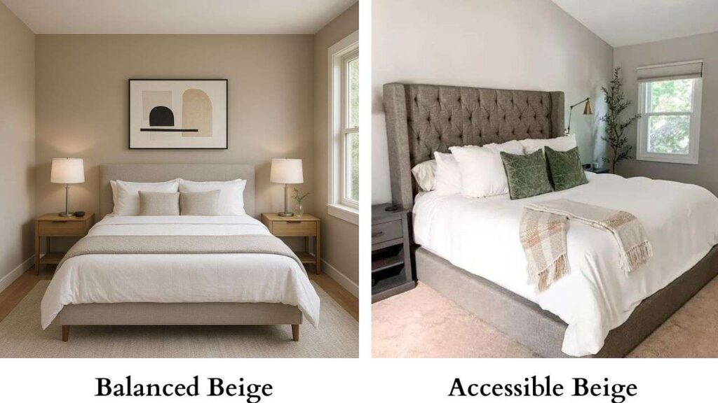
“Is beige back?”, “Or was that a 2000s color?”, “Can I pair beige with black?” – These questions were haunting my mind when I stumbled upon Balanced Beige vs Accessible Beige from the Sherwin-Williams beige collection.
This time, I reworked my study room and painted it with Tricorn Black.
But within a few months, I started to feel that something was missing.
So, off I went to my nearest Home Depot and started to search for some new colors.
When I spotted these two beige colors, “Balanced Beige SW 7037 and Accessible Beige SW 7036”.
I could spot some differences right off the bat but I was still left undecided.
So I took a few samples for the rooms of both colors and went on a deep-dive comparison between the two for my home.
Once I had finalised which beige shade to choose, I couldn’t resist it, and now I am sharing this comparative guide with you. In this Balanced Beige versus Accessible Beige.
I will break down all about the two colors – the color specifics, how they interact with light, the undertones, how they look in each room, their basic differences, along with when to choose Balanced Beige and when to choose Accessible Beige.
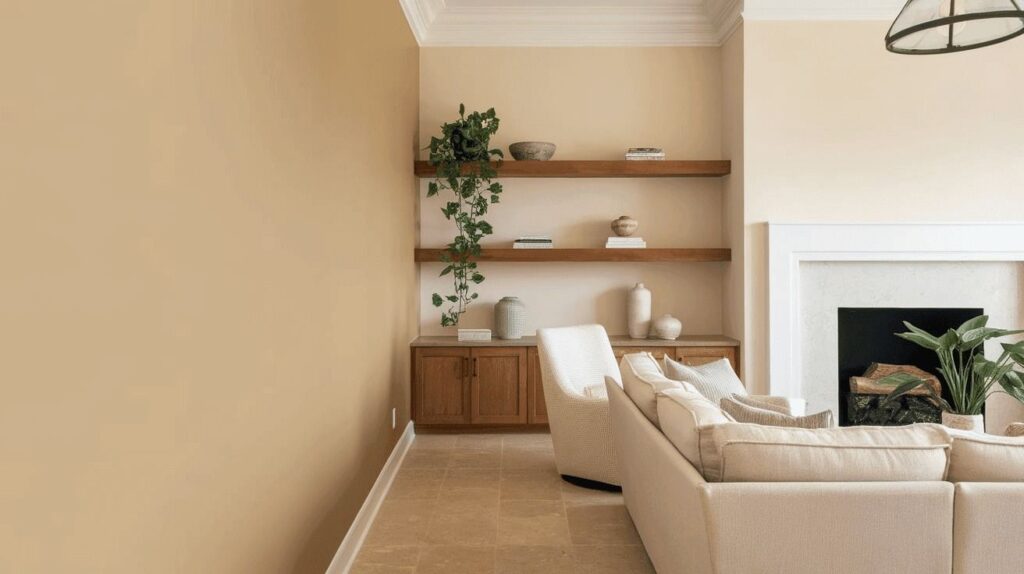
About Accessible Beige Sherwin Williams 7036
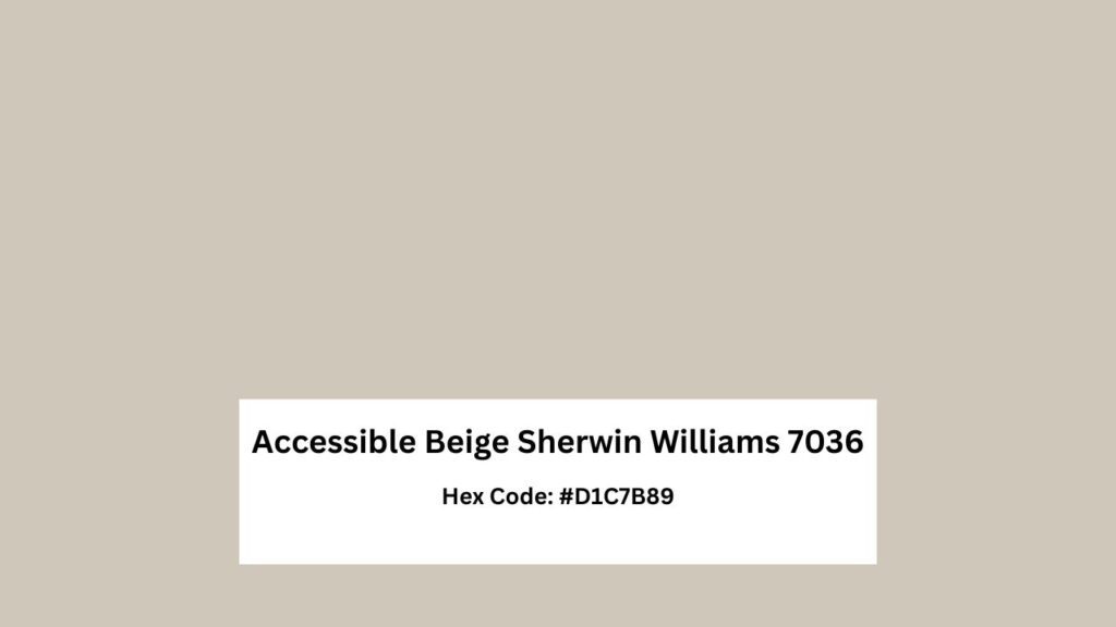
Accessible Beige SW 7036 is a slightly darker beige color, with brownish-green undertones.
Although it belongs to the beige family, Accessible Beige is more of a ‘greige’ color – gray mixed with beige.
When I tried a sample of it in my study room, I did expect the ‘greige’ aspect of it to come through, but I did not expect the undertone of brown with a splash of green to shine so much.
It was like, 70% gray+30% beige with strokes of brown & green added at the end.
And since my study room has huge windows which means I have access to lots of natural light.
Also I can see what my kids are doing in the garden when I am working, so checking the sample around this area was perfect for me.
With the LRV of 58, Accessible Beige shows a very muted, warm shade of beige when light interacts with this paint color and reflects on the wall, making it a perfect beige for indoors.
Technical Specifications Table of Accessible Beige Sherwin Williams:
| Feature | Accessible Beige SW 7036 |
| LRV | 58 |
| Hex Code | #D1C7B8 |
| RGB Values | R:209, G:199, B:184 |
| Undertones | Brown with a soft green edge |
| Color Family | Beige |
| Light Response | Soft, warm, slightly shifts with natural light |
| Best Use | Living rooms, kitchens, bedrooms, basements; warm and inviting interiors |
When used in other interior rooms, Sherwin Williams Accessible Beige creates a very warm and an inviting atmosphere that is contemporary and versatile.
This kind of beige adds a feel of coziness and depth without being too overly stark.
No wonder it was the editor’s pick when I cross-checked on the SW website.
I would recommend choosing Accessible Beige SW 7036 (color code) when you want your room to have a warm yet traditional feel to it.
It is a good choice for the kitchen, rooms, and basement.
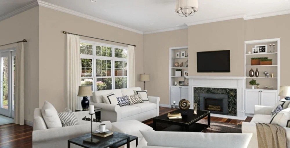
About Balanced Beige Sherwin Williams 7037
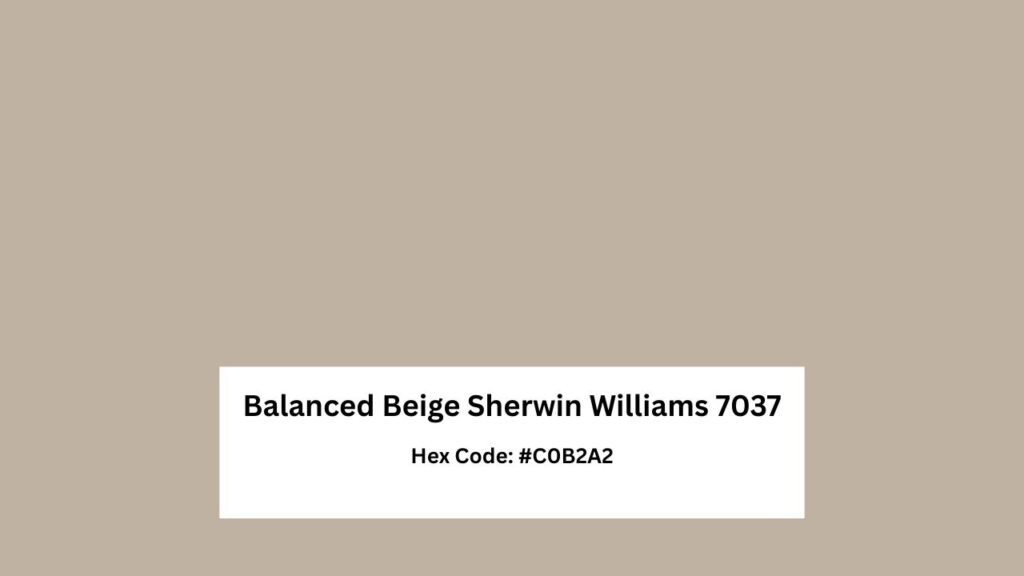
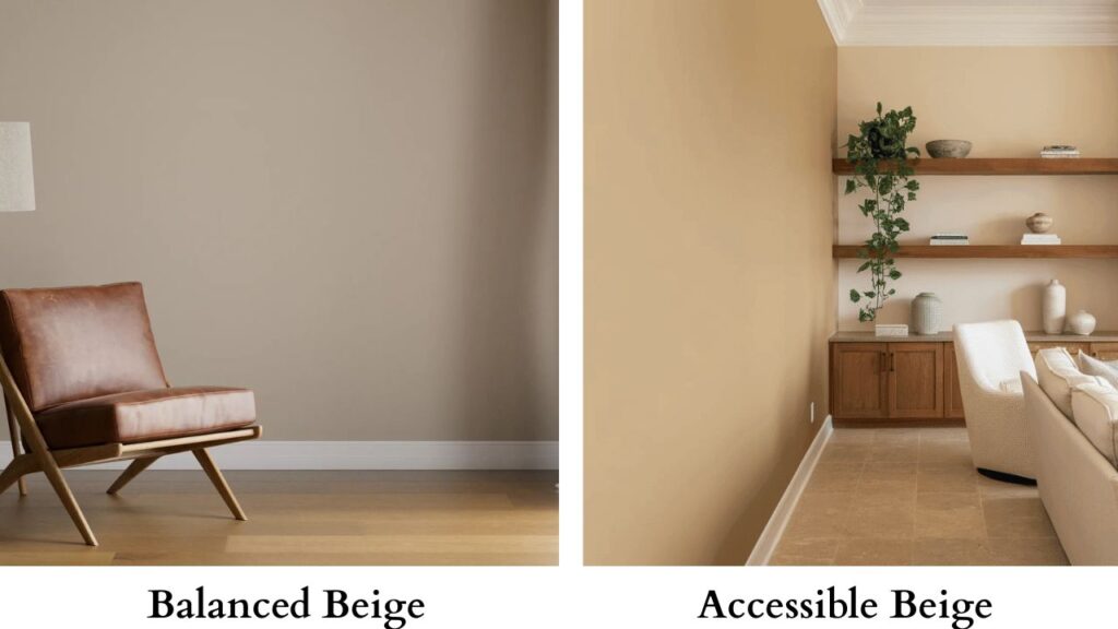
Balanced Beige SW 7037 is a warm, sophisticated neutral beige color that is a splash darker than Accessible Beige.
As its name suggests, it neither goes towards the warm yellow nor too gray.
It is a grounding beige-griege mix that feels earthy and classy at the same time.
With the LRV of 46, deciding on what undertone is balanced beige is a bit tricky because the undertone can depend on the location from where the natural light falls on the wall.
But if I were to simplify it, the base undertone can be described as a subtle gray with a slight, pink-taupe mix.
In a bright, cool light, it can go more towards the grey aspect and under natural light, helping the warm beige shine through.
Technical Specifications Table of Balanced Beige Sherwin Williams:
| Feature | Balanced Beige SW 7037 |
| LRV | 46 |
| Hex Code | #C0B2A2 |
| RGB Values | R:192, G:178, B:162 |
| Undertones | Soft gray with a pink-taupe hint; shifts warmer in natural light |
| Color Family | Beige-Greige (medium-deep) |
| Light Response | Leans gray in cool light; warmer beige in natural light |
| Best Use | Kitchen cabinets, trims, accent walls; spaces needing a grounded yet elegant neutral |
If I want to use Balanced Beige SW in my home, I would use it for my kitchen cabinets or accent wall trims, as this shade will work really well with a cool, white shade.
Due to its versatility, this shade is the perfect match when you want a medium-deep beige color without it being too overly yellow or golden, and can have a classy, sophisticated yet warm effect on the room.
Accessible Beige vs Balanced Beige: Which One Works Better in Your Home?
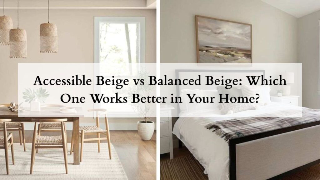
With both Accessible Beige and Balanced Beige being two completely different shades of beige, it is understandable that you can get confused as to which one to choose between the two.
I would recommend both colors to my clients depending on how they visualize the room after the color has been applied to it and what the overall look they are aiming for.
If you want a beige color that can be ideal for central areas like bedroom walls or kitchen cabinets, Accessible Beige Sherwin Williams is my go-to.
But if you want a splash of beige in your master bedroom, trim walls, or the accent walls in your basement, then go for Balanced Beige Sherwin Williams.
Now in this section, let’s learn more about these two colors and help you choose the right one for your home.
LRV: How do they stack up?
One of the biggest features of paints is their LRV – Light Reflectance Value – this measures how much light can bounce back on when it hits a specific color on a specific surface.
The scale goes between 0 – 100, with LRV of 0 being a true black, and an LRV of 100 being a true white.
Accessible Beige SW has an LRV of 58, making it a very adaptable, muted beige color that can still be used in the rooms, while providing a contrast to the overall look.
Because the LRV falls on the lighter side, Accessible Beige is light enough for most rooms, without being too harsh on the eyes.
Balanced Beige SW has an LRV of 46, which means that it absorbs light slightly better than Accessible Beige.
Because of the LRV, it is placed on the mid-range, offering more depth than Accessible Beige.
Undertone: How do they behave?
With respect to Balanced Beige, and its LRV of 46, most people get confused as to what undertones does balanced beige have.
I sampled this color for my study room which has plenty of natural light and have found that Balanced Beige is a soft gray and has passive undertones of pink-taupe in it.
A color like this would look perfectly on the trim walls and accent walls, as it provides a contrast to the room without looking too harsh.
Accessible Beige on the other hand, is a soft, muted beige-gray color, with brown-green undertones.
This color looks more neutral and subtle.
However, it can sort of change its undertone depending on the light that falls on it.
Mostly we have seen the brown-green coming through but other times a touch of pink can also be seen.
This chameleon-like quality can make this shade an almost perfect exterior color.
Visual Differences and Different Lighting
We can’t say anything until we actually see how the colors fit visually with the overall look of the room.
Hence, sampling the colors is necessary in every room.
Both Accessible Beige and Balanced Beige react differently to light coming from different locations.
In bright, natural sunlight, Accessible Beige may appear brighter and more airy, highlighting the beige-gray color, but making it look more beige.
But those same gray aspects will be highlighted in spaces that have cool lighting.
Similarly, lighting affects Balanced Beige very significantly.
In bright, natural sunlight will highlight the gray-beige color, but make it look a little more gray with hints of pink shining through.
But in areas with cooler lighting, the gray will look more visible with hints of taupe coming through.
Design Styles that Suit Each Shade
You can use a shade like Balanced Beige SW 7037 for a modern and minimalist look in your home – pair this shade on the trim walls with some crisp whites to give a very sleek and sophisticated look.
You can also use this shade in contemporary and traditional house styles, providing an overall contrast to the interiors as well.
Now coming to Accessible Beige SW 7036, because of its neutral nature and subtle undertones, this shade is recommended for larger areas and open floors.
It can also be used on the exterior as wall trims.
Comparison Table: Accessible Beige vs Balanced Beige
| Feature | Accessible Beige SW 7036 | Balanced Beige SW 7037 |
| Overall Difference | Soft, adaptable beige-gray suited for main living areas and kitchens; works well when you want a calm, neutral base. | Slightly deeper beige-greige ideal for trims, accent walls, and spaces where you want a bit more presence. |
| LRV: How They Stack Up | LRV 58 – lighter, reflects more light, keeps rooms open and comfortable without looking stark. | LRV 46 – mid-range depth, absorbs more light, adds richness and grounding to a room. |
| Undertone: How They Behave | Beige-gray with brown-green notes; can shift subtly depending on lighting, sometimes showing a faint pink cast. | Soft gray with pink-taupe undertones; looks grounded and balanced, especially in natural light. |
| Visual Differences & Lighting | Appears brighter and more airy in sunlight; leans beige in warm light and shows more gray in cooler light. Works well in varied lighting conditions. | In sunlight, looks slightly gray with a touch of pink; in cool light, the gray and taupe become more noticeable. Shows stronger shifts than Accessible Beige. |
| Design Styles That Suit Each Shade | Great for large areas, open layouts, bedrooms, kitchens, and even exteriors; pairs well with many palettes due to its neutrality. | Fits modern, minimalist, contemporary, and traditional styles; ideal on trims, cabinets, and accent walls for a sleek, refined contrast. |
A Room-by-Room Guide to use Balanced Beige Vs Accessible Beige
No two colors will have the same effect on the interior and exterior of every home.
Likewise, both Sherwin-Williams Accessible Beige and Balanced Beige will have a different overall look to the rooms they have been applied to.
In case you are wondering what these colors will look like in every room.
I will be breaking down the key characteristics of each color and how these two colors will blend in with the rooms.
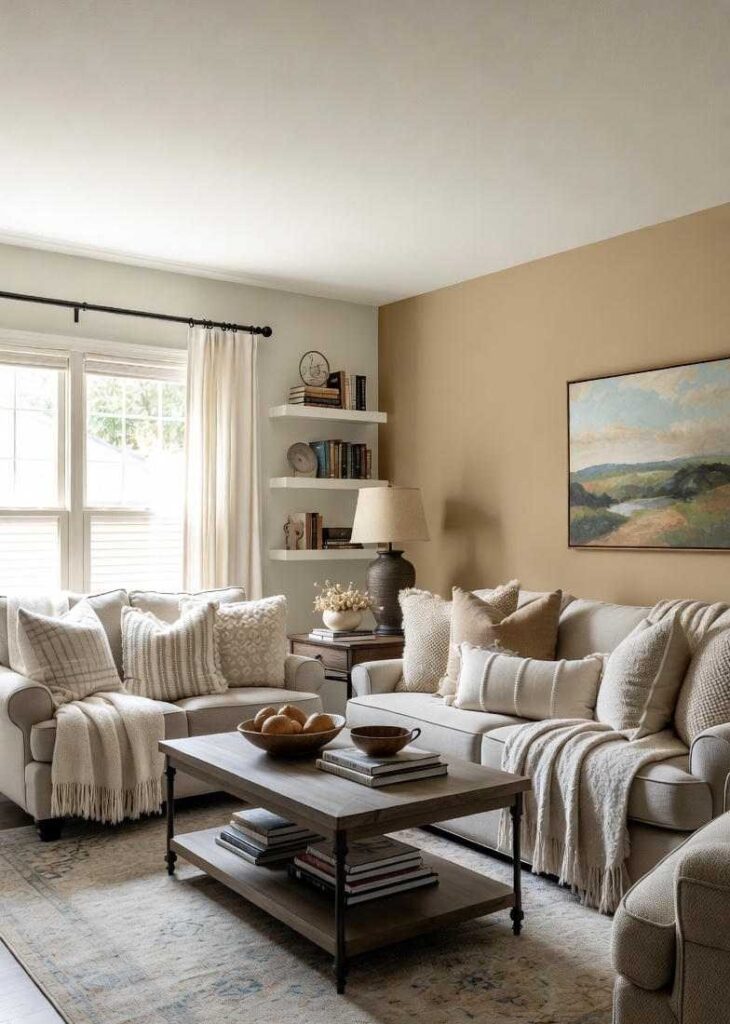
Living room
Accessible Beige: Because of Accessible Beige undertones, it can really morph into a true beige or more of a gray-beige according to the lighting in your living room.
In case your living room is more south-facing, it will appear brighter and airy, highlighting the warm beige tones.
If you are confused about where to paint this color in your living room, I would definitely recommend you paint it on the trim walls.
Just ensure that the other color should not be an off-white shade or a charcoal-gray shade.
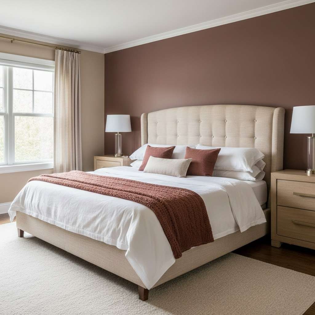
Balanced Beige: This color is the perfect backdrop for a cozy, yet elegant living space.
This color will work well with natural light because the undertones shift beautifully throughout the day.
For this shade, you can pair it with a charcoal black like Urbane Bronze to create a contrasting yet striking look to the living room.
Personal Recommendation: If you want a softer beige feel to the room, go with Balanced Beige, but if you want beige shade that can complement the darker elements in your living room, go with Accessible Beige.
Kitchen
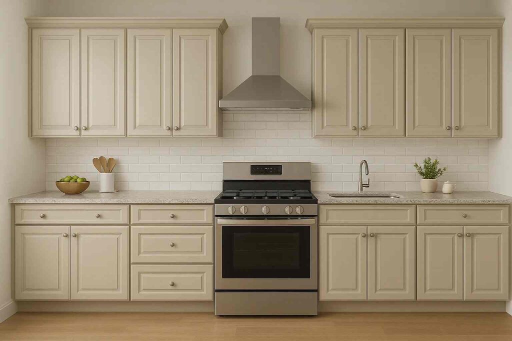
Accessible Beige: This soft, earthy beige shade brings about the right balance of warmth and sophistication to the kitchen.
This color on the kitchen cabinets acts as a grounding element to the entire space.
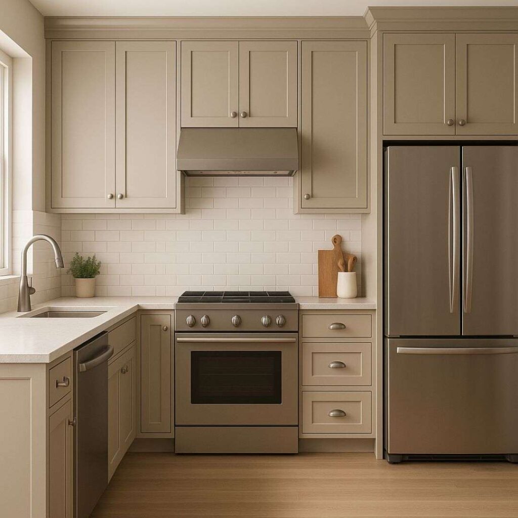
Balanced Beige: This color offers a clean and classic look for the kitchen – especially Balanced Beige cabinets have a special kind of love with the masses.
While most of the kitchen cabinets have white on them, this color bridges the gap between modern and classic design styles.
Due to its undertones and having a greige look to it, this color offers a safe choice to most homeowners who are bored of the usual white.
Personal Recommendation: In relation to Balanced Beige or Accessible Beige kitchen, I would stick with Accessible Beige.
This color has a timeless beauty like quality attached to it.
This shade creates an inviting atmosphere that makes the kitchen feel like a safe space.
Bedroom
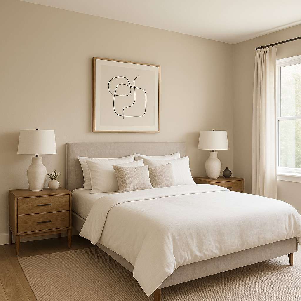
Accessible Beige: This color works well in the bedroom if you want a calm color without it being too dull.
The undertones on this color create a soft, warm look to the overall bedroom.
If the bedroom has natural light, the color gives off a very earthy, lived-in tone to it; and if the bedroom mostly has artificial light, the beige-gray tone shines.
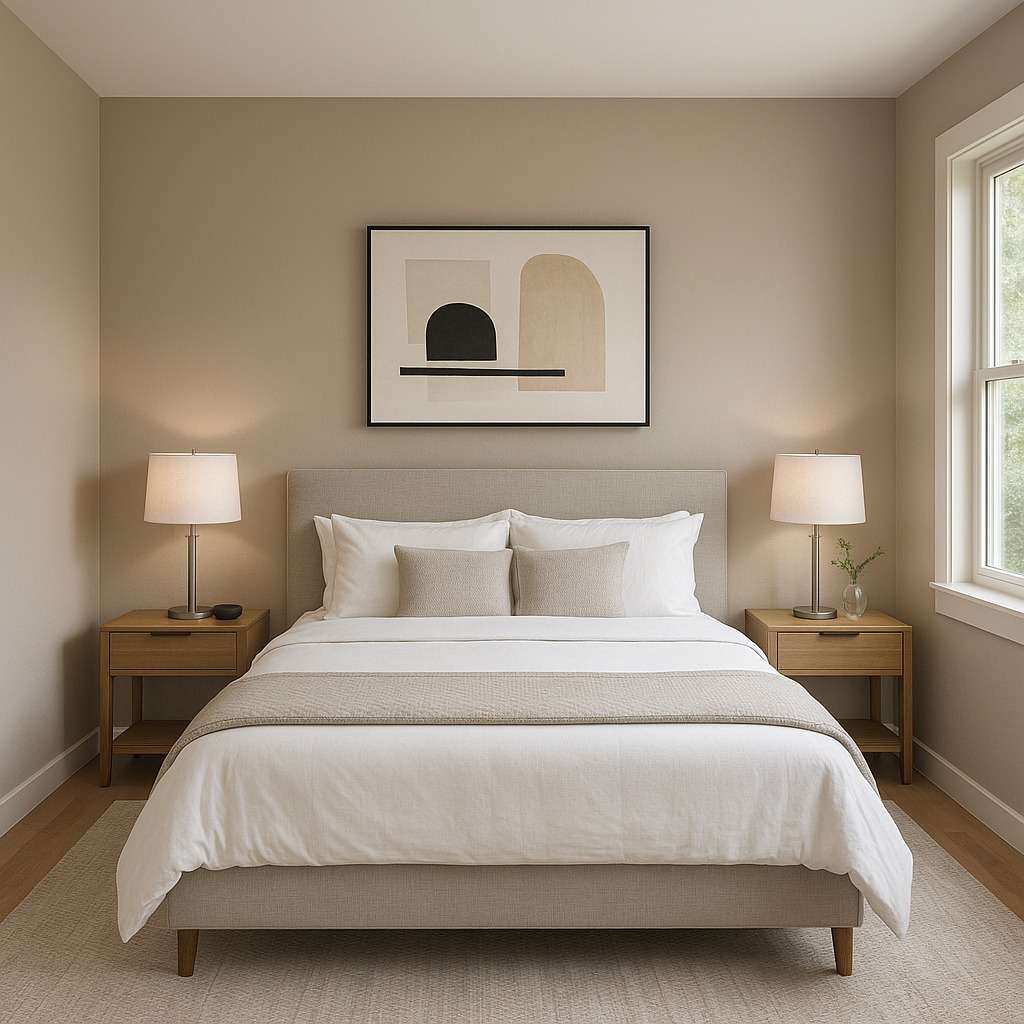
Balanced Beige: For the bedrooms, Balanced Beige sets the tone for relaxation and comfort.
The soft tone helps in creating a peaceful environment in the bedroom.
I would suggest layering different elements and textures throughout the room to create a balanced look.
Bonus tip – use dark, contrasting colors like Tricorn Black or Naval to bring about the entire look.
Personal Recommendation: I would personally go for Balanced Beige in the bedroom as it completely refreshed the overall look in my bedroom.
Bathroom
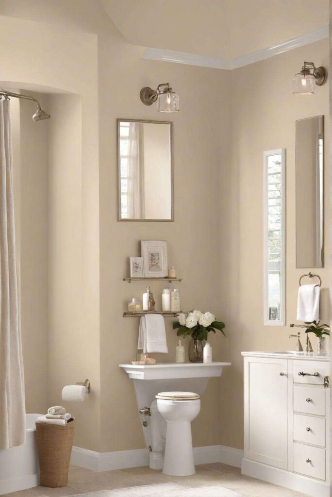
Accessible Beige: This shade of Beige has become a top choice for many homeowners who want some color on their bathroom walls and not use plain white colors.
Because it is a warm, neutral shade, it make small spaces feel bigger and more inviting.
The undertones from this color provide a very comforting kind of feel without looking too dull or bold.
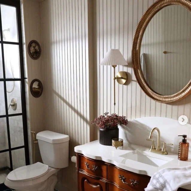
Balanced Beige: Choose this shade of beige, throw in some fake green plants, and add some natural stone elements to create a spa-like feel at home.
In a bathroom with natural light, its has a soft, cozy look to it without being too yellow.
Personal Recommendation: You can choose Accessible Beige if you want to make your bathroom look a bit bigger and brighter, and Balanced Beige if you want a spa-like feel in your bathroom.
Balanced Beige vs Accessible Beige vs Other Top Beige Shades
We have covered most of how SW Accessible Beige vs Balanced Beige looks in each room.
But with the variety of options that are in the market today with respect to the ‘beige’ family, it is given that you feel confused as to which one to choose from.
Why fear when I am here! In this section, I will compare Accessible Beige and Balanced Beige with other Beige colors so that you can make an informed choice for selecting the perfect Beige.
Let the showdown begin.
Balanced Beige vs Accessible Beige vs Agreeable Gray
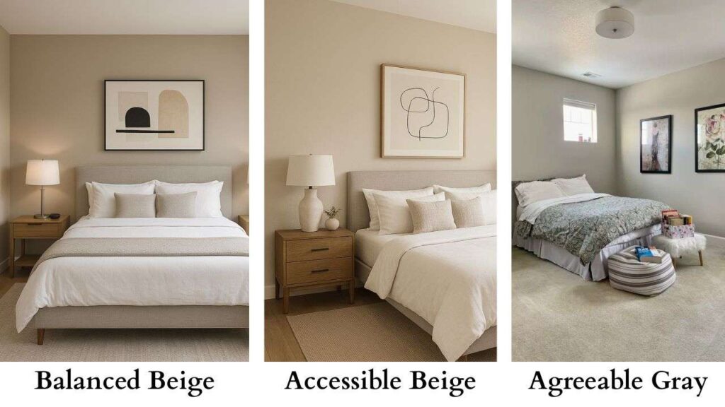
While all the three colors fall under the neutral ‘greige’ range, they differ in depth and warmth.
While Balanced Beige is a neutral, subtle gray with a slight pink-taupe mix, Accessible Beige is a warmer, slightly more gray-toned beige.
Agreeable Gray has similar tones to Accessible Beige, just a shade lighter – almost making Agreeable Gray and Accessible Beige like fraternal twins.
When I sampled Balanced Beige in my study room, I was able to notice the pink undertones shine in the natural light.
This color perfectly complemented the Tricorn Black in my room.
So it was obvious to me that I would choose this.
But I also sampled Agreeable Gray and Accessible Beige for the same room, and I saw just how similar they looked – beige with gray and hints of green shining through in natural light.
Accessible Beige vs Natural Linen
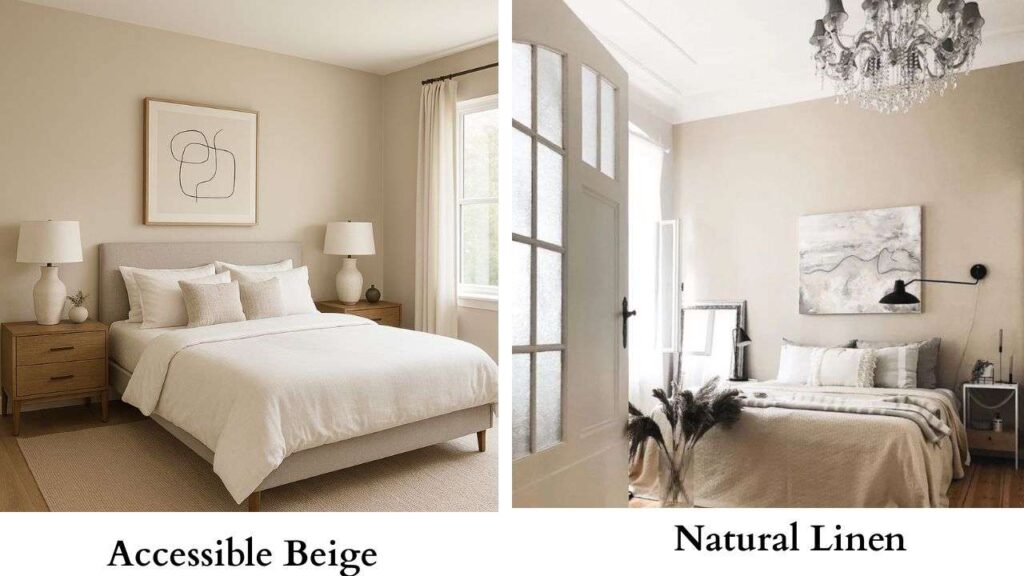
Accessible Beige Sherwin-Williams is a warmer, slightly more gray-toned beige with green-brown undertones, while Natural Linen Sherwin-Williams is a warm beige with pink-peach undertones.
When I sampled Natural Linen Sherwin-Williams in my bedroom, I was surprised to see the pink-peach tone shine out so much since my room only has 2 small windows.
The part where I sampled the color looked really comforting and beautiful.
The neutral beige shade really complemented the deep teal curtains I had.
Balanced beige vs Shiitake

As the color suggests, Shiitake is a warm mushroom gray-beige with red, almost khaki-like undertones, while Balanced Beige is a neutral, subtle gray with a slight pink-taupe mix.
I recommend Shiitake when you want a shade of beige that can complement off-white kind of shades, to just make the entire room have a pop of color.
I recommend Balanced Beige when you want to use a warm beige that can work in modern and traditional home styles.
Pale Oak vs Accessible Beige
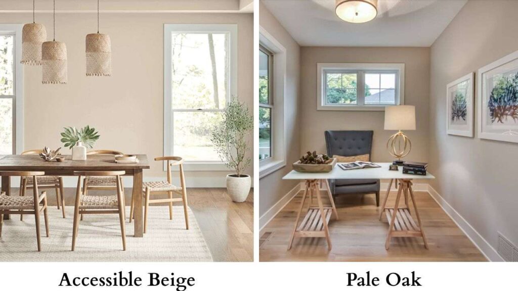
Benjamin Moore Pale Oak (OC-20) is a warm, creamy light beige that has an LRV of 68, which makes it a lot lighter than Accessible Beige.
Because it is so light, you can almost spot the yellow undertones to it, true to what undertones most Beige shades have.
I would recommend Pale Oak if you want a creamy, light beige shade.
It is not quite off-white, just has a hint of it, which keeps the color soft without washing it.
But if you want to use a color that has more depth to it alongside showcasing those gray-beige shades, Accessible Beige is the one for you.
Accessible Beige vs Revere Pewter
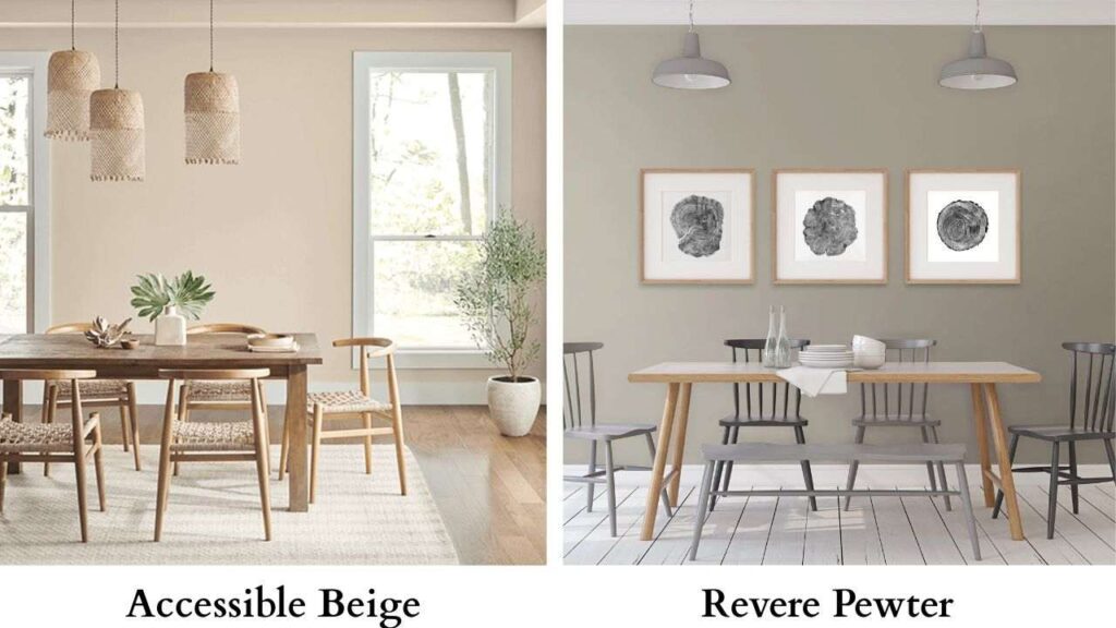
Although both are shades of beige, Accessible Beige is a warmer, lighter version, whereas Benjamin Moore Revere Pewter (HC-172) is a cooler, darker beige.
Revere Pewter has an LRV of 55 and appears more gray.
When used in natural light, it can lean more towards green, and in artificial light, it can go more muddy brown undertone.
I would say that Revere Pewter is a more suited shade of beige for living rooms in homes as compared to Accessible Beige because it sits right in the middle of gray and beige, creating a balanced look.
Balanced Beige vs Bungalow Beige
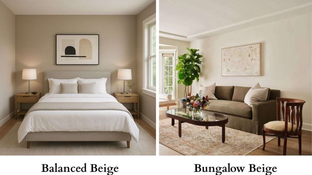
Balanced Beige SW 7037 is a neutral, subtle gray with a slight pink-taupe mix, while Bungalow Beige is a warmer, lighter beige with peach and pink undertones.
Balanced Beige is best used for creating a slightly darker and modern backdrop in your home.
It is great for open spaces as it provides enough contrast.
Bungalow Beige is best used for adding some warmth to the room.
It is good if you want to go for a more traditional type of Beige with a hint of color to make the space more colorful.
Accessible Beige vs Aesthetic White
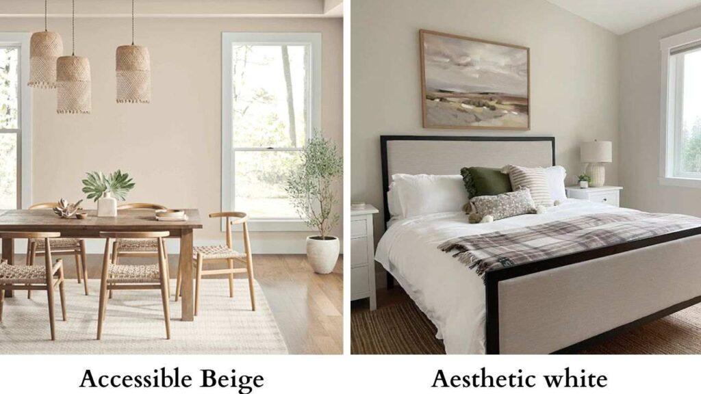
Accessible Beige SW 7036 is a slightly darker beige color, with brownish-green undertones, while Aesthetic White is a soft, neutral off-white with subtle beige-gray tones.
Accessible Beige appears darker and warmer, almost like the color of chocolate milk (when it’s first mixed with milk) while Aesthetic White is a more subtle gray.
I would choose Aesthetic White for a lighter, more versatile off-white, and Accessible Beige for a warmer, deeper beige.
Comparison Table: Balanced Beige vs Accessible Beige vs Other Beige Shades
| Shade | LRV | Undertones | Depth / Appearance | Overall Vibe | Best For |
| Balanced Beige (SW 7037) | 46 | Warm beige with slight taupe/gray | Medium depth; richer & warmer | Cozy, grounded, warm | Bedrooms, living rooms, north-facing rooms |
| Accessible Beige (SW 7036) | 58 | Greige with subtle green-gray | Light–medium; soft & airy | Calm, modern, balanced | Open layouts, hallways, family rooms |
| Agreeable Gray (SW 7029) | 60 | Soft gray with a touch of beige | Light and clean | Fresh, contemporary | Whole-home use, rentals, low-light rooms |
| Natural Linen (SW 9109) | 60 | Warm beige with yellow-tan | Light & warm | Soft, relaxed, inviting | Bedrooms, cozy spaces, warm decor |
| Shiitake (SW 9173) | 51 | Warm greige with brown/taupe | Medium depth | Earthy, organic, grounded | Rustic/earthy interiors, warm wood tones |
| Pale Oak (OC-20) | 69 | Warm greige with pink/violet whispers | Light & bright | Soft, elegant, airy | Modern homes, small rooms, bright spaces |
| Revere Pewter (HC-172) | 55 | Warm greige with slight green | Medium-light | Timeless, classic | Traditional homes, whole-home color |
| Bungalow Beige (SW 7511) | 53 | Warm beige with orange/yellow | Medium; can lean warm | Sunny, traditional | Rooms needing warmth, Mediterranean styles |
| Aesthetic White (SW 7035) | 73 | Soft greige with subtle violet | Very light; almost off-white | Minimal, refined, modern | Small spaces, modern interiors, low-light rooms |
Best Accessible Beige Complementary Colors To Choose From
Accessible Beige SW is the kind of beige shade that can work well with crisp whites, dark teal, and even black shades.
Although Accessible Beige is a light beige, so many people still check if there is a lighter version of Accessible Beige?
Yes, Sherwin-Williams Aesthetic White can be a close match of a shade lighter than Accessible Beige.
Accessible Beige as a color pairs well with colors like Dover White or Alabaster for a very classic look.
You can pair this color with blues/greens for a vibrant and earthy look.
You can also pair this color with other neutrals, whites, and blacks to create a classic home palette.
If you want to make an entire palette for your home using Accessible Beige SW as the main color, here is a breakdown of what kind of colors will complement this color.
Sherwin-Williams Greek Villa (7551):
This shade is a gorgeous warm white and has an LRV of 84; it has soft yellow undertones.
Because of this, this color gives off a very subtle warmth.
If you pair this with Accessible Beige, this color can provide a contrast without being too stark.
Sherwin-Williams Whitetail (7103):
This shade is similar to Greek Villa – a warm off-white shade with yellow undertones, and has an LRV of 86.
Pairing this shade with Accessible Beige will give a very seamless, classic, and understated look to the room.
It will make the entire room look harmonious and cozy.
Sherwin-Williams Alabaster (7008):

This color is also a warm off-white shade, but unlike the other two shades discussed above, this has strong yellow undertones.
With the LRV of 82, it gives off a grayish look in natural light.
If you want to pair this shade with Accessible Beige, I would recommend using it as a single accent wall in the bedroom.
Due to its muted gray look, it will complement Accessible Beige a lot.
Benjamin Moore Swiss Coffee (OC 45):
Swiss Coffee is considered a warm color with creamy undertones of beige with a splash of yellow undertone.
It has an LRV of 81, which gives it a soft, inviting feel.
When paired with Accessible Beige as a wall trim color, it can create a soft, welcoming atmosphere in bedrooms, kitchens, and living rooms.
Benjamin Moore White Dove (OC 17):
Falls in a similar shade range to Swiss Coffee, Whitetail, and Greek Villa, this shade too is a warm off-white with pale, almost invisible yellow undertones. It has an LRV of 83.
I would recommend pairing this with the ceiling and wall trim color in your home, along with Accessible White on the main walls, to create a soft, contrasting look.
Sherwin-Williams Dried Thyme (6168):
This is very outdoorsy yet sophisticated green, with a hint of blue undertone.
With an LRV of 21, it goes more towards the cool green range.
I would recommend using this color as an accent wall to create a cozy yet sophisticated look to the room.
Sherwin-Williams Moth Wing (9174):
This medium-toned taupe with gray undertones is both timeless and sophisticated.
It has an LRV of 29, but due to its gray undertone, it leans toward the warm side.
A neutral, warm color like Accessible Beige will complement the gray undertones of Moth Wing to create a seamless look in the room.
Sherwin-Williams Redend Point (9081):
This is a neutral color with undertones of dark gray, red, and brown that give it the ‘teracotta” kind of look.
With an LRV of 30, this color is just a shade darker than Moth Wing.”
I would recommend pairing these two colors together to create a seamless, monochromatic look.
Choosing the right neutral Between Balanced Beige Versus Accessible Beige
Choosing between Balanced beige vs Accessible beige SW can get really confusing for any person.
An incorrect color can totally break the overall look of the house, whereas the correct shade can often create a harmonious, seamless look.
You can basically use beige as a neutral background color to create a calm, inviting atmosphere.
This color is ideal for making a foundational space that doesn’t overpower other elements, making it a great choice for interior design.
Let me give you a quick rundown as to when you can choose Balanced Beige and Accessible Beige.
When to choose Balanced Beige
I would recommend choosing Balanced Beige if you want a cozier, richer, and warmer space, as it is a bit more saturated shade of beige with a subtle gray and a slight pink-taupe mix.
I will recommend you to choose Balanced Beige when you want a versatile kind of beige shade that works in almost every room and complements almost any design style.
It is good for rooms with ample natural light, when you want a warm, inviting feel to it.
That is because it can adapt itself to light.
I would refrain from using Balanced Beige in spaces that do not have much light or in basements that don’t have any source of natural light, as it can appear a bit too dark in these spaces, almost giving a very dark beige- brown look that may or may not complement all design styles.
When to choose Accessible Beige
I would choose Accessible Beige if you want a warm and timeless look to your room.
Due to its greige base and warm undertones, this color is usually recommended for larger open areas or open floor plans where color continuity is important.
Now, what about when not to use accessible beige?
Simple. Refrain from using this color in tight spaces or small spaces like bedrooms/bathrooms as the base color, because the color might not create the seamless, timeless look you want to achieve.
Conclusion
By now, you have seen how differently beige can behave as a color depending on undertone, light, and depth.
When I first started comparing Balanced Beige vs Accessible Beige, I didn’t expect the subtle differences between them.
But when I finally sampled them out properly in each room, made their personalities pop out.
Accessible Beige SW leans toward calm, and steady, a shade that quietly supports everything around it.
Balanced Beige SW has more presence and provides the room with a grounded type of warmth that feels intentional.
Pitting them with other kinds of neutrals, and both shine out.
If you are still confused which one to choose, I would suggest going back to your space and seeing what’s missing.
If you feel that softness, depth, and coziness are required, go with Accessible Beige; but if it requires warmth, sophistication, and openness, go with Balanced Beige.