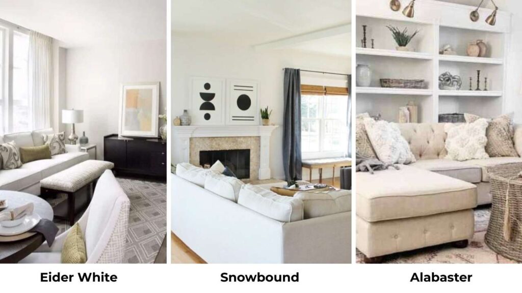
Sherwin Williams Eider White and Snowbound, both are on the same color strip, both called “white,” and both make you rethink your decision.
The Eider White vs Snowbound confusion comes by many clients because they’re popular. But these two are NOT interchangeable.
Both are light neutrals that are in off-white to barely-there-gray. They look almost the same but Eider White is into soft greige territory with some undertones, while Snowbound is clean and bright.
But they’ll shift depending on your lighting, what floor you have, what your cabinets look like, and whether your room faces north or gets come with afternoon sun.
And choosing the wrong shade can make your space feel off.
Here in this post, I’m breaking down everything I’ve learned from Eider White Vs Snowbound, the LRV, the undertones that matter, how they behave in different rooms, and which one you should pick based on what you’re working with.
We’re also comparing them to other popular Sherwin Williams colors.
Here are my other blogs that you can also read:
- Sherwin Williams Rainwashed Vs Sea Salt
- Tricorn Black Vs Black Magic
- Edgecomb Gray Vs Accessible Beige
- Cloud White Vs White Dove
- White Dove Vs Chantilly Lace
Overview of Sherwin Williams Eider White (SW 7014)
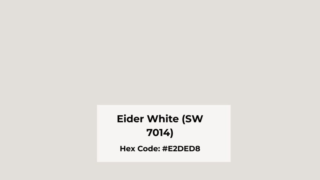
Eider White is one of the colors that confuses people. The name says “white” but it’s a light greige.
With an LRV of 73, it’s visibly deeper than many colors people think of as white.
I used it in my own bedroom and spent the first week I was sure that I made a mistake because it looked purple in the morning light.
The soft greige undertones come from a mix of gray and beige, but, Eider White has these violet and taupe undertones that show up depending on the light.
In north-facing rooms or spaces with minimal natural light, the purple undertones come out.
Homeowners and designers keep coming back to this color for living rooms, bedrooms, and whole-house because when it works.
It has depth and complexity that pure white can’t have. It pairs beautifully with warm wood tones, natural stone, and the soft black accents.
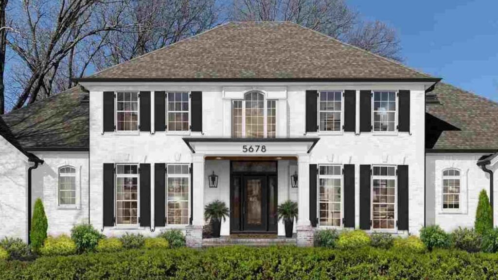
On exteriors, I’ve seen it look stunning on modern farmhouses, mainly when the light is good.
But you need decent natural light for this color to shine. Put it in a dark hallway or a basement room and you’ll get an out of place, sad version.
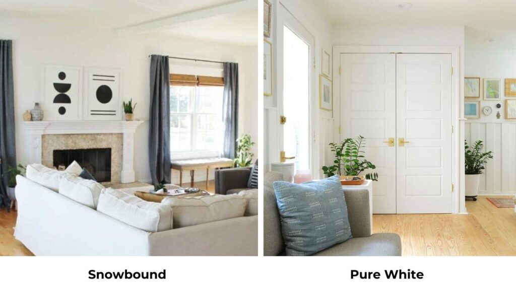
Overview of Sherwin Williams Snowbound (SW 7004)
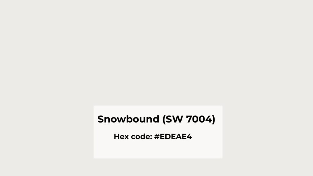
Snowbound is the people-pleaser of the white world. It has an LRV of 83, which means it reflects more light than Eider White and looks white.
This is the color I recommend when someone says they want white walls but Alabaster feels too creamy and Extra White feels like an office.
The undertones are soft gray with hints of pink but it’s subtle. It shows up as a gentle warmth that keeps Snowbound from feeling cold.
I’ve used it on trim many times because it’s clean and bright without being aggressive about it.
What makes Snowbound popular for interiors is how forgiving it is. In low light, it holds up and in the north-facing room, it still looks good.
I had a client who did Snowbound on four walls in her 2,400 square foot house and it worked in every room.
The kitchen with south-facing windows looked bright and airy. The north-facing bedroom didn’t turn gray and depressing.
For exteriors, Snowbound is CLEAN, modern, fresh, and works beautifully with cool grays, charcoal, black accents, and natural wood tones.
I’ve used it for Scandinavian-style homes and modern builds where it should not look boring.
The pink undertones can show on you if you put Snowbound next to a cool white or in a room with warm lighting. Always test it in your space.
I learned this on a project where we painted an entire bedroom and the client called me because it looked peachy.
Eider White Vs Snowbound: Undertones, Lighting and Best Uses
These two colors may be on the same color swatch, but they look different in real spaces. The wrong pick is seen the second you paint a whole wall.
Let me break down what matters so you don’t end up repainting.
LRV
Light Reflectance Value is the number that tells you how much light a color throws back at you. It is from 0 (pure black) to 100 (pure white).
Eider White is at 73, which comes in light-gray territory, not white territory. It absorbs more light, which creates depth and shadow.
If you’re looking for contrast against bright whites or you want your walls to have presence.
Snowbound comes in at 83. Snowbound is bright and will make a room feel open and airy. If you’re working with a dark room, limited windows, or northern exposure, the extra reflectivity matters.
LRV isn’t a random number but it’s how your room will feel when you’re living in it.
Undertones
Eider White has gray, greige, and violet undertones. The gray and beige mix creates a greige base, but the violet notes are REAL.
I didn’t believe it until I painted my bedroom. Morning light brought the purple tones. Evening light with warm bulbs brought the taupe and beige.
It’s neutral-leaning cool, but it shape-shifts depending on what you pair it with.
Snowbound has soft gray and pink undertones. The pink keeps it from being cold, but it’s not warm to look like a cream. It’s neutral-leaning warm.
Next to Eider White, Snowbound looks clean and bright. Next to a true white like Extra White, you’ll see pink softness.
If you’re building a house with warm woods, beiges, and greiges, Eider White goes with that better.
If you’re going modern, cool grays, or you want white without going harsh, Snowbound is the best choice.
Lighting Behaviour
Lighting will make or break both of these colors. Not to be dramatic, but I’ve seen these colors look unrecognizable in different lighting situations.
Eider White needs good natural light. South or east-facing rooms bring the warm greige tones and minimize the purple.
North-facing rooms or spaces with artificial light, the purple comes OUT. It looks dark, cool, and a bit sad.
If you’re working with limited light and you’re set on Eider White, go with warm-toned LED bulbs.
Snowbound is more flexible. I’ve used it in north-facing bathrooms, low-light hallways, and sun-drenched living rooms.
It holds its brightness when the light isn’t ideal. The pink undertones get more visible in warm lighting. This is the color I recommend when someone has a challenging light.
In one project, I used Eider White on the walls with Snowbound trim in a living room with west-facing windows and it was gorgeous.
In the evening when the warm western light came in, the Eider White walls looked purple next to the Snowbound trim.
Style Compatibility and Best Uses
Eider White fits into greige palettes, modern farmhouse, and transitional spaces. It’s complex to work with other layered neutrals.
I’ve paired it with Agreeable Gray, Repose Gray, and Mindful Gray for trim and wainscoting.
Works beautifully with warm wood floors, natural stone counters, and the matte black fixtures. For furniture, it creates a soft backdrop that doesn’t compete.
Snowbound loves modern, Scandinavian, and clean transitional styles. It’s the color for people who want white but don’t want it to look boring.
Pairs well with cool grays, charcoal accent walls, black window frames, and light wood tones.
For cabinets, it’s become a designer favorite because it’s white to feel fresh but soft not to show fingerprints and imperfection.
If you’re using Eider White on walls, go with Snowbound, Extra White, or Pure White for trim. If you’re using Snowbound on walls, you can use Extra White or Snowbound again on the trim.
| Factor | Eider White (SW 7014) | Snowbound (SW 7004) |
| LRV | 73 | 83 |
| Undertones | Gray, greige, violet | Soft gray, pink |
| Warmth | Neutral-cool | Neutral-warm |
| Light Needs | Needs good natural light | Forgiving in low light |
| Best Rooms | Bedrooms, living rooms with good light | Any room, especially low-light spaces |
| Pairs With | Warm woods, greige palettes, stone | Cool grays, black, natural wood |
| Trim Pairing | Snowbound, Extra White, Pure White | Extra White, High Reflective White, or self |
| Style | Modern farmhouse, transitional, greige schemes | Modern, Scandinavian, clean transitional |
Sherwin Williams Eider White Vs Snowbound: Room-By-Room Comparison
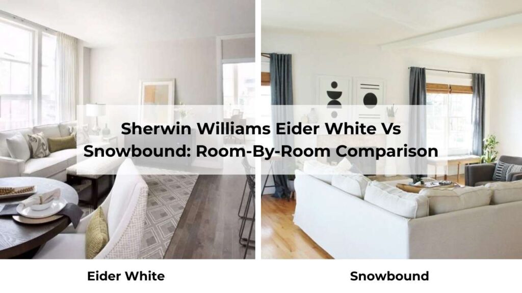
Let’s talk about rooms in houses, because a color that works in a bedroom may look wrong in a kitchen, and I’ve learned this the hard way more than once.
Different rooms have different lighting, different functions, and different vibes. Here’s how these two look when you put them in your space.
Living Room
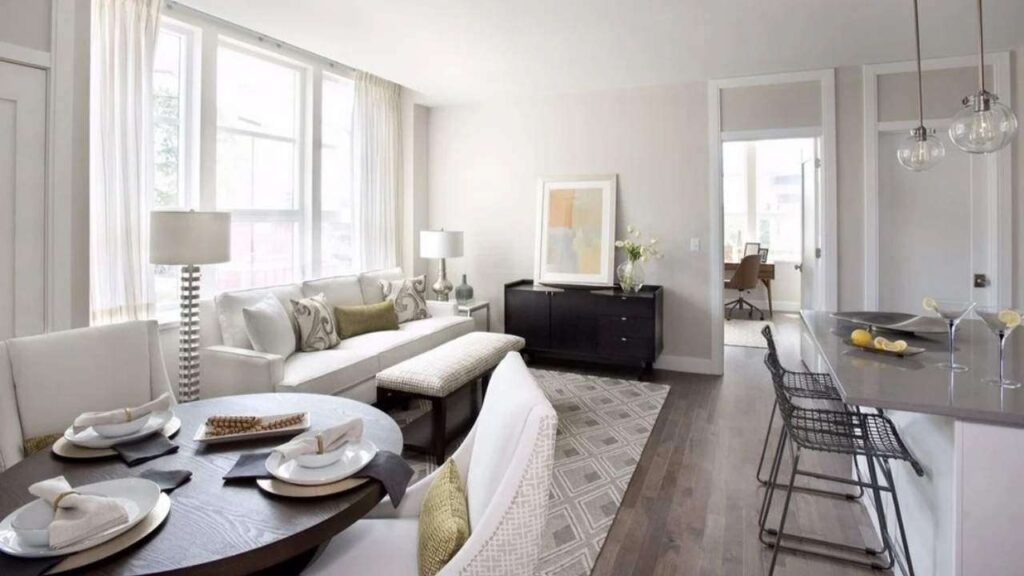
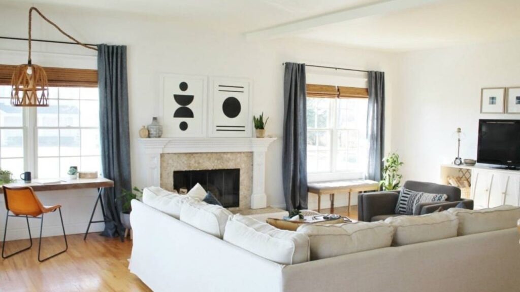
Eider White in a living room is about the cozy, layered neutral vibe. If you’ve good windows and you’re going for a warm, collected look with greige furniture and natural textures, this color creates the perfect backdrop.
It has depth that it doesn’t disappear and your walls have presence. I used it in a client’s living room with oak floors and a stone fireplace, and it pulled the room together.
If your living room is north-facing or doesn’t get great light, the violet undertones will show up.
I had one project where the clients LOVED Eider White in photos but their living room faced northeast. We tested it and the room looked purple-gray and depressing.
Snowbound in a living room gives you a fresh, airy, modern feel. It’s bright to make the space feel large but soft not to feel clinical.
I’ve used it in living rooms with cool-toned furniture, black accent pieces, and light wood floors and it looks PERFECT.
Also, works great if you’re doing a house white because it transitions well into other spaces.
One of my favorite Snowbound living rooms was in a house with south-facing windows.
The brightness can be overwhelming with a harsh white, but Snowbound absorbs light to feel comfortable. And the pink undertones are barely visible.
Bedroom
Eider White in bedrooms is hit or miss. Some people LOVE the soft, cocooning feeling it creates. The low LRV means the room feels intimate and restful.
I painted my own bedroom Eider White and sometimes it had a purple undertone but I loved it at night.
But here’s what I tell clients, if you wake up to harsh morning light, be prepared for the violet undertones.
If you’re someone who needs their bedroom to feel bright and energizing in the morning, Eider White will make it look like it shouldn’t be there.
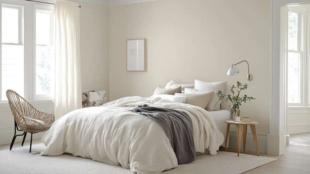
Snowbound bedrooms are foolproof. It keeps the room feeling light and serene without being cold. I’ve used it in guest bedrooms, primary suites, and in kids’ rooms.
It plays well with any bedding color, any furniture finish, any accent wall situation you want to create. The pink undertones work in your favor in bedrooms because they add warmth.
I had a client who wanted white walls but was terrified of her bedroom looking cold. Snowbound was the best choice.
It is soft, clean, worked with her gray upholstered bed and white duvet, and didn’t compete with the art.
Bathroom
Eider White in bathrooms is tricky. Many bathrooms don’t have natural light. Artificial lighting in bathrooms has to be cool.
Put Eider White in the situation and you’re going to get a gray-purple situation.
I HAVE used it in a bathroom with a large window, white subway tile, and warm brass fixtures. The key was the warm metal finishes and good light.
The greige undertones played well with the brass and didn’t look out of place.
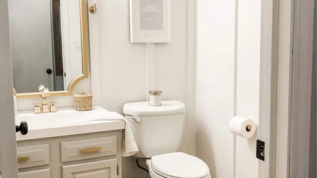
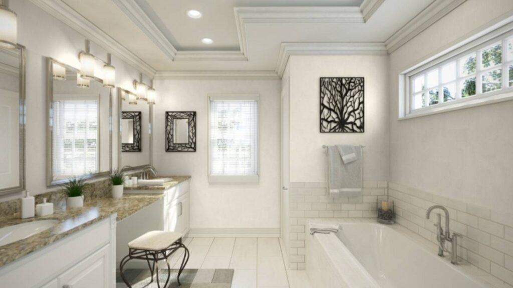
Snowbound in bathrooms is where this color shines. Bathrooms need to feel clean and fresh. Snowbound is what you should go for.
I’ve used it on walls with white tile, with marble, with gray tile, works every time. The high LRV means a small bathroom with one tiny window feels bright.
The pink undertones don’t show up in bathrooms because you’re working with cool surfaces which balances it.
I did an entire bathroom renovation with Snowbound walls, white subway tile, black fixtures, and marble counters and it was clean, modern, didn’t show a water spot, and the clients have had zero regrets.
Kitchen
Eider White in kitchens is a bold choice. I’ve done it twice, and both times it was in kitchens with warm wood cabinets, stone counters, and natural light.
The greige undertones complement warm-toned kitchens and create a soft background than a true white.
If you’ve white cabinets and you paint the walls Eider White, it’ll look out of place in comparison. If you’ve gray cabinets, it can clash with the undertones.
One kitchen I did with Eider White had natural oak cabinets, soapstone counters, and big windows.
The walls created a warm, earthy backdrop which felt more collected than your standard white kitchen.
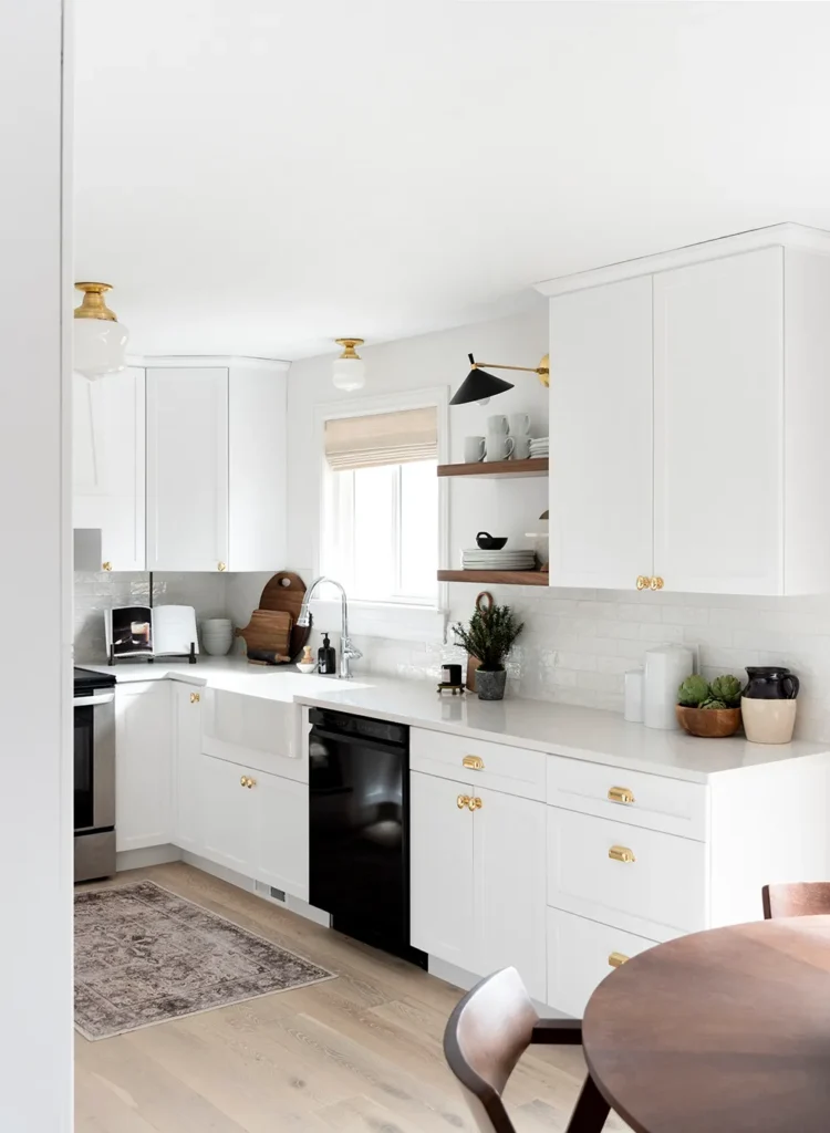
Snowbound in kitchens is more versatile. It’s bright to keep the kitchen feeling open and clean but soft so as not to feel cold.
I’ve used it with marble counters, quartz, butcher block, concrete and it complemented it well.
Also, Snowbound is my go-to for kitchen cabinets. It’s white to feel traditional but doesn’t have the harsh, ultra-bright thing that shows every imperfection. Pairs beautifully with any wall color.
Exterior
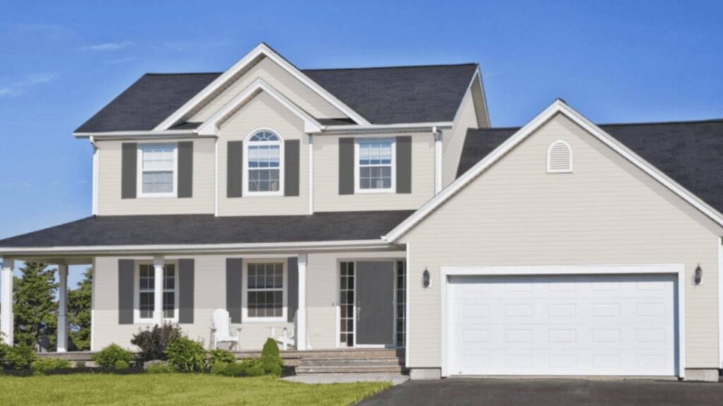
Eider White on exteriors is less common, but I’ve seen it work on modern farmhouses. The greige undertones create a warm, soft look than a bright white.
Works well with natural wood accents, stone, and black or dark trim. The challenge is that it’ll look different on each side of your house depending on sun exposure.
I consulted on a farmhouse exterior with Eider White walls, white trim, and a dark gray roof. It looked beautiful on the sides with good light.
The north side looked flat and gray, but the homeowners were okay with it. If you’re considering Eider White for exterior, test it on ALL four sides and look at it at different times of day. Exterior lighting is more variable than interior.
Snowbound on exteriors is POPULAR and for good reason. It’s clean, modern, and fresh. I’ve used it on full exteriors and as trim with Agreeable Gray walls.
It holds up in full sun without looking harsh, and it doesn’t look out of place on the shaded sides. It works with any trim color, any roof color, any style from traditional to modern.
I did a coastal-style home with Snowbound siding and black windows and it looked expensive and intentional without trying hard.
Eider White Vs Snowbound Vs Other Colors
Look, I know you’re not only comparing these two, but you are also looking or comparing other whites too.
Let me tell you how Eider White and Snowbound look against other colors you’re considering. I’ve compared all of these in real projects, so this isn’t random but this is reality.
Eider White Vs Alabaster
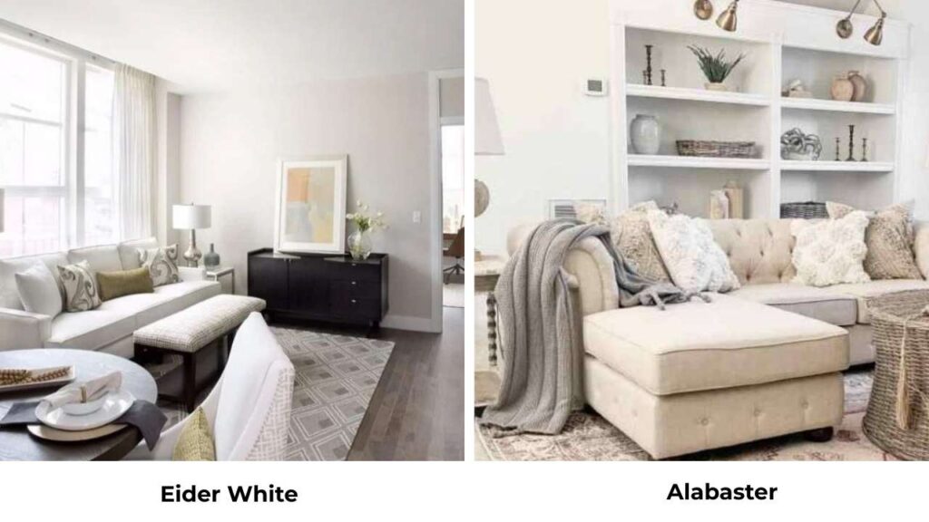
Alabaster SW 7008 is warm and creamier than Eider White. Alabaster has an LRV of 82 and brings beige and cream undertones. It’s one of the popular warm whites out there.
Next to Eider White, Alabaster looks visibly yellow-cream, while Eider White looks gray and cool.
I recommend Alabaster when someone wants a true warm white for walls. I recommend Eider White when they want a greige-neutral with complexity.
Alabaster is easy to work with and forgiving. Eider White requires better light and careful pairing.
Eider White Vs Repose Gray
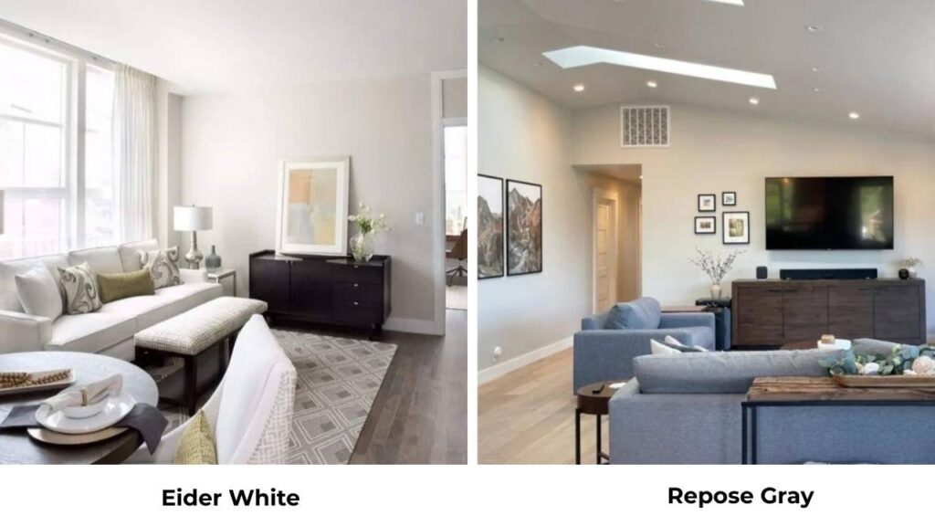
Repose Gray SW 7015 is cooler and darker than Eider White with an LRV of 58.
Repose Gray is a gray, while Eider White is a light greige trying to pass as white. Repose has the same subtle violet undertones but they’re controlled because the color is deep.
I use Repose Gray when someone wants a true gray that’s soft and neutral. I use Eider White when they’re scared of color commitment but want more white.
These two pair well together, Repose Gray on an accent wall with Eider White on the other walls creates depth without drama.
Eider White Vs Drift of Mist
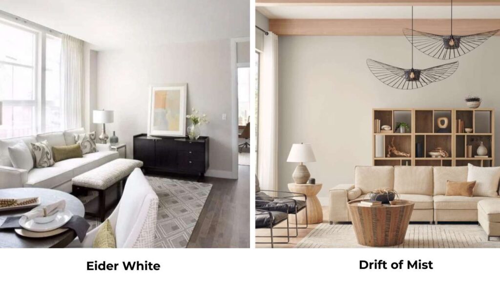
Drift of Mist SW 9166 is light, cool, and has blue-green undertones that Eider White doesn’t have.
Drift of Mist is around LRV 73 but looks different because of the cool undertones. Where Eider White can look purple-taupe, Drift of Mist looks blue-gray.
They serve different purposes. Drift of Mist for coastal, cool, airy spaces. Eider White for warm neutral schemes.
I’ve never had a client between these two, they’re different and the choice is obvious.
Eider White Vs Agreeable Gray
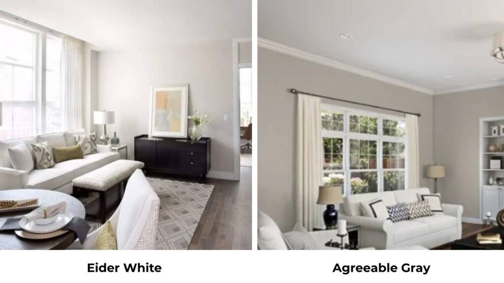
Agreeable Gray (SW 7029) is darker and warmer with an LRV around 60. It’s a true greige – gray and beige balanced pretty evenly.
Agreeable Gray has more presence on walls because it’s darker. Eider White is lighter and more subtle.
I’ve paired these two together. Agreeable Gray on exterior walls with Snowbound trim is my most-repeated combo.
For interiors, Agreeable Gray creates contrast and definition than Eider White.
Choose Agreeable Gray if you want your wall color to be visible. Choose Eider White if you want it to be background.
Eider White Vs White Duck
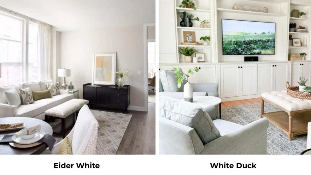
White Duck SW 7010 is between Eider White and Snowbound in terms of warmth. It has an LRV around 83 but is more neutral-warm with soft undertones.
White Duck doesn’t have the pink the Snowbound has or the purple that Eider White has.
White Duck is underrated. It’s a safe middle ground when clients can’t decide between cool and warm. But I find myself reaching for Snowbound more because it’s interesting.
Eider White Vs Shoji White
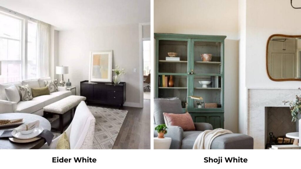
Shoji White SW 7042 is warm, creamy, and more beige than Eider White. LRV is around 82.
Shoji has peachy-beige undertones that make it warm. Next to Eider White, Shoji looks cream while Eider looks gray.
Shoji white is for people who love warm, cozy, traditional spaces. Eider White is for people who want neutral-cool and modern.
Snowbound Vs Pure White
Pure White SW 7005 is cooler and grayer than Snowbound. Both have similar brightness levels but Pure White has more gray undertone and less pink.
Pure White looks like a true cool white while Snowbound has the neutral-warm softness.
I use Pure White when someone wants white, especially for trim. Snowbound when they want white that feels friendly and stark.
Pure White with Snowbound walls is a combo I use a lot that creates contrast without being obvious.
| Comparison | Key Difference | When to Choose First | When to Choose Second |
| Eider White vs Alabaster | Alabaster is warmer, creamier (LRV 82) | Want greige with complexity | Want warm, easy white |
| Eider White vs Repose Gray | Repose is darker, true gray (LRV 58) | Want light neutral | Want real gray color |
| Eider White vs Drift of Mist | Drift has blue-green undertones | Want warm greige | Want cool, coastal feel |
| Eider White vs Agreeable Gray | Agreeable darker, warmer (LRV 60) | Want subtle background | Want noticeable wall color |
| Eider White vs White Duck | White Duck brighter, more neutral | Want complexity | Want safe middle ground |
| Eider White vs Shoji White | Shoji warmer, peachy-beige | Want neutral-cool | Want cozy cream |
| Snowbound vs Pure White | Pure White cooler, grayer | Want soft white | Want true white |
Conclusion
Eider White Vs Snowbound, both are great colors that serve different purposes, and picking between them depends on your space, your light, and what vibe you’re trying to create.
Choose Eider White if you’ve good natural light, you’re building a warm greige palette, and you want walls with depth and presence.
It’s complex, it’s moody and it creates the collected, layered neutral look. But don’t put it in dark rooms and expect magic.
Choose Snowbound if you need a forgiving white that works in any lighting, any room, any style. It’s bright, clean, modern, and more versatile for many people.
It works on walls, trim, cabinets, exteriors and anywhere you need white that isn’t boring or flat.
In my personal opinion, Snowbound is safe for most people. Eider White is beautiful when everything aligns, but it requires the right conditions.
If you’re unsure, start with Snowbound. You can go deeper, but it’s hard to go lighter when you’ve committed to Eider White.
And BUY SAMPLES. Paint big swatches on multiple walls. Look at them for a few days in different lighting.
Choosing between Eider White Vs Snowbound can be a bit tough but it is possible to go with.
FAQs On Eider White Vs Snowbound
Snowbound is neutral-leaning warm, but it’s not a traditional warm white like Alabaster. It has soft gray and pink undertones that give it warmth without making it creamy or yellow. Compared to cool whites like Extra White, it is warm. Compared to warm whites, it’s neutral.
For trim with Snowbound walls, Extra White and High Reflective White are my best choices. They’re both bright and create clean contrast without being harsh. I use Snowbound on both walls and trim because it creates a seamless, cohesive look.
Eider White loves other warm neutrals and greiges. I pair it with Agreeable Gray, Repose Gray, and Mindful Gray. For trim, Snowbound, Pure White, or Extra White create the right amount of contrast. Accent colors that work are soft blacks, warm woods, natural stone tones, muted blues, sage greens.
Cool grays like Repose Gray and Agreeable Gray are classics with Snowbound. Black accents, charcoal, natural wood tones, navy, forest green looks great. For a house, Snowbound walls with Extra White trim and Agreeable Gray accent walls are the best combo.
Eider White Vs Snowbound: A Side-by-Side Paint Comparison